When I started to mix my own paints using artist pigments in earnest I thought that using it for WW2 miniatures and models would be a step too far. The colours are harder to mix and you also start getting into questions of accuracy and the ability to replicate the same colour on multiple occasions. But I gradually realised that the accuracy issue was nonsense – in field conditions there was in fact a lot of variation in end appearance – and that was the answer to the replicability issue too. And as I looked at models and miniatures in magazine pictures and at shows, I felt that these often didn’t look right. Surely I needed to take control and produce my own answers? Colour is much more subjective than we tend to think.
But I wasn’t wrong about these colours being hard to mix. They are dull, deep into what I call tertiary territory – i.e. combinations of the three primary colours. Small changes in hue can make a big difference to the visual appearance (as can lighting) – where there is a much greater tolerance in Horse & Musket colours. And it sometimes isn’t that obvious which hue on the colour circle is dominant. Both olive drab and khaki often look green to our eyes (or rather brains) – but they are actually closer to yellow and orange respectively. But once you get the hang of it, it is very empowering. If you want to attempt this, my experiences should help you.
There are three fields where I have used my paint mixing skills: figures, vehicles and aircraft. All of these are focused on British and German forces in the Mediterranean in 1943, with some American aircraft of that period thrown in. Each of these fields requires a different set of techniques, and has raised different challenges. (I have also painted artillery pieces, but these are hybrids of figures and vehicles which require no special techniques, apart from big bases, which is a bit out of scope). I will look at each of these in turn.
Figures
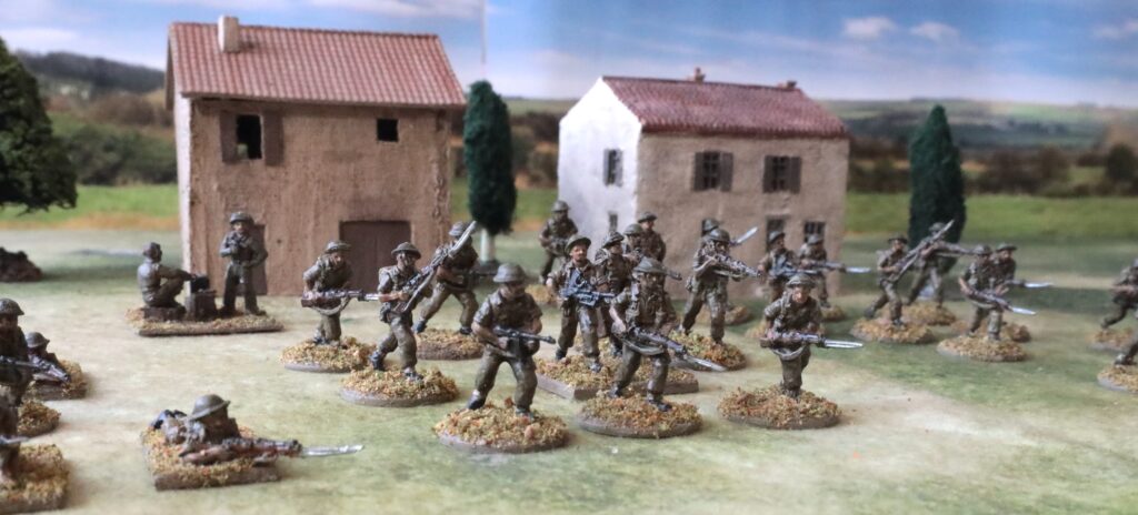
For figures I use virtually the same technique as for Horse & Musket miniatures. But how do I achieve the dull colours required?
The British were dressed in khaki uniforms. I get a bit confused by the nomenclature, but there are two versions – dark, used in uniforms for North Europe, and light, used in tropical uniforms. In 1943 British troops most used the dark version. The campaign in Tunisia was in the winter, which was cold, wet and muddy. Even the 8th Army substituted their famous light khaki and shorts. After this, the terrain had more vegetation, and the darker colour was generally considered more appropriate – though there seem to have been exceptions in Sicily, which was hot and dry.
Dark khaki is a hard colour to get to grips with. Back in my teens (the 1970s) I remember rejecting the standard Humbrol khaki as too brown, and trying to mix my own, starting with green. It didn’t look right at all, though often matched the box artwork for the various Airfix products. I think there were Humbrol Authentics for Khaki Drill, but I don’t think I bought it, for some reason. The key thing to understand about dark khaki is that it is closer to brown than anything – but it is so close to the neutral centre of the colour wheel (i.e. a balanced mix of the three primaries) that it doesn’t take much to tip our brains into seeing it as green. Indoor lighting (including studio lighting in TV and films), for example, does this – and context, the colours it is placed next to, can do this too. To make it I start with a mix of Raw Sienna and Titanium White, and gradually mix in Prussian Blue until it looks right. Having a bit of white mixed in at the start is essential, or you won’t see the colour balance properly. Try to do this in natural light! Pale khaki can be made in a similar way – but start with the white, add the Raw Sienna, and then add a touch of blue. The webbing and other kit in this theatre were quite bleached – so this pale khaki is a good basis for this. Forget the pale green in the textbooks.
The main German uniform in this theatre right through 1943 was the olive cotton tropical one. This is readily made by adding some Mars Black to a Titanium White and Oxide Yellow mix; alternatively mixing Yellow Oxide with Neutral Grey gets you close enough quickly. It should look green in colour. Elements of the standard field grey uniform may also have been in use, especially later in 1943. This is a green, though later in the war may have drifted towards khaki brown. Start with a green such as Sap Green, with the ubiquitous white, and add red to it. If you are starting with a blue-green (such as Viridian), you might try mixing in Burnt Sienna. But a bit like in Napoleonic days, uniform colours were not precise in the mid to late war. For earlier war you might try different mixes for the tunic and trousers (greyer) from the same pigments. A third uniform type may also have been used – the “Reed Green” cotton summer uniform – which apparently was in use on the Russian front in the summer of 1943 (Kursk, etc.). This seems to have been greener and darker than Field Grey – but faded rapidly – more on that subject later.
Then there were the Luftwaffe uniforms. I have only tried to represent these for an 88mm Flak crew – but the Luftwaffe was also represented in this theatre by paratroops, and by the Hermann Goring division – both of which played a prominent role. The standard tropical colour was paler and sandier than the army one – I simply used a lot more white in the same basic mix. Light khaki, described above, was probably also pretty close. The standard Luftwaffe uniform was blue-grey. I simply mixed some black and white with Prussian Blue – but a blue, brown and white mix would be just as good. Camouflage smocks were also in use, both by paratroops and others. I don’t have much specific to say on this – it’s not hard to find appropriate colours, and if they are bit wrong, it doesn’t really show.
How about representing the fading of uniforms? Most uniforms were cotton, which isn’t good at holding dye – think about denim jeans. So a lot of uniforms were heavily faded – especially the German uniforms. The Reed Green uniform was described as very rapidly turning into a piss colour. Some of the German uniforms in Africa look like American chinos. It wasn’t uncommon for different elements of the uniform in both armies to be different colours, due to different levels of exposure to the elements. I have tended to represent this simply with variable levels of white in the mix. In my most recent batches I have kept to just two shades to simplify things. I could have been braver with the extra white- the contrast turned out to be less than I thought when the paint had dried.
Finishing the figures is still a work in progress. In my most recent (and still not finished) batch of Germans, and the preceding batch of British (illustrated above) I have used the wash/glaze (its a bit in between) of black ink mixed into Liquitex Matt Varnish for airbrush, which is in fact off-matt. It brings out the texture of the mouldings beautifully, but stains the rest of the uniform too much. In the case of the British I had to go back over some of the figures with the original paint. I also dusted them with a paler mix of pastels (see below). Here’s how the Germans look after this step – and it looks as if I’m going to have to do some similar corrections:

Vehicles
The two big differences between how I paint figures and vehicles are primers and the use of an airbrush. Plastic models especially must be primed – artist acrylics often struggle to adhere without it, especially if water is involved. I found that plastic isn’t all that friendly to gesso (the water I loosen it with, I expect), and besides for vehicles I wanted something darker. There are quite a few nooks and crannies on models, which the final painting process often doesn’t get to (wheel arches, etc). My feeling was that the standard light mud finish (Raw Umber and White) needed to be darker, and I didn’t want to put too much ordinary paint into the white. So I went out and bought some Vallejo hobby primers – in German Dark Yellow and USA Olive Drab, as well as white. These are quite liquid and don’t need much thinning for an airbrush – though I sometimes apply by brush. I have taken to priming plastic kits (and any other models that require assembly) before assembly, to ensure that the primer gets to those hard-to-reach places. One observation to make on these primers is that they are quite dark – they seem pretty saturated – presumably reflecting how their top coat cousins are. The German Dark Yellow is also quite bright – though within the spectrum of shades actually in use, just, according to my reference book on AFV colours, which has colour swatches. These paints seem to represent what might be applied to an actual, full-sized vehicle in the factory – with no concession to the scale effect. I wasn’t that bothered by this, as I was looking for dark shades. Besides the paint is quite thin. I’m not wholly convinced by these hobby primers. They don’t seem to stick all that well to plastic – at least not in the first day or so: they are easy to rub off. But better than applying paint direct.
The airbrush is another of those innovations that I remain not wholly convinced by. You can achieve a beautifully thin and smooth effect. This is especially useful for aircraft (see later), but less important for vehicles. Is it quicker? Yes, if the stars align and you get into the groove – and you have reasonable batch to get through. But they are a faff to set up, and a faff to clean afterwards. Getting the consistency of the paint and the air pressure right is an art I haven’t truly mastered – though on occasion it works first time. I also haven’t mastered the art of fine detail – or I don’t have the right brush. Still the model looks wonderful after it’s been airbrushed. I use it for priming sometimes, and for the main base colour of the vehicle. Camouflage contrast colours, and canvass tilts if in a different colour, go on with a brush.
The wet palette doesn’t work for airbrush paints. I mix the paint in a small plastic pot, which I cover in clingfilm between sessions. Heavy body acrylic paints need a lot of medium to make them liquid enough. I use a combination of Liquitex Airbrush Medium (disconcertingly an opaque white in the raw) and standard airbrush thinner. Most of this is in the mixing pot, but I usually add more in the airbrush cup if it looks a bit too thick, as it usually does. Following advice, I don’t use water. I usually mix quite large quantities of each colour, to ensure that I have enough. This can be quite hard, especially if you go through the game of overdoing one pigment, so having to put in more of the others to compensate – so it can be a bit heavy on pigment use. But since the paint needs to be quite runny for the brush, it keeps for a long time in the pot under the cling film if there is a decent quantity – actually longer than a wet palette. If the quantity is small, I tip it into the wet palette – as it needs to be available for touching up, mixing with other pigments, and so on. I’m probably moaning too much – as I get used to it, it gets quicker and easier. All I would say is that if you are thinking of using one, expect the usual learning curve. The larger the models, the more appropriate it is. At 20mm scale (1/72 and thereabouts) I think it is definitely worth it for aircraft, but marginal for vehicles. For larger vehicle scales – even 28mm – things might tip more in favour of the airbrush. And if you get proficient then you can do more things with it.
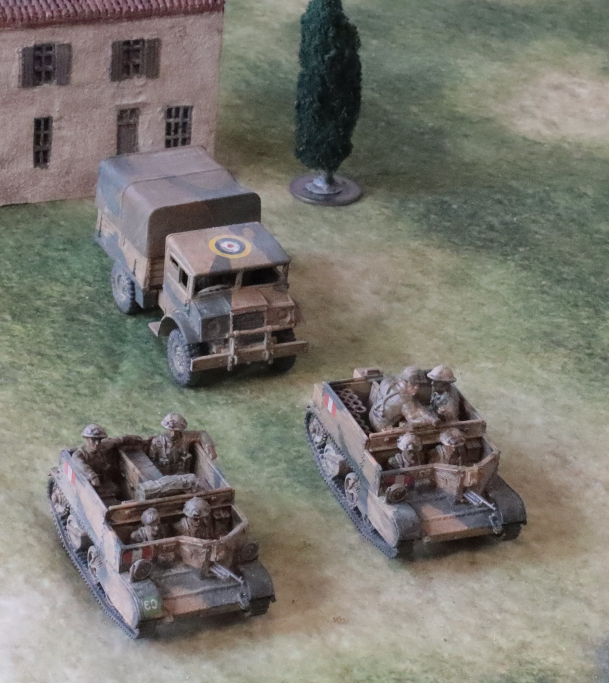
For British vehicles there are four main schemes. At this time vehicles mainly were finished at the factory in a brown service drab (sometimes called “Brown Khaki”), with a blue-black camouflage pattern on occasion. This reflected a shortage of green pigment, where the RAF had priority. The First Army in Tunisia started out mostly painted like this, with some vehicles overpainted in paler camouflage patterns ad hoc. Some vehicles (at least some of the Churchill tanks apparently) were finished in a dark green (“Green Khaki). In Sicily and Italy many vehicles were painted in this, especially second line vehicles. At the start of 1943 the Eighth Army vehicles were painted in a desert scheme, with a base of Desert Pink with an olive green camouflage pattern, and this seems to have been in use through the Tunisian campaign. After this a new Mediterranean scheme was devised of Light Mud with a Blue Black camouflage pattern. This was officially in use in Sicily, though not all that evident from the photos. By Salerno it was in very widespread use. Finally many US-sourced vehicles, from Sherman tanks to jeeps, were left in US Olive Drab
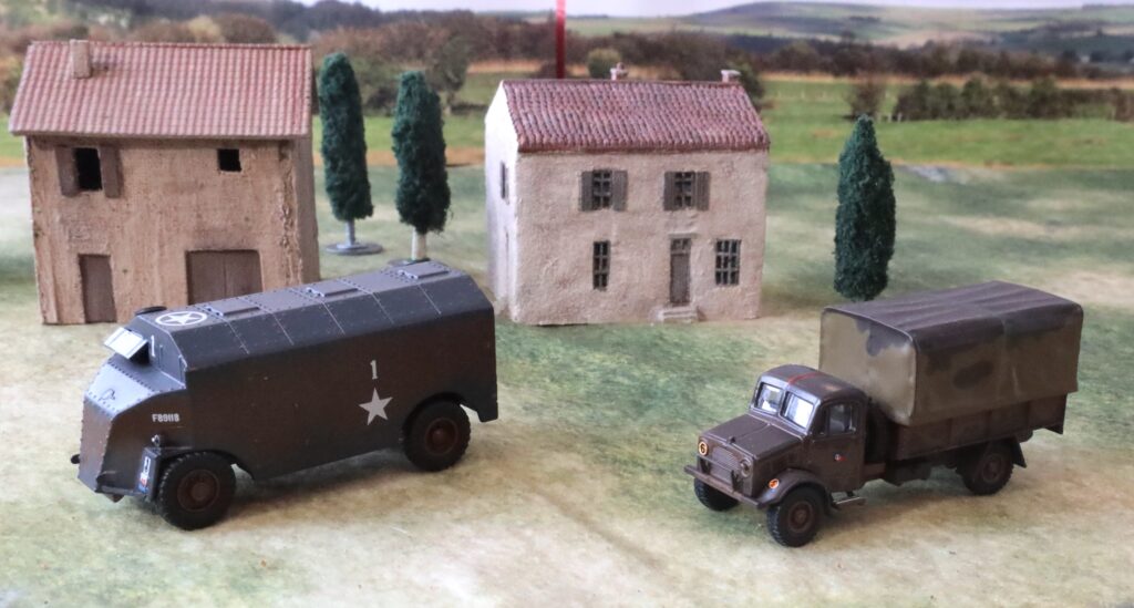
The brown is the most difficult of these to produce, as the colour sources are weak. Modern vehicle collectors would rather use the earlier or later variations on green. It seems to have been a bit redder than the khaki used on uniforms. So Burnt Sienna is the obvious place to start, mixed in with white and blue. This was too red for me when I tried it, so I mixed in Raw Sienna or Yellow Oxide. Maybe Raw Sienna with a bit of red would be a better way. I also use this colour for items of infantry equipment – such as mortars, Vickers guns and PIATs, together with ammunition boxes and so on.
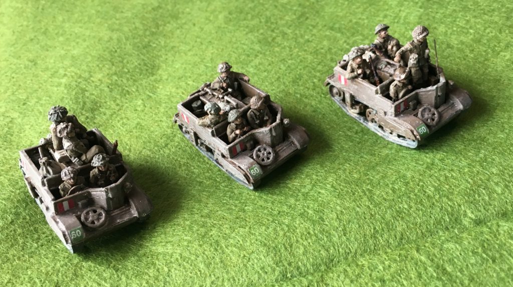
For Desert Pink I have simply mixed white into Raw Sienna (or perhaps the other way round). This may not be quite pink enough, but there is a distinct red tinge. For the olive green I started with Sap Green. I then did the lazy thing of mixing in other colours on my wet palette to make it a bit paler and yellower. White and Cadmium Yellow, with a bit of red to dull it down, should do the trick.
The sometimes elusive colour of Light Mud, which was mixed in theatre, proved unexpectedly easy to mix. White, Raw Sienna and Prussian Blue did the trick – the same combo as for khaki, but with more white and a slight difference balance of blue so give a browny grey. My speculation is that it was made from mixing the redundant Desert Pink with the equally redundant olive green. The Blue Black uses the same pigments with more blue and much less white. I will discuss Olive Drab under Aircraft.
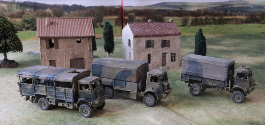
The main German colour in use, especially from Sicily onwards, is the famous Dunkelgelb, which was introduced in early 1943, and in use for the rest of the war. As I have alluded to earlier in this series, this was a struggle to produce at first. My first batch of tanks (some Panzer IIIs) were too red – even after about the third repaint. In fact it would have been passable for the brown in use in North Africa (see later). But the solution was simple enough in the end: Yellow Oxide and white, with some Mars Black mixed in. These are the same components that I use for the olive tropical uniforms with less black. I suspect that the two main pigments are close to those actually used by the Germans, as they should have been comparatively easy to source. With these three ingredients it is possible to replicate pretty much the entire variety of shades of this colour that were actually used. The dunkelgelb was complemented by olive green and red brown camouflage colours applied in the field. I haven’t seen much evidence that these were used in Italy or Sicily in 1943, and I haven’t tried to replicate them.
Dunkelgelb vehicles probably didn’t make it to Tunisia in significant numbers. Instead vehicles were finished in a colour called “Braun” – to distinguish it from the earlier “Gelbbraun“. There was also a camouflage colour of “Grau“; in common with German practice of the time this was pretty close in tone (or tint… I get confused by the terminology), and is quite hard to detect in black and white photos. The Braun is actually not very far from Dunkelgelb, but distinctly redder. I have only tried mixing it in my most recent project (if you don’t count those Panzer IIIs, which unfortunately have turret schurzen not appropriate for Tunisia). Raw Sienna is too red for use as the base by itself, so I mixed some Yellow Oxide in, but I still used a bit of Prussian Blue to dull it down. The Grau is a greenish grey (the Germans seemed to use these a lot), which I made using a similar process to Field Grey – though it isn’t all that far from some versions of Dunkelgelb. The end result is probably a bit too dark – it proved quite quite tricky to judge.

What more to say? I use a blue-grey for tyres. I have used a red-brown on German vehicles to represent primer, on some spare tracks for example. The tracks should be a very dull metallic colour – silver mixed with the gunkiest colour on the palette at the time. I mixed various colours to represent tarps, and usually finished boxes and petrol cans in brown or Panzer Grey.
As for figures, finishing is a work in progress. Earlier attempts were a bit timid, and I used a commercial product for “dust”, but it involved several steps, including spraying with matt varnish. I have been trying to simplify this, and get away from the harsh matt of the aerosol varnish. My last batch of British vehicles I had the same experience as I described for the figures, where I spent quite a bit of time correcting for the harsh black glaze/wash. Before this I applied small dots of Zinc White oil paint and brushed them into a thin but uneven layer (over the decals), a technique I learned from aircraft modelling. This helps give the surface that element of unevenness typical of weathered vehicles in the field, as well as integrating the decals. For my most recent batch of German vehicles (still in progress) I added dots of Raw Umber oil paint as well. This added a dark element to the unevenness. I won’t apply the black wash/glaze to the whole vehicle, but target the wash at grilles etc, and wipe off surplus. I will then finish off with “dusting”.
For this last step I grind cheap artists’ pastels of various dull colours into a powder of a general pale dust colour (not unlike the white-raw umber mix I use so much). This is then applied with an old paint brush. It helps offset the sheen from the earlier stages, and make the vehicle look, well, dusty.
Aircraft
I’m not going to say a huge amount on aircraft painting. It’s been a while since my last project, and I suspect that this of less interest to wargamers. These models are intended to be usable on the tabletop (wheels retracted) and are painted to wargamer standard (no obsessive detail only visible close up). The airbrush is my instrument of choice to cover the bulk of the surface, including primer. I use white primer to better bring out the colours – aircraft have fewer those nooks and crannies. I last used Vellejo primer for this, though it had a tendency to clog the brush at the nozzle for some reason, and it needed regular wiping. Camouflage stripes can be a bit tricky though, as masking is necessary to get sharp edges (experts with an airbrush often don’t bother, but I’m not in that league). This can be a huge faff – sometimes it is simpler just to paint it on with a brush. For splinter patterns used by the Germans, though, masking tape is essential – though it can be a pain in the neck if it’s more than just the wings.
One issue with aircraft is that the finished result is much more sensitive to colour choices than are vehicles, especially if there is more than one colour on the top surface. I’m pleased with the German planes I painted in desert colours (tan and olive green, with azure blue undersides), but my British/Commonwealth aircraft I didn’t quite get right. The Mid Stone looks a bit like Dark Earth, and the Dark Earth looks a bit like Dark Green – replicating early war patterns for the home front. The result isn’t jarring, but it’s not right all the same. The moral is that you have to be very careful about the colour mixing, and not to do it too quickly.
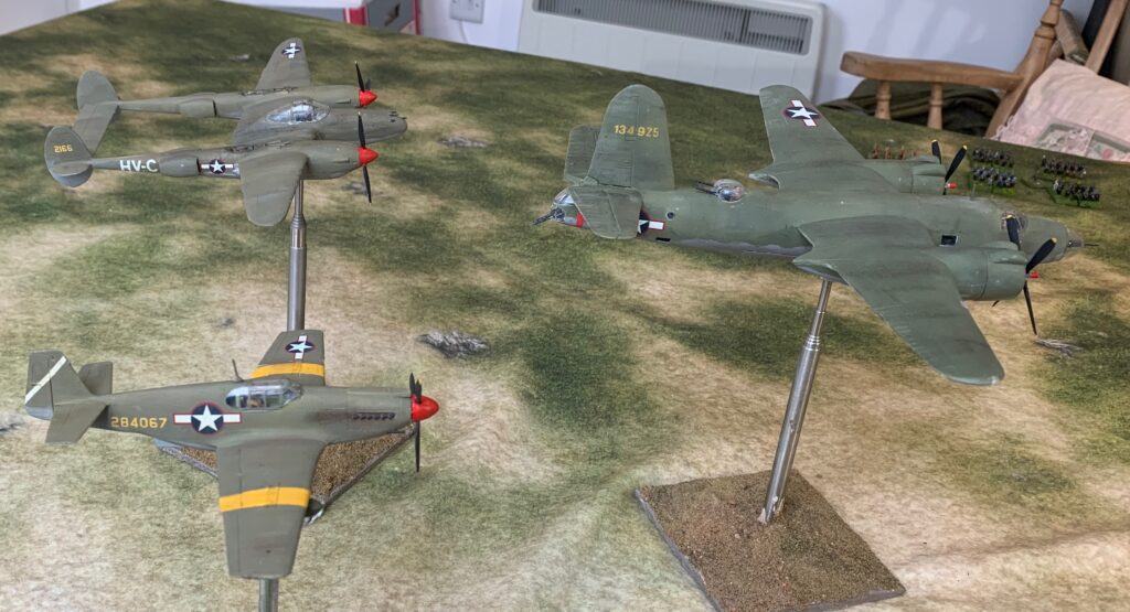
It’s worth talking a bit about Olive Drab – the colour used on US aircraft in 1943 (before they went predominantly unpainted). A very similar colour was used on US vehicles. In pictures this comes out in a wide variety of shades (not unlike Dunkelgelb), which can look a bit brown, or distinctly green; likewise it can be very dark, or quite light. The US government did not prescribe a method of making it, and probably didn’t enforce the results with any level of rigour – so some of the variation may well have been at the factory. The official shade was very dark, however, and quite green. I read that manufacturers used green pigment to make it. Nevertheless the quickest way to get an acceptable result, that looks close to many of the colour pictures, is to mix black and white into Yellow Oxide (the same three pigments as Dunkelgelb but with more black). This gets you towards the brownish end of the spectrum visible on pictures – I suspect this corresponds to a lot sun of exposure and weathering. This mix can be seen in the picture on the Mustang (in its A-36 ground attack and dive bomber guise) and the P-38 Lightning. I have also used this method on the two vehicles I have painted. I also thought I would try a greener version, to represent a slightly fresher aircraft – this can be seen on the B-26 Marauder. This was based on Sap Green, which needed to be duller, yellower and paler.
Its also worth mentioning about finishing on my aircraft. Generally I use the oil paint method, described above, but with a greater variety of colours, including dark ones. These are brushed fore and aft on the wings and tail planes, and up and down on the fuselage. This leaves a nice off-matt sheen, which I think represents British and German aircraft quite well. Crews kept the aircraft clean in order to improve the aerodynamics (unlike military vehicles, where the dirt was left on to make the vehicles less conspicuous). Pictures of US planes in Olive Drab look matter though, so I sprayed the models with the dreaded aerosol matt varnish (from Winsor & Newton). After this I dusted the aircraft with ground pastel, as described for vehicles, but with a darker colour, creating the exhaust stains in the process. Overall this created the uneven weathered look you can see in the picture, and which you can see in pictures of aircraft on campaign. Whether I really need both the oil paint “patination” and the dusting on these matt aircraft is an unresolved question. But on the British and German aircraft the dusting breaks up the even gentle sheen arising from the oil paint, and is the best way to do exhaust stains.
In conclusion I’m still developing my technique, but overall I’m very pleased with the results I’m getting from mixing my own colours. And I get a great deal of pleasure from the control I get, even at the expense of a few mistakes.
Next time I will conclude by dealing with a number of loose ends.
Leave a Reply