2026 continues with its relatively gentle pace, hobby-wise. Since my last update I have had two tabletop games and a board game. I have started my next painting project.
Games
At the end of May I played a game with my Beckenham friends. This was a company level game set in Vietnam, with Australians taking on the NVA. I took charge of the NVA but underestimated the firepower available to the opposition, and got generally creamed. No pictures I’m afraid.
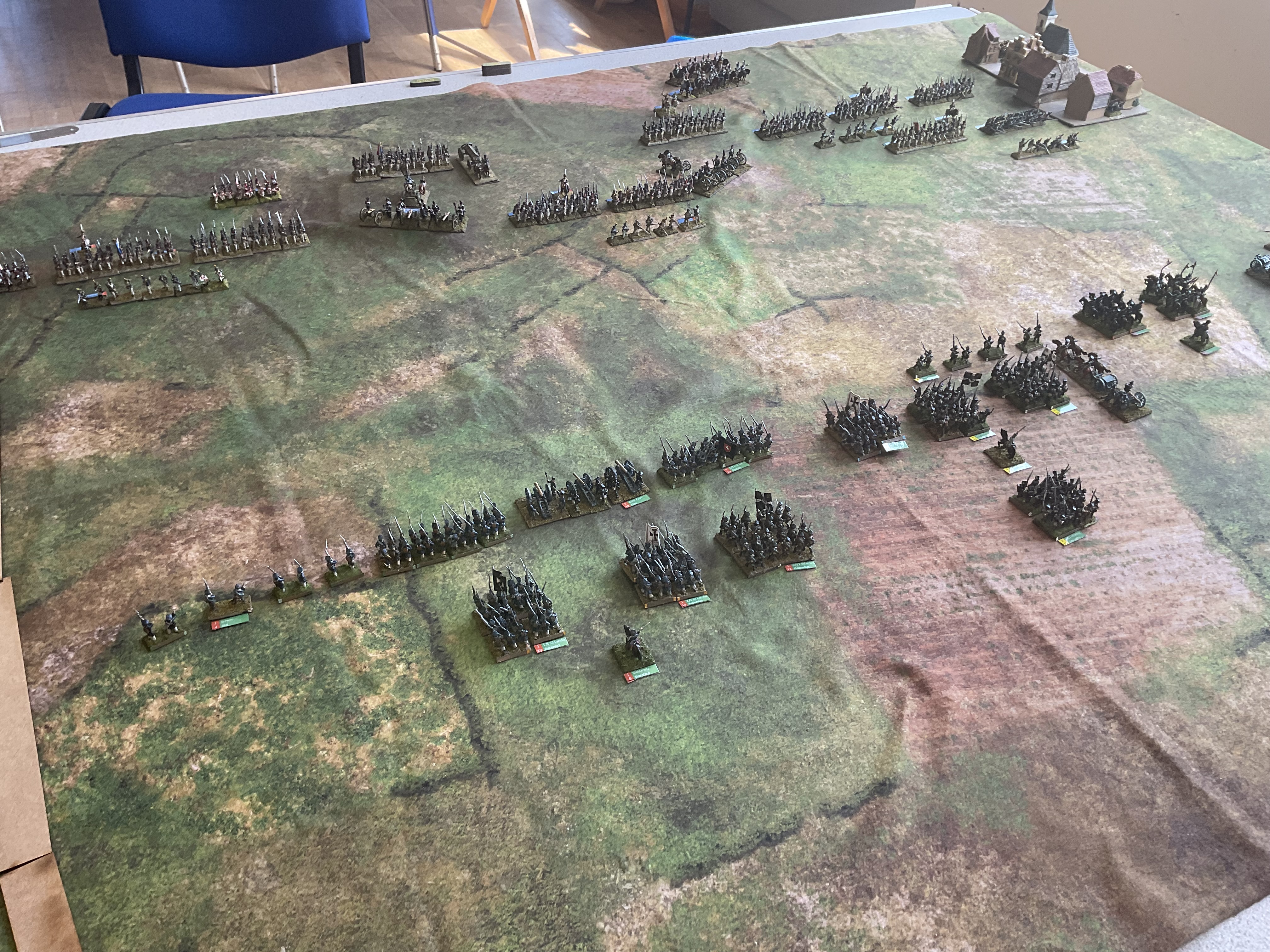
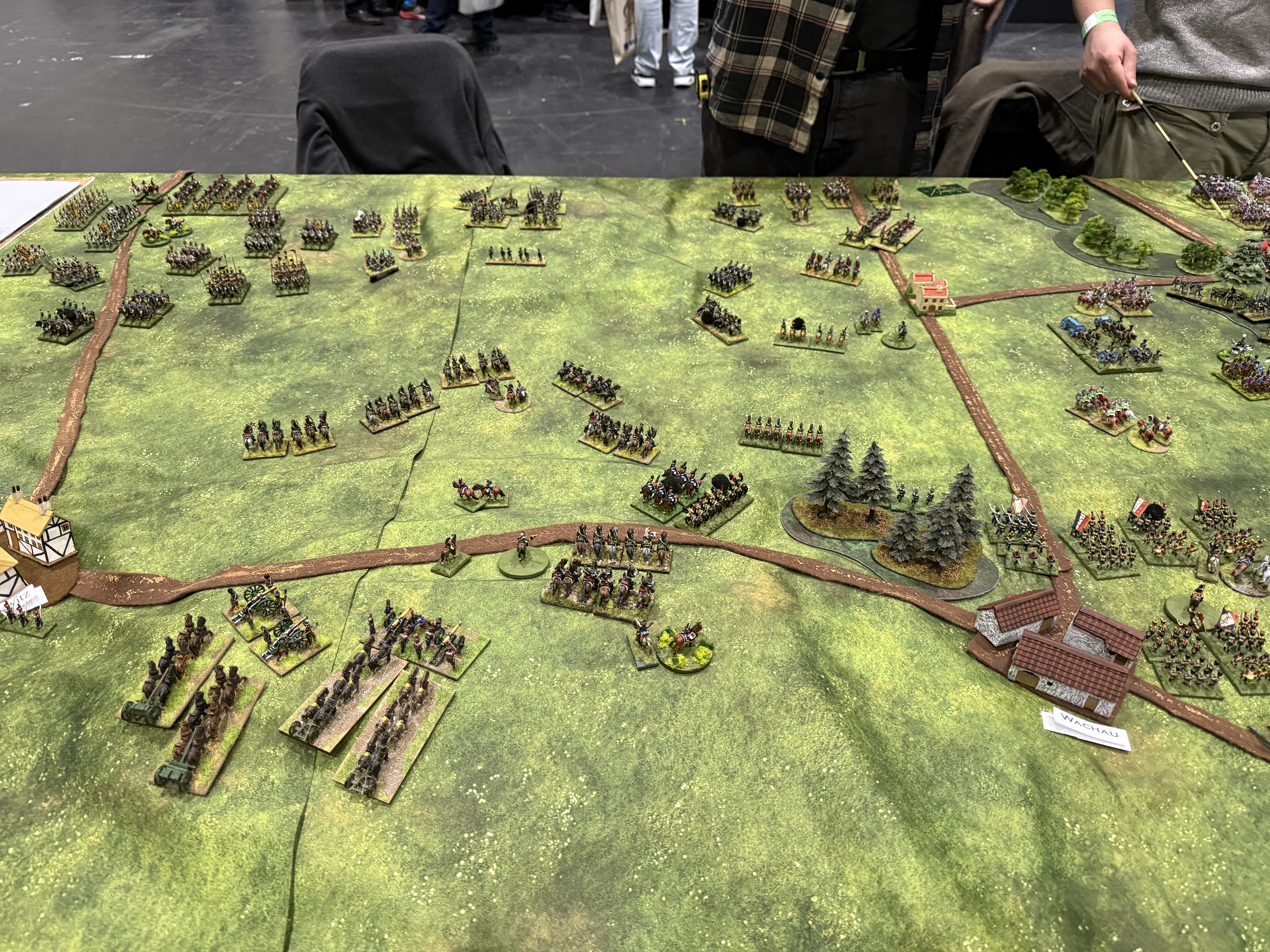
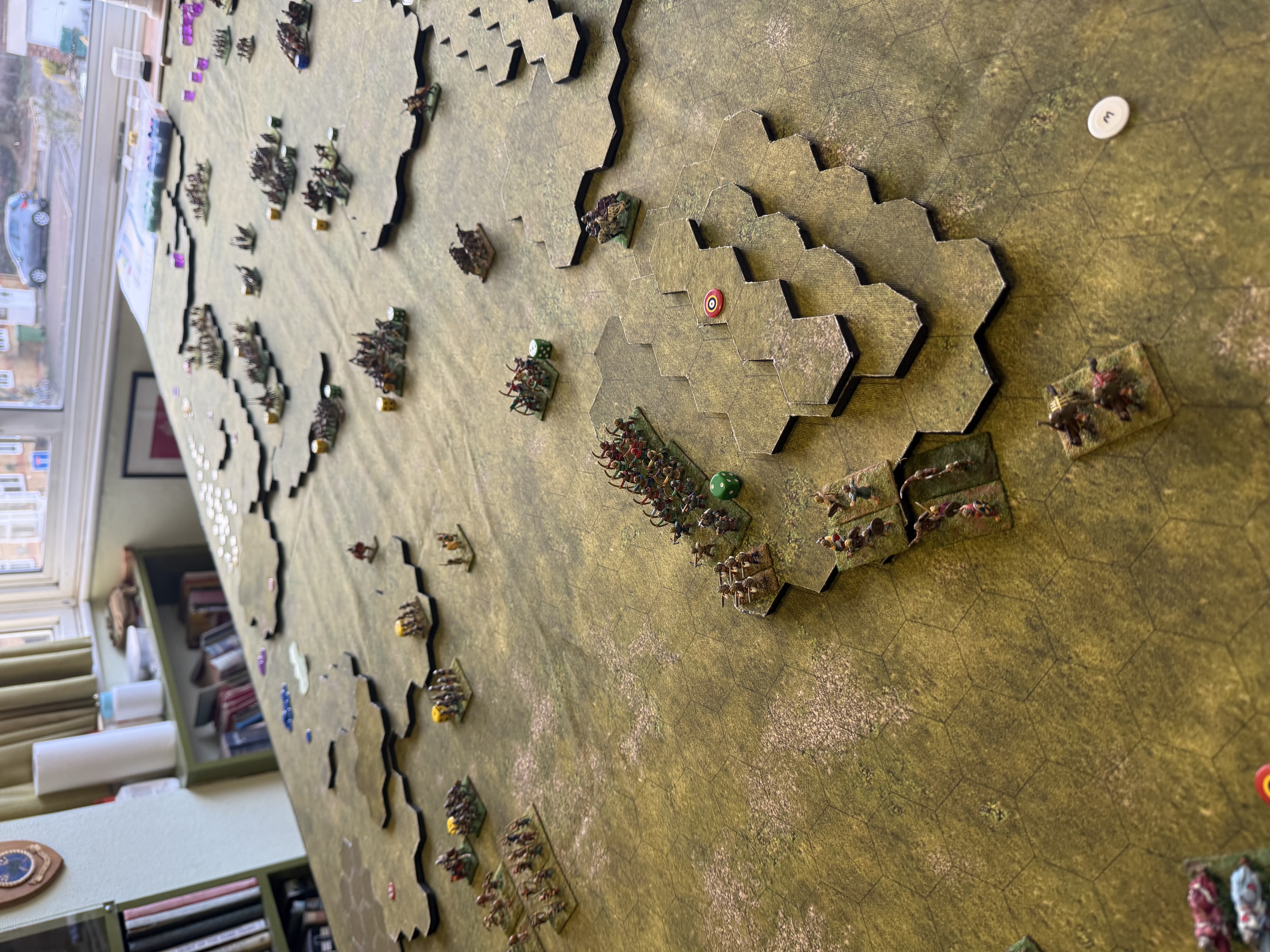
The next game was at the club, where I hosted another game of Général d’Armée 2, with a scenario for Mockern, part of the battle of Leipzig. Hugh took the French while Rod took the Prussians. The scenario was based on the GDA scenario book, but it was a little flawed (as a game, not necessarily historically). The main objective in a largely featureless table was the village of Mockern, in one corner. All the action focused on this corner. Borrowing from the Steven Shann scenario (Let’s Fight Leipzig!), I tried to counter this with a secondary objective in the other corner of the field. The players mostly ignored this, committing a brigade each who largely watched each other.
View of the start of the Mockern gameAnother angle got the start.The situation at lunchAt the close. The French have retaken the village after losing it.
The game turned into a slugging match. We completed 10 of the 20 turns the scenario specified. The French were clinging on, though were greatly weakened. But so were the Prussians and we called it for the French. This had taken some six hours of playing time, including lunch. Both players enjoyed the game, which had plenty of drama. But doing a complete GDA2 scenario in one club session looks an impossibility. More players with strong game management might do the trick, I suppose.
Finally on the gaming side the Beckenham gang played Kingmaker on one of the red heat warning days. It was a fun game though ending in a stalemate (we weren’t using all the KM2 rules, which might have avoided this) – we sweltered, but not as much as we would if we’d played upstairs in the wargames room. Fortunately the car’s air conditioning was up to the 38.5 Celsius it said was the outside temperature.
Command & discipline
At our next Beckenham game, I will host my new Napoleonic rules, Command & Discipline, which are hex-based. I’d like to do another solo playtest first, but they are actually ready. I haven’t decided on a scenario, but that will depend on how many players I am catering for. This will be interesting. It is in the same space as GDA2, but should be much faster and simpler.
One issue though is that I want a new hex mat with hexes aligned to the long edges. Last time I reported that Deep Cut did mats with hexes printed – but on further investigation this applies only to neopreen mats. I want a cloth mat, both for texture and so that it can be draped over formers to make relief. I see that some gamers have been able to get fleeces printed cheaply on Temu, using photo files. Doubtless this could include hexes. I would need to create a file though – and probably it would take more than one go to get right. I haven’t learned the art of creating terrain maps online – and that would be a whole new skill.
My next plan is draw hexes on one of my old green felt mats, possibly after painting them to be a bit more interesting.
Projects
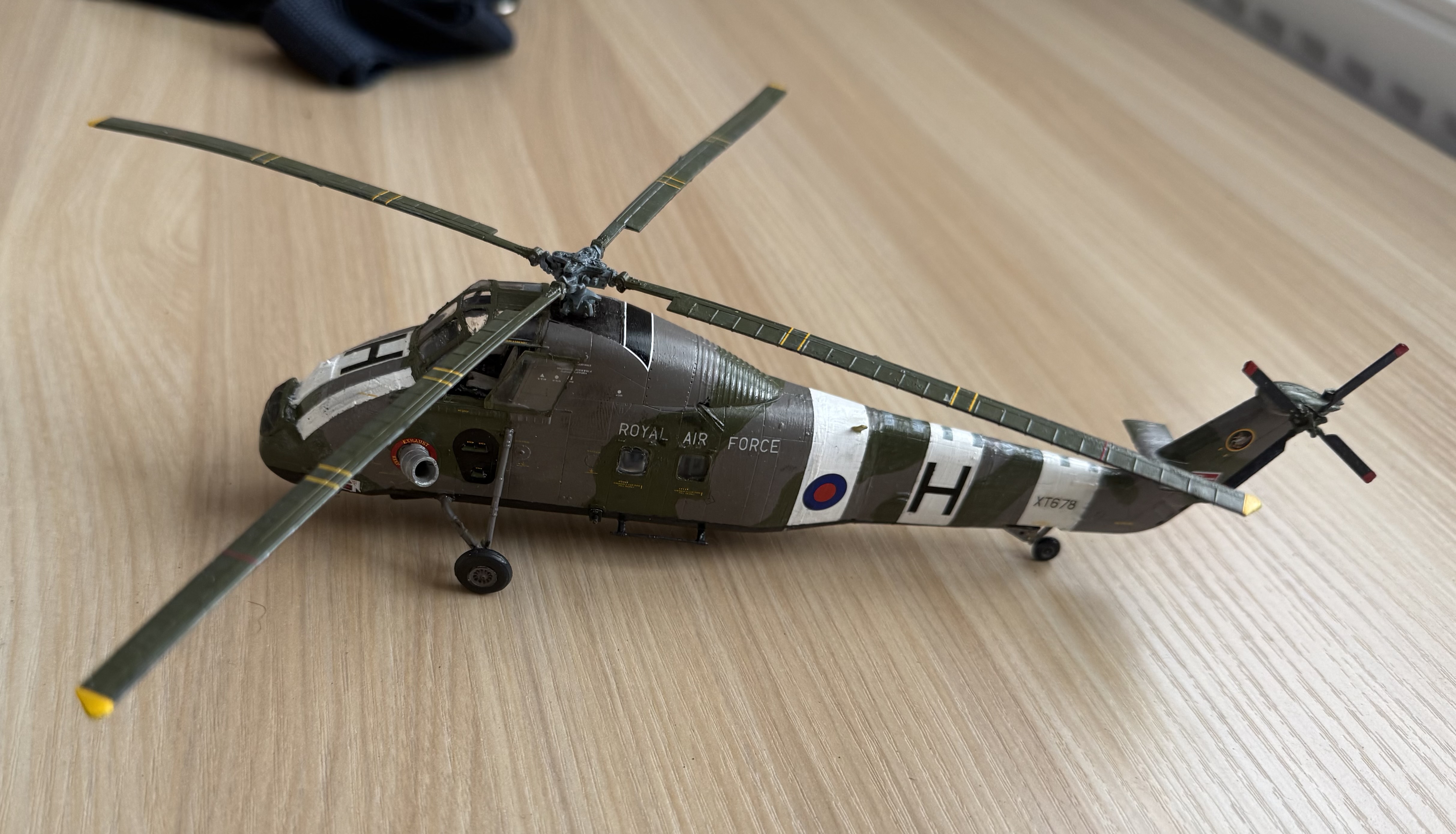
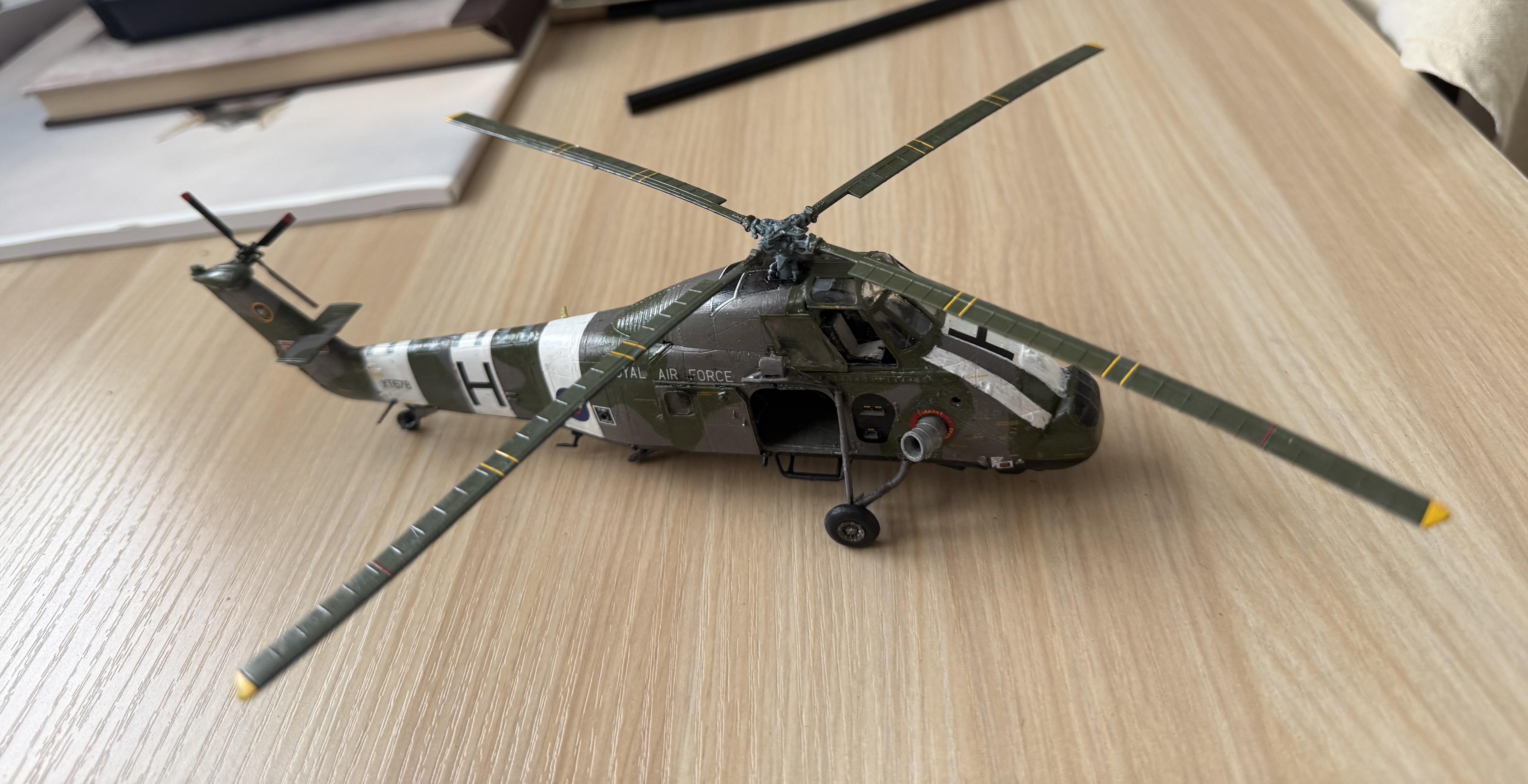
I have now broken cover on the modelling project that I had to keep under wraps – an RAF 1/72 Wessex based in Hong Kong, as flown by my friend – the subject on my previous post here. No wargaming dimension!
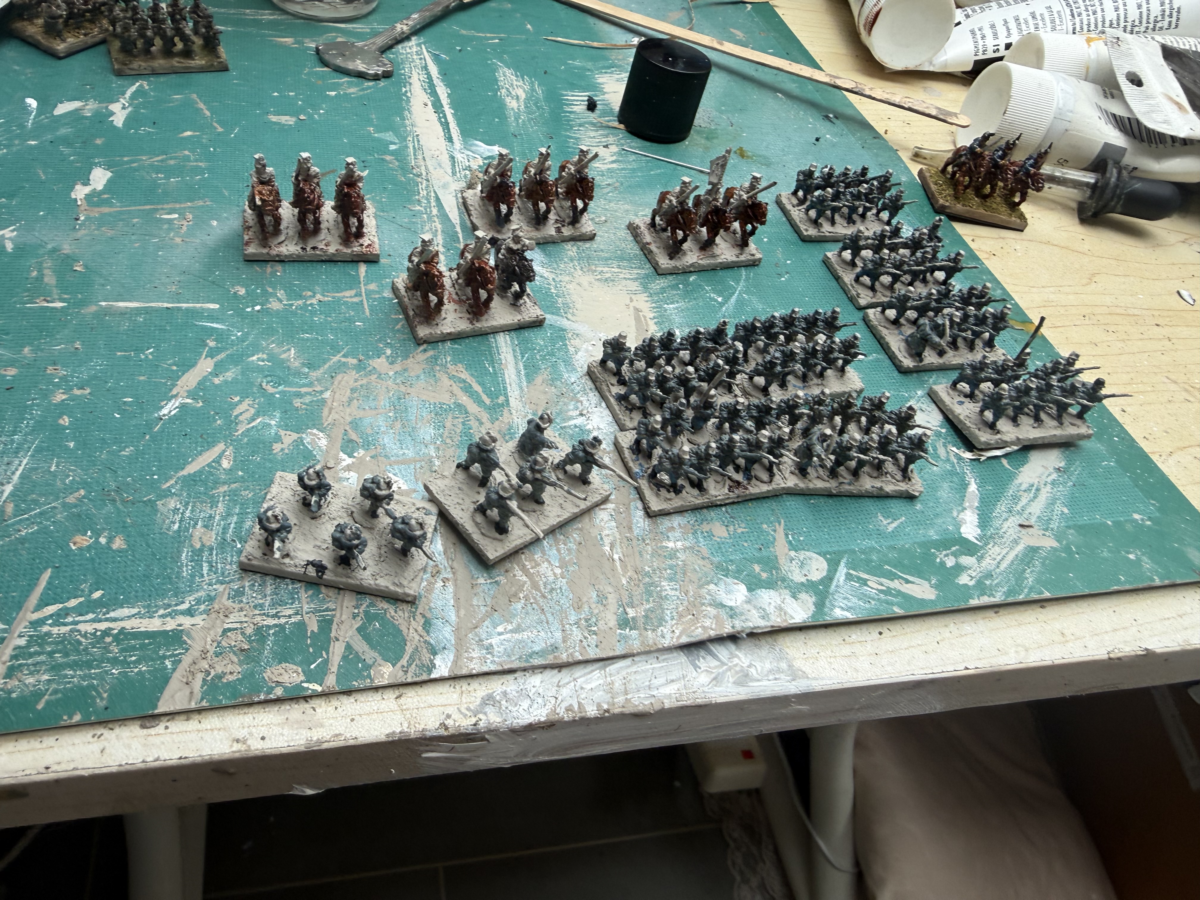
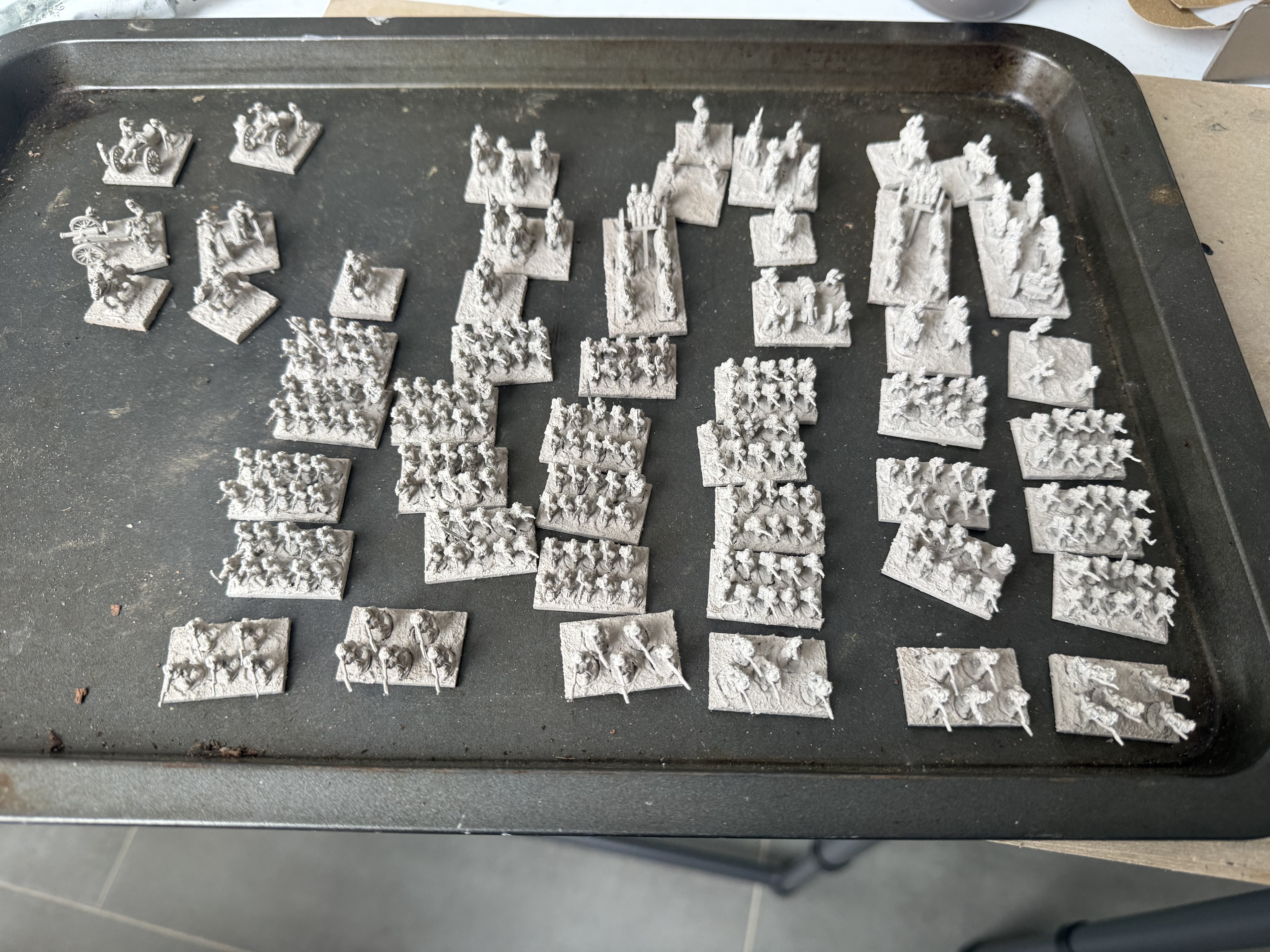
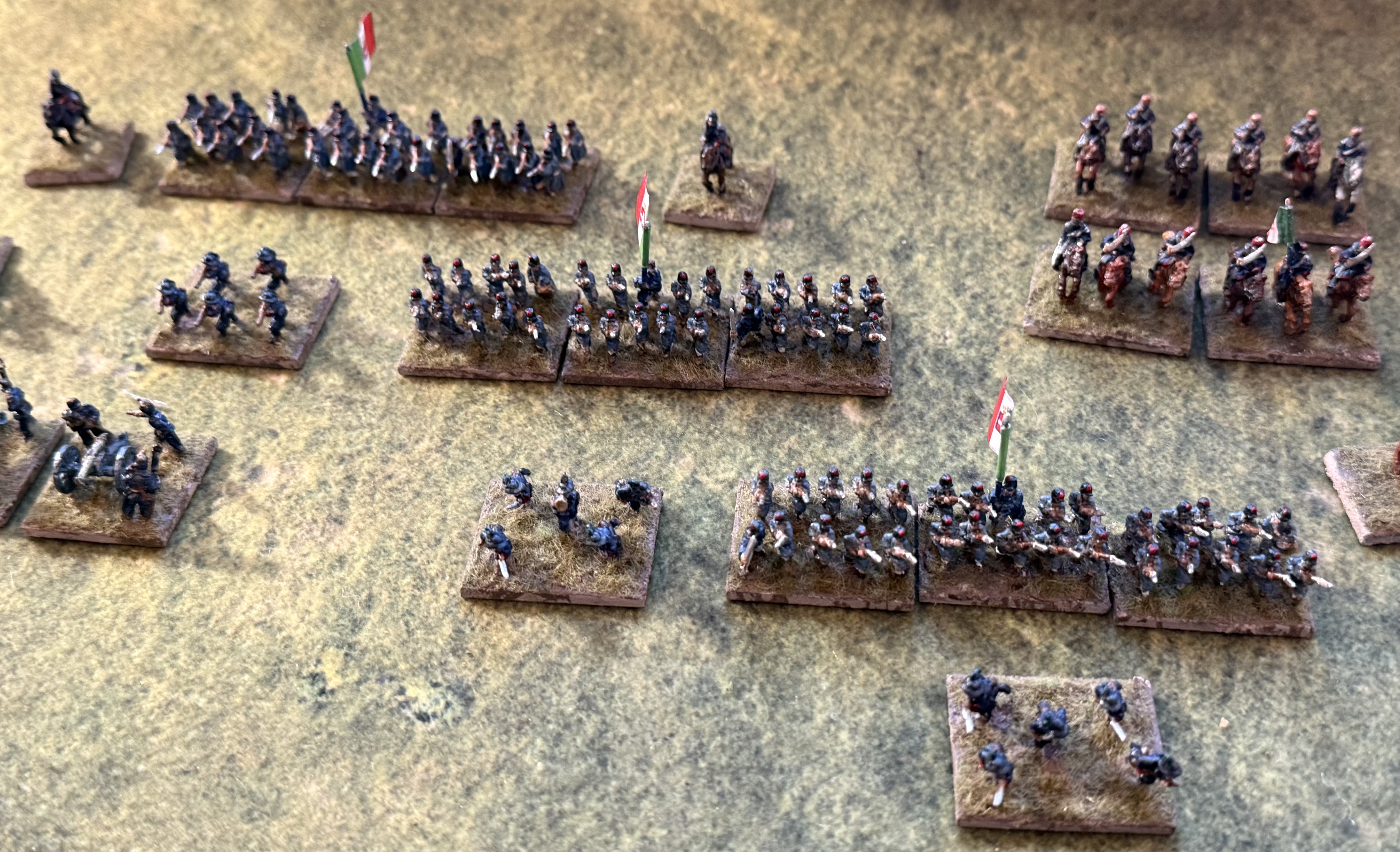
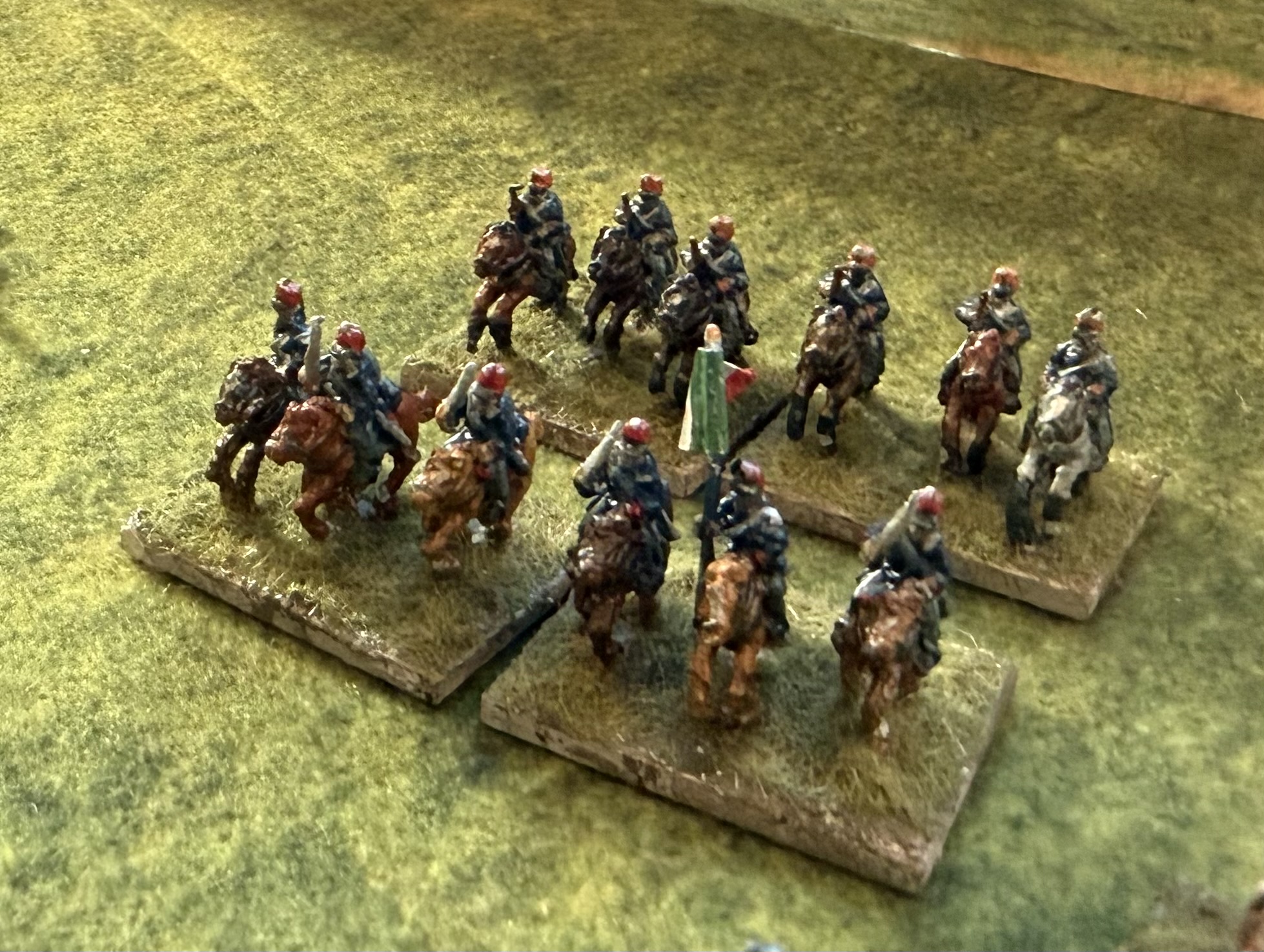
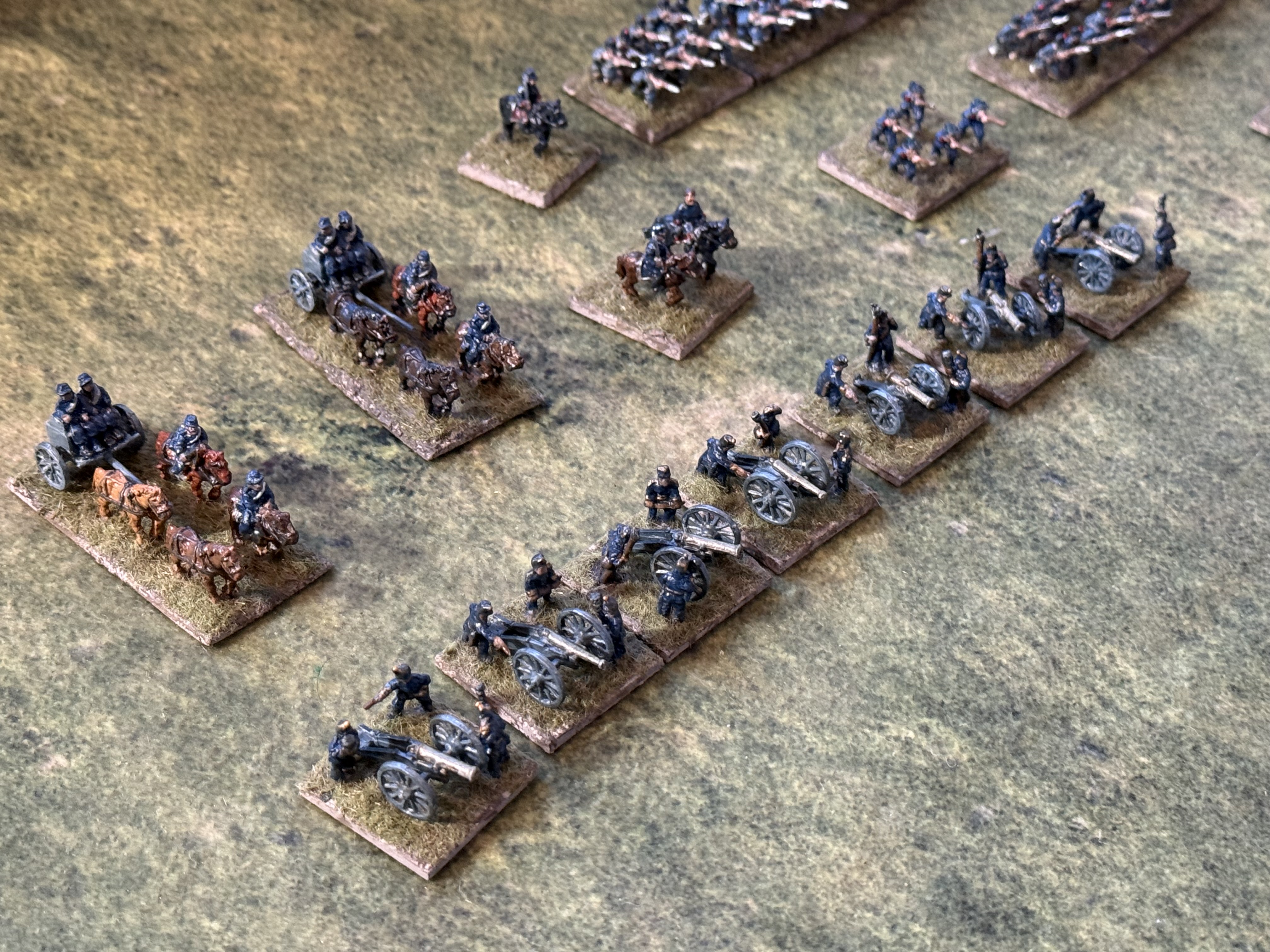
I have now started my next batch of 10mm Austrians. This is a bit daunting. I have based the figures – 30 bases of 10 line infantry, 8 of 5 jagers, four of 3 cavalry, 12 generals (1 to 4 figures per base), 6 artillery pieces and three limbers – and given them a coat of primer (gesso mixed with a bit of raw umber. I will take these in four chunks, and I’ve made a start on the first. Feels like I’ve taken on a lot!
The first batch of 1866 Austrans. Two brigades of infantry plus two regiments of Uhlans.And the rest primed and waiting
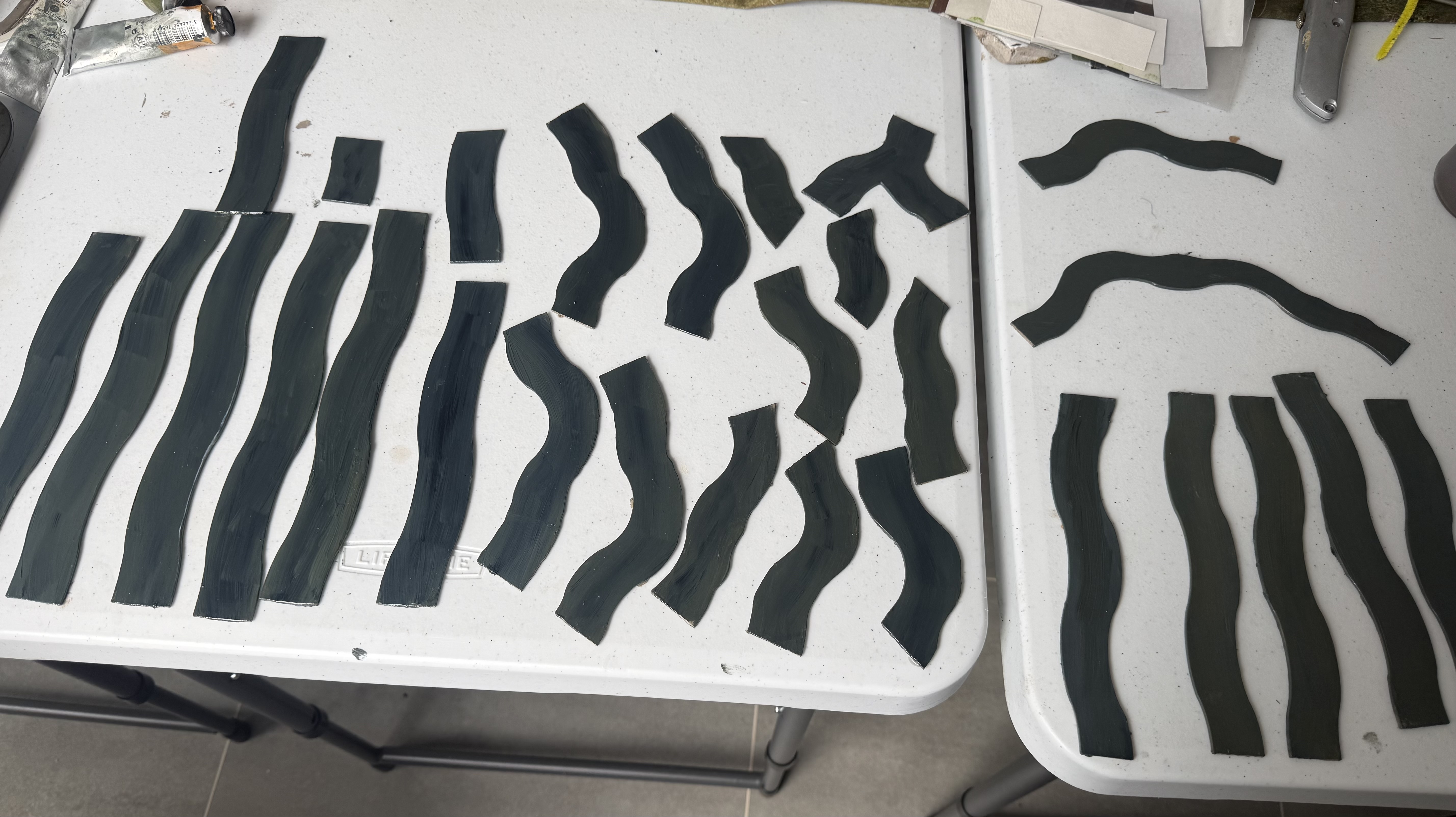
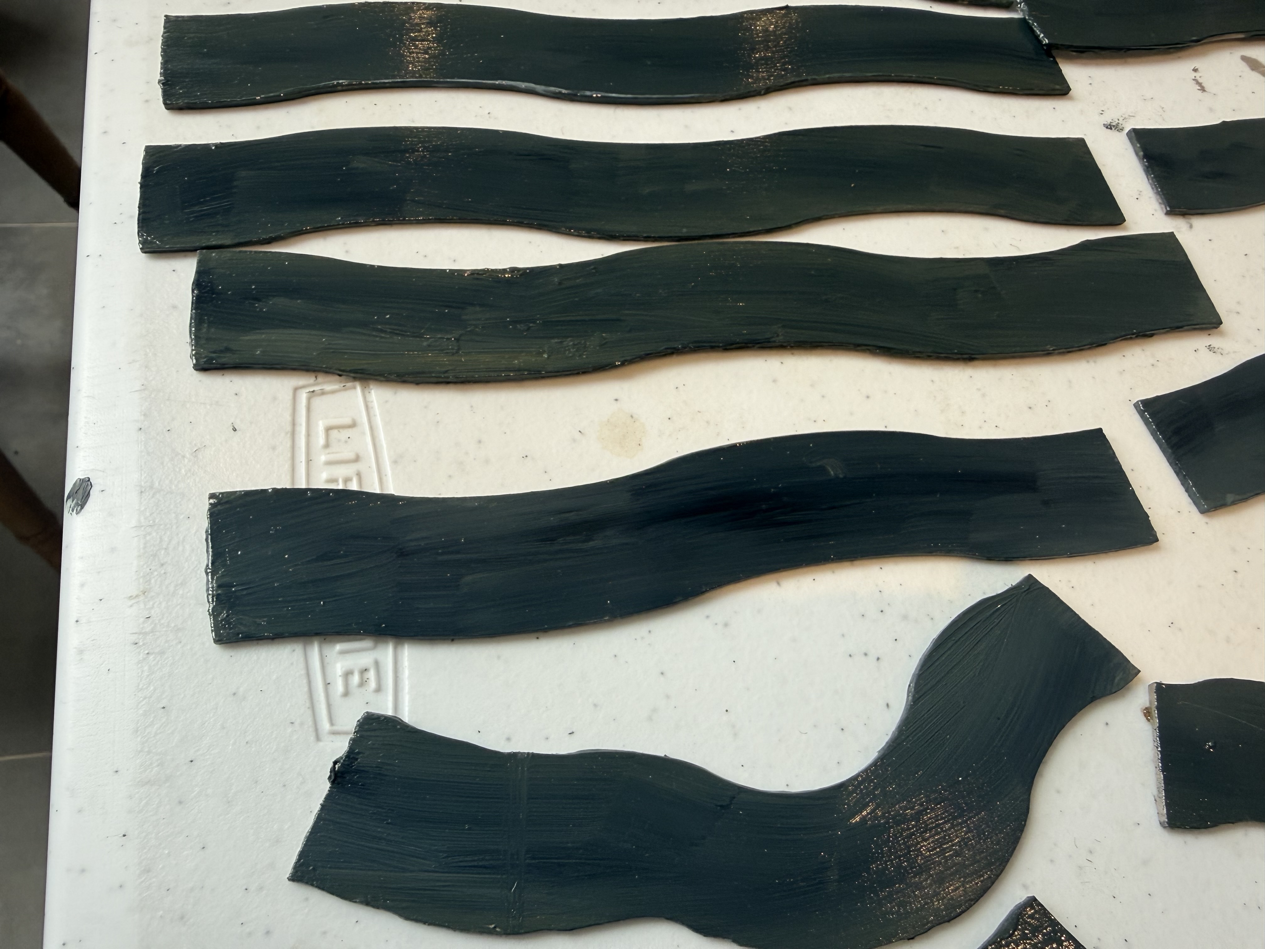
One lesser bit of work has been on river sections; my bits of painted cardboard really needed an upgrade! I noticed some rather nice pieces of cut MDF on the Pendraken website, and bought some of these with both 30mm and 25mm width. I have cut them so that I can use the curves with my new hex system, plus to get some variation in the length of the straight bits. I have now painted them. I have decided not to add banks, as is the usual custom – but to add these separately if appropriate. I used oil paints, as these dry more slowly, so it is easier to blend different colours in. I used Payne’s Grey, a bit of Oxide Yellow and white to get the effect I wanted. I go for a darker and murkier appearance than most people. I then applied three layers of gloss varnish – Liquitex gloss medium. This didn’t quit get the watery finish I’d been hoping for, but will have to do!
The finished river piecesA closer look.
The month ahead
More holidays, house guests and heatwaves and gardening in the month ahead, which will doubtless slow progress on those Austrians. I should get my first proper game of Command & Discipline, but alas the club meeting does not fall on a good day, so I’ll miss that again.
The port side of the model. I later repainted the bar at the bottom centre to metallic grey.
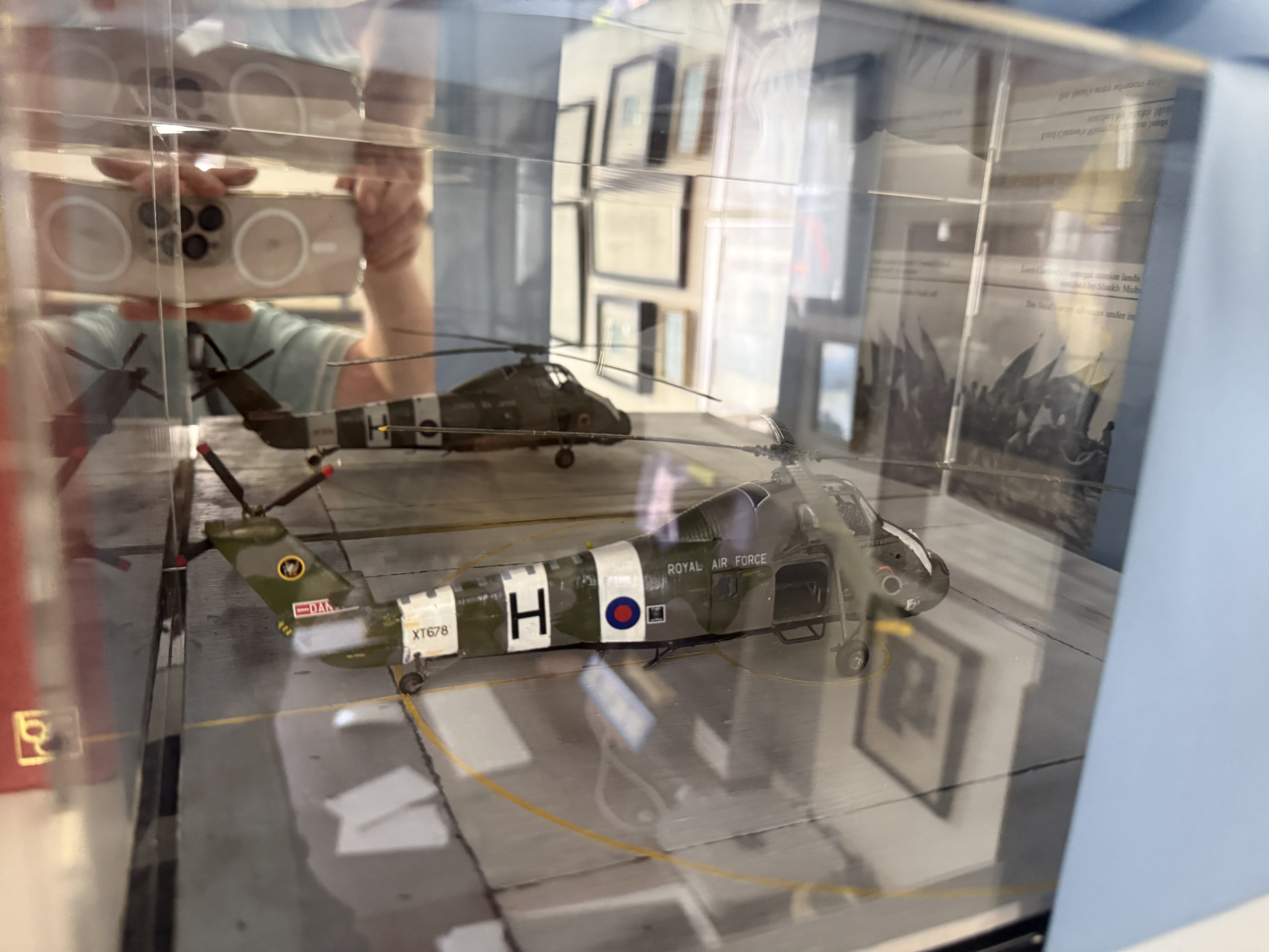
In my regular updates I have referred to a secret modelling project. Now is the reveal. It is this 1/72 model of an RAF Wessex helicopter. It was a present to a friend who is having a significant birthday this year – hence the secrecy. He has now received it – so the secrecy is not longer required.
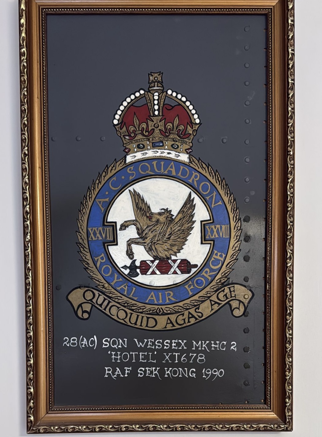
My friend is Gordon Evans, who served in the RAF, rising to Group Captain. The model is of a machine from 28 Squadron, which operated in Hong Kong, with which he was associated. His first tour was in 1980 (I think), when he was a fresh young officer. His logbook does refer to this aircraft, amongst others, though he wasn’t a pilot at this stage. He returned to 28 Squadron in 1990, as officer in command. This was one of two machines he regularly flew then, and the one with which he was mostly closely associated (his name was on it – though I didn’t reproduce this!). It may have been the one in which he flew Princess Diana during a royal visit. Indeed he was presented with this memento, made from a piece of the aircraft’s skin:
The idea for doing this model came last year when Airfix released their Wessex kit. One of the three featured schemes was for one of 28 Squadron’s machines. It was actually one that had crashed in its early days, but lived an after life at Sek Kong for fire safety training.
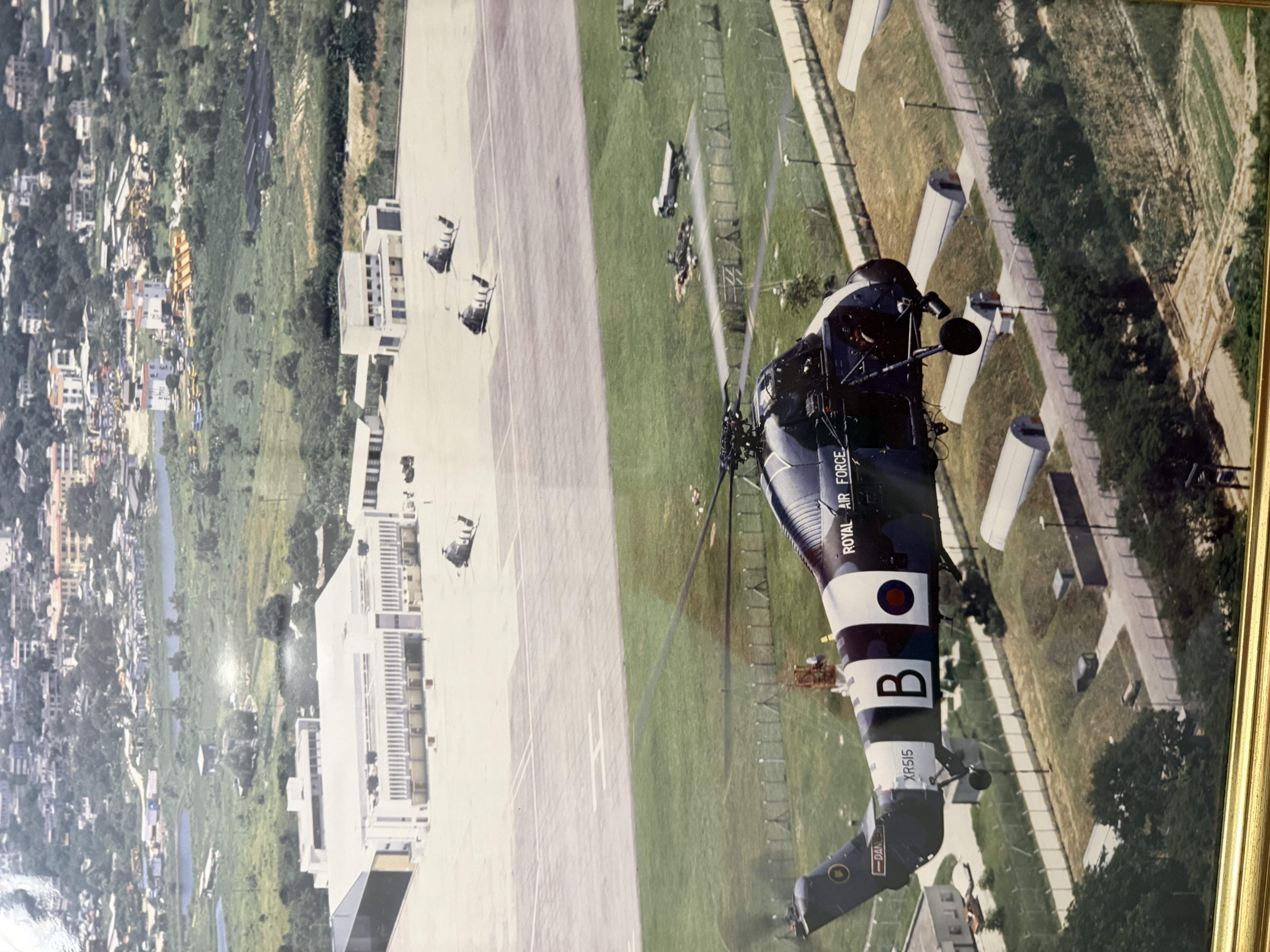
Another of the 28 squadron machines in action over Sek Kong – a picture on display in Gordon’s house (alas with a reflection from the display glass). You can see the immaculate condition in which these machines were kept.
There were a number of challenges to overcome. First were the white “conspicuity” stripes – the only context that I’m aware that word has been used, though the spell-checker has passed it. These were introduced for the Hong Kong Wessexes after a near miss, I believe – I think during Gordon’s first tour. Then, of course I had to source decals for the XT678 serial on the tail, and the large H ID letters. Also the “Royal Air Force” lettering on the side were in white at this time – not the black in the Airfix decal set.
I could find no photos of Hotel – though there were useful shots of other machines in the squadron. One ambitious modeller on Britmodeller (“hendie”) did make a very impressive model of it in 1/48, and this was a useful source. Amongst his many posts I didn’t find why he picked this machine (depicted at 1982/83); apparently he was part of the maintenance crew at RAF Sek Kong.
I opted for a bog standard build, with the main door open, and the side cockpit windows open too – so that some of the interior would be visible. Assembly was generally straightforward, though I did have to putty some cracks. The hairiest bit were the main wheels, for which the struts were not firmly set on the model – and getting them in the right position and matching on both sides was tricky (I don’t think I got this 100% correct…). As usual I mixed my own paints from artists pigments, tweaked with a bit of acrylic ink. I decided to paint with a brush rather than airbrush. That was a mistake. Another mistake was to prime in olive drab (I had some Vallejo primer in that colour) rather than white. The conspicuity stripes required several coats and the surface ended up distinctly on the rough side. I painted these before the camouflage colours, and then masked – having learned before about how hard pale on dark can be. The primer was bad enough. Elsewhere the surface was less than smooth too. You can get away with using a brush (and I have on other models), but the paint has to be pretty thin – which often means more than one coat.
The serial numbers and Royal Air Force were in 8in (or 20cm?) lettering. I found a decal sheet in my 1970s leftovers designed for Fleet Air Arm planes (I can’t remember for which project) and was able to use these, cutting out individual letters/numbers, except for the “Royal”, which came from a “Royal Navy”. The good news was that the large H’s closely matched WW2 Luftwaffe lettering, used underwing on some bombers, etc. I had one of these left over from one of my 1970s models, and a couple more from a Letraset sheet that I used then for one of my last projects – a Ju88 night fighter. Alas the Letraset letters disintegrated – but I was able to find a decal sheet on eBay. In principle I could have made my own decals for these and the serial numbers (which were also black – white lettering can’t be home printed) – and I even found close enough matches in my font collection and created a Word document for them. Alas my current home printer just wasn’t up to it.
Starboard side
The rest of the decals came from the kit, mostly from the 28 squadron set, but some from the others, which seemed to fit the later-dated model better. For my earlier 1/72 aircraft models, designed for use on the wargames table, I haven’t bothered with the tiny lettering and markings that modern models are now provided with. I used them this time, which was fiddly, and I did lose one – but it certainly enhanced the look of the model for display purposes.
As for finishing, there was no need for weathering – as the 28 squadron machines were kept in immaculate condition. I still patinated the finished model with oil paint and some linseed oil – placing small dots of white and brown pain on the model and brushing it out. The effect is so subtle as to be just about invisible, but it gave the whole model a slight sheen, and perhaps helped integrate the decals. One thing I didn’t do was use a wash to bring out the panel lines. This is de rigeur for modern modellers, but photos don’t show much in the way of visible panel lines – some of which were lost anyway when I fileded down the putty used to fill cracks.
Once the model was finished I started to think about how I was going to present it. I decided to buy a display case – the model fitted one of the standard sizes very neatly. But I quickly realised that I would need to construct a base that portrayed the tarmac at Sek Kong. I could get a general idea of this from photos. There was a large painted circle to mark the reach of the main rotor blades, and smaller one to mark the main wheels. The tarmac (or concrete) came in slabs separated by lines of bitumen (?).
Making the base proved harder than I expected. My first attempt was gluing sandpaper “slabs” to a foam board base. The sandpaper at first didn’t adhere properly, and when it did, the foam board warped. Instead I cut the base from some spare hardboard, and glued cardboard slabs (from the backing of paper pads) to it. This wasn’t 100% flat, but near enough. I primed it with gesso mixed with a bit of plaster, and then painted in with the usual acrylics (student grade this time). An attempt to paint the yellow circles and lines using masking tape, didn’t really work, so these had to touched up by hand.
Alas I don’t have a good picture of the finished result. While I was out (wargaming) my wife tied a lovely light blue bow around the display case, before I had taken any pictures. Gordon isn’t taking this off until the big day arrives. This is the best I could do – I will try again when I next visit – but he lives in Devon and I am in Sussex.
You can barely see it for the reflections, but the base is there!
There are not a few imperfections with the model, but Gordon was very pleased with it!
After a frenetic start (by my standards), 2026 continues to be a relatively slow year. The rest of life intrudes. There’s been a backlog of gardening, and we’ve just spent a few days in Salzburg.
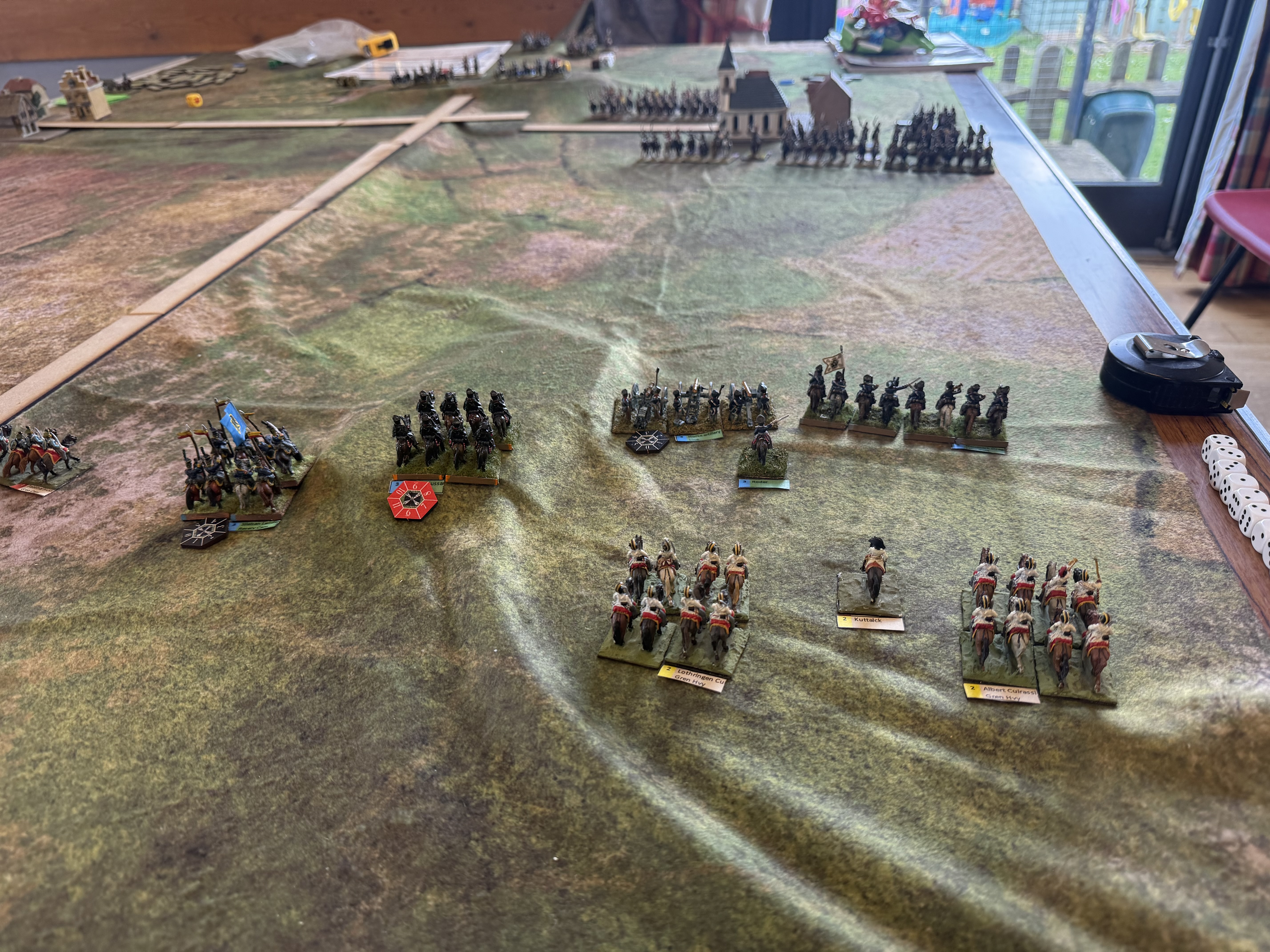
Game – Liebertwolkwitz, sort of
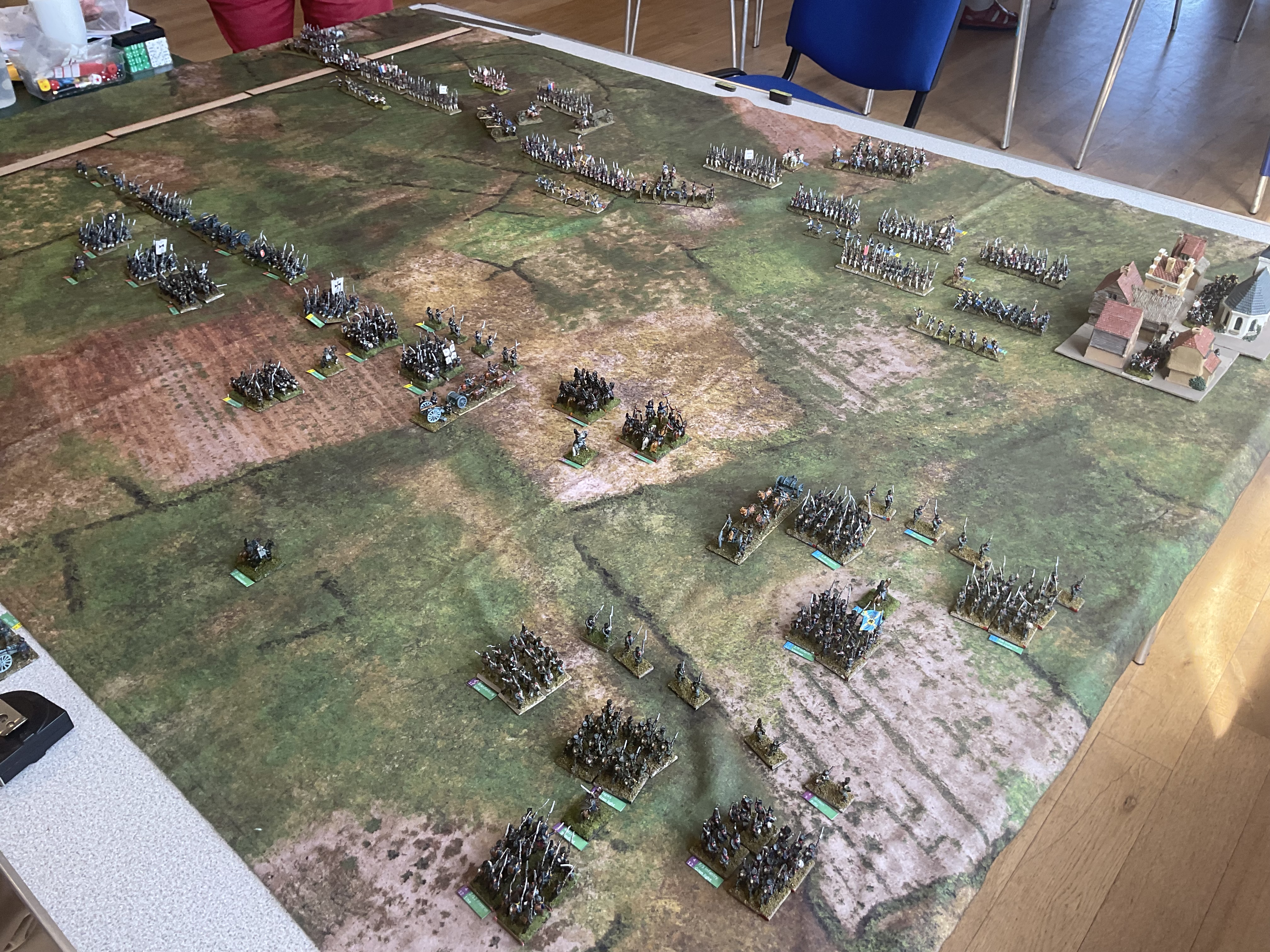
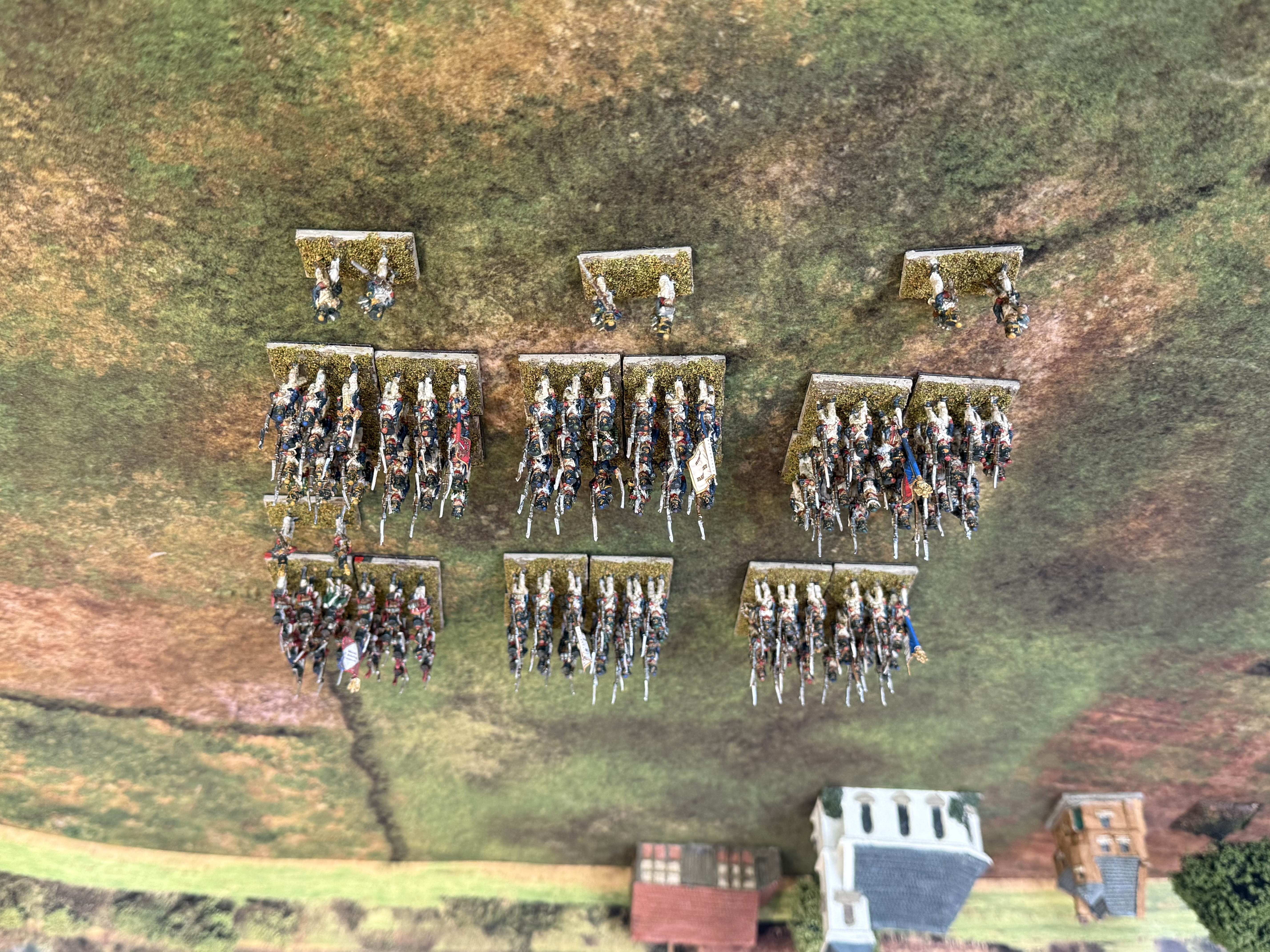
I managed one club game; tomorrow I will be playing a Vietnam game with my Beckenham friends. The club game was one I put on for Général de Armée 2. This was based on the famous cavalry battle at Liebertwolkwitz, October 1813, just prior to the main Leipzig battle. The starting point was a scenario in Steve Shann’s Let’s Do Leipzig. I had to adapt it to the miniatures I had. Each “brigade” was mostly a historic division, scaled back slightly (four units to three typically). For the French I did not have enough dragoons – so I substituted one division for one of cuirassiers. On the allied side, I had no Russians, and no Prussian cuirassiers. I substituted this with an army based on my Austrians, which hadn’t been on the table for many a year, with a sole “brigade” of Prussians. I did away with the special rules to reflect Murat’s command style.
The situation at lunch: from the Allied linesThe field from the French lines. The first attack (led by the dragons) has been pulled back, but the (very hesitant) cuirassiers have now been brought in ready for the next lunge.
On the rules, we had tried out a new command system for GDA2 in our last game. These evidently needed more work, taking it even further from the original. We decided to go back to the original rules – we do get opportunities to play GDA2 games elsewhere, and it’s as well to get used to the standard rules. Amending the rules so radically is a bit of a rabbit hole.
Malc took the French. He made no attempt to channel Murat. As allied reinforcements started to turn up with withdrew his two original divisions to consolidate his force and switch flanks. This was quite risky, as this was a time-limited game. He then ran into the familiar GDA2 problem of hesitant brigades (the main problem that the our abortive house rules were meant to address). Rod, taking the Allies, had fewer problems on this score. He stayed calm in face of the onslaught, and managed to outmanoeuvre the next wave, led by the cuirassiers – though he did lose his Commander-inChief! Malc conceded. This scenario did fit nicely into the time available – but a cavalry-only battle is much quicker!
It was nice to get back to the game table. My companions enjoyed the change to a cavalry-only battle (with a little artillery support).
Command and Discipline
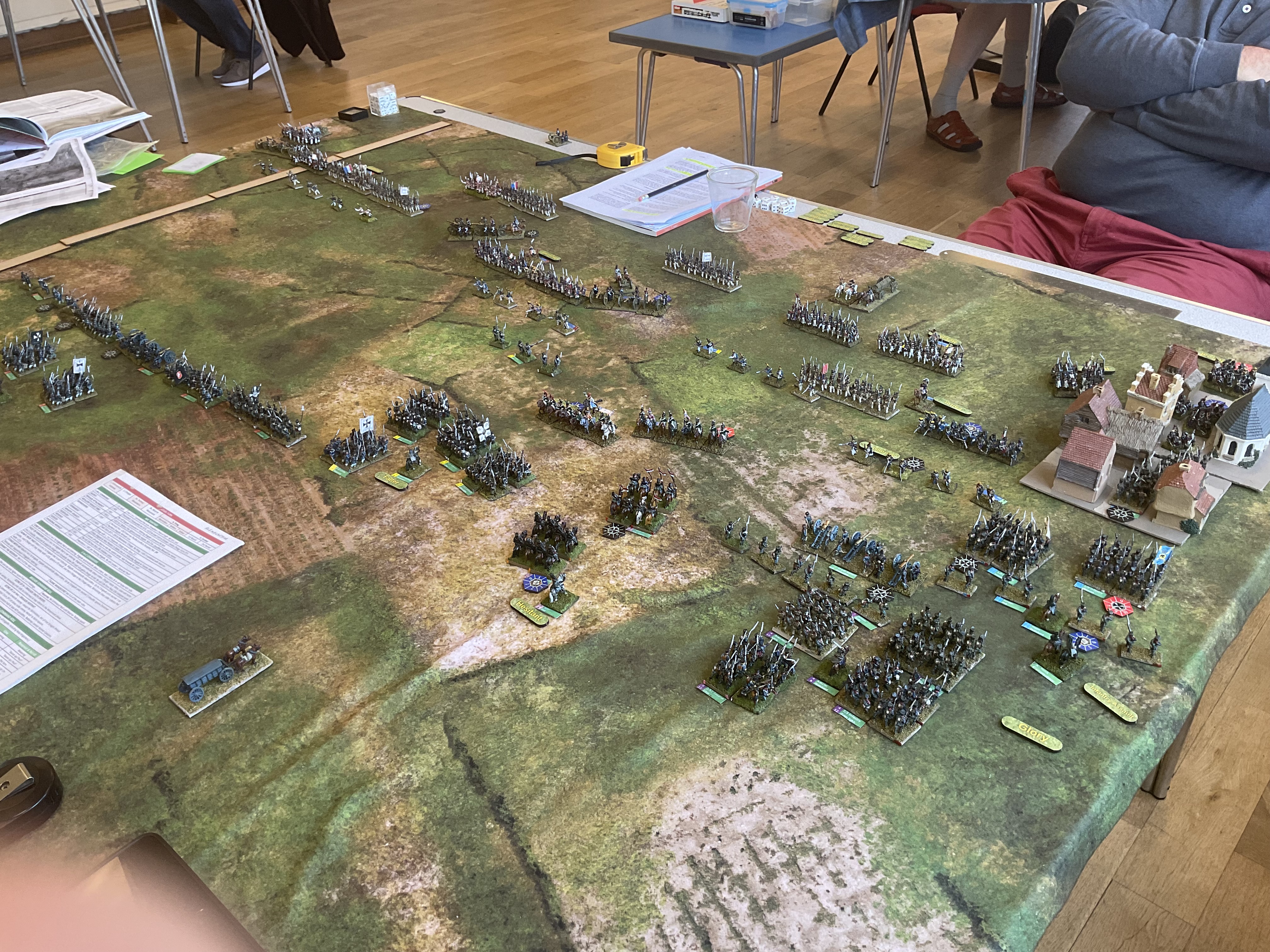
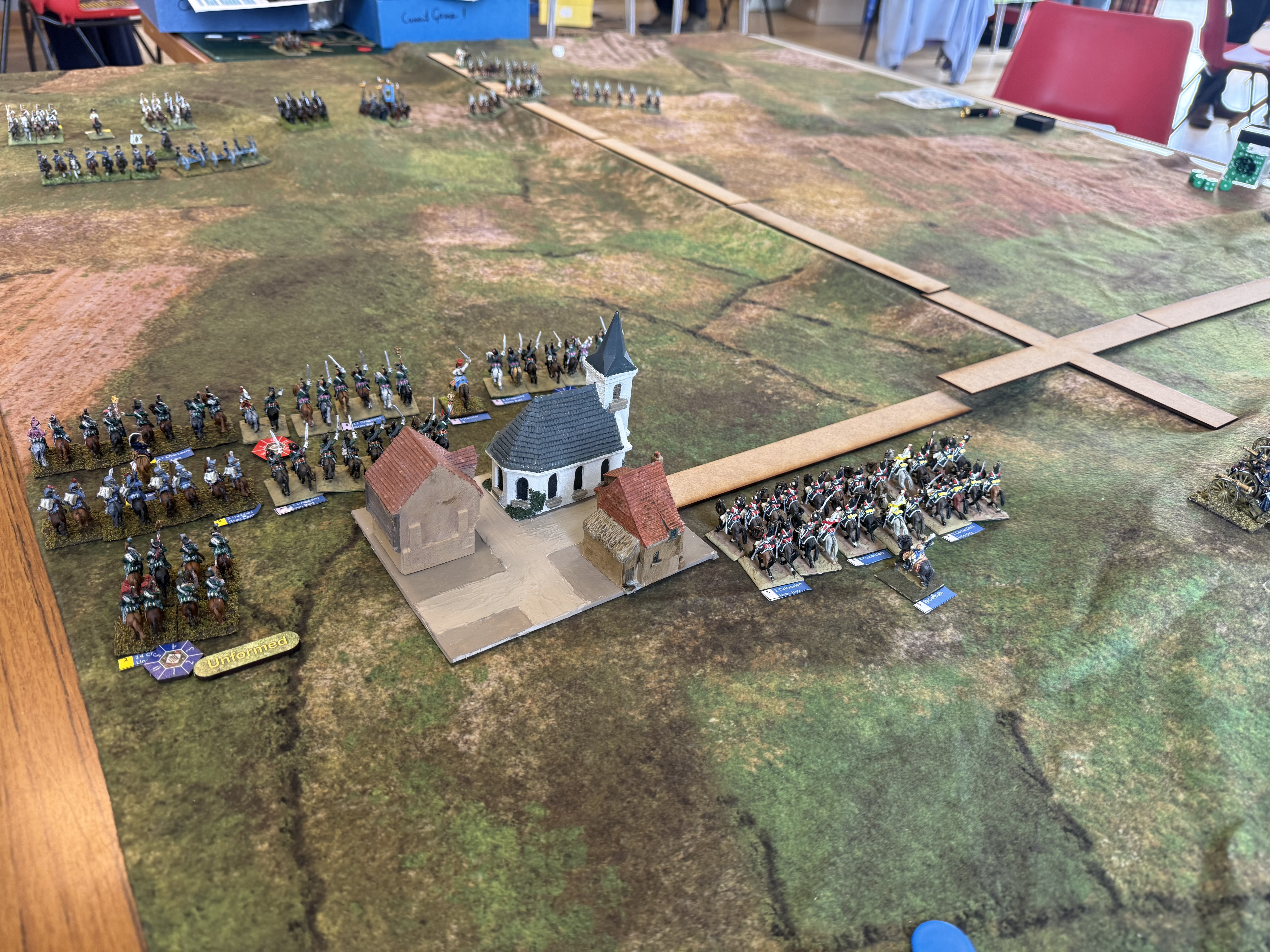
These are my new hex-based Napoleonic rules, which started out as an adaptation of Valour & Fortitude. I managed my first trial game at the end of April. I ran with my adapted version of the GDA Weissenfels scenario form 1813, with Prussians from the Lützen order of battle substituting for Russians. I played this with Rod some time ago at the club. This helps compare the systems.
Towards the end of the trial game. The French have managed to get across two of the crossings, but are in no shape to fend off the Prussian cavalry and horse artillery. I’m using unpainted streams and roads bought from Pendraken.
Interestingly the Prussians had a fairly clear victory, in a scenario that is usually regarded as very challenging for the defenders. The rules made it quite hard for them to defend their bridgeheads against cavalry in particular.
The game played reasonably well, but led to quite a large number of changes to my draft rules – just what such a trial is supposed to do. This is now done, so I’m ready for the next trial. The game also gave me an insight into the V+F system, since many mechanics are copied. I can see how they can produce a quick, exciting game. But I’m changing a lot, incorporating several ideas from GDA2. It is a much less complex game than GDA though, with even the revised draft rules fitting into 8 pages. It has been much more fun than I expected producing my own rules. I think k they will suit my Beckenham group very well. We will continue with GDA2 at the club.
The main problem with the rules is their hex format. This is what my Beckenham friends like, but you need to acquire a hex mat to play. Other grid system use squares – which are easy to set up even without grid mats (discrete markers at the corners or centres are easy to put in place – much harder for hexes). I rejected a square grid firstly because it is harder to make natural-looking terrain, and also because you get arc of fire problems for artillery. I have had two hex mats made, for my attempts at WW2 rules. These came from Tiny Wargames, who are no longer in business. The big problem is that the hexes are not oriented in the best way for horse and musket encounters. For these it looks best for units to point to the corners; for WW2 games it’s best to point to the flats. As a result the units don’t align to the baseline, assuming this is the long edge of the table. I need to get a new hex mat printed; I think I have found somebody that will do it (Deep-Cut Studio); I’m a bit nervous about getting it wrong though!
I might try to do a non-grid version, or one based on a square grid. Meanwhile I have found that the hex grid is a good basis for making modular terrain. I have bought some MDF terrain bases from Pendraken (rivers and roads to start with). This will work fine with ungridded formats.
Other projects
My secret modelling project is nearly at the reveal point. I thought I had finished at the end of last month, but decided to make a base for it, which took a bit longer.
I have started basing my 1866 10mm Austrians for my Custoza project. Let’s hope I get some time to do it.
Salzburg
Salzburg is a delightful town to visit, but fortunately for it, it doesn’t have much in the way of military history. It is dominated by a very impressive fortress, which served to tell would-be attackers “Don’t bother”. That fortress did contain a rather nice regimental museum for Austrian infantry regiment 59 (Rainer), which was based there – though the city only came into the Habsburg Empire after the Congress of Vienna in 1816.
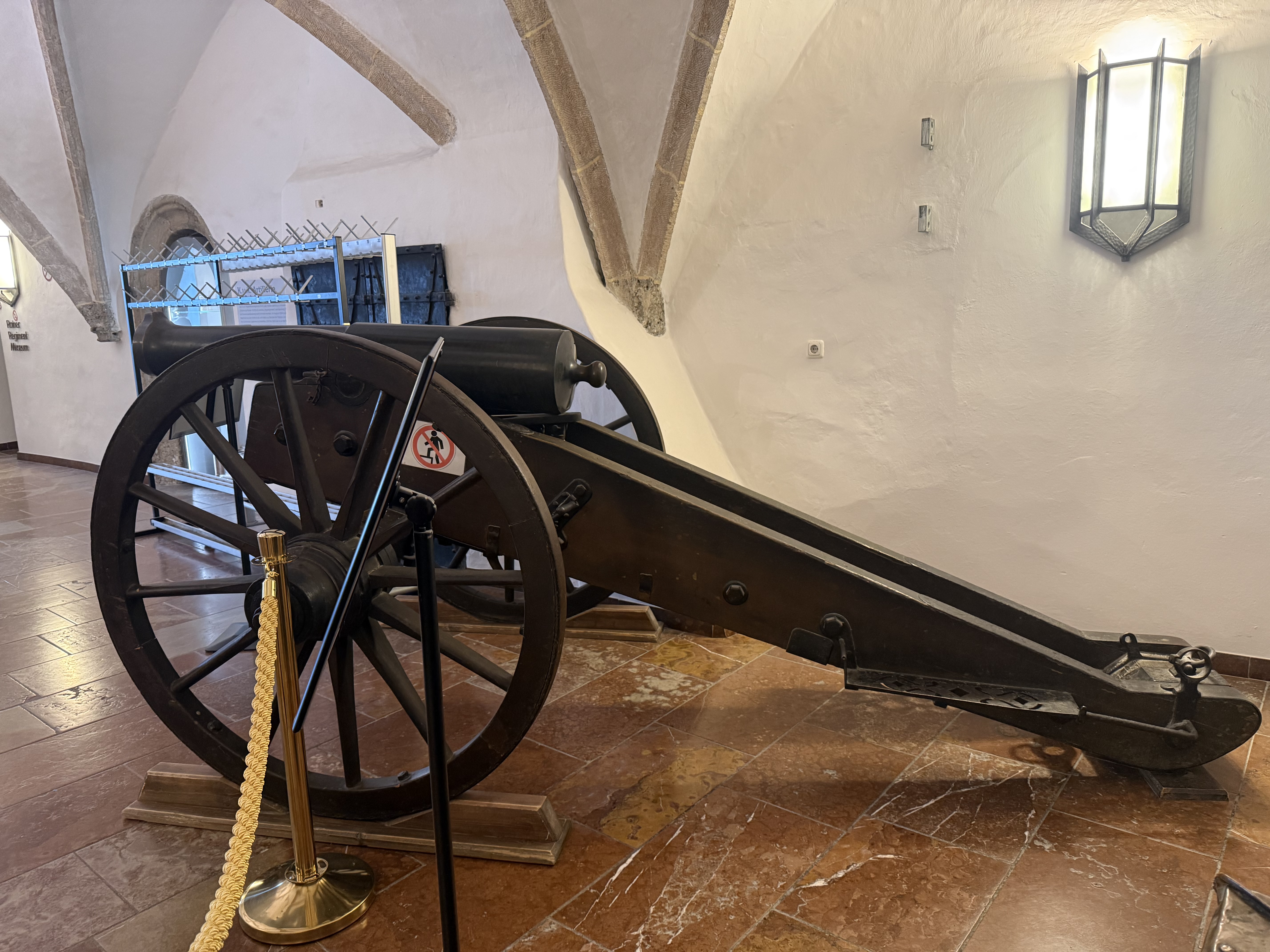
There was a fine example of a 4-pdr rifled gun as used in 1866 A couple of points of interest. The carriage was unpainted, being dark varnished wood – I had read this was the case for this era. The darkness was a surprise, though that may be an age effect. The barrel is black – but I didn’t think to examine it. It doesn’t look painted so this may just be 140 years of patination.
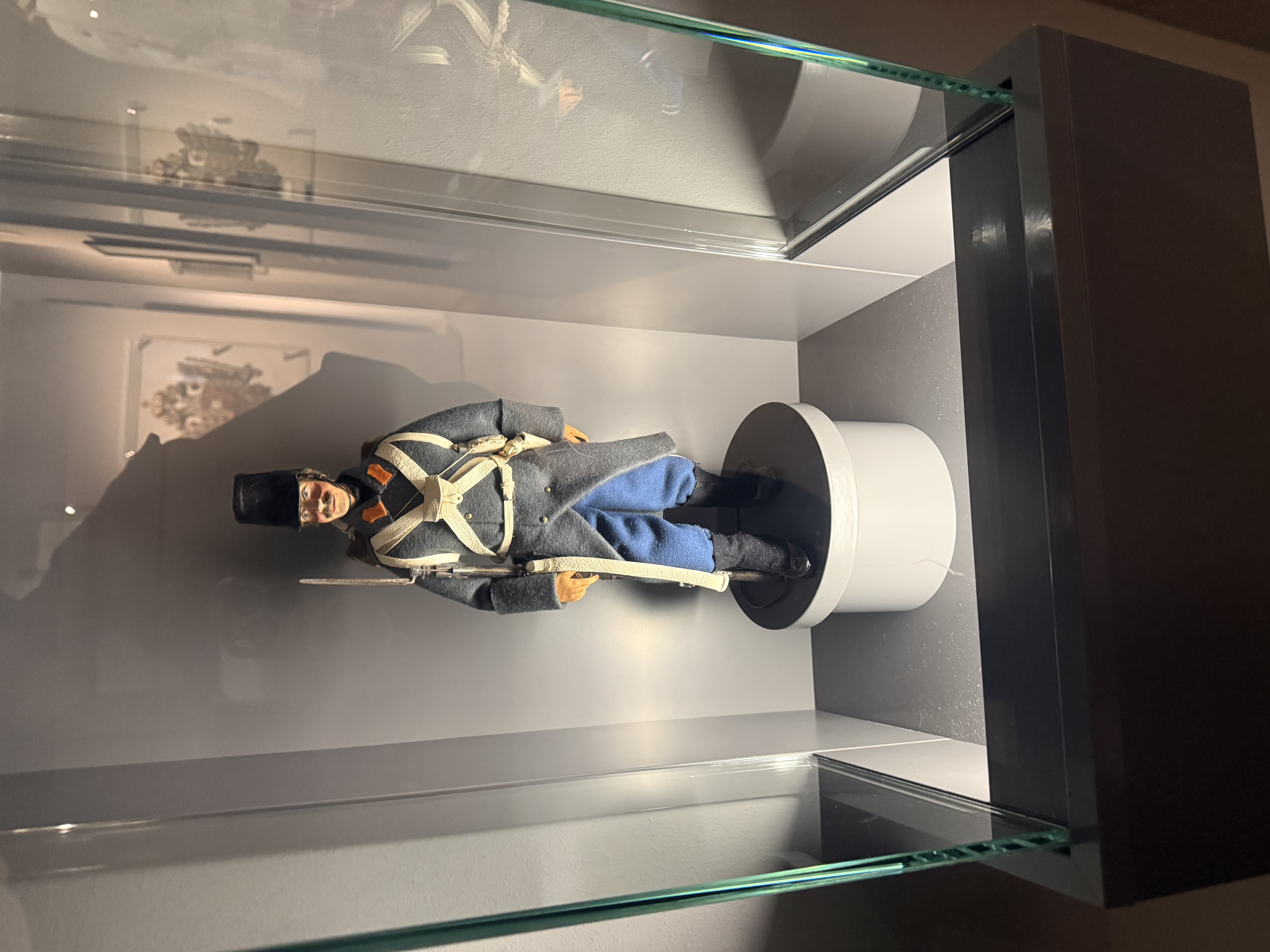
Here were further exhibits of infantry weapons through the ages, and some felt uniform models, as well as original coats, etc. There were particular exhibits around the regiment’s role in WW1.
Felt model of 1866 infantry uniform
No big holidays planned for June, but the garden still beckons…
Another quiet month on the hobby front. At least I got a game in. Meanwhile, somewhat better weather meant that I needed to rectify months of neglect in the garden, which ate into hobby time.
Salute 2026
The prize-winning What a Tanker game
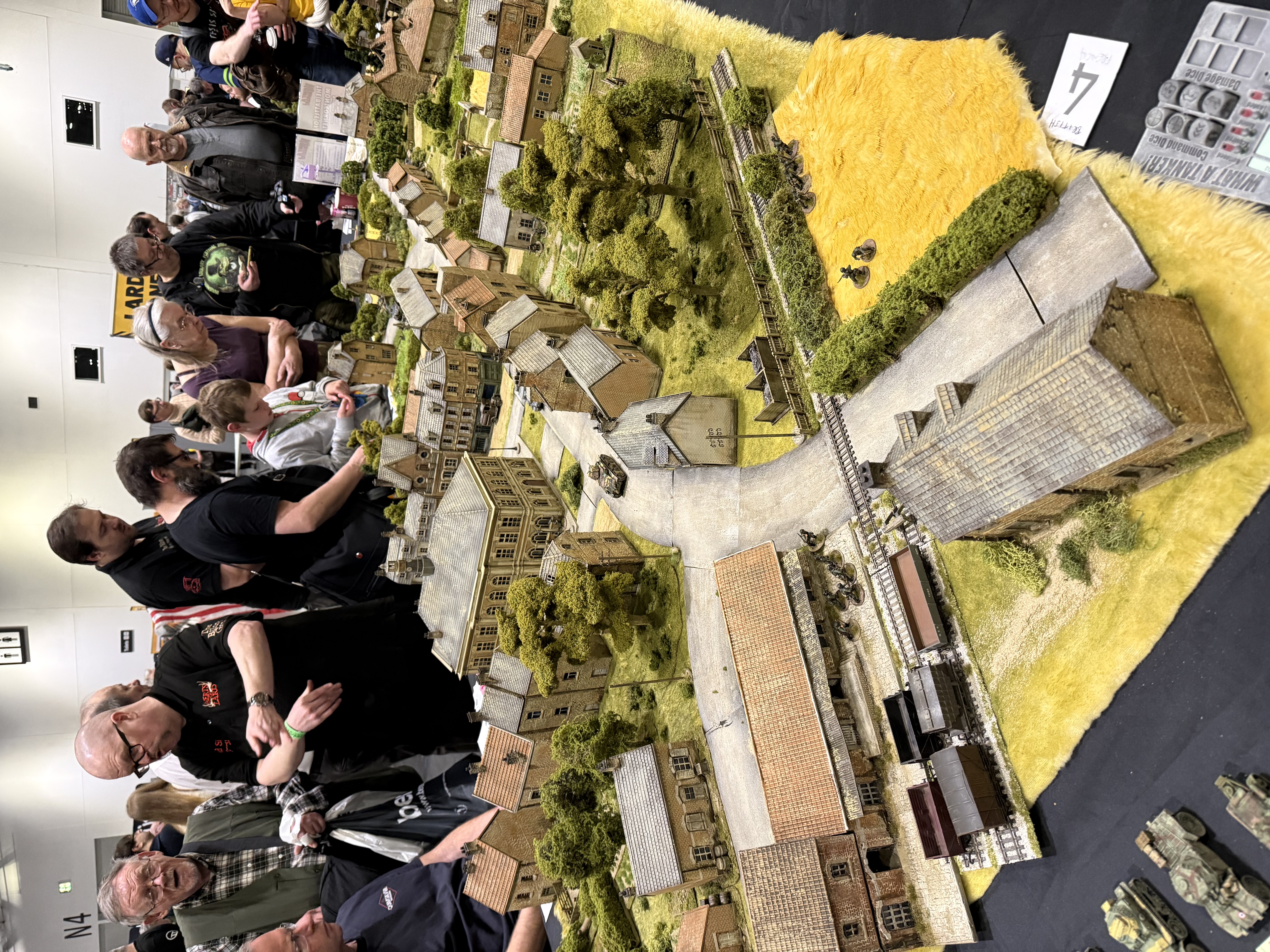
The highlight has been making it to Salute. I nearly didn’t make it, as we were scheduled to have a house guest that weekend. But she postponed for a week, so I took the opportunity. I used to be a member of the South London Warlords, and was a volunteer helper one year at the show. It’s amazing that such a big and professional show is put on by these volunteers, and manages to keep fresh. The show drew in large crowds, featuring an excellent range of ages, and even a (relatively) high proportion of women. Of course that means that the show’s content continues to drift away from my interests. Younger gamers (and most of those women) prefer fantasy and science fiction, rather than historical games. I thought there were fewer historical games with outstanding terrain boards than last year – but there were plenty of well-presented miniatures. The best terrain was the Lardies’ What a Tanker game – featuring De Gaulle’s counterattack in France 1940. I’m not really a fan of games based mainly on tanks, but the board was excellent, and the engagement from the public excellent too.
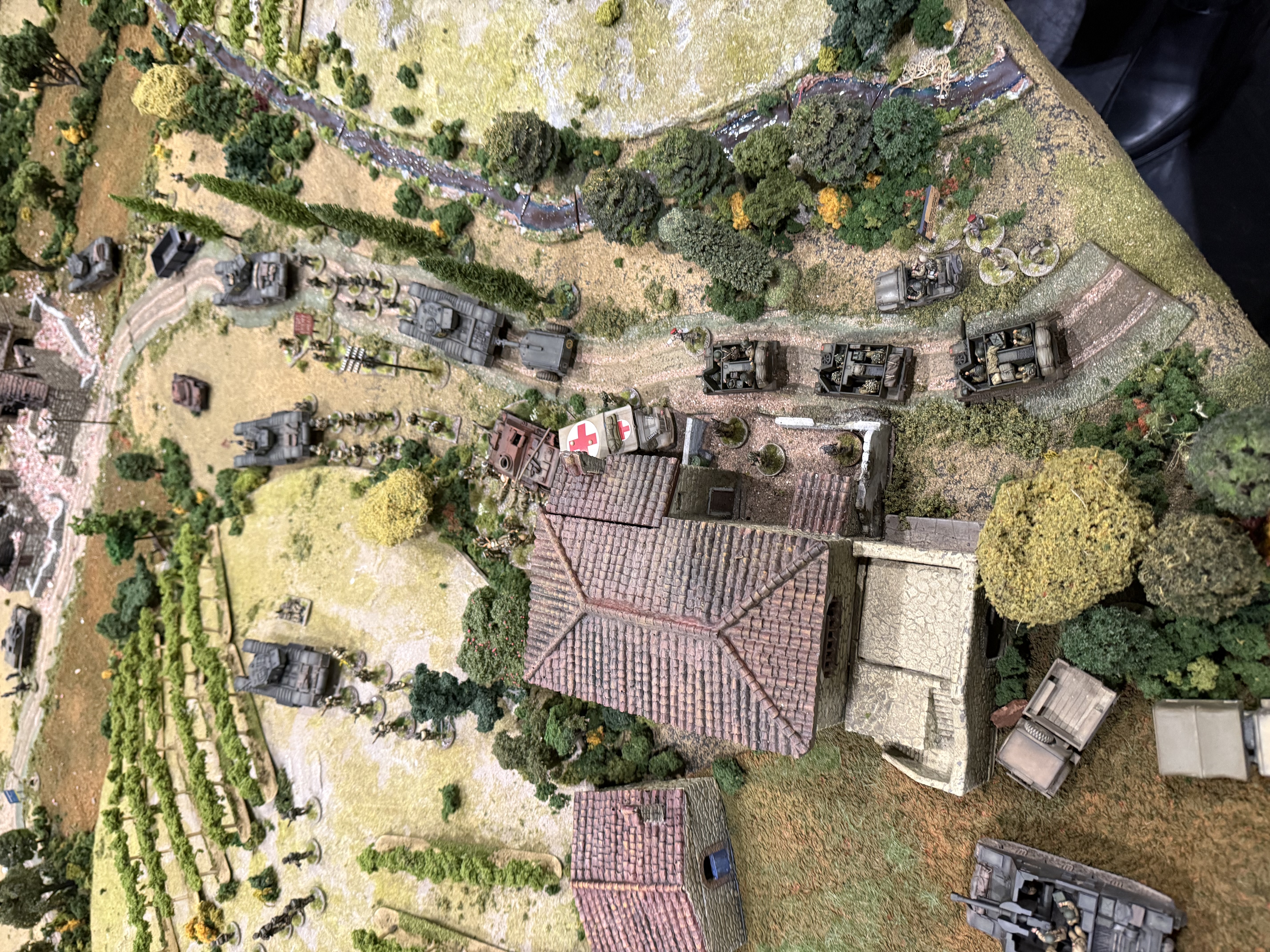
On high quality terrain there was also this table set in late war Italy:
This was allegedly a game based on Battlegroup rules. Allegedly because there didn’t actually seem to be a game going on – it was more of a diorama. A lovely one, though. Worth mentioning is Yarkshire Gamer’s massive Italian Wars presentation, which needs a video to do it justice:
This is a classic traditional big game, with a rectangular board loaded with miniatures setting to with very little hope for manoeuvre. The figures were breathtaking though, and it was good to say hello to Ken Reilly, and to thank him for his highly enjoyable podcast. I also saw an 18th century big game (though not nearly as big as this) based on the same idea – a table filled with two armies facing off and little empty space. For Napoleonics there was this presentation of Liebertwolkwitz 1813, though not the famous cavalry battle by the look of it:
This was put on by the Central London Wargames Club, using a set of rules that I haven’t encountered before – but I didn’t make a note of the name! This looked more my sort of game, played with 15/18mm figures – even if the presentation was a bit basic. The basing convention was quite interesting: it looked like 8 infantry (two ranks of four) on a 40mm base, with 2 bases to a unit. With 16 figures to a unit this just about worked, with the units not taking up too much space, allowing bigger battles to be fought. Still I’m committed to my current basing system and I’m not changing!
I didn’t buy very much. I bought a set of dry-brushing brushes from Pro Arte, and some dice. I thought I had found some average dice (2,3,3,4,4,5), which are hard to find these days, but when I got home I realised that the were D3s (1,1,2,2,3,3). Dopey or what!
Other news
I finished my secret aero-modelling project by the end of March, but then decided I needed to do work on a display base.
Meanwhile I finished the first draft of my Napoleonic hex-based rules – Command and Discipline. These still need a play test though.
I managed one game – with my Beckenham friends. We played a 6mm AWC game using our host’s hex based rules. I forgot to take picture.
Coming up, I should get a game at the club, and another in Beckenham. There’s still a lot to do on the garden…
Another quiet month, hobby-wise. Alas no games – I was unavailable for both the club game and the Beckenham group one. Most of my hobby time was spent on the secret aircraft modelling project that I will not report on yet! This isn’t quite finished.
My second project has been to develop some hex-based fast-play rules for Napoleonic games. The first draft is pretty much there – but they need a solo play test before I move onto a more robust playlets with other gamers. I’m call them Command and Discipline – a riff on Valour and Fortitude, the system on which they are largely based. In the absence of much else solid to report on, I will take this opportunity to offer some thoughts on the VF system – with the huge caveat that I haven’t tried it in action.
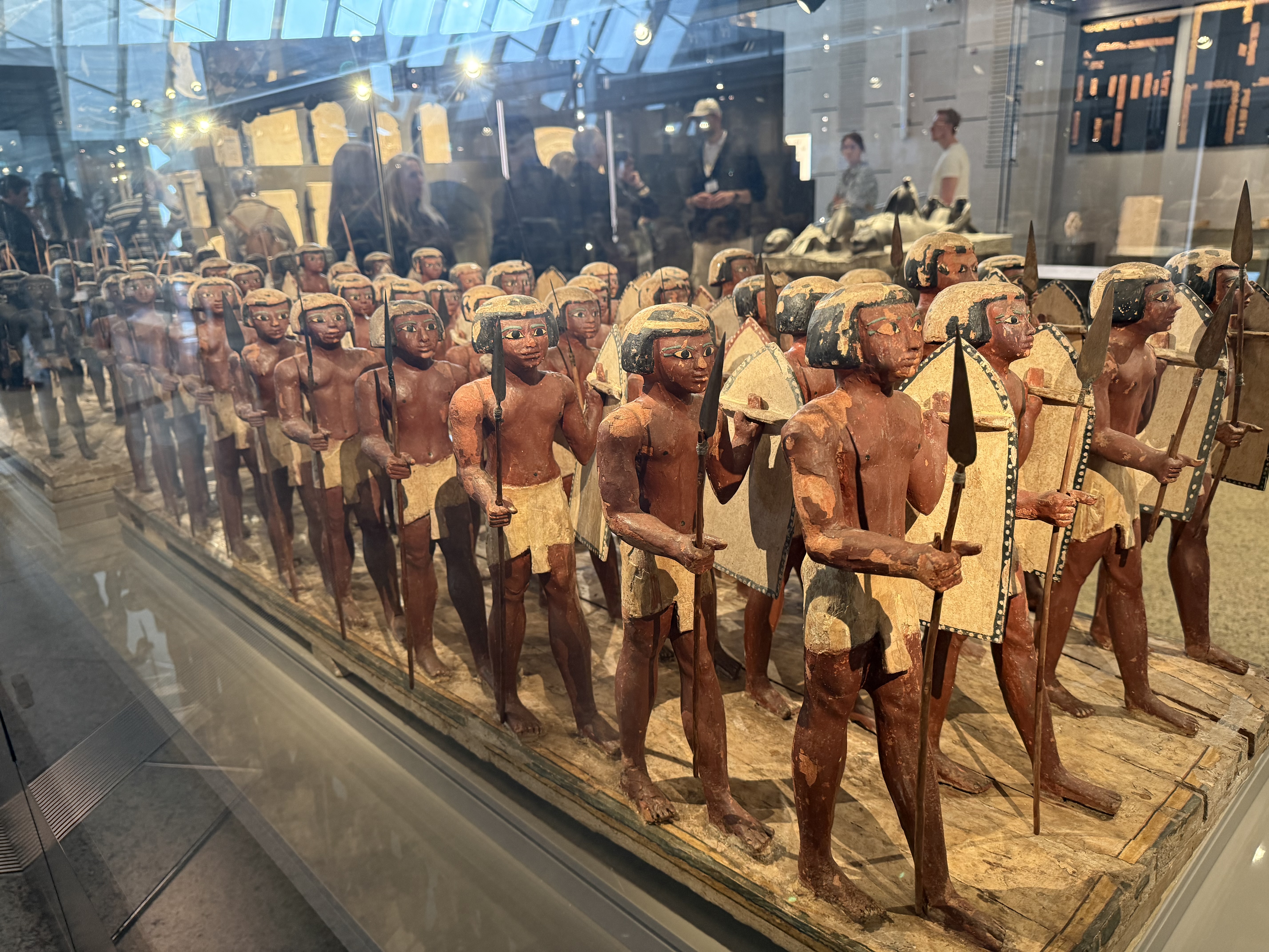
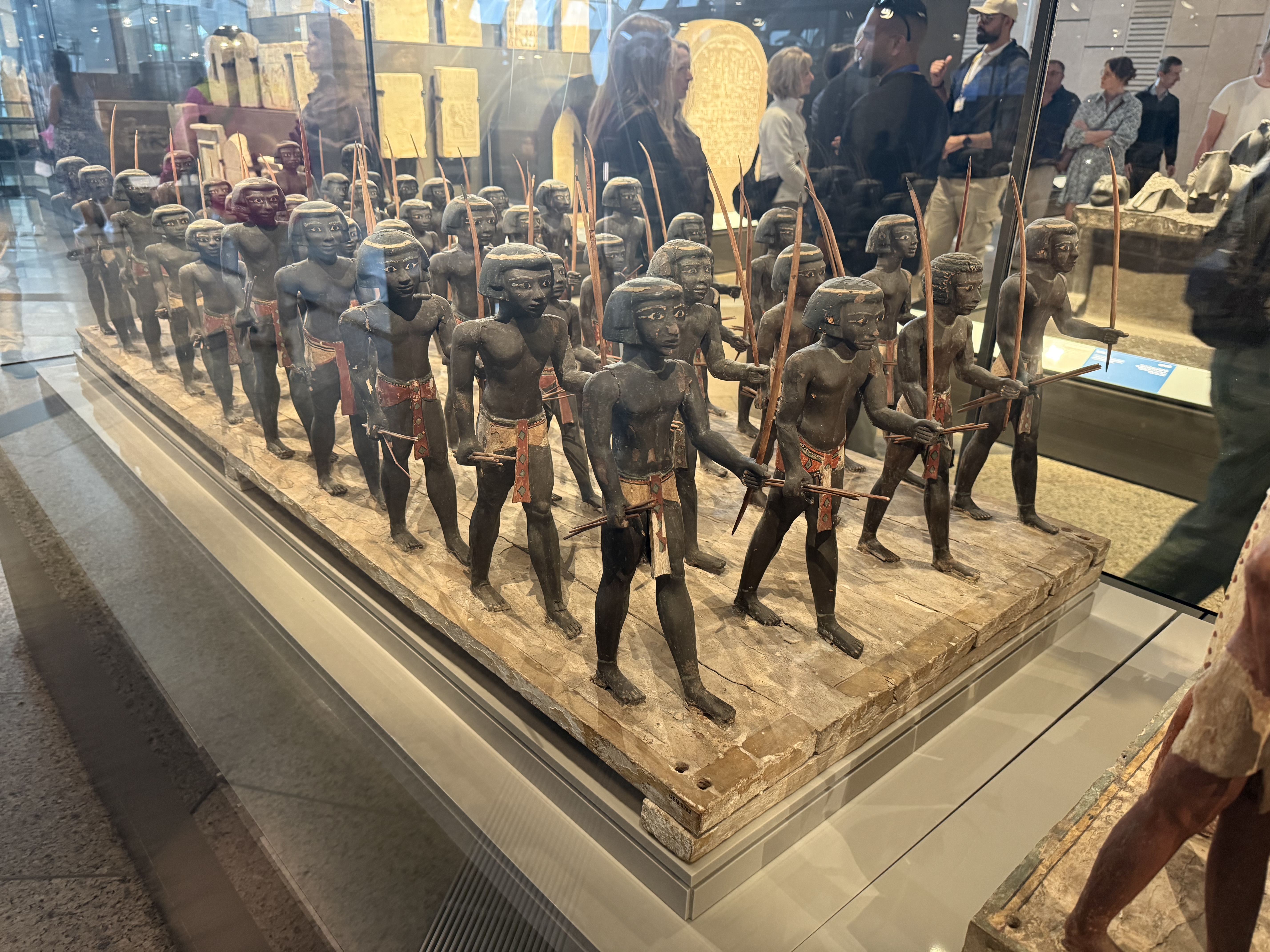
We also visited Egypt during the month. It was a seven-day crash tour, including four nights on a river cruise boat. Nothing much of hobby significance to report, but I was blown away be this exhibit in the new Grand Egyptian Museum:
The first picture shows Egyptian infantry, the second Nubian archers. They come from a Middle Kingdom tomb dated about 1900BC. It is more than rare that we have such a full colour contemporary representation of how soldiers looked from ancient history. It was notable that the figures are of different heights – but they are all marching in step. It is a wonderful combination of individuality and uniformity (the shield patterns on the spearmen are all individual, seemingly representing cattle skin). It almost made me want to go out and paint up an army featuring these troops – options are available in 15mm and 28mm. Alas this army is tactically not very interesting – their opponents (the Hyskos) had chariots and composite bows. One of the reasons the Middle Kingdom fell. The later New Kingdom is understandably more popular with wargamers.
Valour and Fortitude
I have mentioned these rules before. They are published by the Perry brothers, and they were written by Jervis Johnson, with the Perry twins also credited – and can be downloaded for free. They are designed with Perry miniatures in mind. The photos and videos published alongside feature gloriously painted 28mm miniatures on sumptuously dressed tables. In fact they look easy to adapt to any scale. Their scope is all of the horse and musket period (the Perry range is extensive!), though they started life with Napoleonics. There is a four-page set of core rules. Each period is covered by two-page army sheets, which give both period-specific rules (e.g. for Napoleonic squares) and army-specific ones (e.g. one for French élan). This compact writing is a welcome contrast to the tend to much longer rules – where it can be hard to find specific rules, and where sometimes the rules a re pad out with chat. The dense writing can be a little hard to understand sometimes, though.
The game structure is an old-school I-go U-go system, with separate phases for firing, movement and mêlée. This is doubtless to ease multi-player format games, though each phase is structured highly sequentially between units (you fire with one unit it, then move on to the next, etc.) – this is no great obstacle to parallel activity in different parts of the table. There a lot of single D6 tests – a bit like the old Wargames Research Group horse and musket rules.There are more modern features too. There is a “Fate card” system, where each side draws a card at the start of their turn from a set of 13 specific to their army (using conventional playing cards), which can then be played later in the game to boost your own side or thwart the enemy. Movement rules are also highly flexible – without the careful wheeling and oblique movement of traditional rules. The system for losses and morale rather resembles Sam Mustafa’s Disruptions in Lasalle (both versions), rather than old-school casualty removal and morale tests.
But there is a very old-school feel, overall. These rules seem to be in a “Grand Manner” tradition, dating back to huge games played of old at the Wargames Holiday Centre, which inspired so many. This comes up in some of the details the rules choose to pick up on – that French élan for example, and cavalry skirmishing with carbines. Not having played any Grand Manner games (I do have a copy of the rules, but I never used them), I might be wrong on this. It just comes over from the look and feel of the games in the pictures. Rules on command friction are very limited – the Grand Manner tradition is that the players generate plenty of command friction without any help. It is also reflected in the language – “valour” and “fortitude” being examples of an attempt to create period feel with period language.
This boils down to a different conception of Napoleonic warfare from Général d’Armée, the system that I am currently using It seems a bit old-school: in which the French do well in charges, and the British in musketry. The example play video (featuring a French attack on a British brigade), while instructive, did not inspire any confidence about historical authenticity. Strangely, though, skirmishers are abstracted away, except certain light infantry units adopting open order. GdA2 comes across as being more serious, with a stronger historical base – but much more complicated.
My current project is to translate VF into a hex-based game, that I can use with my Beckenham friends, for whom the complexity of GDA2 is a disadvantage, but where we usually play two to three a side. At least that was the original idea. In fact, in a topic that I am so deeply marinated in, Napoleonic wargames, this is impossible. I can’t help fiddling with it to fit my own ideas of Napoleonic warfare and game play. The Fate cards are out – players should be playing their troops and not a hand of cards in my view (though you can do very interesting things with cards). In its place I have put a basic command system, where players must decide what to do with their command figure – whether to intervene directly in events or stand back. I have also introduced a Discipline test for troops undertake certain actions in close proximity to the enemy. I have brought in a system of brigade skirmishers (I think these are important to the visual feel of a Napoleonic battle, if nothing else). Hence my new name: Command and Discipline. Alas I fear that I have added complexity – though my basic rules (which include period specific rules for Napoleonics) run to just seven pages so far, and the quick reference sheet is comfortably contained within a page and a half (compare four pages for GDA2).
The hex system can be used to sort out a lot of traditional tabletop nonsense, however. This includes columns ganging up on lines (the explanatory video suggests this could be an issue for VF). It’s will be interesting to see how well all this works under tabletop conditions!
Looking ahead
I will miss the next club game, which is on Easter Sunday. That would never have been on for me, even if we weren’t visiting friends and family. I should get a Beckenham game, though. My secret modelling project should be done by next week. That will allow me to get on with my 10mm Austrians for 1866, which are now ready for basing. And Command and discipline will get a solo tabletop excursion. Unfortunately, the garden is pressing for attention too…
After having a lot of hobby time in January, February was a slower month – though I did get some gaming in.
Games
Our medieval game in Beckenham
I managed have three gaming sessions since my last report: two were with my Beckenham friends. A group of up to six of us meet monthly to play a variety of games. At the end of January we played a hex-based game using medieval armies, using rules compiled by our host, Pete. There was nothing particularly historical about it, but it was good to get together as usual, and it provided an absorbing contest. It is interesting how when using new rules you move on from thinking that the rules need tweaking, to developing the tactics required to be successful. The rules were loosely based on Lion Rampant. We lost a lot of the heavier uniss to missile fire, mainly bows and crossbows. The instinct is to suggest that these missiles should be made less effective in the rules. But tactics are another solution. By holding the heavy forces in a compact mass, with light troops at the front, the problem might be solved. This is actually how they fought, as far as I understand it. Especially with home-grown rules, there is too much temptation to tweak the rules rather than develop tactics.
We didn’t finish our January game, so we finished it in a second session in mid-February. We reckoned it a score draw.
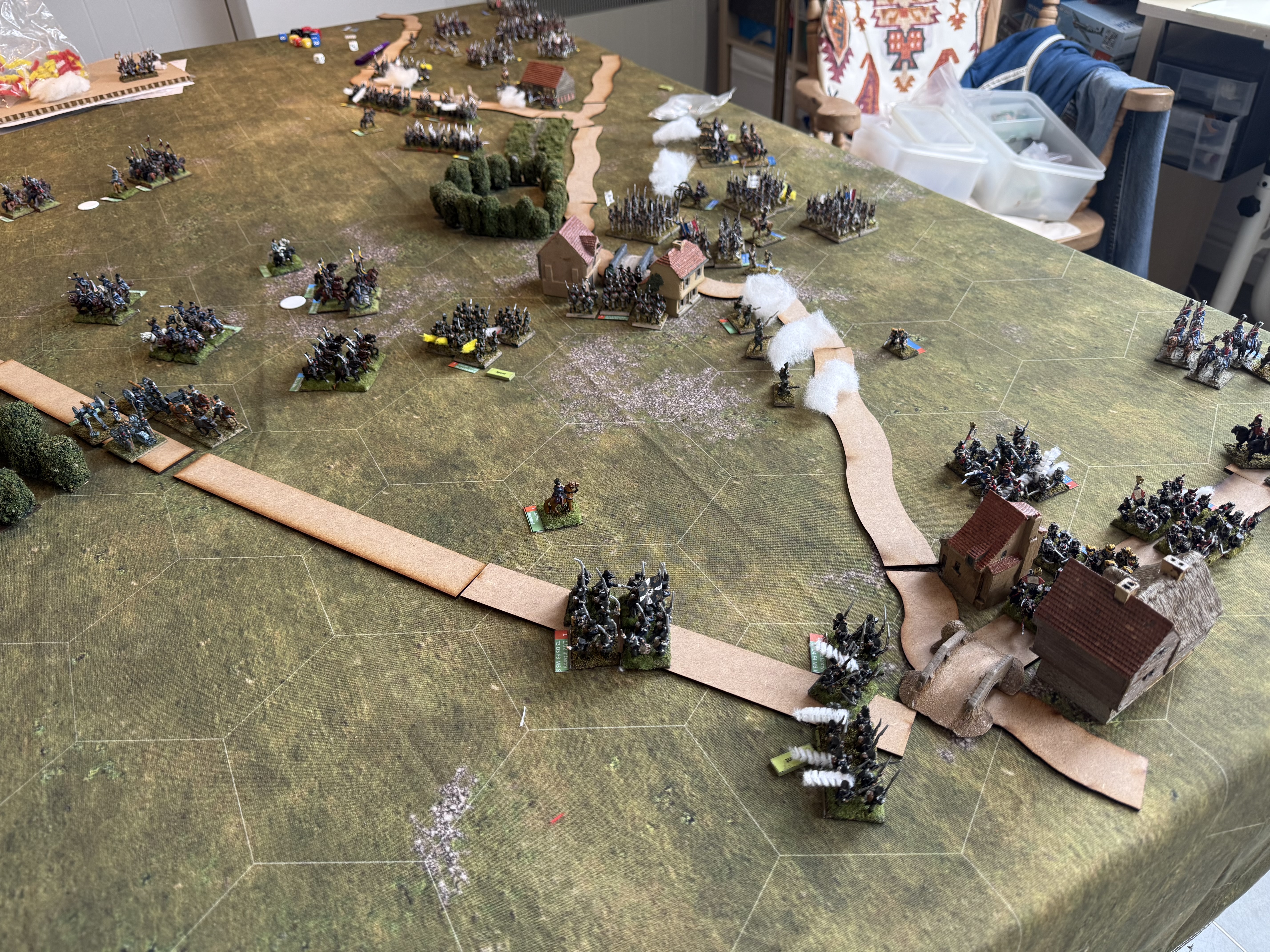
I managed a game with my usual gaming partners at the club too (Tunbridge Wells Wargaming Society). I hosted a game of Général d’Armée 2 using a Lasalle scenario but forces based on Lützen, 1813. The main interest was that I tried rewriting the command system based on some ideas from members of my old club (South London Warlords) – credit Iain Fuller. I think these produced a better game experience, but there is more work to do. Here’s a picture of the game in progress:
This was another score draw, but we still need the game to go faster.
Painting and modelling
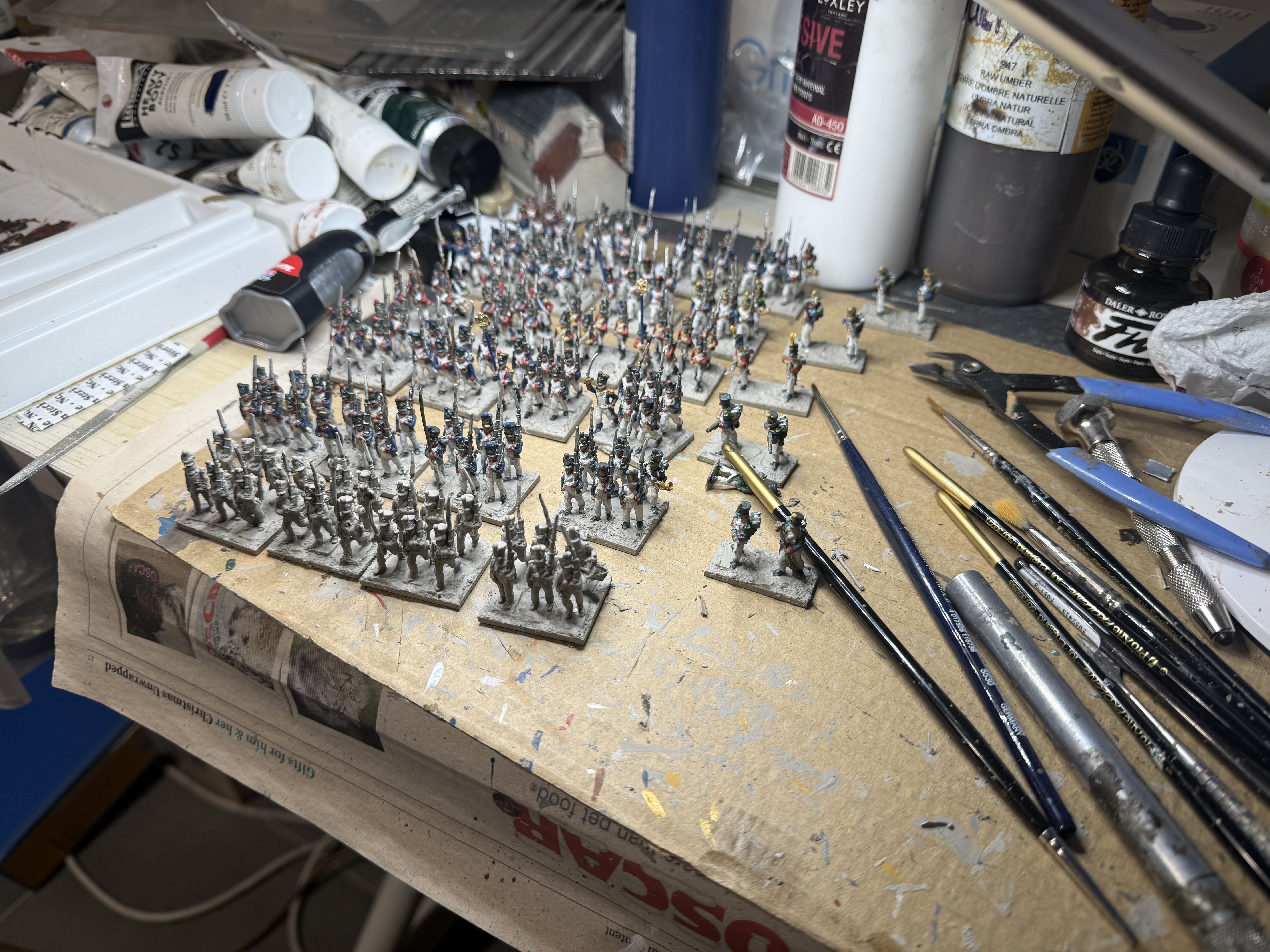
I finished my six new battalions of French infantry by the end of January, and used them in the GDA2 game. These units represented Dupeyoux’s brigade of Habert’s division (Vandamme’s corps) in 1815. This brigade had a quiet Ligny, so not an immediately obvious brigade to model (unless refighting Wavre) – though I have it in mind to model Habert’s clash with Tipplelskirch’s brigade (which I have already modelled) at Ligny. Dupeyroux’s brigade seems to have been held in reserve and not used in the class, though it would need to be available in any wargame. I chose it mainly because it includes the single battalion of Swiss troops in the French 1815 army. Back in the 1970s when my brother and I bought Airfix Waterloo soldiers to start wargaming, we were attracted by the uniform, and so painted up this regiment. One of my ambitions is to produce all the units that we painted up at that time in my current armies – so I wanted to include this unit.
My Swiss. The deuxième port-aigle is missing, and one of the men is dislodged, which I don’t notice until later. I used two different facing colours – something I will explain another time! These are Eureka 18s.
There’s more I want to say about this project, but I’ll leave it for another post. What I will say is that I really enjoyed painting these figures. The AB figures (used for the five French battalions) are lovely, and a pleasure to work with. I have now ordered the miniatures for my next batch of six battalions. These will be two battalions each of French line, French light and Young Guard Voltigeurs.
My current project is some aircraft modelling, which does not have a wargame role. It’s a bit of a secret so I won’t say any more until later in the year.
Meanwhile I am assembling my 10mm 1866 Austrians ready for my Custoza project. This will be a big project, and not as much fun as painting up AB Napoleonic 18s.
Rules
Writing rules is one of the things I enjoy about the hobby most. Mostly my creations don’t go anywhere, but the process is fun. My next project is to create some Napoleonic hex-based rules for my Beckenham games. Pete likes hex grids, and GDA2, my go-to rules for Napoleonics, aren’t a good fit for the Beckenham crowd, where we can have up to three a side, and the demand is for simple mechanisms. I am using the Perry Brothers’ Valour & Fortitude rules as the starting off point. But they will be substantially rewritten. That is proving an interesting journey, and I will write about it in a future post.
And that’s it for the month. In March we are going to Egypt for a week, which will slow things down hobby-wise. My aircraft modelling will also take up a bit of time. And I will miss both club and Beckenham games. Not such a productive month in prospect.
At last I have had more time to spend in the studio to work on painting my little men. In the remaining days of December since my last update, the 10mm 1866 Italians were finished. In the new year I started my next project: 6 battalions of 1815 French infantry. I’m on course to finish these by month end! Alas the early January club game had to be cancelled because my wife wasn’t well.
10mm 1866 Italians
This relatively modest batch has taken me months of elapsed time as I have not been able to spend much time in the studio across October to Christmas. There are nine bases of line infantry, three of Bersaglieri , four of cavalry, a more impressive seven of artillery, plus two limbers and five generals.
A closer look at the infantry
10mm is a new scale for me, and I’m starting to understand that they are small. And as my efforts show, difficult o photograph! You can’t see much in these pictures. There isn’t actually a huge amount to see. The 1866 uniform meant that the men were in grey greatcoats (as were the Austrians), notwithstanding the heat. No regimental distinctions are visible. The red pompon on the shako is about the only feature to lighten the dull appearance. The greatcoats are described as blue-grey, and illustrations show variations from almost French-style dark blue, to neutral mid-grey. A went for a paler blue-grey (reminiscent of French WWI troops) – as I want to there be a clear difference with the mid-grey Austrians. The Bersaglieri are only slightly more interesting in their dark blue uniforms. My original plan was to put them on 30mm by 20mm bases, but when basing I started using the pile of 30mm by 25mm bases (my new standard for 18mm troops), and all but two are on this deeper bases. They look fine, but I prefer things to be a bit more compact.
A closer look at the cavalry – not that there is much to see!
Th cavalry are a bit more interesting – each regiment has a distinguishing colour for facings and kepi. I painted up four bases from two regiments. I had to make and paint my own flag using foil – not too hard to do fortunately. Foil is nicer than the printed paper I use mainly, though I struggled a bit with paint adhesion, as my usual gesso primer didn’t fully stick at first pass.
Artillery -four smoothbore 8-pdrs on the left, and French rifled 4-pdrs on the right.
Artillery is proving a bit of a headache for this project. The main Italian piece was the 8-pdr. In this era the use of pounds to denote calibre had lost all comparability between nations. But this ordnance was heavier than the main Austrian piece, the 4-pdr. The models in the Pendraken 8-pdr pack look like smoothbores, though, which would be suitable for 1869, but not 1866, when the Italians had rearmed with rifled weapons. Apparently these were based on the French 4-pdr RML guns – so I bought a pack of these (complete with French crew). I painted these up to use with my Italian crews, but they look a bit small! If I get to 1859, I will have a use for the French crews anyway. The limbers are French – the uniforms are slightly different, but I don’t think that matters too much.
I will write more about this army when I finish it. This will require as many as 40 more bases of infantry, which is quite a daunting prospect. I am going to finish the Austrians first.
1815 French
My Napoleonic French infantry are mid-war (1807-1812) and have been working very hard. GDA2 uses a lot of miniatures, and it’s been clear that the troops need reinforcements. Since their main opponents these days are my late war (1812-1815) Prussians, clearly these should also be from the late war period. AB have a relatively new range of late-war French, and I wanted to use these. My New Year’s resolution for 2025 was to get 6 battalions into action. But I decided to prioritise six battalions of Prussians, and then got distracted by WW2 and 1866. As my painting schedule became dislocated in the late part of 2025, the resolution went unfulfilled. But I had bought the miniatures and I have been at it with a will this month. They should be ready in time my club game on 1 February, just a month behind schedule.
The picture shows where I’ve got to: five of the six battalions are ready for finishing (bases and a wash). The remaining battalion will take another couple of sessions to do – so I’m on track!
I will post more about these when I’m finished. The AB castings are a joy! These are much more fun to paint than the small 10mm figures I’m doing for 1866. I might need to rethink things in future. I am now hatching a scheme to do another six French late-war battalions.
January isn’t over – but I will report on the last week in my next monthly update. I hope to do a post specifically on my new French battalions too.
Current edition – mine has a slightly different cover
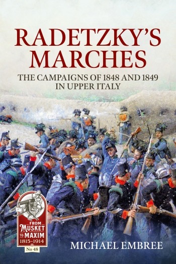
I have recently read Michael Embree’s Radetzky’s Marches – the campaigns of 1848 and 1849 in Upper Italy. I bought it at last year’s Salute show – the hard back version, a limited edition and signed, bought for the same price as the current paperback edition (£35). I finally got around to reading it last month. It proved to be an interesting read – will it open up a new period for me?
This book piqued my attention for three reasons. First, Radetzky is a familiar name from the Napoleonic wars, but his achievements in the 1848/49 were what made him famous – inspiring the Radetsky March from Johann Strauss the Elder, his most famous work; I wanted to know more. I am increasingly interested in the Italian wars of unification, with plans to refight the second (1859) and third (1866) wars: what about the first? As a regular visitor to Italy on holiday, I’d like to know more. And finally I am interested in the evolution of warfare in the 19th Century. I know a lot about Napoleonics, and I’m gathering more knowledge of the wars from 1859-1866 (encompassing the American Civil War). The wars of 1848-49 (also including the Hungarian uprising) are a way marker in that evolution.
I found the book itself a bit on the dry side. There is all the detail you would want as a wargamer, with the forces involved in each engagement, right down to many minor skirmishes, listed meticulously, with casualties as far as they were known. In this it recalls George Nafziger’s works. The detail of what happened in each battle is a little vaguer: he follows the popular route of using verbatim quotations from eye witnesses to do quite a bit of heavy lifting. For historians to attempt more than this requires an enormous amount of work though: this is as good as it usually gets. What’s missing is atmosphere, and descriptions of the personalities and how many of the decisions were taken – and especially from the Austrian side. I have no better feel for Radetzky’s personality that I started with. There is almost nothing on the political background, especially from the Austrian side. I also missed a narrative on the balance of forces through the various phases of the campaign, or rather campaigns – the actions of 1848 and 1859 were separated by an armistice, and the rise and fall of the Venetian rebellion is separate again. This is in complete contrast to Lieven’s book on the Russians in 1812-1814 – and its strong grasp of the strategic and personalities. Still, it clear why people have suggested that Radetzky’s grasp resembled that of Napoleon in the same theatre in 1795-97.
What about the wargaming possibilities? By this I mean refighting the battles – rather than strategic conflict, which would be very promising for a boardgame or kriegsspiel. There are four biggish battles, but none are particularly easy to wargame. The battles of Santa Lucia and Goito were a bit tentative, without a clear objective for either side – though they could be turned into more decisive scenarios. The critical battle of Custoza is a three-day sprawling affair with none of each day’s actions being lop-sided (first day to Austria, second to Italy; last day to Austria); the grand-tactical level is interesting enough, but this plays out over too big an area for a wargames table, and the whole point is that each side doesn’t know where the other is or where it is moving. Of course, scenarios where one side is badly outnumbered and making the best of things can work, but this is not classic wargames play. The final large battle, Novarra, in 1849 is maybe more promising. The Austrians are outnumbered but have substantial reinforcements on the way – but the difficult terrain could pose a challenge. Overall, if restricted to historical battles, the 1859 and 1866 wars are better. There are lots of skirmish level possibilities though, which this books documents thoroughly.
What about the evolution of warfare? Technologically, this is very close to the Napoleonic period. The muskets were fitted with percussion locks rather than flint locks, which would make them more reliable. The Austrians made extensive use of rockets (which also make an appearance in 1859, but not 1866 as far as I know). Napoleonic rulesets don’t take rockets very seriously and would need attention. The main point of them, as far as I can see, is that they were lightweight and much more mobile than conventional artillery – but much less lethal, although they had their moments.
Tactics seem to be strongly Napoleonic, but the regular forces would be better drilled than was usual in Napoleonic times, and I suspect tactical doctrines a bit more rigid. Both sides made use of specialist light troops, unlike French Napoleonics, though line troops could skirmish if required. There were quite a few irregulars on the Italian side, which were often given light infantry tasks. On the Austrian side, Grenz infantry were still used as light troops alongside the jagers. The quality of the Austrian troops is generally good, including their commanders – these are not the Bruce Quarrie Austrians! The Piedmontese regulars were generally good too in 1848, but seem less well-led, and perhaps cracked under pressure a bit earlier. In 1849 their quality was diluted by massive conscription, and doubtless the confidence of their leaders had been dented.
One striking feature, though, is that casualties seem quite low, when compared both to many of the Napoleonic bloodbaths, or many of the battles of 1859 (Solferino led to the founding of the Red Cross). The casualties in 1866 were also high, but aggressive Austrian tactics can explain that. The terrain was generally quite cluttered, and probably the tactical leadership more conservative when it came to exposing their men. There weren’t many glorious artillery targets, as there were at Waterloo, Borodino, etc., or classic volley moments against dense targets.
After an initial bout of enthusiasm, I don’t think I will be pursuing this. At a pinch I could reuse many miniatures from 1859/66 or even Napoleonics (for the Austrians – though the shakos wouldn’t be right). And terrain pieces would be reusable too. But I have to many other irons in the fire!
However, for a detailed understanding of this interesting and historically consequential campaign, I recommend Mr Embree’s book, though you might want to skip through some of the lists of units and leaders.
Alas another slow month, with little hobby progress. The cold that I mentioned in my November update developed into a rather vicious virus that took weeks to shake off. I was banned from going to the studio to paint my little men, and I had to pull out of two games. I did do lots of reading though!
I’ve also had some email issues. The notification from my last post (on d’Erlon’s attack at Waterloo) had a large number of bounces. This was due to a change to the WordPress software. I’ve had to upgrade my mailing application, taking me into technically dark territory – but I hope I’ve solved the problem. While I was at it I noticed that scores of dummy names had been added to my mailing list, and I’ve deleted the obvious ones.
Reading
The first new book I read was Graeme Callister’s book Waterloo – the Attack of I Corps. I have already posted on this, together with the reflections it provoked on that battle.
Next up is Michael Embree’s Radetzky’s Marches: the Campaigns of 1848 and 1849 in Upper Italy. Another period! But I had always been a bit curious about this famous campaign (which caused the Strauss senior’s Radetsky March to be written) about which so little has been written in English. When I saw this book second-hand at Salute I could not resist the urge to buy it. Since I have visited Italy a few times over the years, I have become more curious about Italian history, and I’m slowly being drawn into the Risorgimento – and the series of wars through which the modern state of Italy was formed. Custoza 1866, my main current project, is almost the last of these wars (there was some unfinished business in the Papal States afterwards). These 1848-49 campaigns were fought over largely the same ground as 1866, including another battle of Custoza. And after this year’s holiday to Lake Garda, I now have a much clearer idea of the geography. I am also curious about how warfare evolved from the Napoleonic period to 1870 and beyond. The 1848 wars are an interesting link.
More on this when I finish the book. Will I be drawn into wargaming this war? I could re-use some of the terrain. I might, but I would need to reuse my 1866 armies, which won’t look quite right. The Austrian uniforms were closer to the Napoleonic era. Too many other projects come first before I indulge in building yet another army!
Gaming
Alas I had to cancel two games due to my virus. A game with 17th Century sailing vessels in the Caribbean with my friends in Beckenham, and a Général d’Armée 2 game I was setting up at Tunbridge Wells.
On the subject of GDA2, Iain Fuller, from South London Warlords, kindly shared with me the modifications to the GDA2 command system that he and this friends use. These are quite radical. I want to try out some of these ideas, along with others I have. To that end I have drafted some house rules for use in my next game at Tunbridge Wells. More on that after the game.
Painting
My 10mm 1866 Italians in progress, with the cavalry bases in the foreground
I finally got back to the studio last week. Some of the paint on my wet palette was still usable, but a layer of mould made using it unappealing. I set up a new wet palette, recovering some of the paint. I have had two sessions on my remaining 10mm Custoza Italians – cavalry, artillery and generals. The cavalry are now nearly there – just the flags and finishing (base decoration and wash). It shouldn’t take too many more to finish. Meanwhile the figures I need to finish the Austrians arrived from Pendraken. The 10mm figures are proving reasonably quick to paint – helped quite simple uniforms for the period. This scale is much closer to 6mm in style than 18mm. Still there’s a lot to do! After the Italians my plan is to switch to 18mm late Napoleonic French.
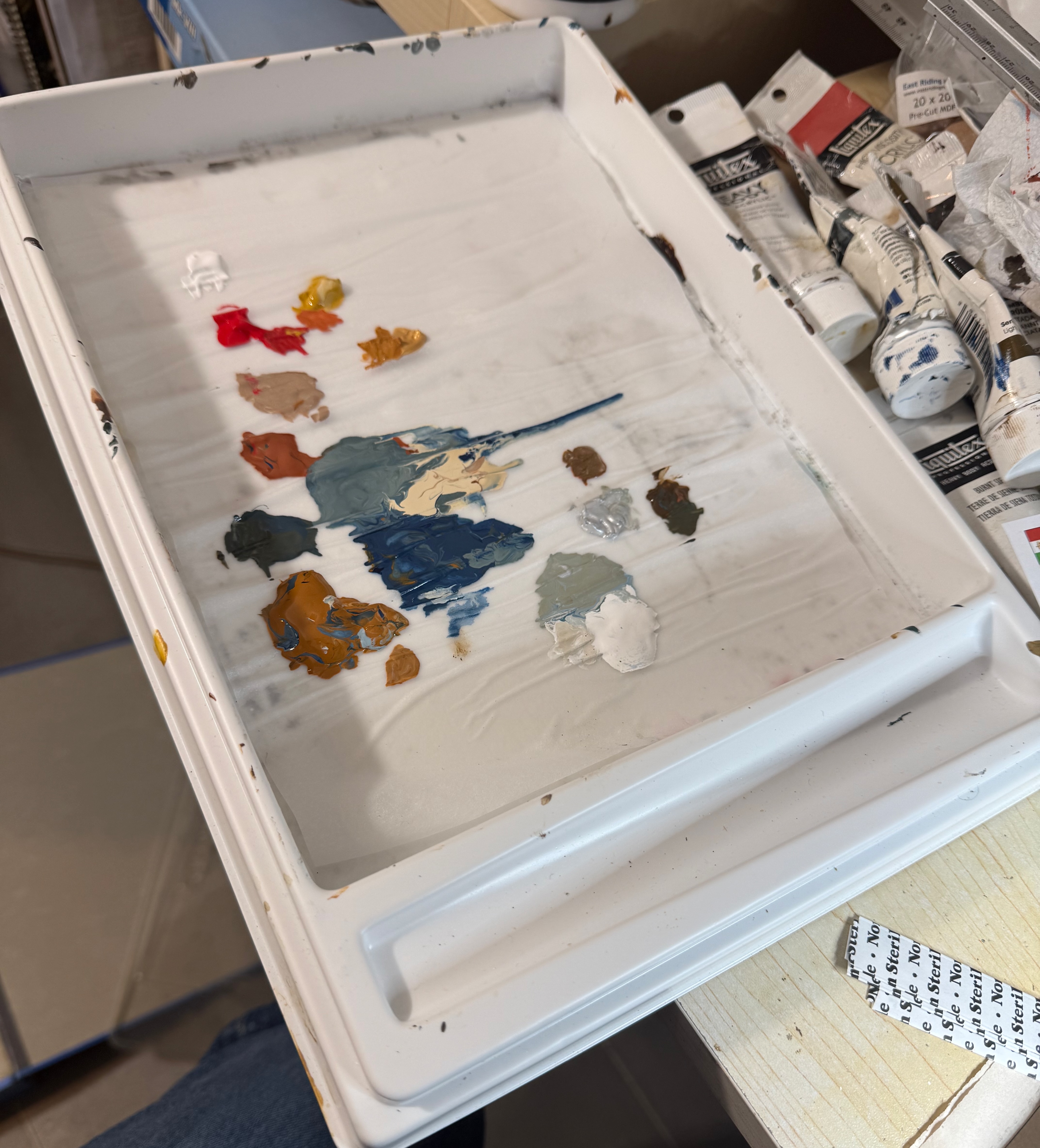
While I’m here, with a short post, it’s worth saying a little about my wet palette. Ken Reilly, the Yarkshire Gamer, hates them almost as much as round dice. A wet palette consists of a sheet of greaseproof paper, sitting on a sheet of blotting paper, enclosed in a shallow box with a tightly fitting lid (but not so tight it’s a challenge to lift it!). You soak the blotting paper with water, and put your paint on the greaseproof paper. After your session you put the lid on and it should be ready for you to resume your painting where you left off. How long the paints last depends on things like temperature – it can be weeks in winter, if the mould is kept at bay. You can buy these from artists’ suppliers (the one I use is from Rowney), and the usual hobby sharks have their own versions. They are also easy to make yourself at a lot less cost, though you need to find a suitable container.
Here’s my wet palette. There has been some running of the paint.
The reason I use one is that I use artists’ acrylics rather than hobby paints (e.g. those from Vallejo). Hobby paints are more liquid and come ready mixed in a huge variety of colours. Artist paints come out of tubes, are quite thick and are generally pigment-based. Almost every colour you use on the miniatures is mixed – that’s the fun! So it helps to preserve your mixes for multiple sessions. And the stiffer consistency means that the paint behaves well on a wet palette – usually. Every so often the pigment runs a bit – presumably when the blotting paper reservoir is too wet. I’ve read that poorer quality pigments (usually sold as student grade) have a greater tendency to do this – though it’s not something I have particularly noticed. I tend to use student grade paints for terrain.
And so Happy Christmas to all my readers. Over the festive period I hope to catch up a bit on the painting, and get started on that French infantry. But theatre’s a lot to do in the garden too – as I wasn’t well enough for that either!
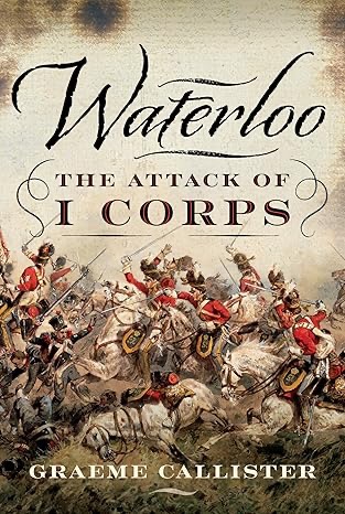
I have just finished Graeme Callister’s Waterloo – the Attack of I Corps. This book was published last year, and is interesting as an up to date history of what has always been for me the most interesting episode of the battle. I can’t help but to view it through a wargamer’s eye though!
And that has always posed a challenge. They say hard cases make bad law. In the same way Waterloo makes for bad wargames rules – it is such an exception battle in so many ways. That is truer of D’Erlon’s attack than any other part of the battle. Indeed it is a test of any set of rules I write: how well it copes with this episode is a challenge indeed. All I ask is that the overall outcome is within the range of possibilities. It rarely is.
Mr Callister’s book follows all the usual sources: the limited number of eye-witness accounts and official reports. To this he has added a detailed examination of the official French personnel records. This was the new trove of data first trawled by Paul Dawson in his very flawed works on the campaign. This helps give a detailed picture of the French units that took part. The Allied units were always more familiar territory, but he has examined the records for these too. He starts the story from Napoleon’s seizure of power and re-formation of his army, and tracks the units of both sides up to the attack of I Corps on 18th June, the counterattack by British cavalry, and the interventions by French, British and Netherlands cavalry after this. I Corps’s Waterloo does not end there, but Mr Callister does not explore its later history – which is a pity.
A thorough analysis of the personnel records does help us rate the troops – though Mr Dawson has done something similar before, with similar conclusions. The French infantry can be rated as “Line” in GDA terms. The ranks were filled with veterans, but they hadn’t had the time to be knocked into fully cohesive units. And many of the veterans were ex-prisoners who hadn’t seen combat for some time. The British of Pack’s and Kempt’s brigades were genuine veteran formations, which can this be Veterans or Drilled Grenadiers. The exception was 2/44th – Line or Grenadier. The Netherlands militia would count as Reservist. It should be noted that these British and Netherlands troops took heavy losses at Quatre Bras, and might be down-graded as a result (the same would apply to Bachelu’s division on the French side, not involved in this combat). The British Heavy cavalry were well-mounted and had high esprit, though not a great deal of battle experience: genuine heavy cavalry, with a Grenadier rating – perhaps Elite for the Life and Horse Guards. The rule about British cavalry not rallying after a Victory very much applies though – including to the Light Dragoons. I’m not so sure where to put the rest of the cavalry, as I haven’t really internalised how the GDA classifications work.
Mr Callister makes one suggestion that I haven’t read before: he says that the French practice of putting the taller men in the front rank would have limited their effectiveness in musketry duels, as the second and third ranks would have been blocked. He expands this idea at length. I’m not entirely convinced. If this was a serious problem I’m sure that we’d have heard more about it. It’s the sort of thing that re-enactors could help us get to the bottom of. Beyond this the book gives an admirably clear account of the course of the combat and the evidence that we have of what happened. He does not discuss the suggestion made by Mr Dawson that Donzelot’s division had dropped behind the divisions on either side and so suffered little in the attack. But he does observe that this division remained largely cohesive after the attack, along with the 85th regiment detached from Durutte’s division.
It is interesting to see how the generally accepted history has evolved over the years. I first read about Waterloo in the 1970s. At this time British historians (and they are the only ones I read) painted the whole episode as a standard French attack as seen repeatedly, so they suggested, in the Peninsula War. Wellington adopted a reverse slope position, which sheltered his troops from artillery fire, and allowed British infantry lines to deliver a decisive ambush attack on the French columns. Then the cavalry went in and finished the job off. Wellington himself talked of the French coming at him in the “same old way”. Bijlandt’s Netherlands division, which was not inured into Wellengton’s cunning ways and stood on the forward slope as “Continentals” were wont to do, got carved up by artillery, and broke as the French approached. This general narrative was supported by numerous accounts of veterans published in the 19th Century.
Then came the revisionists. They had a lot to work with. It wasn’t a classic reverse slope position (which was not a tactic unique to Wellington) as these slopes were gentle and rolling – and not good protection against artillery. Bijlandt withdrew to sheltered position before the artillery bombardment started and his men stood and fought before being pushed back – a record not dissimilar to Pack’s British brigade (which, like the Netherlanders, had suffered badly at Quatre Bras two days before). Kempt’s British did better, but only after Bijlandt’s men had done their bit. The French columns were in fact gigantic brigade or divisional affairs unlike the battalion columns used in the Peninsula, with different strengths and weaknesses (more on that later). Then various details were questioned. The 80-gun grand battery mentioned by early sources (not least Napoleon himself) was perhaps just over 50, and not positioned on the Belle Alliance ridge with the main army, but deployed 400m or so further forward on a slightly lower ridge, which became known as “Grand Battery Ridge”. The infantry started behind the battery on the Belle Alliance ridge and pushed through it to deliver the attack. This is how it is shown in Mark Adkin’s lavish Waterloo Companion, which is everybody’s favourite Waterloo book (including me!).
Then Mr Dawson came along to revise the revisionists. Mr Callister stands alongside this in a much more measured and coherent way – but upholds many of Mr Dawson’s conclusions. I recommend this book.
And now readers, if you tuned in just to find out about this book, and you are a sane and normal person, I advise you stop reading reading right here. I’m now going to scratch the Waterloo itch and talk about a number of issues that this book has raised with me, and which have a bearing on wargaming, as well as historical interpretation. I will divide this with headings into a number of topics.
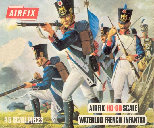
Gaiters
The box artwork for the Airfix infantry that I remember so well. These miniatures have a special place in my heart.
Let’s start with the most trivial. I got into Waterloo back in the 1970s thanks to Airfix’s OO/HO soft plastic figures, produced mostly in a ghastly pale yellow. The French line infantry were not especially accurate (having cross belts and sabres), but they were wearing gaiters and breeches in accordance with parade regulations. I have always felt this is the way French infantry should look. And it is how the bulk of my little men are turned out – they are in mid-war uniform with the gaiters going above the knee.
Some of the figures in the box
Alas virtually all figure manufacturers, including my beloved AB, have them wearing trousers, in the belief that this is how they looked on campaign. This is not without evidence. Some contemporary pictures show this. It was clearly how it was in Spain after the troops had been there a few months, and had to source clothing locally. One (not entirely reliable) memoirist French officer claimed that the first thing infantry did on campaign was throw out the gaiters and breeches and replace them with more comfortable trousers. And yet.
I saw a programme on TV many years ago about excavations of French mass graves outside Vilnius, where many soldiers met their end in the winter of 1812. They were wearing breeches and gaiters (the above knee ones too), even after a gruelling campaign (of course they may have purloined fresh stocks on their retreat).
Two of the French soldiers in this account of Waterloo mention that the difficult ground that d’Erlon’s troops had to cross broke their gaiters. They were wearing gaiters! Of course they may have been wearing trousers over the top, but it is small scrap of evidence.
I am planning six battalions of new infantry for my French. These will be the first of my 18mm collection in late war uniforms (gaiters below the knee). These are mainly AB and wearing trousers, as the core is a number of Young Guard figures I bought from a friend a few years ago. However I bought one battalion’s worth in gaiters from Eureka’s own-label range. Unfortunately these don’t have as wide a range of poses, but the core will be properly turned out.
The reverse slope
Photo: Andrew Jones posting on Waterloo Association FB page
Mr Callister doesn’t discuss the topography much. He goes along with the general narrative that the Allies occupied a reverse slope position, with only artillery and skirmishers visible from French positions, once Bijlandt had pulled his men back. This is widely corroborated from his sources, from both sides. It was interesting, however, to pick up on Facebook post by Andrew Jones on the Waterloo Association page drawing attention to an article in the Waterloo Journal challenging this. It features the above picture, which is close to the Brussels road, on the eastern side, looking towards the French position – in other words the general area where Bijlandt and Kempt were deployed. It’s hard to discern much relief! It’s possible the ground has been flattened a bit from the building of the memorial mound, and a couple of centuries of agriculture – though the main terrain alterations are to the west of this.
The contention of the article, I think, is that the allied deployment area was in fact visible from the Belle Alliance ridge, and not concealed by a reverse slope. The main evidence cited is the heavy casualties suffered by the British 27th later in the battle when it was in square in this area – mainly from artillery it is thought: it must’ve been visible. Of course while this position may have been visible from the Belle Alliance ridge, which was slightly higher – and which I think is visible on the horizon in this picture – once off that ridge and into the valley, including on the “grand battery” intermediate ridge, then these positions would have been invisible. That might account for the eyewitness accounts saying that the main British positions could not be seen.
What is clear is that Napoleon had a pretty decent idea of where the Allied army was deployed. D’Erlon’s attack was precisely targeted at its weakest point. It is also clear that allied positions, as far back as the third line of cavalry, were exposed to the fire of the grand battery – and sought out hollows for shelter, according to one witness. The British position was more of a plateau with slight folds than a ridge – and still less a reverse slope.
This all reflects an attempt by British historians to ram the battle into a Peninsular War template that not even the Peninsular War, fits that well. It is also suggested that the reverse slope tactic was not widely adopted by “Continental” generals. None of this stands up to close scrutiny. The British position bears a striking resemblance to that adopted by Austria’s Archduke Charles on the first day at Wagram in 1809, fought on another gently undulating plain. That didn’t go well for the French either.
The grand battery
Mr Callister does spend some time discussing the grand battery – and rightly so. It is an interesting topic. Initially it was widely accepted that a battery of 80 guns was deployed on the Belle Alliance ridge – as described by Napoleon himself. But as researchers dug into the data, two problems emerged. The first problem was that while generally corroborating this account, the artillery general of I Corps, Desales, mentions only the batteries from his corps, reinforced by the 12pdr batteries from II and VI Corps. That’s just 56 guns, or 62 if you include the horse battery. The numbers can be reconciled if you include an extra three batteries (24 guns) from the Guard sent over by Napoleon. There isn’t much direct evidence for this, but one eyewitness does mention the presence of guns from the guard. These are usually identified as 6pdr batteries attached to the Guard (not the three batteries of 12pdrs, “Napoleon’s daughters”) – some of which were manned by the Navy. I’m happy enough that these were indeed deployed here, though perhaps under a separate command.
The second problem was the location. The Belle Alliance ridge was located about 1km from the Allied positions, and more like 1,400m to the rearward echelons. Effective artillery range is usually described as no more than 700m. My GDA rules suggest that the Allied forward positions were just within the extreme range of 6pdrs firing from an elevated position (which would count here), but the rearward positions would have been completely out of range of even the 12pdrs.
But fear not! Modern historians found a solution. If you reposition the battery further forward by about 400m to an intermediate ridge, the problem is solved. I think this is a clear case of wargamers trying to rewrite history so that it conforms their rules. This idea took hold after wargaming become fashionable in the 1970s. The trouble is that there is little or no direct evidence for it. And the forward position is very exposed; the left of the position is not far from the forward Allied position of La Haye Sainte. A further problem is that it would have presented a significant obstacle to the advancing infantry. This narrative requires the infantry to form up in their divisional columns on the Belle Alliance ridge, and advance through the battery. This is easily done on the wargames table – most wargames rules allow for the easy passage of troops through deployed batteries – but surely less easy in life, considering the limbers, caissons and such associated with them, and the density of the infantry formation used. There is no eyewitness account of this awkward passage.
Instead Mr Callister suggests that the infantry advanced through the battery before it started firing as individual battalions and assembled into divisional formations in the dip in front of the battery. Once they moved off at least some of the battery’s units then moved forward to the intermediate ridge, as indeed Desales’s account suggests. These advanced batteries were then caught exposed by the British cavalry in their follow-on charge (along with perhaps some still on the ridge behind). This all fits the evidence much better.
And that leaves wargamers with a headache. Why did the foremost military leader of the age, and an artilleryman at that, order an artillery bombardment whose targets were out of range? As it turned out, the artillery did not do much damage – though eye witnesses attribute a lot of this to the soft ground. Others suggest that the fire was too elevated (!). The fire was worrisome enough for the cavalry, some 1,500m away, to take evasive action.
On weapons ranges, incidentally, the von Reisswitz Kriegspiel, a near contemporary source, puts the 12pdr range as 1,500 paces for elevation fire and 2,000 paces for “rollschuss” (i.e. ricochet), that is 1,125m and 1,500m. The equivalents for 6pdrs were 1,200 (900) and 1,800 (1,350); howitzers could reach up to the same range as the guns they were posted with. This is for Prussian ordnance – but these were pretty similar weapons to the French. This puts the Allied troops within extended range, though the rear echelons would have been subject to ricochet rather than bounce through fire. Wargamers often restrict these long ranges not because the weapons couldn’t reach, but because they regard them to be ineffective, based on quotes from soldiers at the time.
Another notable point is that overhead fire by artillery was clearly Standard Operating Procedure. I mention this because the generally excellent rule-writer Sam Mustafa adamantly states that it never happened, so bans it in his rules systems. To be fair in his Blücher grand scale, I don’t think the artillery range issue would be a problem. Neither range nor overhead firing is a problem (or not much) for Bloody Big Battles, a system that is sometimes used for Napoleonics, either. The key is that when designing big battle rules to keep maximum artillery ranges long. The problem comes when trying to scale up rules designed for smaller battles. Ranges that are ineffective for a single battery might not be so for three or more batteries firing together. Also the French seem to have been using something of an area fire tactic – but then again note my comments on the reverse slope that wasn’t. Having said that, fall of shot would be very hard to see at these long ranges, accounting for the poor ranging noted by some observers.
Those columns
Which brings me to the biggest issue raised by this episode: the formation adopted by I Corps’s four divisions. These were divisional columns by battalion. In two cases all 8 battalions in the division were deployed in line and arrayed one behind the other, as little as three paces apart. The other divisions deployed with fewer battalions as they detailed troops on flanking operations (including an attack on La Haye Sainte). This was a huge dense mass of men. I don’t think it has much precedent, perhaps beyond massive pike blocks deployed in early modern times, and by Alexandrian armies in ancient times. It was not an accident; it may have been on Napoleon’s direct orders. Some of the officers thought it unwise, but they all seem to understand what was required.
The first question is whether this formation was unprecedented, or part of SOP, and perhaps used more often than we realise. I remember reading that it was a formation used by French conscripts in the revolutionary wars. I don’t think this was based on much in-depth research. I’m no expert on those wars, and in my various readings I have found no definitive reference to the French having adopted such a formation. Indeed I think that far from being a good way of deploying raw conscripts, it required pretty well-drilled troops to operate. In my various readings I have found just two possible examples, both used by the Austrians in the war of the Second Coalition, 1799-1800.
The first is at the battle of Novi (I think) and it is so insubstantial that it hardly counts. Apparently the Austrians are shown as using the formation on a contemporary map. I don’t know which particular units, and which map. There are some candidates when I search for the battle. I don’t know the history of the battle at all, and I wouldn’t even mention it if it wasn’t for the second example.
This is the attack of the grenadiers at the end of the Battle of Marengo in 1800. David Chandler shows them having adopted this formation. What gives this a bit more substance is that the formation was routed by a small number of French cavalry – in a something close to a rerun (pre-run?) of the events that befell Marcognet’s column at Waterloo.
All of which is a very long time before Waterloo, with no examples from the Empire period that I know about. What did the French think they were doing? One suggestion has been that with a full battalion in line, its firepower would match opposing infantry. Mr Callister dismisses this – citing his theory about the weakness of French infantry fire because of putting the tallest men in the front rank. Regardless of whether this makes sense, it is evident that the troops themselves expected to plough on without a shot. In fact it seems to have been a momentum thing. The front ranks had nowhere to retreat and would be carried forward by the troops behind them. The formation was also very compact, allowing the French to drive all their troops into the target area quickly. Splitting into battalion level formations would have taken much more space. Indeed the French would probably have not been able to send more than two divisions in on the first wave. And managing 30-odd battalion columns would have created its own issues.
The interesting thing is that this appears to have nearly worked. Bourgeois’s two regiment (four battalion) formation on the left pushed Bjlandt’s men out of the way. They were then attacked by Kempt’s brigade. It does seem to have been pushed the column back, but it was by no means broken when the cavalry struck. Something similar is reported with Donzelot’s column, the next in the sequence. The first ranks were pushed back, but the column as a whole did not break. Donzelot’s column also largely withstood the cavalry attack (from the Inniskillings) that followed. It is likely that the thin British line would have exhausted itself before defeating the whole column.
The situation is a bit clearer with Marcognet’s column. It encountered two waves of British troops (the 2/44th and 3/1st, followed by the Highlanders of the 92nd). The first wave seems to have been brushed aside; the second led to some hand to hand fighting (a bit of a rarity in open ground in the horse and musket era), which the French started to get the better of – doubtless the numbers started to tell. And then the cavalry (the Scots Greys) struck, and the French column collapsed completely.
The conclusion from all this is hard to avoid: without the cavalry counterattack, the French would have overwhelmed the troops facing them and reached Mont St John, leaving a pocket on their right – two Hanoverian brigades, a Nassau brigade and two brigades of cavalry, which would have been contained by Durutte’s division. Wellington did have reserves to call on face this breakthrough, but it would have been a very different battle. If the cavalry had struck later, the chances are that the French would have seen it, and closed up their columns to be invulnerable. Uxbridge saved the day.
The massive column is not a formation catered for in wargames rules. Insanity awaits rule-writers who try to devise rules that cover every historical peculiarity. In most rules, battalion is king, and multi-battalion formations are not catered for. In fact multi-battalion squares were commonplace. There are two examples from this episode alone. One of the Hanoverian brigades formed a four-battalion brigade square. The French 85th Line, detached from the rest of Durutte’s division, formed a two battalion regimental square, which withstood the British breakthrough charge easily (which the rest of Durutte’s division appears not to have done – though casualties were much fewer than for Marcognet and Bourgeois). Functionally these big squares are not so different from the small ones, so not a great deal is lost.
The multi-unit column is another matter. When do you treat the units as individuals? When do you look at the formation as a whole? The Waterloo experience points to treating the units individually for the infantry combat, but collectively for the cavalry one. There’s no easy way of doing this. When replaying this attack, players will doubtless form their French units in battalion columns. In grand tactical rules, with units representing brigades or even larger (as with BBB), it is easier to fudge.
Conclusion
The difficulties for wargamers don’t stop with the columns. The cavalry attacks pose interesting challenges too. The British follow-up charge was pretty devastating – especially for the French artillery. The French lancers adopted a sort of open order formation in their pursuit. But in general these are the types of things that wargames rules handle reasonably well.
The challenges posed by long-range artillery fire and multi-unit columns are headache enough if you want to try and recreate this dramatic episode on the tabletop!
Postscript. Andrew Jones got in touch about his reverse slope posting – and I have made some corrections to this post.