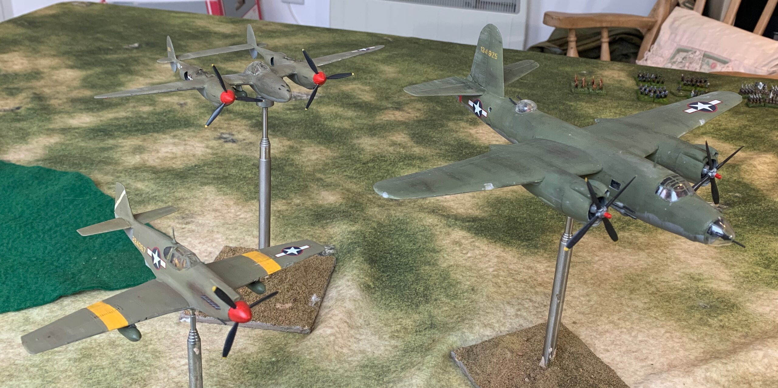
The new trio overflying the wargames table: left to right: the A-36, the P-38 and the B-26
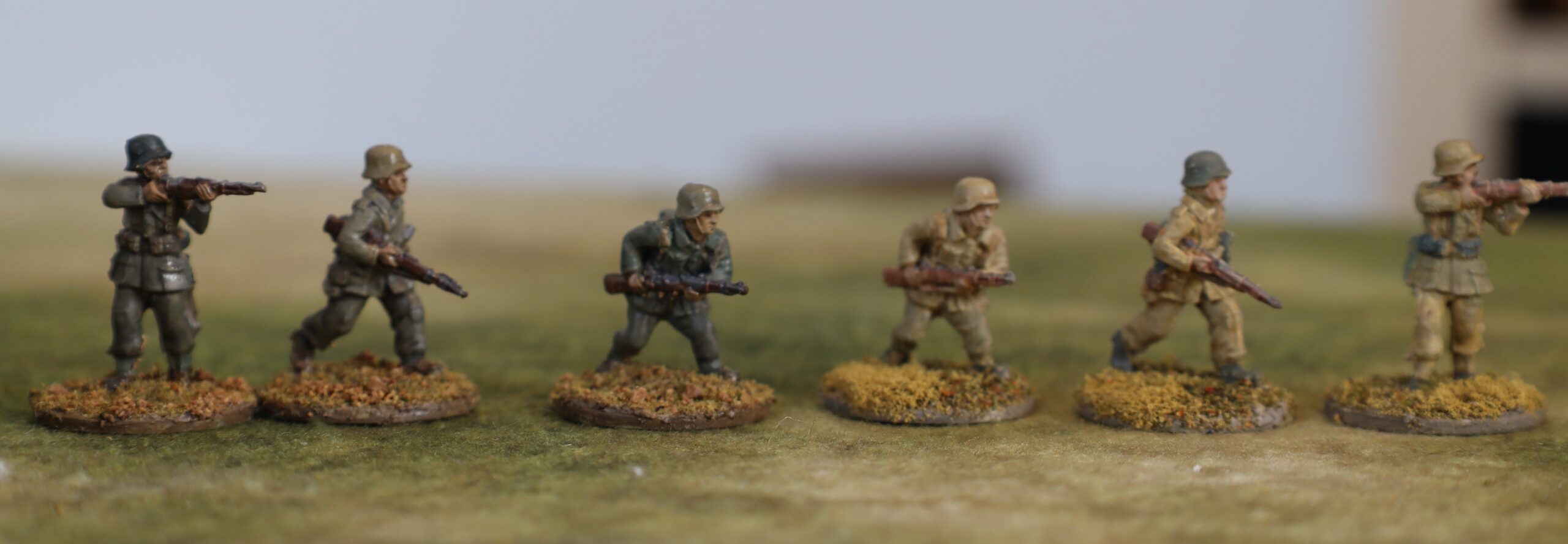
Back to aircraft modelling. The next batch of 1/72 planes in my 1943 project represent the Americans. These are a B-26 Marauder bomber, a P-38 Lightning fighter, and an A-36 Invader/Apache fighter-bomber. Since my main focus is on the British and Germans, these were the only American planes that I initially planned, although I now plan to do a P-40 as well, but not in the olive drab scheme like these, but the RAF one. As usual I will use this post to describe the common aspects of the project, and then publish separate posts for each model.
This project took quite a bit longer than expected – something I have said about each of my most recent projects – it’s probably age! Two things in particular held me up. First the B-26 model is a big one, compared to the single-engine types that I have attempted so far; and the P-38 isn’t a small one either. Bigger models do take more time. Second, none of the models were particularly easy to put together, and the P-38 the worst of all the models to date – worse than my Stuka and Hurricane. And that takes a lot more time, as you attempt to reconcile ill-fitting parts, and then patch up the results with filing , sanding and putty. It doesn’t help that I model with undercarriage up, which only the B-26 kit (a 40-year old Airfix job) catered for, and as with all long projects I then went through a flat patch – especially since the studio where I assemble my models is in the garage block, and not part of the central heating system – so it was pretty cold in the patch of freezing weather we had. One afternoon was just too cold for me to try! Still, they were finished in time for Christmas.
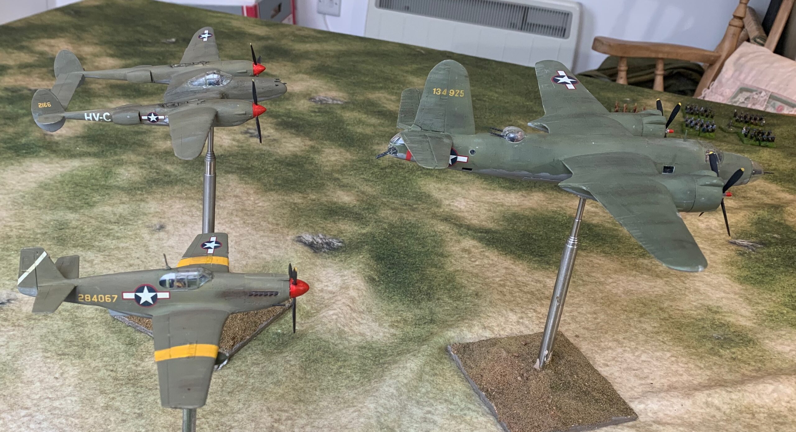
Another view
The steps I went through were the painting of the interior and crew, assembly (easily the most time-consuming phase), priming and painting with the airbrush, and then the various finishing steps, including decals. Not a huge amount to say about the first stage. I had to supply my own crew figures apart from two from the B-26: I dipped into my stock of figures from PJ Productions. I will describe the assembly process for each model in my later posts, as each was a very different experience. The painting and finishing processes were pretty similar, so I’ll say something about that now.
In spite of my frustrations, I persisted with the airbrush for these models. I used white primer from Vallejo. I then mixed my own paints for the main event. For the undersides I mixed a neutral grey from the black and white paint pots that came with the airbrush. For the olive drab I mixed the basic colours using Liquitex artists paints, mixed with Liquitex airbrush medium and on occasion with thinners. The airbrushing was hit and miss. Sometimes things went well, and the paint left the brush with a nice flow. I haven’t managed to get a precision spray yet, but I don’t think that is supposed to be the strength of this particular model. On other occasions I couldn’t get the flow right at all – it came out too thin, or wouldn’t come out properly at all. As a result the process took more sessions than it should. The primer tended to clog on the nozzle, and it needed wiping quite frequently. This didn’t happen for main paints so much (and not at all on the olive drab mixes) – but these were prone to clogging further back in the mechanism when they weren’t too thin. One thing I discovered to be a bad idea was mixing in the cup – by adding thinner to a mix that was a bit thick, for example. I had been encouraged to do this by a video tutorial. I think the thicker paint tended to get into to the system and clog it before being mixed properly. If mixed separately to the right consistency, and then put in the cup, things went much more smoothly. I like to think I’m getting the hang of the airbrush, but I’m not sure, to be honest. It produces a lovely finish, but is it worth the trouble?
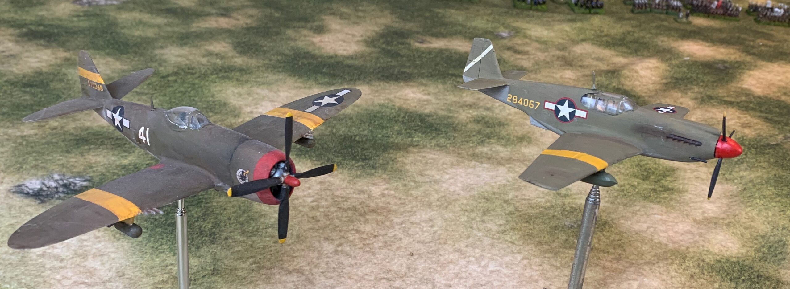
I used two mixes for the olive drab. For the P-38 and A-36 I used the usual yellow oxide/black/ white combination (though I may have started with neutral grey and yellow and tweaked with black/white). This was the as same as for my P-47 trial model, but a bit lighter. For the B-26 I wanted something a bit greener. I started with Sap Green, and mixed various things into it. The first attempt was too green, but with tweaking I got a satisfactory result, looking close to a lot of artist’s portrayals of the aircraft. This was a bodge as I kept adding different things to the mix, though, and I can’t say precisely how I got there. My general rule is to only use two pigments/premixes and white for mixing – that makes it much easier to replicate. I would need a different method to repeat! The first mix was to represent a more weathered finish – the colour reportedly turned quite brown after exposure to the elements. The second, which is closer to the commercially available mixes, was for a newer aircraft. I am pleased with both results. Incidentally the pictures were taken on a dull day (I gave up waiting for the sun!), so there’s a lot of artificial light in the mix, which tends to make things a bit greener.
The A-36 alongside my P47 model, showing the paler version of olive drab
I used a combination of tape and Blu Tak to mask. This included the canopies for the A-36 and (mostly) the B-26. I left the canopy off for the painting stage for the P-38 and the B-26 nose and tail to be stuck on later. This was a mistake for the P-38, as it was so ill-fitting it needed filler and more paint later. Blu Tak works better than magic putty, as I needed it to stay in place for days. The magic putty is easier to put on, though, and I did use it for varnish spray.
After the decals came the oil paint patination: small blobs of oil pigment in various colours (white, Payne’s grey, yellow ochre and raw umber) brushed vigorously into a very thin layer with a fore-and-aft or up-and-down motion. The paint did not spread as easily as before – perhaps because of ageing, or perhaps because it was colder than normal – but nothing that a little extra linseed oil couldn’t sort out. I’m getting better at this – I have had a tendency to over-apply; and there was the disaster of trying to apply over matt varnish! The undersides were left looking pretty messy – but with the dust from Mediterranean airfields, I gather that they did get into a bit of a state. This stage left the models with quite an appealing off-matt finish: but photos of US planes in theatre usually show a very matt finish. So I sprayed on Winsor & Newton matt aerosol spray, which leaves a very matt finish. I protected the decals with some gloss varnish first – though I doubt there was a real danger from contact with matt varnish – but I wanted to play safe. The next step was to represent a bit of paint damage using a silver/pewter coloured pencil. I didn’t want to overdo this; I think ground crews were usually quite diligent in repairing damage. But it’s usual to represent quite a bit of damage on a B-26 – they were especially exposed to flak explosions – so I tried a bit harder on this, though still quite subtle. Finally I applied some powdered pastel in various mixes of grey and brown. The biggest job here was applying the exhaust stains on the A-36. I couldn’t see anything comparable on old photos of the P-38 though, and not on the B-26 either. In the end it did a similar job to the oil paint, in producing a rather weather-beaten finish, with the effects of air flow as well. On the B-26 I tried to show a bit of differential weathering on the canvas control surfaces – but not very successfully. With the high-matt finish for these models, I could have skipped the oil paint stage, I think. For my British and German models, where I like the off-matt finish that the oil leaves, it’s a different matter.
As usual, close examination of these models reveals a lot of things I could have done better (or in the case of the P-38 model, defects I couldn’t quite remedy) – but I’m not comparing myself to the master-hobbyists. I want good-looking models from a respectable distance – and that is what I have ended up with!
I have just finished reading this short book published by Helion as part of the Wolverhampton Military Studies series. The cover shows the scope. Its main focus is operations of the British Eighth Army from 1941 to 1943. The earlier campaign between British and Italian forces in 1940 is covered in the same level of detail, but conclusions from it are not integrated with the rest of the book. First Army operations in Tunisia are not covered.
The author, Neal Dando, probably had a lot of fun researching this book, going through the (almost entirely British and Commonwealth) primary sources in depth, and a wealth of secondary sources, and appraising the course of the campaigns. However, the book is quite short and focused on the key theme: the impact of terrain on the British approach. His contention is that terrain is not given sufficient attention as one of the factors dictating the course of events, compared to such things as tactics and leadership. It’s a long time since I have read anything much on these campaigns, so I can’t judge this contention for myself. I think there’s something in it – but it is problematic. Firstly, all historians surely comment on the desert terrain, and suggest that it lent a particular character to events, even if they can be a bit vague on details. Second since much of the function of leadership and tactics is about the use of terrain, it is hard to separate it out as factor on its own – and a bit false.
Still I am a big believer in the importance of terrain in warfare – and feel that it is often not given the attention it deserves. This is reflected in many wargames, which tend to over-simipify and abstract away terrain features. Time and again when studying battles in detail (mainly Napoleonic ones) I have found that terrain factors neglected by historians explain much. One example was how a recent historian suggested that the French grand battery at Waterloo should have blasted away the strongpoint at La Haye Sainte. In fact the lay of the land made that pretty much impossible. And I have often read that it is wrong to think of the Western Desert in WW2 as being entirely flat. It featured many minor undulations, which could have a critical impact on events. You could place antitank guns in hollows and wait for the approaching tanks to be silhouetted on the ridgeline as they approached, for example. How well this is reflected in wargames I wouldn’t like to say – I have played very few desert-based WW2 scenarios. The exception have been some quick club games played on a flat table.
I bought this book as I am trying to put together some rules for my 1943 project, featuring British forces in Tunisia, Sicily and Italy. It has always been clear that terrain had a huge impact on these campaigns, so I was looking for ideas on how this should be reflected. I was pretty disappointed. I understand why Mr Dando does not want to give a detailed narrative of the battles – but I was hoping for something rather more systematic on the analysis of terrain impacts. Something like a description of the different impacts, and the part each of these played in each of the battles. There are brief terrain descriptions, but nothing very systematic on the narrative. There are a few maps, but representation of terrain on these was pretty thin. In fact I’m not actually sure he familiarised himself directly with the terrain, rather than simply relaying what the various primary documents, and a few secondary ones, say. He seems to jump straight to his conclusions with a “take my word for it” approach. On top of that, the book is riddled with minor editing errors (of the sort you will doubtless find on this blog, I’m afraid, but shouldn’t on things you pay money for), including one map mislabelling a German division as Italian. This is the rule rather than the exception with modern specialist publishing, however.
So what were the main impacts? Going was variable, affecting the ability to move different types of forces (one area could be traversed by tracked vehicles but not wheeled ones, for example) – including some steep slopes and cliffs. Terrain could offer a degree over cover (e.g. the use of hull-down positions), but was generally notable for the lack of it; in some places it was impossible to dig in because the ground was too rocky. Concealment was important factor using undulations, wadis and depressions – and there is related aspect of the usability of heights as vantage points for use by direct fire, and most especially as observation points for indirect artillery fire. Most of this is standard wargames fare – though wargamers often fail to bother with gentle terrain undulations. But artillery is usually less well thought about in this era. And yet it’s clear from this book that it was critically important – with battles often resolving around the possession of heights for use by FAOs. This was obviously the case with the mountain warfare in Tunisia – where the entire campaign revolved around the issue – as my reading of the account of Longstop Hill showed.
This book, though, gives me very little data to flesh this out. At one point it mentions a tank attack suffering at at 2,000 yards from enemy lines from artillery fire (6in Italian coastal artillery, apparently). I guess it would not be too hard to make out approaching vehicles at that sort of range, with the usual optical equipment. But fall of shot would have been much harder.
So an interesting but ultimately disappointing book.
My 1943 WW2 collection of 20mm miniatures, vehicles and aircraft has absorbed a lot of my creative energy. It is a project I started in the 1970s while still at university, but abandoned as I moved to a professional career, inhabiting bedsits. When I eventually returned to hobby activities, I took up with 15mm Napoleonics to the exclusion of all else. And then a few years ago I found some of my old models (and plastic figures) in the loft, and decided to revive the project. It was a sort of homage to my teenage self.
My focus is on British and German forces – who were then engaged in the Mediterranean theatre, starting in Tunisia, and moving on to Sicily and Italy proper. I like this rather neglected period because both sides’ armour was quite well matched (apart from the odd Tiger tank), and the panzerfaust and panzerschrek infantry antitank weapons had not come into use (British PIATs did make their appearance in the later part of the period, though, and the Americans had their bazookas). This gives it a different dynamic to the popular 1944 period, with the Allies struggling to cope with Panther and Tiger tanks in their Shermans, with deadly infantry weapons potentially lurking in every bush. I was not drawn to the Western Desert battles either, as these were too dominated by tanks, and I like a bit more terrain.
But I am left with a problem: what rules to use? Back in 1978 I was using WRG rules, which were quite advanced for their time – but the world had moved on. They took no account of troop quality, for example. I still use them as a reference work, though, for things like weapon ranges and spotting distances. These rules used one-to-one scaling, with 1mm to 1m ground scale. The writers recommended the use of 1/300 models, but you could get an interesting game with 20mm ones. The nearest equivalent in scope these days would be the Battlegroup system. I did use these once at the club, but they weren’t very popular with my fellow gamers. I moved on to Iron Cross, which worked for a while, but I soon became dissatisfied.
In fact it was clear that I am looking for more than one system. A one-to-one skirmish system, centred on infantry, with a low ground scale, not far off 1/72. I have two promising candidates for this: Chain of Command, and Disposable Heroes. Then, getting whole companies on the table top, there could be O-Group or Battlefront WW2. These aren’t ideal for 20mm, but can be made to work. My current lack of a club or regular gaming opponents, alas, means that I haven’t tried any of these systems out yet. While I think about how to solve that problem, I have a clear wish to go for something bigger-scale again, that I can use for historical scenarios. Initially I am focusing on a Tunisia battle: Hunt’s Gap (or Ksar Mesouar), fought over three days at the end of February 1943. A decent scenario can be made out of each of these days – or they can be strung together as a campaign. I have been interested in this battle, where a British force held off Germans equipped with Tigers, since the old days, when it featured in an old Bellona booklet by Terence Wise on the Tunisia campaign.
There is an obvious candidate for this level of game: Rapid Fire!. This is an old school system often played with 20mm models, but with each vehicle representing abut half a dozen real ones, and each infantryman about 10 real ones, organised into companies. We tried these out in a game at my club, when I was still in London. They produced an entertaining enough game, but I really didn’t like them. The first problem was that they suffered from the move and fire issue, common in old-school rules. In this it is easy to move your forces forward, fire at the enemy and destroy them before they can fire back, unless those enemy had reserved their fire in the previous move; this creates a sort of forward ambush jeopardy that feels wholly unrealistic (incidentally my old WRG rules avoided this with a Fire then Move mechanic). Still this was not as bad as another popular system, A Fistful of TOWs, and I could probably live with it. The bigger problem is that it is an out-and-out bath-tubbing system. That means that although each vehicle may represent half a dozen, for game-play purposes it is just one. Once hit, it is usually totally destroyed. There are even rules for the crew baling out. You should really expect units of this size to sustain various levels of damage before being destroyed – and baled out crews have no role. These are really skirmish rules but scaled so that you can bring in big bits of kit onto the table that would normally be well to rear (which is exactly what I want to do). It simply does not feel like a clash between brigades of troops.
What I wanted was something with more of a board game feel. The closest system I have found for this is Sam Mustafa’s Rommel. This is played on a square grid, at 1km per square. But this is too high scale for what I want, abstracting away a lot of the items of kit I want on the table – such as antitank guns, headquarters elements, and so on. This is a system that can be scaled up successfully, but not scaled down. In any case it does not adapt well to the sort of terrain that my 1943 battles where fought in, where rough ground and steep slopes played an important role, with high ground being of critical importance for observation, even at the grand tactical level. And things took longer to unfold, with battles often taking days. (It would not be too hard to bring these terrain factors in with a house rules, it should be said – and one day I may well try this).
Still, what I have taken from Rommel is that, like a board game, a grid is a good idea. Apart from simplifying many of the game mechanics, it makes handling artillery and concealment easier, by giving clear definition to locations. That leads to the choice of squares or hexes. Squares are how the human brain organises space – especially if we think of the grids on the maps in use in this era. That is why it makes sense for Rommel to use them. But natural features are easier to fit onto a hex grid. I’ve seen great-looking hex-gridded board games. And since the natural terrain is such a dominant part of the battles I want to recreate, it makes sense to use these.
My next step was to look for board games to use as a basis for my game. I had seen an article in a magazine where somebody had had successfully done this (albeit for 10mm miniatures in a Cold War setting). I asked for pointers from fellow gamers at my old London club on the Facebook forum. They pointed me to several games, of which the most relevant seemed to be the ancient Avalon Hill Panzer Leader, and a rather more recent Nations at War system. But I quickly ran into a serious design problem, relating to the models I want to use. With 20mm models a hex of anything less than 6 inches (150mm) point to point (or 130mm side to side) is going to be too cramped. I need to be able to fit two or three units into a hex comfortably, and four at a pinch, with maybe some terrain items too. On a reasonably sized table each hex needs to represent about 400m across. In these board games it is more like 250m per hex. You can stack counters, so board game hexes can be quite small. I have to have a lot fewer hexes on the table than the typical board game, even with a much bigger playing area. Starting from scratch you would use much smaller models. With 6mm models you could go down to two inches, or three with more breathing space.
These are 6in hexes (corner to corner) with some of my 20mm models. Three tanks a single hex could entail spillover into neighbouring hexes. The hexes can’t be any smaller.
From a gaming perspective, big hexes are perfectly viable – this is what Rommel achieves after all. But this has a profound effect on game mechanics. Still, there is much to be learnt from these board games. But it does look as if I will have to build the system pretty much from scratch.
What then should the design priorities be? The first point of departure from most WW2 systems is that these battles are not primarily encounters between rival tanks. Even Tigers have a tough time when not seriously opposed by other tanks. Success comes from combining armour, artillery and infantry. Allied artillery was often decisive – and yet it is often a bit of an afterthought in games systems. One thing a player has to do is to prioritise artillery targets carefully. And spotting is critical – with vantage points taking on a special significance, with visibility on the level often very limited.
But there is a reason that tank battles dominate wargames: it makes for a dramatic game – “cinematic” is a word people often use. Not all warfare makes a great game. WWI Western Front battles are very absorbing subjects for historical study, but, apart from the early drama of 1914, they are very hard to make into good wargames. “What’s the point of it?” one friend asked me of one friends’ WWI system. There can be a lot of hard slog in the 1943 battles that I am studying (in contrast to those being fought at the same time in Russia in much more open ground). There have to be important tactical choices, and plenty of jeopardy and swinging fortunes. I’m not quite sure how to get this. But 1944 Normandy battles are enduringly popular amongst wargamers – and that faces many of the same challenges. So it should be possible!
I love writing wargames rules. But it’s a slog. It could be a while before I’m ready with this!
I’ve had more trouble with German Dunkelgelb, the standard base colour for vehicles and equipment from 1943, than any other colour. I first attempted to mix it on my batch of Panzer IIIs in 2017, and it took me several goes before I settled on something – and even that does not look quite right to me now! However, on my most recent batch of German vehicles, I have hit on a formula that I think works.
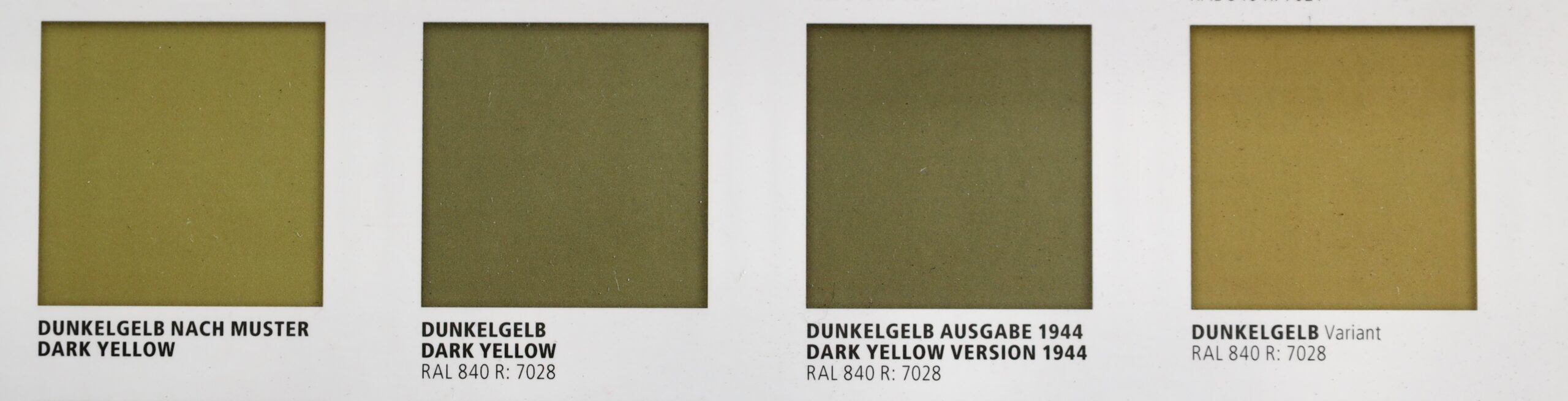
Much has been written on the topic of Dunkelgelb by modellers, as each hobby paint manufacturer has its own version. It’s a real rabbit hole – like US Olive Drab, which I have also struggled with. My main authority now is the book Real Colors of WWII by AK. This is based on quite a bit of research, including examining bits of surviving equipment. They produce for swatches to show the variation, even before various field factors intervened. The photo above shows the four swatches in this book, though it does not do justice to the actual colours. They give some idea of the degree of variation, though. The first, Dunkelgelb Nach Muster, came with the original directive in February 1943 saying that all vehicles should be painted in this colour, with camouflage over painted in olive green and red brown. Some suggest that this shade was never actually used. The second swatch shows the RAL 7028 standard for the colour registered in March 1943 – RAL referring to to the German colour standard system, which is still in use today, though RAL 7028 is now defunct. This is greyer than the earlier version. The RAL system was reworked in 1944 to reflect wartime exigencies – and the third swatch shows the even greyer version in this. And finally, for good measure in the fourth swatch they produce shows another variation from actual samples, to give an idea of the amount of variation there was in the field. This is even yellower than the original sample. What to conclude? There is a lot of scope for producing whatever variation you happen to like – but as the war progresses, the greyer it gets.
The starting point for mixing the colour was always clear: Liquitex’s Yellow Oxide. This pigment is based on Iron III oxide-hydroxide (FeHO2); it is an industrialised version of the ancient yellow ochre, which is usually slightly redder. This is almost certainly the pigment the Germans actually used for the colour – as it cheap and light-fast. But by itself, even with added white, it is much too bright. Back in 2017 I was heavily influenced by artist’s colour theory for mixing pigments – so I sought the colour’s complement to dull it down. This is purple – but the purple pigment I had was very bright and I could not get the results I was looking for. It was my introduction to the fact that colour mixing in practice does not follow the standard theories (there is a good theoretical reason for this, but I digress). Easier, I thought, to use a combination of a dull blue (Prussian Blue) and dull red (Venetian Red). I mixed these straight into the yellow, along with the ubiquitous white. From this I learnt never try to achieve a colour by mixing three different pigments. It was very hard to get the blue/red balance right while minting the right balance with yellow. In fact I should have mixed the blue and red prior to mixing into the yellow.
Years passed before I was next to attempt to mix the colour – for my recent German soft-skin project. I was older and wiser by then. I had got past my idea that you should not use black (or neutral grey – a black and white mix) in colour mixing – to satisfy my inner Monet. So I thought I would try mixing some Neutral Grey into the yellow, before I tried a purple. Immediately this proved to be a direct hit. I could get close to all four of the colour swatches (allowing that they should be a bit lighter when used on a model vehicle) by varying the balance of yellow to grey. The Neutral Grey got pretty close all on its own, but for tweaking I used Mars Black and Titanium White. This was much easier than my earlier efforts – and it got better. By upping the ratio of black to yellow, I got something greener, which looked a lot like the olive used for German tropical uniforms (and in turn more added white could replicate the fading these uniforms showed). Of course it is quite likely the Germans themselves mixed the paint using yellow oxide and black pigments – increasing the black element as the yellow oxide got scarcer.
Interestingly enough, yellow oxide mixed with black and white is also what I have used to replicate US Olive Drab – to say nothing of Napoleonic French gun carriages (which used paint mixed from yellow ochre and black…). In fact the US colour can be a bit greener than this, and they often used a green pigment.
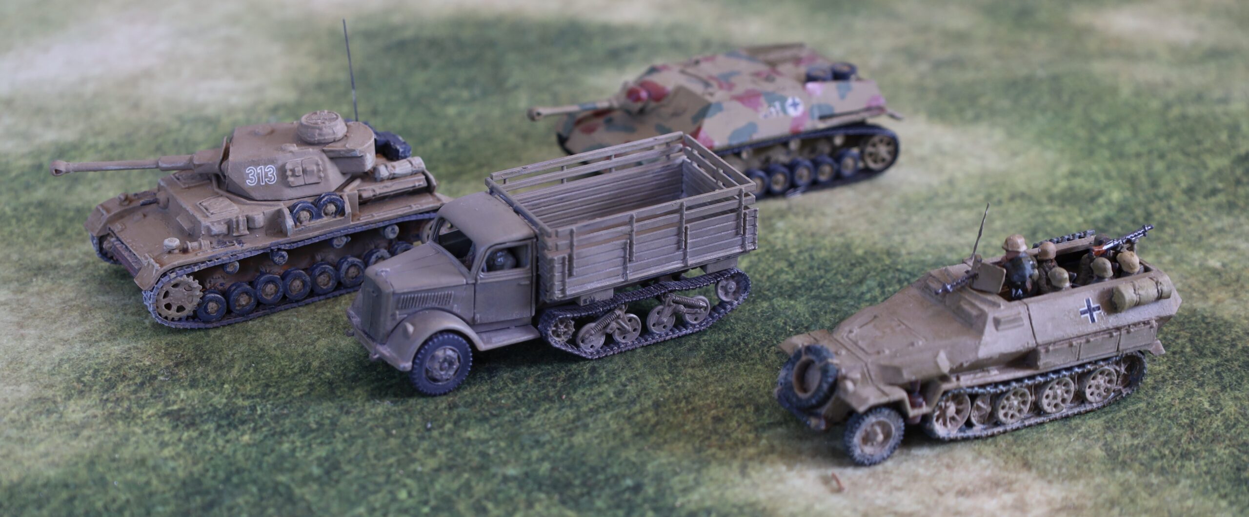
Anyway here is a picture of a selection of German vehicles in my collection, to illustrate the sort the variation.
The Panzer IV is an Airfix model from my original collection from the 1970s, repainted in 2017. The Sdkfz 250 is a PSC model painted not long after, using the same technique. The Opel Maultier truck was in my most recent batch, using the yellow-grey mix. Behind it is a Jagdpanzer IV, which I converted from the Airfix Panzer IV kit in the late 1970s, in its original Humbrol enamel paint, using the “Authentic Colour” range straight out of the pot. The Panzer IV and Sdkfz 250 are not far from the “Dunkelgelb Nach Muster”; the Maultier is close to the RAL 7028, while the Jagdpanzer IV is a fit with the fourth variation swatch from Real Colors.
I am still left with the question of how pale the colour should be. The swatches are dark; contemporary photos look quite a bit paler, as do photos of surviving equipment. Why this should be is a much debated topic – there is the hotly debated “scale effect” suggesting that scale models must be paler to simulate atmospheric effects; colours tended to fade when exposed to the open air and especially sunlight. Part of the problem may even be that the models are usually seen indoors in shade or artificial light, while the photos show vehicles in direct sunlight. My Maultier is maybe a bit on the dark side.
There remains a question of whether Dunkelgelb is the right colour for Tunisia, where my 1943 project begins. The German vehicles used there were all recently manufactured. There were just about no survivors from the old Africa Korps after El Alamein and the retreat, and most of the German troops were reinforcements anyway. These would have been units refitting in Europe after being withdrawn from the Russian front, doubtless leaving any surviving vehicles in theatre there. All the pictures from Tunisia show vehicles in fairly pale colours (i.e. not the old Dunkelgrau), and the Tank Museum has painted its captured vehicles from Tunisia (notably a Tiger and a Panzer IIIN) in what lookes like a yellower version of Dunkelgelb. From this I assumed that Dunkelgelb was the appropriate colour (though without the camouflage green and brown – not visible on phots from this theatre until much later). But the directive to use Dunkelgelb was not issued until February 1943, by which time most of the equipment would have been shipped. In fact it is more likely that the vehicles would have been painted in the previous tropical colours of RAL 8020 Gelbbraun (the primary colour) and RAL 7008 Graugrün for camo patterns taking up to one-third of the vehicle). RAL 8020 Braun and RAL 7027 Grau were authorised substitutes for each of these respectively, given shortages. The Gelbbraun is really not very far from the greyer version of Dunkelgelb, according to the swatches, but has a slightly warmer tinge. The Braun is distinctly redder, and may be the origin of the Humbrol Africa Korps desert colour in issue back in the day, which was quite a bright orange shade. I might try replicating these in a future project for vehicles especially destined for the Tunisia phase of operations – though alas too late for my Tigers and Panzer IIIN.
Anyway, Dunkelgelb is the right colour for Sicily and later, and I’m very glad I have found a way of replicating it without too much trouble.
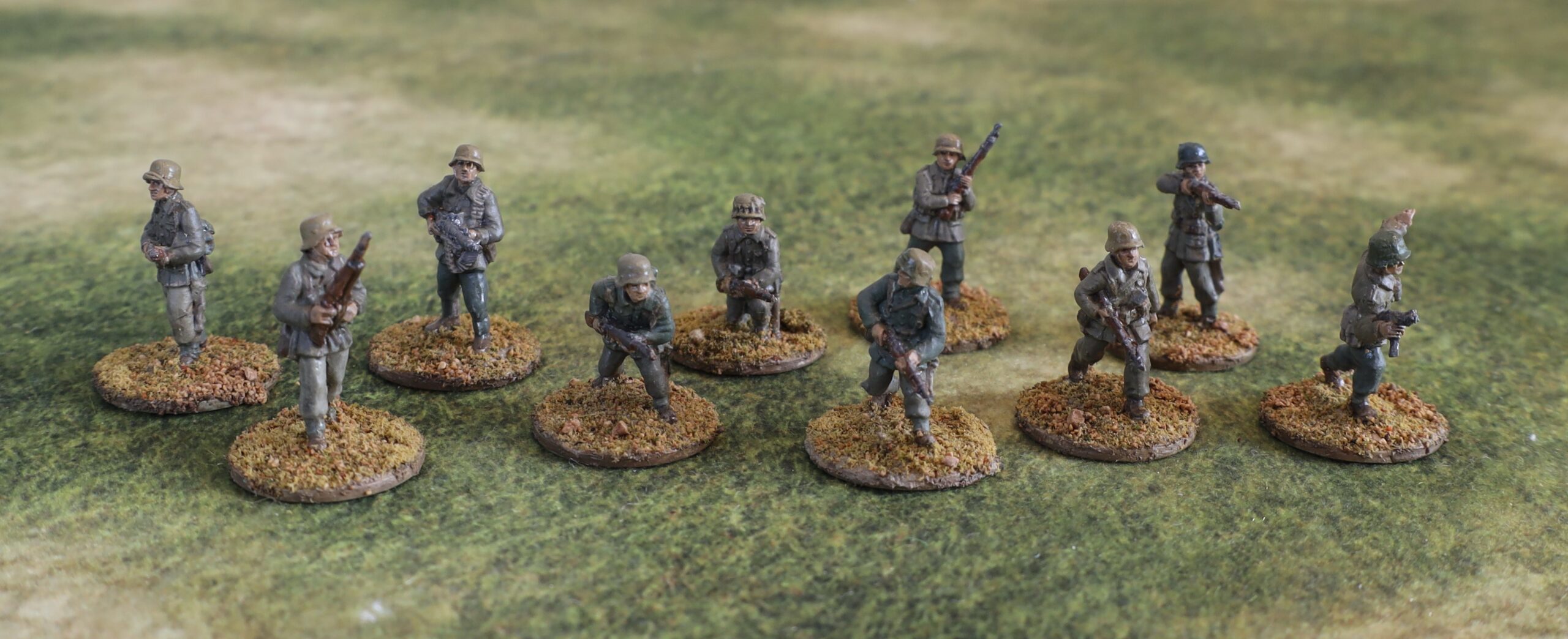
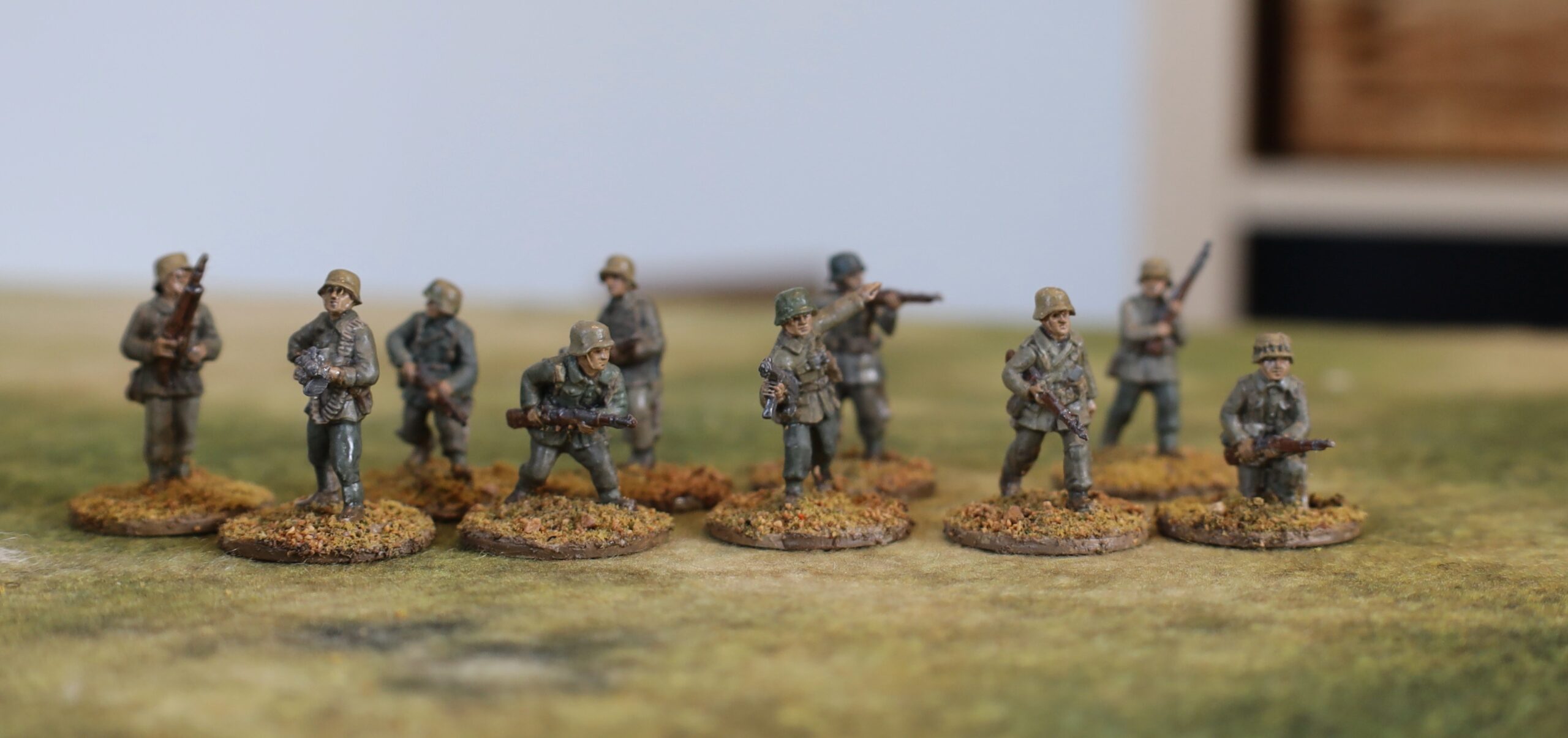
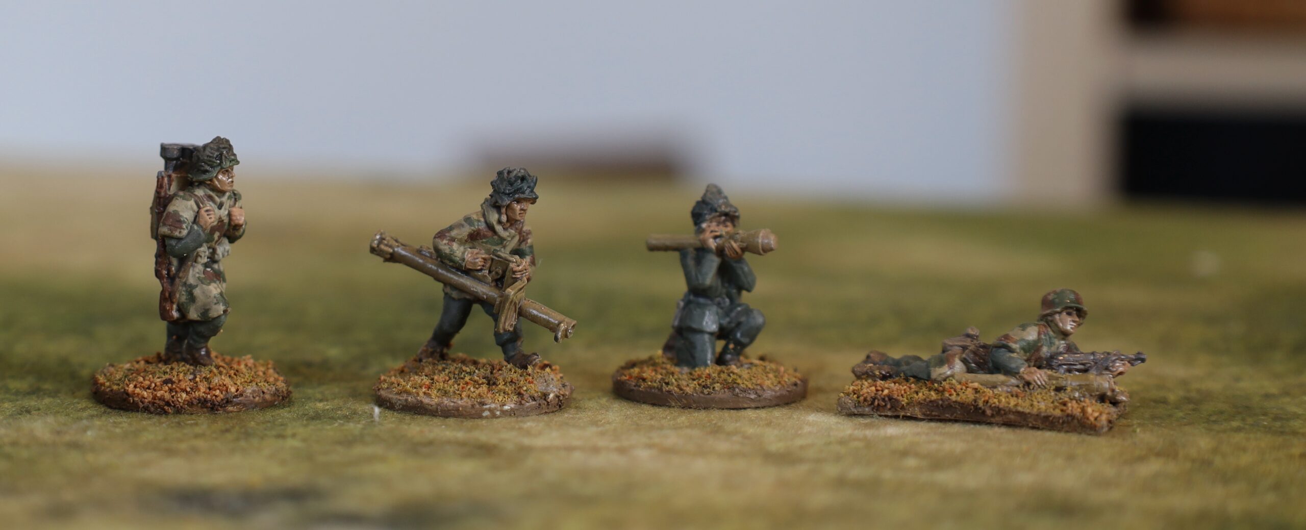
Alongside the vehicles and guns, I also painted 14 German infantry (in 20mm) for my 1943 project in my last batch of work. This was for bog-standard infantry, serving as either panzer grenadiers or ordinary infantry. Most of the German infantry in this theatre in 1943 were either panzer grenadiers or paratroops – with the exception of parts of the Tunisia campaign, where ordinary grenadiers, as well as ad-hoc units, were used extensively. I have not done any paras yet – though these played a big part in all the various campaigns. This smaller batch of infantry was put together so that the Germans have numerical parity with the British in my collection, giving me more gaming options. I painted one pack of AB infantry – the “section advancing cautiously”, which was ten men, including one MG34 and an NCO with an MP40. In addition I painted up one panzerschrek team and two figures with panzerfausts. These antitank weapons were only distributed to the German infantry late in 1943 – and after Salerno – so I hadn’t painted any up yet. But these will be needed to do later scenarios, especially if I push into 1944.
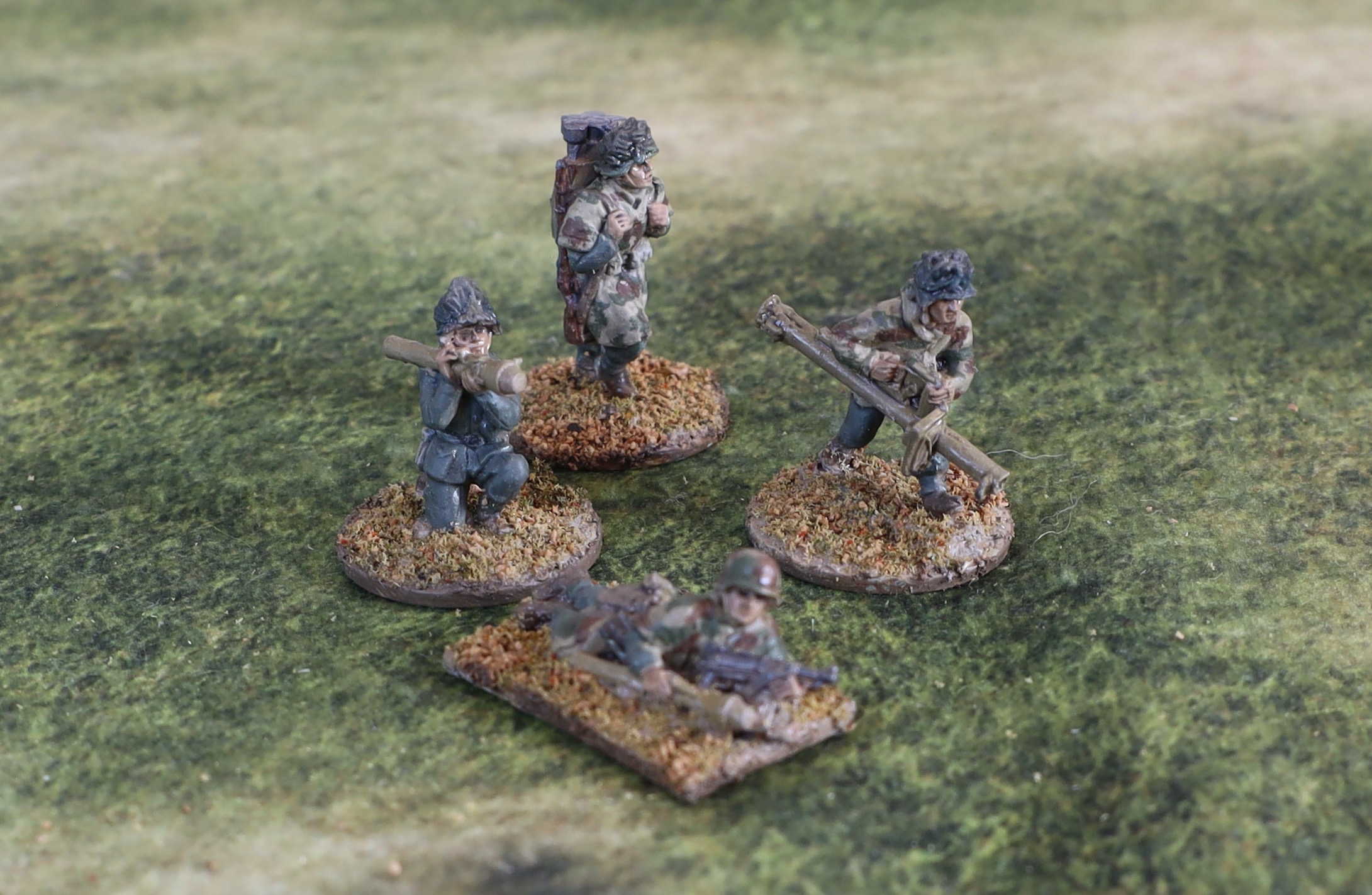
The panzershrek and panzerfaust figures
I did my original batch of German infantry back in October 2017. I wasn’t very happy with the end result, though I wasn’t able to articulate clearly why. The problem is that there are very few photographic sources for German infantry in Sicily or Salerno (and even these are mainly paras!). There is a little more for Tunisia. I think I was heavily influenced by pictures of prisoners in Tunisia, showing a huge variation in uniform colour, with quite a few people wearing very pale uniform items. So I depicted a lot of very pale kit. In fact the very few pictures from Italy show the German uniforms as being a bit darker than this, apart from some of the helmets. So I decided to go a bit darker this for this batch.
The panzer grenadier section
As before I decided to use the German infantry figures from AB depicted in standard uniform, rather than the tropical or summer uniform. The three uniforms were a very similar shape (the main difference was in the clot and dye), so they look pretty similar from a distance. In fact in Tunisia the weather was pretty cold and wet, so there wouldn’t have been call for rolled up sleeves etc. and other signs of a warm climate. I avoided Africa Korps figures because these tend to include figures in caps and shorts – which I didn’t want. In fact the in-combat DAK infantry figures from AB don’t have either – and not even rolled up sleeves. The only problem looks to be that a few of the figures have sand goggles on their helmets. I dare say that these can be cut off and filed down.
The figures were first mounted on steel washers, set in my usual mix of sand, acrylic paste with a bit of paint (white and raw umber). They were primed with gesso (I can’t remember if this was applied with airbrush, or darkened with some paint). For the main uniform for the most part I used a mix of Liquitex Yellow Oxide (aka yellow ochre) with varying amounts of black and white (sometimes using a neutral grey mix to speed things up). This gives a decent representation of the tropical uniform. This is exactly the same combination of pigments I used for the dunkelgelb on the vehicles, about which I post separately. The ratio of black to yellow is higher, giving a more olive finished result. There was not quite as much variation in colour as I had intended – the white seemed to fade on drying! some of the items were painted in field grey, which I mixed using a Viridian green mixed with neutral grey and tweaked a bit (I may have added some burnt siena to calm the green). The helmets were mainly painted in the dunkelgelb used for the vehicles, with one in dark field grey (as they would have left the factory) and one in olive green (as per the tank camouflage colours). As for the accoutrements and webbing, I had almost no guidance from photos, and conflicting advice from other sources. I ended up with a dull brown for the webbing and certain items, and greys mainly for the rest. The boots were brown.
The picture below shows three of the figures next to the same three from my original batch from 2017. They are much darker, but I’m happier with the overall appearance. Next time I might try to lighten the olive mix a tad though.
The panzershrek and panzerfaust figures
These depict figures from later in the campaign, when winter had struck, as well as the fighting moving further north. I therefore decided not to depict them in tropical gear. Three of them are wearing camouflage smocks. I am depicting them in sumpfmuster 43 pattern – though how well I have caught this I’m not sure. It’s probably a bit too chunky. The remaining figure is in field grey. Three of the helmets feature attached vegetation. I painted this quite dark – probably too dark, but I wanted to avoid the garish greens I so often see on miniatures – I may touch these up later. The prone figure features a painted camouflage pattern using panzer camouflage colours.
Luftwaffe uniforms
As a slight digression I will mention the AB 88 crew that I also painted as part of the batch. These are in Luftwaffe uniforms. The tropical colour was paler than the army one, apparently – so I used the same basic mix with more white. And in place of the field grey, the Luftwaffe had blue. This I got from black, white and Prussian Blue, a paler variation of the mix I used for the “panzer grey” gun and tractor. This is guesswork as I have few colour pictures to go on.
Finishing
After the paint I applied a glaze. As with my most recent Napoleonic figures, I used alkyl medium as the base, mixing in some oil paint – a mix of Payne’s Grey and Burnt Sienna to reach a sort of dull mauve, to complement the olives and yellows that predominate in the uniform. This dried quite glossy – which I can accept in Napoleonic figures (it adds depth to the colourful uniforms), but not for WW2. But I didn’t want to use aerosol varnish, as I didn’t want a uniform matt finish. So I used my old Winsor & Newton varnish in a bottle to apply to the uniforms. This is unreliable, depending on how much of solid gunge at the bottom of the bottle gets into the mix. My first batch, used on the vehicle tilts, was fine. The batch used on the figures, alas, still left a strong sheen, which can been seen on many of the figures. For the weapons, helmets and skin I wanted a slight sheen – and I used another brand of matt varnish, which is more reliable, but not very matt. The next time I mix up some really matt varnish, I will need to touch these figures up.
After that it was the bases. I applied My usual Woodlands Scenics flock mix with some sand using undiluted artists strong glue. I then added patches of sand to give a bit of variation. For some reason the adherence of the flock/sand on the larger weapon bases was much better than on the figures. I needed to seal the latter with diluted PVA glue, but not the former. I think I was more careful to press the flock in on the larger bases, which I did one bit at a time. Must remember to do this on all my bases next time, as the sealing is an extra step and a faff. I did not dry brush the figures; I though of dusting them, after the technique worked so well on the vehicles, but I decided not to. It is no necessary.
Overall I am happy with the result, apart from the sheen on the uniforms, which is easy enough to fix later. I am pleased that my painting technique is settling down – this will speed things up in future.
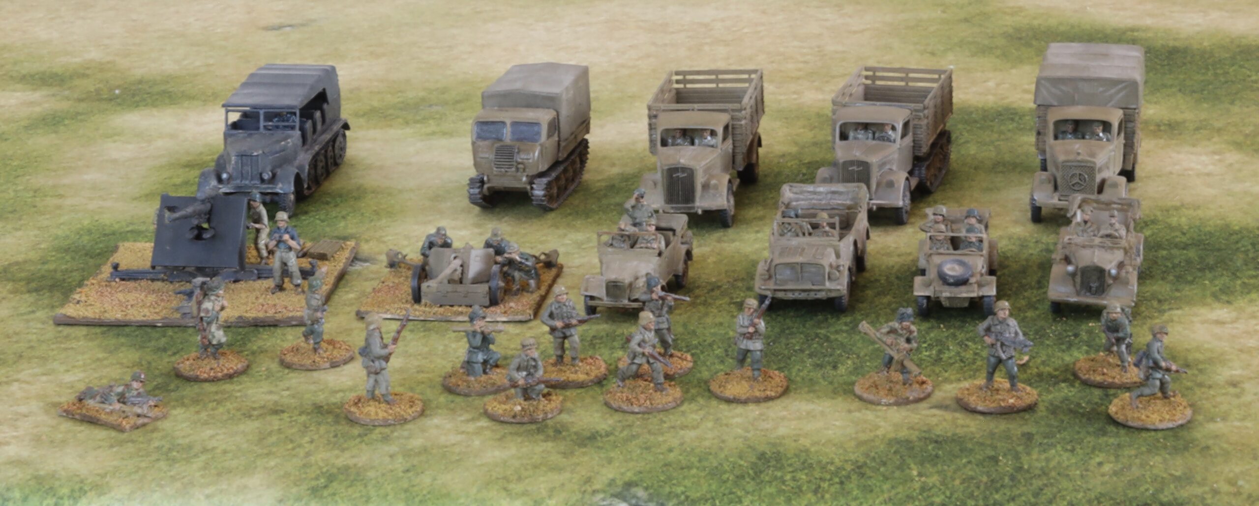
I’ve been off line here for nearly three months. At first I was pushing on with my Napoloenic rules project. I reached the point where it needed play testing – and then got distracted. I then moved on to my next project, which was to build more 20mm ground forces for the 1943 Mediterranean campaigns. These are 9 vehicles, two artillery pieces and 14 infantry figures, all German. At least twice I lost momentum as the project progressed, and I got distracted by other things. So the whole thing took quite a few weeks. I have been going for bigger projects to get more stuff done more quickly – but you can overdo it. This one was too big and complex, causing the fatal loss in momentum.
Looking back on it there were two main problems. First was combining infantry (AB metal figures) with model vehicles/guns. The processes between the two are too dissimilar, so for almost every session it was either on one or the other. Even though the models featured crew figures, these were much simpler than the infantry – and the artillery crews had different uniforms anyway. The second problem was that many of the models took far longer to assemble than I expected. The main culprit were the three Milicast cars, which are resin models with a number of fiddly parts and no assembly instructions. The Airfix Vintage Classics 88mm gun and tractor was also a nasty model to put together – mainly because the parts were ill-fitting. By contrast the Plastic Soldier Company (PSC) models (three medium trucks, a Raupenschlepper, and a Pak 40) were simple models that were quick to assemble. The S-Model Kubelwagen was somewhere in the middle. It was quite fiddly (more parts than then the Milicast ones), but in polystyrene, with well fitting parts and with clear instructions, so it was much easier to assemble. Painting and finishing a vehicle batch of this size was not a problem, however, even with two different colour schemes.
I will describe the project in three parts: the vehicles (and artillery) in this post, followed by the infantry, and a digression into dunkelgelb, principal vehicle colour.
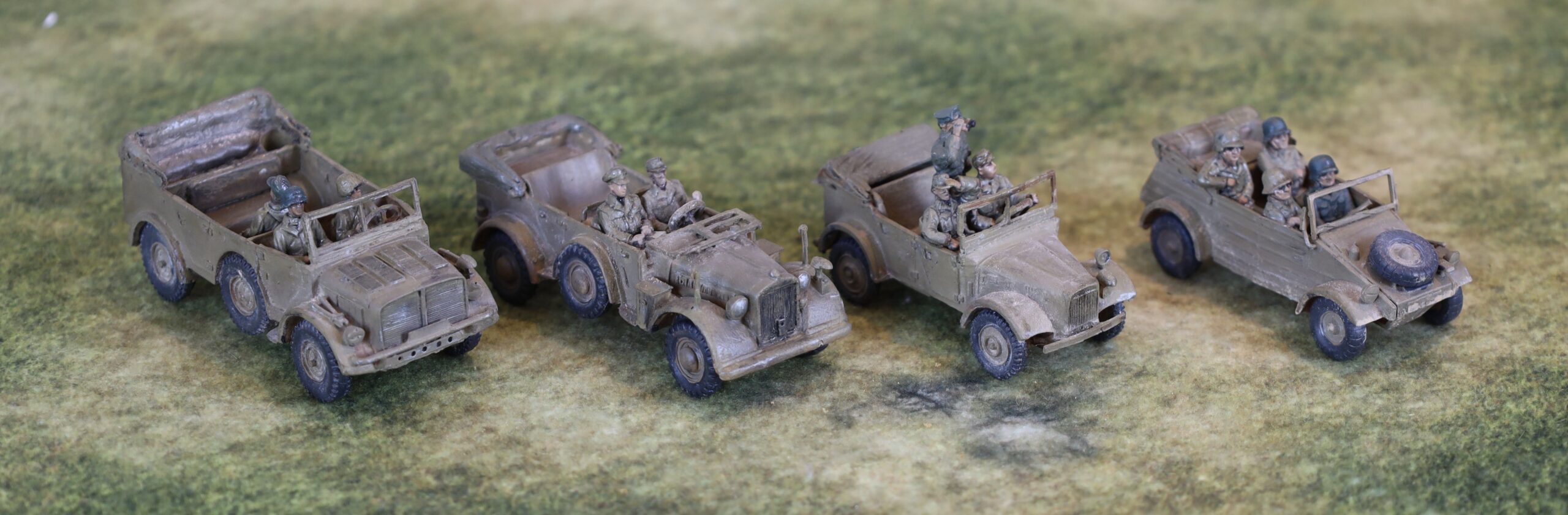
The four cars
L to R: Horch Kfz 69, Horch Kfz 15, Stoewer Kfz 1, Kubelwagen
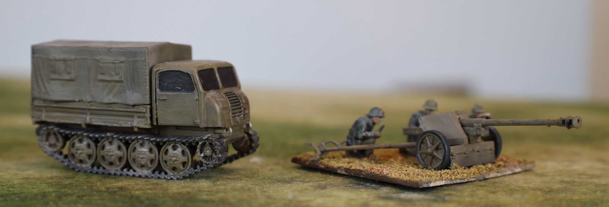
These vehicles (Horch Kfz 15 and 69 heavy cars, Stoewer Kfz 1 and VW Kubelwagen field cars) will be used as transport for small command, comms and observer groups. The two Horch cars (especially the large Kfz 69, really a light truck) are also suitable as tows for lighter field weapons, such as the Pak 38. The 69 could transport a small infantry squad too. All except the Kubelwagen are from Milicast. This is one of the two suppliers I am using for slightly more obscure vehicles and equipment; the other is SHQ, who make metal models. Both are in 1/76, so on the small side. I’d prefer 1/72, as these work better with the AB metal figures I like to use, but there is quite limited availability at this scale. The Milicast models are in resin – which can produce very fine detail, but is a bit fragile. I fell in love with the pictures of these vehicles on the website and got a bit carried away. I bought three SHQ metal models at about the same time (back in 2019), but was a bit disappointed. I have assembled a jeep and a Loyd carrier (a Bedford truck is still awaiting assembly), and found them a bit crude. The parts weren’t especially well-fitting. The end result was more than acceptable though.
Another view!
What I discovered this time was just how difficult resin is to work with. It didn’t help that the crew figures were resin too (bought separately from Milicast), and often needed arms to be glued in place. For each of the vehicles, the body came in one piece, but wheels, windscreens, lights, mirrors, steering wheels and various other bits, depending on the model, had to be glued on. I faced four main problems. The parts were fragile; they were often tiny; there were no recesses to secure them; and gluing was a bit tricky. On the final point I used standard cyano superglue. It look longer than expected to harden; the (usually tiny) part often needed to be I held in place for few minutes, and wasn’t properly secure until the next session. By a miracle no parts were lost in assembly, though some did go awol for a bit. At least one of the of the front lamps broke off at later stage, and I did not even attempt to search for it. Trying to clean flash off the windscreens was a nightmare, given the fragility the material – and one of them broke into several fragments that had to be reassembled. The upshot of all this is that these three cars took several two -hour sessions to assemble. I was vowing “never again” at the end. Come back SHQ, all is forgiven! Alas I have two more Milicast models awaiting assembly: a 17pdr antitank gun, and a 2cm Flakvierling (with quad barrels) which looks a complete nightmare, though this time with some assembly instructions.
The fourth car is the classic Kubelwagen. I actually have no less then four models of this vehicle (only one assembled) from old 1970s Airfix reconnaissance sets – but these were so terrible as to be unusable. They are tiny, and you couldn’t fit 1/76 figures in, never mind ABs – they came with some very diminutive crew figures, so it would have been obviously wrong to the designers. Those were the days. Instead I bought an S-Model kit in 1/72 – there are two models in each box, and I am saving he second one for later. To my relief the model proved big enough to take an AB crew of four figures specifically designed for the Kubelwagen – which fitted quite nicely. This wasn’t a particular simple kit, but in plastic, and with well-fitting parts (mostly with recesses to aid fitting), it was much easier than the resin models.
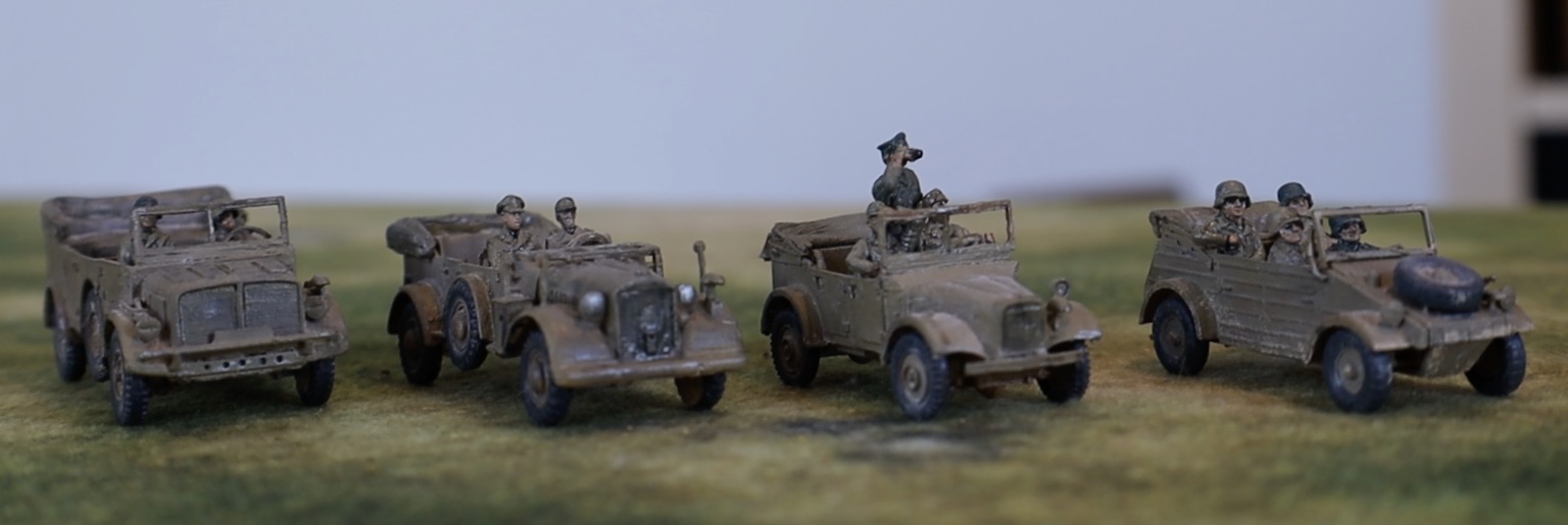
The medium trucks
The PSC trucks
From one extreme to another! These models came from a single box from PSC, designed with wargamers in mind. They are in 1/72, but originally engineered for 15mm scale (i.e. about 1/100), so they are quite chunky. There aren’t many parts, and no fiddly bits (no wing mirrors, and with headlamps crudely folded onto the mudguard, for example). They were very quick to assemble. The only complication was that I had to paint the interior of the cabs before assembly, which meant assembly of this bit was delayed. By the time I got there some of the parts had bent a bit out of shape, so the fit wasn’t as good as it should have been.
A different view in different lighting
As is generally the case with PSC, there were multiple options – leaving a lot of unused parts at the end. There were two choices each for cab (Mercedes or Opel), drive (wheeled or half-track) and bed (higher sided without tilt or lower with tilt). As you can see from the picture, I tried each of these variations out.
You can see the Mercedes truck without tilt here
These aren’t fine models, but work well enough for tabletop gaming, and I’m really pleased with them. On the strength of this I bought a second box (PSC models are often out of stock, so it’s best to buy while you can). I have an idea of converting one of them to take a Flak gun on the back. Otherwise these vehicles are versatile as troop transports (the German troops in this theatre were usually motorised), tows for medium-sized guns, or supply vehicles (although there is limited call for these on the tabletop).
Raupenschlepper and Pak 40
This is also a PSC kit. I needed Pak 40 75mm antitank guns, as these, according to some sources, were used in Tunisia (I’m not sure but Pak 36(r) converted from Russian 76mm guns, which used Pak 40 ammunition, definitely was in Tunisia), and by Salerno they seem to have been the standard antitank weapon in use by the Germans. The model comes with the Raupenschlepper Ost as a tow. I haven’t seen any pictures of this vehicle in use in this theatre, but Wikipedia has a picture of it in Albania in September 1943, so presumably it was around. It was designed for the Russian front, and used as a tow for medium weapons – it is usually pictured with the 10.5cm howitzer.
This isn’t such a good buy as the trucks. There are only two sets of models in the box. The Raupenschlepper has an alternative cab, with flat-panel construction used later in the war. There are also parts for a version used as a self-propelled Pak 40. Very few of these were actually built, so why all that plastic was used in a model designed for wargames use is a puzzle. I’m not especially a fan of the solid windows – though these looked much better in the end result than I feared. The tilt is moulded in two parts, and the join needed filing and puttying so as not to look too obvious. The crew figures for the Pak 40 aren’t very nice. These are standard PSC sprues, which I also had for the Pak 38s, with some figures requiring assembly. Somehow these are much harder to get looking lifelike than the AB cast figures, though these are quite expensive. They are depicted wearing smocks, which I painted up as early pattern German camouflage (though this is perfectly in keeping with the theatre).
Still the models were easy to assemble and the result is perfectly satisfactory. I’ll do the second models later.
From a different angle
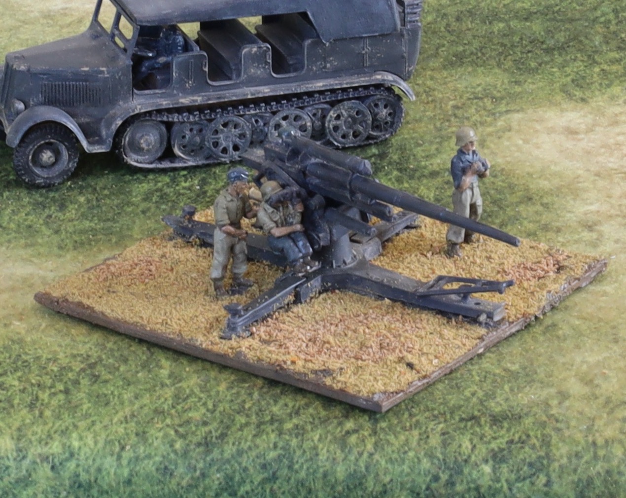
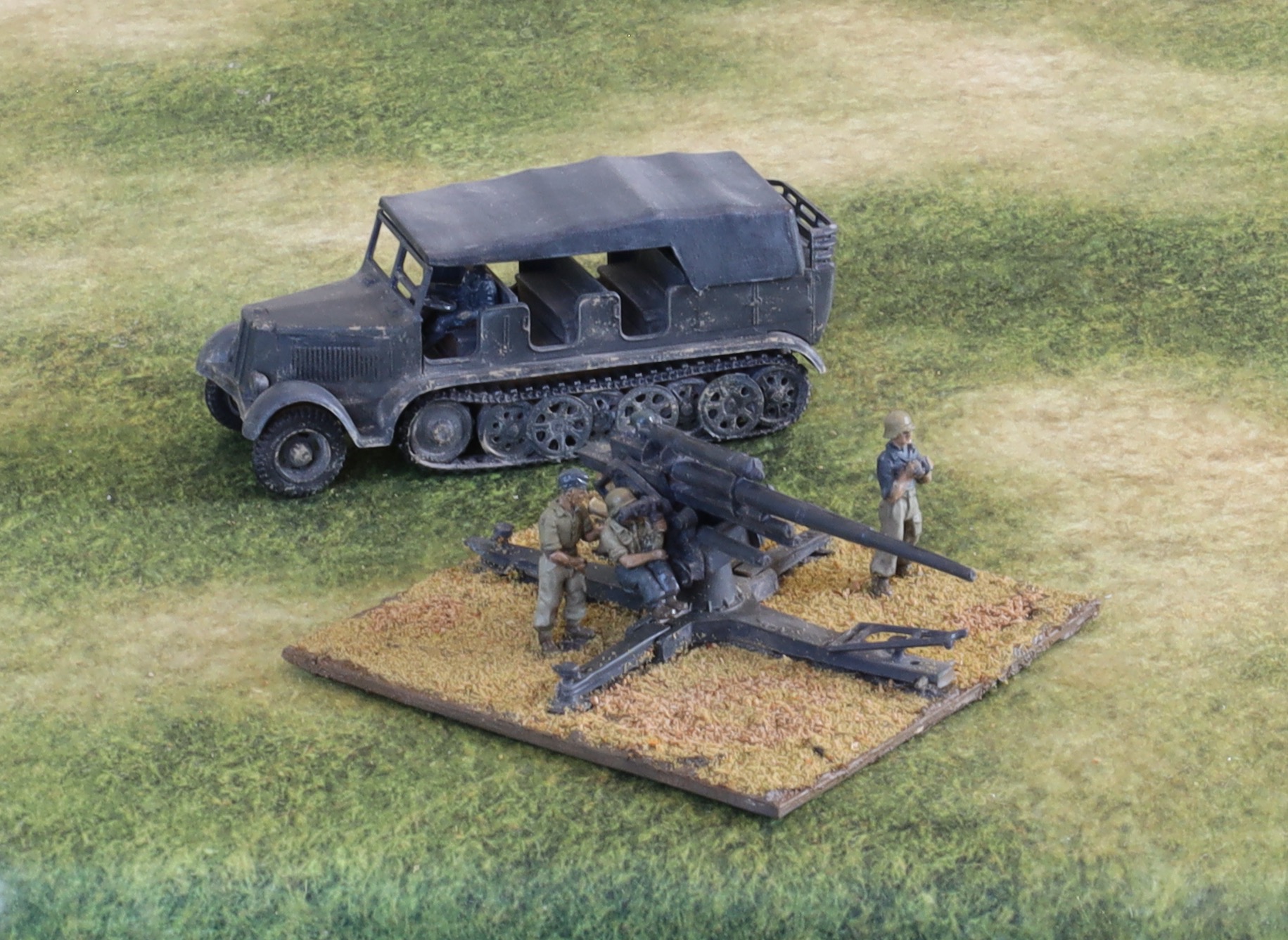
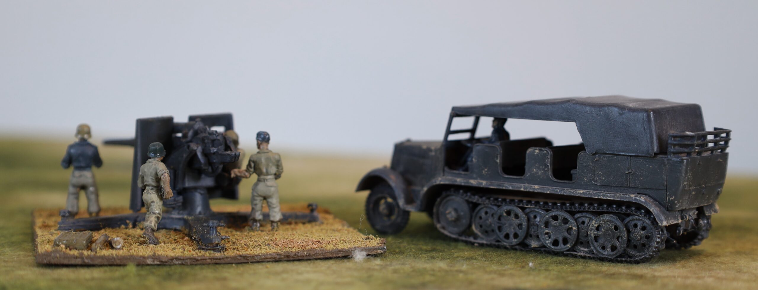
88mm Flak gun and Sdkfz 7
The 88 without shield
This was a bit of a disappointment. I bought the model from the Airfix Vintage classics range (see my 2018 post here) – in fact I bought two of them. They looked good value as I remembered them as being decent models back in the 1970s, though the track wheels on the tractor were a bit awkward to assemble. I also bought crew figures from AB. But the parts fitted badly, which made assembly harder than it should have been. Each of the running wheels comes in two parts, and the track is flexible polythene. The tractor was not particularly easy to put together as a result. But the gun was a bigger problem. Back in the day I could get the wheels on and off and the side-riggers up and down so that we could have it in both deployed and in transport mode – but for this model the fit was not tight enough. I did paint the wheels, but in fact none of my artillery is in towed mode, so I decided not to use them. The gun does not fit snuggly into the cradle. But worst of all the fit of the gun into the base was loose. This mattered because I attached a metal seated figure to it, which meant that the assembly tilted over to that side. In the end I had to feed plasticine into the hole in the base to help hold it in the upright position. The model comes with a shield, not shown the in picture here, as this was often not used. I had to cut a hole in it so that the seated crew figure and use his range-finder.
I decided to paint this in pre-1943 colours of “panzer grey”. Photos, even from the later war, often show 88s quite dark. The narrative here is that this is an old weapon brought forward from a rear area for front-line use, which nobody had repainted. The crew is Luftwaffe, who had slightly different ways of doing things. The AB crew figures are excellent, and the scale difference isn’t jarring. I painted them in slightly different colours to the infantry to reflect the Luftwaffe provenance.
I don’t think I will bother the second gun. I do have the crew for a second 88, but I will source this elsewhere – as a later variant of the weapon if I can get it. I will assemble the second tractor at some point, as it looks OK when finished. It can be used with any second 88, or with a towed 15cm howitzer if I get one.
With shield, from rear
Painting and finishing
Step one was primer, which I applied after assembly (except of the cabs of the trucks. I wanted something quite dark, so that it wouldn’t show if the later painting did not reach all the recesses. To get into those recesses I used the airbrush. I used white airbrush primer paint mixed with darker acrylic paint (and some medium to make it more fluid). I used a brown for most of the vehicles, except the 88 and tractor, where I mixed in black. I’m still working on airbrush technique – and I’m being a bit frustrated with the tendency of the nozzle to clog – so the phase took longer than expected. Getting into the recesses was a bit harder than expected too. In future I will try to doing this differently. I have bought some Vallejo primer, with some in German dark yellow (and olive drab) – I will use this directly out of the bottle. I will also prime the parts before assembly, while still on the sprue – though still with the airbrush.
After this I painted the interiors and crews, so that I could finish assembly of the cabs. That done I painted the rest. This was simply one layer of the base colour applied by old-fashioned brush. As usual I mixed the colour using artists’ pigments – I will explain more how in a later post. The tyres, tracks and other detailing was then done. There were no decals. 88 barrels often have rings, presumably signifying claimed kills – but I couldn’t find anything suitable to use. I decided not to bother with number plate – and second line German vehicles such as these did not carry other markings.
After this I used the oil paint patina technique that I have been using on model aircraft. I dabbed small dots of oil paint onto the model – white, yellow ochre, brown, Payne’s Grey, black – and brushed it into a very thin layer. This softens the flat finish, giving it a rather worn appearance. It also gives the models a slight sheen, like new paintwork. I applied matt varnish to the tllts and the clothes of the crew. I am using a very old bottle of Windsor & Newton varnish, which is not reliably matt, but it looked OK. I then applied a glaze of dark mauve-grey that I was using on the infantry figures, to the crews and radiator grills. This left a slightly glossy finish, that will need a bit of touching up with matt varnish.
After this I used a metallic pencil (silver and pewter) to simulate exposed metal. Since the theatre was mostly dry, rust would be less prominent than vehicles elsewhere. The pencil works quite well, but the impact of this was not great, and I don’t think this is really worth bothering with. The exception may be on the tracks, though even this wasn’t very visible in the end.
Finally the vehicles got a dusting in – another technique learnt from model aircraft. Previously I used a specialist textured paint to simulate dust. This is quite thick and easy to overdo. It looked pretty good on the last batch of British vehicles I did; less so on the previous German ones. I tried putting some on a couple of the vehicles – including the dark grey Sdfz 7. I thought it was a bit too strong, especially on the dark grey. This technique works better to simulate mud than dust (though there was a lot of mud in Tunisia – not really in Sicily or Salerno). I then created dust from ground down artist’s pastel – mixing white, pale yellow and grey mainly. I then applied this generously with a paintbrush. It worked pretty well, though the process created clouds of pastel dust. A mask would have been a good idea, but I just held my breath. I am pretty pleased with the result. In fact I think careful application of the paint product on the wheels and lower surfaces complements the effect quite well. But dabs on the upper surface, as per the Sdfz 7, don’t really work. The dusting did away with the need for dry brush highlighting.
After this came the question of whether so seal the models with a layer of matt varnish from an aerosol can – as I have done with my earlier land vehicles. This would serve to hold the dust layer in place and protect the model generally. I decided not to in the end. Aerosol matt varnish gives a very uniform flat finish. The dusting gave a generally matt finish, but with a bit unevenness that makes the models more interesting. Alas these models are unlikely to see much tabletop action, so protection isn’t a priority.
The aim with my modelling and figure painting is to achieve a strong impact from a medium distance (a foot or two), and to do this with as few steps as possible to simplify production. This contrasts with serious modellers, who like to use lots of different techniques together. I am now settling down to a pattern. Dark-ish primer (perhaps before assembly) applied by airbrush; base coat and detailing; decals if any; oil patination; dusting. There is not usually a need for washes, glazes, dry brushing or varnish.
Next a look at my Kittyhawk. The P-40, later models of which became the RAF Kittyhawk (earlier ones were called Tomahawk by the RAF), played an important role in the RAF efforts in the Mediterranean. At first they were used to supplement the Hurricanes as air-superiority fighters – as the former were outclassed by the arrival of the Messerschmitt Bf 109F – plus it was easier to ship them direct from the US to Egypt than supply from the UK. Then as the Spitfires took on that role, they were used primarily as fighter-bombers. By 1943 they had become the RAF’s principal fighter-bomber, increasingly supplemented by Spitfires Vs, as the Luftwaffe retreated and the Spitfire VIIIs and IXs came into play.
The P-40 isn’t the most elegant of aircraft (US designers rarely did elegant, unlike their British and, less often, German counterparts). But it was robust and highly functional (which the US designers were unbeatable at, except maybe by the Russians), and especially suitable for this theatre and the fighter-bomber role. It was let down by its Allison engine, which performed well at low altitude, but not at the higher altitudes needed for escort and other mainline fighter roles. By 1943 the P-40F and L (RAF Kittyhawk IIs) were powered by Merlin engines – which did much better at altitude. Americans using these models as fighter escorts against Bf-109Gs got perfectly respectable results, especially as by this time the US pilots were better trained and rested than their opponents. But the Merlins were needed elsewhere – notably for Mustangs, a far better air-superiority machine – and the later Allison engines were fine for fighter-bombers, so later P-40s (the K, M and N) went back to these.
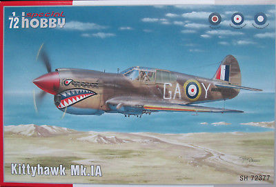
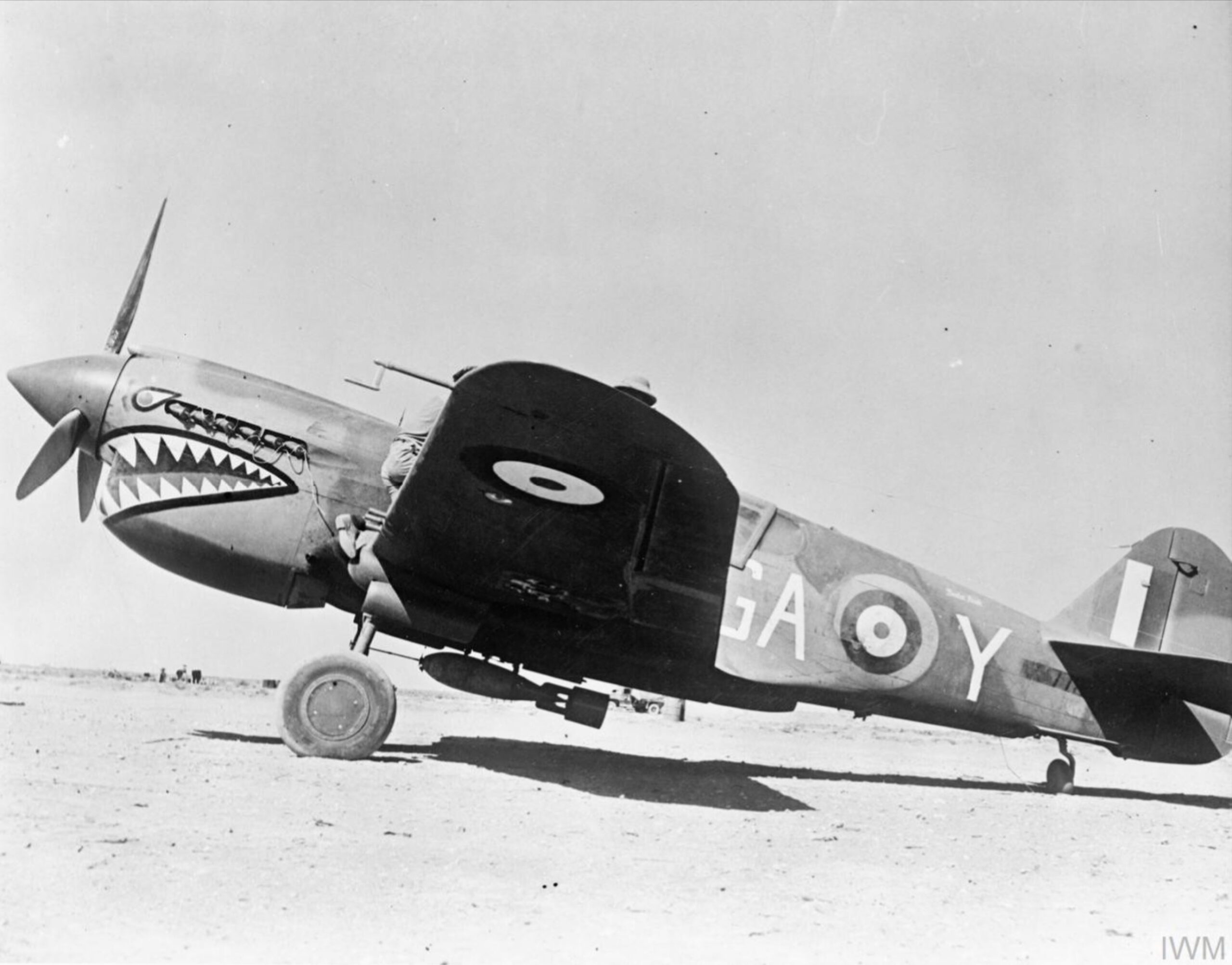
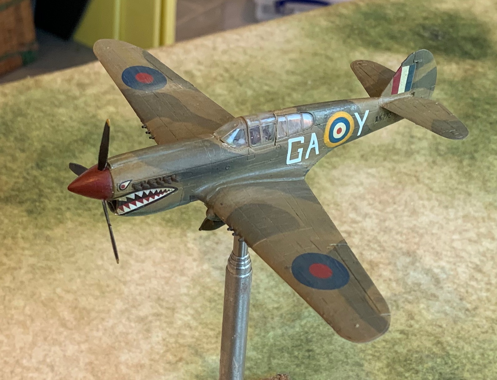
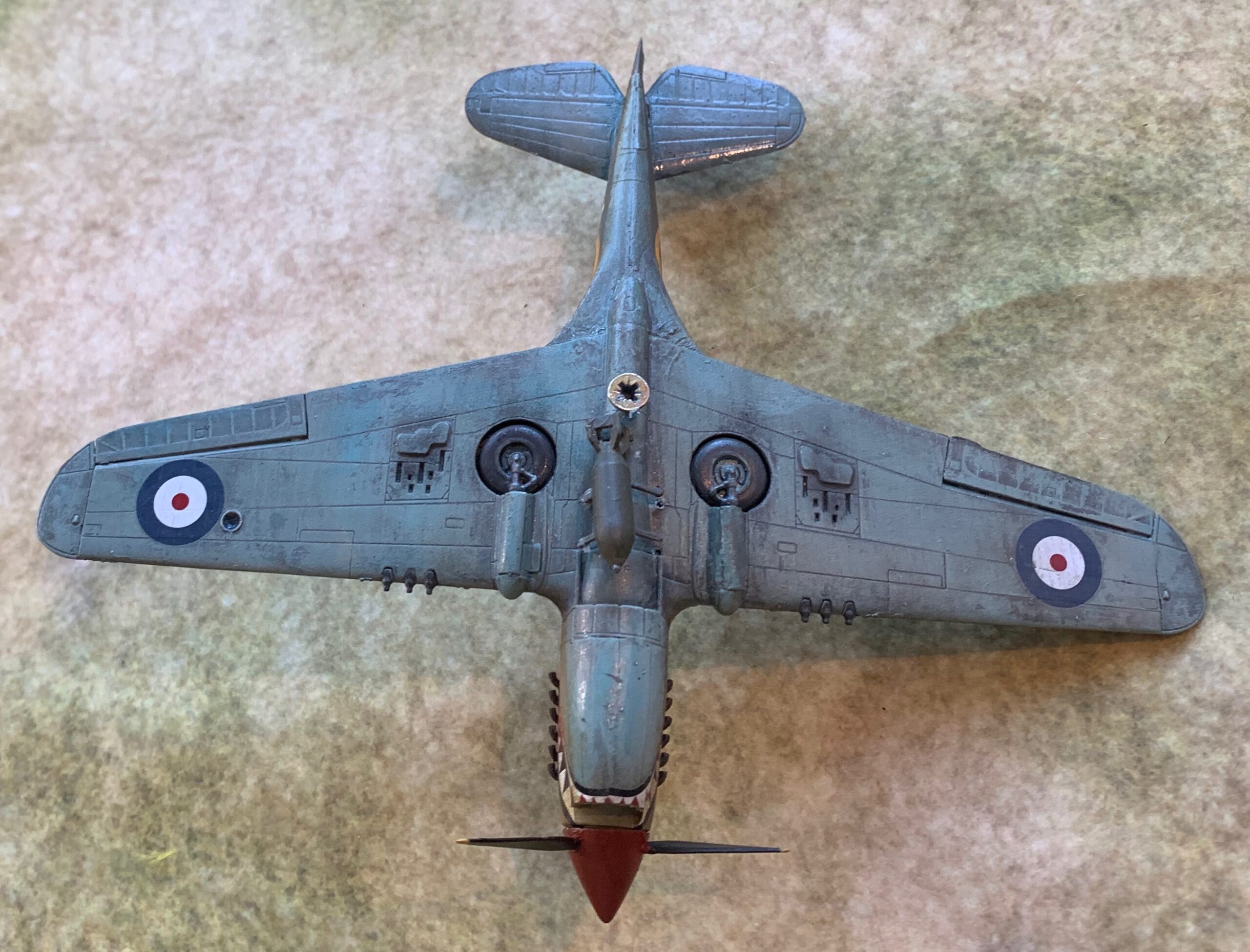
At the start of my project, in autumn 2020, I went on a buying spree for my models, anxious to beat full Brexit, which kicked in in January 2021. I chose this model from Special Hobby of the Kittyhawk IA to be my Kittyhawk. Alas for my research. The Kittyhawk 1A was the P-40E, which was obsolete by 1943, being replaced by the Kittyhawk II (the P-40F or L) or, mainly, III (the K or M – and apparently some of the Ls, though presumably re-engined). The later versions were chiefly distinguished by a lengthened fuselage, which set the tail back a bit from the tailplanes. I discovered my mistake quickly enough, but decided to press ahead. I decided to do the plane on the box art from 112 Squadron, with its distinctive shark’s teeth. This is a bit hackneyed and overexposed in artwork – other squadrons did not have these markings. But they really do work well on the P-40, so I thought I’d do it anyway. The plane is marked GA-Y, is from 1942, and was lost in May of that year. For some reason it has been by far the most popular to be portrayed on model aircraft. Here is a picture of it:
The Special Hobby kit proved to be a lovely one, in spite of being on the usual undercarriage down mode. The undercarriage doors fitted neatly into the recesses – the only problem is that one of them was very small, and I managed to lose it. This is the mark of a good quality, professionally-made model. The PJ pilot got in without too much trouble but it is a roomy cockpit compared to the Hurricane or Spitfire – or the Bf 109 or Fw-190 come to that. The only awkward bit was fitting the fuselage assembly onto the wing assembly. For some reason this often seems to be a problem (it was the case on both the other models too). I needed to be a bit more patient, and the fit isn’t quite right. Anyway, here is the result:
I used the US bomb from the kit – the RAF did use these (and the US used British bombs). It’s a bit skew though. Also the bomb dips a bit, probably because I didn’t get the pylons right. I have seen pictures of centrally mounted bombs dipping on Spitfires – but that doesn’t show on the picture above. I might try to correct this. I have already commented the errors on paint colours. Also the cockpit canopy suffered from some excess glue. The biggest problem was with the decals. Unfortunately the GAOY on the port side got displaced, as did the starboard serial number – and this escaped my final checks an so dried out of place. I decided that I could correct the worst of this by replacing the roundel (even though it wouldn’t then match the position on the other side). As I was searching stock for a new roundel, I found the decals for my original Airfix Kittyhawk kit from the 1970s. They were for the same aircraft. The big letters were a bit heavier than the Special Hobby ones (which are more realistic anyway), so I decided only to replace the roundel – though I needed to overpaint the yellow to hide a pale outer circle. The GA remains slightly skew. I was also able to replace the serial number, though the Airfix ones were also a bit heavy. The port serial in the kit has a dark background (which looks like an unsuccessful intervention from the censors!) – which is there in the original photo. I didn’t like this so I was happy to replace the serial on this side too.
And so there it is! Another 1942 model in dodgy colours. This can do service on the table, but I’m minded to do a Kittyhawk III as well. I’m also looking at a P-40L in US service, as flown by the Tuskegee Airmen, which would also have RAF camouflage colours.
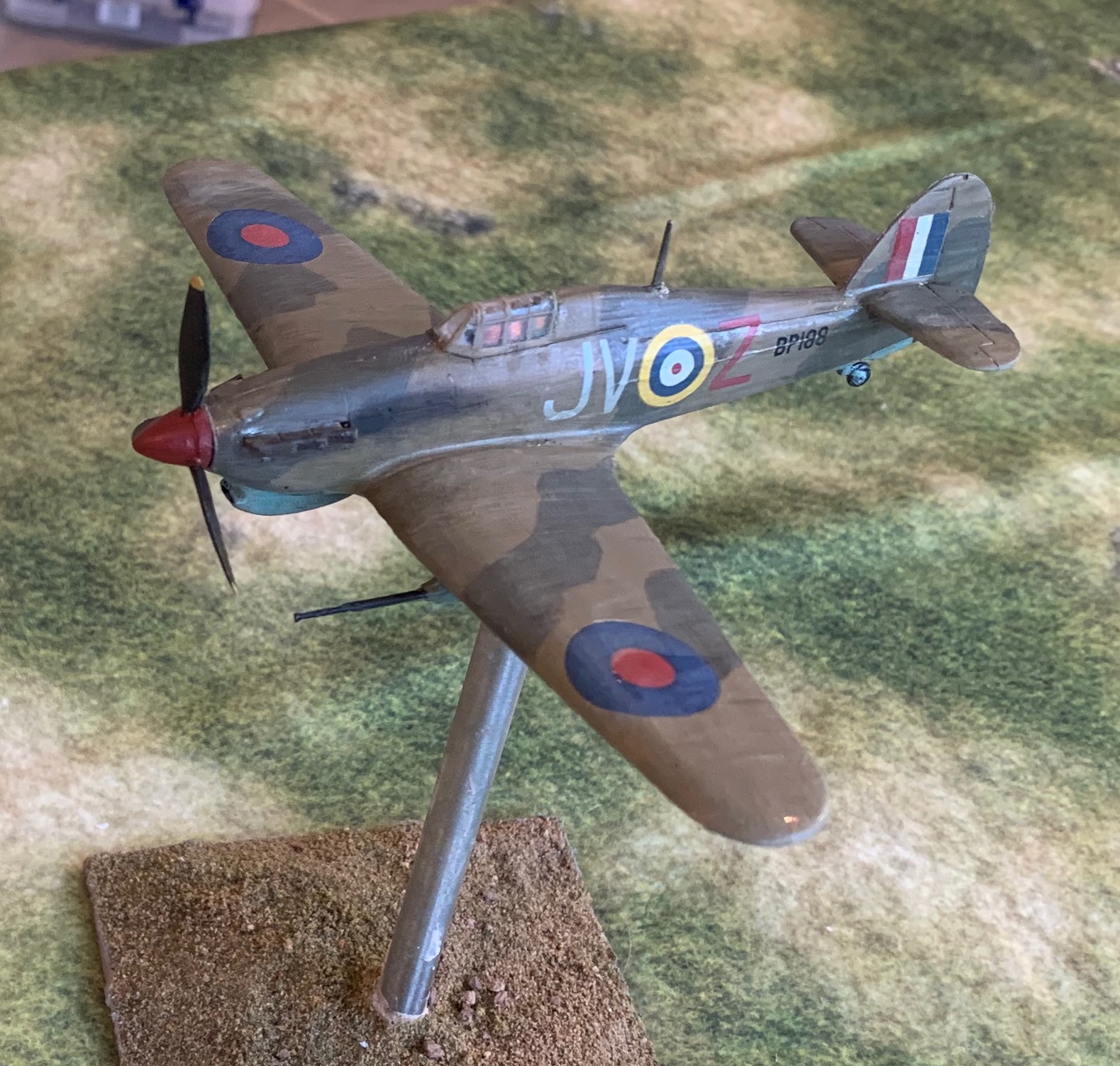
The obvious choices for my first RAF models for the 1943 project were a Spitfire V and a Kittyhawk. But I have always loved the Hurricane, and so I wanted one of those too – even though the type was on the way out in Tunisia, and does not seem to have played a significant role in the Sicily and Salerno battles. Hurricanes continued to be used until the end of the war in the Mediterranean, but apparently not in the major land campaigns.
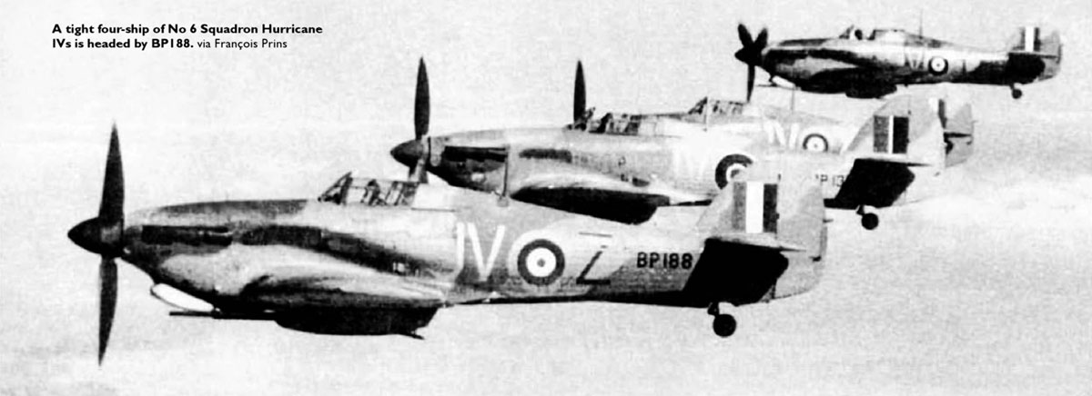
I wanted to do the IID model, which featured two 40mm anti-tank guns underwing, and reduced machine-gun armament (down to two, firing tracer). One squadron of these was in operation in Tunisia (6 Squadron). This squadron played a significant role in supporting the advance of the Eighth Army into Tunisia, providing direct battlefield support by attacking tanks in particular, sweeping through in advance of the ground forces. This makes it particularly interesting from a tactical point of view – since mostly fighter-bombers were used for interdiction behind the lines. The IID was reported to be very effective in this role, and apparently referred to as the “can-opener”. There is actually quite a lot of controversy about how effective aircraft were at tank-busting in WW2 – extravagant claims by the crews are almost never corroborated by hard evidence (notably Typhoons in Normandy, using rockets rather than guns). There is no corroboration for the Hurricane pilots’ claims – though the psychological effect of air attack from tank crews should not be underestimated. The 40mm guns were awkward things, and hindered the aircraft’s manoeuvrability. The calibre (the same as 2 pdrs) was by then obsolete for ground use, but planes had the benefit of extra velocity coming from the aircraft, and the ability to attack from the side or top of the tank. They would have been useful enough against the Panzer IIIs that were the Germans’ main tank at the time. But after Tunisia the RAF used rockets for tank-busting. With battles in Sicily and Italy providing more cover for tanks, tank-busting went out of RAF repertoire. 6 Squadron swapped the guns for rockets, and used their Hurricanes against shipping – upgrading to Hurricane IVs in due course. The high-ups were always sceptical of using aircraft in close support, in spite of army pressure. Interestingly the Germans also used underwing guns of similar calibre, mounted on Stukas, in Russia. Extravagant claims of success were made for them too.
There seemed to be only one choice for for a 1/72 IID, from AZ Model, though a number of others manufacturers do other versions of the Hurricane II. Alas, I found that it was an poor model, especially compared to the Spitfire and Kittyhawk. It is now withdrawn. Starting again I would go for one of the other IIs, and try to model the underwing guns somehow – it is possible that one of the other kits has them, but doesn’t advertise it (there are often parts for other versions included). I have some guns from the Stuka, but I don’t know similar they are. The model often didn’t have proper pins or recesses for the parts to fit together in right place (the two halves of the fuselage had to be glued together free-form – a bit alarming); detailing was weak though perfectly adequate for my purposes. The fit of parts wasn’t great. It came undercarriage down, and without a pilot. The undercarriage doors needed a bit of work to fit into the recesses to model the up position – and I couldn’t make the side struts to the door work at all, so just plugged the gap with plasticine (I’m not stressing on the detail for these models). There were few resin parts, including the pilot’s seat and the radiator. It was very hard to get these off the sprue without damaging them. In fact I lost the seat in the attempt, and had to replace it with a spare from the Kittyhawk. The cockpit was too small for the PJ Productions model pilot I had (I have a stock of these) – so I used the Airfix one form the Spitfire, with a bit of filing, as this was a bit smaller, though not especially nice. The whole interior was quite hard to do. That didn’t matter too much because the cockpit canopy is quite small, and you can’t see much from the outside. I also managed to blur up some of the canopy interior with excess glue. Anyway, I pressed on, and here is the result:
It Is OK considering, apart from the colouring. The underside has been heavily weathered partly because I wasn’t very happy with the underlying paint colour – at once too chromatic and too light. In any case the undersides of the aircraft got pretty hammered from the dust airstrips – though I don’t have a good picture of what they actually looked like.
Here is a picture of the actual aircraft (apparently over El Alamein in 1942):
Could be worse! The decals weren’t that great – with lots of flash on the lettering and numbers. The tail flashes seemed too big compared to the box illustration – but seem to fit the photo OK. The exhaust stain should be much bigger. And if this aircraft survived all the way to Tunisia (doubtful), it would have looked even more weathered. In fact two of my supposed 1943 planes turn out to belong to 1942. This is in fact evident from the roundels and fin flashes, which were changed in July 1942. The above photo shows the newer version on the second nearest plane, which gives authenticity to the Alamein date (July to November 1942).
Unfortunately, the more I look at colours on this batch of models, the less I like them! This model will be fine to use on the wargames table, but less for display. But while I will consider doing another spitfire V and Kittyhawk, the hurricane is too minor a player for me to consider doing another one. Still, the model does look like a Hurricane – not particularly beautiful, but iconic.
So this is my first post of 2022! I have spent a lot of time refining my Napoleonic big battle rules, but that is a hard thing to blog about while you are doing it. But earlier this month I returned to my modelling project on WW2 aircraft, based around my 1943 theme, featuring the Tunisia, Sicily and Italian campaigns. This is a return to aircraft modelling after a break of 35 years or so. I started with a single American P-47 Thunderbolt, a bit after 1943, but in Med colours. I then did a batch of three German aircraft for Tunisia. My next batch was three British Aircraft: – a spitfire VC, a hurricane IID and a Kittyhawk IA. Alas on a number of counts the results are rather flawed.
The idea is that I complete the models up to wargames standard. They need to look good from a distance, and have undercarriage up and pilots in place. They would not pass muster for keen aero-modellers, who would include much more close-up detailing. For this batch of aircraft I wanted to focus on the model-making and painting, so I decided to use the decals in the box, rather than the palaver of creating something different (which I did for the P-47 and two of the German planes).
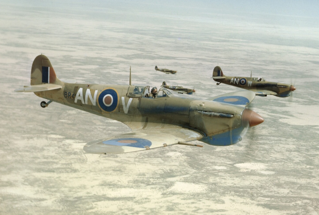
Why are the results flawed? The biggest problem is that I got the colours wrong. The planes look as if they are carrying the early north European scheme of Dark Earth and Dark Green; only the blue underside (not very visible from the picture) gives the game away.. This is a sorry saga with a clear moral. Do your research first! I thought I had understood what was required as I mixed the colours for the airbrush. First I mixed the Azure Blue for the underside. I started with Azure Blue Rowney artist’s paint, dulled down with a bit of white and brown. Too much white: while this is consistent with what some artists show, photos show it to be quite dark. And then I thought it also looked too green – that may be as a result of the white, which causes a bit of a clockwise shift on the colour wheel for some reason (blue to turquoise, red to magenta, etc.). By then the Mid Stone had already gone on. I based this on the brown colour in the German tropical scheme, which I based on Raw Sienna. It should have been yellower, and actually lighter than the Azure Blue. Next I put on the Dark Earth, which I though should come out a bit redder than the Mid Stone. I mixed this based on Burnt Umber. I then looked at this colour photo of a plane in theatre:
Spitfire VBs over Tunisia, presumably in 1943
This shows a distinctly greenish hue to the Dark Earth (which intros picture is generally quite weathered – it fades in the sun quite quickly) and not the reddish one I had. I remixed, using adding in some green, and overpainted. Too much green – though I was probably being led astray by the Mid Stone being wrong. When done I actually thought it didn’t look too bad (it is easy to misjudge colours out of context). But I thought I would tweak with some glazes mixed from oil paints and linseed oil – to make the underside darker and bluer, and the topside paler and less red (which means a bit greener). It took a few days to be dry enough for decals. At this point I just pressed ahead. Alas the Mid Stone looks more like Dark Earth, and the dark Earth looks more like Dark Green! And the Azure is still too pale.
I will profile each individual model separately. But here are some notes on the general technique. I first assembled and painted the interiors and pilots. I then assembled the models apart from the cockpit canopies. I filed, fillered and sanded to smooth over the worst cracks while trying avoid damage to the panel detailing. Then I added the canopies and masked them. I did think about leaving this to later, but thought it was better this way. Apart from the Spitifire I did not attempt to leave the canopy struts unmasked – I would paint them later. But I struggled a little with this, and applied a bit too much superglue on the Hurricane and Kittyhawk – this meant that the canopy fuzzed bit on the inside. And by the time I discovered it the canopies were so secure that I didn’t dare to try and remove them.
After this I airbrushed with white primer. The plastic really needs this step. Then the saga with the paint started. This was my first attempt with RAF camouflage. I sprayed the all the upper surfaces Mid Stone. And then I used Blu Tac and magic putty to mask the Stone areas. This took literally hours to form the rather complicated shapes, and even then I made several mistakes. The magic putty is easier to apply and remove, but it flows – so can’t be left for long, and I needed it to last for days. So I couldn’t use it for the edges – just infill. I won’t do this masking again. After the masking came off and I realised my mistake on the colour, I decided to overpaint with a good old paint brush. I did this with many thin layers – not too hard as the acrylic paint dries fast, so I could do it all in one session. That worked fine – so in future I’m going to use the paint brush for the overpainting. After the paint I put on the oil glaze. the idea was to correct a colour imbalance. It did improve things, but it’s much better to take a bit of trouble to get the colour right in the first place. Ideally all the main colours need to be mixed at the same time and tested before application. I have relished the challenge of mixing my own colours – but my experiences shows how difficult this is – and I don’t think I’d recommend it to anybody isn’t an artist (and I’m not!).
I am making slow progress with airbrush technique – the critical thing being to get the paint consistency right. I have also learnt how to clean the brush more quickly, so I can do it more often. It produces a lovely, delicate finish, which looks really good on aircraft. But good conventional brush technique is just as fast and the results are pretty good. Actually I think the airbrush might come into its own on vehicles, where the smooth finish is not as important, but the nooks and crannies take forever to paint with a brush – and aren’t good for brush health either. So far I have not learned how to do fine work with the brush – so I have to mask – which is clearly an issue! This is partly because of the brush – which isn’t designed for fine work, but mainly its because I don’t think I have set the brush up properly. As for masking, Tamiya standard tape is lovely. I also have 2mm tape which is meant to do bends, but it’s no good for RAF camouflage patterns, and it doesn’t stick all that well after a few months.
After the glazing and detailing the canopies, I went on to the decals. I didn’t think the decal softener was working properly as they weren’t melding properly with the surface. But as they dried, it mostly worked very nicely. Unfortunately I managed to dislodge some of the carefully positioned decals on the Kittyhawk, which required some corrective action – which I’ll describe on my piece on that model. The only surface prep on the decals was using decal fluid, which blobbed a bit on the glazed surface. I didn’t seal the decals afterwards either, as I did on my first model.
After the decals were dry I used the oil paint patination technique of putting small blobs of paint on the surface, and brushing them in. This caused a near-death experience with my German aircraft – but I did not make the mistake of doing this on top of a layer of matt varnish this time. My technique is improving and this step was quick. It really helps integrate the decals, which can be a bit saturated and stark, as well s giving the aircraft a bit of a used look. The glaze left quite a glossy surface, so I applied layer of matt varnish after this. I used the LifeColor airbrush varnish for this, but applied it by conventional brush. This is quick on the smooth surfaces of an aircraft – and I did not want to mask the canopies again. I did not want a deep matt finish, so I didn’t think of using the Winsor and Newton aerosol. The varnish blobbed a bit, so it was a bit trickier than I thought it would be – just as well I didn’t try the airbrush, as the standard brush would have been needed anyway!
Finally I finished with a bit of powder scraped from pastels. This was mainly to create the exhaust stains. But I applied small quantities more generally to give a slightly dusty look. You can’t really tell from my picture above – but closer up pictures will be come with my later posts.
So disappointing. The RAF tropical scheme is hard to get right. I have seen many horrible-looking jobs on restored aircraft, models and artwork. There’s usually an error somewhere. The pre-mixed paints often don’t get it right either. Still my first attempt doesn’t measure up. I plan another batch of models in this scheme later – and I promise they will look much more like the picture above. I may also do another Spitfire V and Kittyhawk anyway, as these models aren’t quite right for other reasons – more later!
My 1943 project focuses on British troops in the Mediterranean that year. I started it as a teenager in the late 1970s, but suspended it, like so much else, when I left home in 1979. I have so far focused my research on two campaigns: Tunisia in January to May (and especially the First Army) and Salerno in September. Between these two comes the battle for Sicily in July to August, which I have neglected. I bought these two books to start to fill the gap.
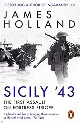
The first is James Holland’s Sicily ’43. Mr Holland seems to be one of the most popular British historians of WW2 at the moment, but this is the first of his books that I have read. I am impressed. This is how history should be written for general consumption. Wargamers will find that it lacks detail, but it should offer inspiration for further research – or may put them off trying to recreate the combats on the tabletop altogether – more of that later.
The 38 day battle for Sicily (starting from the date of the invasion itself rather than the pre-campaign, as the cover of the other book does) has been somewhat neglected by historians – along with the rest of the subjects of my 1943 project. In between the battles of the Western Desert 1940 to 1942, and Normandy and north west Europe 1944 to 1945, and the Russian Front 1941 to 1945, Tunisia, Sicily ad Italy don’t get much of a look-in. Inasmuch as historians have dealt with it, they have tended to be very critical of the Allied command. They have suggested they were too cautious, and should not have let so many Germans and their equipment get out at the end. Mr Holland seeks to set the record straight.
In this he is mainly convincing. Only on one issue do I think he needed to say more – could the Allies have succeeded with a smaller invasion launched earlier? The Axis defence was in disarray at the start of the attack, and things would have been even worse if the attack had been conducted earlier. The key is the Etna area in the north east. This was very easy to defend, and the Germans managed to do so successfully with reinforcements sent in shortly after the invasion started – and most of all with airborne troops. The Allies would have had to get there very quickly to head this off, across terrain that made movement difficult. It probably was too risky, at a time when the Allies did not want defeats – but it would have been worth exploring this a bit more by looking at the resources available to both sides. Incidentally one of the interesting aspects of Sicily was the use of airborne forces. Theses were an innovation for both Allied powers, who learnt the hard way the difficulties of inserting them directly into enemy territory. There were disasters, especially for the British glider troops, and the shooting down of many American transports by friendly fire by the navy. The Germans showed that they had learned the lesson by using airborne forces for a rapid insertion behind their own lines, mostly landing the troops in airfields. It turned a rout into a hard-fought battle which bought time and cost the Allies many casualties.
Mr Holland’s style is to range from the top command to the front line, not neglecting the experience of civilians caught in the middle. He looks at all participants sympathetically – this is the best way to draw out telling insights. Too many histories just look at one participant (based on the sources most readily accessible to the author); this can be good for drama, but not so much for understanding what was happening and why. Another mistake is historians being too eager to criticise the decisions of participants. My rule of thumb when doing historical analysis (which I developed as a history student) is that unless you understand how you yourself could have taken a decision, especially a bad one, you have not understood why it was taken. That requires a sympathetic approach. It also makes more enjoyable reading – though that may just be down to my personal taste. Mr Holland scores well on both counts. It is fluently written too, another plus in an era when history writing is often badly edited. I found some clichés, such as the frequent use of “to say the least”, a bit annoying, but that’s small stuff.
The second book, which is shorter, and which I read first, is not so well-written: Eagles over Husky by Alexander Fitzgerald-Black. It concentrates on the air campaign, and plays to my increasing interest in the use of air power in support of military campaigns. It too seeks to set the record straight – as a number of authors criticised the Allied air effort in the campaign. The air forces were accused of fighting a private war and not supporting the armies well enough, and then letting the Germans get away at Messina. Mr Fitzgerald-Black has little difficulty in putting the counter-arguments. For my taste he overdoes it; Mr Holland comes to the same conclusions, but with much less argument. Mr Hamilton-Black feels it is necessary to take apart the criticism line by line, showing how it is not based on facts. This is a bit tiring for readers like me, as it just seems to give air time to nonsense.
That’s my only real criticism of this work though. It draws heavily from sources on all sides to give a convincing picture. Like Mr Holland he combines a strong strategic narrative with many vignettes of the action. He makes an interesting case that the Allies forced the Germans to make a similar commitment of resources to this theatre as the eastern front (while Kursk was going on) and the north (where the Allied strategic bombing had got going), but suffered vastly more losses than in either other theatre. The campaign was an important step in the breaking of the Luftwaffe across the whole continent. Perhaps that argument can be challenged – but I’m not the person to do it!
So what is in the Sicilian campaign for wargamers? There is quite a bit of interest at a strategic level – but his can only really be tackled in a board game (which I think has been done). A Rommel-style grand-tactical game may be feasible, most easily for the Axis counterattack against the Americans at Gela, where you even get to use a unit of Tigers. (Incidentally Tigers proved hard to use in the difficult terrain and primitive roads – they mostly broke down through being over-worked). The early battles are pretty unsatisfactory from a gaming point of view though, one or two episodes excepted. The defence was very disorganised; the Italians have little stomach for a fight, and the Germans lacked decent leadership; the main challenge for the Allies (and it was considerable) was logistics. Later the fighting got much tougher; a Rommel game would encounter the sorts of problems with mountain warfare that I described for Longstop Hill in Tunisia.
Tactical gaming is more promising, but a bit limited in a different way. There are a lot of important clashes at company and even platoon level, as it was hard to deploy larger formations in the terrain. The problem for the Allies was crossing open (but rough) terrain which exposed their troops to concealed weapons and indirect fire, while canalising them onto mined roads. Their trump card was plentiful artillery and air power. I don’t think this makes for a great tabletop game. There is much less of the Normandy-style fighting in close terrain. Still you can create a game with orchards, olive groves, farms and villages. It should really involve hills and rocks too. A battle for a hilltop village could be visually very attractive, if much harder to recreate than a bit of bocage country. You get to use German paratroops too.
As for air power the key is finding a game where the player chooses between air superiority, interdiction and close support – out of scope for a tactical game, but a possibility in an expanded Rommel-style game perhaps. Air superiority was settled very quickly though.
I have not settled on rules for my 1943 project. I have just bought a second-hand copy of Chain of Command, and this looks very promising. There are other good systems for one-to-one games (Battlegroup and I ain’t been shot Mum) which I’m a bit less convinced about. Rommel also looks quite exciting – but hard to use out of the box in this theatre. I would like something in between – Rapid Fire! and Fistful of TOWs nominally fill that space, but I’m not that happy with either. The long journey continues.