After a productive summer, holidays and the rest of life intruded, and my build-up of forces for 1943 halted. Apart from buying a few more things to make up later; I now have a mountain of plastic, resin and metal. My next project was a German infantry platoon.
This unit needs to be reasonably generic for Sicily and Italy and perhaps Tunisia, and mainly to serve as panzer grenadiers. The first question was which figures to use? I am in love with at AB range, but their Germans are really meant for further north, in standard uniform. I don’t have many pictures of German infantry in Italy for the period though. I did look at alternative figures from SHQ, and didn’t like them as much as the ABs. I decided that a paint job on the AB figures would do. At a distance the tropical and summer uniforms mainly used by these troops resemble the standard uniform. There should be troops in shirtsleeves, and more caps, perhaps, but less so in Salerno theatre which is the centre of my planning.
My platoon consists of three sections of eight men including an MG34 (or MG42) team, and an HQ section of 5 plus a radio operator, and two teams of tripod machine guns and 81mm mortars for support. No panzerfaust or panzerschrek , as these belong later in the war – though I need to have these as a gaming option later. I had already painted up the mortar teams in the early pathfinder stage of my project. The support weapons, of course, should cover a whole company – but I want to have tabletop options. My thinking is to do a second platoon of paratroops later – as these played a prominent role in the campaigns I am representing. But not until I have made some big inroads into my plastic mountain.
And so how to do the colour scheme? I’m not used to painting WW2 anything, still less German infantry. And I’m making life harder still by mixing my own colours from artists’ pigments. I can’t use the paint-by-numbers guides published by various sources based on commercially sold micro-shades. Add to that the lack of photos as reference sources and the project is quite intimidating. This undoubtedly affected the end result, which no doubt can be pulled apart by an expert. The Germans of this era had long since dropped the early war smart uniformity. They cobbled together their “uniforms” from multiple sources, and personalised where they could. This says something quite important about German military culture, a hugely successful one it must be said, which went against the alternative military idea that compromise on smart uniforms would lead to breakdown of discipline. I am reminded of a quote about Wellington about not caring about the state of his troops’ uniforms as long they kept their weapons clean. There seem to be three main sources for infantry uniforms in this theatre. The most important was the olive tropical uniform (used in north Africa); there was also the standard field grey uniform (a greyish green at the start of the war, becoming muddier as the war progressed); and then there was the reed green summer uniform (a dark greenish grey). The olive and reed green uniforms were cotton, which does not hold dyes well (think jeans), and the uniforms were subject to a lot of sun-bleaching too. So these rapidly faded to something much lighter, almost chino-like in many cases – something modern artists seem reluctant to represent. In addition there was some camouflage cloth in use for helmet covers and smocks. The helmets were often repainted locally, and often seem to be quite light – I suspect the standard equipment dunkelgelb was used, alongside olive and grey. All this is quite confusing, and I have no clear mental picture of what I am aiming at.
I decided on a three colour palette plus white, with silver for some of the metal. The colours were yellow ochre (actually Liquitex yellow oxide), Venetian red and Prussian blue. In my pathfinder batch (the mortars and some anti-tank gun crews in smocks) I used yellow ochre, but experimented with purple, black, green and a dark orange. What I discovered was that using bright organic pigments (the purple and the orange) was quite hard when aiming for the dull colours of WW2 military uniforms and equipment. Best to start with something duller. The Venetian red is an old Windsor and Newton pigment, in a tube with a deteriorating cap (not like my preferred Liquitex, whose tubes last forever) – but I have found it a very useful pigment; burnt sienna would probably be just as good, as no strong red pigments are needed (except for the mortar bombs, which I had already done). I used artists’ colours throughout, rather than trying cheaper student colours, as I did (successfully) for the tanks, on account of the amount of fine work. I mixed quite a decent quantity of a base coat, not dissimilar to dunkelgelb which the all the miniatures got (after priming in white). This was mainly yellow ochre and white, but with red and blue added to dull down. Other colours were reached either by taking some of this mix and tweaking it, or mixing from scratch. This is a fairly decent modus operandi – though it is much easier to mix greys and blacks if you have two complementary colours in the palette – such as blue and orange/brown, or green and red. Purple is a complement to yellow, but my dioxazine purple is very bright and quite hard to use – though it does produce a beautiful dark yellow when mixed with yellow ochre, I just can’t get a properly neutral grey/black. Hence I had to use my red and blue in combination to neutralise it, which can be tricky to balance. I could have brought a brown like raw umber into the palette, which complements the Prussian blue well, but I wanted to see how easy it was to keep the colour palette down to just three. My thinking is that the fewer pigments I play with, the easier it will be to reproduce in later batches (one reason which I am recording so much in this blog!).
After the base coat, the jackets, trousers and helmets were painted in different variations of grey-green, olive and dark yellow – all mixed in with liberal amounts of white. The straps were painted light brown, rather than the black used further north, but ammunition pouches and other bits were dark grey. Other bits of equipment were loosely based on Osprey illustrations, but not with a great deal of confidence. I mixed a bit of silver into grey for the metal bits. I painted camouflage covers for some of the helmets, as I had for my anti-tank gun crews; I used the Italian three-colour scheme (olive green, chestnut and dark yellow). Large amounts of Italian camouflage cloth was appropriated by the Germans, though it probably didn’t come into large scale use until later in the war – it is relatively easy to replicate. I will attempt the rather more complex German patterns for my paratroops. I added a small length of fine fuse wire for the aerial on the radio set in the HQ section (I don’t think infantry platoons usually had radios – but these are meant to be panzer grenadiers, where that was surely more likely).
After the painting, a light dry-brush with a dusty colour. I used the white and raw umber mix I used for the bases for this (in student paint), with a little extra white and the dark yellow base colour. I am getting a bit less heavy-handed with this – but the boots certainly need it, and I think it softens the colour blocks. After that Quickshade soft tone. All this took two weeks elapsed time – though if I had been less interrupted I could have got it done in a week. My Stay-Wet palette worked really well this time, after being not all that satisfactory in the summer. This kept the larger quantities of mixed paint fresh. It’s a bit cooler now – plus also I was careful to make sure that the original water reservoir was well-loaded.
After the Quickshade had hardened I flocked the bases. The bases were mainly “steel” washers (sold as such, but they turned out not to be magnetic) and mount board cut in rectangles for the multiple figure bases (the machine guns). These were covered in a mix of sand, paint (raw umber and white), and impasto gel, applied at the same time the figures were glued on. The flock is from Woodland Scenics – a mix of Earth blended turf and yellow grass fine turf, plus some longer grass on some of the bases, though this is coming out rather matted. I find these materials bond to the bases rather well – the matt varnish seal sprayed on at the end is all that’s needed to seal it. Other products leave a trail of specks when handled, unless you seal them in properly with a soaking of water and PVA glue.
And here we are. The first group are from AB’s prone infantry, though I left one of them out by accident.  Next comes the HQ section from various AB sets, alongside one of my Pz IIIs.
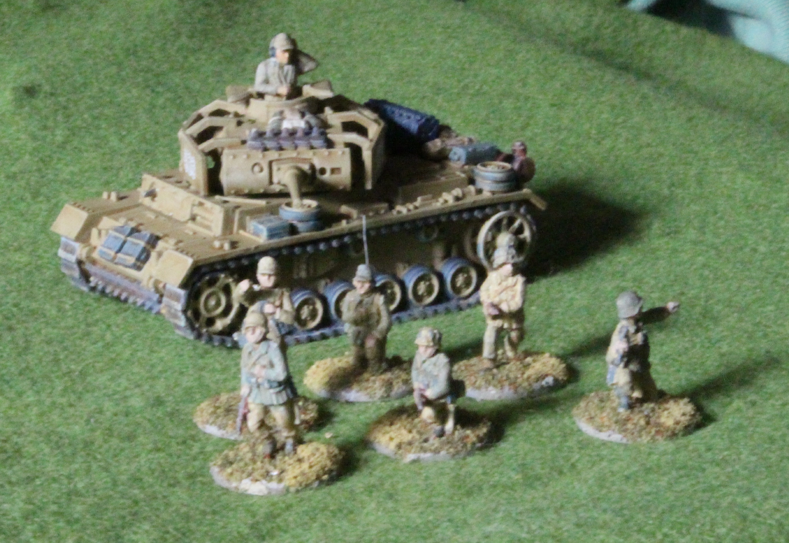 Next are a section based on the AB advancing skirmishing set:
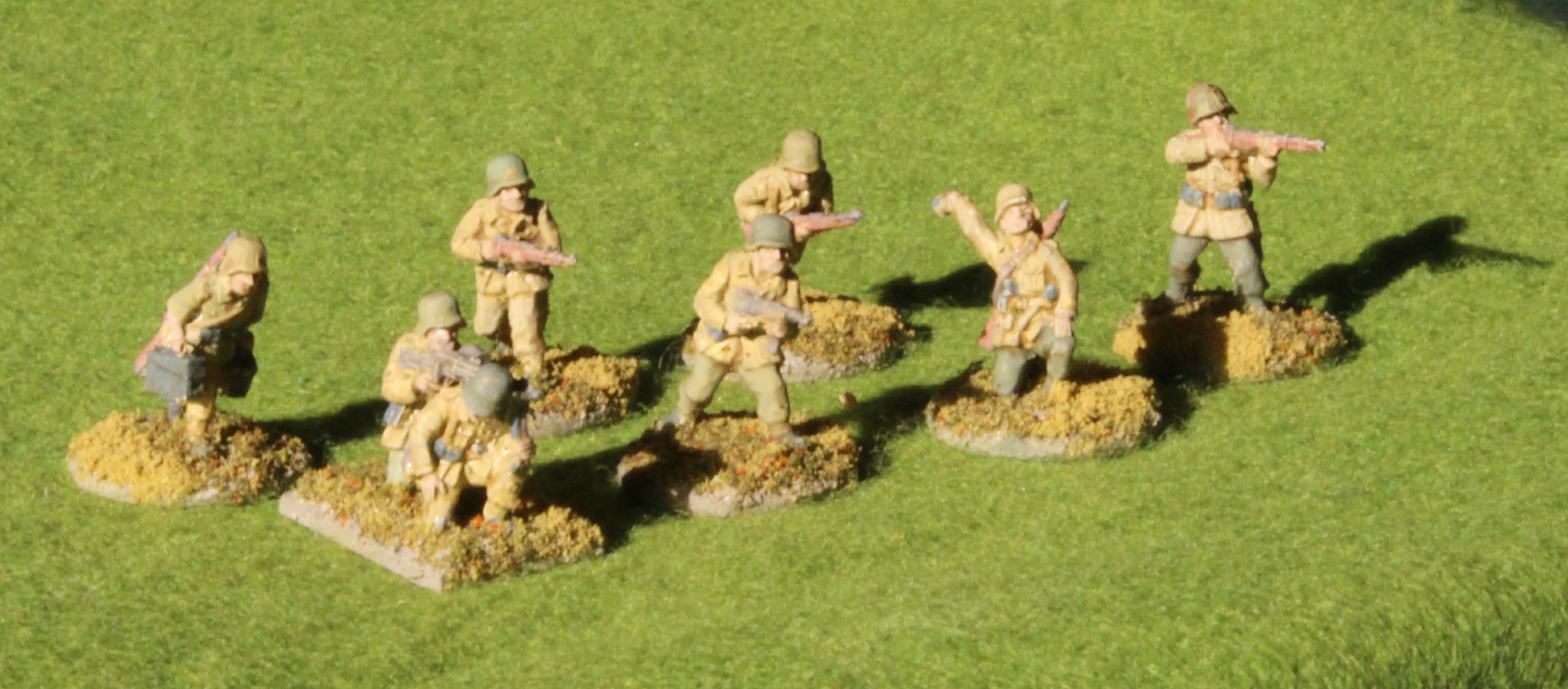 Now the advancing cautiously set:
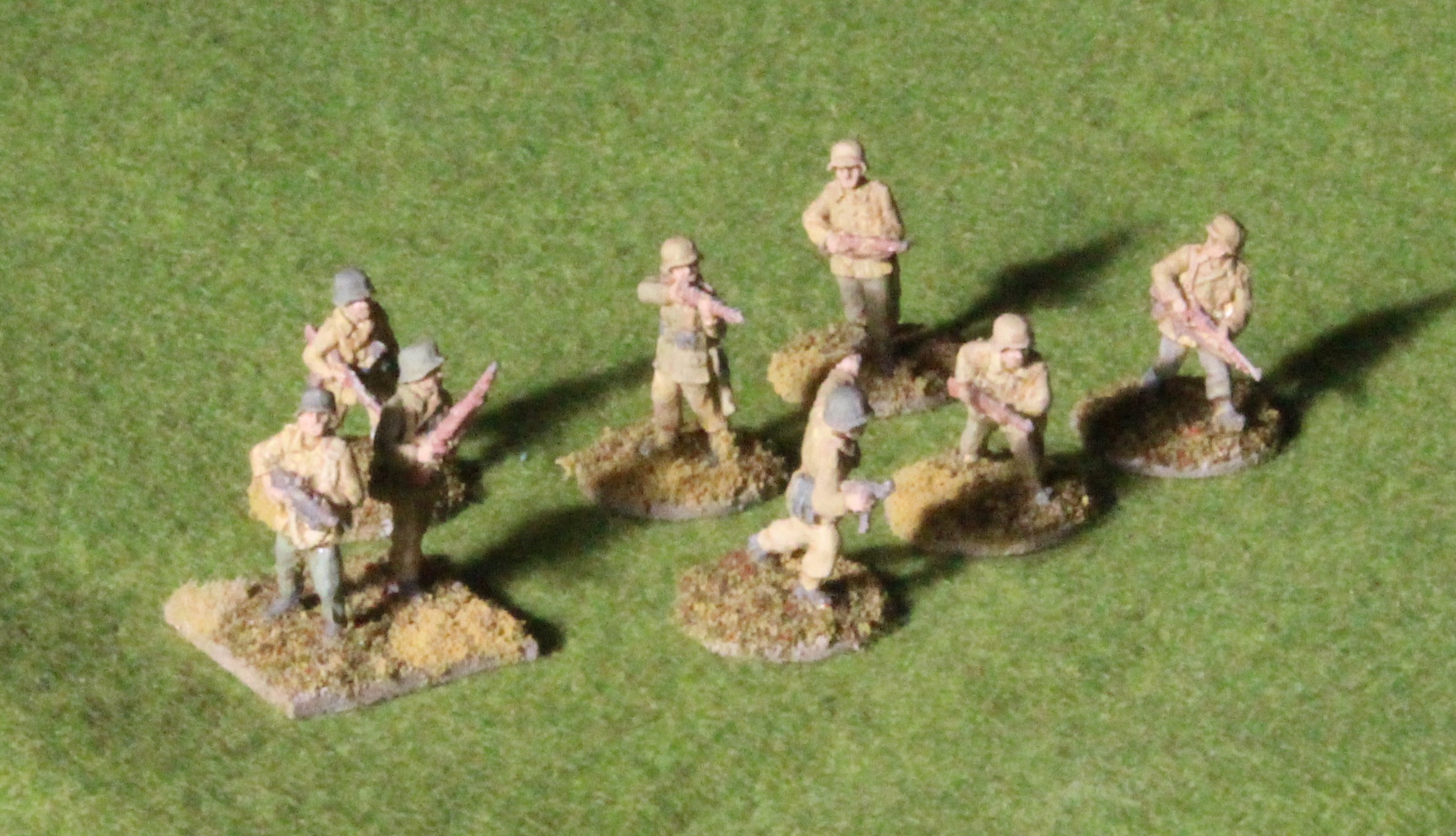 The tripos machine guns:
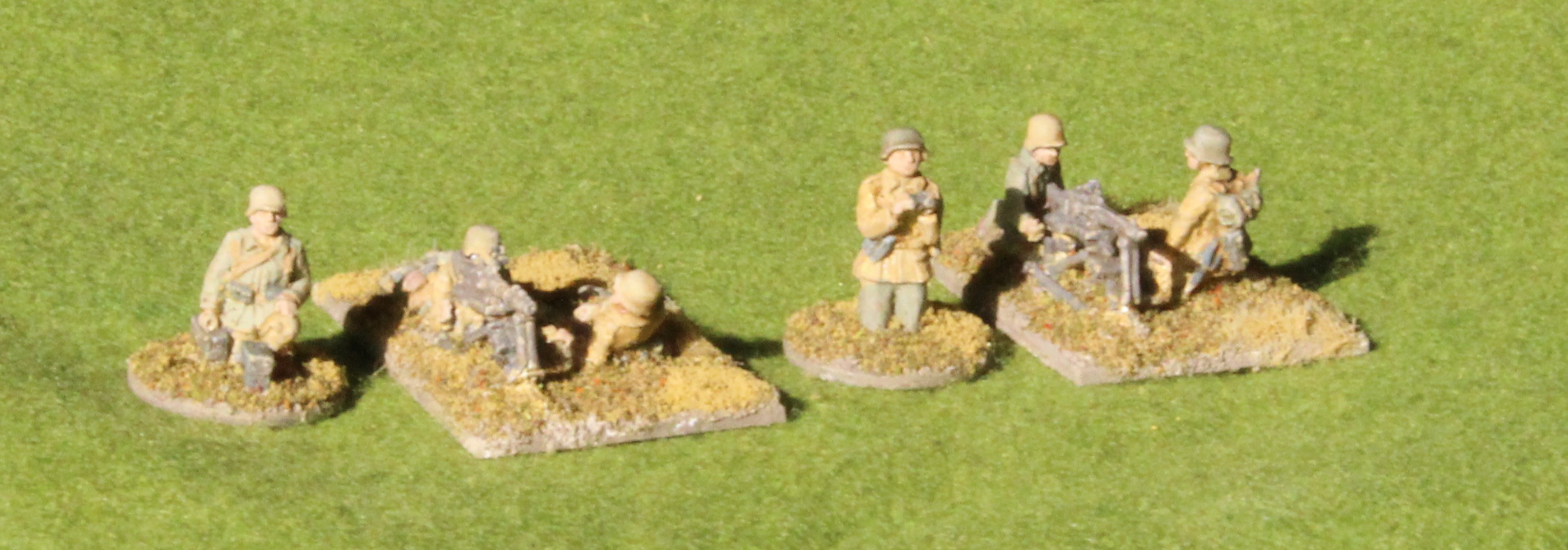 And finally the mortars, painted earlier:
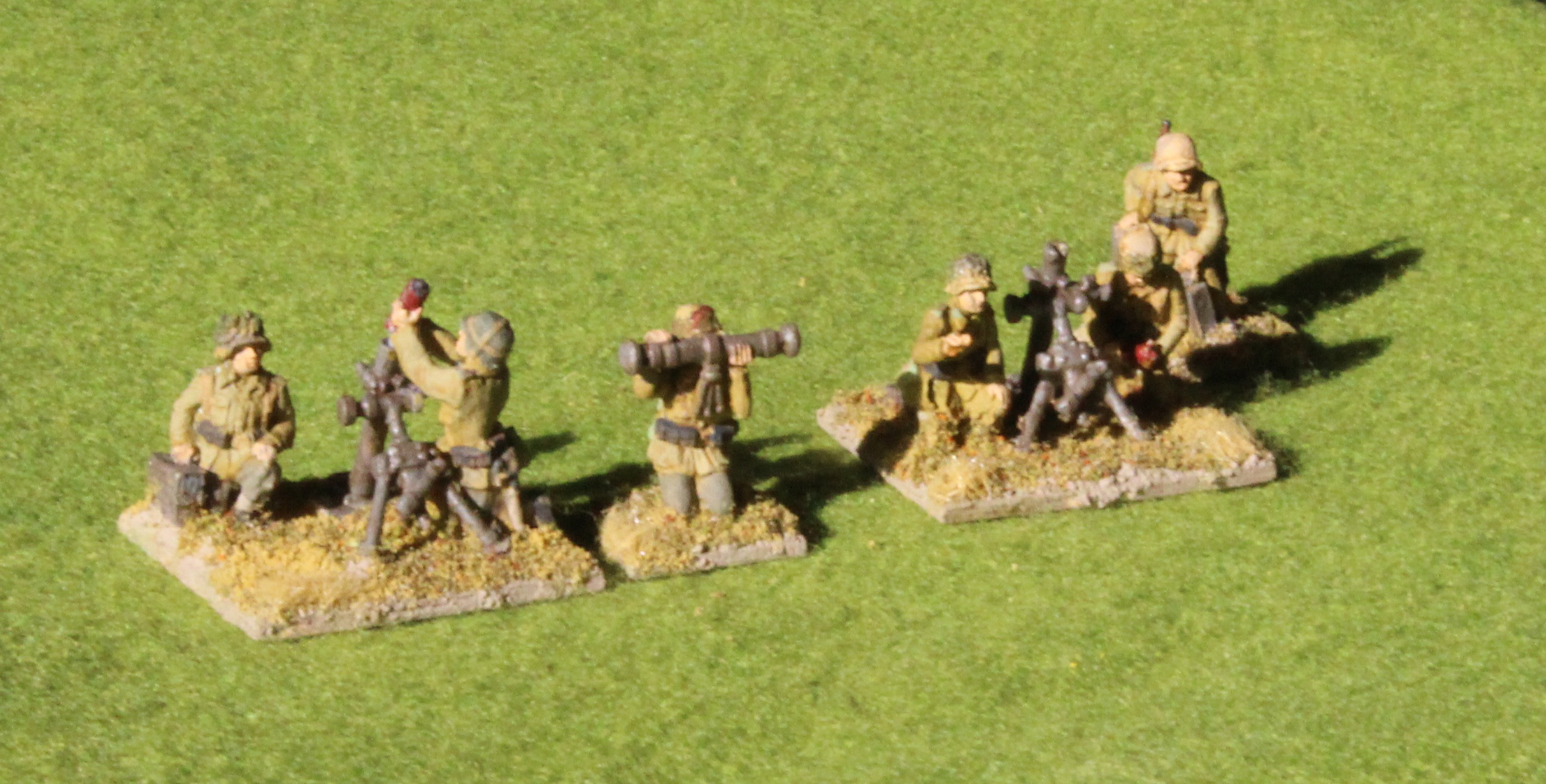
No terribly good pictures I’m afraid – I have more to learn about taking pictures of miniatures; this was my second attempt. It is interesting to note the effect of sunlight on the colours – it was all natural light though.
Verdict? They’ll do fine, but I don’t think I’ve quite hit the spot. The brushwork isn’t that brilliant – but then I didn’t want to take ages over them; I don’t think that’s the worry. They just don’t look very German! I may have overdone the very bleached clothing too. The trouble is that I don’t really have enough idea about what I’m aiming at.
Leave a Reply