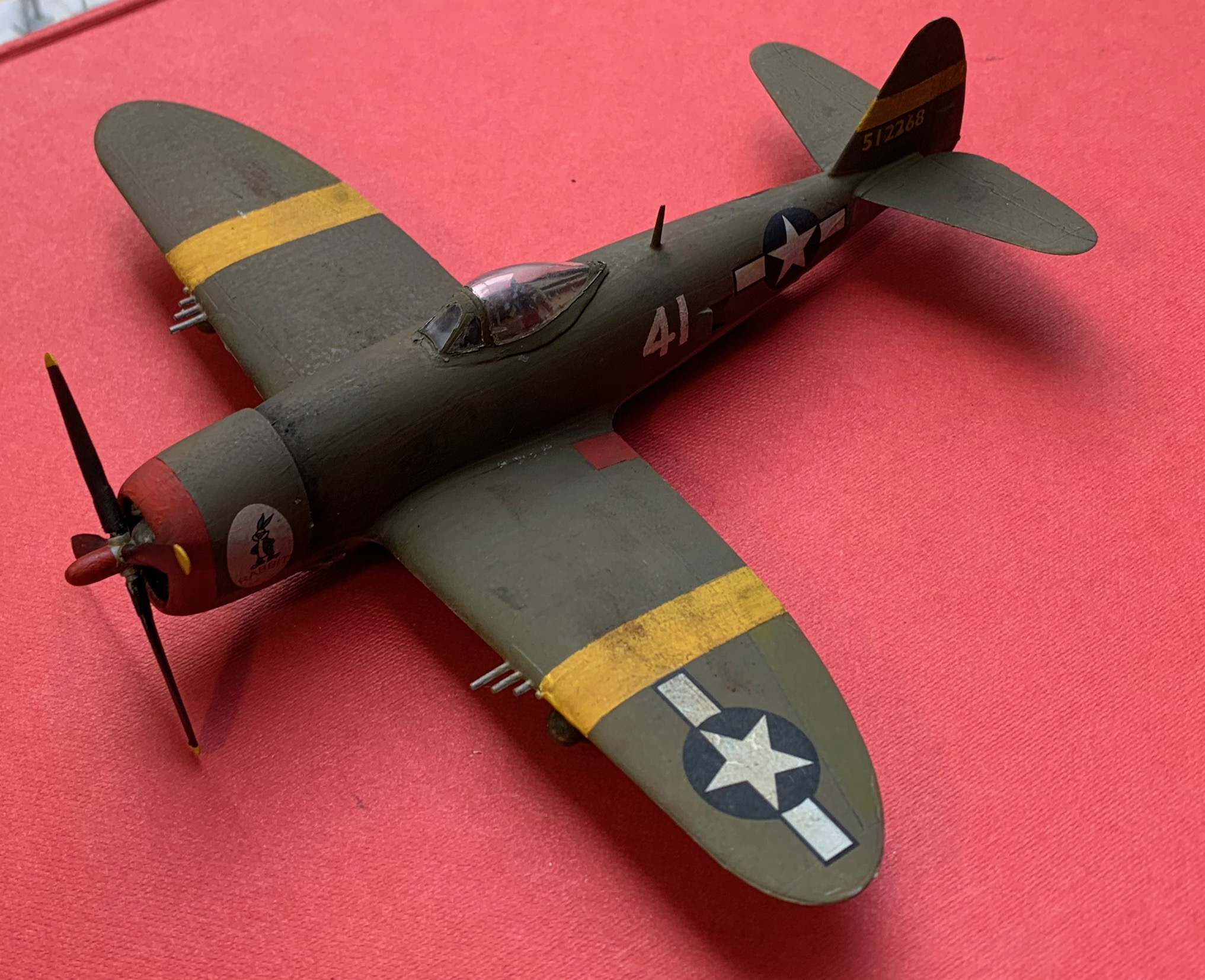
Readers familiar with my blogs may have noticed an omission from previous post on the P-47. I didn’t say anything about the paint colours. And I’m usually a bit obsessive about that. A lot of hobbyists are, but I take it in an unusual direction because I mix my own paints from artists’ pigments, separately for each project. I left the topic out because I had too much to say. It needed another post, which readers less obsessed with colours can skip, and this is it.
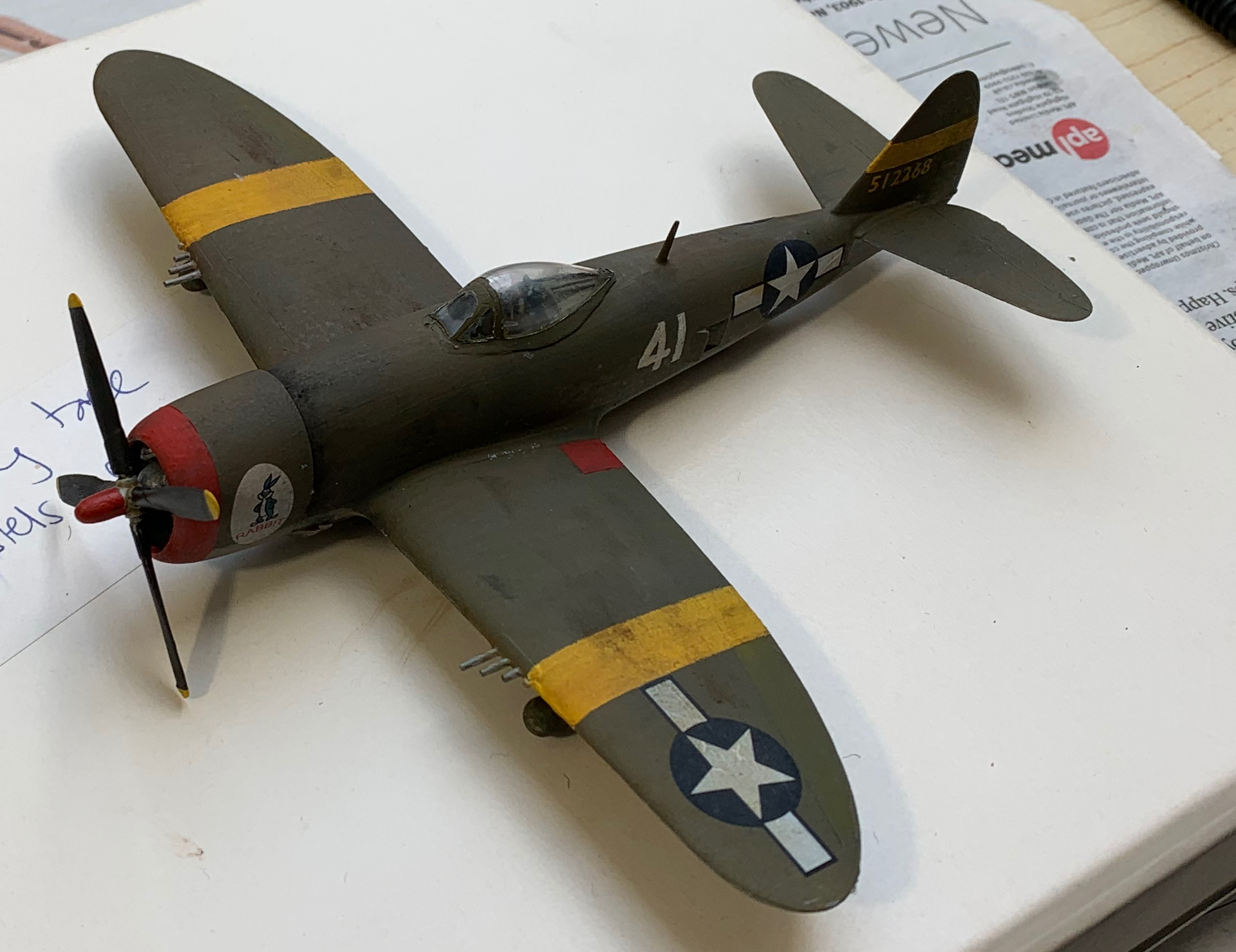
The predominant colour on this model is, of course, Olive Drab. The underside colour is Neutral Grey, a mix of black and white, the main question around which is how light it should be. I based my colour on an old artists’ Liquitex Neutral Grey I had lying around; if it hadn’t been there I would have mixed Mars Black and Titanium White. The Liquitex colour is probably 50:50 and turned out to be a bit dark, so I added some white to it. From photos I suspect that the USAAF grey is a bit darker than it is portrayed by most artists, as the tonal contrast between it and Olive Drab isn’t that great. But I went quite pale nevertheless; white with everything is my standard practice for miniatures painting after all. Other colours are yellow for the stripes and red for the nose. My main concern with these was to make them bright but not too bright. For the red I recycled some red from my previous project (French Napoleonic cavalry) that was still wet on the palette, though I found myself tweaking it a bit. Yellow is a bit of problem because pigments tend to be bodiless and thin. I like to use Yellow Ochre or Yellow Oxide (the Liquitex name, but much the same thing), as this is the best behaved, but it is a bit dull, do I used some of my other yellow pigments. First an old yellow (can’t remember the name, but its not on sale any more) that was horrid and thin, and then Cadmium Yellow that was better. A little white was in there of course. But the result was still thin. I painted the stripes (with a brush over masking tape) over the Olive Drab and Neutral Grey, which had been airbrushed on. I started with an undercoat of white, but it still took at least three coats of the yellow mix to get anything satisfactory. Maybe next time (the yellow stripes will probably feature on my A-36 too) I will paint them first and mask before airbrushing the main colours.
But the big interest is the Olive Drab. This was the standard US military colour, developed in WW1 and used on both vehicles and aircraft in WW2. It is a notoriously tricky colour to pin down. The US authorities were very pragmatic on colour standards, and did not care greatly whether the colour precisely matched the standard, and it weathered quite dramatically. The official formulation changed slightly from time to time, and eventually the Army and USAAF went for slightly different definitions. Different companies used different pigment combinations (and doubtless changed these over time), so even the weathering varied a great deal. The colour could vary a great deal across the same aircraft, depending on when that particular part was painted. Probably no two vehicles or planes were the same colour (apparently like modern Israeli tanks), because in wartime this just didn’t matter. This causes hobbyists – wargamers, modellers, collectors or re-enactors – a lot of angst. Modellers like their premixed paints, and often ask which one to use, to which the answer has to be a shrug; “several” is to them the wrong answer. Collectors either paint with something like the as-new shade (doubtless in a modern paint that is much more colour-fast than the old ones) or make up a lighter shade to simulate what they think it might have looked like in the field, but which tends to look too fresh and new.
Meanwhile we have not so much evidence for what planes and vehicles actually looked like. Colour photography wasn’t prevalent, and not especially accurate on colour either; colourised photos, increasingly popular, are just an interpretation. And as with all dull colours in the middle of the colour wheel, small differences to colour sensitivity and lighting can make a big difference to how it looks to the human eye. This website (gmodelart.com) has a number of interesting pictures of aircraft, though (leading with one of a crashed P-47 in very similar scheme to my model), which shows how much variation there might be, even on the same plane.
So what colour is it? “Pig crap” is an early description of the dark, freshly painted version. Olive is just on the green side of yellow on the colour wheel, but the “drab” takes it a long way towards the middle, meaning that it is quite brown. To date I have tried simulating it with a mix of three pigments: Yellow Oxide (i.e. Yellow Ochre), Black and White. I have assumed the standard way of making it was combining yellow ochre with black, as these were two cheap pigments – just as the French did in the Napoleonic wars to make the olive green they used for artillery woodwork. Here is a picture of the sorts of result yI get:
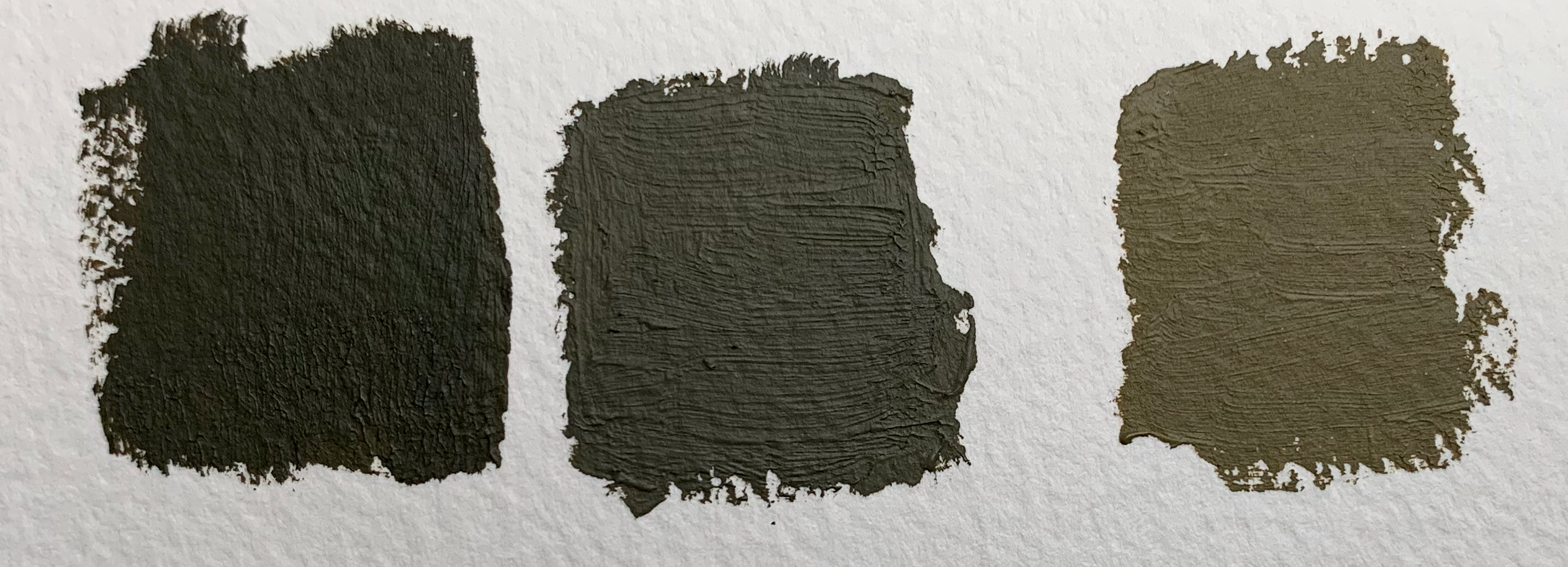
On the left you have just black and yellow; this is as close as I could get in tone to the colour swatch I have, which show the colour as new. In fact the swatches were slightly greener – but more yellow would have made it a bit too light I though. Fresh Olive Drab is a very dark colour, something that caused me consternation when I applied authentic Humbrols too my models back in the day. Next has a bit of white and a bit more yellow (I was assuming that the black would fade faster than the yellow); it turns into something a bit greener. On the right I have mixed the yellow with Neutral Grey to give something lighter and browner. My model is painted in something between the right hand and centre pictures. If nothing else this exercise shows how challenging photography is in representing colour; they all look darker than they “really” are.
As another exercise in demonstrating the perils of photography: the following show the effects of different backgrounds. The red in particular makes the model look browner, while the green makes it look greener. I don’t really understand that!. The lighting conditions were slightly different for this photo than the other three though.
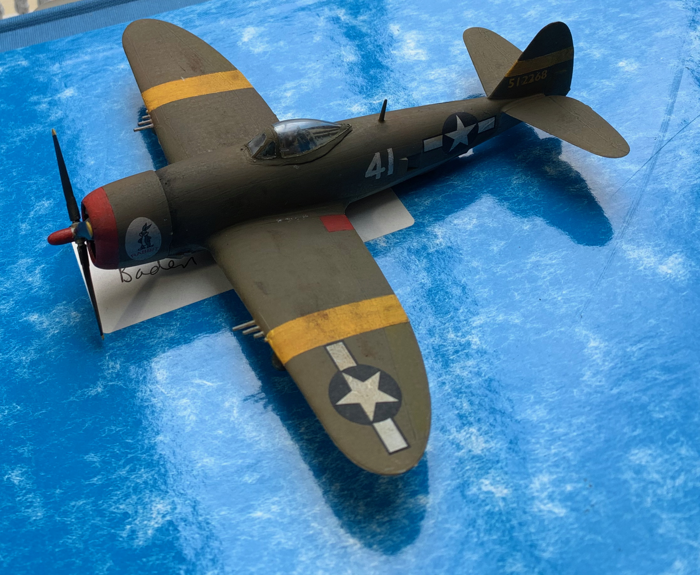
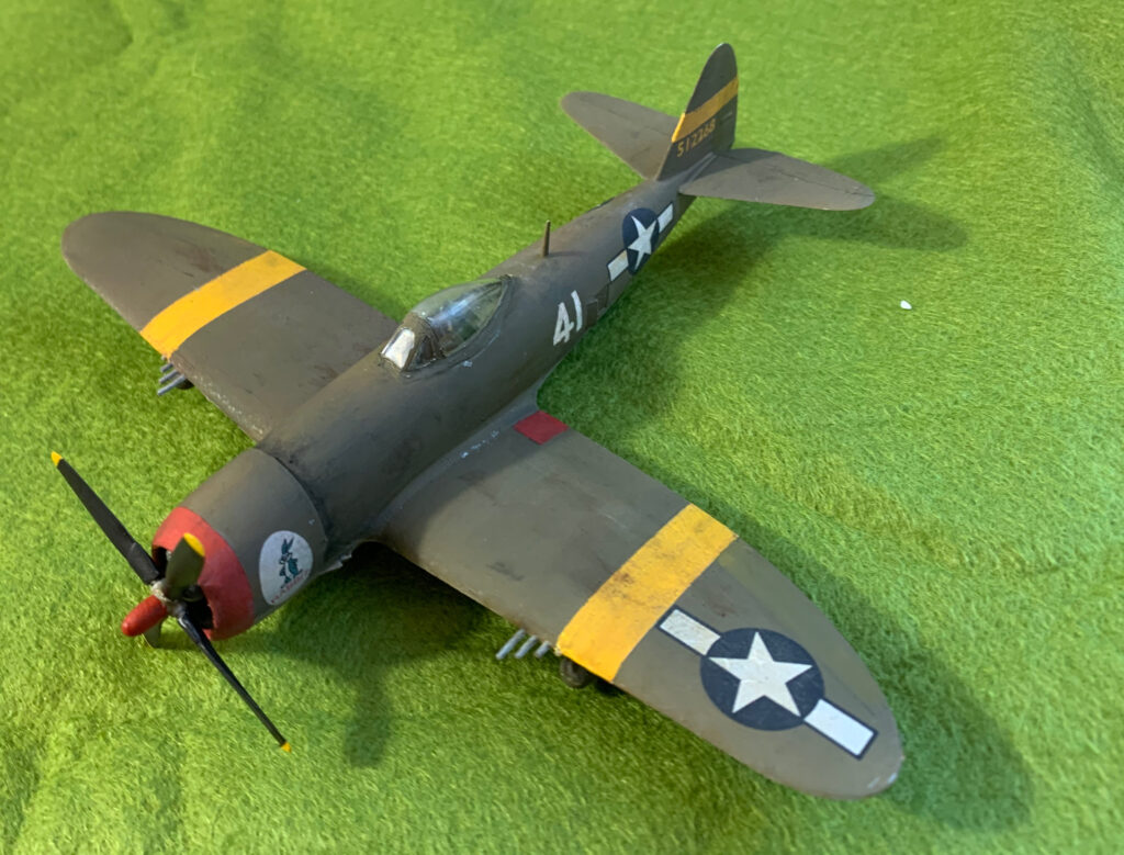

Comparing these photos with the ones on gmodelart.com and my model is in the right zone, but looks a bit dark; it seems closest to the new Liberator bombers. But all the photos were taken in bright sunlight while I took my pictures on an overcast day, with a little artificial light to boost it a bit (and a lot more artificial light for the one against green cloth).
A further thought is that my idea that Olive Drab was often made using yellow ochre and black is probably off the mark. These may have been the appropriate pigments in the pre-industrial age, or even in Europe, where green pigments were in short supply, but 1940s America is another matter. The original formulation of the colour included raw umber, a dark brown. Chrome yellow was a standard primer, used in the interior of aircraft – this is brighter and greener than ochre. The greener hue of the colour swatches suggests it wasn’t ochre-black. It might be worth trying a different formulation, to produce something with a slightly greener hue. On the other hand the black-ochre combination produces a nice, opaque paint that is very easy to apply. A brief attempt to produce something using Raw Umber and Viridian was not nearly as good.
So where next? The issue will return when I do my batch of three US planes. The main issue is not the precise hue, but that fact that the colour is not standard. There should be a bit of variation between the planes and on the same aircraft. It is less of an issue for vehicles, since in 1943 most US vehicles used by the British were repainted. But if I move out into later war or US forces (and I’m thinking of just that in 1/300), the issue will return. This is a problem that will run and run.
Leave a Reply to admin Cancel reply