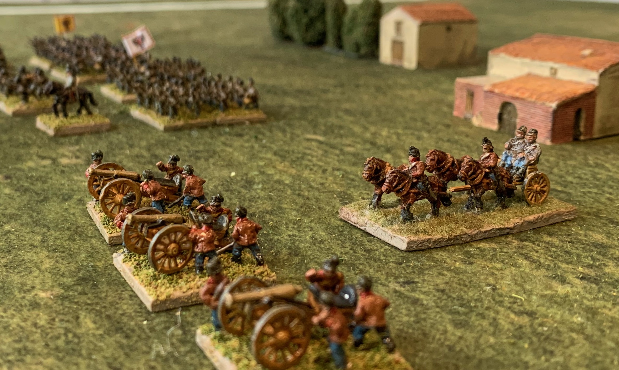
My new 1815 Prussian artillery and limbers – on my new Geek Villain Fields of Glory mat.
Apologies for the long silence on these pages. I’ve been quite busy. In 2025 I’ve had two games of Général d’Armée at the club, one with my figures, and one based in 1800 with a fellow club member. I’ve been working on some new ideas for my WW2 rules, some of which I will apply to other periods. And I’ve been busy painting reinforcements for my 18mm Prussian army for 1813 to 1815. I’ve also revamped this website, though not so sure about how much better it is. Today I am going to describe my new Prussian artillery an d limbers; next time it will be the turn of seven battalions of infantry.
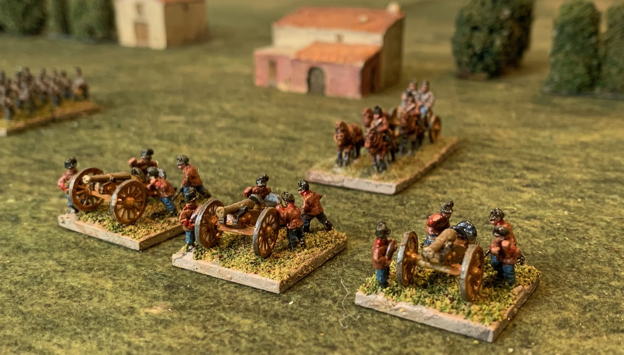
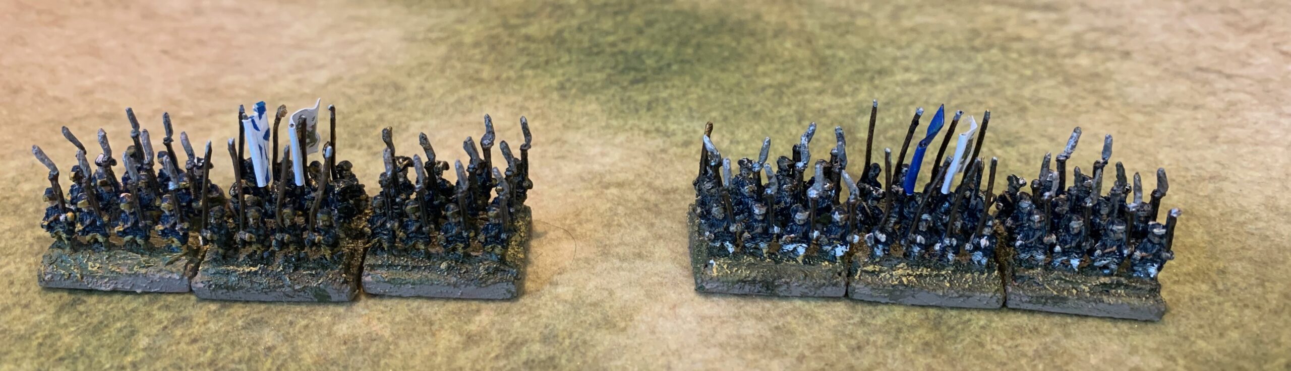
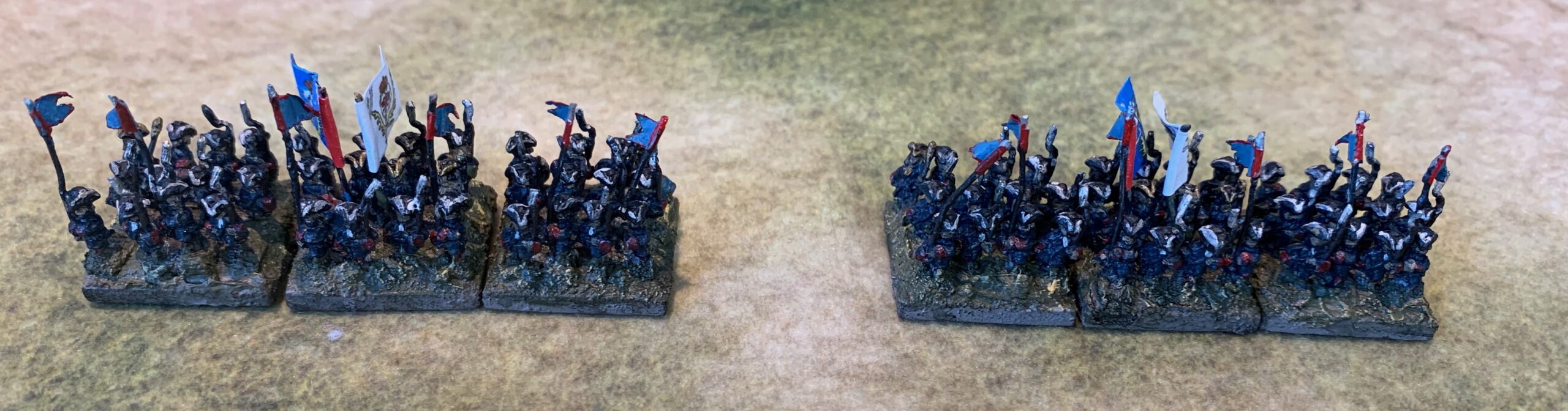
I started with the artillery, not because I had any special need for my GDA2 games, which are not intensive of artillery, but because I had been planning this as part of my Ligny project – for which I will use my own grand-tactical rules – which use a lot more artillery models by comparison. I had gone as far assembling all the figures and models ready to complete this aspect of the project a year ago – but then got distracted. I actually finished this in January, but not got round to photographing the results – I am actually a bit vague about what I did! There are ten bases of deployed artillery – three horse artillery, two heavy artillery, four field artillery and one howitzer. In my system I denote horse artillery with two-figure bases (and the howitzers too), field artillery with three crew figures, and heavy with four. The historical batteries were all the same size – 8 guns. In addition I painted eight limbers – three with two pairs of horses, and the rest with one.
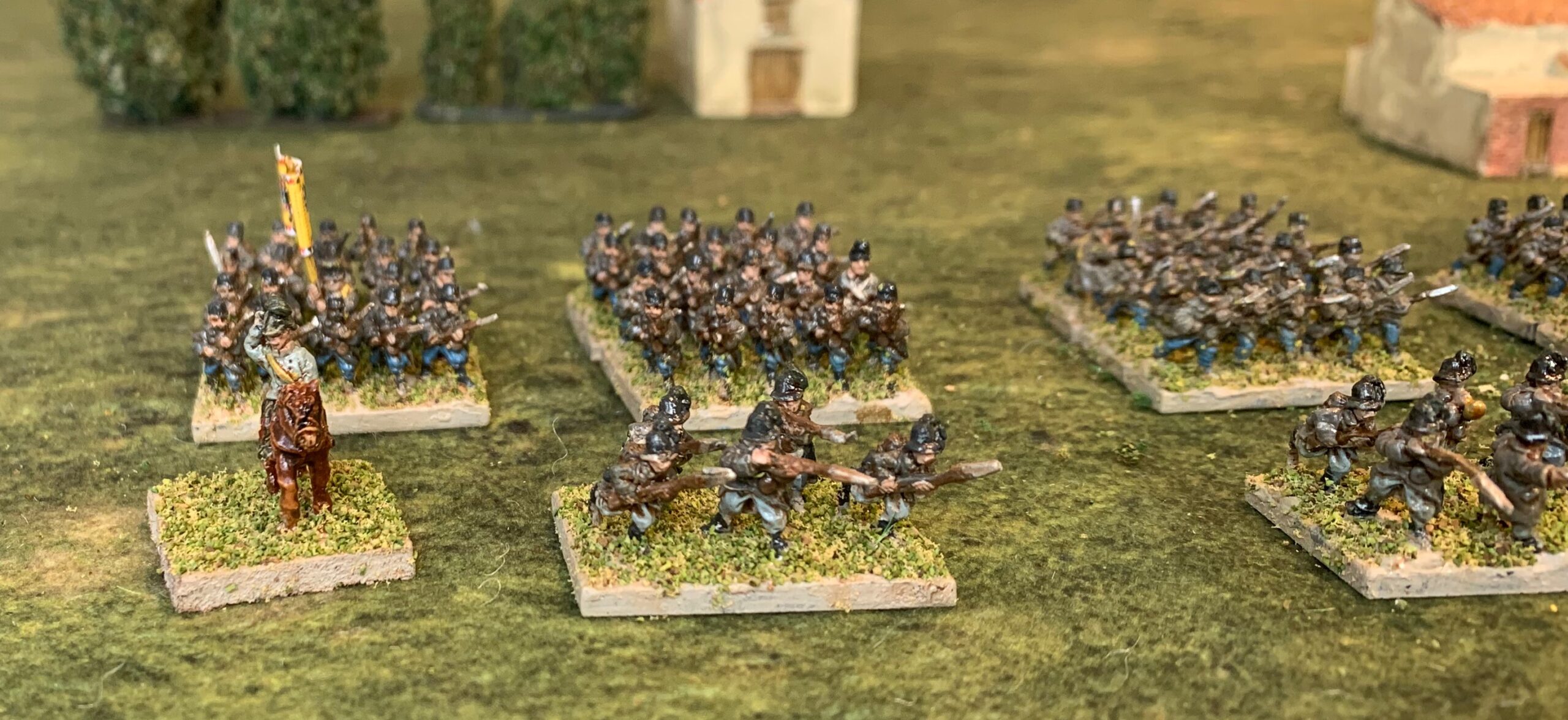
The first image shows the heavies on the left and one of the field batteries on the right. The figures are all AB – much nicer than the Old Glory ones I have been using before. The 12 pdr pieces are also AB; the one on the right (in paler blue) was not painted in this batch, but left over from before. The 6 pdrs are Blue Moon – these are chunkier than the AB ones, and I’m using them for foot artillery. Apparently there was a bit of variation in Prussian artillery in use.
The next picture shows three horse artillery bases (far left, and both on the right) and the howitzer. The base on the left is meant to represent a battery from the Lützow Freikorps , which was still wearing the old uniforms in 1815. These are old Battle Honours Austrians with head swaps from Old Glory Prussians. Nothing very impressive, I have to admit. All the artillery pieces are from AB, with the howitzer in the lighter colours of my earlier batch. Incidentally I replaced the howitzer barrel with one from a Battle Honours Austrian 7pdr howitzer, and the AB one appears to represent the heavy 10-pdr howitzer.
What to say about the techniques used? The bases were cut from some packing plastic that I had lying around, after trouble with cardboard (even mount board) warping on bigger bases. They worked out in the end, but the material is too flexible and not very easy to glue. I needed to fix the magnetic material on the bottom early, and cure on a steel surface to make sure they were flat. In future I will use polystyrene plasticard – more expensive but more reliable. The figures were finished in the fast-drying oil medium I have been using before, with some raw umber mixed in – but the result is a little too glossy for my liking. Next come the limbers:
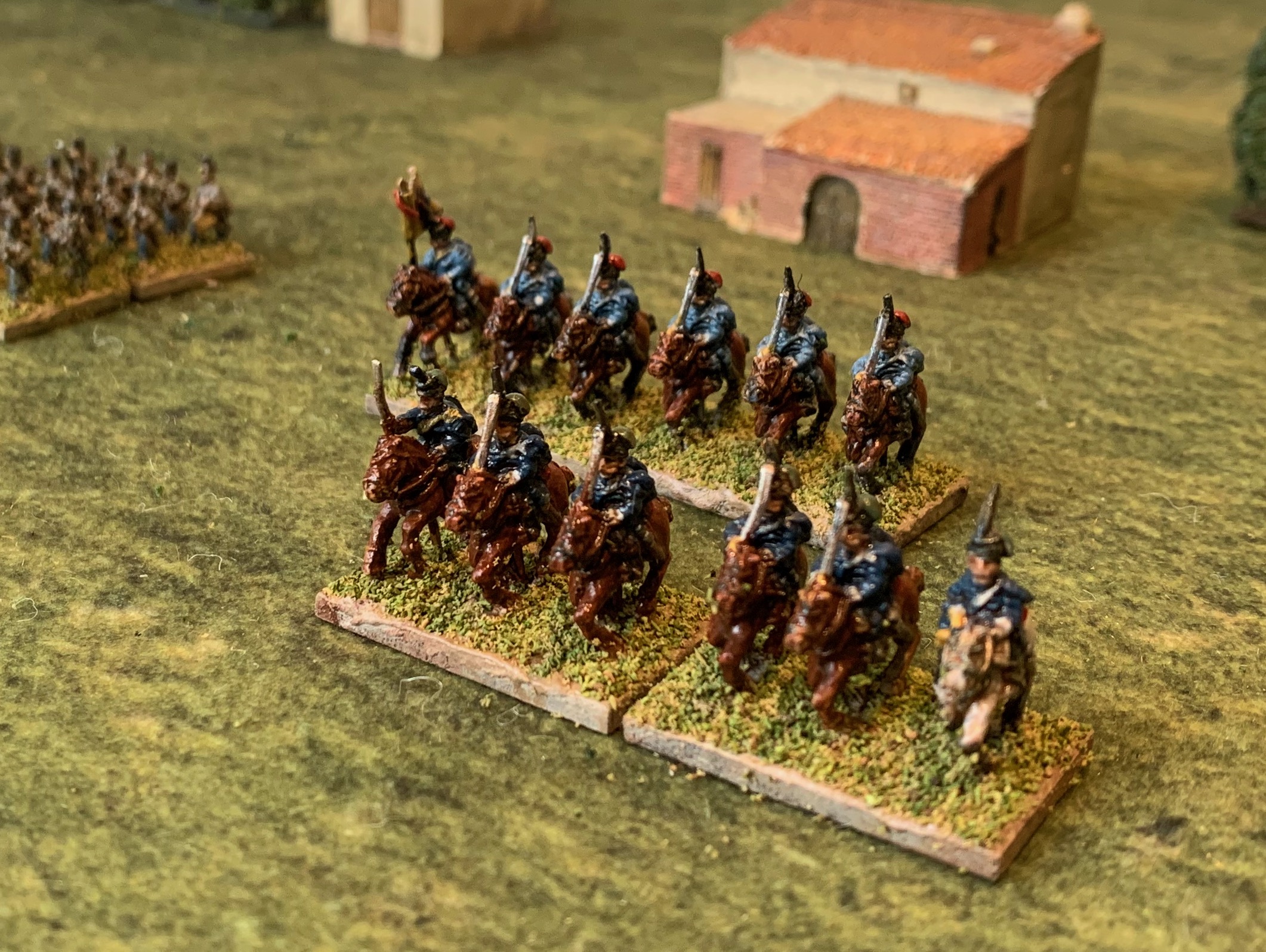
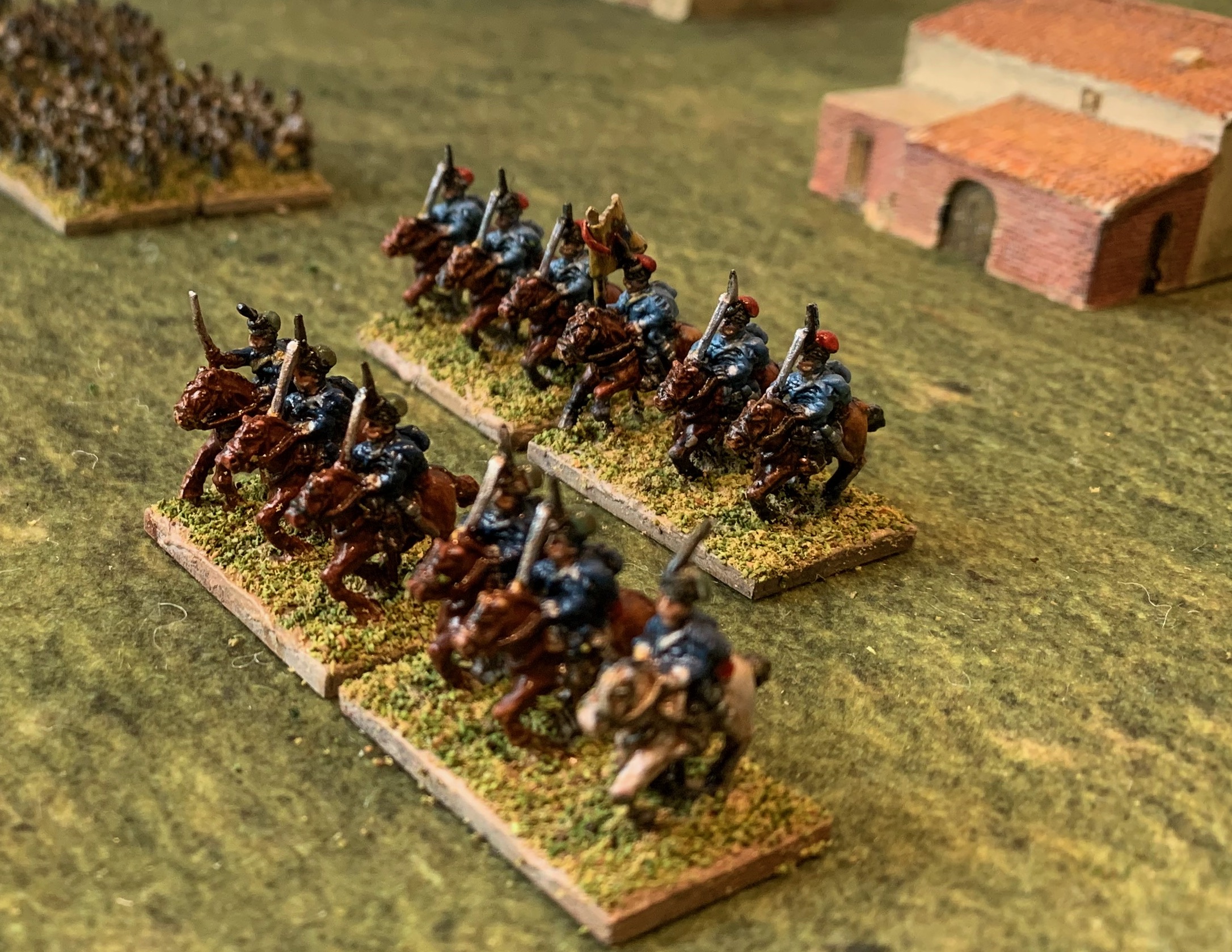
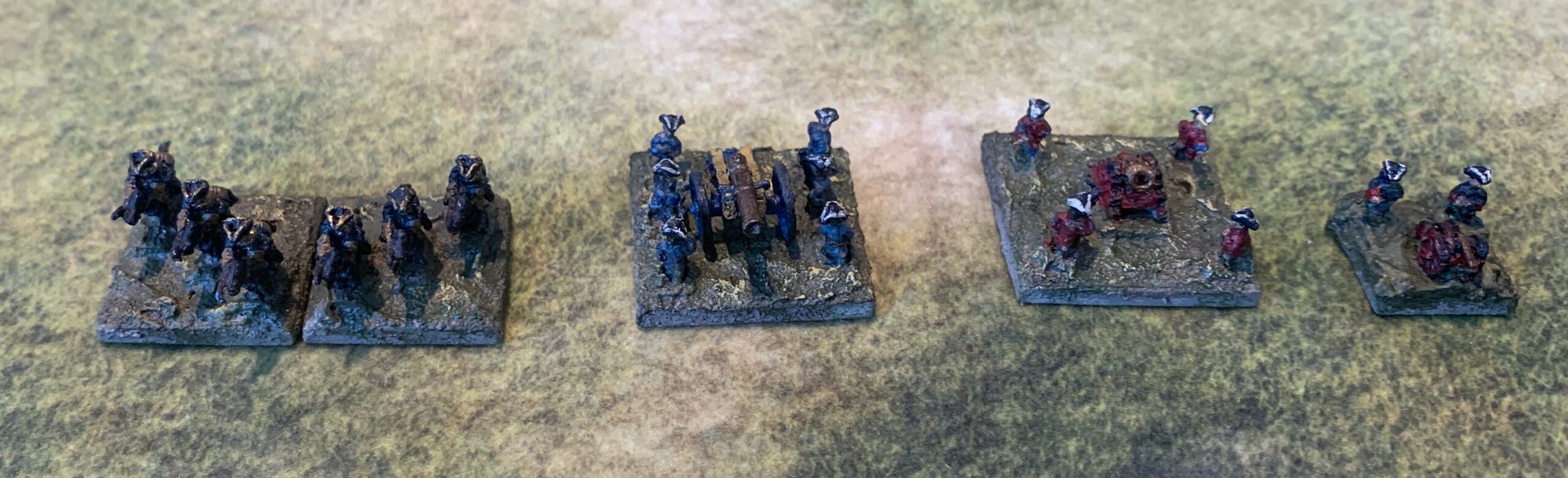
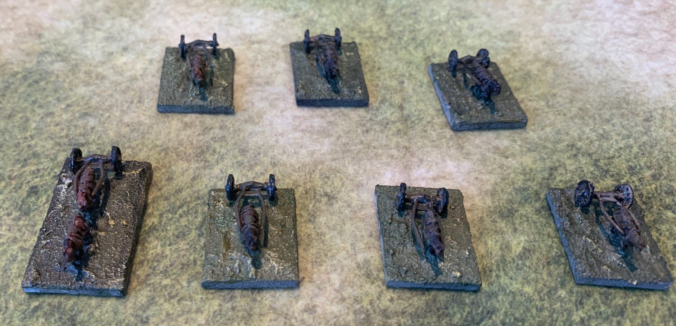
I have used Blue Moon Prussian heavy limbers and limber horses (with riders) for the foot artillery. The two horse artillery limbers – at the left end, are Minifigs – whose more dynamic pose works better for that arm (though I’m not a fan). AB limbers are works of art but fearfully expensive. For bulk buying wargames use Blue Moon are a much better source. If I didn’t have substantial numbers of Minifigs horses and riders already in stock (from more than a decade ago when the choices were more limited) I probably wouldn’t have used them. To date almost all my limbers have been with a single pair of horses (which would only have been used for manoeuvring – two or three pairs was the norm for normal use) – this because I was worried about the table space they would take up. This is not an issue for GDA2 games, so I have introduced a few larger models with two pairs (though without any attempt to represent the tackle).
I tried a new technique for the horses. I built up the colour in thin glazes of acrylic on a white base, using acrylic airbrush matt varnish as the medium. I thought this might give the horses the more luminous quality I have been searching for. It was a lot of faff for not especially striking results. I will be back to oils next time – have picked up one or two ideas from Yarkshire Gamers’ You-Tube tutorial. The horses will need a bit of touching up – in the hurry to finish I forgot the white markings. Looking at the photo I also notice than one horse doesn’t have the tackle painted.
The bases were covered in my usual sand and acrylic medium mix, coloured with white and raw umber for a pale dried mud colour. This is then covered with a mix of flock and sand to give a rather paler green-beige ground that in my earlier efforts: dark bases don’t show the miniatures to best advantage. Though the strong PVA adhesive I use to fix the flock mix is pretty good, I still felt that it could do with fixing with a mix of PVA and water. I thought mixing a bit of raw umber paint in would help bring out the texture. Disaster – the paint made the bases too dark. I tried rescuing with a bit of light brushing with beiges and lighter green. The result is OK but not great.
That may finish my Napoleonic Prussian artillery for all time. I have lots of it.
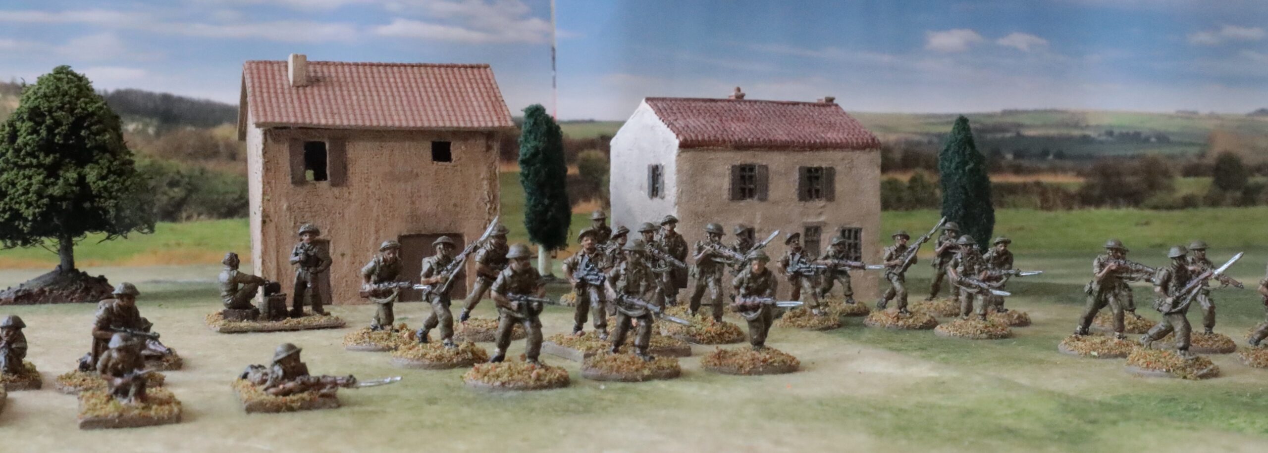
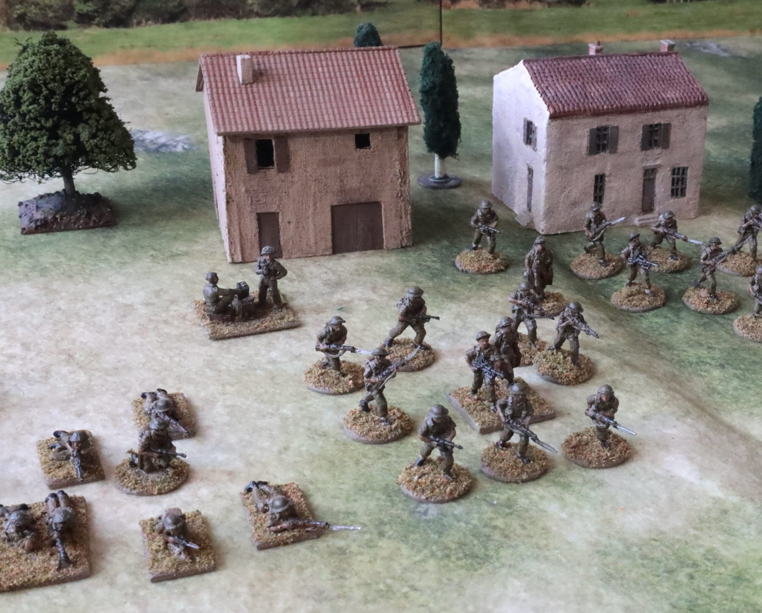
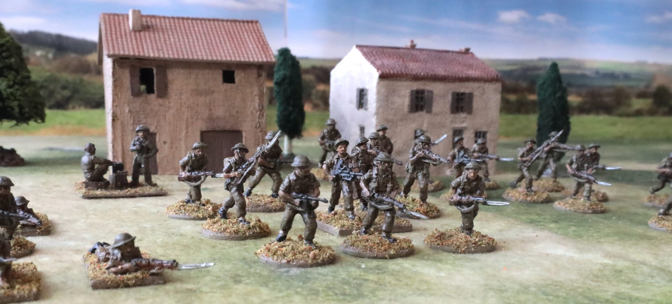
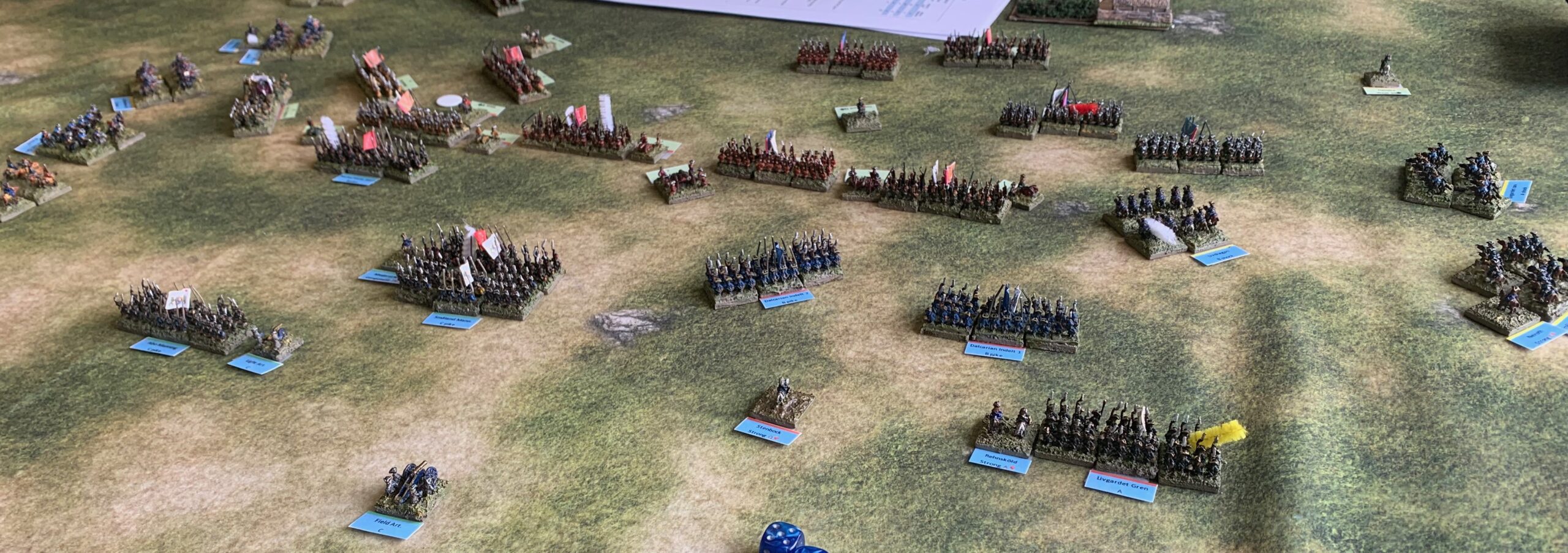
Most of my Napoleonic infantry is on display here, along with a couple buildings that I have painted. It is the Gilly scenario for General d’Armee – played with V2 of the rules. This Geek Villain Autumn battle mat isn’t too dark
In this post I conclude my series, which has been longer, both in article length and number, than I thought it was going to be, by timing some loose ends. I will consider scenery, inspiration and reading.
Scenery
Colour mixing skills are, of course, applicable when painting scenic items, such as buildings, roads, rivers, etc. Here I differ less from other hobbyists. Scenery usually requires quite a bit of paint, but less precision. Hobby paints for miniatures or models are needlessly expensive for this, and so are artist quality paints. So people typically resort to cheaper paints, including household emulsion – though again with a tendency to use colours that are close to the final result. But mixing seems to be common enough, as is the use of artist-originated colours, such as Naples Yellow. I use student quality paints. These are similar to artist grade pigments, but made with cheaper materials. I’m not sure exactly how they differ. They don’t seem to be as sharp, so it can be harder to create edges; they collapse into pools on the wet palette; I have also seen it suggested that the colours tend not to dry as true as higher grade pigment – in other words the dry colour differs from the wet colour (though I occasionally have this problem with the artist paints); Liquitex paints don’t come in the high quality, long-lasting tubes. Anyway, they are significantly cheaper, especially if you buy them in bigger quantities. I have already mentioned my use of this lower quality paint on bases.
What I haven’t tried yet, though, is to use paint to colour the ground, except in my 6mm bases (with mixed success). I use flocks, and ready-printed fleece battle mats instead. These can have the disadvantage of being a bit bright and saturated. I go for duller battlemats – Geek Villain’s Sicily and Autumn, or Tinywargames’ Arid. I have had quite a big issue with the flock (or grass) on my bases being a bit dark. I have now found some paler products to mix in – I also mix in sand quite often. As I have said before, I find greens quite tricky, so representing swathes of grass in paint is distinctly intimidating. But I often paint buildings, where the browns, dark greys and dull reds are in the comfort zone. The same basic rules apply as for miniatures: mix in plenty of white. Streams and rivers present their own challenge. Many gamers seem happy to revert to primary school bright blue (which, to be fair, is how water can look when reflecting a clear sky). I prefer dull greys, browns and even greens – but I can’t say I have found a winning formula.
Inspiration
Emile-Jean-Horace Vernet; The Battle of Montmirail; 1822; Oil on canvas, 178.4 x 290.2 cm Bequeathed by Sir John Murray Scott, 1914 https://www.nationalgallery.org.uk/paintings/NG2965 Wonderful evocation of troops en masse – but challenging light (if beautifully rendered)
I have said that one my aims is to paint miniatures and models so that they look right – a subjective idea – rather than pursuing the false idea of accuracy. That rather leaves the question as to what “right” is. What drives my idea of how things should look? I have already said one thing that doesn’t: Hollywood movies and their saturated colours. Well, not all Hollywood movies – some try to portray some of the gritty reality of war (Saving Private Ryan comes to mind). For World War 2 there are photographs – but the trouble is that almost all of them are black and white. Colourised ones are now more frequent, and though the colour on them is far from reliable, they do convey a feel of colour. But then again both real life colour pictures and colourised ones can have a slightly washed out quality, arising from the photographic process in the former case, or mimicking it in the latter.
Art can be a source of inspiration. This often faces similar challenges to the wargames table – and especially the need to convey a lot of action in a small space. There are some wonderful painters from the 19th Century. There is Vernet – and in particular the quartet of paintings at the National Gallery in London. My favourite is the depiction of Montmirail (above) – but this depicts action in the evening light, so rather a treacherous guide to colour. It remains a beautiful representation of the massed ranks of infantry, though. Another is Lady Butler (otherwise known as Elizabeth Thompson) – I especially love this depiction of a square at Quatre Bras:
By Elizabeth Thompson – Artrenewal.orgNational Gallery of VictoriaFile:Elizabeth Thompson – The 28th Regiment at Quatre Bras – Google Art Project.jpg, Public Domain, https://commons.wikimedia.org/w/index.php?curid=4082016 Peerless. Lady Butler took huge trouble to make her works look authentic
Another 19th Century artist I really like is Edouard Detaille:
By Édouard Detaille – uQHHEYw3tHfkcw at Google Cultural Institute maximum zoom level, Public Domain, https://commons.wikimedia.org/w/index.php?curid=21997544 This is the French 4th Hussars at Friedland. The grass colour is clearly a bit off though!
Modern artists are rarely in the same league as the 19th Century greats (presumably because less subject to the natural selection effect of time…), but you do see some wonderful renderings, but also a bit of a Hollywood tendency. The interesting thing about the pictures I have shown here is that the lighting is muted, which means that the colours don’t aren’t that bright. The red and white stand out only because they are next to very next to very dull colours. Incidentally, if you are representing action in the tropical sun, in Sudan say, then there is a good case for brighter colours. Of course as wargamers our miniatures will be called upon to represent battles in all weathers, so this is bound to be a bit of a compromise.
For WW2 we are reliant on more modern art, if we put aside photos. This one, representing an episode from the 1943 era that is my focus, is one of my favourites, also showing that Tunisia is not just a continuation of the Desert War:
A WW2 picture from the era that I’m following. Longstop Hill April 1943 by Peter Archer, in the Argyll and Sutherland Highlanders Museum. This depicts Major “Jack” Anderson in the action that earned him a VC and the British a dramatic victory. I wouldn’t swear to the German uniform colours (which look like Field Grey), but the British uniform colours and terrain look authentic. Note how pale the ground is.
I will be doing well if I evoke these paintings with my miniatures, and scenic representations on the tabletop. But taking control of the colour palette, and toning down the tendency to brightness and saturation, is an important part of it.
Reading
Here are some of the books that have helped me. First is Betty Edwards’s Color. This what it says on the cover – a book that is American and didactic. I am troubled with some of the mangling of the language (I have already sounded off about the use of “tertiary”), and the ultimately I haven’t followed her thinking on light and dark, preferring to focus on saturation instead.But I found it a fantastic introduction – and pushed through the mental breakthrough required to think about colour.
Next comes Lexi Sundell’s The Acrylic Artist’s Guide to Colour. You need to have got through the basics as described by Edwards’s book before you are ready for this. But this gave me the concept of colour wheel, with an interior of complementary mixes, that is part of my mental map. And it talks pigments. There is a wonderful plotting of pigments on the colour wheel (actually by Bruce MacEvoy here). This book led me down rabbit hole of buying bright pigments, but, having put it away years ago, I find myself rereading it.
The next book is a bit of an antidote to the layers of theory pushed forward by the above. I found it in my late aunt’s things – she was a keen amateur artist, especially in watercolour: Michael Wilcox’s Blue and Yellow don’t make Green. This is written from an artist’s perspective and I haven’t followed much of his specific advice (though I have given a second look at Viridian) – it’s about the use of bright pigments, when I have gone down a rather different route. He absolutely hates ready mixes (Payne’s Grey, etc) – you should be mixing your own. The big takeaway for me is that the pigments behave very individually when mixed. If you are interested in colour theory or how artists mix colour, you might find this an interesting read.
Conclusion
I have greatly enjoyed writing this series of articles, even though it feels as if I have rambled a bit. If I had tried to write a magazine article it would have been much sharper, but I would have left so much out. But looking back on it I think the “journey” is the operative word.
I started in the world of ready-mixed paints, with no artistic training. Mixing colours was a question of finding the closest shade, and then trying to tweak it, perhaps with another colour quite close to the result I wanted to achieve. This was often much harder than I thought. In colour mixing two and two don’t necessarily make four – mixing colours creates something duller and darker than the average of the original ingredients.
So my eyes were opened when I finally started to read up on colour theory and how modern artists mix paints. Modern artists tend to base their palette on bright pigments to combat the tendency to dullness. So I rushed out and bought a lot of bright paints. But then I realised that what most modern artists are trying achieve, and what I am trying to do as a wargamer are different. I am composing pictures made up of various shades of dull, and making no artistic statement with a palette tilted to one colour with a particular emotional resonance. No obsession with purple in the natural world, for example (look at a David Hockney landscape). This is bit more like what pre-modern artists were doing, they mainly had to work with duller pigments, reserving brighter, more expensive ones for moments of high impact.
Since the duller pigments, like Raw Sienna or Prussian Blue, are actually a bit brighter than needed in the end result in most cases, it is fine – and easier – to work with these for the most part. I was coming back to where I started (using duller ready-mixed paints) – but with a much smaller basic set of colours (a couple of dozen rather than well over 100). But the basic theory of mixing remains very useful – and especially the use of complements to dull down colours without affecting the hue.
The other big thing I have learnt is the battle against saturation if you want to get a “realistic” feel for colour, especially in smaller scales. I have learned this only slowly though – and much of my Napoleonic collection was built before I had really grasped it. This is where hobby paints tend go wrong, though, to be fair, you can unsaturate a paint by mixing easily enough, but trying to go in the opposite direction is difficult to impossible – so a tendency to saturate is perfectly understandable.
My journey continues. I am still looking for a good way to finish the miniatures with the minimum number of steps. I will continue to experiment with horses. I’m sure I will discover new mixing combinations – and the hobby will take me into new colours to create. But this is all part of the fun.
Recently I had a look at the Warlord Games website. I was astonished to see a “complete” paint set on sale for £300, and another one (actually out of stock) for £600. My Premier League of high quality artist paints should cost in the region of £100. Money isn’t the reason I have gone down the mix-your-own route, but it is certainly much less expensive. This time I want to explain how I go about painting my miniatures, starting with those from the Horse & Musket era. This is the best place to start, as the process is very straightforward.
I have two Horse & Musket collections, and I’m starting a third. My biggest is 18mm Napoleonics, mainly French and Prussian, but I have a few old Austrians knocking around too; the other current collection is 6mm Great Northern War – Swedes and Russians. Both of these have been built up over many years, as my painting technique has evolved. My newest is 1866 Austrians and Italians. What I describe here should work for pretty much the whole era from 1800 until dull-coloured uniforms came into general use at the end of the 19th Century. It should work pretty well for earlier eras too – though there is more bare metal and that may need adjustments to technique. Also medieval heraldry is usually represented in bright colours, which might require an extension of my normal palette if you are painting heraldry items yourself, rather than buying in banners and decals, etc. I would still try to make them a bit duller than the norm, but that’s taste! And if you want to follow the fashion for painting ancient soldiers in unfeasibly bright colours, that is easy too, but you will need brighter pigments. The camouflage era I will cover in my next post. If you are after the traditional toy soldier look, you might have a need for some brighter pigments, but not outside my “second division”, except maybe some ultramarine blue – though in fact I think the Prussian Blue Hue would do fine. Fantasy figures may also need brighter pigments, depending on the aura you are trying to create.
Firstly, where do I mix my paints. I use a wet palette, a Daler Rowney Stay-Wet one. Wet palettes have come in for a lot of criticism from Ken Reilly in his popular Yarkshire Gamer’s podcast. He thinks that they are a gimmick promoted by the commercial hobby suppliers. I looked at the Warlords one on their website, and it does look a bit more engineered that the Daler Rowney version, though not that much more expensive. I find the wet palette very useful. My projects usually run in a series of two-hour sessions, which may take a couple of weeks elapsed time (alas projects typically take longer, but I don’t need fresh paint for the whole project). Virtually all the paints I use are mixes, and I might want to use the same mix at various points, and the wet palette helps keep these mixes on the go for the duration. Hobby paint mixes may not be needed for that long – and besides they tend to be runnier than heavy body artists acrylics. So perhaps Ken’s hatred of wet palettes is as rational as his hatred of round dice, rather than irrational as his dislike of coffee.
Lid off. This is at the end of a project for WW2 Mediterranean German infantry and vehicles. A Horse & Musket project would show a wider variety of hues, and fewer small variations on a similar theme.
I use artist’s gesso as a primer, and I find acrylic flow enhancer useful to loosen up stiff paint – though often a touch of water is all that is needed. I do not use an airbrush on Horse & Musket era miniatures, though I have experimented with using it for priming – it’s still surprisingly hard to get the paint into all the nooks and crannies. I use oil paints for horses in 18mm – but I’ll come to that later.
My basic process is unremarkable. I prime the figures first, using a mix of gesso with a bit of student grade Raw Umber (which I have in industrial quantities thanks to a mixup by one of my suppliers). This gives a nice neutral dried light mud colour, which doesn’t mess up the paint layers placed on top (like dark primers do) and is relatively kind to coverage gaps. This goes on with a bigger and usually older brush – as the rapid technique I use is harsh on brushes. Like most wargamers, I don’t aim for painting perfection – the priority is to get presentable results quickly and in bulk; mistakes happen and aren’t always corrected. Next I usually mount the figures on their final bases at this point, setting them in a mix of acrylic medium, sand and a white and raw umber paint mix again (using student paints). I mount WW2 figures, mounted usually singly or in dispersed groups, before priming – but for closer packed Horse & Musket units I usually prime first. This is probably much earlier in the process than most people base figures – but there’s no point in painting things you can’t see, and I feel that basing first gives the result more unity (another unprovable assertion, of the sort commonly held by artists and hobbyists alike).
Next there is a base coat covering of the main uniform colour using a bigger brush – aimed mainly at where that colour is required, rather than the whole figure, but without worrying if it strays a bit. I also paint the bases now, in the same Raw Umber and Titanium White mix I have been using on primer and the sand/medium mixture, though perhaps a bit darker. Until this point I work on as big a batch of figures as I can – which might be 50 or even 80 18mm infantry figures. I might paint some other items at this whole batch stage – shakos perhaps, if they can be painted quickly, without too much accuracy required. After this I paint the detail with a finer brush, but in much smaller batches – 8 to 12 figures at 18mm typically. Once this is done I give the figures a wash or glaze, using a dark colour mixed with whatever medium I happen to favour at the time – at the moment with some matt varnish designed for airbrush use. Finally I do the bases by gluing on various mixtures of flock, sand and static grass. That’s more or less it – but do I go about mixing the colours?
Readers of this series so far will understand that my technique now is to use a series of dull and mainly old-fashioned pigments most of the time, and only use fancy bright ones occasionally. This resembles the approach of the old masters, before modern pigments were invented, rather than more modern artists from the Impressionists onwards. Still, modern colour-mixing theory remains very helpful.
I think about this in terms of three colour axes, being complementary pairs: orange-blue, red-green and yellow-purple. The orange-blue one is easily the most useful for Horse & Musket. It covers blues, browns and flesh tones. I do this almost entirely with four pigments (plus Titanium White): Prussian Blue Hue (or Indantherene Blue), Raw Umber, Raw Sienna and Burnt Sienna. Blues, blacks, greys and dark browns are made using the Raw Umber and whichever blue, plus white. For lighter browns, I use Raw Sienna (for more yellowy hues) or Burnt Sienna (for redder ones, including Caucasian flesh). For white I mix a bit of one of my brown mixes in with Titanium White. Sometimes this is all you need apart from the metallics for the shiny bits.
The red-green axis is used much less often, and I have found it a bit trickier to mix. You need this for greens and reds (obviously), and if your base coat is one of these, then I would use this for the blacks and greys as well. For bright red, I usually dull down Cadmium Red Hue with a bit of Viridian green, but go easy on the white – or else it turns a bit pink. Often the red is on small but higher impact features like facings – it can safely be brighter and more saturated; sometimes I use the Cadmium Red straight from the tube. Reds in uniform coats need more dulling down with Viridian, and a bit more white – and perhaps a dash of Yellow Oxide. This can look awful on the palette – but much better on the figure when placed alongside the other uniform colours. True red dyes were very expensive, so that used on all but the finest uniforms was a bit dull – typically made from madder. For greens my usual starting point is Sap Green, though sometimes greens are shown as being slightly bluer, and you might like to mix in a bit of blue (use a Cyan-like shade for preference, but Prussian Blue should work OK). The green can be cooled down with sparing quantiles of Cadmium Red, or rather more Venetian Red, or Burnt Sienna – and add a bit of white. As I have already said, I have had quite a bit of trouble with green – and some of my attempts have ended up a bit on the dark side – but Sap Green is a good place to start. For the blacks and greys Sap green is also probably the best place to start, and then add in Venetian Red or even Cadmium Red. Burnt Sienna might work too, though I haven’t tried this, and theory would suggest that wouldn’t create a true grey.
And then we come to the yellow-purple axis. The pigments here tend to be very hard to work with, and it is pretty frustrating if you try to follow the usual paint-mixing theory. Fortunately it isn’t needed much for uniforms. The difficulties with yellow and purple pigments extended to the dyes available in this era too, so they were used rarely. Having said that, a dark yellow (such as that achieved with Yellow Ochre) was used a bit, and Yellow Oxide is a good starting point for this. The olive green colour used for French artillery actually belongs here, even if your eye thinks it is closer to a true green. Use Yellow Oxide as a base, and mix in some Mars Black – and the usual white. This is, in fact, pretty much how the colour was made at the time (Oxide Yellow being chemically the same as Yellow Ochre). Austrian artillery was painted in yellow ochre – and this isn’t far off Yellow Oxide, though it is a bit too bright straight out of the tube. It needs the usual white, and I would try adding a very small amount black – though I haven’t painted any Napoleonic Austrian artillery since I took up paint mixing properly. (1866 Austrian artillery was varnished natural wood – though sometimes mistaken for the old ochre). For yellow facings, Yellow Oxide and white should be fine. This should work for most yellow uniform coats (sometimes used for musicians – and the Neufchatel battalion, of course) – but you can add in some Cadmium Yellow if you wan to zap it up a bit. For my 6mm Swedes I haven’t need anything more than Yellow Oxide. Purple comes up even more rarely than yellow. I would reach this by mixing Cadmium Red with Prussian Blue.
The wash or glaze applied after painting is an important consideration when it comes to colour. It is one of the quickest ways to lift painting results, and for me now replaces (almost) all efforts to highlight or lowlight using direct paint – but it does affect the overall colour. I have experimented with various things – Winsor & Newton peat brown ink, adding paint to water, and using diluted inks. I currently use Liquitex Airbrush Matt Varnish (which isn’t fully flat) with a bit of acrylic ink in it – something between a glaze and a wash. Remember your colour wheel here. A brown wash will deepen blues nicely, but distort reds and greens – though not necessarily in a bad way. Black darkens things more and can turn yellow into olive. The red-tinted Peat Brown will work well on greens and reds, but could be disastrous on pale figures (white uniforms or grey horses). If the wash turns out to be too heavy handed, I sometimes do some near-dry brushing with a suitable highlight colour on the raised bits.
Incidentally, if you want to mix your own highlights or lowlights, that’s very easy. There are three ways. First is to mix in a bit of white or black – but this is a bit colour distorting. The second is to use the colour wheel – mix a bit of the complement to lowlight (i.e go to the middle of the wheel), or a higher chroma version for highlights (taking it to the rim). The third is to use the colour wheel again to migrate the colour towards yellow for highlights or towards purple for lowlights (i.e. mix reds into blues or blues into reds). So far as I can see artists use all three methods according to situation/taste. Shadows are often represented as dull shades of purple.
Two of my more recent Naploeonic efforts using the techniques described here: French Old Guard Chasseurs and Prussian 23rd Infantry Regiment.
And then we come to horses, which after all are one of the defining features of the Horse & Musket era. I paint these in large batches straight after basing – after first working out the numbers of each type – Bay (about half, perhaps more), Chestnut, Black, Grey and other. For 6mm and 10mm figures I use the usual acrylic paint technique, as described above. The bays and chestnuts mostly start with Raw Sienna or Burnt Sienna – though many of the bays in particular need to be darkened down with Raw Umber or Burnt Umber. The ubiquitous white needs to go in too. For blacks and greys I typically start with my dying tube of Payne’s Grey – but this is easily made using Prussian Blue and one of the browns to get a distinctly blue-grey. This needs variable amounts of white, from a lot (greys) to very sparing (blacks). Payne’s Grey is also used for the mains, tails and fetlocks of the bays. If you are quick and brave you can mix in a bit of blue with the brown on the horse while it’s still wet to get this – but acrylic dries fast.
For bigger horses – in my case 18mm, but the same logic works for 28mm – I have been converted to the oil paint technique, as may earlier attempts with just acrylics looked a bit flat. First you base coat the horse over the primer. You want something quite bright for all but the darkest horses. For Bays and Chestnuts I use Raw Sienna and Burnt Sienna with only sparing white mixed in. For darker horses use Payne’s Grey or Burnt Umber (the reddish hue works better here than Raw Umber) and white. The technique involves putting oil paint over this and, waiting until it’s a bit tacky. Advice on how long varies, and probably depends on the paint used – it needs long enough to stain, but mustn’t dry out; I tend to go quite quickly, 10-15 minutes, and try again if the results aren’t right. You then wipe the oil paint off, with a kitchen towel or bit of rag, leaving more paint in the recesses.
What oils to use? It doesn’t need to be great quality – I bought whatever was on cheap offer on my preferred online supplier. In my case this was Sennelier Rive Gauche Fine Oil. The main ones I use for horses are Van Dyke Brown and Payne’s Grey (not at all a satisfactory paint in this Sennelier version as the medium separates out in the tube and floats to the top), together with Zinc White. The two principal colours are old-fashioned mixes of the sort despised by modern artists – but they work in this context. The white needs to be mixed in to un-saturate; the undercoat should give variation between the more golden and redder coat colours. The Payne’s Grey works for black and grey horses, and for the mains, etc of the bays. To provide variation I also have some Raw Umber and Burnt Sienna to mix in. I now get satisfactory results for bays, chestnuts and blacks – but greys, roans, etc. are a work in progress. I have experimented with bright orange and bright red undercoats, but not with satisfactory results – and if you miss a bit they show up like fury. But the undercoat needs to be quite bright – and lighter than the oil overpaint. Painting horses is a whole art in itself, and I’m learning all the time – but a lot of fun too.
Is all the faff and extra expense of using oil paints worth it? Truth be told I don’t think the results are much better than would be achieved using normal paints. I still look at real horses in life and feel I’m not doing them justice, especially some of those the gorgeous chestnuts, to say nothing of greys. It’s been interesting working with a different medium, and I also use oil paints to create weathering effects on vehicles and aircraft.
Some of my most recent horses are drawing these French limbers – black, chestnut, bay and grey; I like to have both horses in a pair to be of the same type.
If there is interest – I have no idea how many real people read this blog – I might do a photo demonstration of my technique, perhaps using some of the free 28mm plastics that I keep getting with the magazines. I didn’t do it this time as it would have added a good week or two to the publication time.
In Part 1 I said that a wargamer only needs a dozen artists’ pigments instead of scores of hobby paints. In Part 2 I said that pigments behave quite individually, and that you need to get to know them. This time I will describe the pigments I actually use. I will organise the 33 pigments in my collection these into three groups of 11: the Premier League – the top ones I use all the time; the Second Division (I know, I know, that’s not how the football league works) of the pigments I use occasionally but could probably do without if need be; and the Also Rans – the ones I have bought but don’t actually use these days.
But first I need to talk about replicability. One reason people might stick to ready-mixed hobby paints rather than mix their own is that they are worried that each time they mix a fresh batch it will look a bit different. This why I try to stick to a two pigments plus white rule for mixing. This way it isn’t too hard to replicate an old mix. Otherwise if a third pigment is used this must in a small quantity for a tweak. And anyway a little variation doesn’t matter – there is variation in life, after all. At one point I tried juggling three main pigments (in my initial efforts to get German Dunkelgelb), and this was indeed a nightmare. That affects the palette choices.
The next point is that unless I say otherwise, all the pigments I describe are from the Liquitex Heavy Body Acrylic range, where I use tubes of 59ml. I have found these to be constantly good and reliable paints – but the killer feature is that they come in the best designed tubes. The screw-top lids last for ever. Unlike Winsor & Newton or Daler Rowney, where eventually I tend to lose the whole tube because the top malfunctions, or I have some other packaging failure. This has never happened with the Liquitex Artists range – though this doesn’t apply to their Basics student-quality paint, which comes in cheaper tubes. Unless you are into bulk processing, a 59ml tube should last forever. My Cadmium Red Hue is over 40 years old, I think, and has been in regular, if sparing, use. I have had to renew only a few of my Liquitex paints (Titanium White and raw Umber, for example).
The Premier League
These are the pigments I can’t be without. If one of these gives out, I immediately replace it – though with Liquitex paints this has happened only a few times.
Titanium White. Almost everything needs a bit of white in it – only bits of detail that need to stand out, like facings perhaps, should be saturated. This is often where hobby paints go wrong, though I think that some manufacturers may be wising up to the problem. The scale effect – the idea that the colour needs to be paler the smaller the scale – is not uncontroversial, but the fact is that saturated colour is for advertisements, not representing gritty reality. So you need white pigment. Titanium White is the most versatile on offer – it is bright and opaque (a virtue in the hobby context, if not always for artists). There are alternatives, but they don’t make the Premier League. Incidentally I almost never use this by itself, as it is too bright. To represent white on a miniature it needs to be mixed with a touch of something (I use raw Umber most often) – unless for small dabs where strong contrast is needed.
Prussian Blue Hue. This is a lower-chroma blue, but actually a bit too bright to use directly for Prussian or French uniform coats. It is a mid-register blue, that mimics the colour from the standard indigo dyes well. This Liquitex paint is not pure pigment but behaves really well. It is the only blue to make it into my Premier League as it is the only one you really need. Mix with white to get paler, sky blue colours. Idantherene Blue is a decent alternative and is what I started with – and is in my Second Division.
Raw Umber. A low chroma mid-brown that I use all the time. Mix with Prussian Blue to get greys, and as close to black as you need. This is the place to start for most browns. I also use it a lot in primers, mixed with white gesso, and terrain (but not the artist quality stuff).
Yellow Oxide. This is the industrial age version of the ancient pigment of Yellow Ochre. Yellow is a difficult pigment, which often comes out thin and horrible. Yellow Oxide is bit duller and veers a little bit orange, but it is robust. It is my go-to yellow, even for facings (including for Swedish uniforms). It mimics the available pre-industrial yellow dyes well. It is also useful for more modern camouflage colours, from German Dunkelgelb, to Olive Drab (and the similar French Napoleonic artillery green).
Cadmium Red Medium Hue. Alas pigment with this name is not in the current Liquitex range – they have Cadmium Red Medium and Cadmium Free Red Medium. I think what I am using is the latter. It is the only high chroma paint in the palette, and is a lovely opaque pigment . You don’t need much – but sometimes you want your red to really pop, and this does the job. Otherwise you tone it down with a bit of green.
Raw Sienna. This is a beautiful orange-brown. When you need more chroma for than Raw Umber offers, this is where to go for yellower browns. I also use it as a basis for khaki.
Burnt Sienna. This is redder than Raw Sienna, and useful when you want a red tint to things (Caucasian flesh for example). I use it quite a bit for horses.
Permanent Sap Green. I’ve had more trouble with greens than any other hue, and I still do. This lower-chroma mix isn’t too blue and I have found it quite useful. Funnily enough I don’t need green that much, away from the olive colour that I get from Yellow Oxide.
Mars Black. Recently promoted to the Premier League. Monet always said that black should have no place on a palette. Totally saturated black rarely happens in nature – things just look black in context. The near-blacks we get by mixing Raw Umber and Prussian Blue, say, look fine on a miniature. And when mixing with true colour, it distorts the hue. But I have been finding more uses for it – especially mixing with Yellow Oxide to produce a wide variety of colours that are useful in the WW2 context. And sometimes you want a black very quickly – and you can just mix a bit of any unsaturated colour in to lighten it up a bit. Also you might want a neutral grey (e.g. for US WW2 aircraft) – best reached by mixing black with white. Mars Black is very potent, though – one of my most frequent mistakes is putting in too much in, which then forces you to put too much other pigment in.
Iridescent Rich Silver. I’ve not found metallic artist acrylic paint all that satisfactory for miniatures. I even experimented with a hobby paint – but that was worse. I have also found that silver doesn’t last as long as other paints in the tube. But it is very useful – usually mixed in with something else to give it a bit of body, except when representing polished metal, like sword blades.
Iridescent Bright Gold. As with silver, not wholly satisfactory – and often needs to be mixed with Yellow Oxide or Raw Umber to give it bit of oomph. But still necessary for most horse and musket miniatures, and doubtless earlier eras too.
Second division
This motley crew is my Second Division
The second division are pigments that I use regularly. Some I use quite frequently but could substitute with something else – or I might replace them with something different if they die. Others I are harder to substitute but I only use rarely.
Burnt Umber. The last of the quartet of classic earth pigments (the two umbers and siennas), it is redder than raw umber but also dark. It can fulfil the same general role – mixing with blue. But I don’t think it is quite as well-behaved, and mixes with Titanium White quite can come out looking not very nice. I used to use it quite a bit for horses, but I have since changed my method, using oil colours – where I use Van Dyke Brown instead. But that’s a whole other story.
Idantherene Blue. As noted above, this used to be my go-to blue. It’s a bit darker than Prussian Blue, but I recently bought a replacement tube (my old one was from Winsor & Newton and suffered a tube failure). I now use it for French uniforms, while retaining Prussian Blue for the Prussian ones. I don’t really think it makes enough difference to be worth it, but it keeps me amused.
Venetian Red (Daler Rowney). I have already said that I like to work with lower chroma pigments. But my go-to red, Cadmium Red Hue, is high chroma – and Burnt Sienna is a bit on the brown/orange side. Venetian Red is an old-fashioned dull red pigment that I have found to be quite useful, and which is more crimson than the Sienna. Apparently the old masters used to use it for flesh tones – but it is in fact too red for that for miniatures. Alas Liquitex don’t make it (or at least not under that name) and I have and my old Daler Rowney is suffering from cap failure and is slowly dying as a result – so I find myself avoiding using it. When it finally goes I’m tempted to try and find something to replace it.
Payne’s Grey. This is a classic mix, now, according to Wikipedia, often made by combining Burnt Sienna with Ultramarine Blue. It isn’t hard to mix this yourself, but the ready-mix is convenient on occasion. For miniatures it is popular to use for horses, either as an undercoat (it approximates to horse skin colour) or for black/grey horses – and this is where I mainly use it these days. Mine is an ancient tube from Winsor & Newton, which is about to die through cap failure. I used to use this quite a bit as a black, and to tone down blues – but nowadays I have other ways of acheiving this. Liquitex do a version these days, but I don’t think I will replace this tube after I throw it out.
Cadmium Yellow Medium. Occasionally I want a yellow that is higher chroma and with a truer yellow hue than Yellow Oxide – and this is what I use. It is probably the best of the brighter yellows – which tend to be thin and horrible. Its opacity is still pretty poor by the standard of most pigments. Using a mix largely based on this on WW2 aircraft can take several coats. It is probably better to use a true yellow when mixing greens too – though I’m no expert on this.
Azure Blue. This is a mixture from Daler Rowney. I bought it because I thought it would be useful to have a pigment closer to primary Cyan. I haven’t used it much – I get sky blues by mixing white with Prussian Blue. I have sometimes used it when trying to adjust greens – where I have found it to work well, to my slight surprise. I think there are several alternatives. I didn’t see anything that looked quite right in my preferred Liquitex range – though Cerulean Blue might work as well, as might their “Brilliant Blue”. I dislike Cobalt Blue (see below), which is a bit darker and redder.
Transparent Mixing White. Otherwise known as Zinc White. I use white a lot to reduce saturation, and this is mostly Titanium White, as do most artists. Zinc White is an alternative where opacity is not an issue – which it usually isn’t if white isn’t the base colour. I can’t say I have noticed much difference – except my impression is that it has a bit less punch – which can be a good thing. I’m not sure I would replace it if it died. I do use Zinc White as my standard white for oil paint which I use on horses, where opacity is not an issue.
Viridian Hue. I bought this because it was the recommended green in one of the first books I read on painting with acrylics. I found it a horrible pigment to work with – runny and thin, as well a being a bit too blue for most uses. I then read that it was a very good mixing pigment, and since had a tube in stock, I started to use it to mix with reds to get grey-greens (such as German Field Grey or Israeli Sinai Grey), where it works fine. So I actually use it quite a bit, but I wouldn’t buy it again, so it doesn’t make the Premier League.
Iridescent Rich Copper. I had an idea that I should be able to mix metallic paints rather like the normal ones – and copper provides the red. I do use it sometimes, but not very much.
Neutral Gray. This is straight mix of black and white. I used this quite a lot in the early days, but then stopped when my colour mixing got more sophisticated. I have started using it again for convenience – in mixes which require both black and white – and adjusting accordingly after the initial mix. There have been three applications: with Yellow Oxide to get Olive Drab (though typically needing more black), as a base for Neutral Grey on US aircraft (funnily enough – though it needs a bit more white if I recollect correctly), and with Prussian Blue for Prussian Napoleonic artillery – it’s a bit less faff than using white and Raw Umber. This was useful enough for me to replace the tube recently.
Unbleached Titanium. This is a recent acquisition when I wanted to top up a recent order – and I haven’t used it yet. Since reducing saturation is a constant, I thought this might be an interesting alternative to using white (after reading a write-up on the Jackson’s blog) – requiring a bit less sensitivity when mixing. It might even be light enough to use as a dirty white by itself.
The Also Rans
The pigments I almost never use
These are the pigments that are still in my studio but which I no longer use regularly, and which I could have saved myself some money by never acquiring.
Cadmium Orange Hue. (Presumably Cadmium Free Orange in today’s Liquitex range). The orange-blue axis is the most important mixing spectrum for horse and musket miniatures. I thought it would be useful to have a high chroma orange whenever the orange dimension needed a lift. But it’s rare you need anything brighter than Raw Sienna, and if you do, you can mix up an orange using Cadmium Red and one of the yellows very easily. This one stays in the box these days, but it’s possible I will use it occasionally. It handles in a perfectly friendly way.
Ultramarine Blue (Red Shade). On the same logic this was my high chroma blue. It’s a very powerful pigment and mid range to reddish bright blue – a delicious colour and quite a user-friendly paint, but in fact Prussian Blue is almost always bright enough miniatures purposes. And if I want to use a blue to create or adjust a green, I prefer to use something closer to Cyan – i.e. Azure Blue in my palette.
Quinacridone Magenta. After I got religion when I was first introduced to the art of colour mixing, I thought a powerful primary magenta would be useful. This is a modern organic pigment, and seemed to fit the bill. I have almost never used it. It might be quite fun to mix it with greens, but I’ve never seen the need. If I ever needed to mix Polish Pink I might start with this, as I have it already – but there are other ways to do this.
Phthalo Green. This Daler Rowney pigment was yet another result of my enthusiasm for high chroma colours on the various segments of the colour wheel. Like most of the others it now languishes. I could use it in place of the Viridian, but its higher chroma would probably make it harder to manage.
Permanent Yellow (Arylamide). My first yellow, from Daler Rowney, which I bought in the very early days. It’s a horrible pigment, thin and runny with very little opacity. Cadmium Yellow is much better – and if you are happy with lower chroma (which I usually am), then there is Yellow Oxide or Yellow Ochre.
Dioxazine Purple. Another pigment bought when I was looking for bright pigments to represent the main hues. Purple itself has very few applications in miniatures painting – and if you do need it, a workable lower chroma version is easy to mix. I found it quite difficult to handle when I tried mixing it with Oxide Yellow to dull it down, and gave up. I use Mars Black these days – after trying to mix a red and blue pigments to get something more controllable. However, when creating my own colour wheel I did get a beautiful, rich dark yellow-brown when mixing with Cadmium Yellow.
Cobalt Blue. This Daler Rowney pigment was one of my early ones – for use when I needed a rather greener and brighter hue of blue than Idanthrene. I found it to be a horrible pigment to work with, and used it less and less until I stopped.
Opaque Oxide of Chromium. Another one of my early Daler Rowney pigments – this is a lower chroma mid-hue green. It has an interesting consistency – quite dense, but easy to apply with a brush, and wonderfully opaque. It’s an ideal pigment to apply straight from the tube, which is what I did a lot of in the early days – this worked well on French dragoon coats, for example. But I haven’t opened it for years. Its consistency means that it is a bit harder to mix and the old fashioned cap is a bit intimidating. Incidentally the blue colour on the label is the result of aging – the yellow component of the ink used clearly wasn’t light-fast.
Cobalt Green. I bought this Windsor & Newton pigment when I was casting around for greens that I could use straight from the tube, subject to the odd tweak. It didn’t work for me. This was so long ago I can’t actually remember why – probably a bit on the blue side, and high chroma. There may have been a problem with the texture too. If my Viridian gives out it will probably work as a substitute.
ACRA Red Orange. Now sold as Quinacridone Red Orange. I bought this when looking for pigments that I could use with only small adjustments – I was looking for a red that could be used as a base for uniform coats. I actually used it quite frequently; it’s a bit dark for uniform coats, but this was readily rectified (at the time I mixed in a bit Yellow Ochre). I have since stopped using it. Its lower chroma means that it remains potentially useful – but the normal earth pigments seem to be cover this area well enough, without bringing in fancy modern ones.
Pyrole Red. I bought this at the same time as the Acra Red Orange, when I thought it would be useful to have an alternative to Cadmium Red. It proved pretty much indistinguishable, and so I have almost never used it. It turns out that this pigment was developed for Ferrari for use in its famous bright red cars – its virtues being its brightness and stability; its downside being expense. And I do remember it being quite pricy – but then so were the Cadmium Reds, including the “hue” version. Actually these days it is slightly cheaper than the other bright reds, but still expensive for acrylic pigment. As and when my faithful Cadmium Red Hue gives out, this pigment should be a perfectly decent substitute. It may yet have its day in the Premier League.
Finally there are a couple more pigments that used to be in my collection, but which have now expired – and which I won’t be replacing.
Daler Rowney Pale Olive Green. Olive is a useful colour in the hobby field, and this was one of my very first pigments. I got a bit of a shock when I opened the tube, though. It is very bright: it needs a lot of cooling down to be anything close to usable. I didn’t know how to do that in the early days – and later on, when I did, the question was why bother? The description “pale” is a misnomer. More recently I tried this out as a student grade paint for use in terrain – but found the same problem. I was a bit puzzled until I saw the modern Yellow-Magenta-Cyan colour wheel – which show the high chroma greens as being much lighter than in the traditional colour wheel – in the sense that yellow is lighter than blue.
Winsor & Newton Graphite Grey. I used this quite a bit when I realised that black was too dark to use directly on miniatures – how do you lowlight it? It was my usual substitute. Eventually it suffered cap failure and died, and there was no need to replace it. Now that I use a wet palette it is a trivial matter to mix something into Mars black, or create a dark grey from a blue-orange or red-green combination.
A bit of a long post today – but I hope it is of value to hobbyists thinking of using artists’ colours. It’s also a bit of a window in my evolving understanding of using artists paints.
Post Script. One of my commenters has reminded me of another colour in my original collection which has expired (tube failure, as usual) and was not replaced: Flesh Tone. I can’t remember who made this, except that it wasn’t Liquitex. Doubtless political correctness means that it would have to be renamed, as it represents the flesh of only a minority of people (i.e. Caucasian flesh). Daler Rowney Peach Pink might be it. I used it a lot, using for it exposed flesh without any further mixing – and frequent use is doubtless why the tube/nozzle broke. Since then I mix my own based flesh tone on a brown and white, usually with a little of something else (blue or red) to tweak it. This can be a little tricky, especially when I want to represent sunburned skin. Human faces and flesh are so important to us, and used to provide so much information to our brains, that we often can’t see the colour objectively. That said, as my commenter says, this mix can be a very useful mixing agent – as it is unsaturated and its basically brown colour is quite neutral. If you want to lighten something to create a highlight, this would work very well in most cases. And it could be a good starting point for lots of things. I’m hoping that my recently acquired Unbleached Titanium will fulfil this role – and could be a place to start for flesh tones.
Blasts from the past. On the right is my last pot from the Humbrol Enamel range I used in the 1970s (though as polyurethane varnish, not strictly enamel). Next to it is the last tube from the artist acrylics I experimented with in the late 70s. This was quite a nice one approximating to “French Dragoon Green” – but I rarely use it these days. The Cadmium Red Hue on the left is almost as old, and I’m still using it.
I have long been meaning to share my journey on the use of paint in the hobby. I am in a small minority that use artists’ paints rather than hobby paints. I have thought of trying to compose something for publication in one of the magazines – but I think it is best to start here, with something a bit less tightly edited. It will take more than one article. In this one I will set the scene by recounting my journey. I don’t expect to make any converts – but if I do, I can save them a lot of trouble. But a lot of what I have learnt will help anybody that uses paint in the hobby.
But first: why? The problem with hobby paints is that they encourage a painting-by-numbers approach. Hobbyists look for the exact shade they need straight out of bottle. Hobby paint providers enthusiastically cater for this market, and in no time hobbyists build up stocks of scores of paints. One manufacturer even provides separate products for highlights and lowlights – encouraging you to buy three bottles instead of one for any bulk application. Contrast this with the artist’s approach: a typical “palette” has no more than ten different “pigments” – from which all the multifarious hues on a painting are composed. Often palettes are even more restricted that that. A hobbyist needs no more than a dozen different kinds of paint for anything they are likely to do using the artists’ approach. A 59ml tube of Liquitex Heavy Body Acrylic (the sort I like best) costs about £7, and lasts forever. Vallejo hobby paints (the brand leader) comes in 17ml bottles costing £3. Even assuming that 17ml is enough to last for ages too (you should need to use less of each paint), you are likely to acquire way more than three dozen. In fact I have over 30 tubes of artists acrylic pigments – but half of them I rarely use. That’s all part of the journey that I wish to share – you don’t need as many pigments as you might think at first.
Then there is something else: mixing your own colours – which is what using artists’ paints is all about – gives you control and understanding. You break out of the prison of hobby conventions and scouring forums and articles for recommendations of what is the right colour for French dragoon coats, for example. You then start looking at the world in a different way, with a much greater understanding of colour. Hobbyists tend to make basic mistakes – typically using over-saturated colours. I might add that mixing your own gives more variation and “life” to your creations – though that is a hard point to prove. Having learnt almost entirely the hard way, it has been a long journey for me. But an enjoyable one – and I wouldn’t dream of going back to hobby paints.
I started the hobby in the 1970s (or even 1960s if you count making Airfix kits), with Airfix models and plastic soldiers. Back then I did what almost everybody else did – I used Humbrol enamel hobby paints. Humbrol brought out a range of “authentic” colours – which allegedly matched the actual colours used – I think they did a special green for those French dragoons – and I became addicted to these. I owned probably approaching one hundred of the little tins. I only recently threw them away, apart from the one tin of gloss varnish in the picture.
My wargaming came to an abrupt halt in 1979. I graduated from university and started training as an accountant. Furthermore, my parents moved out of London (where I was working), leaving me to live in a series of bedsits and one-bed flats. I didn’t have room or the time to pursue the hobby in any serious way. That changed in 1984 when I at last bought my own flat (at the age of 26 and without parental assistance – how times change!). I now had the space to pursue a hobby I had never forgotten. But I decided to do things differently. For a start I was going to use 15mm metal miniatures (starting with Minifigs). I also decided to start using acrylic paints, to complement and the eventually take over from the enamels. I had read a lot about how acrylics were the better than those nasty smelly enamels, and so I decided to make the change.
But what I thought people meant by “acrylics” was the artists paints I saw on sale at W.H Smiths – not the hobby paints that people were doubtless actually referring to. So my whole journey started on a false premise. I actually started experimenting with these in the 1970s, but I became more serious in the 1980s and used them more and more. It was not especially satisfactory because I still had the hobbyist mindset. I was expecting the colour coming out of the tube to be pretty close to the end result. I started to acquire lots of different pigments. But that is not what artists’ paints are for. It took me an incredibly long time to grasp this, but once I did, my outlook was transformed.
How I used to think was something like this: all things have a colour; when painting a model or miniature the idea is to replicate this colour as closely as possible; you then look for a paint that gets as closely as possible to this and tweak as necessary. This is complicated only slightly by such ideas as the “scale effect”, which says that smaller scale models should be paler to replicate the effect of atmosphere on viewing at distance. You simply mixed in a bit of white if you wanted to reflect this. Artists have a completely different approach. They start with the end effect they want to achieve, allowing that this has a strong subjective element (or in the case of abstract art – 100% subjective). It is not a question of accuracy, but whether it looks right. Colour isn’t a property of the object you are depicting – it is how your brain interprets the information from your eye. The colour when viewing that object close up under neutral light (however you define that…) is only one factor. Things look different, for example, when viewed on a cloudy day than they do in bright sunlight. They then construct this colour from a small number of paints – the “pigments” – which they call a “palette”. The pigments represent colours with a chemical simplicity, or simplicity of source. (This isn’t entirely true though – there a re some mixed pigments in use, like Payne’s Grey, and modern manufacturers make “hues” which are mixes to replicate traditional pigments which are not widely produced any more due to toxicity, etc.) This is a world away from hobby paints, which are ready-made mixtures of pigments to achieve a particular colour.
For me the penny didn’t really drop until I bought a book on how to mix paints. It was one of those great moments of revelation. A whole new world opened up. Alas I overdid it. I rushed out to buy yet more pigments, to cover parts of the colour wheel that were missing. Many of these, a purple and a magenta for example, I have barely used. There are important differences between how artists and hobbyists use colour, which affect the hobbyist’s palette. The first is the question of vibrancy. This is a quality artists often seek, and it is why they chase bright pigments, and mix these with care. But, unless they are going for the toy soldier look, wargamers rarely chase vibrancy. They seek a sort of authenticity of presentation that reflects weathering, cheap dyes and camouflage. In ancient and medieval times, bright dyes were expensive and the preserve a small elite. The bulk of the soldiery used cheap and dull dyes, or undyed cloth. These then got even duller as people lived in their clothes in the great outdoors, exposed to rain or sunlight, to say nothing of mud and dust. This was followed by a brief age where most uniforms were designed to be bright – in the 18th and 19th centuries – but even here the problems with dyes and weathering persisted. There may have been a brief moment towards the end of the 19th Century when advances in chemistry allowed cheap, bright dyes. But by this time camouflage was coming in: soldiers and their equipment became deliberately dull. And there’s another factor: we want an outdoorsy look to our gaming tables, and that dulls things down too – a matter of lighting and atmosphere. All this makes the job of a wargames painter much easier than for the typical artists – though, of course, that depends on the art being created. Artists complain that if they get their mixing a bit wrong they end up with something looking like mud; for a warmer variations on mud is often what they seek. Things are also quite easy for hobbyists looking for the toy soldier vibe: the colours are bright, but they are also simple. This highlights another difference between the hobbyist and the typical artist: the quest for exactitude. Artists are not after the false exactitude of accuracy, but they often care deeply about the precise hues of the colours they create, and especially how they bounce off each other in a particular composition. This really isn’t worth hobbyists worrying about. A degree of consistency across a wargames table improves the appearance – but getting the reds, greens and khakis exactly “right” matters little. I once tried devising mixes for the three (or is it four?) types of red in use by the Prussian army for facings. But I really couldn’t tell the difference on an 18mm figure at arm’s length.
Now I was fully converted to an understanding of colour, and at time when my hobby painting activity started to take off with my early retirement. Firstly I applied the new found knowledge to Napoleonics. This was, and is, a good place to start, as the colours are very basic. I found I could paint a French infantryman with just four pigments: Titanium White, Raw Umber, Cadmium Red and Prussian Blue. That included the black shako and the flesh. Not quite true: I still needed the metallics of silver and gold for some of the details. I only needed the red for the facings (though it also helped with the mix for the face) – and having one of the lighter brown Siennas to hand was helpful (in point of act I could have replaced the Raw Umber with one of these Siennas entirely – but some of the mixes would be a bit more difficult).
With my confidence built on Napoleonics, I broke into WW2. When I embarked on the journey, I had always considered this too difficult. But by the time I reached my first WW2 project, some German vehicles in 20mm, I was too far gone. I was not going to be dependent on some paint manufacturer’s interpretation. Dull colours are complex ones – involving all three primary colours in relatively high proportions. Small tweaks to the colour mix have a big impact, and can take it in completely the wrong direction. So it proved. I made several attempts at German Dunkelgelb before getting something I found acceptable. And even that first attempt, on some Panzer IIIs, looks to my current eye as being closer to the German desert colour Braun than Dunkelgelb – which as it happens was just as appropriate fro a Panzer III in 1943. But slowly I have got the hang of it. I have even got as far as painting WW2 aircraft, though my first attempt at RAF desert colours was not entirely successful.
It’s been a long journey, and I’ve learnt a lot. Above all I have achieved an understanding of colour, and a sense of control over the whole process.
Making up and painting models from kits and castings is a faff. What about buying die cast models ready assembled and painted? A bit more expensive, but not that much, and less trouble. For my most recent project I decided to try a couple of models from Oxford Diecast. These were a Bedford OYD 3-ton truck, and a Dorchester Armoured Command Vehicle (ACV). The former was to provide a bit more variety to my transport (dominated by Bedford QL trucks), the latter to act as brigade command vehicle for my British at Medinine and doubtless subsequent scenarios. Here’s what I found.
Firstly these are marketed as collectors’ items and not as wargames models. They come in nice plastic display boxes, screwed to the base. For tabletop use you have to unscrew them – and you then have the display boxes to throw away or repurpose (or leave hanging around while you try and think of how you might repurpose them). Once out, the models are nicely detailed and beautifully finished. They also handle nicely. The Bedford even rolls one its wheels. Unfortunately the Dorchester’s front wheels don’t fit properly and are jammed against the wheel arch. They are quite small – true 1/76 scale I would guess without measuring them. Alas I’m finding that “20mm” models come in a range of scales. If the 20mm is meant to come up to eye level – itself a bit of a scale creep definition (it should really take you to the top of the head) – then the scale should be about 1/80. All 20mm products are bigger than this that I have seen. Plastic Soldier has 20mm in the range description, and 23mm in the instruction leaflet (about 1/70 in my book) – and maybe a bit bigger even than. So these models are at the smaller end of the range, but consistent with Airfix vehicle kits, old and new, for example, and models from the likes of Milicast and SHQ.
Here’s the OYD next to my Airfix QLD to give an idea of size:
One obvious difference is that the die cast models come with windows – though in fact I could have put these into the QLD in this case. Most wargames models either have the windows completely open, or, now more common in the age of 3-D printing, moulded solid. There is no driver model, and adding one would mean disassembly and potential damage. You would also struggle to find space.
The next issue is finish. These models are painted in authentic colours (they match precisely to the colours in my reference book on WW2 colours). That means there is no attempt to lighten them up to replicate the scale effect, which is something I like to do. This is a complicated topic with “that depends” type answers – it basically means that they look best representing originals in in strong light, and this is clearly the standard for display models. On the wargames table they will be a bit dark. There is also a slight off-matt finish – appropriate for a parade ground rather than the battlefield. The tilt on the Bedford is plastic, and the finish a bit plasticky. The decals are lovely and intricate, going down to serial numbers, etc, which I don’t bother with.
So how about incorporating these vehicles into my 1943 tabletop army? Take the truck first. This is modelled on a vehicle in the 15th (Scottish) Division in the UK in 1943 in the artillery. The paint scheme is fine for 1943 First Army in Tunisia. And second-line vehicles might well not be repainted for later campaigns. The divisional marking is not correct – but this can be removed rather than replaced, as these aren’t very 1943 in theatre. Perhaps it should have a roundel on the roof for air identification (the white stars were not used by the British in this theatre, even later in the war). Removing the divisional decal would be quite delicate work, though – but I do have some very fine sandpaper. To integrate with my army at large the model will need to be weathered – though this feels a bit sacrilegious on such a nicely finished model. I think this would take the form of a little white oil paint, brushed very thin, which would help lighten it up, as well as representing slightly uneven discolouration. And then dusting with powdered pastel. I don’t think there is the need for a wash.
The Dorchester is another matter. This represents a vehicle in use by the Polish Armoured Division in Northwest Europe in 1945. In fact the camouflage scheme is similar to the Bedford (brown and blue-black) and OK for 1943. But unlike the trucks, these vehicles were nearer the front line and surely would have adopted one of the standard or ad-hoc camouflage schemes. This might be the Desert Pink (appropriate for Medinine), Light Mud (Sicily and Italy) or plastered with lighter coloured paint ad-hoc (First Army Tunisia). But it does look as if I should repaint this, using the airbrush. That gets round the issue of the decals, which would be overpainted rather than sanded off. At least I don’t have to worry about the windscreen and windows.
So the models will need some work to be table-ready, and I should reserve my final judgement. I don’t see myself buying many more, though.
The three Bedfords. The QLT on the left; the QLD on the right is the metal SHQ model; the others are Airfix
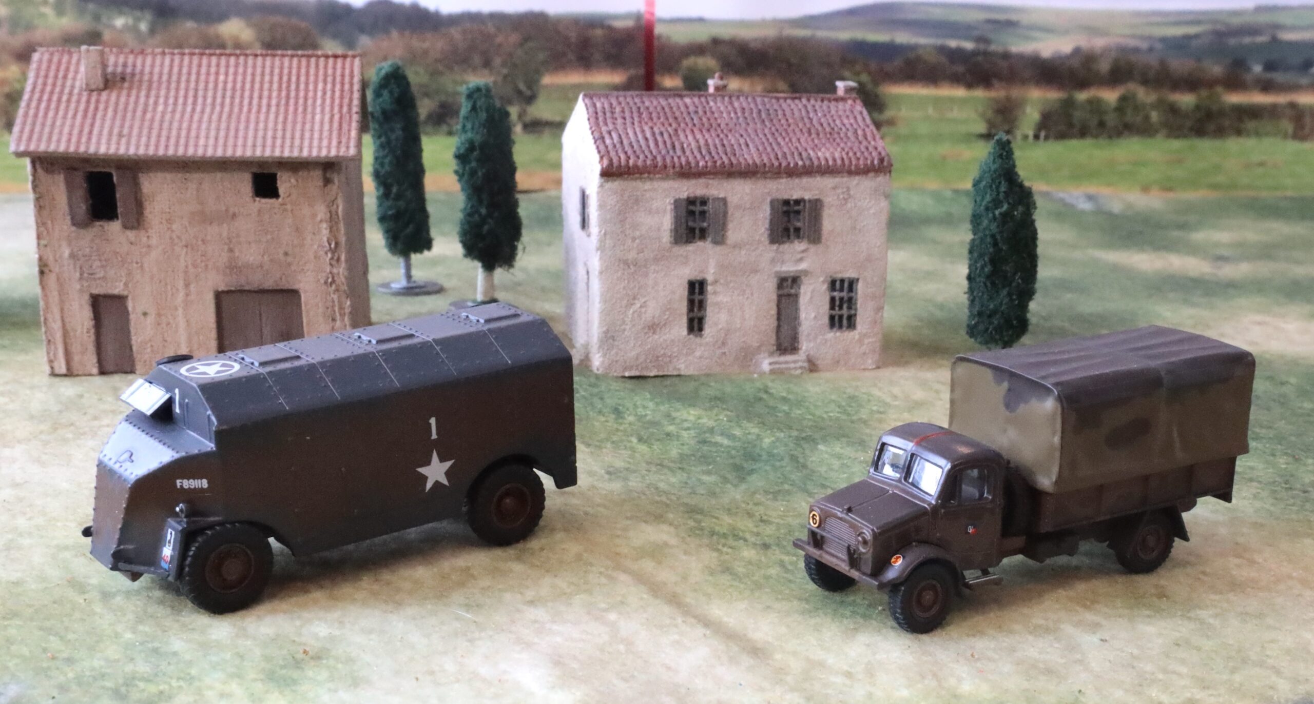
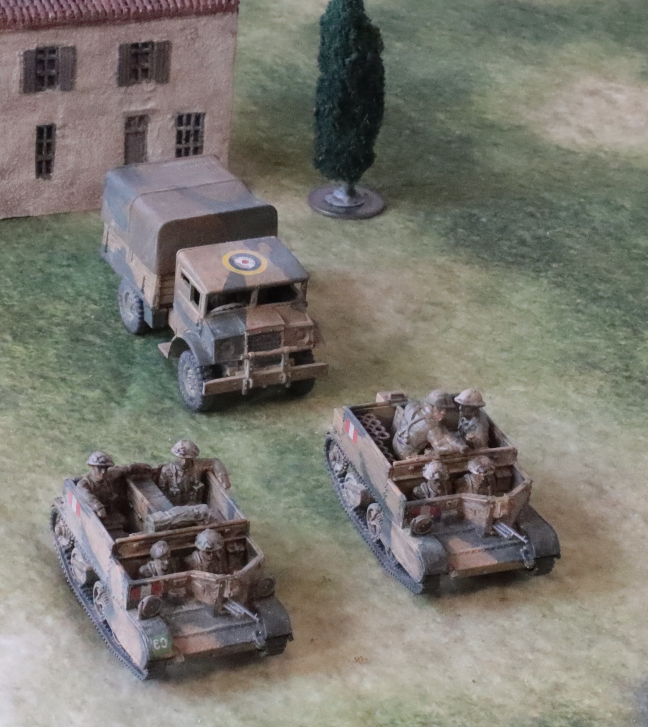
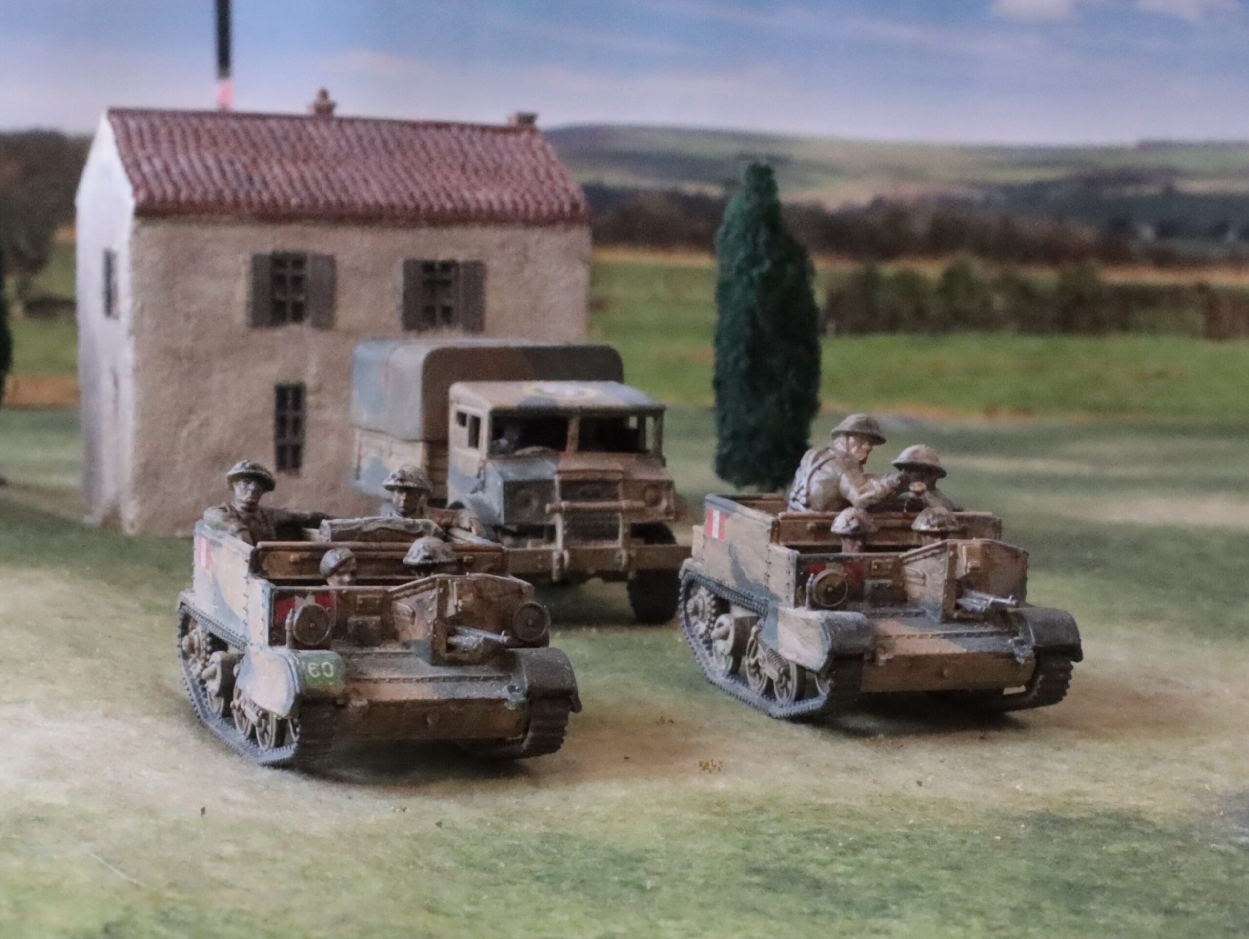
My third article on my latest batch of 1943 British covers the vehicles: three Bedford medium trucks, three carriers, two Quads with limbers, and a CMP 15cwt light truck. I’m not showing the Quads or the OP carrier in this post – but you can see them in my previous one, along with the artillery.
First the big trucks. These Bedfords were one of the mainstays of the British war effort, and the easiest medium trucks to acquire as models in this scale (20mm, 1/76 or 1/72). I had an Airfix kit of the QLD (general purpose) and QLT (troop transport) trucks, and a metal SHQ model. The Airfix models are proper, detailed kits with lots of parts, that require intricate assembly. The SHQ model is much cruder, though also requiring assembly, but with many fewer parts. Neither came with crew. For the Airfix models I used AB figures, though they weren’t an easy fit. For the SHQ model I took a very crude figure from a vintage Airfix Matador I had in stock. That was actually fine – it’s waste of good quality models to put them in an enclosed cab. The Airfix models are nice – they are modern ones, rather than reissued Vintage classics, which I’m going off a bit. The SHQ model, though, was simpler to put together (though vague assembly instructions didn’t help) and looks very similar at distance. Incidentally, the Airfix models came with clear plastic for the windscreens, etc., but I couldn’t lay my hands on them at the critical moment – and would have made it even harder to fit in the crew. None of my other models have clear plastic windows so I wasn’t going to stress about it – though they did turn up later.
After my initially negative impressions of SHQ, I find they are growing on me – they look much better than you would think when they arrive unassembled, and have a nice weight when handling. Their figures are growing on me too – though I prefer the beefier AB ones. Unfortunately SHQ have ceased business. They have been bought by Grubby Tanks/Britannia. As it happens, a few weeks ago I was helping the owner of Grubby Tanks to unload his stuff at the Cavalier wargames show in Tonbridge (put on by my new club); he says that he’s going to put the SHQ items back on the market later this year. I took the opportunity to buy some items of light artillery from his Britannia range – which look quite similar but are significantly cheaper. None are assembled/painted up yet, but include one of the 2pdrs I will need for Medinine (I also bought a German 20mm flak gun and a 75mm infantry gun).
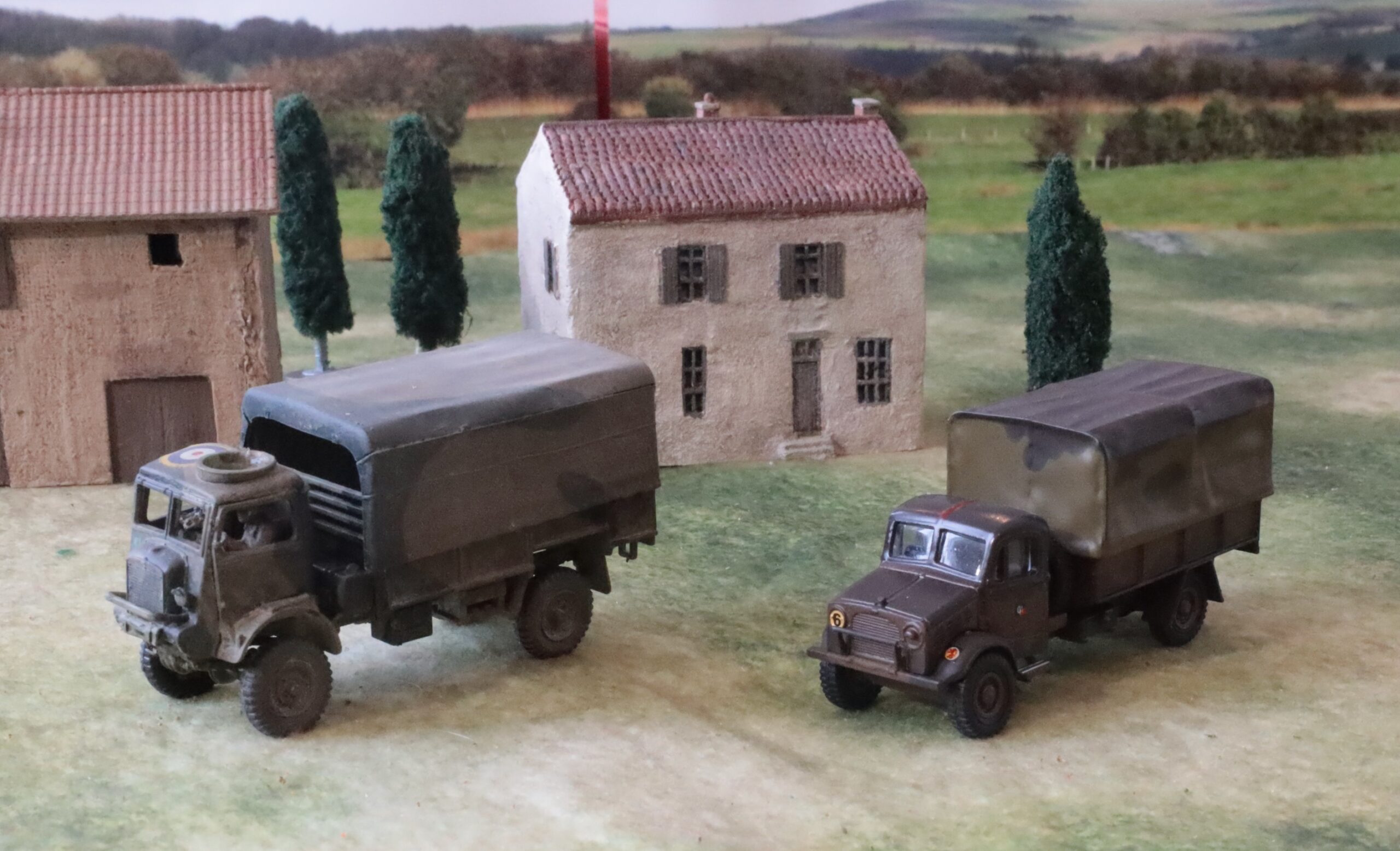
Here’s another view:
The SHQ model is in the middle
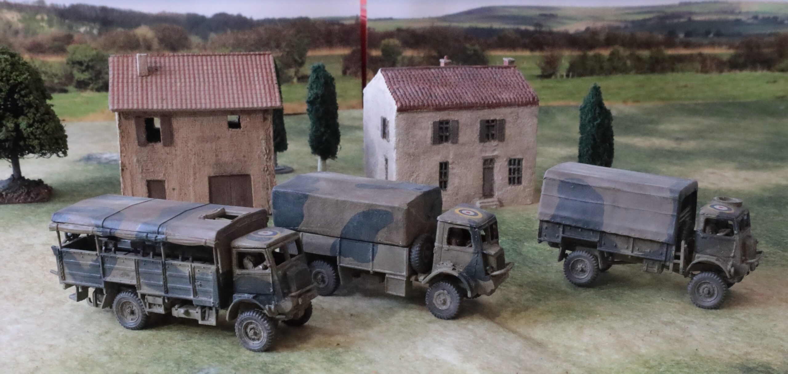
And now for my models in desert colours, the CMP light truck and two carriers:
These are all from Plastic Soldier. The CMP truck was easy enough to put together, but it is hard to get excited about it. It’s a very basic model with no options. I left the tilt loose so that I could play it without should the urge take me. This vehicle has no clear role in my set up, but it is available to shift 2-pdrs or Vickers guns if needed. The carriers are a bit more interesting. The are from the PSC Carrier Variants set. The one on the left is the 3in mortar transport. The mortar couldn’t be fired from the vehicle (unlike the German equivalent with the SdKfz 250), but is stowed away at the back. The crew are the standard crew for the PSC “generic” carrier. The one on the right has a 2in mortar in firing position – this weapon could be fired from the vehicle. Since the light mortar was part of the standard equipment of a carrier platoon, this vehicle will stand in as transport for a carrier platoon in my setup.
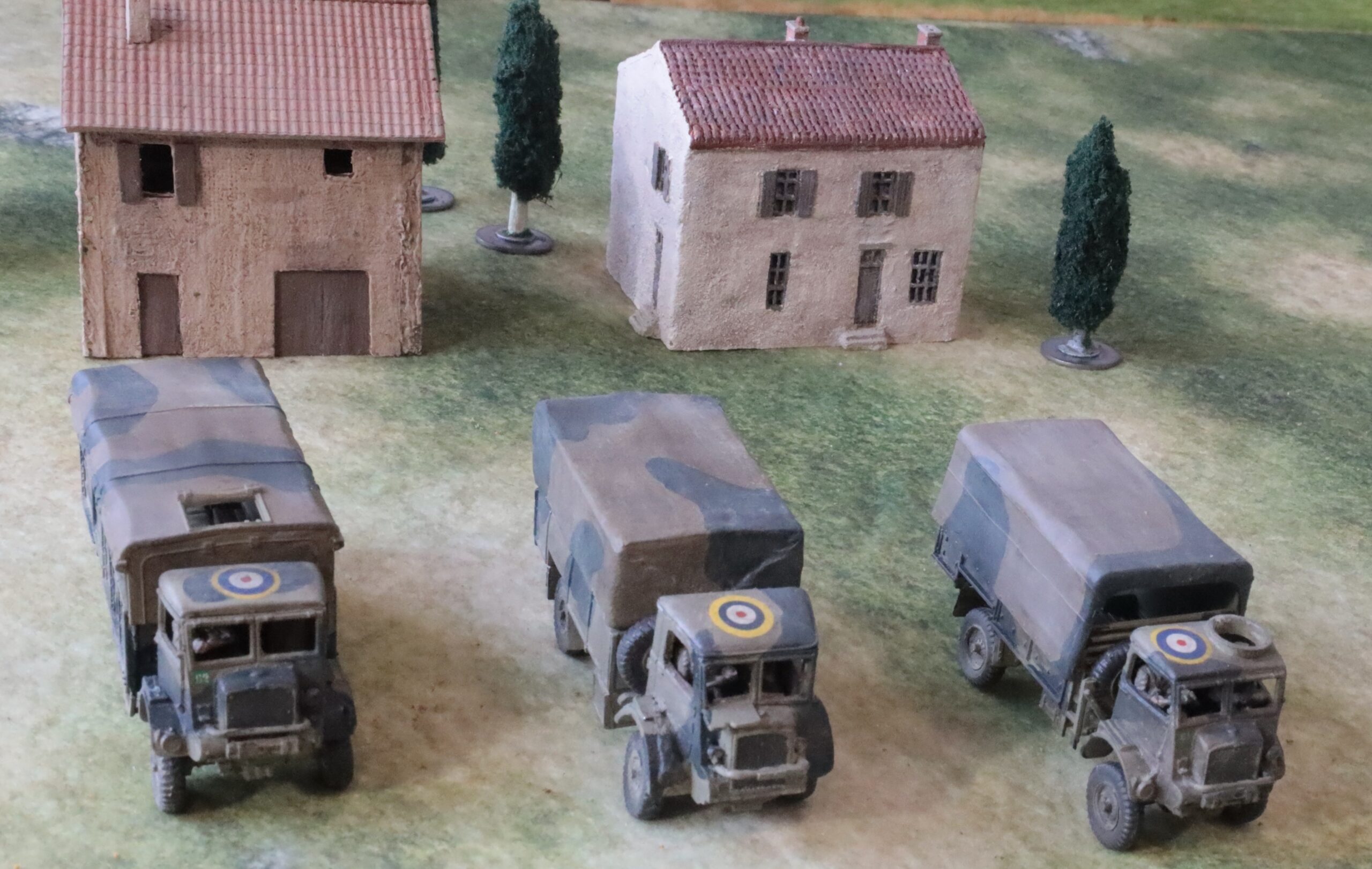
Another view
The Carrier crew are those supplied by PSC. I’m not a fan of these – a lot of PSC figures seem to be sculpted in 15mm and scaled up, looking a bit clumsy. AB make carrier crews, which would be easier to fit into these models than the slightly smaller Airfix ones – but they are rather pricey and don’t have the 2in mortar in action. From a distance the PSC crew work OK. The generic crew are appropriate for NW Europe with scrim on the helmets; the driver comes with a beret, though the head is separate and easy to swap. I hadn’t woken up to the idea of sawing off heads from the desert uniform to use on the NW Europe bodies yet, though the desert heads would have to come from other PSC models – so I left the scrim helmets on, which isn’t realistic either for 1943 or this theatre. The supplementary figures on the Variants sprue are OK in this regard, though not especially nice mouldings. I added a few boxes and bits to make the carriers look a bit more used. The models worked well, with one exception – it’s hard to fit the Bren gun in the front slot when there is crew in the front seat. You have to skew it a rather awkward angle fairly early in the assembly process.
On the subject of the Carriers, I made up a third one from the Variants set, as an OP (visible in my previous post). This is extremely useful on the tabletop, and it is modelled with a heavy-duty radio set and lots of cable for the field telephone – and a ladder, presumably for accessing vantage points. I only have two niggles; one is that the officer with binoculars is rather crude; the second is that there is no range finder amongst the equipment stowed in the vehicle – even though this does seem be there in the picture in the assembly instructions. These instructions, incidentally, tell you which parts belong to which variants on the additional sprue (the set consists of seven generic sprues and one variants – it would have been more useful for the balance to be 6-2 or 5-3…), but you have to work out for yourself where they go based on a rather basic pictures of the assembled models; in my case even this instruction sheet was missing, and I had to find it and print it off from the website. There are complete instructions for the standard generic carrier though, which is just as well as this is much more complicated. There are alternative parts for Mark 1 and Mark 2 versions; I used the former, based on pictures of the vehicles in theatre.
Now for some notes on my painting of these vehicles and the artillery discussed in the last post, including the Quads and limbers for the 25-pdrs (good basic models from PSC, about which there is not much more to be said – no whinges here). There are two schemes: the Light Mud scheme used in Italy, from Sicily onwards, with Blue-Black as a contrast colour; and the desert scheme of Desert Pink, with Olive Green contrast, used by the Eighth Army in Tunisia (but not the First Army in Tunisia, which had darker UK colour schemes, overpainted ad hoc in many cases). The first of these is well explored territory here. I mixed Light Mud from Raw Sienna and Titanium White, with some Prussian Blue. These are the same pigments I use for Khaki, but with a bit more white and a bit less blue. The Blue Black can be made from the same pigments, with only a touch of white and a lot more blue. In fact I think I just dived into another mix I was using that was lurking on my palette, adjusted slightly. Incidentally, I use a wet palette, as I have for many years. Not the expensive one marketed by one of the usual suspects in the hobby world, but a Daler Rowney one that has been going for many years. Mixing paints from artists’ acrylics, this is a bit of a no-brainer, as you want to keep your pigments going across a multi-day project. In fact in the winter (my studio is only heated when I’m using it), the paint kept going for weeks. Which was just as well given all the interruptions. For the tilts on the trucks I used the Khaki mix I had been using for the infantry for both schemes.
The desert scheme was new for me – this being the last of the three main scenes used by the British in the desert (Coulter and Light Stone being the earlier ones). For the Desert Pink I simply mixed white into Raw Sienna. This is a touch less red than the usual portrayals of this colour, though I suspect (for no particularly good reason) that the pinkness softened with weathering. The Olive Green was a mix based on Sap Green, into which I threw various mixes used for the uniforms to dull down and lighten up a bit. The result may be a little dark. Greens are the hardest colours to mix. The schemes themselves were based on a variety of sources, including the official guidelines (which generally didn’t cover the vehicles I was painting and which were usually simplified in practice), photos (giving only one angle) and otherwise guesswork.
Apart from the basic scheme I painted the tyres and radiators (a variation on the dark grey-black mix) and tracks (ditto with some added silver). And that was pretty much it (apart from the crews, painted as infantry). I took the view that other detail (the lights for example) weren’t important enough to pick out. After this came the decals. I put roundels on the truck and Quad roofs, filched from old aircraft decals, and a couple from some an Italeri halftrack kit that I had recently acquired. I also put some arm of service markings on where I could use appropriate ones. I used the ones in the Airfix kit for two of the Bedford lorries. The others were from some I had printed myself a few years ago – but these were tricky and I lost a number of them in the process. Some models, like one of the carriers in the picture, had to do without. I did not bother with divisional markings (these often weren’t used in 1943 in this theatre).
After this came the weathering and high/low-lighting. I wanted to simplify this from the multiple stages of earlier versions. First I used small amounts of white oil paint brushed into a very thin and slightly uneven layer. Then, as an experiment, I mixed some ink into some new acrylic matt varnish that I recently acquired to make a wash. Previously I have used dark oil paint mixed with a slightly glossy medium, to get into the crevices as a glaze (which, in my parlance, is thicker and stickier than a wash) – followed by spray-on matt varnish. But the matt varnish is a very harsh matt, and the effect is too uniform to my taste. So I was trying to combine the two steps with the new, very liquid varnish, which dries off-matt. The basic concept was sound enough, but unfortunately I used some very powerful black ink. This enhanced the crevices beautifully, but made the models too dark. I had to light brush over the lighter colours on the original paint work again (which the wet palette has preserved); even then they still look a little on the dark side, especially the desert scheme. Finally I applied some powdered pastel in a sort of light dusty mix, with a brush. This served to matt-ify the off-matt varnish, without the harsh uniformity of the spray, and create a dusty texture. Apart from the matt varnish wash being a bit too dark, I’m pleased with the results. I have nice weathered finish, and the decals look well and truly integrated – and the method is quite simple.
My next project is the Medinine Germans – which I have now started. But before then I will do a quick post on some Oxford Diecast models I have acquired.
It’s been a long absence since my last post. I don’t tend to post until a project is complete, and my most recent project has been a big one. As usual lots of life has intervened to slow things down. But I also have a lot of half-finished projects lying around, especially on the rules-writing side, which is not conducive to regular posting. Still, I now have something definite to report.
Following my last post for Rapid Fire! for hexes in December, my focus has stayed on WW2. We played two games, loosely based on episodes at Salerno. They weren’t particularly interesting. Much depended on encounters between tanks and antitank guns, turning on a small number of D6 throws. Infantry proved pretty useless. The first game at least had a close finish, but the second was an overwhelming British victory as the Germans failed to make any impression on the British Shermans, while the British scored hits pretty much every time. Scenario design was partly at fault, I’m sure – but the whole thing reinforced my dislike of the bathtubbing aspect of the rules. Too much hinged on too few dice throws. But I like scaling of RF, allowing bigger battles using 20mm figures. So I have embarked on writing my own rules – which will be part of a rules family stretching from Great Northern War to Napoloenics to the 1859-71 wars and on to WW2. It is surprising how much the game structure and mechanisms can overlap. That’s the idea anyway.
But I needed a scenario to focus on. Salerno is tricky at this level, especially if you leave the Americans out (they had more tanks, which makes it easier to design good games), and I think I need more experience with the system to work out how to design decent scenarios. Similar things can be said for Sicily. But Tunisia is another matter – there are more tanks!. As it happens the Rapid Fire crew have two Tunisia scenarios (or scenario groups): Medenine and Tebaga Gap. These are among the last desert battles, as the 8th Army fought their way into Tunisia – and so fit into the desert battle series that has been designed for Rapid Fire. I picked Medenine – the last major German tank attack in Africa- though allied tanks were only marginally involved. The scenario is based on the central of the three principal thrusts, with the 15th Panzer Division’s attack on 131 (Queen’s) Infantry Brigade of the 7th Armoured. I decided to set out on two large batches of model-making and painting, first for the British and secondly for the Germans. I started with the British.
For the British I needed two four-company battalions (actually this was more than I needed for this scenario – but I’d need more troops for Tebaga Gap), each with a 3in mortar (with carrier), a 6-pdr and a 2-pdr AT gun, and a carrier platoon. In addition I needed Royal Artillery support with a further two 6-pdrs and a battery of two 25-pdrs – and brigade command, for which I wanted a Dorchester ACV. Mostly field artillery at this scale is off the table, but I wanted the 25-pdrs on the table as a last line of defence should the panzers (eight panzer IIIs and Panzer IVs) push their way through the four 6-pdrs and two 2-pdrs – although historically they didn’t. I already had all I needed for one battalion except the 2-pdr. For the second battalion I bought in AB Tropical infantry (four packs of 10 plus support weapons). These are a recent release, and work pretty well 1943 British infantry in this theatre (unlike my earlier British infantry, which are more appropriate to Normandy 1944). In addition I had PSC 25-pdrs with Morris Quads in stock. I bought in two extra 6-pdrs from Valiant, to use with an old Airfix one I had in stock, and an AB desert crew. On top of this I decided to bring into service an old Pheasant 17-pdr I had made up in the late 1970s from an Airfix 25-pdr and a Panther gun barrel; I compared it to the parts in the PSC 25-pdr kit (which can be made up into a Pheasant), and it didn’t look too far off. I had some crew available bought a number of years ago from SHQ. I needed more carriers – I still have three of my old Airfix ones (three are already in service with AB crews and look jolly nice too) – but I decided these didn’t come up to snuff. I needed crews. The AB ones look fantastic, lifting my rather ropey old Airfix models to the heights, but they took a lot of work to fit, as well as being pricey. Also I needed one as a 3in mortar transport and, more complicated, as the all-important OP for the 25-pdrs. I decided to go for the PSC variants set, which has seven models which include an OP and 3in mortar transport – as well as one with a 2in mortar in firing position, which I can use for a carrier platoon. Finally there was the question of transport. Strictly this wasn’t needed. The British positions were essentially prepared and static – the lorries would have been well to the rear. The antitank guns were carried on portees, but they were lifted off these into dug-in positions – keeping these weapons concealed was tactically critical. Still, I had three Bedford QL lorries in stock, and I thought it was time to bring these into the picture, together with one of my PSC 15cwt CMP light trucks.
So for this project I assembled some 50+ infantry and artillery crew figures, three 6-pdrs, three carriers, three Bedford lorries, two 25-pdrs plus quads, a CMP light truck, and 17-pdr Pheasant. For this post I will stick to the infantry. Here’s a different perspective on my group photo:
And another, closer up…In the background you can also see a battery command element for the 25-pdrs, which got swept into this photo:
And this one catches the Vickers gun on the end. Loyal readers may notice I have been trying to improve my photography. This now includes a backdrop photo bought from a model railway shop (online). This depicts a a very English looking winter or early spring scene – and I need to pay attention to the join! But it does make the picture look a lot better.
As I already said, these are from the recently introduced AB 20mm British “tropical infantry” range, designed to cover the Med and Far East theatres, when troops weren’t wearing shorts (North Africa) or Burma hats. This works pretty well for my 1943 project – they are wearing the earlier version of the helmet, without scrim, and they are using Tommy guns rather than Stens. In Tunisia it was pretty cold, so even the Eighth Army had abandoned their shorts (though they don’t seem to have bothered with the gaiters, and their helmets were still painted sand) – but their sleeves weren’t rolled up. In Sicily it was pretty hot, and many troops adopted shorts, though not as consistently as in the Western Desert. For Salerno, these figures are just right; later in Italy it tuned cold and wet. I’m making no attempt to get the figures, vehicles and guns to look exactly right for each scenario – and if there is one episode that I’m focusing on, it is indeed Salerno, in spite of my struggles with scenarios. So this range was perfect. I had three packs of advancing infantry, one prone infantry, and a Support 2 pack, with a 3in mortar and Vickers gun. The Support 1 pack has a flamethrower, 2in mortar, AT rifle and a PIAT – and I will doubtless get these later – but I have plenty of 2in mortars and PIATs in the later uniform. (PIATs were not in use in Tunisia – so I could probably have use the AT rifle).
The bases are mainly metal washers, but the prone figures and support weapons required bases cut out from mount board. I decided to have only two crew for the mortar and Vickers (three were provided in the pack) to keep the bees size down. These were plastered with the usual mix of acrylic medium, sand and paint (a mix of white and raw umber) to integrate the figure bases. Once mounted the figures were given an undercoat of artists’ gesso (which is white) mixed with some raw umber. The raw umber and white mix gives a nice neutral grey-brown colour, which is now my go-to base colour for figure paining across all eras. It means that any gaps in painting don’t show up. Then came the usual paint job in various mixes of Liquitex artists’ acrylics. For the uniforms this comprised Raw Sienna (orange-brown), Titanium White and Prussian Blue (not much of the last of these, but it’s needed to get khaki), plus a little green for the helmets. The flesh was based on white and Burnt Sienna (red-brown), but once I get the palette going I keep throwing in bits of this and that. This came out a bit on the dark side, but I did want to get tanned flesh, but with a slight pinkish hue. I’m not entirely convinced, but it probably roughly simulates how my own fair flesh would look in those conditions. I’m painting less detail on the figures these days, so the water bottles and bayonet sheathes did not get more than cursory attention, for example. One innovation for this batch was the use of a light/magnifier. My short-range eyesight is pretty decent, but this in fact proved a big help.
Once the basic paint was laid down I was left with the vexed question of how to finish. With my previous WW2 figures I have used ink washes or oil medium glazes, followed by matt varnish spray. This leaves a very harsh matt finish which I don’t really like – though it’s quite fashionable these days. I have recently tried to moderate this by applying a little not-so-matt varnish with a brush – on flesh, weapons and helmets, but I have been rather underwhelmed by the result. As an experiment this time I mixed some black and brown ink into some Liquitex matt varnish (which is very fluid and dries off-matt). Alas I overdid the black ink and the effect was too dark. I had to go back to the figures highlighting the paler bits, including the flesh. This took me to the margins of the level of shine I can tolerate on WW2 figures (I have a much higher tolerance for earlier eras), but brought out the wonderful AB castings very nicely. I need to go a bit easier on the black ink (the stuff I have is extremely powerful), but otherwise I think I’ve found a good technique.
For my rules system I will need to mount these men in pairs on temporary bases – as I have already done with my other infantry using lower-adhesion Copydex. I still want to be able to use as singles if I want to try platoon level games. Next time: the artillery.
Back to the 1866 project. September and October were largely taken up by holidays and gardening, and figure painting took a back seat. The result was that this second batch of 1866 troops was a bit protracted. It will be a while before I’m ready to refight Custoza.
The figures are 10mm from Pendraken, whose range from this period is unmatched. In appearance and detailing they are closer to larger 6mm (such as from Baccus and Adler) than they are to 15/18mm. They need to be deployed en masse and not a great deal of attention needs to be paid to details. They are providing pretty much what I hoped for to recreate the big battles in the age of Bismarck. I have already introduced this project here with my first batch of Italians. Those figures were more appropriate to 1859 (Solferino, etc) than 1866. These, on the other hand, are very much on period. The infantry are in greatcoats, and the cavalry have updated uniforms.
Like the previous batch, this is a three arms package – though not using Pendraken’s army pack this time. The infantry was a mix of Germans and Hungarians (not that it is easy to tell the difference) – enough for 12 bases of line infantry and three of jagers. The cavalry were hussars (4 bases). The artillery were 4 pdr rifled guns, with one limber (there are two to pack, but I only painted one this time). In addition I painted up three generals (from a pack of 5). I bought laser-cut mdf bases from Pendraken: 30mm by 20mm for the infantry and cavalry; 25mm square for the artillery; I already had plenty of 20mm squares for the generals. This is enough for one three-brigade corps (as was the organisation of the Austrian Army of the South – the main army had four-brigades corps) under the system that I am developing.
Here is a closer look at the infantry:
And even closer:
The troops are in the regulation greatcoat which the troops had to wear even in the heat that June. Funnily enough the Italians used the same system, making the troops remarkably similar in appearance; both sides suffered from the heat. The most distinctive feature of the Austrians was the blue trousers (visible because the front skirts of the greatcoats were buttoned back – as with the French and Italian practice) – contrasting with the bluish grey of the Italian uniform trousers. At least the hats are slightly different. One more distinctive feature of the Austrians was that their webbing was pipeclayed white, rather than left dark. However the pose for these figures has the arms and musket in front of the body concealing this. With figures so small it is not worth trying to represent this, apart from the drummer. That at least makes them quite simple to paint. The jagers also wore the greatcoat – though not always, apparently – so I might do some without – perhaps to represent the elite Kaiserjäger. I painted the generals in their grey field uniform. They all came in the same pose, which means that they won’t look right if paired up to represent more senior commands. There don’t seem to be any good figures to represent ADCs, and a charging hussar (I have some spares) won’t look right either. I think will have to use infantry officers.
Moving on to the cavalry:
These are hussars. My system is to represent a regiment (4 squadrons) in two bases. One pair of bases is painted up as the 1st Hussars, which were at Custoza, and the other as either the 4th or 6th regiment – neither of which were in Italy, but which provided a nice contrast, with their light blue uniforms and scarlet cap bags (compared to dark blue and green). The uniforms were much simplified from the Napoleonic era, and not much detail was possible at this scale.
Moving on the artillery:
These are rifled 4-pounders. The trail seat on these Pendraken figures is a bit clumsy though. I may try cutting it down in future. I have put four crew figures on each base (as opposed to three for the Italians) as the Austrians had 8 guns to a battery rather than the usual 6. The mounting is a bit too tight for this though – in future I think 30mm by 25mm would be better. Looking ahead, I want to have some heavy 8-pounders as well. Pendraken don’t make these, so this might be a bit of a challenge. The woodwork was apparently not painted, unlike in the Napoleonic era – but I haven’t seen any clear colour representations of how it looked. As far as I can see it was a bit redder than than the ochre paint used beforehand – which suggests it was stained or varnished in some way – otherwise it would soon start looking a dull grey. I opted for a slight orange-brown, though I can’t say this screams “unpainted wood” to me.
How did I get the raw metal figures ready for the table? The first stage was to mount them on the bases (10 to a base for line infantry, 6 for jagers), set in a matrix of acrylic medium with a mix of white and raw umber paint. I didn’t mix any textural material (such as sand or model railway ballast) in as I do for larger figures, as I thought this would make the basing a bit trickier and slower, with the grains getting between the base of the figures and the mdf mounting. I had previously tried plaster filler, but this proved even trickier. I can’t say I have found the ideal basing matrix – but mounting such individual small figures in dense formation (6mm figures are usually come in strips) is quite tricky. I hoped I could just squish the figures into blob of matrix, but wasn’t that easy. After the matrix had hardened I painted the whole assembly, base included, in white gesso mixed in with Raw Umber paint to create a dry earth colour. After that came the main job of painting, using my usual artist’s acrylic paint. Obviously it was tricky to reach lots of places on the infantry bases, with the figures so close together – but if you can’t see it there’s no point in painting it. This was much rougher and readier than my normal 18mm painting. There was very little in the way of striking high contrast detail to lift the figures (such as white cross-belts, facings, plumes or hat pompons). It still took a few sessions. There really is no good way to speed this up. I used oil paints on the horses, mimicking the technique I use on 18mm – but it was messy and it was hard to overpaint reins, etc. With little positive benefit (the figures are bit small for the wiping technique to create high/low lights) – so I won’t be doing that again. Given that these are armies assembled in peacetime I made the horses on each pair of bases look similar with only small variations (and grey for the trumpeter).
These figures needed a wash or glaze with a thin dark colour particularly badly to bring out the moulded detail that could not be picked out in paint. Like my Italians I used a glaze made with a supposedly fast drying oil medium, mixed with a little brown oil paint. This did an excellent job of distributing the dark pigment to the lowlights, but the finish was too glossy: I wasn’t looking for ultra-flat, but there are limits. After giving it 24 hours to cure I started to apply the basing material – flock or “turf”. This was a big mistake as the basing material stuck to the touch-dry but still slightly-sticky glaze, and I had to abandon it. I then decided to apply matt varnish (which I had done for my Italians) – using some old Winsor & Newton varnish designed for oil paintings. This is nasty, sticky stuff where the flatting agent tends to separate out in the bottle and is very hard to mix back in. I had to take out a quantity of the runny stuff and the some of the gunky flatting agent to mix together in a small batch. Thankfully the result was the right off-matt finish. It was only after this was thoroughly dry that I went back to applying the basing material – just flock this time, as I decided that the turf didn’t look as good (though I used it for all my Italians). Applying flock to the tightly-packed infantry bases was still pretty hard to do with it sticking to the figures themselves. This is hard enough in 18mm! I frequently had to use a large brush and water to clean up the figures. For my 6mm I don’t bother with flocking at all, though I use a textured basing matrix. But that leaves the smooth metal bases visible and didn’t want to do that for the larger figures.
The base flocking/turfing is good enough, without looking particularly good. I will stick with the flock in future, but with variations on the bases with large exposed areas. The main thing I need to change for the next batch is low-lighting glaze. I need to get it in done one coat, without the need for an extra coat of varnish. I have acquired some acrylic matting medium to try out. This is milky when wet but turns transparent when it dries. This will make it tricky to judge the right to amount of ink to mix in. A challenge for next time.
The final step was the flags. For the infantry I used the Pendraken printed paper ones. The cavalry standard was moulded metal – which I did a rough and ready paint job on – which wrks OK at arms length. The flags are important for such relatively dull figures.
I have ordered the next batch of miniatures. I will concentrate on doing a large batch of Italian infantry. This isn’t very exciting but I’m hoping to generate a bit of speed so that I have enough figures for a decent game as soon as possible..
My recent game, which the Swedes taking on the Russians
How time flies! It’s been quite a while since I last posted. My hobby focus has been mainly on my Great Northern War project – though as usual the rest of life intervened to limit the time spent on it. I developed my Carolus Rex rules ready for a proper live game in April. Since then I have modified them, and they are now published on here the Rules Page. I have also painted up six more infantry units (mostly Swedish) and a few other bits and pieces. That draws a line under GNW for the time being. It’s on to the next thing now.
The game was with the monthly group from my old club, which I’d had to miss for a couple of months. There were six of us. It was a sprawling affair using the bulk of my Swedish and Russian armies (I left some Russian infantry, a lot of the Swedish artillery, and the Swedish irregular cavalry out), shown in the picture from the Swedish side. There was no serious terrain. Although the Swedes had much the smaller army, the Russians were mainly D class, and the Swedish troop and command quality showed through, especially with their cavalry. The Swedes had one hairy moment, when the Russians managed to rout both Swedish guard infantry units. If the Swedes (played by me in this case) hadn’t done well on a divisional morale check, and then managed to rally one of the units, it would have been a big struggle for them to win. But the game flowed well, and we concluded within the time allotted. The feedback from the players on the rules was very positive – no big holes were revealed, though some tweaking was needed. Cavalry was too powerful against infantry, and flank attacks needed to be a little more effective. The one issue I won’t fix is the card driven activation system, which means that the six players need to go sequentially, reducing the possibility of parallel processing. I think this dynamic adds a lot to game play.
I have made those tweaks to the rules, as well as correcting a few other details. Increasing the effectiveness of flank attacks meant I felt the need to introduce an option to form square for infantry. This is perfectly historical, in fact, but there is a risk of the unit becoming disordered as it forms up. Interestingly I also changed the rules in a couple of places to reflect what we actually played, rather than what I had written. What we did was more intuitive and made better sense. I am pretty pleased with the rules overall. s discussed before, I feel I may have tilted a bi towards playability rather than historicity, especially in command and manoeuvre, but I do think I have caught important aspects of combat in this era. It should be possible to use them for other conflicts than Swedish/Russians in 1708/09, except that I haven’t developed them to cater for the new Dutch fire discipline methods and three-deep lines, used by Britain and the Netherlands, and neither some of the looser infantry and cavalry types used by the Ottomans and others. I might also want to distinguish between “galloping’ and “trotting” cavalry charge tactics. But life is short and I don’t plan to build armies for these other conflicts. Next time, though, I will design a more interesting scenario – the one inspired by Holowcyzn that I used in early play testing is a suitable starting point.
After that I painted one more batch of figures to give me more options for armies on both sides. These were four Swedish line infantry battalions, two Russian guard battalions, a Swedish heavy gun, a small unit of Swedish Drabant cavalry, and seven artillery limbers. While I still have more metal to paint, I plan to draw a line under things for these armies now. I will only paint up more if a particular scenario demands it. If I have enough units to keep a six player game going for four hours plus, I don’t need more.
For the Swedes I painted four units from different regiments: Kalmar, Skaraborg, Västerbotten and Västmanland. Until now I have prepared two battalions from the same regiment, except for two Manning (additional draft) units. But I have the flags and in any case there is usually a bit of bathtubbing going on in my scenarios. The first two of these units are in hats, and the second two in caps (karpus). I don’t think that the karpus was as widely used as I have them in my armies, but I had bought a lot of the figures from Baccus, and they were a bit nicer than the ones in hats anyway (since then Baccus has brought out some better ones in hats).
The Kalmar and Skaraborg infantry unitsThe Västmanland and Västerbotten units
I have plenty of Russian infantry, but there was something to be said for having a couple more guard units to beef the army up. I painted these from the Semonovsky regiment, with its blue coats. Like my two units for the Preobrazhensky regiment, I attached foil pennons to the pikes. the evidence for this is pretty thin (one of my early source book suggested it), and even thinner for their use in battle (unlike cavalry lances, where the pennons were considered to add to the psychological effect). Still it helps make the guard units special. I painted them mid-blue with a red lining, like the company standards.
The Semonovsky Russian Guard units
The Swedish Drabants were Karl’s personal bodyguard, and like him were often in the thick of the fighting. I didn’t really need this unit, but Swedish armies were heavy in cavalry, and this unit gives me more options. They weren’t up to full regimental strength, so I’ve had to create rules for smaller, two-base units.
For artillery, I wanted a Swedish heavy gun. The Swedes weren’t usually big on artillery, which hindered mobility, but they did use 12 pdrs at Holowcyzn, and I had the metal. Why I bought a mortar I don’t know, as these were generally siege weapons, but having bought them I thought I’d better paint one up in Russian livery. The other piece in the picture is the regimental artillery for the Semonovsky regiment – which was a matter of covering a piece that I had already painted.
The Drabants, the Swedish heavy artillery, the Russian mortar and a light gun
And finally limbers! I’ve made light (regimental) artillery and even field guns relatively mobile, without the need for limbering – so in our game players didn’t bother with limbers, as it takes a whole turn to limber up (limbers were not under military discipline). But in my next scenario there could be a lot more movement, and I had the metal away. So I painted up seven models to join the two I already had. One of these (like both the earlier ones) had two horses; the other single horse ones are there for my plentiful regimental artillery.
For painting technique I followed the same method as my last batch, described earlier this year. The main point of interest came at the end, when I used a rather dark wash. I started to use my Windsor & Newton peat brown ink, but this has turned thick and very red in hue with age. I tried diluted Antelope Brown (Liquitex I think), but this was very yellow – so I added some black, which is strong stuff and overwhelmed the brown. As I merrily applied it (including to the bases), I thought it enhanced the look. As it dried I the result was a bit dark – it’s not just poor photography in the pictures. I felt the need to highlight some of the yellow facings on the Swedes, and some light yellow highlighting on the bases. this proved to be quite a quick and easy process, leaving me to think that perhaps the lighter colours (facings, flesh and weapons) could be done after a dark wash (with paler base colours), using a quick dab of paint. This going down the rout of the black outline style that I have dismissed as being cartoonish. But it may be more appropriate for the tinies.
My next project is 10mm figures for Italian/Bismarck wars of 1859-71. More of that anon.