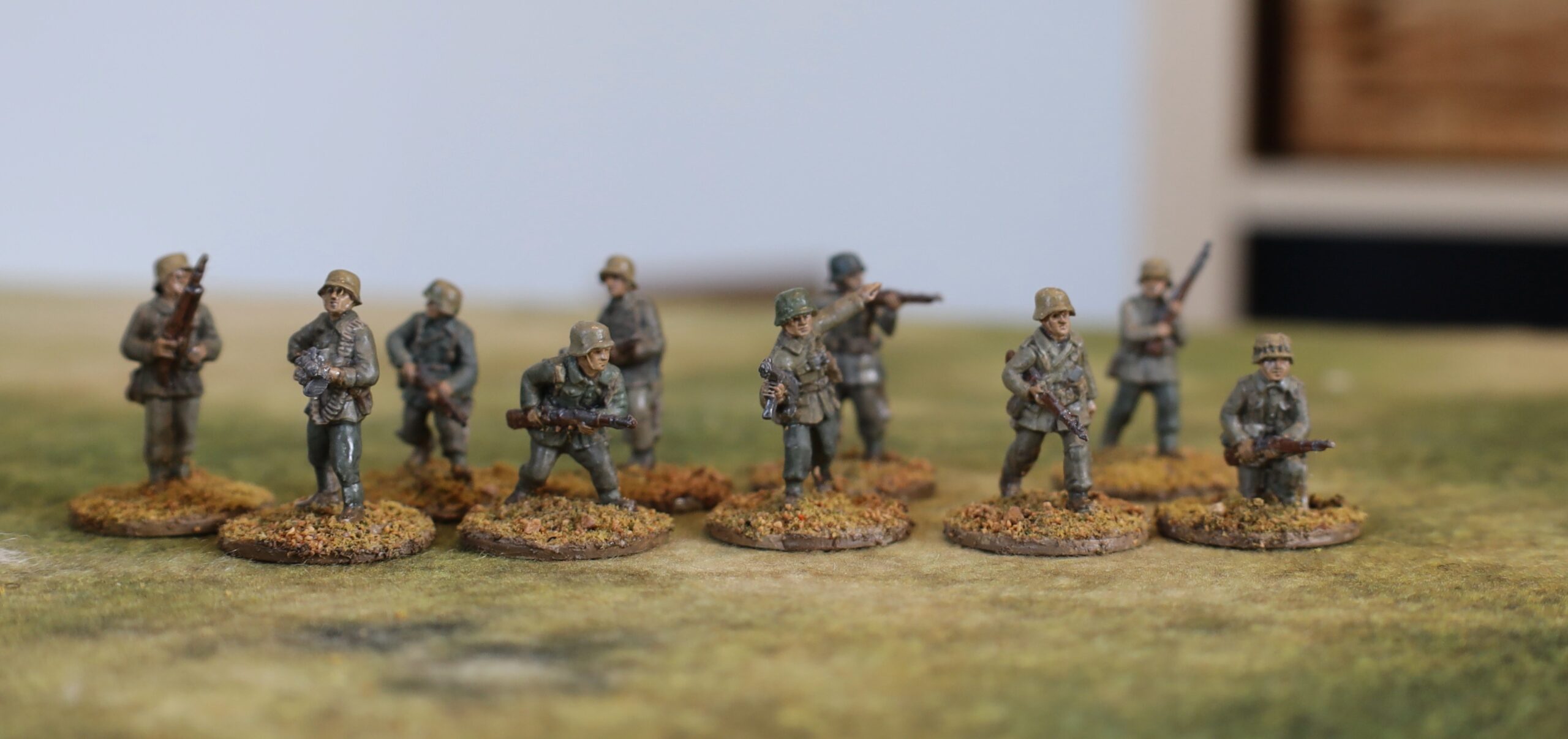
After getting back into the Great Northern War, it was time to bolster my rather limited armies, and run down my lead mountain. My biggest deficiencies were Russian line infantry and Swedish cavalry. So I have painted up six units of Russian infantry, and two units each of Swedish line cavalry and dragoons. I added in some regimental artillery, and a Swedish general. It is some years since I last worked on 6mm figures, so this is quite a break from normal.
The miniatures are from Bacchus, and were all bought back in 2012. I bought a job lot from a friend who had decided to take a different route on his GNW forces. I then developed an absurdly ambitious plan to build up my armies, and bought loads more from Baccus. Then I got distracted when about half had been painted up, and the painted and unpainted figures lived in a plastic box for a decade or so, rarely seeing daylight. I had enough painted up enough for an interesting game, but choices for force composition were very limited. My plan was to paint up two more batches (this is the first), amounting to half or so of the unpainted ones, and then stop – unless a particular need arises.
My original figures were painted in a manner quite similar to my larger 18mm ones. I painted them up before mounting on bases, and put quite a bit of detail on them. Even the barrels on the muskets. But I noticed that this was taking quite a long time, for a scale which was supposed to be quick! This time I wanted to take a different approach – more inspired by Impressionist painting. Impressionist paintings are beautiful from a distance, but make a lot less sense closer up. This is harder than it sounds!
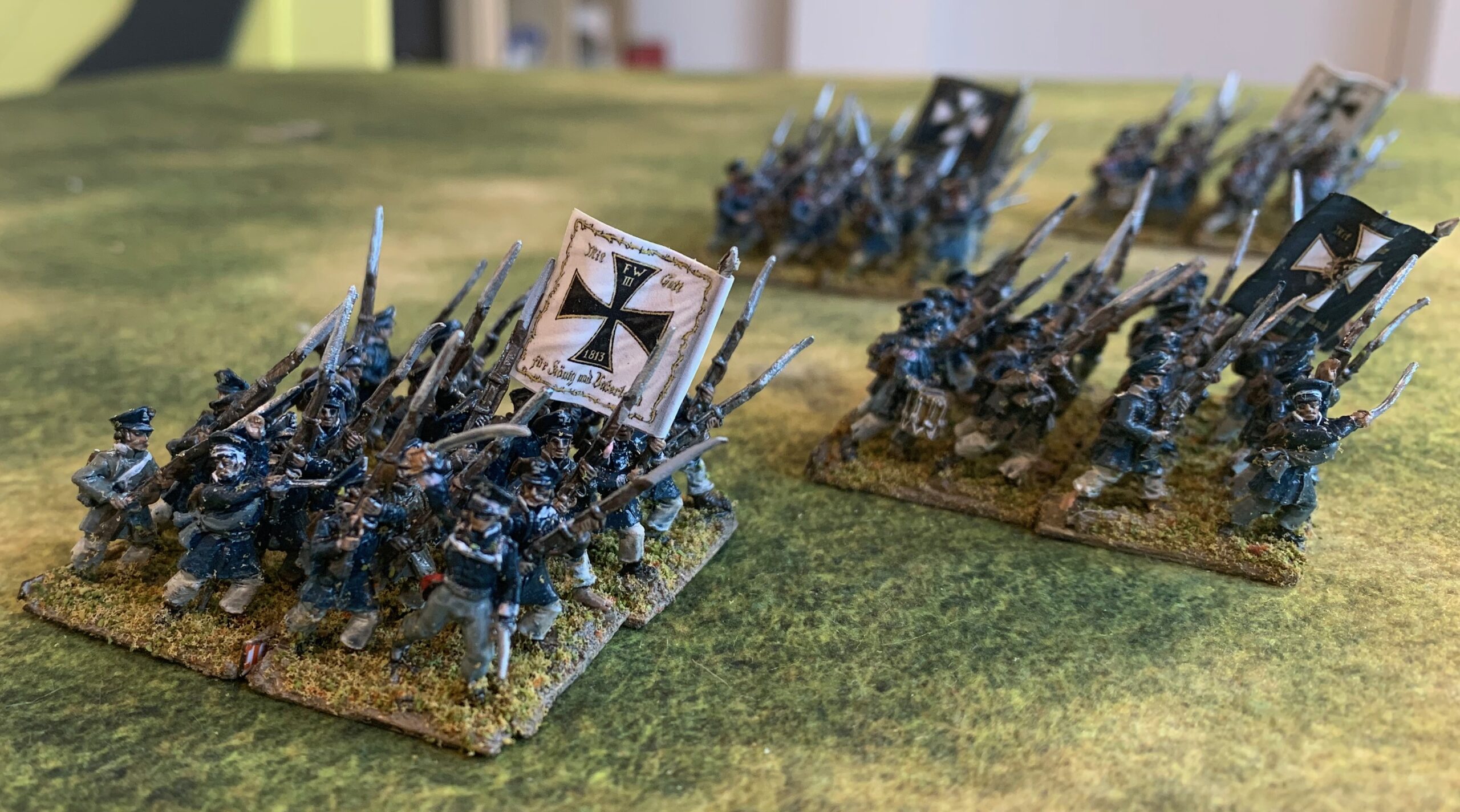
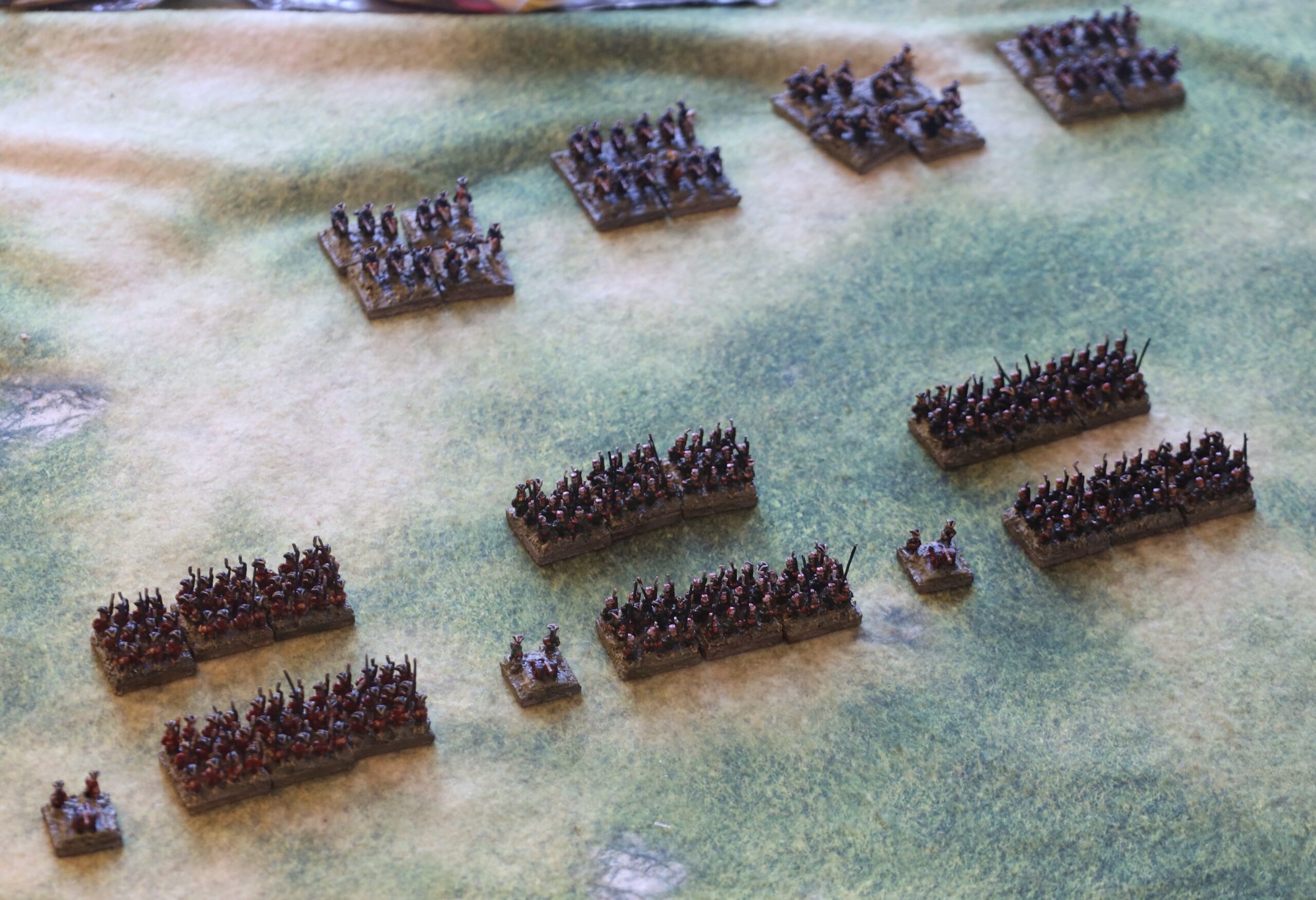
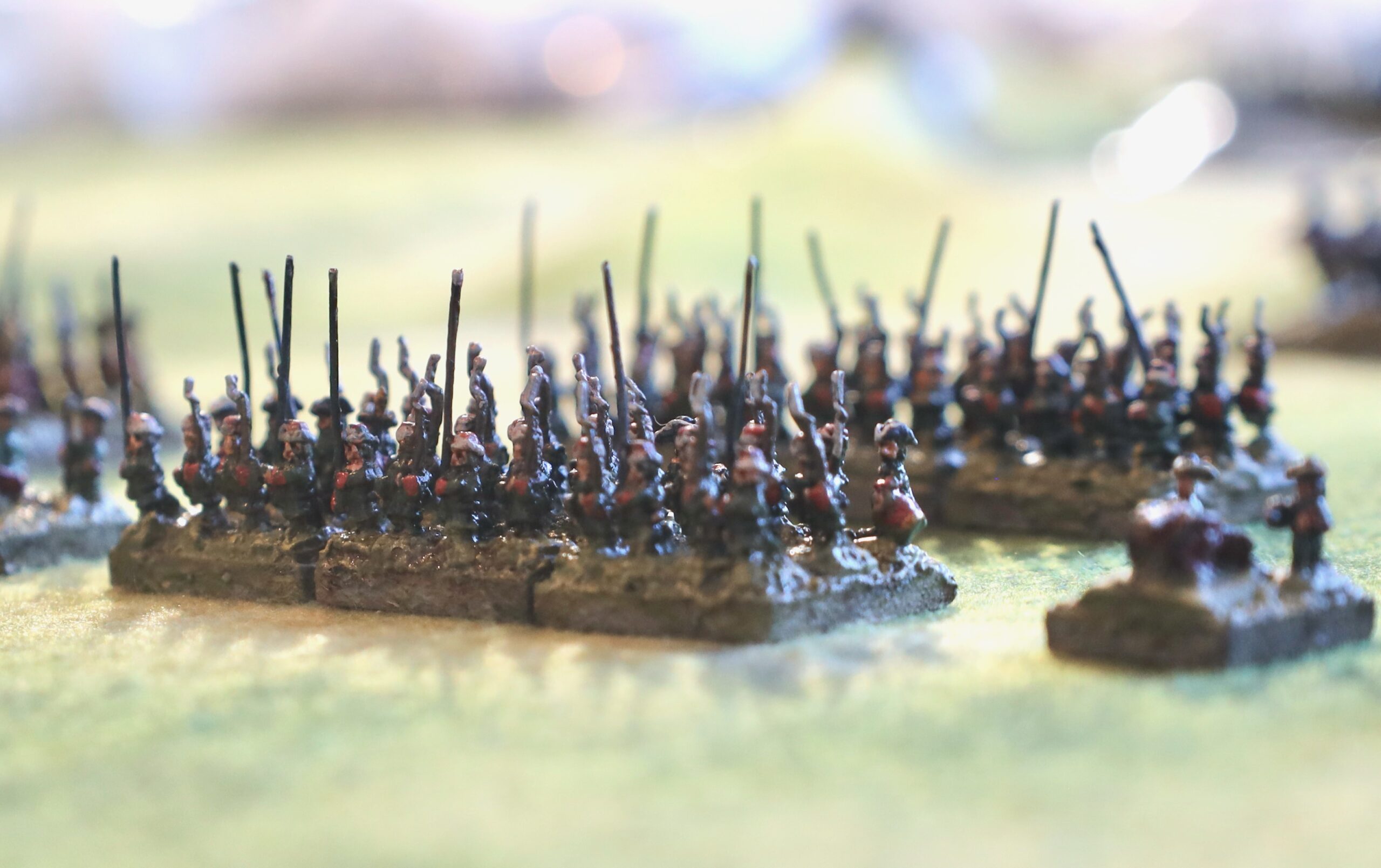
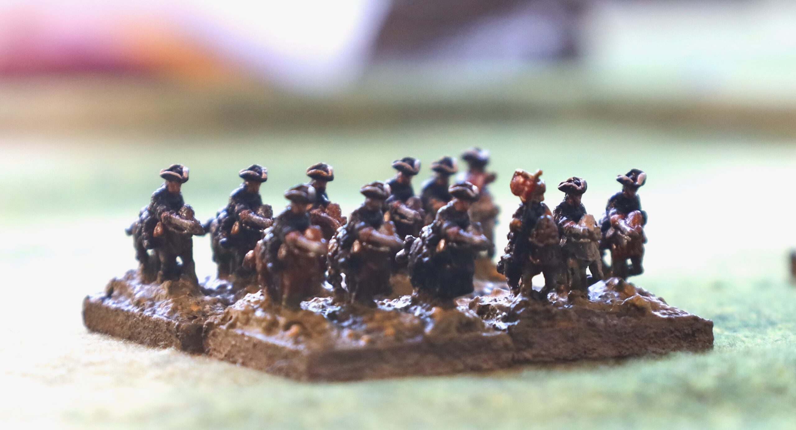
The first step was to mount them on the bases. Apart from the artillery, these are mounted on 20mm squares of MDF, which I had bought along with the original figures, and of which I have more than I will ever need. The regimental artillery is on 15mm squares. I find this system of basing very attractive – though it is what caused my friend to abandon his miniatures, and buy in others mounted on larger bases, with one base to a unit. Baccus produces its infantry figures in 20mm strips of 4 side-by-side. Three of these fit comfortably on a base one behind the other. Historically formations were four deep, with about 150 files (i.e up to 50 per base). So these bases are both too shallow and too deep! Nevertheless this basing recalls contemporary representations in pictures. This would be easy if I could simply plonk the strips on the bases. But there are two problems. Firstly the command strips (supplied at a ratio of one in five in the packs) only have one standard bearer, along with an officer, flanked by two drummers. I like a good proportion of my units (typically the first battalion of a two battalion regiment) to have two flags. That means cutting up the command strip, and then the line strips to make room for the spares. The second problem applies to the Russians only. Russian infantry at this time was armed with a small proportion of pikes (one in eight); I read now (this wasn’t in the literature in 2012) that these were deployed in every other file in the front rank. I decided to represent this, rather than just plonking a strip of pikes in the back row of the centre stand, as I did before. I decided to distribute them PMPM; PMMP; MPMP – so that the pikes would be on the corners. That means cutting up the pike strips, and also the musketeer strips for the front row. Each pair units uses three command strips, three pike strips and 12 musketeer strips. You can just about see how this works on this close-up:

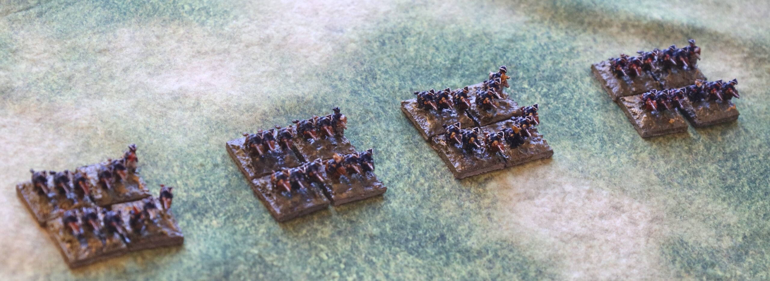
The cavalry is more straightforward. These are come in strips of three, fore-and-aft, so they have to be cut up anyway. I mounted the Swedes three to a base, the cavalry staggered to represent the arrowhead formation, the dragoons side-by-side. Actually the Swedish dragoons fought in the same manner as the cavalry; they were equipped to fight dismounted, but I don’t know of them doing this ever in a significant battle (though I know almost nothing of the later war years), unlike their Russian counterparts. Still this mounting serves to distinguish them on the tabletop. Here are the four Swedish units:
I mount the figures in a matrix of acrylic medium mixed with model railway fine track ballast and raw umber acrylic paint. This is the same method as before. The ballast is something I have had for decades: it is finer, lighter (in weight) and more uniform than the sand I use in bigger scales. It gives the surface some texture. After the assembly is fully set, I primed them with gesso mixed with paint. I went for an overall pale grey-green shade (it has to be pale because of the gesso). This is equivalent to the ground in a canvass painting (thinking back to the Impressionists) – the idea is that the colour doesn’t jar if it shows through (modern painters sometimes use a bright ground, thinking that it adds to the effect when it shows through – not appropriate for the wargames table!). Since it was going to be difficult to paint the bases between the strips, I wanted something that would merge with the base colour comfortably – hence the green element. I was overthinking that – in future just mixing in some raw umber (of which I have industrial quantities, thanks to a mistake by my supplier) with the white gesso will be fine. I used an old paintbrush to do the priming, covering both figures and base. I gave some thought to using an airbrush, but actually it can be a little hard to get airbrush paint into nooks and crannies, and getting between the figures and rows wold be tricky. It didn’t take too long with the brush, but it looked awful afterwards, though a lot better after cleaning with brush soap.
Next was the mass painting stage. At his point I treated all ten units and extras as a single batch, though no colour applied to all of them. I started with the horses, using various shades of brown, with some Payne’s Grey, so get a variety of bays, chestnuts and blacks – with a few greys, mainly for the musicians. Also I applied the main coat colour (blue, red or green), and then dark grey for the tricorn hats. For all this, I used my now standard technique of mixing artists acrylic (mainly Liquitex – as their tube design is easily the best, prolonging their life, as well as being excellent quality). No faffing with oil paints as I do with my 18mm horses. All mixes have a bit of white in them. The red was dramatically dulled down (from Cadmium Red Hue) to reflect cheap dyes and campaign weathering; the green (Sap Green as a basis) and blue (Prussian Blue Hue) were dulled down somewhat less. The horse colours (Raw Umber, Burnt Umber, Raw Sienna and Burnt Sienna) didn’t need much mixing beyond a touch of white – though the Siennas are a bit bright and I mixed a bit of the Umbers in.
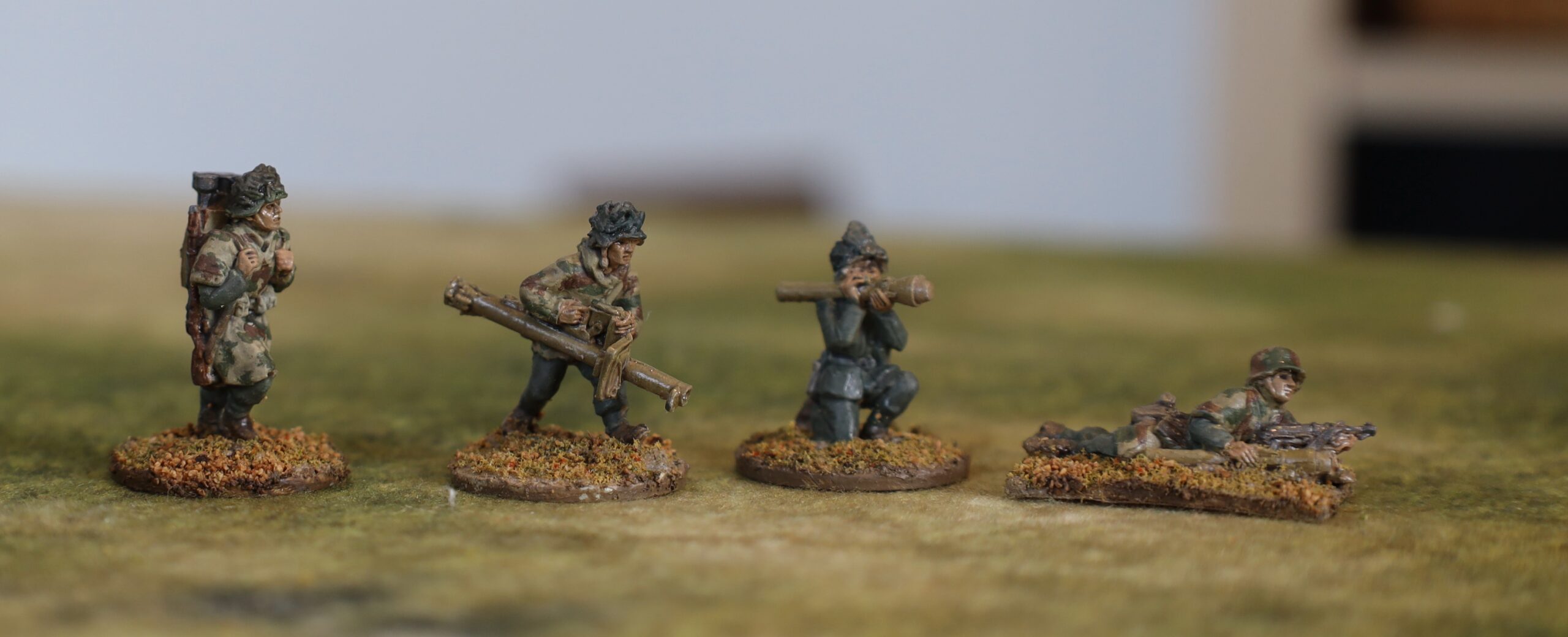
After this I concentrated on finishing each unit in turn. The Russian units were in pairs of battalions from the same regiment, and each pair was treated as a batch. My worry was that if I did each colour for the whole assembly, I would start to lose the will to live, as the results would take so long to show – as well as the greater likelihood of mistakes. What did I paint? Flesh on the faces and hands; red or yellow facings on the cuffs only; brown for the muskets (where easy to reach) and the hair at the back of the head for the back row; dark grey for the pikes, cavalry boots and the scabbards for the rear ranks only of the infantry; I used a paler brown for the pistol pouches on the front of cavalry saddles . Accuracy was not a priority: blobs here and there where I could reach the spot with a brush. I ignored the legs of the infantry and the neckerchiefs; these aren’t visible enough. Finally some detailing. The hats got trim of white, yellow or gold. This detail really stands out when viewing the figures from above; similarly the karpuses had a contrasting lining colour (white or yellow – against he red main colour); silver for the bayonets, sabres and the pike trips; visible straps on the backs got quick attention too. The drummers and officers got a little more work (including the flags for the cavalry – a base colour, edging and a blob in the middle). And that was it. The final step was to wash the figures with diluted ink (peat brown or black).
Then, of course, there are the bases. I don’t go for the fashion of elaborate works of art; I don’t want the bases to draw attention away from the figures, and ideally I want them to blend with the table. At this scale my normal techniques of using flock, sand and/or static grass wouldn’t work – the strands and grains are too big – I just used paint and the texture arising from the basing material (i.e. the model railway ballast). It took me a long time (i.e. trial and error) before I settled on a shade of green that wasn’t too verdant or too grey – a combination of black, white, Yellow Oxide and just a little Sap Green. I then gave them a heavy highlight of a white and yellow mix. I also used a white and Raw Umber mix on some of them. I was left with the issue of the base sides. The MDF I am using for the bases is very chunky – typically I use much thinner material for bases, so as to blend better with the table. But I like the feel of the chunky bases, and it certainly makes handling easier – you can grasp the bases rather than the figures. But what to paint them? At first I tried a green to match with the table surface – but then I noticed that these edges were often shaded. I thought a bit of countershading might work, so I used a white and Raw Umber mix. Whether or not the countershading works (not really light enough from the pictures above), I did like the overall result.
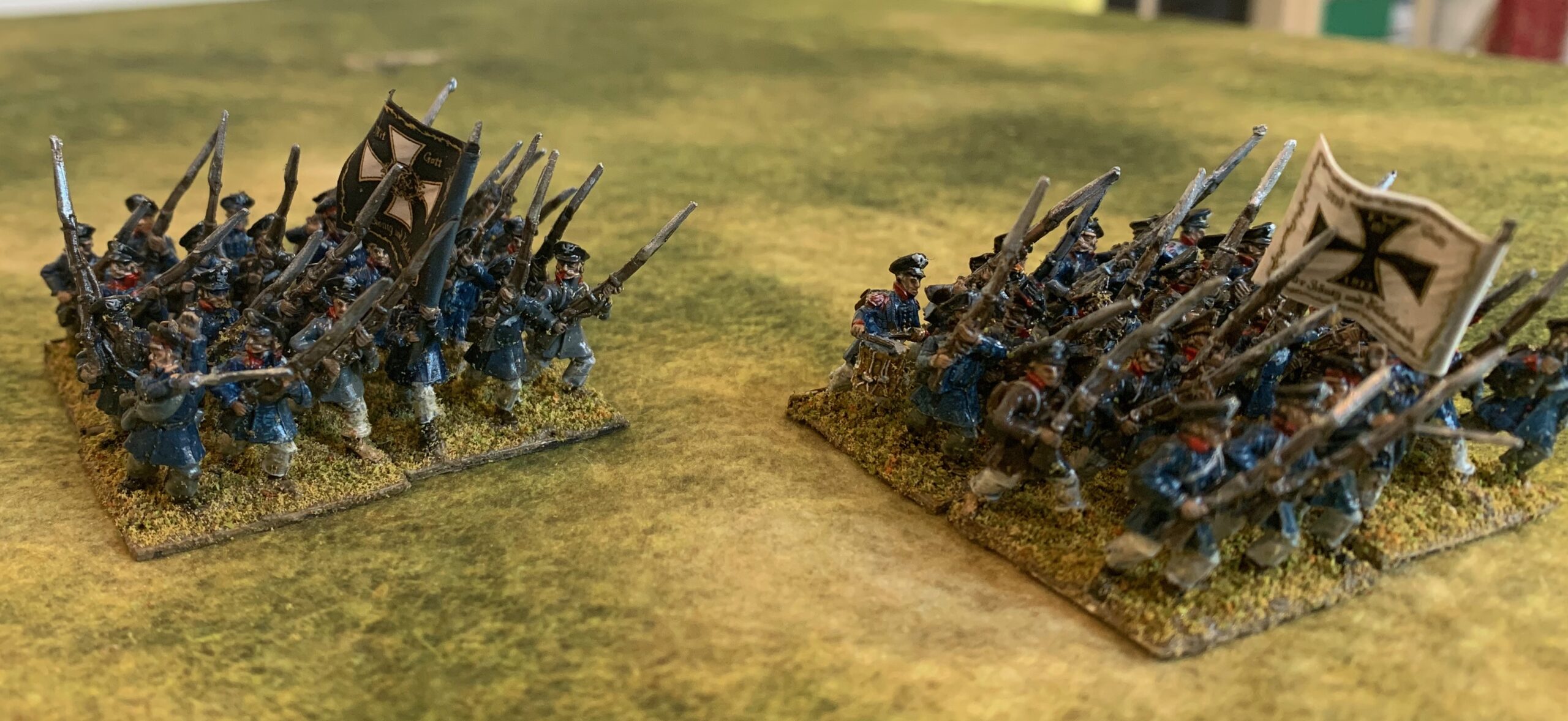
The infantry represent three Russian regiments – Astrakhanski, Butyrski and Schlisselbergski, with two battalions each. Uniforms were subject to the colonel’s whim at this stage, and there was a lot of variation. Evidence for particular regiments is patchy, and my sources back in 2012 disagree with the most recent ones (a book from Helion), so there’s a lot of guesswork. I gave the Astrakhanski and Schlisselbergski green coats with red facings – the most common scheme, which later became the standard. I gave both of them a carpus for headgear in place of the usual tricorn – because I had a lot miniatures with these hats which needed using up (Bacchus don’t appear to sell them any more for the Russians) – these I coloured red and yellow and red and white (one of my existing regiments has a green and white karpus – allowing a ready distinction between the three units). The Butyrski regiment I gave red coats faced yellow, with tricorns with yellow trim. I haven’t given them their flags yet – I’m waiting for colonel’s flags with eagles, though I have coloured company flags from Baccus. I painted the regimental artillery crew in the uniform of the parent regiment (though with tricorn hats in all cases), but the gun itself in red, as used on the bigger guns.
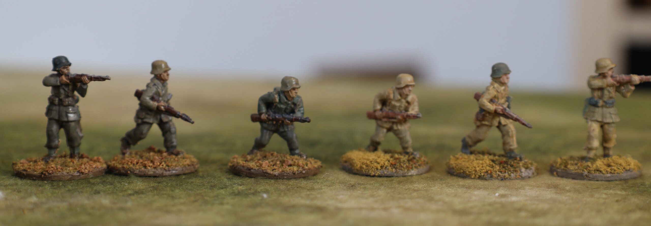
The Swedish cavalry represent the Småland and Nyland Indelt regiments, along with the Gyllensterna and Taube dragoon regiments. These all had the standard Swedish blue uniforms; I decided not to try and represent the yellow breeches or coat turnbacks, with facing colours (yellow, red or blue coat colour) on the cuffs only. On the Swedish infantry it will be worth a dab of yellow on the front for the breeches and turnbacks for the front rank at least.
And that was it. Alas my photography at this scale is a bit weak, so I’m not giving much of an impression of the result. They are a bit dark maybe (but they need to fit in with my earlier figures) – perhaps an example of the rule that you should use paler colours for smaller scales. But the results work on the tabletop – the Impressionist approach works, and is certainly quicker than attempting too much detail (and correcting minor mistakes). I did need to repaint the bases on my earlier figures to make the assembly more coherent – but I didn’t like these earlier bases anyway – they were too bright and too dark. I will move straight on to next batch, which will add four Swedish infantry units, along with two more units for the Russian Guard, a Swedish heavy gun, a Russian mortar and more limbers.