At last! Back to the painting, which I had been forced to stop in February by pressures from the rest of life. Naturally I am starting where I left off, with my 1943 forces. I need to paint enough so that I can get a game going. When I broke off I was in the middle of my most complex project to date: the Royal Scots Greys’ Shermans at Salerno in September 1943. This means resolving one of the key issues when doing British vehicles in the Italian theatre. What is Light Mud?
Light Mud was the new camouflage colour introduced in 1943 by the British command in the Mediterranean, as British forces became embroiled in the mountains of Tunisia. The desert camouflage schemes based on Light Stone and Desert Pink were no longer appropriate – too pale. Meanwhile the service drabs of vehicles shipped from Britain (dark greens and browns) were too dark. Other colours had been used, including Mid Stone, and various mixes, but Light Mud became the new standard by order from April 1943. It was meant to be used in conjunction with a disruptive pattern in Blue-Black – though it often wasn’t.
But what was it? It was manufactured locally (in Egypt) and any specifications have been lost. I doubt whether many original samples of the paint survive, or not without irredeemable weathering. Almost all photos are black and white, and the colour pictures are unreliable. There are verbal descriptions that mention grey and khaki. This would appear to rule out one suggestion, that the colour was produced from a mix of Dark Stone (a dark yellow) and Desert Pink. That would have given a sort of light tan. It could have been a mix of Desert Sand and Dark Olive Green, the standard colour for disruptive patterns – my personal pet theory, as it would have been a good way of using up stocks of redundant paint. We are left with the idea that it was a light to medium grey, with a dash of khaki about it.
These illustrations from Star Decals is where most people seem to end up.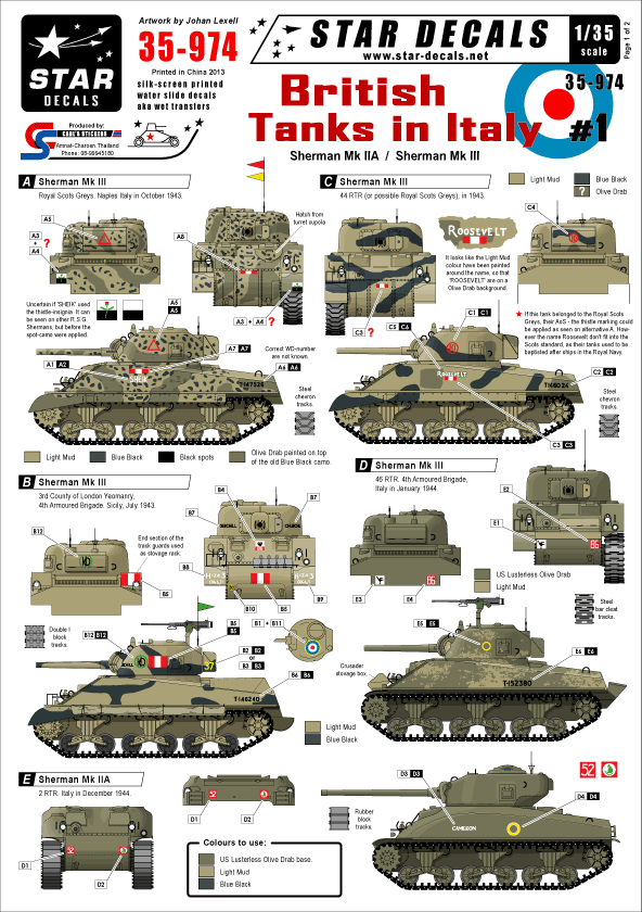
Another source has been a book published by AK paints called The Real Colors of WWII. This claims to based on careful research, including on surviving samples. It includes quality-controlled colour chits. Inevitably, almost, most of this effort seems to have been on German colours, because that is where most hobbyist interest is. They do have a chit for Light Mud, but I don’t know what sources it is based on. That looks greyer and darker than the star decals sheet, but then the same can be said of the Olive Drab. Tonally the colour seems to be very similar to Dunkelgelb, the standard mid to late war German vehicle colour. But it is greyer, though not that far from the grey end of the spectrum of different Dunkelgelbs. I have used the AK book as my main guide on hue, but looking for a rather paler tone than the chit, because of the scale effect and the use of Quickshade later in the process.
I decided to use the same method that I used to produce Khaki. Start with a base colour of Raw Sienna (an orange-brown), dull it down with Prussian Blue, and add white. I used student colours for the blue and the white, but used up some old Liquitex artist grade Raw Sienna, as I don’t yet have student paint for that pigment. My policy is to use student paints for vehicle base coats, and move to artist quality for finer work.
This took a few goes. After a few months out of practice I may have lost my touch a bit – though it took me just as long to reach a satisfactory Dunkelgelb for my Germans. On two occasions I thought I had it right, only to decide that it was too dark or too green once the model was fully dry. It may be that the paints aren’t drying true – a bit of a risk perhaps when you use student colours. The result is here, with one of my German Pz IIIs for comparison. The German tank should probably be a bit greyer, but it looks to be within the authentic range. 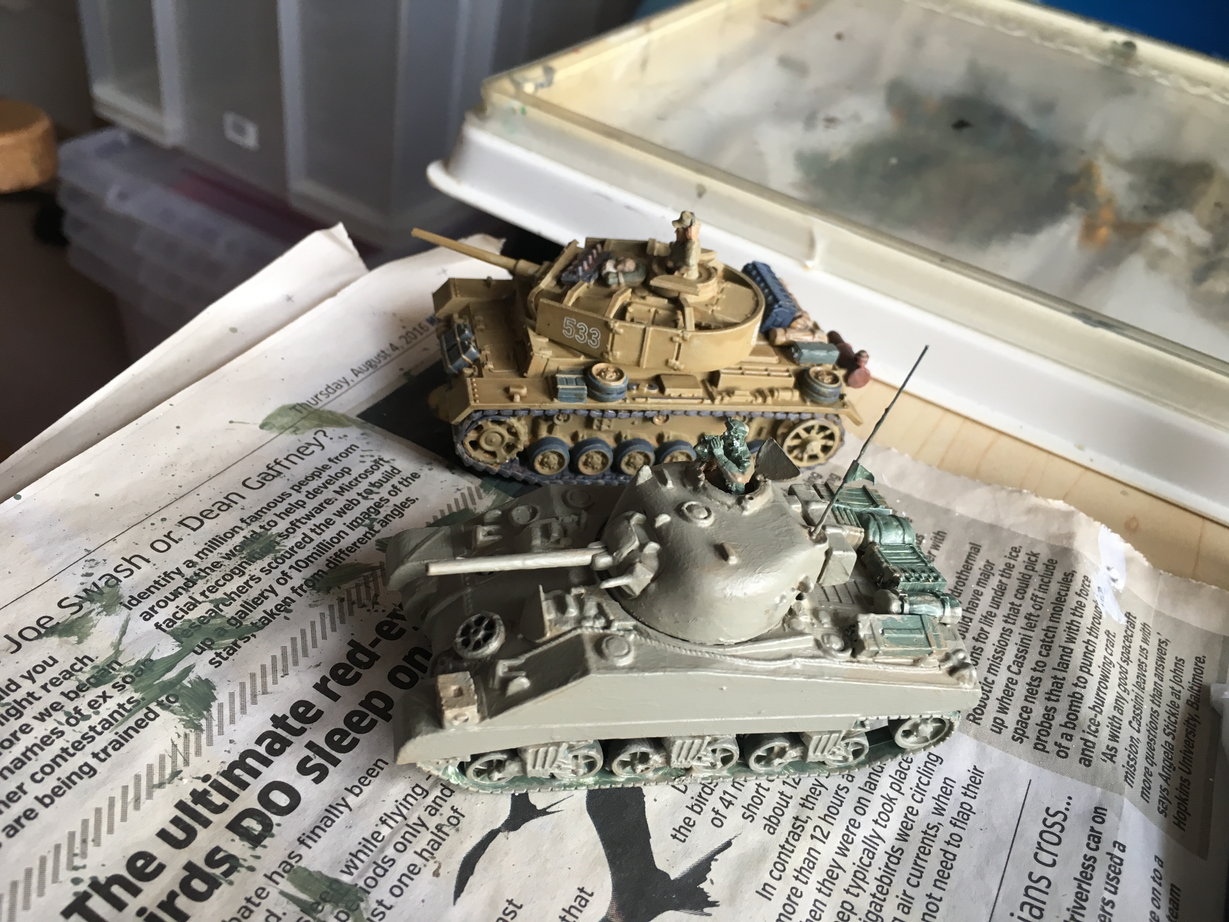
It does look a bit green, especially compared to the Star Decals sheets. But apparently that’s how it was. Incidentally it is one of the issues when with working with khaki – it sometimes looks green and at others brown.
The next step will be putting on the Blue-Black disruptive colour. The Salerno pictures show high contrast with the Light Mud, before the dust patina built up.
Leave a Reply