Monthly Archives: October 2017

Barossa and Bussaco: unsatisfactory histories

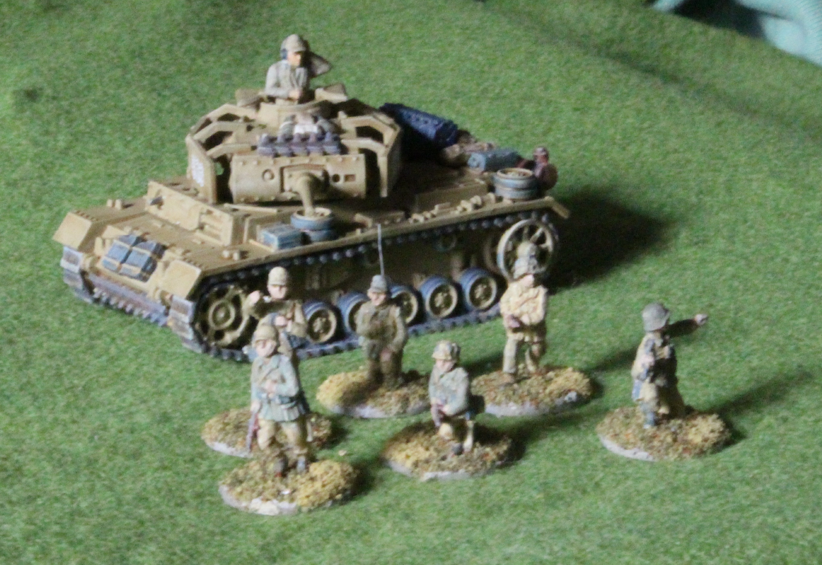
Back to the Napoleonic Wars. I have been doing a little steady reading of accounts of the Peninsular War. English-language histories of battles between the British and French are very stereotyped – one of my ambitions is to develop an alternative narrative of the infantry tactics in particular. My hope is that my reading will shed some light on. This time there was less light than I hoped.

The first book was The Battle of Barossa 1811 by John Grehan and Martin Mace, published in 2012 by Pen & Sword. This battle near Cadiz was dramatic and historically important – though often overlooked by historians, because it was away from Wellington’s main army. Though the book centres on the battle, it takes on the whole siege of Cadiz – which is interesting enough. But the book is a big disappointment. Though quite well written it is little more than a rehash of British accounts of the affair, with no attempt to extend the usual sources; all the (limited) primary sources are British, as were the overwhelming majority of secondary sources. If recent Napoleonic history teaches us anything, it is that new insights are likely to come from overlooked foreign sources. Since this particular campaign is neglected, that would be particularly the case. So far as the main historical narrative is concerned, the main feature is the tense relations between the British and the Spanish, and between various Spanish factions. This very nearly led to disaster in the battle itself, where the British contingent ran into a superior force of French, with the Spanish failing to come to their aid – they nevertheless secured a remarkable victory. Alas this book throws no new light on proceedings, and contents itself with condemning the Spanish inconstancy. 200 years on we really should do better than that. And as for the battle itself, the narrative is the familiar one. There are no new insights, and no attempt to pull the usual accounts apart and put them back together again. Tactically it is an interesting battle, but I’m going to have to do that pulling apart myself if I want to get to the bottom of what happened and why.

My reading on Bussaco, the main battle during Masséna’s invasion of Portugal in 1810 is a bit different. This is an important battle, and much has been written about it. It is usually characterised as a standard French column versus British line encounter – but I wanted to understand how much that was based on actual evidence, and how much people were filling in the blanks with how they think it must have happened. It started when I picked up a translation of Colonel Pelet’s account of the campaign. Pelet was a senior aide to Masséna. I was drawn to this book because it contained a very interesting account of Ney’s attack, describing an intense skirmish duel between the French troops and the Light Division. This account is widely quoted in forums and such. It is an interesting and colourful account of the campaign from the French perspective. It was translated by the American academic Donald Horward. This drew me to Horward’s account of the battle: The Battle of Bussaco, published in 1965; I managed to find a second-hand copy, formerly belonging to the late Paddy Griffiths.

Horward’s book is quite slim but interesting. This is proper history, unlike so much of the amateur stuff published these days (including that book on Barossa). The sources have been properly compared, and the disagreements and controversies tackled head-on. It is quite interesting because it is written mainly from the French perspective; and in fact there seem to be a lot of French sources. His account of the battle itself has a very different feel to the normal ones based mainly on British sources. I only wish that more history of this quality was written today. For comparison I read the relevant chapter of David Buttery’s 2007 work Wellington against Massena, which I had bought but not read, and René Chartrand’s Campaign Osprey, which I had read before.

Chartrand and Buttery do not see the need to pick apart the standard British account, nor refer to controversies – but prefer to dramatise things a bit. For the former, that rather goes with the Osprey format, which allows little space for analysis. Buttery can’t resist filling in the blanks a bit – though Horward does that a bit too. Horward always describes the British artillery as raking the French with “grape and canister”; in the same cases Buttery says they fired shot. (This was also the first battle in which shrapnel was used, though Wellington was unimpressed). In one passage Buttery describes the British using rapid fire tactics – even though this was against British doctrine at the time. And I’m afraid that reveals a major limitation in all three works. They aren’t actually interested in the French and British tactics, and so they don’t press the evidence very hard.

My working hypothesis on Bussaco was that French tried to use heavy skirmish tactics to beat the enemy, but were thwarted by the superior skirmishing ability of the Light Division. The evidence doesn’t really hold up for this. There was indeed a lot of heavy skirmishing (in contrast to Vimiero and Talavera), but the most important encounters were between denser bodies of men. And the French suffered a clear disadvantage from exposed flanks, even though they had superior numbers. This fits the column and line thesis – but that doesn’t quite work either. The terrain was very broken, by steep slopes, crags and gorse. It was very difficult for either side to hold formation. Descriptions come through as disorderly melees. The tiredness of the French advancing up steep slopes with packs may have been a factor, as well the momentum of the fierce Anglo-Portuguese counterattacks. And the Allies did not have it all their own way. Foy was able brush aside the Portuguese 8th and 9th Regiments (probably only one battalion of the 9th); Buttery and Chartrand dismiss this as being down to overwhelming strength but that looks far too glib in view of how the French struggled to use numerical superiority elsewhere (Foy outnumbered the Portuguese by about 2:1).

Foy’s attack, effectively the third and last wave of Reynier’s corps was actually remarkably successful, capturing the plateau at the top of the ridge. It looks to me that at this point Reynier had Picton beaten. It required well-time reinforcements from neighbouring divisions (especially Leith) to restore the situation. If the French had reinforcements at the ready, perhaps the outcome would have been different. But Junot’s corps was in completely the wrong place. And that leads me to an observation relevant to the grand tactical level, and more relevant to my rules project. The Anglo-Portuguese were able to beat off the French easily enough, but at the cost of considerable disorganisation. If there were French reserves ready to exploit this disorganisation, then they had an opportunity. That’s how Foy’s brigade captured the summit at Bussaco – though by then the French were themselves disorganised.

I have less to say on Ney’s attack. It strikes me that the terrain here was much more complex, and that I need to look at it again to get any new insights.

1943: my first German infantry platoon

After a productive summer, holidays and the rest of life intruded, and my build-up of forces for 1943 halted. Apart from buying a few more things to make up later; I now have a mountain of plastic, resin and metal. My next project was a German infantry platoon.

This unit needs to be reasonably generic for Sicily and Italy and perhaps Tunisia, and mainly to serve as panzer grenadiers. The first question was which figures to use? I am in love with at AB range, but their Germans are really meant for further north, in standard  uniform. I don’t have many pictures of German infantry in Italy for the period though. I did look at alternative figures from SHQ, and didn’t like them as much as the ABs. I decided that a paint job on the AB figures would do. At a distance the tropical and summer uniforms mainly used by these troops resemble the standard uniform. There should be troops in shirtsleeves, and more caps, perhaps, but less so in Salerno theatre which is the centre of my planning.

My platoon consists of three sections of eight men including an MG34 (or MG42) team, and an HQ section of 5 plus a radio operator, and two teams of tripod machine guns and 81mm mortars for support. No panzerfaust or panzerschrek , as these belong later in the war – though I need to have these as a gaming option later. I had already painted up the mortar teams in the early pathfinder stage of my project. The support weapons, of course, should cover a whole company – but I want to have tabletop options. My thinking is to do a second platoon of paratroops later – as these played a prominent role in the campaigns I am representing.  But not until I have made some big inroads into my plastic mountain.

And so how to do the colour scheme? I’m not used to painting WW2 anything, still less German infantry. And I’m making life harder still by mixing my own colours from artists’ pigments. I can’t use the paint-by-numbers guides published by various sources based on commercially sold micro-shades. Add to that the lack of photos as reference sources and the project is quite intimidating. This undoubtedly affected the end result, which no doubt can be pulled apart by an expert. The Germans of this era had long since dropped the early war smart uniformity. They cobbled together their “uniforms” from multiple sources, and personalised where they could. This says something quite important about German military culture, a hugely successful one it must be said, which went against the alternative military idea that compromise on smart uniforms would lead to breakdown of discipline. I am reminded of a quote about Wellington about not caring about the state of his troops’ uniforms as long they kept their weapons clean. There seem to be three main sources for infantry uniforms  in this theatre. The most important was the olive tropical uniform (used in north Africa); there was also the standard field grey uniform (a greyish green at the start of the war, becoming muddier as the war progressed); and then there was the reed green summer uniform (a dark greenish grey). The olive and reed green uniforms were cotton, which does not hold dyes well (think jeans), and the uniforms were subject to a lot of sun-bleaching too. So these rapidly faded to something much lighter, almost chino-like in many cases – something modern artists seem reluctant to represent. In addition there was some camouflage cloth in use for helmet covers and smocks. The helmets were often repainted locally, and often seem to be quite light – I suspect the standard equipment dunkelgelb was used, alongside olive and grey. All this is quite confusing, and I have no clear mental picture of what I am aiming at.

I decided on a three colour palette plus white, with silver for some of the metal. The colours were yellow ochre (actually Liquitex yellow oxide), Venetian red and Prussian blue. In my pathfinder batch (the mortars and some anti-tank gun crews in smocks) I used yellow ochre, but experimented with purple, black, green and a dark orange. What I discovered was that using bright organic pigments (the purple and the orange) was quite hard when aiming for the dull colours of WW2 military uniforms and equipment. Best to start with something duller. The Venetian red is an old Windsor and Newton pigment, in a tube with a deteriorating cap (not like my preferred Liquitex, whose tubes last forever) – but I have found it a very useful pigment; burnt sienna would probably be just as good, as no strong red pigments are needed (except for the mortar bombs, which I had already done). I used artists’ colours throughout, rather than trying cheaper student colours, as I did (successfully) for the tanks, on account of the amount of fine work. I mixed quite a decent quantity of a base coat, not dissimilar to dunkelgelb which the all the miniatures got (after priming in white). This was mainly yellow ochre and white, but with red and blue added to dull down. Other colours were reached either by taking some of this mix and tweaking it, or mixing from scratch. This is a fairly decent modus operandi  – though it is much easier to mix greys and blacks if you have two complementary colours in the palette – such as blue and orange/brown, or green and red. Purple is a complement to yellow, but my dioxazine purple is very bright and quite hard to use – though it does produce a beautiful dark yellow when mixed with yellow ochre, I just can’t get a properly neutral grey/black. Hence I had to use my red and blue in combination to neutralise it, which can be tricky to balance. I could have brought a brown like raw umber into the palette, which complements the Prussian blue well, but I wanted to see how easy it was to keep the colour palette down to just three. My thinking is that the fewer pigments I play with, the easier it will be to reproduce in later batches (one reason which I am recording so much in this blog!).

After the base coat, the jackets, trousers and helmets were painted in different variations of grey-green, olive and dark yellow – all mixed in with liberal amounts of white. The straps were painted light brown, rather than the black used further north, but ammunition pouches and other bits were dark grey. Other bits of equipment were loosely based on  Osprey illustrations, but not with a great deal of confidence. I mixed a bit of silver into grey for the metal bits. I painted camouflage covers for some of the helmets, as I had for my anti-tank gun crews; I used the Italian three-colour scheme (olive green, chestnut and dark yellow). Large amounts of Italian camouflage cloth was appropriated by the Germans, though it probably didn’t come into large scale use until later in the war – it is relatively easy to replicate. I will attempt the rather more complex German patterns for my paratroops. I added a small length of fine fuse wire for the aerial on the radio set in the HQ section (I don’t think infantry platoons usually had radios – but these are meant to be panzer grenadiers, where that was surely more likely).

After the painting, a light dry-brush with a dusty colour. I used the white and raw umber mix I used for the bases for this (in student paint), with a little extra white and the dark yellow base colour. I am getting a bit less heavy-handed with this – but the boots certainly need it, and I think it softens the colour blocks. After that Quickshade soft tone. All this took two weeks elapsed time – though if I had been less interrupted I could have got it done in a week. My Stay-Wet palette worked really well this time, after being not all that satisfactory in the summer. This kept the larger quantities of mixed paint fresh. It’s a bit cooler now – plus also I was careful to make sure that the original water reservoir was well-loaded.

After the Quickshade had hardened I flocked the bases. The bases were mainly “steel” washers (sold as such, but they turned out not to be magnetic) and mount board cut in rectangles for the multiple figure bases (the machine guns). These were covered in a mix of sand, paint (raw umber and white), and impasto gel, applied at the same time the figures were glued on.  The flock is from Woodland Scenics – a mix of Earth blended turf and yellow grass fine turf, plus some longer grass on some of the bases, though this is coming out rather matted. I find these materials bond to the bases rather well – the matt varnish seal sprayed on at the end is all that’s needed to seal it. Other products leave a trail of specks when handled, unless you seal them in properly with a soaking of water and PVA glue.

And here we are. The first group are from AB’s prone infantry, though I left one of them out by accident. Next comes the HQ section from various AB sets, alongside one of my Pz IIIs.Next are a section based on the AB advancing skirmishing set:Now the advancing cautiously set:The tripos machine guns:And finally the mortars, painted earlier:

No terribly good pictures I’m afraid – I have more to learn about taking pictures of miniatures; this was my second attempt. It is interesting to note the effect of sunlight on the colours – it was all natural light though.

Verdict? They’ll do fine, but I don’t think I’ve quite hit the spot. The brushwork isn’t that brilliant – but then I didn’t want to take ages over them; I don’t think that’s the worry. They just don’t look very German! I may have overdone the very bleached clothing too. The trouble is that I don’t really have enough idea about what I’m aiming at.