Alas the course of wargames projects rarely runs smoothly. I’ve been suffering from a cold this last week, and not felt well enough to go to the studio above the garage to keep my painting going. My Custoza project is barely further forward from last month. But it has given me more time to read. Attention has shifted to Napoleonics.
Games
I went to my club (Tunbridge Wells Wargaming Society) for my first game there in ages. We played Général d’Armée 2. I have already reflected on that game and pondered on the rules at length. Sunday after next I should be returning with another GDA2 game with much the same forces but a fictitious scenario. Whether I will try out some the new house rules I was pondering is yet to be decided!
Projects
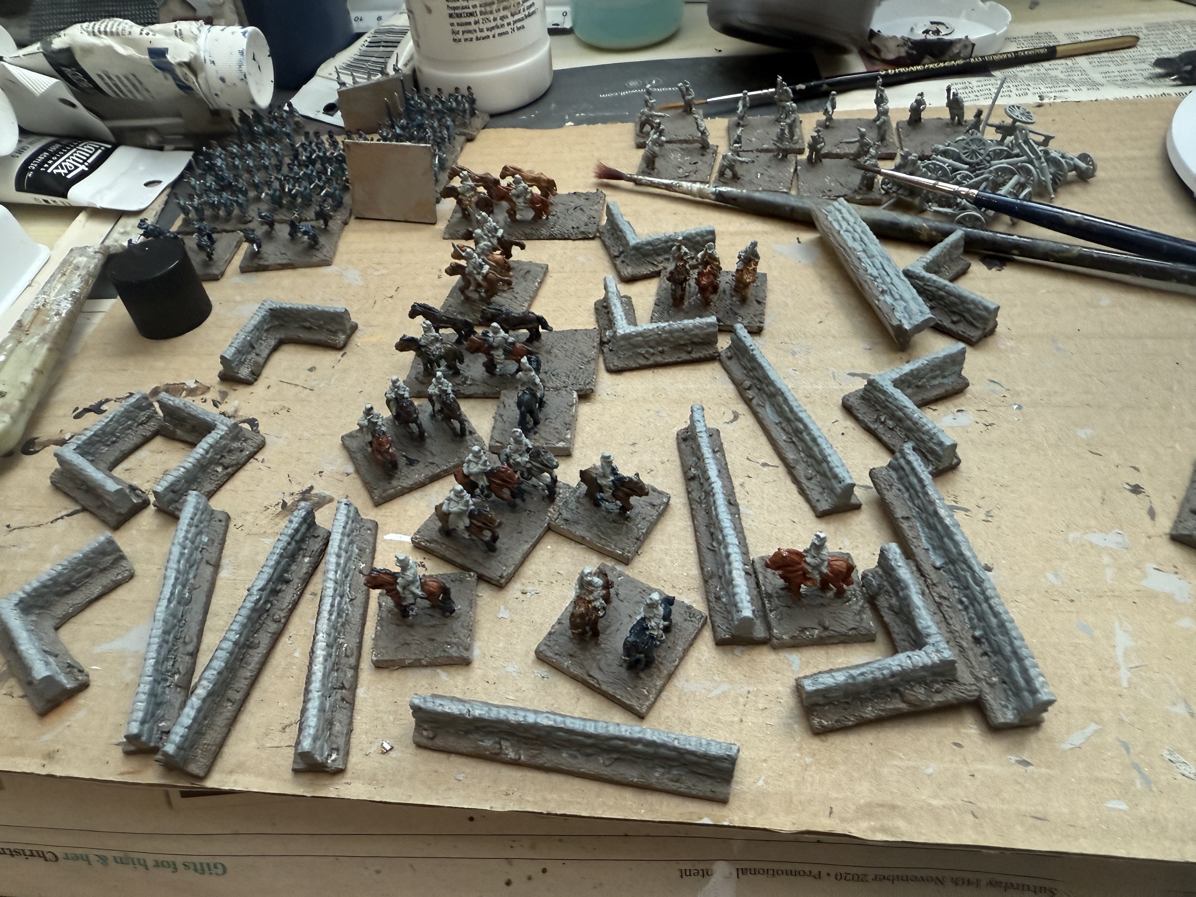
My incomplete Italian project amid the new stone walls.
I was a bit distracted by getting ready for the game, and then by things going on in my life, before the cold took hold. So my 10mm Custoza Italians are in much the same place as a month ago: I have painted the horses and bases. It won’t take long to finish these once I get going though. Meanwhile I ordered from Pendragon all the figures I will need to complete the Austrian army. My plan is to is to do this in one mega batch. Once I get going with this, I will order the remaining Italians. This won’t be done by Christmas!
One of the distractions came because when getting ready for the Lützen GDA2 game I found myself short of buildings. I also found a box of 10mm Total Battle Miniatures buildings unpainted. I promptly got on with painting them. They just need finishing (weathering and a wash). There were also some stone walls.
The Total Battle Scenic buildings before finishing
Once the Italians are done I have decided to switch back to my 18mm Napoleonics. I have been reminded that my overworked French infantry need reinforcements. I have the figures for six battalions of late war infantry, and I want to get these done (three line infantry, one Swiss and two Young Guard is the plan).
Rules
I have finished drafting my 1866 rules Forge of Nations. These need to be play tested. I am also contemplating some house rules for GDA2, as noted. And I am working on my own version of a quick reference sheet for those rules – which I will post about when it’s done.
Research
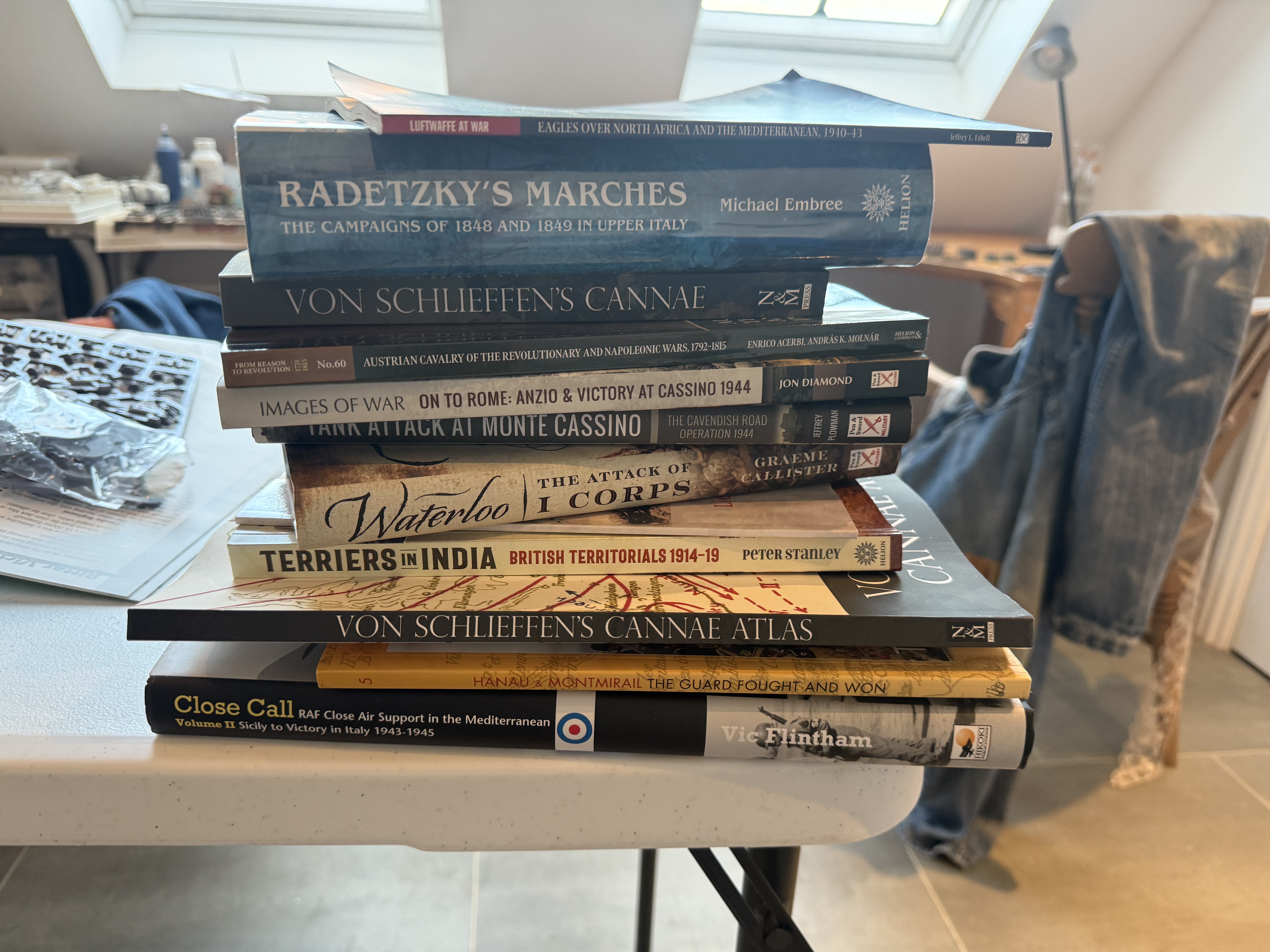
The stack of unread military books
One of the things I have been doing has been tidying up my study. This has produced a whole pile of books on military subjects that I haven’t read yet. So what did I do? I went and bought another book and read that!
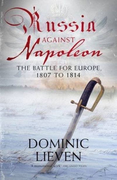
This was Russia against Napoleon – The Battle for Europe 1807 to 1814 (2009), by Dominic Lieven. It was a recommendation I picked up from Facebook.This served to give me a better understanding of both Russia in the Napoleonic wars, and the 1813 campaign, which is of growing interest. I wasn’t disappointed. The scope of the work is strategic, so there wasn’t much detail of the type that wargamers like. But it was a wonderful overview, making use of the massive additional level of information available post Cold War. There lots of pen portraits of a long cast of characters. Mr Lieven paints a very positive picture, not least of Tsar Alexander. This is a necessary corrective after neglect from French, German and British historians, and the rather negative picture painted by Leo Tolstoy in War and Peace. Absolutely fascinating. I also got a much clear picture of the 1813 campaigns than I could get from Nafziger’s trilogy – which was never been presented as a strategic study.
I remember back in the 1970s when I set out on Napoleonics that the Russian army got a good write-up from Bruce Quarrie, the author that got me going – along with the French and British. This book shows how justified that was.
Of course this means I will have to start introducing some Russians to my 18mm collection. I will start with some cavalry, I think.
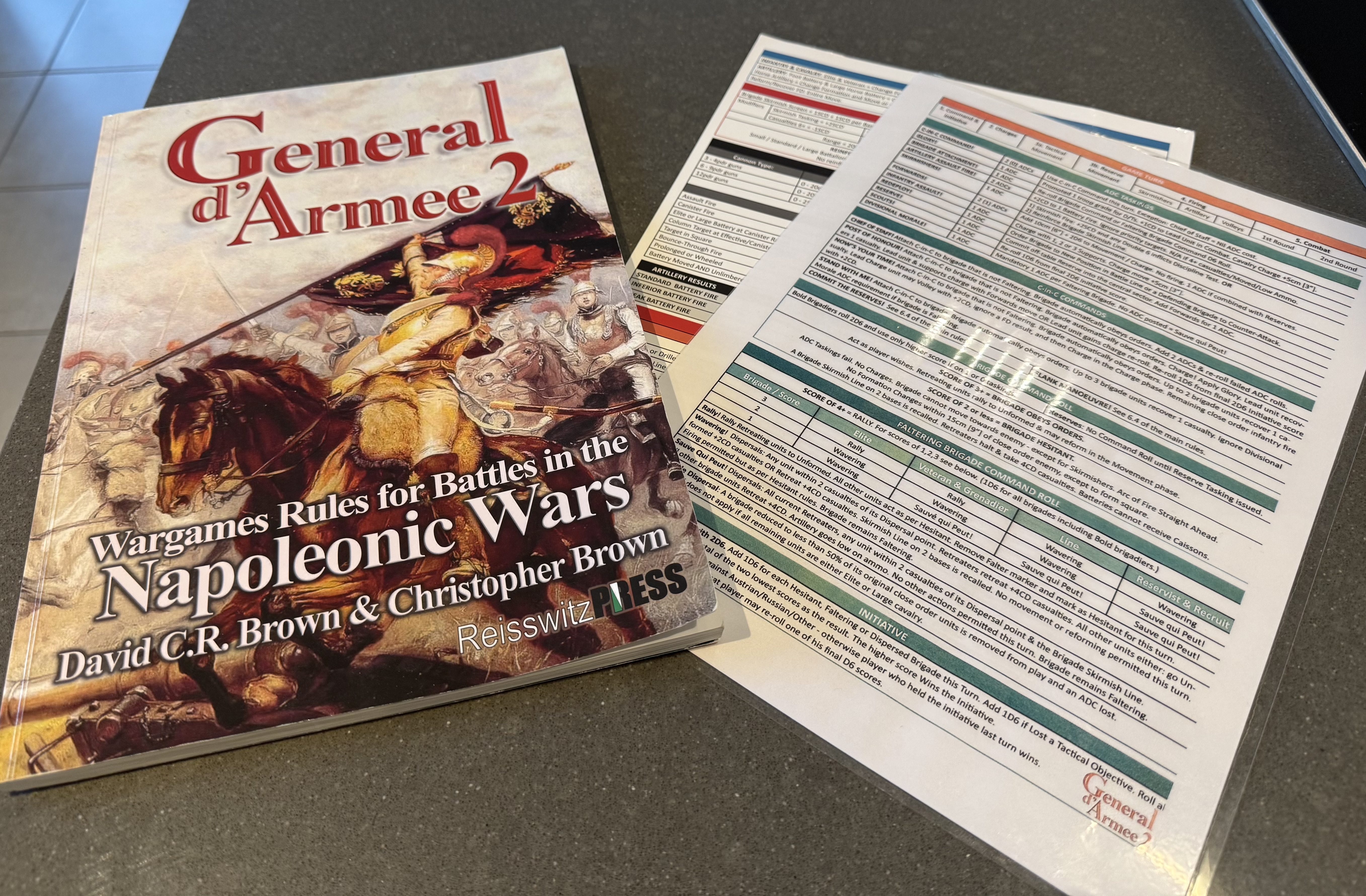
In my last post I expressed a some frustration with GDA2 rules, which I have now been using for some time. This moves on to the question of house rules to improve the system. But the rules are widely used and are comprehensive. Messing around with them is not to be done lightly. So I am writing this piece to try and clarify my own thinking.
What I like
But first we need to get this into some perspective. Why do I like GDA2? I was previously using Sam Mustafa’s Lasalle 2 rules, which are in roughly the same game space. Each side has typically 5-6 brigades of 3 to four infantry battalions or 2-3 cavalry regiments, each typically consisting of four bases, with two bases for an artillery battery. For my 18mm miniatures they can be happily played out on 4ft by 6ft table. Each set has been thoroughly thought through and play-tested by the designers, who both have a deep understanding of Napoleonic warfare.
But the period feel from GDA is so much better than it is for Lasalle. That comes at a considerable cost. Lasalle rules are simpler and so play faster; Sam has put a huge amount of thought into explaining the rules in the simplest possible way, giving them an exemplary clarity. But they are very abstracted and “gamified”. The role of commanders and skirmishers, for example, is abstracted almost out of existence. I, and my fellow gamers, much prefer GDA.
How do the rules achieve this Napoleonic feel? Two things stand out for me. First is the system of “Taskings” and “CinC commands”. These confer specific powers or bonuses to the brigades to which they are awarded. If the rules were written by me I would not use the word “tasking”, which is not a widely used word in English (it means “taskwork” in my dictionary, which is “work done as a task, or by the job” – definitions that don’t really apply here). I would call them “orders” – though that isn’t quite right either. But whatever you call them they do give the feel of a Napoleonic commander directing his troops, without all the problems of doing so more literally on the tabletop. The CinC commands – which are limited to two per game – also reflect the more dramatic interventions that senior commanders sometimes made, and are referred to in battle accounts. The command mechanisms in Lasalle 2 are very clever, and to be fair are better at reflecting move-and-response dynamics, but they feel more like a game than battlefield engagement; they are also harder to adapt to a multi-player format.
A second aspect that works really well is only allowing only one unit from each brigade to conduct a charge in the same move – which may be supported by other units in the brigade. This is the first time that I have seen it in wargames rules, and it really helps give a realistic feel. It stops the common wargame practice of two or more battalion columns bunching up and attacking a battalion deployed in line. This happened to devastating effect in one of my more recent games of Lasalle. It didn’t happen historically – one of those things that look simple on the tabletop that are impossible to accomplish in real life. This changes the dynamics of the battle in ways that give it a more authentic feel.
There are other things. The system has found a way to represent skirmishers that is consequential but not too fiddly – another rare accomplishment. Brigade commanders are represented on the table and have a role. Rules for built-up areas achieve a realistic balance that few systems achieve (though Lasalle 2 isn’t too bad either, unlike its upscale cousin, Blücher).
Minor quibbles
Overall then, it’s an excellent system. I am not tempted to try and design my own system to replace it – which, alas, I often am with rules, though rarely successfully. But there are things I don’t like. Not so much on the detail – I think they are harsh on the firepower of columns, for example – but even there I know that things are the way they are for a reason, based on deep knowledge of the period and experience of game play.
I would be tempted to redo the troop classification system, and change some of the names (e.g. grenadiers ranking below veterans). I would replace the six main categories with four: elite, professional (=veteran & grenadier), conscript (=line) and militia (= reservist & recruit). I would then add a number of special characteristics that could be overlaid (such as “drilled” already in the rules, which I might extend to rapid formation changes as well as firing). I haven’t completely got my head around to the many different sorts of cavalry classification, but I’m sure that could be simplified too. I would be tempted to give 8-gun batteries more resilience (or 6-gun ones less). But I won’t do any of this as it is sure to create more confusion amongst my fellow players, while not really changing anything much.
Another issue I discussed in my previous post is the slow speed of movement of troops outside the immediate combat area. I was a little frustrated by my attempt to move cavalry from one flank to the other in the last game. Of course you might react that it served me right for posting them in the wrong place to start with! A more serious problem is bringing up reserves for an attacking side. The table edge can be a long way from where the troops need to be deployed. These are things that I think are worth fixing with house rules, but that is quite straightforward.
Command system
That leaves two more serious problems: command friction and rules layout. To take the second, the rules are quite detailed but they aren’t laid out very clearly. If you want to refer to a particular rule that you know you’ve read somewhere, it’s often hard to find it in the rulebook (though there is an index which helps enormously). There are four sides of quick-reference sheet on two separate laminated pieces of paper. When trying to find something it is common to pick up the wrong one first, and, especially when a bit tired, it takes much longer to find things there than it should. I am in the process of putting together my own version of the QR sheet, though whether that will work any better remains to be seen. I have already put together my own version of the main rules (but not including the tables in the QR sheets), which is much more compact than the original, which a number of my fellow gamers like, but I still find myself usually going to the main rule book to look things up. All this slows the game down, though as we get more familiar with the rules, this is less of a problem.
Which brings me to the command system, which I discussed at length in my previous post. One issue I didn’t discuss is a problem with rules for bigger battles (of six brigades and more). There is a system for a corps battles, which I’ve read up, but never used. This involves a system of Corps Orders, which are quite detailed and not intuitive. In a big game this year I was asked to command the Austrians at Castaglione – which involved supervising three other players, each with their own GDA divisions. So I read up these rules to be ready – but I was relieved when the games master decided not to use them. It’s an added level complexity that could easily slow the game down. What the games master did instead was to reserve the CinC commands to the army commanders, including the limit of two per game. That worked fine, as it operated within the players’ rules knowledge.
But this points to a curiosity. The typical larger game is played using the divisional game rules as if each side was a large division. That is how the scenarios in the GDA scenario books are set up (though that is based on GDA1 – I don’t know if the Corps game rules are in them). The armies actually consist of two or more divisions. That was the case for the Lützen scenario we played for the Prussians (Ziethen and Klüx)(the French divisions and brigades of the time were large; each brigade was split in two for the scenario, and the infantry all came from the same division). It is true that the typical corps of this period were bigger than this, though. Still, the officer coordinating the battle on each side would surely have been a corps commander, even if there had other troops not on the table to look after as well (Blücher in the case of the Prussian at Lützen). What is more, the CinC commands correspond quite well to the sorts of intervention this corps commander might make (as I pointed out in my previous post). The roles of divisional commander (who would typically have two brigades and a battery) is not represented separately – it is simply integrated with the brigade command roles.
This represents a widespread game design problem. On the wargames table, with the players’ helicopter vision and compressed spaces, representing the full command hierarchy is often impractical. And it is the divisional layer that is usually skipped. But these feature historically important commanders. How to solve?
The Napoleonic command system
I think it is helpful first to reflect on the actual historical roles of generals in this era. Let’s start with the brigade. This was the basic unit of battlefield manoeuvre, consisting usually three or four infantry battalions, or two cavalry regiments. For the Austrians it was bigger: typically two infantry regiments, or six battalions. The Prussians in the later wars operated a more flexible system, with ad hoc groups of battalions being the main battlefield unit, and brigades being the equivalent of divisions in other armies (with 9 battalions and artillery). Earlier in 1813 (including Lützen), Prussian brigades look more typical, with often four battalions. But as reserve and landwehr regiments became incorporated, the brigades got larger.
Brigades would typically be commanded by a Major General (Generalmajor in German) or Général de Brigade for the French (renamed Maréchal de Camp in 1815). Colonels were often brigade leaders too. The Prussians were short of senior officers, so we often find brigade level formations led by Lieutenant- Colonels or even Majors. This is also the case for Hanoverians and other German allied armies in 1815 – doubtless for similar reasons. Note the lack of the rank of Brigadier-General (let alone the 20th century one of Brigadier – a field officer rather than a general). It did exist in the British army at the time, but it was not widely in use in the field, for reasons that I don’t know. “Brigadier” more usually referred to a French NCO. It is interesting that wargamers usually ignore ranks. Of course rank in this era was hardly a guarantee of tactical savvy – but it did convey authority. I think that lower level Prussian tactical leadership was often a bit lacking in 1815 – and the relative lack of seniority of the officers does point that way. This is rarely reflected in wargames rules. Since rank is widely available information in orders of battle I think this is a lost opportunity.
But I digress. The brigade (or perhaps the regiment where brigades comprise six battalions) was the critical tactical element in battlefield organisation, and wargames rules do a good job of reflecting this. A brigade commander would surely spend pretty much his entire time directing his battalions or squadrons. Overall I think GDA does a good job of representing command at this level. It does try to reflect quality of brigade commander (with provision for bold or poor ones) but in the games I have played we tend to ignore this. This is supposed to be determined at random at the start of a battle. The reason I don’t bother is a prosaic one. It’s an extra complication and I don’t have a good way of discreetly labelling it – my labels are typically printed a long way in advance of the game. There’s plenty of random friction in the command system anyway. It would be one way to reflect variations in command quality though – so perhaps Prussians in 1815 would have a high share of “poor” ones. However it would easier to do this by defaulting all an army’s brigade commanders: I haven’t had the courage to do this yet!
Divisions were a major innovation of the Revolutionary-Napoleonic era. Their main role was as a manoeuvre element on campaign, consisting typically of two or three brigades and an artillery battery. It would usually be led by a Lieutenant-General or French Général de Division – but it wasn’t uncommon for the more junior ranks to act up. The Prussians used over-sized brigades instead, consisting, eventually, of three regiments (nine battalions), but typically commanded by a Generalmajor. The battalions were then organised into groups of two to four ad hoc task groups, with the different regiments usually mixed up. These should form the wargames brigades.
A divisional general would typically have only a small staff, but operate in close proximity to his troops. His job was to receive and implement instructions from his superiors, and to communicate back to them. It would also be his job to maintain a wider situational awareness than would be the case for the brigade commanders. They would make direct interventions fairly frequently, often delivering orders in person.
And then we have the corps d’armée, which consisted of a variable number of infantry divisions, together with cavalry support and reserve artillery. These would be commanded by a senior general, in the French case often a Marshal. This was meant to be able to operate as a self-contained army, if need be independently of the main army. There would usually be a substantial staff. The French were the first to adopt this system, but the Austrians, Russians and Prussians had caught on by the mid-war period. Indeed by 1813 their corps commanders were rather more effective than the French ones, in my view. The system never caught on in Wellington’s armies. In the Peninsula he did create what were effectively corps under Hill and Graham, but the main body remained under his direct control. There was a nominal corps system for Wellington’s army in 1815, but this was long way from proper grand-tactical system of other major power armies. On occasion the French dispensed with the corps system too: for example Marmont’s army in 1812, which was organised in a very similar way to Wellington’s.
The problem for GDA is that games are typically bigger than a division but smaller than a corps. The solution is to pretend that the smaller ones are just large divisions, and to have a special corps superstructure for the bigger games. I don’t think this really works, and I want to try and imagine how this might work differently.
GDA command system reimagined
The starting point is that there would be no distinction between divisional and corps games. All games are corps games, though they may not represent a complete corps d’armée, but are played using the Divisional game as a basis. There is a CinC, who might be a corps commander, a divisional officer taking the lead, or even the army commander.
We need to recognise the divisional role. Each side would be divided up into a number of divisions and independent brigades, following the historical order of battle. Divisions would have a divisional commander represented on the table. My inclination is that batteries would not be not treated as part of brigades but as separate parts of a division – unless assigned to support an independent brigade. This needs thinking through, though. Corps reserve batteries may be formed into their own independent brigades of up to two batteries, with a brigade commander.
Start the turn like the Divisional Game. Throw a D6 for each allocated ADC across the whole army. The CinC player then allocates these to divisions and independent brigades, and decides whether to use one of his CinC commands. The Chief of Staff operates at Division level, but all others are brigade interventions.
Players controlling the divisions then throw a D6 for their divisional commanders, unless the division or one its brigades is subject to a CinC command. A score of 3+ means that they may intervene. This means that they are committed to one brigade (or battery), which automatically obeys orders, unless Faltering. This counts as one ADC for Taskings, but no Brigade Attachment tasking is required. In the case of a Faltering brigade, add one to the Command roll die. It replaces the Divisional morale ADC. In this case a Brigade Attachment tasking is allowed (costing a further ADC), and this allows a re-throw.
What is the ADC allocation? I think keep this at the current level, with a maximum of six (dependent on quality). This is clearly more generous than in the current game, as each divisional officer (there are likely to be two) becomes a super-ADC. However, I am proposing to treat batteries as a separate “brigades”. The maximum limit represents the fact that corps commanders could be stretched, and would struggle to manage more complex operations. There is a case for giving the attacker a bonus (or defender a penalty) at the start of the game – perhaps lasting until the move after the first time the defending side wins the initiative.
What about officer quality? There are four grades for CinC, though I hate their names (Blusterer, Commissariat, Campaigner and Incomparable). It is not just personal ability that should reflect this grade: seniority, staff resources and off-table responsibilities (i.e. trying to manage a bigger battle than the one represented on the table) affect this too. Which category should be clear from the historical context. Perhaps rename the categories: Passive; Tentative; Active; Exceptional. I would be inclined to be a bit more generous with the CinC interventions (add one). Or perhaps allow a one ADC interventions to ensure that a particular divisional officer or brigade commander is under control.
For brigades I think that leaders belonging to divisions should be rated as poor (i.e. capable of a single tasking only when left to themselves). Independent brigades would be standard, or bold if the historical context pointed that way. Occasionally they might be poor – perhaps a reluctant attachment from another formation.
Which then leaves divisional leadership. It is doubtless a good idea to represent different levels of effectiveness – and easiest to copy the nomenclature for brigade commanders. Simplest is to vary the score required on the activation die. A poor leader activates on a 4, as they spend more time on dithering and in displacement activity. A bold divisional leader may be activated on a 2. Each of these categories should be quite rare
Which leaves us with the question of initiative. There is no necessity to change the existing rules, which can be based on the number of Hesitant/Faltering brigades. However this is one of the aspects that annoy some gamers. What does it represent? I suppose an army with lots of hesitant brigades is less likely to seize the moment – but there’s an element of that old wargaming vice of double jeopardy there. Isn’t it enough that the brigades are hesitant? Besides some of those hesitant or active brigades may be quietly sitting in the rear or on an inactive flank on standby, not affecting the wider battle. A better idea (one of a number of suggestions from my friend Malc) is to base it on a single die throw based on the CinC rating. So this might be a D10 modified by quality rating (the system used in Age of Eagles, apparently). Or use different types of die depending on quality (a D10 for Active, D8 for Tentative, etc.). This might be modified upwards if the CinC is using Post of Honour, or Scouts and downwards for other CinC interventions (in these cases best to be a die modifier rather than move the quality rerating). Draws preserve the status quo, except Turn 1, which goes to the attacker.
A lot to ponder there. I will let you know how it goes get on!
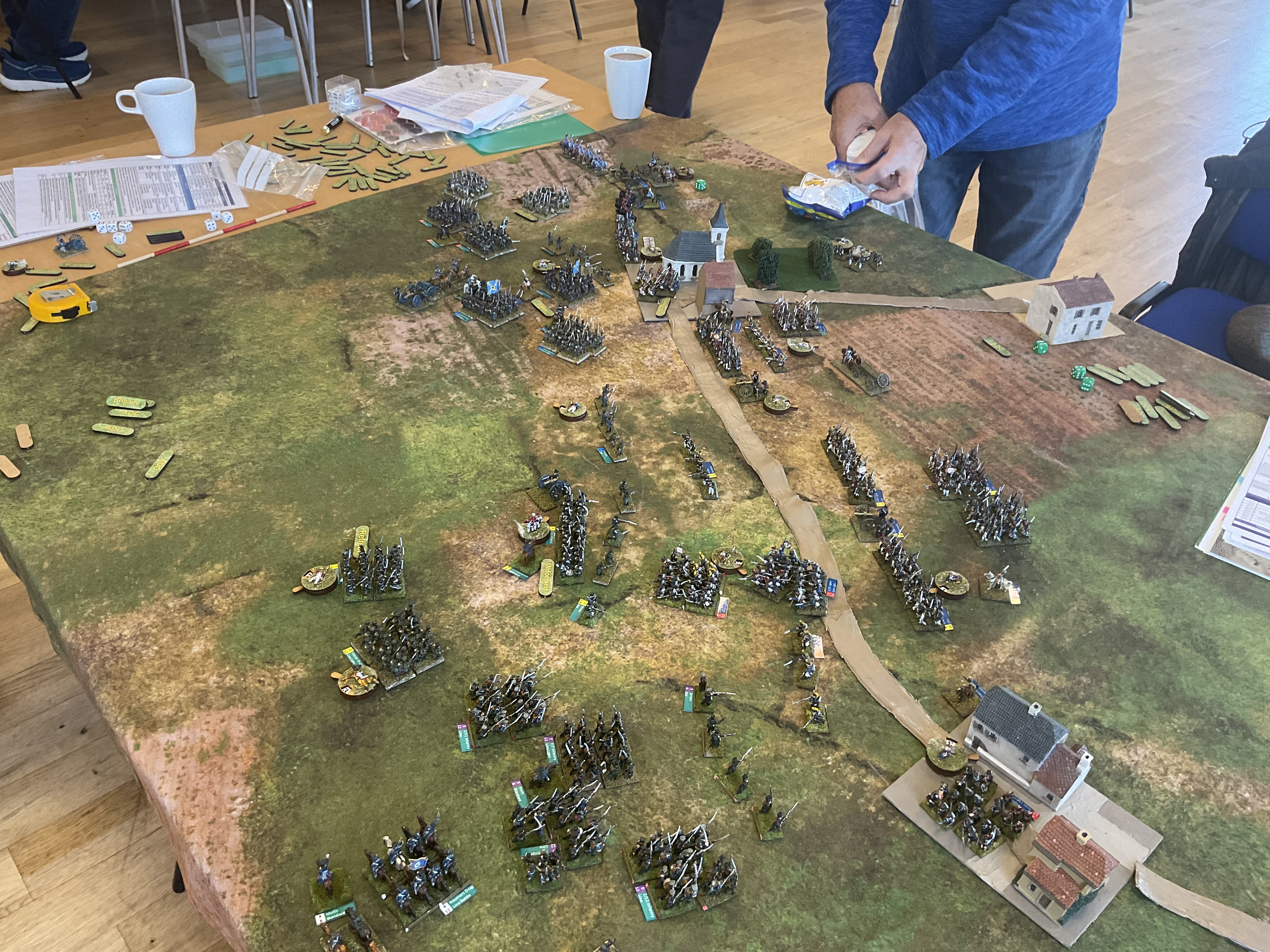
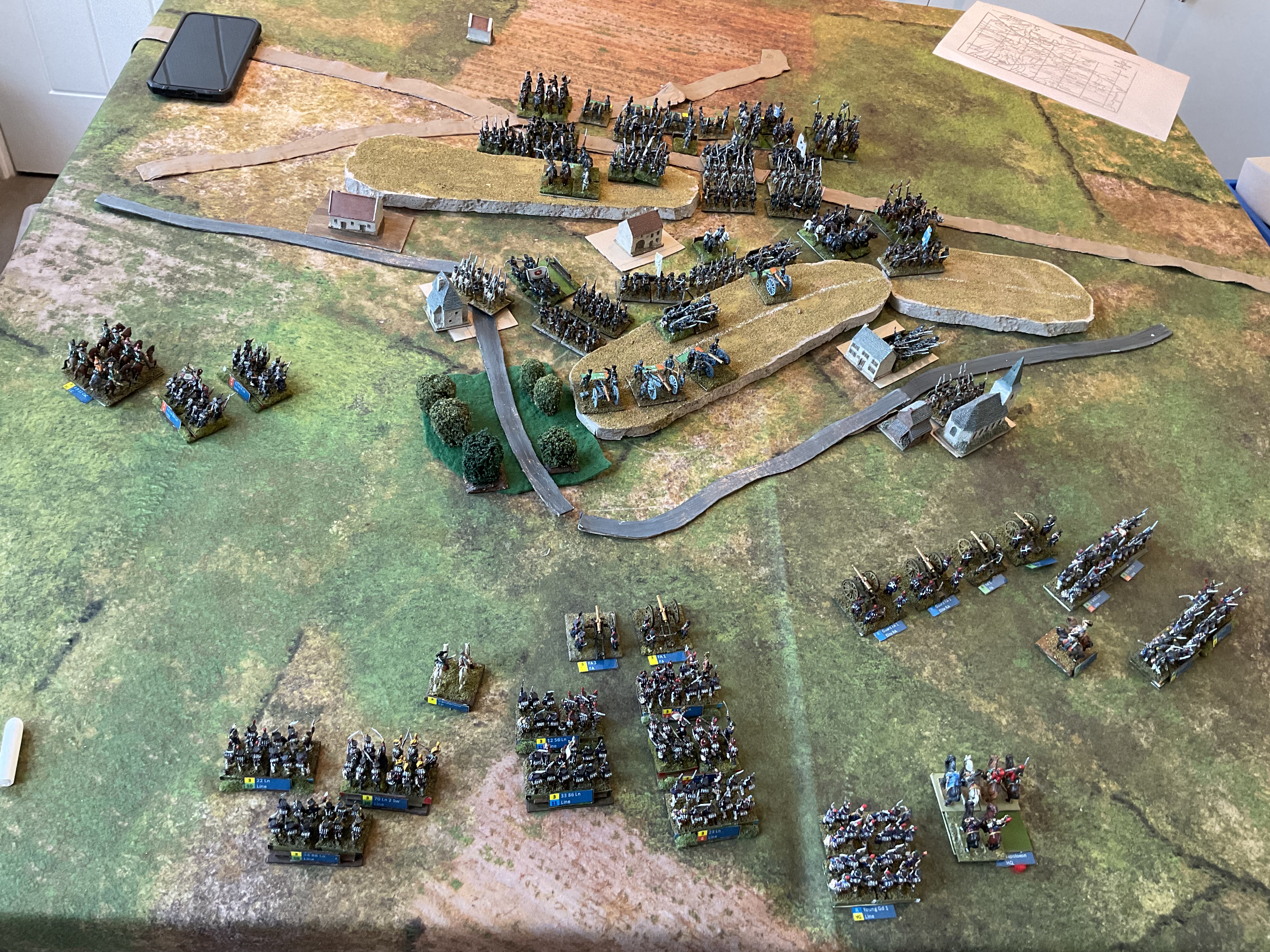
Our Lutzen game at the club at lunchtime – turn 5 I think. Prussians on the left.
Last weekend I got back to my club (Tunbridge Wells Wargaming Society) after a long break for a game of Général D’Armée 2 (GDA2). We attempted the shorter Lützen scanario in the GDA scenario book. We got as far as turn 7 after five hours of play of a supposedly 20 turn game. It was in fact clear by this point that the Prussians (played by me) weren’t going to win. Is it realistic to expect us to get through a scenario of this size in 6 hours – which I think is the effective maximum playing time for a club day? I need to know because this is not a big scenario by the standards of the GDA books.
How the game went
First a little bit of after action report. If you’ve been click-baited into this article by the title, then move on to the next heading. The French (played by regular club partner Malc)had four brigades of infantry, joined by a cavalry brigade in Turn 3. They had to defend four villages (three visible from the picture, and one off to the right) and an area of high ground (at the top of the picture). There objective was to ensure that no more than two of these fell into Prussian hands. He deployed one brigade each in and around each of the two forward villages, one in between and one as an off-table reserve.
My Prussians had three infantry brigades and one of cavalry at the start, with a further brigade of infantry arriving on turn 4. Alas I was meant to have a further brigade of cavalry, but I left it at home (along with a foot battery on each side, meaning that we had to represent each battery with a single base). The missing cavalry was two units that were supposed to be there at the start. I did bring the second brigade of one unit and one horse battery – and I deployed this at the start rather than wait to turn 3. My plan was to refuse my right and send two brigades to the left to take the high ground and village on the left (Rahna), with the remaining brigade to pin down the French centre. The cavalry covered the right flank. This plan proved defective – and Malc had correctly anticipated it.
On the left, my best brigade could not reach the high ground in time. Up popped the French cavalry reinforcements in that spot, pinning it down for the rest of the game. My cavalry was on the opposite flank and although I did redeploy it, it took too long to get it where it needed to be.
On the right my brigade ran into the fire of two batteries. At this early stage the French had plenty of of spare ADCs and so could afford Artillery Assault taskings. In the first turn they scored a double six each. After that the French artillery managed two or three 11s! The centre brigade reached the Rahna, but with one unit ragged from artillery fire. Stupidly I led the attack on the village with this unit, and it got destroyed in the attempt (more artillery fire on the way in, including one of those 11s). A second attack took the village; helped by the fact that the French were hesitant and could not reinforce the combat. But they were able to retake it the following move, when it was my turn to be hesitant. I decided to use my reinforcing brigade to shore up the collapsing brigade on my right (having been severely mauled by artillery fire), and to keep pinning the French brigades of right and centre. It did this successfully, even attacking the village (Gross Gorschen) on one occasion, but with little prospect of being able to take and hold the village.
And so we came to Turn 7. Malc had one entirely fresh brigade. All of my brigades were looking battered, with one on the edge of destruction. A final humiliation was the loss of one of my batteries (see below). The French brigade defending Rahna was getting a bit battered by now, but the others looked in reasonable shape, and I still hadn’t unpinned the brigade from the French cavalry, which was slowly being destroyed by the horse artillery. I had used both my CinC commands in a desperate attempt to keep the attack on track. I decided to throw in the towel. A throughly deserved French victory.
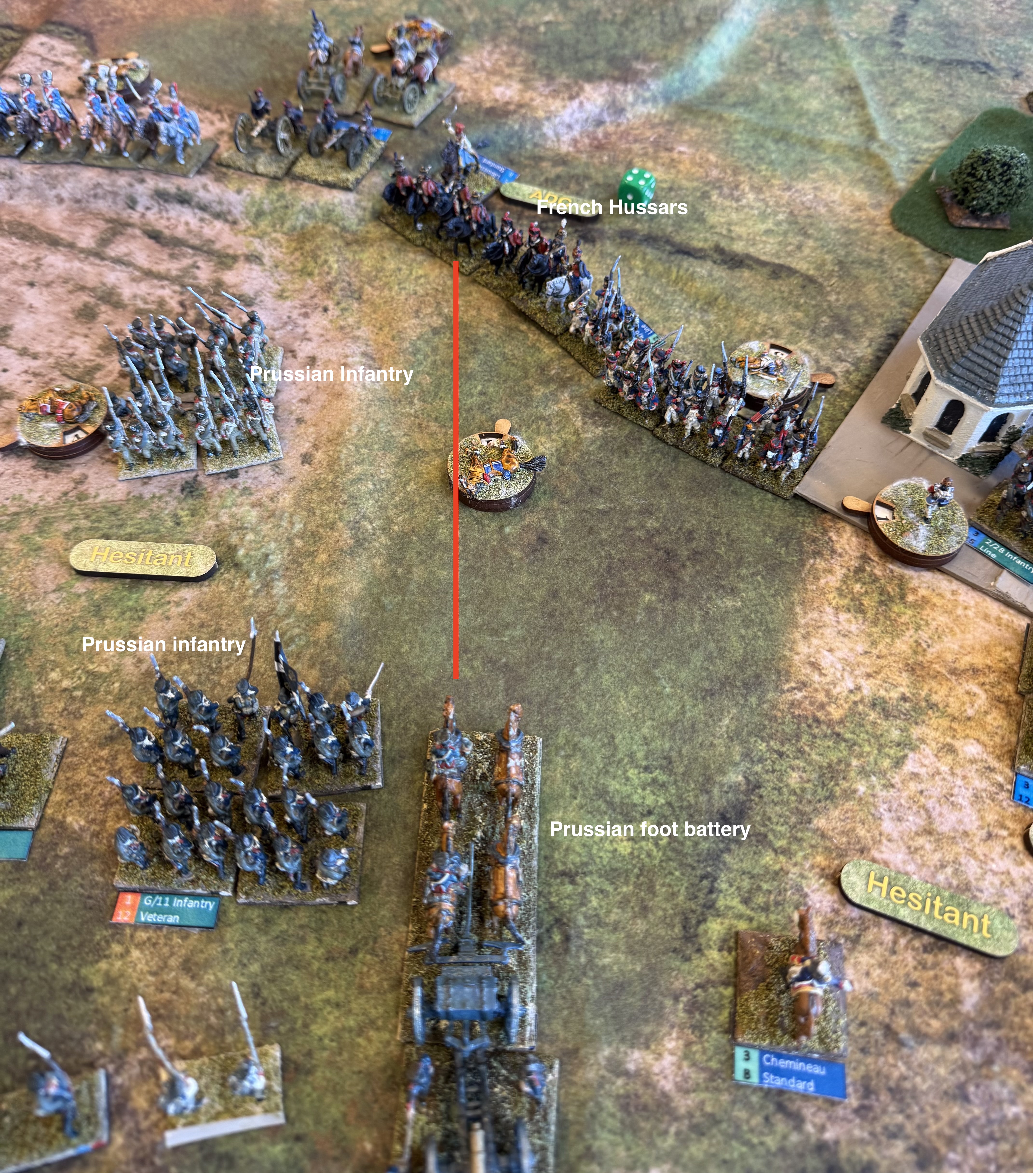
One item of interest, which I raised on the GDA Facebook group, is worth mentioning here. On turn 6 the French Hussar unit pictured below decided to attack the artillery battery I had brought up to assist the pinned brigade, but which hadn’t unlimbered. That was nasty because attacking an unlimbered foot battery means automatic dispersal. The cavalry went on to attack the Prussian column next to it, but this was beaten off with losses to both sides.
I decided this was legal, even though it meant brushing past a Prussian infantry unit in square at closer than 5cm. I thought that the rules said this could be done in a charge move – but I hadn’t read them closely enough. The only time units can get closer than 5cm to the enemy is in the final step of a charge, after reaching the 5cm point when the charge process is resolved. Thanks to FB group for setting me right! The FB group also suggested that the hussar unit could not legally manoeuvre past the infantry unit to its left. But I’m pretty liberal on such things, as I think there is more flexibility in practice – especially for cavalry which manoeuvred by squadron.
Making the game faster
This scenario is by no means large by the standards of both the 1813 and 1815 scenario books. So if I want to run these at club days we are going to have to get through them much quicker. A 20 move game needs to be do-able. First of all I will cover things that don’t involve modifying the rules.
One thing to do is have more players. We had originally planned to have a third member of our group, Rod. He would have taken charge of the Prussians, while I did the game mastering, perhaps assisting the Prussians a bit. We could easily have had two players a side with an additional game master. But I’m not sure how much faster this would have made things. At the start of turn everything focuses on the overall commander of each side; and the turn is structured into a number of phases which apply across the whole table, which means there would be quite a bit of waiting for players to finish. And more players ,more chat! But it would help.
Secondly, is to spend less time referring to the rules. I’m afraid that I’m a bit of a rules lawyer, and I really like to get things right. Many players prefer to keep things moving even if it means getting things wrong. And GDA2 is difficult to master in detail. I have written a summarised version of the rules to speed things up, but this isn’t all that helpful (though an excellent introduction to the rules). The things that I need to look up tend to be in the main book – and I found myself turning to this first. The index is a godsend. Still we were checking rules much less than in earlier games, now that I’m much more familiar with the rules. The FB group is a help here. I read the rule queries coming through there, and try to answer the ones if somebody else hasn’t got there first. And I do try to make decisions quickly at the risk of being wrong – as I was about the attack on the battery. I will think about doing my own version of the quick reference sheets (4 sides) which are notoriously hard for finding the bits you are looking for. But as a game master I need to focus on keeping things moving.
Another idea we actually implemented is to make the table a bit smaller. The scenario recommends that if possible the games should be played on a table 5ft deep and 6-8ft wide. We played on my standard battle mat which 4ft by 6ft (actually a little over). It helps that my bases are only 25-30mm wide, with four to a standard battalion. That means a standard battalion is 10-12cm frontage in line rather than the recommended 15cm. The game table wasn’t overcrowded. Since no adjustment was made to the move distances or ranges, this means things should happen a bit more quickly. And I think that was so – by move 7 it was quite clear how things were heading. That would justify knocking a few turns of the game length.
After that I’m running out of ideas. Movement sabots for columns might speed up pushing the metal around the table. I could do this relative discreetly since my bases have magnetic bottoms, so this could be done with a relatively thin piece of metallic card. Still I think bases are thick enough as they are, and sabots are usually a bit unsightly.
Fiddling with the rules
Now to consider moving beyond the pale to think about any house rules that might might things happen a bit more quickly. David Brown, the author, has done a lot of this for version 2 of GDA, and I think the combat mechanisms should be left alone. the troop quality system it could be simplified a bit, that is likely to be more trouble than it is worth. We’re getting used to the existing system fast.
Instead I want to think about making things happen more quickly at the command level, and in movement outside the combat area. I’ll tackle the second issue first. Both of these should reduce dead time and help battles get resolved in fewer turns – they won’t make the turns any quicker to resolve.
Moving reserves into combat can take quite a few moves, soaking up ADCs as you try to avoid the risk of hesitancy. This applies especially to attackers bringing in off-table reserves after having advanced deep into enemy territory. There is also an issue in moving uncommitted troops from one flank to the other, as I tried to do. I don’t think either of these was particularly difficult historically, and it’s a well known wargames design conundrum that troops more quickly outside the combat area than when you approach the enemy. At 2 mph troops could be expected to cover 30cm on the tabletop for the minimum turn length of 5 minutes; the column move distance is 15cm. When following an order to reposition, outside a combat zone, things should happen much more quickly.
My current thought experiment on this works for the Redeploy and Reserve taskings. Outside the combat zone (perhaps defined as 20cm from the nearest enemy troops, perhaps 30cm) troops with these taskings should be able to move faster – perhaps using the Forwards move rate, or simply double standard, or a fixed bonus of 20cm, say, provided units are in column or limbered. I think a road bonus could be added – to reflect their use as a navigation aid as they are too narrow to handle combat formations. The tasking is not removed at the end of the turn provided the unit is outside the combat zone. However it would still be subject to brigade command rolls, and would be lost if the brigade became hesitant. (This is actually similar to the current rule for Redeploy – though I’m not sure about losing the tasking if hesitant).
If reserves are deployed far from the front line, and the Reserve tasking or is lost because of hesitancy, then this can be replaced with a Redeploy tasking.
An alternative house rule is to allow reserves to be deployed anywhere on the table where there is a clear line of march outside the combat zone from the entry point. Where troops are forced to deploy in the combat zone, then they can do so deployed. But there would be no reserve movement. On reflection, this may be a better way of handling the reserve tasking as it is altogether quicker.
Command rules
Changes to non-combat movement amount to tweaks of the existing system. I next want to consider something much bigger, which will be beyond what most players of GDA2 will want to contemplate. But not all: because I know some people who have done this already. Iain from my old club, South London Warlords, explained this to me when we were involved in a big reconstruction of Castaglione played using GDA2 – though I’ve forgotten what he said his replacement system was! But it went to the point that I am now going to make.
The issue is the brigade command roll: this has a one-third chance of failing, reduced to one-ninth if you invest in a Brigade Attachment tasking for that brigade. This is often severely disruptive. In many cases it is entirely realistic. The brigade commander (incidentally I think the use of the word “brigadier” in this context is an anachronism – I suspect the word more usually referred to an NCO at this time, and certainly for the French, where it still does) might well get confused, or orders might get lost. But this is unlikely under the nose of his superior officer, and certainly not for more than one move in a row (a not infrequent occurrence in GDA). If the brigade was the divisional/corps commander’s focus of the time, then the brigade was very likely to do as wished. But Commander interventions are limited to two in the whole game. The rules don’t reflect this commander focus well. In any case hesitancy would be pretty obvious to the CinC in the relatively small battles in scope of GDA.
Let me digress a little at this point. The Napoleonic (and Revolutionary Wars) era was a period of command transition. In the earlier 18th century command was focused on the commander, who would array his army in one or more lines. Junior officers were expected to hold their place in the line until ordered to move by the commander. The commander would take himself to the main locus of the action and take control there. The classic pattern was Frederick the great’s “oblique order”. The commander would start on one flank and progress towards the centre as the battle unfolded. Nothing much would happen on the opposite flank unless the enemy was able to seize the initiative there. The best Napoleonic example of this was Wellington at Salamanca. Wellington’s command model was very much in this 18th century mode, though he adapted it with an intermediate divisional command instead of the inflexible lines of battle.
Roll on to Bismarck’s wars of the later 19th Century (and maybe the American Civil War or the same era – but I’m less family with this). Here the battlefields were vast and a delegated model of command was in operation. The role of the battlefield commander during the battle was limited. His main contribution was to plan of battle the night before and issue orders to his subordinates. Battles could get very muddled. We can see this devolved model developing in the Napoleonic era. Napoleon’s marshals had wide discretion when Napoleon was not breathing down their necks. In my view the most developed example was the Allied armies of 1813/14 (especially Schwarzenberg’s Army of Bohemia) – battles often turned on intermediate commanders using their initiative, while central command looked distant.
In wargames terms the best way to reflect the old model is Phil Barker’s PIP system – players get a variable allocation of PIP points which they allocate to junior commands, with those further from the commander model being harder to allocate to. No PIP, no movement. The new model is best reflected by the Fire and Fury system developed for the American Civil War, and used in Chris Pringle’s Bloody Big Battles for Bismarck’s Wars, where junior commands are subject to activation throws (called movement throws) to see if they move, and the commander has little influence over this. GDA uses elements of both: ADCs are its version of PIPs, but the brigade command roll is like the Fire and Fury movement throw.
But GDA2 games (in spite of their name) reflect smaller battles between extended divisions – so their model should be closer to the commander-centred one – which in any case was far from dead in bigger battles. So how might the rules be tilted to reflect this?
My thinking revolves around a more active Commander. The commander model can be placed with any brigade, which automatically then operates under orders, and may take on one or two taskings (two would cost an ADC). Perhaps there would be a distance restriction for moving the model around between brigades at the start of the move. ADCs and taskings would be issued to other brigades as usual. But the very powerful CinC commands would disappear. That would be a pity as these add a lovely touch of drama. They might be used to represent the intervention of a more senior commander on the field – but if so they would not be under the complete of the player. Also something on the Destiny table should knock out the CinC figure for one or more moves.
This needs more thought. One idea might be to use an event card system – cards drawn at the start of the turn might allow a senior officer intervention (i.e. CinC command), take the CinC out to deal with staff, comms or intelligence tasks, and perhaps other events. There also needs to be some mechanism for allowing for the difference between more active and passive generals.
This all needs a lot more thought – but I thought I’d put it out there!
This bottle of Custoza wine was as close as I got to the battlefield during my recent holiday on Lake Garda.
I’ve decided to do things a bit differently on this blog. I’m not posting stuff often enough. This isn’t helping me to get engagement with other hobbyists. The problem is that I haven’t been posting until I feel I have something to say – which usually means finishing a project – or perhaps exploring an issue in (like mixing paints), which takes quite a long time to write about. But my life, even though I’m retired, has quite a few other things in it other than the hobby. We go on holidays; we have people to stay; I’m chair of governors at the local primary school; I’m on a number of online committees; sometimes I just like to go for a walk or see something with my wife; and there’s the garden. The hobby has to squeeze into this agenda, and often involves a number of parallel activities which take time to resolve. There a quite long stretches when I don’t finish something, or don’t feel I have time to write a long blog piece.
But often people just like to know what you are up to. My plan is to do regular hobby updates – at least one a month. These may not take long to write (though this one is quite long) – but should be enough for any followers to have an idea about what I’m doing. This is the first and I’ll cover what I have up to since the last post, in July, following my rather unsuccessful game for the Battle of Medenine (1943) in June, featuring innovative game mechanisms.
Games
I have played just one miniatures game in the period – an Arab-Israeli scenario from the 1967 war, using Cold War Commander. This was with my regular London group of players (mainly from my ex-club of South London Warlords). This was entertaining but a bit one-sided (to the Israelis) – though John, who put the game on, didn’t think it was unrealistic. We used John’s 6mm miniatures – I particularly liked the way he used colour flashes on the back of the base to denote unit ID, without the use of labels. The rules I was a bit less impressed with. I had used the very similar Blitzkrieg Commander before, with a similar reaction.
After this the London group has met a couple of times, but playing a board game – Here I Stand – representing the Reformation in Europe. We played it quite a bit a few years ago – it’s an excellent game but no miniatures! We have one more round to go, in November.
Meanwhile my commitments conspired against my regular club’s days. I haven’t been able to play there since March. Thankfully I’ll be back on 2 November. We haven’t decided on a game yet.
Projects
The Medinine game was a bit of a downer for me. I am a long way from having a decent system for brigade level games in 1943, after having devoted to quite a bit time to trying, and getting things ready. And as for my attempt to create sangars from modelling clay and bits of model railway ballast – I really don’t want to relive that. I decided to give 1943 a long rest. I have plenty else I want to do.
So I have returned to the battle of Custoza in June 1866 in the Third War of Italian Unification (there was also a battle there in the First War in 1848), using home-produced rules. This has been interesting on a number of levels.
Custoza was the main land battle in that war. Taking advantage of Prussia’s attack on Austria, the Italian army attacked the Austrian-occupied province of Venezia. It ran into the Austrian army near Custoza, just southeast of Lake Garda and southwest of Verona. The Austrians were outnumbered but won, forcing the Italians to retreat across the Mincio. However the outcome of the war was soon decided by the Prussians at Koniggratz a few days later, and the Austrians gave up Venezia. The Italians also suffered a naval catastrophe at Lissa.
The battle looks as if it would make a great close-fought and evenly balanced war-game. It is especially interesting because the Austrians used their system of stosstaktik, which proved so disastrous against the Prussians, and is usually written off as being utterly stupid. The Austrian infantry formed into close columns (in divisions of two companies, in contrast with the more typical Napoleonic battalion columns), and went as quickly as possible for the enemy in a bayonet charge. It was no disaster at Custoza, but the Austrians suffered heavily casualties (more than the Italians), so the evidence isn’t conclusive. But it should create an interesting dynamic on the tabletop.
I started this project in 2023 (here and here), and painted up my first batches of figures then, using Pendraken’s 10mm figures. I did one batch each of Italians and Austrians. I also started work on some rules – named Forge of Nations.
Miniatures
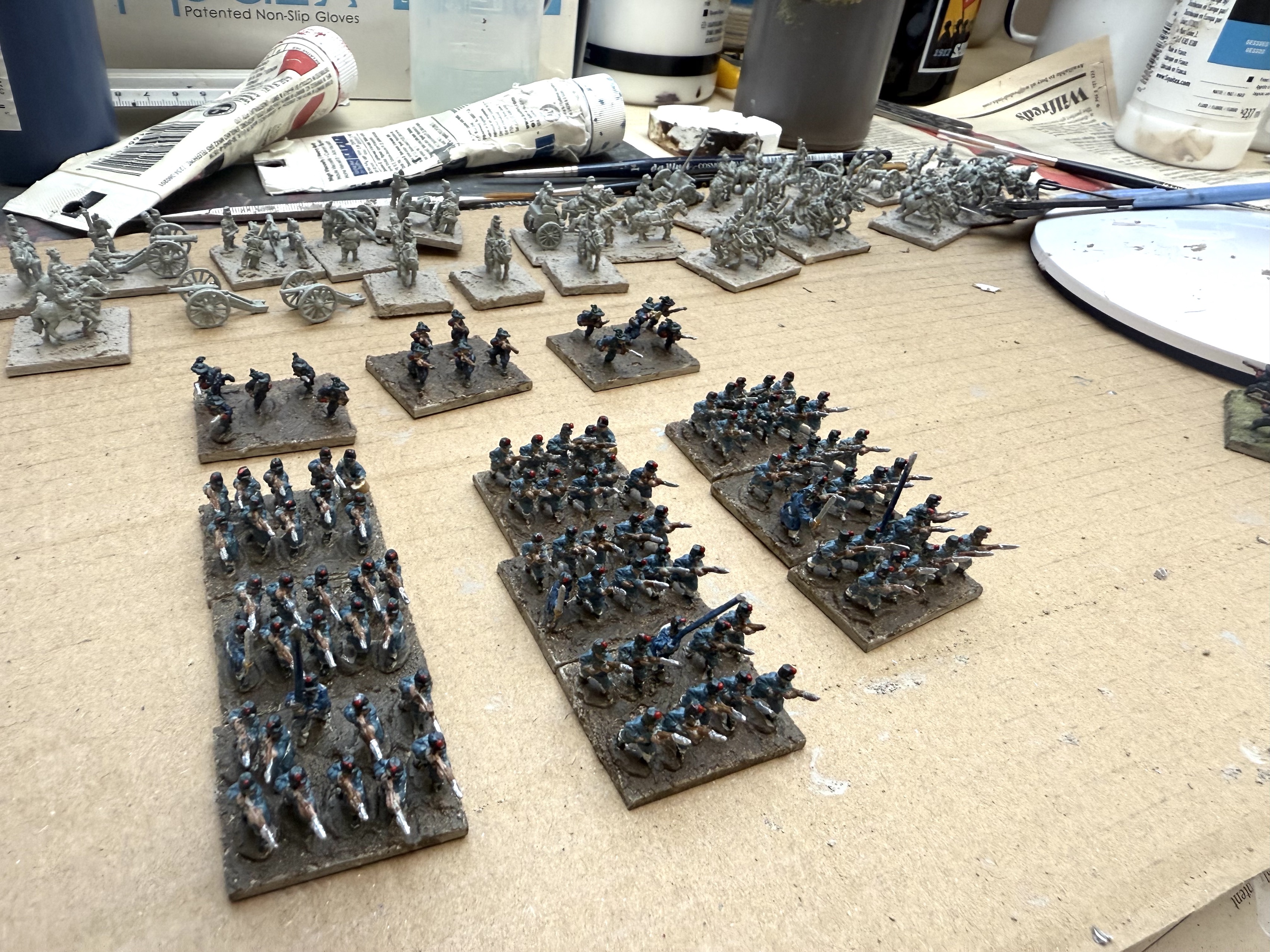
I cleared up the considerable mess from the Medenine game from the Studio – the hobby room I have above the garage, nominally shared with my wife, though she has almost never used it. And I then did practically nothing until last week. I picked up the Italians from my last order from Pendraken, featuring all arms and generals. After basing and priming the complete batch, I decided to focus on the infantry – 9 bases of 10 line infantry, and three of 5 bersigelieri. After three sessions these are now ready for finishing (wash/glaze with a dark shade; flocking the bases).
The Italian infantry are ready for finishing. The cavalry, artillery and generals are primed in the background
Research
As it happened we went on holiday to Lake Garda a couple of weeks ago. We stayed at Salo on the western shore, but were taken bus to Verona on two occasions. The route crossed the northern edge of the Custoza battle site (from which the Austrians advanced), but it was difficult to see much. The modern motorway was a corridor of ugly modern engineering and the view across country was often obscured. This is the best I could do:
View from our coach. I think this is looking towards the village of Custoza itself. The vineyards in the foreground are doubtless modern, but this provides some indication of elevation and tree cover.
It was interesting to get a general feel for the terrain. The hills dominate the battlefield, but were surprising gentle. This is an area of morainal hills sitting between the mountainous pre-Alps and the flat plain of the Po River. The land is agricultural, and there are a lot of vineyards (the produce of which we sampled, see above), and trees, especially on field boundaries. This limits line of sight, though artillery still played an important role in this battle – doubtless because there were elevated spots with better visibility. It will also be interesting to consider how to present the table visually. The miniatures are relatively boring in appearance (both sides fought in greatcoats, notwithstanding the heat) – so good looking terrain will help. It would be quite nice to take the game to a show but that’s a long shot.
Interestingly, the coach also passed San Martino, at the northern end of the battlefield of Solferino (1859), from the Second War of Unification). I played the Piedmontese (Italians) in a beautiful recreation of this battle hosted by Bruce Weigle at Newbury. The road went right through where my troops were operating. There’s a monument to the battle, which is seen as a glorious Italian victory.
Rules
I have probably spent more time on this activity than anything else. I can do this from the study in the main house, meaning that it’s easier to do short sessions between other activities.
Forge of Nations is designed to cover 1866, including the Austro-Prussian war and 1859. This is but the hors d’oeuvres to the Franco-Prussian war in 1870-71, of course – but that is still a distant prospect.
I had produced a first draft in my first pass at the rules in 2023. This copied quite a bit from my Carolus Rex Great Northern War rules. However, I moved away from the randomised activation of different commands to a more conventional I go/you go system, which is easier to run in multiplayer games. But I wanted to use the card system described in my previous post – with a Move deck to regulate movement, and a Cohesion deck to evaluate combat and rallying.
I think the Move deck is a sound idea, and I want to persist with it. But I have been reflecting on the feedback I received on the Cohesion deck. It replaces dice throws, but comes over as a bit of a black box. Gamers have an intuitive idea about dice odds – and seeing how they land is part of the entertainment. Game design is a careful blend of innovation and conservatism, so I thought I would create a dice system that largely replicates what the cards were meant to do.
My idea is to have one distinctive die to reflect unit quality (D6 for D class, D8 for C, and so on, and then one D6 in place of each card in the old system, which reflect the attacker’s circumstances, such as weapon and range. You add each D6 result to the unit quality die – and see whether it meets a target number – which is adjusted to the unit circumstances. Each fail is a hit. A high score might an Elan result. We’ll see if it works.
Philisophical reflection
It is quite common to design a rules system based on one campaign or period, and then extend it into others. It is interesting to understand how this starting point influences the system. I am hoping to extend my 1866 rules into not just the 1870 war, but back into the Napoleonic and Revolutionary wars, and even into the next version of Carolus Rex, my Great Northern War system.
This is evident from the two different rule systems that I have used that have this battle in scope. One is Bruce Weigle’s 1866 – which is a development of his 1870 system. An interesting feature of this is that it makes extensive use of a “suppression” result for firing. 1870 was probably the first major war where troops often went to ground when fired on – as breech-loading weapons could be fired from the prone position. It is one reason why, in spite of a huge advance in the lethality of firearms, casualties did not escalate (or so I read – casualities in the FPW were still high). This doesn’t seem to have been a feature of the 1866 wars – perhaps the last in history where this applies. The Prussians had breech-loaders, but since their opponents didn’t, they don’t seem to have gone to ground. Still “suppression” could still reflect a hesitancy to move when under fire, and doubtless that is why bruce retained it.
The second system is Chris Pringle’s Bloody Big Battles (BBB). Chris also developed this originally for the FPW, so far as I can tell. But it is based on the Fire & Fury system used for the American Civil War. Going to ground wasn’t a feature of that war either. This is a more abstract system than the 1870 series, with a higher level of scaling (typically a base represents double the number of troops) – so doubtless Chris felt that representing suppression specifically was a needless complication: he has been ruthless in keeping the mechanisms as simple as possible, which is one of the great strengths of the system. However, the European wars of 1859-1871 were not the ACW, even though they are contemporary with it. The weapon systems (for the Prussians in 1866 and both sides in 1870-71) were different and this played a critical role in tactics – but BBB does a careful job of representing this. The use of cavalry was different too – the Europeans clung to the romance of the Napoleonic era, insisting that the charge into close combat was the most important cavalry tactic, and retaining pretty uniforms in many cases, while largely neglecting firearms. The Americans were much more flexible, often deploying cavalry on foot, using firearms – which proved to be the way of the future. BBB retains this approach, with cavalry being very similar to infantry in the way it is represented. Cavalry didn’t play a big role in the European wars, so this doesn’t matter that much. But if you start on the European side of the Atlantic with your system, you would try a bit harder to reflect the possibilities of the grand charge – as the Weigle rules do.
My rules use much the same scaling as BBB, but the base articulation of 1866. Bases move individually, and are not organised into rigid units. Cavalry have a more Napoleonic feel. If I take them into 1870, I will need to reflect suppression in some way, but for now I’m ignoring it.
What BBB and 1866 share, with very different mechanisms, is strong command friction. Command and control is heavily devolved – the direct influence of corps and army commanders is limited – and subject to heavy activation tests. This clearly reflects how things worked in this period – and it is one of the reasons that I find that BBB does not translate so easily into the Napoleonic era – when the action was much more centrally directed, but subject to less friction. This will be interesting to reflect in my rules.
I haven’t posted for three months. In that time I have mainly been participating in other people’s games, using other people’s toys. And a lot of fun it has been too. Notably, I took on the role of Napoleon at Waterloo (using Horse, Foot, Guns) and Würmser at Castaglione, in a huge game of Général d’Armée 2. Unfortunately I haven’t had much opportunity to expand my collections. I have bought the miniatures for six battalions of late period Napoleonic French, but I’m a long way from starting the painting.
A selection of my Turn deck cards
My big focus has been on rules. I have been working on WW2 rules for brigade sized encounters, using a hex board. The forces are roughly those for Rapid Fire! but the mechanisms are very different. I was developing some ideas that I could use in other periods. I have now played these out in a game with one of my groups of playing buddies. Unfortunately, I didn’t have the presence of mind to take pictures. Overall, I thought the game was more failure than success, and it is prompting a big soul-searching rethink. Still, I thought it would be interesting to share some of the ideas that I road-tested. These involved the use of cards. Dice had a minor role in the system.
The first, and most successful, was the Turn Deck. This drove the order of play. Each Turn was divided into a number of moves, where, for the most part, players could move one hex for eligible units, or fire. Units that had not moved could reaction fire on those that did. Both sides moved, but the cards dictated which side moved first. Four of these cards were General Moves, where all units could move (though for two of these, not in difficult terrain); in these moves players could also change orders and enter close combat. There were then six vehicle move cards, where only vehicles could move, but could not initiate fire; fast vehicles could move on all six of these, slow ones on only two. In addition there were four Area fire cards, where area fire was evaluated (the targets having been previously selected). There were two “Pause” cards. When the second of these was drawn, the Turn was concluded. On the first one I allowed some stealth movement, where elements could move without attracting reaction fire. There were also a pair of cards for road movement, and another pair for recce movement.
The big idea was to do away with the complexity of movement allowances and terrain effects. Faster units can move more often; and that was built into the cards. You still needed to know whether vehicles were slow, medium (the bulk of them) or fast, or had strong all-terrain ability – and even then that only mattered when certain cards where drawn. No tables of movement rates! A further aim was to randomise the timing of area fire (typically indirect). Separate area fire moves meant that by the time the fire arrived the target might have moved on. One experienced British infantry officer said that the trick for attackers was to keep moving so that the enemy artillery never caught up. The whole thing worked very much as I hoped, with the mixed order of the card draw making things very unpredictable. You could easily get three Area Fire cards in a row, which might really mess things up – or you might be forced to move before your hoped-for suppression fire had materialised. The variable Turn length added another dimension of unpredictability. Each Turn was meant to represent a distinct episode – the scope of a game of O Group perhaps – after which there would be regrouping.
My main criticism of the system is that the General Moves were overloaded, and I had to devise a move sequence to handle this – which went against the simplicity. The stealth moves should probably get a card of their own, with the first pause card being a short breathing space to recover suppression and pull back if desired. Should both sides be able to move each turn, or follow the more modern idea of only one side, randomising things yet further? As yet I see no reason to change it.
Examples of cards from the Hit Deck
The next most successful idea was the “Hit Deck”. This had two functions. The main one was to resolve antitank fire quickly. It was also used to resolve communications for orders and area fire. AT fire has been something of a frustration for me with WW2 rules. You have to balance three main things: the weapon capability, the armour strength and the range. You then factor in things like target size and cover. This usually involves a couple of dice and a table. Rapid Fire! has a simple table and a single die – which for my taste takes things too far the other way. The Hit deck has 50 cards. These are divided into 13 groups of 3 or 4 cards; one group misses at all ranges, the next hits at one hex only, and so on to the last group which hits all the way up to 12 hexes. The cards also vary the AP value of the gun; the earlier ones in the above sequence with more positive variations, the later with more negative. If the AP value equals or exceeds the armour value (both based on the Rapid Fire! system but reverse sequence), then you have a damage hit. This is very quick and simple; all you need is the attack and defence values.
The comms test is much less interesting, except the one SNAFU card, which takes any area fire into a randomly chosen neighbouring hex.
This system further reduces the need for tables and quick reference sheets. The only real difficulty is that it isn’t intuitive to people newer to it. With a target dice score you instantly understand the odds – the cards feel more like firing blind, until you have properly internalised the pack structure.
Examples from the cohesion deck. Alas my laser printer does not do a good job of distinguishing between yellow and orange – which I don’t think helped.
That is probably an even bigger problem with the third deck, the Cohesion Deck. This is a morale test system: each card (again there are 50) gives one of three results, depending on three variables: fail, pass or elan. As currently designed there are only ever two possible outcomes on each card (pass/fail or pass/elan). The variables are troop quality (A, B, C or D), risk factor (Green, Yellow, Amber and Red) and density (dense or dispersed). Each increase in troop grade improves odds by about 20%; each increase risk factor roughly doubles the odds of failure; the difference in odds for density is about a third. The odds of failure for a dense B class unit at red is 50%, and of an elan result are 6%. There are two special cards – Apocalypse (everything fails) and Fortuna (always elan) which on drawing the pack is reshuffled.
A further variable is to be the number of cards drawn. So that a rifle group firing at one hex range would cause two cards to be drawn, but one card at two hexes (red risk if moving in the open, amber if gone to ground, and yellow if dug in). Very simple and easy to remember, but my gaming friends found it all a bit of a black box. The risk categories were hardly fine grained either, though that suited this system.
I have designed the Cohesion Deck to work in any period. My next project is rules for 1866 wars with Austria. I’m not sure whether I will use it, or go back to a dice-based method.
I created the cards on PowerPoint, and printed them off as handouts four to a sheet. I then cut these out and put them into card sleeves (from Titanshield), with a different colour for each pack. These played and shuffled well enough. I think that I could probably work out a way of printing them off with less wasted paper though (you should be able to get at least 12 to a sheet of A4, not 4).
As for the WW2 game, the issues go much deeper than the working of the three card decks. It needs a major rethink. This starts with what I think the game is actually about, and what is meant to be the source of tension. Most WW2 systems are designed with tank battles in mind. There is an important exception for O Group and Chain of Command, which are infantry-based, but on a smaller unit of command. For the theatre that I am concentrating on (Mediterranean 1943), there are no big tank battles, like there were in the desert war or Russia. Those infantry games start with a clear idea of what the game is about, beyond playing with your toy soldiers. That needs be the case with my system too. On the brighter side 1943 brigade battles were often quite slow burn – and that is a good fit with the episodic turn-move system – but I need to think more about the deployment of forces and reinforcements.
The best map available of Medenine from the regimental history of the Queen’s . The scenario was based on 15 Panzer’s attack in the centre.
The Medenine scenario was quite interesting. I based in on the Rapid Fire! scenario. But I soon realised that this was based on extremely limited information on the battle (practically none from German sources that I could see), all from sources that I have traced; the armies were chosen with the help of a points system. The terrain was then made to fit the standard terrain pieces designed for their desert war scenario book. I tried tracking the terrain shape more faithfully, but found that the German forces were highly congested at the start line – and this encouraged a broad front attack, rather than carefully selecting lines of advance, which the Germans actually did. It occurred to me that the issue was that the German forces were not fully available at the start of the attack. I have often found that trying to war-game a scenario helps develop an understanding of historical events. This is true here too.
My battlefield terrain was another failure – but I won’t dwell on that here. I will come back to this with a different approach! Meanwhile I will go back to other periods…
But to return to original topic – the cards were a good way of reducing complexity of play. The QR sheet could quickly be reduced to one side of A4. But it is a bit of a black box, and many wargamers are addicted to the D6. I think I need to keep going though.
The French mass for the attack on Ligny – this is the trial set up at home
My most recent club game was a “small Ligny” – excluding the action on the eastern flank, and the final commitment of reserves by Napoleon. This was not in fact a serious refight – the main aim was to familiarise ourselves with the Horse, Foot, Guns rules, which we are due to use for a “big Waterloo” game (including Wavre and Grouchy) in a month’s time. This latter game, put on by somebody else at the club, promises to be very interesting. We will use 2mm troop blocks with the lovely Ferraris map as the playing surface.
Still, Ligny (two days before Waterloo in 1815) is an enduring fascination of mine. I want to do a full version of it using my own rules – and a “big Ligny” too, incorporating Quatre Bras. It is a very demanding test of a grand tactical rules system. To date I have tried Blücher and my own adaptation of Bloody Big Battles; both failed – the French didn’t stand a chance. There are two big challenges: fighting in the villages, and Prussian command and control, where the two and eventually three corps became intermingled, and where the (division-sized) Brigades were sometimes broken into pieces ad-hoc. How would HFG do?
The game in progress with Gerard’s division attacking Ligny village in the foreground. Chateau Ligny is on the wrong side of the stream…
We used my own version of HFG, which I produced nearly 10 years ago – as the original’s scope was too wide (1700-1910, naval support, etc.) and densely-written (by Phil Barker of Wargames Research Group fame). These were designed to work with my basing system. I felt it would be easier to use these rather than the originals, which were slightly updated (V1.1) since ten years ago. I fought two battles with the system (Waterloo and Salamanca – both described on these pages – search for HFG) before moving on.
Each element was about 2,000 infantry, 1,200 cavalry or 20 guns. The bases corresponded to French infantry brigades or cavalry divisions – with a couple of extra bases for Vandamme’s corps. For the Prussians I used one element for each regiment – though in practice they mixed the regiments up. On numbers they should have had a couple of elements more – but the OB I was using did not account for losses at Gilly the day before, and I gave them an addition of Chateau Ligny as a strongpoint, without deducting anything for the garrison. The landwehr I graded as inferior, but all other troops on both sides were standard. This is a bit generous to the Prussians. The French were probably better quality in general, and some of the newer Prussian regiments were not tip-top, especially where they represented elements of different formations thrown together. Still HFG has only three quality grades, so fine-tuning was not possible. Elite would have been reserved for the French senior Guard (at Ligny, but not on my table). For the Prussians I got a lot of pleasure from using my collection to get figures closely approximating the actual regiments in 1815. The French were my hard-working 1809 miniatures, so not especially realistic.
The board was thrown together quickly. The playing area is just 3ft by 3ft. It was thrown together very rapidly from elements that I had in stock – the hills in particular only vaguely reflect the actual terrain. Ligny brook was treated as an area of slow-going. Ligny village was treated as two built-up ares (BUAs), separated by the brook. St Armand was treated as parkland/orchard (slow going, cover from artillery, but otherwise limited impact), with Longpré, where most of the fighting on that flank took place, was treated as a single BUA. I used my new Geek Villain “Field of Glory” battle mat – which was glorious, in spite of not being to scale. I used 6mm buildings, as anything bigger doesn’t work at this very compact ground scale. I shouldn’t be using 18mm miniatures – but I’m not building 6mm or 10mm armies up from scratch! There is more than even the usual disconnect between figure and ground scale (but if that’s all right for Rapid Fire!…).
We played for about 3 hours, packing up for the club AGM, which took place at 2pm. I wasn’t counting the number of turns. HFG turns represent a short time interval (10-15 minutes), so there are meant to be lots of turns, but it was inevitably slow at first. We only really got as far as the opening stages of the battle. The French, played by Malc, massed all their artillery in the centre, and proceeded to drive off the outnumbered Prussian artillery opposite. Meanwhile Gérard”s corps tried to pile into Ligny, Girard’s division into Longpré, and Vandamme worked round the French left, eventually joining the attack on Longpré. The Prussians, played by Rod, gradually moved their second line – from Pirch II’s corps – round to the right flank. Gérard repeatedly tried to break into Ligny, and only succeeded in the last move before we broke up. He only lost one element – but not to the fighting in the BUA but to a single Prussian artillery battery posted on their left, out of range from the French artillery. It was the only destroyed element on either side during the game.
Girard and Vandamme’s attacks on Longpré were just as futile, and never broke in. Given that historically the French did break into both places fairly quickly and then started a seesaw battle, sucking in almost all the two Prussian corps’ infantry, this didn’t seem to be reflecting history. It was also rather dull and slow game play. HFG was not a good system for this battle. A more appropriate trial game would have been smaller and on more open terrain.
On the two Ligny problems, I don’t think HFG handled the first (BUAs) at all well. Part of our problem was unfamiliarity with the rules. In HFG there are two phase of combat: “firing”distant combat” and close combat. Infantry can’t move into close combat without starting from within firing range. When attacking BUAs this initial firing combat is critical, and the defenders start with a big advantage. It’s important to get this right, or otherwise your attack won’t get to the close combat stage – which is also at a significant disadvantage unless you can get a “silenced” result in firing combat. If the French had got this sequence right, they would have done much better at Ligny – not so much at Longpré.
Still I don’t think the rules capture Napoleonic BUA combat well. Fire combat before the sides closed was not important historically. In practice defenders could only mount skirmish fire at the edges. Most of the combat in the interior took place in the streets, without much cover. There was a lot of close-quarter fighting with little or no advantage to the defender – unless they could organise on a strong point with a secure perimeter, such as a churchyard (and even then this usually needed to be prepared in advance to be properly effective). The rules seem to framed for later 19th century warfare, with far more effective firearms, and where soldiers used the local cover to much better advantage.
On command and control the rules did pose a challenge. The corps commanders were “command parties” which were mobile but only have a small command radius. Army commanders can’t give direct orders to units not under direct command. With Prussians’ large corps this made it hard going. That wasn’t unrealistic – though historically the battle was controlled by the army command, with the corps commanders having only a limited role, it ended up in a similar place.
Another thing to learn from the rules is that because the turns represent a short time period, you can be patient, building your position before launching an attack, and using long artillery bombardments (five or six turns, even).
My earlier criticisms of HFG stand, however. The biggest of the is that it doesn’t capture attritional combat well – the gradual wearing down of armies. It is a low-probability/high impact system, which I don’t really like, though this works better the armies and timescale. The fact that both sides must dice for each combat and add up combat factors slows things down, though this speeds up with practice; this matters when you need to get a lot of turns in. Although I can think of ways of improving the system a bit, I’m not investing in it – I’m going a different way.
The journey on my big battle rules continues. I got quite a long way with a new activation system inspired by Lasalle II on my BBB-based system, but I realised this was not going to work in the multi-player games that I want to play. Instead I’m working on some other ideas:
Instead of multi-based units in contact, in formations analogous to lines and columns (following BBB), I want to try moving each base as an individual element – a bit like HFG, except that the elements are smaller (say 1,000 infantry rather than 2,000, with a 30mm frontage rather than 50mm), and each subject to damage before being removed. This follows Bruce Weigle system for his 1870 series.
I want to use a card system for quick resolution of morale. A bit like the Twilight rules, combat will be resolved by alternating morale tests.
I’m thinking of using a card system to drive the turns too – but this is undeveloped in the Napoleonic context. The central idea is that all moves are standard (say 6in), but not all units can move every move.
My idea is the develop a series of systems with common elements to cover WW2, Bismarck’s wars, Napoleonic and the Great Northern War. I’m close to testing the WW2 system, and I am thinking of moving to Bismarck’s wars next. Meanwhile for Napoleonics I’m playing very enjoyable mid-sized battles with Général d’Armée 2.
GDA2 uses a lot infantry miniatures. Fifteen or more battalions on the table is commonplace, and often more in their scenarios, and there are 24 figures in each one on my basing system (not counting large battalions). I didn’t have enough Prussians for some of the 1813 or 1815 published scenarios – except perhaps using some Landwehr as line infantry. I have similar problems for the French, where I have had to use Guard units in the line. So I needed reinforcements!
My immediate focus was on the GDA Lützen scenario. For this I needed lots of bog-standard Prussian line. Four regiments were involved (two Silesian and two West Prussians), with up to four battalions each and 13 altogether – plus two battalions of grenadiers and one of Silesian Shützen. And that’s not the full game size – though I doubt we will ever play the extended variant with another 3 battalions of late reinforcements. I have but three battalions of standard line infantry (from the 2nd, Pomeranian, regiment). In addition I can rustle up seven odd-looking battalions from the 1815 new regiments – previously reserve units (plus 8 Landwehr) – and I had a couple of bases of Silesian Shützen.
My plan was to put together another six and a half battalions. Four of line infantry – painted as the 2nd West Prussian regiment – and two of grenadiers (West Prussian and Pomeranian) and an extra couple of bases of Shützen. The line infantry and shützen I could cobble together from Old Glory figures in my lead mountain, with a few AB officers which I also had in stock – which would leave me with only a handful of unpainted Old Glory figures. I bought the grenadiers and some extra skirmishers from AB. AB do them in campaign uniform, without the fancy shako plumes – but with a couple of details different from line infantry, like badges on the cartridge box.
This project is especially significant because I bit the bullet and decided to change the basing. Until now my infantry (and cavalry) have been based on 25mm squares (and skirmishers on 25mm by 15mm bases). I decided to move them to 30mm wide, with the same depth. The tipping point was the decision that in my future grand-tactical rules I would articulate the bases individually, rather than forming them into lines and columns like individual battalions. When a base is on its own it looks a lot better as an oblong, so you can see readily which way it is facing. The difference is not so great that I can’t use them alongside my smaller bases: indeed a I have some British units, bought from a friend, on 30mm squares, which I have used successfully co-mingled. A second decision was to use pre-cut MDF bases (bought from Pendraken) rather than cutting them myself from thin cardboard. I use these bases on my smaller scale figures (6mm and 10mm) for ease of handling, and I have decided that the thicker bases aren’t so bad visually. The handling issue still applies, and the cardboard can warp.
This first picture shows the 1st and 2nd battalions of the 2 West Prussians. Each line battalion comes with a skirmisher base, and to these I have added a couple of bases of volunteer jagers. The 2nd West Prussian regiment actually contributed little (one or two battalions out of a possible four) to the Lützen order of battle for the GDA scenario – but I already had the flags in stock.
Next come the Fusiliers and the 3rd battalion. The Fusiliers count as a light unit for GDA purposes, so I did five skirmish bases. When fully deploying the unit my plan is to take off two bases from the main unit and put on four skirmish bases; this is not in the rules but has an almost identical effect. The 3rd battalions of Prussian infantry were only used at the start of the 1813 campaign. After Lützen they were folded into the other battalions. However, since all my 1st and 2nd battalions are standard sized, I can use bases from this unit to make them into large units (and the Fusiliers too if I just add a single base), typical of 1815, and even later in 1813.
And finally the grenadiers and shützen. The Pomeranian grenadiers are in the front rank. I chose this regiment rather than the Silesians (who were actually in the order of battle) to match with the Pomeranians I already have. Also there was Frederick the Great’s quote about Pomeranian grenadiers. The AB figures are lovely, and a cut above the Old Glory ones (though these are not bad – and quite characterful). The shützen are a combination of my old two bases, rebased and touched up, and two new ones. Likewise with the skirmish bases (where as a light unit, they get five – plus I did three bases of jagers for the other regiments). They integrate pretty smoothly, though getting them off the old bases, covered in static grass was less straightforward.
Doing seven units of infantry as a single project was easily my biggest at 18mm – but I it felt necessary to get the troops table-ready in reasonable time. I based and primed the units all together. I then did the basic painting by individual unit, so as to be able to see progress more easily. After the first four units, I finished the bases and gave them the final coat of varnish/wash for the ones completed so far. I then moved on to the final three units. Because I thought the wash dulled down the white webbing and the white/red facings a bit too much, I did this earlier in the process for the second batch, and did the final paintwork (the webbing, facings and metallics) in one big batch afterwards. I also did a little highlighting on the first batch to lift them a bit – including on the flesh parts, which looked a bit dull. I’m no expert at highlighting (getting the right weight of paint on the brush is a real skill) so I don’t think this added that much.
Incidentally the wash is one aspect that I have been experimenting with. This time I mixed a bit of sepia acrylic ink with acrylic airbrush matt varnish (from Liquitex). I have used black ink before, and found it a bit too strong. The sepia is better, and the finish of the varnish (if properly shaken before use) is exactly what I want. As I said, I still think the figures needed final highlighting – but this is not a big job.
How about the new bases? I’m not a total convert. The figures still look a little loose for close order infantry to my eye, especially in the “march attack” pose. When posed advancing with lowered weapons (only the shützen this time), and the ranks slightly offset, then the extra space works. For the light infantry I did try to offset the ranks, though this is barely visible. However, by modern wargames standards these units still count as densely packed, and the wider bases do look better on their own.
The first batch of units were finished in time to take part in one of my club games, mixed with my older units. You can see from this excerpt:
The shützen are on the front left; 3/2 West Prussian is the right of the limber (which is from the artillery batch described in the last post). There’s no problem mixing the two. But the big question lurks: do I rebase my old units? Not for now.
My Prussian lead mountain is now substantially reduced. I have some packs of AB Landwehr that I will paint up as Silesians. I have a couple of AB cavalry units that I don’t really need but would look good. My next Napoleonic project is French infantry reinforcements: six battalions in late uniform, including two of Young Guard.
My new 1815 Prussian artillery and limbers – on my new Geek Villain Fields of Glory mat.
Apologies for the long silence on these pages. I’ve been quite busy. In 2025 I’ve had two games of Général d’Armée at the club, one with my figures, and one based in 1800 with a fellow club member. I’ve been working on some new ideas for my WW2 rules, some of which I will apply to other periods. And I’ve been busy painting reinforcements for my 18mm Prussian army for 1813 to 1815. I’ve also revamped this website, though not so sure about how much better it is. Today I am going to describe my new Prussian artillery an d limbers; next time it will be the turn of seven battalions of infantry.
I started with the artillery, not because I had any special need for my GDA2 games, which are not intensive of artillery, but because I had been planning this as part of my Ligny project – for which I will use my own grand-tactical rules – which use a lot more artillery models by comparison. I had gone as far assembling all the figures and models ready to complete this aspect of the project a year ago – but then got distracted. I actually finished this in January, but not got round to photographing the results – I am actually a bit vague about what I did! There are ten bases of deployed artillery – three horse artillery, two heavy artillery, four field artillery and one howitzer. In my system I denote horse artillery with two-figure bases (and the howitzers too), field artillery with three crew figures, and heavy with four. The historical batteries were all the same size – 8 guns. In addition I painted eight limbers – three with two pairs of horses, and the rest with one.
The first image shows the heavies on the left and one of the field batteries on the right. The figures are all AB – much nicer than the Old Glory ones I have been using before. The 12 pdr pieces are also AB; the one on the right (in paler blue) was not painted in this batch, but left over from before. The 6 pdrs are Blue Moon – these are chunkier than the AB ones, and I’m using them for foot artillery. Apparently there was a bit of variation in Prussian artillery in use.
The next picture shows three horse artillery bases (far left, and both on the right) and the howitzer. The base on the left is meant to represent a battery from the Lützow Freikorps , which was still wearing the old uniforms in 1815. These are old Battle Honours Austrians with head swaps from Old Glory Prussians. Nothing very impressive, I have to admit. All the artillery pieces are from AB, with the howitzer in the lighter colours of my earlier batch. Incidentally I replaced the howitzer barrel with one from a Battle Honours Austrian 7pdr howitzer, and the AB one appears to represent the heavy 10-pdr howitzer.
What to say about the techniques used? The bases were cut from some packing plastic that I had lying around, after trouble with cardboard (even mount board) warping on bigger bases. They worked out in the end, but the material is too flexible and not very easy to glue. I needed to fix the magnetic material on the bottom early, and cure on a steel surface to make sure they were flat. In future I will use polystyrene plasticard – more expensive but more reliable. The figures were finished in the fast-drying oil medium I have been using before, with some raw umber mixed in – but the result is a little too glossy for my liking. Next come the limbers:
I have used Blue Moon Prussian heavy limbers and limber horses (with riders) for the foot artillery. The two horse artillery limbers – at the left end, are Minifigs – whose more dynamic pose works better for that arm (though I’m not a fan). AB limbers are works of art but fearfully expensive. For bulk buying wargames use Blue Moon are a much better source. If I didn’t have substantial numbers of Minifigs horses and riders already in stock (from more than a decade ago when the choices were more limited) I probably wouldn’t have used them. To date almost all my limbers have been with a single pair of horses (which would only have been used for manoeuvring – two or three pairs was the norm for normal use) – this because I was worried about the table space they would take up. This is not an issue for GDA2 games, so I have introduced a few larger models with two pairs (though without any attempt to represent the tackle).
I tried a new technique for the horses. I built up the colour in thin glazes of acrylic on a white base, using acrylic airbrush matt varnish as the medium. I thought this might give the horses the more luminous quality I have been searching for. It was a lot of faff for not especially striking results. I will be back to oils next time – have picked up one or two ideas from Yarkshire Gamers’ You-Tube tutorial. The horses will need a bit of touching up – in the hurry to finish I forgot the white markings. Looking at the photo I also notice than one horse doesn’t have the tackle painted.
The bases were covered in my usual sand and acrylic medium mix, coloured with white and raw umber for a pale dried mud colour. This is then covered with a mix of flock and sand to give a rather paler green-beige ground that in my earlier efforts: dark bases don’t show the miniatures to best advantage. Though the strong PVA adhesive I use to fix the flock mix is pretty good, I still felt that it could do with fixing with a mix of PVA and water. I thought mixing a bit of raw umber paint in would help bring out the texture. Disaster – the paint made the bases too dark. I tried rescuing with a bit of light brushing with beiges and lighter green. The result is OK but not great.
That may finish my Napoleonic Prussian artillery for all time. I have lots of it.
Hougoumont, 1815 – seems to tower over British ideas of fighting in and around buildings. This portrayal shows combat just outside the gates. Picture: Denis Dighton, Public domain, via Wikimedia Commons
Happy New Year to my readers! As part of a general change of year tidying up, I have changed the Theme on this (WordPress) site. This has not gone entirely as I hoped – the process is so much more complicated than last time I tried it. I probably picked the wrong template – but anyway it feels a bit fresher. The biggest change is that I have made the blog home page the home page for the whole site.
In this post I am continuing my series on wargames terrain with one of the trickiest topics: built-up areas. By this I mean areas of terrain dominated by buildings, from farms or manor houses, up to urban areas. These are often tricky to represent on the table, and their role in warfare is often misunderstood.
Historical view
Built-up areas feature in ancient warfare mainly as fortified cities. These have a hard perimeter – city walls. Once an attacker had breached this perimeter it was usually game-over for the defenders. Thus the military actions were primarily sieges, as attackers built up to attempt a breach, or to starve the defenders out. These generally don’t make great wargames, though city walls make a good backdrop to a more conventional battle game.
We need to consider this a bit. Unless there is a fortified perimeter, built-up areas are hard to defend. My contention is that this is true right up until modern times (by which I mean well after WW2). This is a bit more debatable in the world of firearms, but it is certainly true before that. The buildings themselves were quite hard to defend unless built with defence in mind. Perhaps a bigger issue was that they were mostly quite small (and poorly constructed) – and that breaking up your army to defend them was very risky. It would be very easy for defenders to become isolated and cut off; moreover small unit command was more of a modern development – so detailing a couple of dozen men to look after a building was more of a risk. Defensive tactics worked much better in open ground before firearms. Open ground was obviously not the death trap it became in later times. Shifting a serious body of troops with missile weapons alone pretty much never happened. An early cannon did more damage with their noise than their projectiles.
This pattern seems to continue right into the 17th Century. Urban battles did happen – with the fighting taking place mainly in the streets rather than anything akin to modern house-to-house fighting – but not very often. Fortified manor houses played an important role in the English Civil War – but these were sieges involving relatively small numbers of troops. I don’t have any kind of detailed command of history in this era, but by Blenheim in 1704, villages are starting to play an important role in the course of at least some battles, and by Napoleonic times built-up areas are a feature of most battles. Battlefields were much bigger, and so villages and or farms were an inevitably encompassed. But once part of the field of battle, it is less clear why they should be so significant – and they clearly were. I have read several theories. If left undefended, they might offer the enemy an opening. And if defended they were perhaps easier to attack than open ground. Or perhaps their dominance of the geography offered a psychological marker of progress. Anyway, if in earlier periods wargames rules can get away with ignoring built-up areas, this cannot be done from the horse and musket period onwards. Still, even in the horse and musket era true urban battles, with house-to-house fighting, are a rarity. I know of just one: Saragossa in 1808. The Spanish defenders were largely irregulars, though, and had the numbers to provide breadth and depth of defence, making it very slow going for the French, with heavy casualties on both sides. It is hard to see that regular troops would have been used in that fashion. The retreating French troops did not make much effort to defend Leipzig, for example, in 1813. When it came to towns and cities, most fighting took place outside (think of Dresden), or at the perimeter. The rule that once the perimeter was breached, the town was lost still held true almost all of the time.
Saragossa 1808 – a rare early example of of a true urban battle. Picture: January Suchodolski, Public domain, via Wikimedia Commons
As weaponry advanced to include breech-loading rifles and machine-guns, buildings took on a new significance: they provided cover. But at the same time, explosive shells were developed for artillery, and indirect fire techniques were developed. While buildings provided cover, they were also an easy target to locate. If an artilleryman sees a building, his first instinct is to blow it up. This became even more prevalent once air power came into play. Towns in particular seemed to have a magnetic attraction for bombs – they were such easy targets to locate, and the effect of bombing was reassuringly visible. The odds still favoured the attacker in urban combat – as it was so easy to bypass and isolate defenders. This was the conclusion of a data study (reviewed by me here) into 19th and 20th Century infantry warfare. I’m not sure how much this was understood by soldiers of the time, though. Some clearly did. At Salerno in 1943 the Germans held the town of Battapaglia at the start; as the British Fusilier brigade approached, they withdrew. The Fusiliers duly occupied the town, but then suffered heavily as the Germans counter-attacked. The Germans clearly understood how it worked, and the British were more naive. Interestingly, the study I quoted found that once buildings were reduced to rubble, the advantage to attackers was greatly diminished; it became much like other rough terrain.
By the time we reach Ukraine, or even Gaza, however, it is clear that something has changed, and that the odds have shifted to the defender. That, however, is well beyond the scope of this article on wargames rules up to WW2.
Fighting in built-up areas
I think we can draw some general observations here. Buildings can either be used as cover for skirmishers – and abandoned once the enemy approach in force – or used as fortresses, with an all-round defence. In the former case, escape routes need to be well-understood. And only a limited number of buildings are appropriate for the latter role. Most buildings, especially in earlier eras, are too small or too flimsy, or have restricted outward visibility. If used as a fortress, you need to have enough men to do the job, and a decent supply of ammunition. And morale needs to reasonably good.
So buildings actually have relatively little direct combat value. What has real value are the streets. The combatant who controls the streets controls the whole village or town. And if you read battle accounts closely, up to the 20th Century it is clear that most combat took place in the streets. Witnesses of speak of them being strewn with bodies from both sides. Barricades were important tactical features, and a small number of buildings might be turned into fortresses (the church in Aspern or in Planchenoit, for example; the granary in Essling; there were two farms in Ligny – not counting an almost entirely separate battle for the chateau; but nothing in nearby St Armand, which was barely defended).
This general rule is less true of more recent times, where small groups of soldiers often defended fairly ordinary houses, and fighting in built-up areas often took the form of house to house clearance. That is presumably down to the extra firepower of modern weapons and the greater development of small unit command. If he who controls the streets controls the town, it became the case that he who controlled the houses on those streets controlled the streets. Even so, streets would be the central focus of any plan of attack.
On the table
Representing built-up areas on the wargames table is not easy. We start with the problem that figure scale and ground scale are of a different order of magnitude. The scale of my 18mm miniatures is 1:100. Usually the lowest ground scale for such figures is 1:1,000 (1mm to 1m) – and often it is much more. The figures are mounted on bases 25mm wide – which is narrow by wargaming standards. That means to fit one base width a street would need to be at least 25m wide in ground scale. This is much wider than the typical village street, especially in the earlier eras. If you try and represent the street plan of a typical village, you will often have little space left for model buildings. And these tend to be enormous in ground scale terms.
There are two types of solution – not counting skirmish games where the scale discrepancy is much smaller and everything can be 1:1. In one buildings are scaled down to be representative, and then the game is played as if what you see on the table is what is there is in life (this is typical of WW2 games). The other is to be abstract: built-up areas are represented by zones, which represent both buildings and streets. There is then a set of arbitrary rules about occupying, moving through and combat. Obviously the greater the scale discrepancy, the greater the attraction of the zone method.
Big problems happen when the two methods are in effect merged. A built-up area zone is represented by a single model building, and the rules deal with it as if it was a single building with a secure perimeter. Of course that is visually intuitive. And when we remember the heroics of Hougoumont and La Haye Sainte at Waterloo (or Rorke’s Drift in a later era), this might appear realistic. One example is Sam Mustafa’s Blücher rules, where the playing units are brigade strength. Each zone (referred to as an urban area) is only slightly bigger than the unit base (though square). If a unit occupies it and takes up “prepared” status, which is very simple to do, it becomes a garrison – and “garrisons are very difficult to dislodge” as the rulebook says. I experienced this when I tried the rules out on a scenario loosely based on Ligny. The Prussians garrisoned Ligny village, and the French simply didn’t have enough infantry to stand any chance of victory. Repeated attempts to take the village ended the way of attacks on Hougoumont. Historically the French did take a long time to win Ligny, but they had much greater economy of force than the Prussians – it cost the Prussians more to defend than the French to attack, and the former became exhausted, in spite of superior numbers. It is my biggest criticism of the otherwise very clever Blücher system. Interestingly by the time Sam came on to rewrite his Lasalle system (where units are battalions) he changed the balance, though it uses the same zonal system. It is harder to attain garrison status, and no so difficult to wear down and shift a garrison. And garrisons may not “un-garrison” themselves – which is easy in Blücher (which to be fair is representing longer periods of elapsed time). Moreover he explains what his rule system is trying to represent much more clearly.
The current rule system I use for Napoloenics, David Brown’s Général d’Armée 2, operates at similar scale level to Lasalle and also has a zonal system for built-up areas. It works in a not dissimilar way – but the general practice seems to be for the zones to have a much bigger footprint. In the Mustafa systems you can’t have your model soldiers and the building occupy the same table space -you remove the building when the troops get there. In GdA2 the practice seems to be to fit them both in the same space (something which I allowed by house rule when I was using Lasalle 2, as in the picture below). GdA2 also has the concept of “stronghold” for a more robust zone – something that can be used to represent the cores of the two famous Waterloo farms/manors.
On the tabletop, even when using the zonal system, I like to represent streets and make them big enough to take all the occupying troops with at least two building models. The buildings need a small footprint (which can be achieved by using suppliers such as Total Battle Miniatures Big Battalions Range, one scale size down from the miniatures)and should not need to be moved. Buildings look so much better in groups.
In this game you can see two of my built-up area zones in a Napoloenic game (Lasalle 2). The figures are 18mm (Old Glory and AB), and the buildings 10mm, mainly from Total Battle Miniatures.
Rules
If I was writing my own rules for the battalion-as-unit level (I won’t be – my creative activities focus on much bigger battles), I would try to use a much more representational approach (which is typical of WW2 games played on similar ground scales, though with a much lower density of troops). The basic street plan of the area should be represented, with the streets big enough to take infantry bases (though perhaps sideways if people insist on wide bases). Some buildings would have a stronghold capability, and these may be occupied – and generally only skirmishers could move through building models without being disrupted. I think this is just about doable at 1mm to 1m ground scale and 18mm miniatures. A village would have quite a large footprint – but remember that it also includes back-gardens, allotments, sheds, and so on. It would be more complicated than current systems, but at least it would present players with more realistic choices. It matters where the entrances to villages are. At Aspern (1809), at one point the Austrians were advancing up one street, while the French advancing down the other, parallel street in the village – such complexities are beyond most rules systems. Alas this is fantasy and I don’t think any modern rule-writers will want to take this up.
Once you scale up, then the zonal model is the only workable one, and realistically this will be the system used most of the time. The rules need to represent the ebb and flow realistically. I think that it is OK to give defenders some kind of initial combat advantage, but they must also be exposed to higher risk if forced to retreat – to represent the risk of elements being cut off. This should apply right up to WW2. I think this should achieve the high defender casualties shown up in battle studies. Strongpoint battles, like Hougoumont, are harder to represent, because the garrison is much smaller than the typical brigade-level unit. But remember that to last out the garrison will need refreshing (if only with ammunition supplies). If you look a little more deeply, those heroic battles at the Waterloo farms, you will see that many more troops were involved in the defence over the course of the battle than many accounts suggest. It should also not be so easy to bypass enemy-occupied villages or farms, however. Waterloo was not unique in small-ish farm complexes delaying the progress of large bodies of troops. This happened at Marengo in 1800, for example, with an occupied farm delaying an Austrian flanking move. But setting up a strongpoint does require a degree of preparation – it isn’t just a case of moving in. Zone of control rules, designed to prevent bypassing of units in the open, can do the job well enough here, I have found. It also helps if villages, etc, can be assigned as objectives with victory points – this relates to the idea that they are important geographical reference points, with psychological significance.
When it comes to WW2, I am less of an expert. But I think it is even more important to represent streets – as these provide transit for vehicles. These are not always wide enough to accommodate tanks, especially German Tigers and Panthers (one reason that the Panzer IV was more popular I some settings, apparently). Tanks would also be wary of ambush, especially after bazookas, PIATs and the like came into being. On the other hand, covering fire provided by tanks should make the life of attacking infantry much easier. How about reducing buildings to rubble? I am wary about this – I think this was generally quite hard work without the heaviest guns (say 150mm and up) – and even this should be quite slow work. Demolishing a building clearly puts its occupiers at great risk – but if defenders are allowed to occupy rubble, they can be quite hard to clear.
Conclusion
I think wargamers can be misled by two things when representing combat in built-up areas. The first is the temptation to play the terrain on the basis of what they see on the table. Typically a single building model represents a group of buildings- something that is altogether more complex – it is one place where bath-tubbing really doesn’t work. For one thing troops tend to occupy the streets between buildings rather than the buildings themselves. The second temptation is to turn all such combats into reruns of Hougoumont. But real Hougoumonts were rare – and depended on having the right building in the right place. Hougoumont favoured the defender – but in most cases combats in built-up areas favoured the attacker.
And a final point: remember that the old buildings we see today are the survivors – the ones that were well-built enough to survive the vicissitudes of time. Most buildings were much flimsier and are long gone. They were often constructed of wood or wattle-and-daub. More robust construction methods, using mass-produced bricks, only emerged in the 19th Century.
For the next time in this series I will look at water features – but before that I will return to my painting projects and latest games.
Woods are major feature in this game based on Shiloh – with Napoleonic troops!
Woods are a common feature in European battles, and even more so for battles in Eastern America. They weren’t an ideal spot to actually conduct the fighting but wooded terrain in some shape could not be avoided. I want to think about the European context especially – but some of the observations will apply more widely.
It is natural to think of wild forests as dense, impenetrable and overgrown and contrast them with navigable, managed woodlands- indeed such a contrast is the basis of what little Clausewitz has to say on forests in On War. It was often the reverse – which shows how little even military people took to consider the matter. So we need to start by trying to understand what woodland is.
Real woods
Woods are collections of trees. Our natural understanding of how trees look is based on the ones we see on their own – with all round foliage coming down nearly to the ground – and model trees typically follow this. Trees in woods are different; they compete with each other to reach the light, growing on upwards, and not wasting foliage where the light is poor. Typically they comprise a long trunk with a relatively thin canopy of branches and foliage at the top. The visual impression in a wood is of a dark place with lots of bare tree trunks. The canopy blocks out the light, inhibiting growth in the lower storey, which is often also kept in check by forest animals as well. How easy this is to traverse depends on the development of this understory, how close the trees are to each other, and any other terrain covered by the wood. In the case of many European wild woods (from Poland eastwards), there is little understory and the trees are reasonably spaced – and I expect this is true of North American woods too. So it is actually quite easy to traverse, except at the margins, where there is more light and vegetation, or where other types of terrain – rocks, slopes, marshes, streams – intervene. Hardly a parade ground, and close formation isn’t possible, but not necessarily slow going. Horses would have little difficulty (ancient forests were roamed by big beasts) – but horses with riders perhaps not so much. The main problem is maintaining a sense of direction, as there would be little in the way of external reference points and few tracks.
A scene from Bialoweiza Forest on the Poland/Belarus border. This is one of Europe’s biggest wildwoods and shows how wildwoods are often not impenetrable. Photo by Robert Wielgórski a.k.a. Barry Kent – Own work, CC BY-SA 3.0, https://commons.wikimedia.org/w/index.php?curid=2052575
It is not quite as simple as that for wild woods, of course. There is a reason that Clausewitz describes them as impenetrable: that is because they are often associated with other difficult terrain, such as steep slopes. That is why they are left uncleared or unmanaged in much of Europe. But in the American Civil War we often find infantry pushing through ancient forests, little managed by man. Uncultivated does not mean impenetrable. Of course as in all terrain, there would be some areas more difficult to traverse than others.
In Western and Southern Europe, there was little in the way of wild wood in well-populated regions. Woods were a resource used by a rural population that was often much denser than in modern times (not counting commuters and retired people in villages). One important land use was wood pasture – where animals such as pigs would roam the forest eating what they could. This was often common land (like the New Forest in Hampshire now). There was little in the way of understory, and the trees were generally well-spaced. In Southern Europe I believe this type of woodland was commoner – and certainly accounts of the Peninsular War suggest that Iberian woods were relatively open (the French retreated through one with little difficulty after Salamanca). Cork forests, where the pigs roam to eat acorns while the trees are harvested for their bark, are often so open that they can’t be considered to be woods at all. It may also be that regular fires kept any undergrowth in check – something that doesn’t happen further north.
Wood pasture can be as dispersed as this example from Spain – actually classed as Savannah. Photo by Ardo Beltz – Self-photographed, CC BY-SA 3.0, https://commons.wikimedia.org/w/index.php?curid=749372
Otherwise woods would be managed for the trees themselves to be harvested by felling. We typically think of timber, for use in building and carpentry, coming from the felling of mature trees. But in pre-industrial times charcoal, firewood and hurdles were very important. Hurdles were an important building material, latticed for fencing and even walls of buildings (e.g. in wattle and daub construction). These last products came from poorer quality wood, from smaller trees. These were typically harvested using coppicing – with smaller trees such as hazel cut to the stump, and growing into a thicket of small branches, suitable for hurdles. Another method was planting potential timber trees such as oak densely and thinning them out as they grew – with the thinnings used for firewood and charcoal. My father managed such a wood in the traditional style, and did both. The significance for our purposes was that these woods were (and are) dense, except for the odd clearing where recently harvested, because the understory has economic value. This made them hard to traverse, and impossible for cavalry. This is mitigated to an extent because they would be traversed by a network of trackways (“rides”) so that the resources could be accessed, but it was still very easy to lose any sense of direction – as I know from walking in my father’s wood. This type of wood is the default in Northern Europe.
Freshly felled coppiced woodland. This illustrates European managed woodland well – some cleared areas, but look at the density of the forest on the far side. You won’t get cavalry through that! Photo by Charlesdrakew – Own work, CC BY-SA 4.0, https://commons.wikimedia.org/w/index.php?curid=41974308
The two types of wood – common land with a history of wood pasture, and the much denser managed woods, can be illustrated in the Waterloo campaign. The Forest of Soignes, to the north of battlefield, was an example of the former. It was quite open, and some troops, including cavalry, traversed it to avoid the congested main road on the approach. Napoleon’s famous comment that it blocked Wellington’s line of retreat was mistaken – though doubtless artillery and baggage would have been challenged. The Bois de Paris, through which the Prussians advanced to the battle seems to have been an extension of this, as cavalry units seemed to have traversed it. On the other hand the Bois de Bossu at Quatre Bras was a managed wood. Cavalry avoided it, and even the infantry often struggled. The British Guards were able to push through, but took heavy casualties.
Forêt de Soignes – cavalry can move through this without too much difficulty. Photo by GdML — own work, CC BY-SA 4.0, https://commons.wikimedia.org/w/index.php?curid=84543885
In more modern times there are conifer plantations, used purely for timber. These can be extremely dense when recently planted, but when mature the pine needles kill any undergrowth and they become much more open – though the trees might be planted quite close together. Sometimes these are planted in rows, allowing you to see quite a distance when looking between them. The Reichswald in Germany, site of one of the 1945 battles in Germany, was such a place. These typically use non-native species, and would not have been around in Napoleonic times or before.
Then there are orchards and olive groves – though it is probably not correct to call these woods. The trees are spaced widely enough apart so that they can branch sideways as well as upwards, and typically they are managed so that there is no undergrowth; the trees aren’t very tall, and may be pruned so that the fruit is easier to harvest (as my grandfather did with his apple trees). These are quite easy to traverse, though the lowness of the trees might give cavalry pause. They are often surrounded by fences and walls. Closely related, but definitely not woods, are vineyards. Wargamers need to be careful about how they represent these, as viniculture has evolved rapidly in the last two centuries. Modern vineyards look nothing like the older ones. My knowledge of how these older vineyards looked is very sketchy. I understand that they consisted of mounds of vine, and not trained into neat rows until later in the 19th century. If a reader can point me in the direction of some research on this, I would be interested! For wargames purposes they are quite similar to orchards, but probably provide less cover. Vineyards would be much less of an obstacle in winter, when the vines died or were cut back; at Austerlitz cavalry was able to penetrate them. This would be true of temperate orchards too.
Combat effects
The main importance of woods is that they make it hard to see and control troops, and impossible for them to hold close formation. Clausewitz didn’t like them because they might conceal an enemy advance, and advised woods to be kept in the rear when on the defensive – unless they are impenetrable and block and canalise the enemy. In more modern times, concealment is a much greater virtue (amply demonstrated by the current horror in Ukraine), as it makes it much harder to attack with artillery or from the air – and close formations are irrelevant. Woods do stop most vehicles though.
The extent to which woods provide cover to small arms fire (or mortars and artillery if they do find you) is perhaps exaggerated in our imaginations. There is typically not a great deal of undergrowth, and the wood can give off nasty splinters. By breaking up close formations they would have made hand-to-hand combat more deadly. In modern times you definitely still need to dig in.
On the table
The commonest way to represent woods on the wargames table is with patches of dark green cloth or textured paper, with or without model trees scattered across them, as in my Shiloh terrain at the start of the piece (an excellent subject for a war-game, incidentally). This does the job, but lacks something visually. Another method is to have loose groups of model trees placed straight on the table. All these model trees, of course, represent stand-alone rather than forest trees – but at least they are easy to move around to make way for you model soldiers. A few people have constructed detachable canopies with which to cover an area of woodland. This offers the benefit of concealment. What you can’t do, though, is represent a wood by populating it with a realistic quantity of model trees (even if you could find models with long trunks), as that would leave no room for the troops.
My favoured compromise is that used by my hero Bruce Weigle. Here is his Kissingen board, representing a battle in 1866 in Germany:
He represents the edge of the wood with a line of touching tree models whose foliage comes practically down to the ground. The interior wood is represented by foliage-coloured cloth. I particularly like this because it replicates the denser foliage usually found at the edge of woods, which is a genuine physical obstruction. This may work a bit better in his 5mm scale. Here’s how it looks in one of my games with 18mm figures:
The dark green felt looks a bit ropey, I admit. One question when modelling the interior of a wood like this is whether it should be coloured like the canopy – green, or grey in winter – or the forest floor – various shades of brown.
The loose model tree method works much better for orchards and olive groves, where the models look more like the real thing. Boundaries can be represented by fences or walls. Vineyards are much harder. Bruce Weigle simply paints in rows of dark green on the base cloth (by the time of his later 19th Century battles doubtless this was how they looked). For larger scales you could try something more textured, or else movable models for the vines.
In the rules
Most wargames rules recognise two types of wood: dense and open. The latter category would include orchards. Troops move more freely in open woods, and cavalry is (usually) permitted, but not artillery. Usually movement is slower in woods for all types of troops, except perhaps skirmishers. This is fair enough. Even where the ground and vegetation is less of a physical obstacle, the need for orientation would slow troops down.
In all rules woods block line of sight; there is usually a reduced vision distance within a wood. Thicker vegetation at the margins, and the light contrast, make it hard to see into woods from outside, and within the you had to push right to the edge to see outside the wood. Visibility in woods is limited in even the more open ones, unless the trees are in neat rows – a rarity. There should be more visibility in orchards, where trees are much more likely to be in rows, but these are usually relatively small, and not worth making special rules for.
I am more sceptical of any defensive advantage given to troops in woods as cover against various forms of fire, or in close combat. I don’t think this is worth bothering with – except that the edges of woods can realistically be treated as hedges. Having said that, at Quatre Bras the British Guards suffered heavy losses when pushing through the woods – and it is safe to assume that the French suffered much less. These French troops would have been light infantry, though, and much more skilled at this type of warfare – and the Guards were in a hurry.
A further consideration is the way that woods would break up close formations – and even make looser formations harder to maintain because of reduced visibility. If advancing through woodland, troops would need time to sort themselves out once they emerge, if in any bigger unit than a platoon.
And finally it is worth remembering the effect of woods on command and control. There is much more friction for troops deployed in woods. It is harder to see where they are; it is harder for them to know where they are, or where anybody else is – and it is quite easy to lose your sense of direction unless you are familiar with the ground. Where woods feature as relatively small patches – which is typical for most games – then obviously it is less of a problem.
Conclusion
The main thing to learn from all this is that it is important to do research on any woods that feature in your historical battles. See how the armies used them, or not, at the time. If they didn’t feature at all, then they are likely to be dense. Also be aware of other terrain features – such as slopes – which would impact their use. If woods are extensive, consider how the affected command, consider how to reflect this in the scenario. The Waterloo campaign shows that both dense and open woods can be in the same landscape, and can look very similar from a distance.