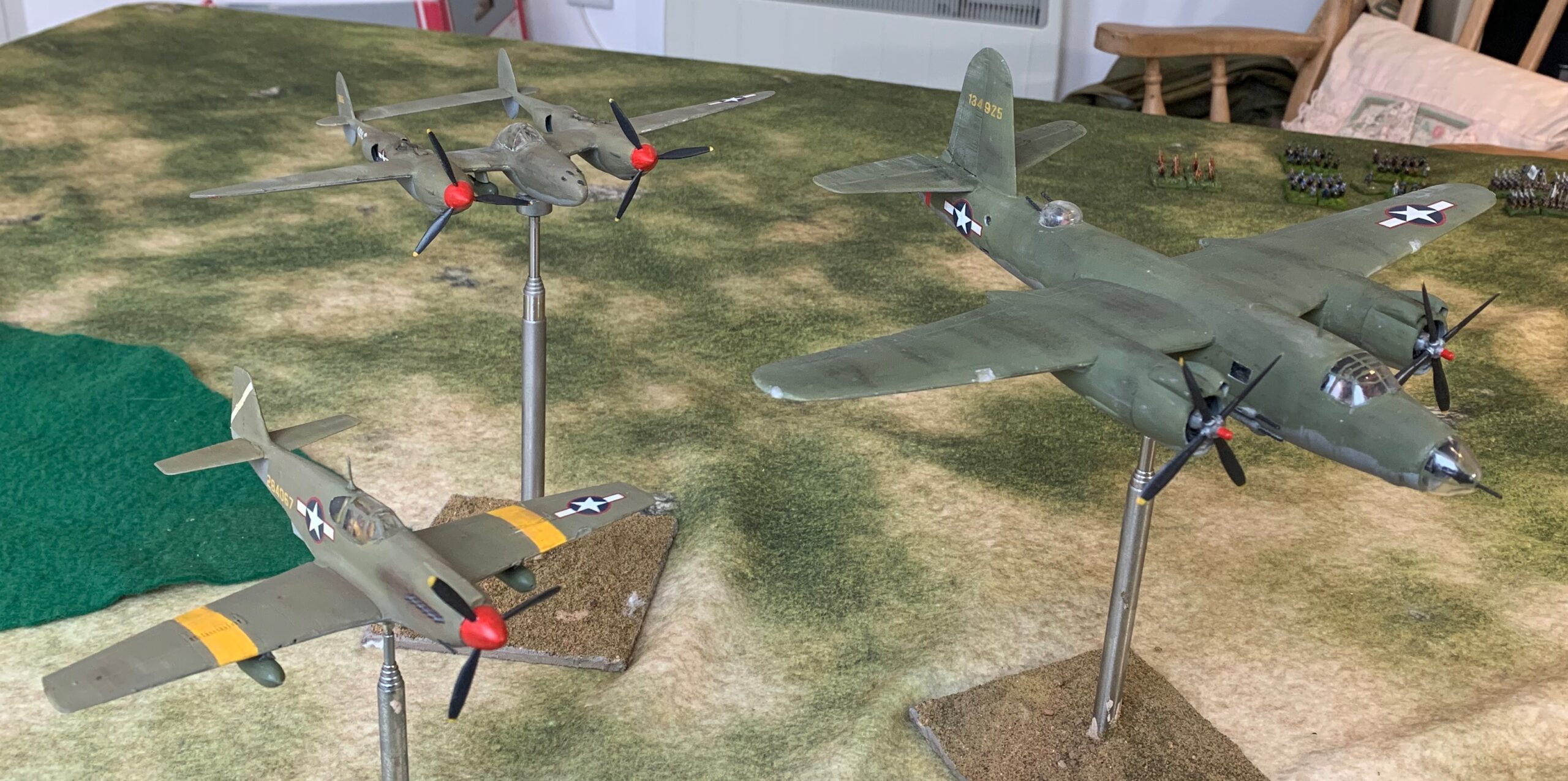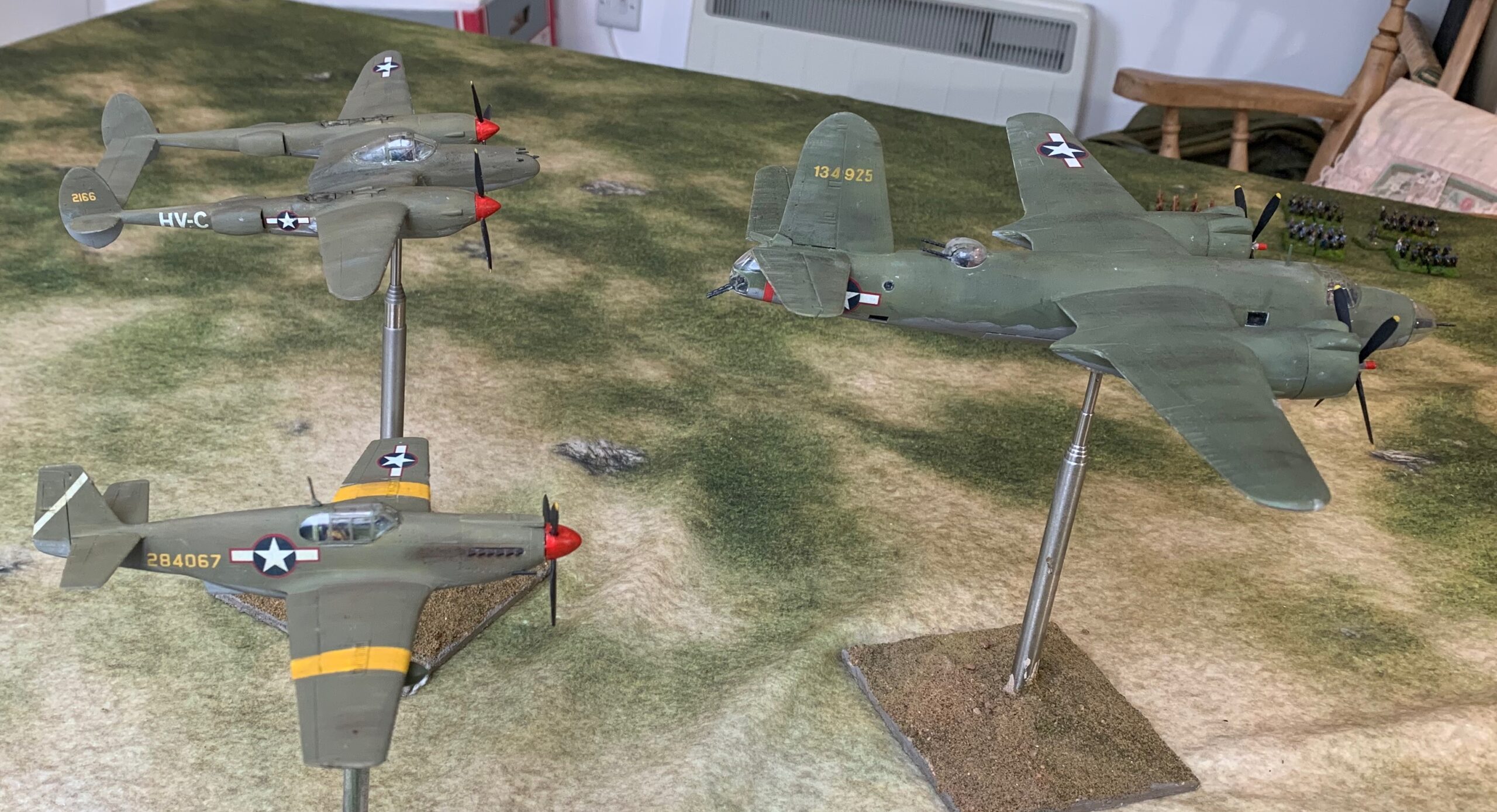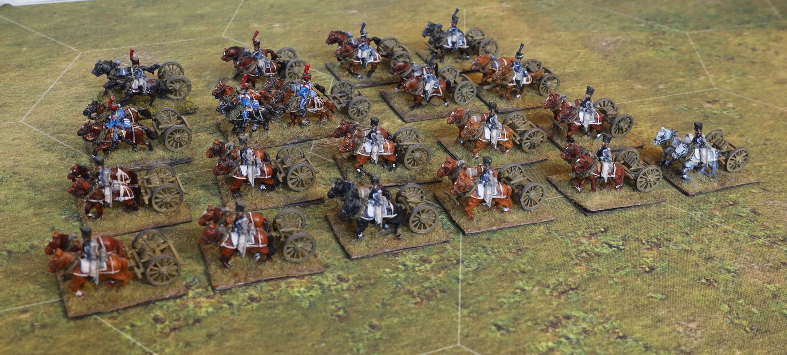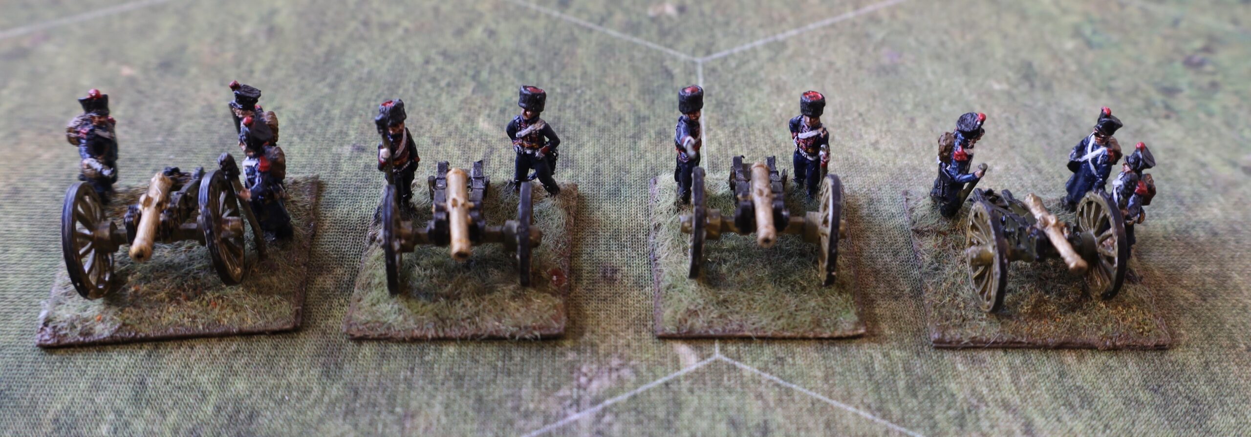
I have mentioned that I have a small 6mm (Baccus) collection of Swedish and Russian troops for the Great Northern War in the period 1708-09. I offered to bring these out for a game with my South London Warlords friends at one of our regular meetings in Beckenham. The game had to be postponed, alas, but it has got me going on an interesting project: developing a set of rules that I can use with these miniatures with friends not inured in rules systems or the period.
There was no time to develop new rules for the planned game in January. My idea was to use Helion’s In Deo Veritas (IDV) rules, by Philip Garton. I reviewed these a while ago (here and here) for use with my GNW forces – when I thought they were an answer to a prayer. They are really designed for an earlier era, but I thought that it didn’t matter much; indeed Helion and Philip brought out Captain General, a supplement to take them into the early 18th Century. They are pitched at exactly the right level for the games I want to put on.
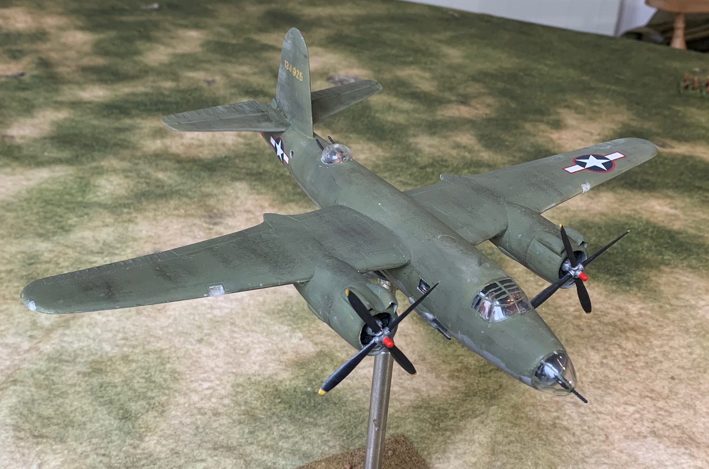
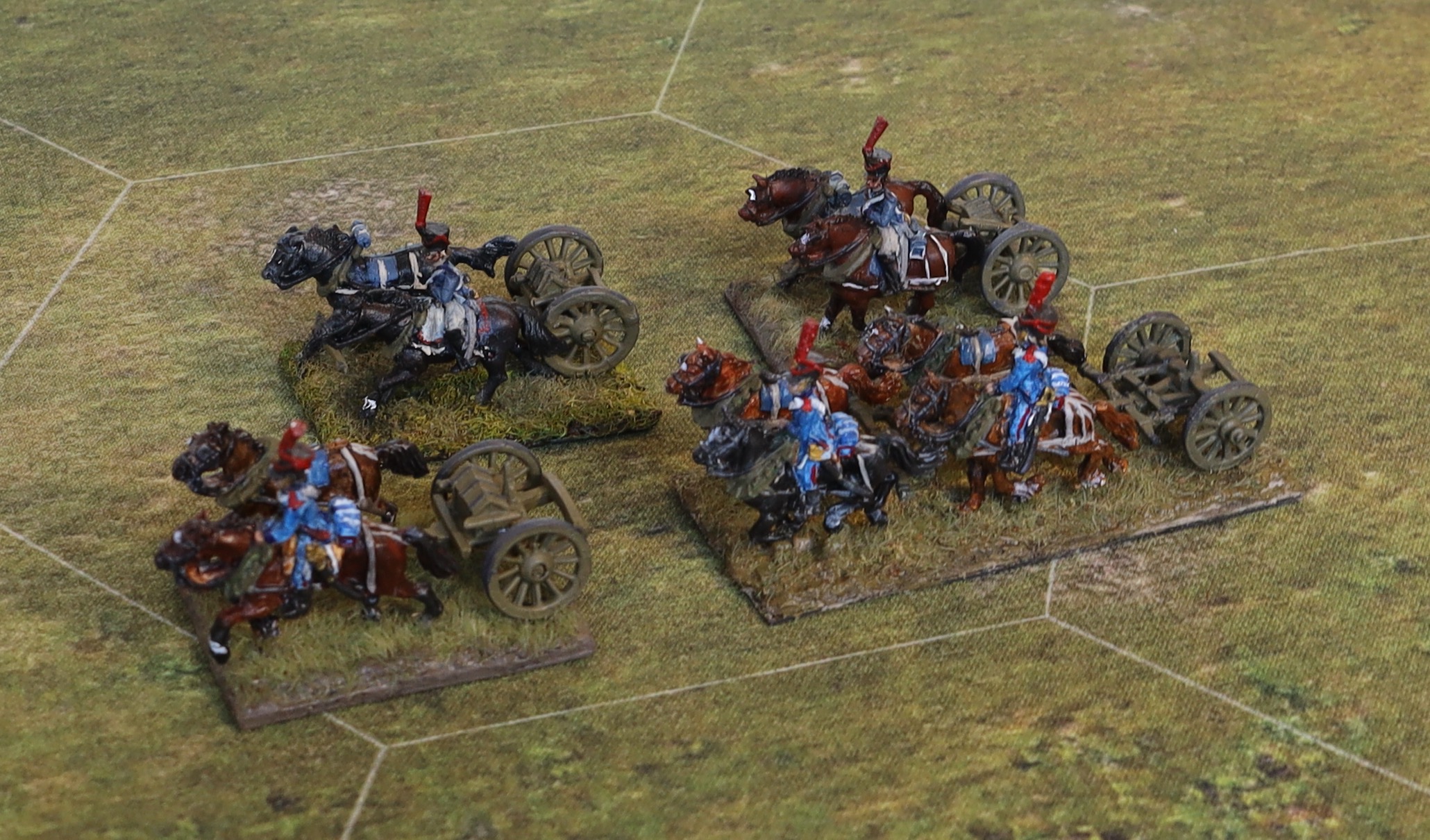
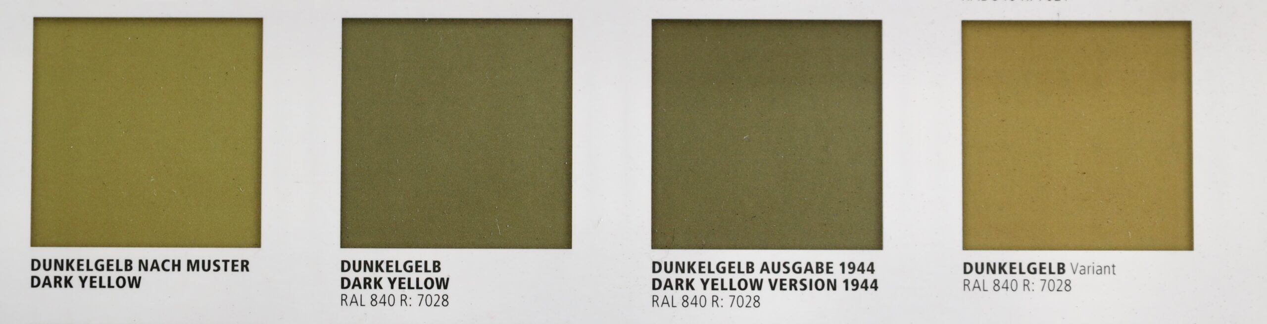
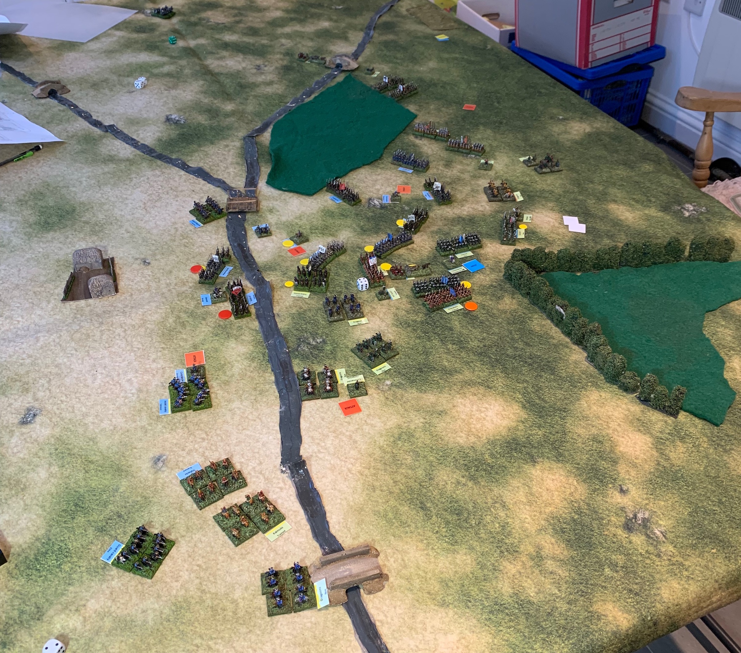
The problem for the January game was that the format isn’t very user-friendly – the rules are spread over 66 pages with lots of nice pictures and large script, and four pages of quick reference tables in smaller script. This is how publishers like it – Osprey’s Lion Rampant is the similar. Scanning them to prepare other gamers is deeply impractical, as well as a breach of copyright. I like my rules to be compact, allowing the minimum of time to check things out. The rules are also a bit vague in places. This doesn’t seem to bother most people – IDV has a fan club, and people are generally complimentary about the presentation in reviews. One reviewer does try to deal with some of the ambiguities, sharing a correspondence with Philip. I have tried contacting Philip via Helion on a couple of queries, but without luck. What I decided to do was to write my own compact version of the rules, tailored to my basing system and the troop types I was using, with a couple of extra rules to cover the peculiarities of the Swedes, and dealing with aspects of the rules that I felt were unclear. This came to six pages (just) in 10 point script with a two-page quick reference. I then ran a trial scenario at full strength (illustrated above), after having already played a game with the original. This showed the need for a few adjustments, but the rules were suitable and ready for my January game.
But then some serious health issues arose with my wife. We were going in and out of hospital, with the prospect of a big operation in February or March. This meant having to apply an isolation regime, in case of picking up an infection that would throw everything off kilter. My January game was off, and any February one was looking very shaky. This was a big blow, but the enforced idleness gave me an opportunity. Some aspects of IDV were a serious problem for me, applied to this particular period, even though it gives a thoroughly entertaining game. And there were other, lesser things I wasn’t so keen on. I now had time to write my own rules taking in aspects of IDV that I liked (which in turn were largely culled from other systems – such is the evolution of our hobby), and combine them with ideas from other rules. And one set in particular: Gå På (GP), by Thomas Årnfelt. These were the rules that brought me into the period, and which I had used quite a bit. They were innovative, and used the GNW as their starting point, rather than tagging GNW on to the wars of Louis XIV – the unusual Swedish army was handled with proper attention. But the rules are too complicated to throw at my club colleagues for a quick game. The core rules are 35 pages, with only a few line drawings for padding. A lot of time in games was spent trying to find a particular rule to check something. There’s a further problem: poorer quality armies (including the Russian one) were prone to collapse, even when they had a substantial numerical advantage. It was hard for the Swedes to lose, even with a half the number of men, provided they were handled aggressively. Regardless of whether this is historically sound (which I don’t think it is for the Russians in 1708/09), it didn’t make for good gaming. The friend that I had played so many games with gave up on them after a while. The problem could be addressed by weighting the Russians with guard and veteran units, but that is a bit artificial.
The biggest problem by far for me with IDV is that the armies are too responsive – there isn’t enough friction, and this is not impacted by quality of leadership. There is friction – with the use of Attack/Hold/Withdraw orders constraining choices, and restrictive rules concerning direction changes. But against this move distances are long for the standard 4ft by 6ft table which speeds things up a lot. My test scenario was inspired by the battle of Holowczyn in 1708. The Russians are dispersed across the table, with a river and marsh separating one substantial division from the rest. The Swedes need to get across the river, and tackle the Russians piecemeal before they can concentrate. I played it twice with IDV, and both times the Russians had no difficulty concentrating and destroyed the Swedes before they could properly establish their bridgehead. In the historical battle (admittedly fought over a bigger area), the Russians never came close to concentrating properly, and were defeated without many of their troops being engaged. The Swedish-Russian conflict was one of asymmetry. The Swedes had a small, high quality army, with effective and aggressive leadership. By this time, the Russian army was no pushover (unlike the pre-modernised army at the start of the war), but it was inferior and ponderously led. Beating it required manoeuvre. That is what makes the pairing so interesting. This simply can’t be reflected in IDV.
My solution was not in fact derived from Gå På, though it does have a system for doing so. Instead I used the PIP system, invented by Phil Barker and his friends, and used in the revolutionary De Bello Antiquitatis (DBA), and developed in Horse, Foot, Guns (which I have done a similar rewrite job on for Napoleonics). You throw a dice, and this gives you points with which you can spend on moving units around. I applied this a wing level (renamed “divisions”) , using an average die, and dropped the orders system. The orders gave an interesting dynamic, but there is less need to contain the players with the PIP system. There are plenty of other changes, but I have kept the system where the divisions are activated at random using cards (before joint shooting and close combat phases), as this gave a really good chaotic feel to the games. I particularly wanted to reduce the dice throwing in shooting and close combat (you throw for hits, then saves for both sides in IDV), and simplify other throws, where the number of modifiers was too heavy. Most dicing involves two six-sided dice, instead of either just one, or multiples. I reran the trial game, modifying the rule mechanisms after a couple of moves when they weren’t working. This time the Swedes won comfortably, though the Russian army did not collapse. But their poorer quality units were no pushover; towards the end one standard (D class, as I am calling IDV “Raw” and GP “Green”) unit routed a Swedish A class one, though admittedly taking it in the flank. I think the outcome turned on a few decisive throws and card draws, and on a different day there would have been a very different outcome; fortunes swung either way. But the Russians only had ten infantry units (two B, two C, six D) to the Swedes’ eight (two A, four B, two C), so they probably should have had been up against it.
I am pretty pleased with the result, which I have named Carolus Rex in honour of Karl XII of Sweden, the central personality in this conflict, but I’m making one more significant change – which is to cut down the move distances to more like GP ones from the ones based on IDV. That’s to constrain manoeuvring round the flank without the other wide being able to react. This needs to be play tested before being unleashed on the public – but I won’t be doing that just yet. If anybody wants to see what I’ve come up with (the rules are now just over 7 pages of A4 in 10pt script, with a two page quick reference) then get in touch. They are designed for a very specific period and forces, but should readily work for later encounters between Sweden and Russia (the Swedes have fewer high quality units), and to the Danish and Saxon armies too. Earlier Russian or Polish armies though, never mind Ottomans, would require some new troop types. I’m also not so sure about Western European armies – where fire discipline was better developed by some armies, and three-deep lines (from four) began to be used. They are designed for GP basing, with three bases to an infantry unit, in my case 20mm square. At the smaller scales it is now fashionable to have single base units, 60mm-90mm wide. The rules could be used for this, though march columns would need to be dropped (they were rarely used in proximity tot the enemy anyway) and the shooting rules would need to be adapted.
This has been an interesting exercise. My earlier rule-writing efforts (Napoleonic and WW2) have been steeped in history. This time my historical knowledge is relatively light, and I have a strong focus on playability. In two cases I think I may have sacrificed faithfulness to history to playability. I have made the units quite easy to manoeuvre, in an era before such innovations as cadenced marching were in widespread use. But players get frustrated when they can’t do things, and I have noticed a modern fashion to take the faff out of moving units around on the table (Sam Mustafa’s Blucher and Lasalle rules for Napoleonic wares for example). Second it is relatively easy to rally units to bring them back into battle. This is actually quite hard in IDV and GP. But I have just four cohesion states (Good Order, Disordered, Shaken and Broken) and no casualty removal. It’s quite easy to knock a unit into Shaken or Broken status with some moderately good dice, so for playability purposes I thought there needed to opportunities for recovery. In my trial game the Russian commander spent practically the whole battle scooping up shaken and broken units, rallying them and sending them back in (not always successfully). I really don’t know how historically faithful this is. Still in the real Holowczyn I think there were reports of the Russians doing this – so I might not be so far off the money after all!
Next I need to paint up some more units to give me more options in future games.
Update 3 February
No matter how hard you try to draw a line under rule writing, the brain moves on. I said above that I am using the PIP system for giving orders to units to move around the field. I’m having further thoughts on this. I had already decided to go for the idea of generals moving from unit to unit to issue orders in person, rather than using such ideas as “command distance”. This is based on the idea that staff systems had yet to develop, and that most communication was in person (though admittedly orders would tend to be valid for more than a single move). This may be another case of game play getting ahead of history. The general would be limited by an overall movement allowance (generous at 24in), with the number of orders issued limited by PIPs. But what if instead of PIPs I used the die score to determine movement allowance? Say 3in per pip, which (using an average die) would mean 6in to 15in – but putting no limit on the number of orders. Perhaps a cost (say 2in) for each order. You could keep track using a D20. A low score represents the general gathering information and trying to decide what to do. I remember reading Paddy Griffith saying wargamers had little concept of how generals had to manage their time…