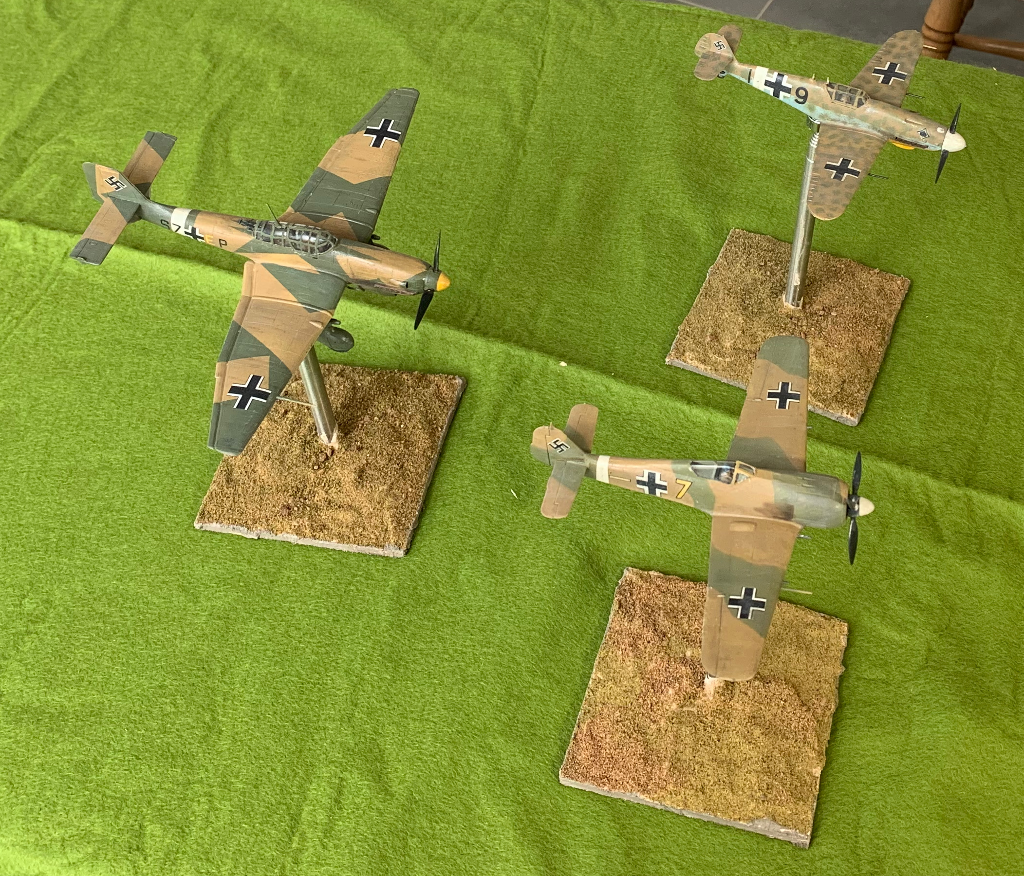
So at last I have finished my latest project. These are three German planes from Tunisia at the winter of 1942/43: a Messerschmitt Bf-109G2, a Focke-Wulf Fw-190A4 and a Junkers Ju-87D1 Stuka. I want to describe each of these planes individually in separate posts, but before that there are a few things I want to say about the project as a whole.
The project was quite a late idea in my plans for an aircraft collection based on my 1943 theme. The P-47 was an interesting trial run, but I thought it would be a good idea to do some more practice on cheap models, before launching into some of the more sophisticated (and expensive) kits that I had bought. I was also a bit short of German aircraft (three from the original ten). This wasn’t so inappropriate given that the Germans rapidly lost air superiority in this period, but at the start air superiority was fully contested. Also I had planned to do the three German aircraft in the standard European grey scheme. But in the early period, in Tunisia, they used their desert colours as well, adding some more interest. And they also used Stukas, which I wanted to model, though increasing Allied air strength quickly drove them into a very minor role. So I bought cheap models of the early versions of Bf-109G and Fw-190A in use at this time, the former from Hobby Boss (£6.25), and the latter from Zvesda (£8.50). For the Stuka I went to Hobby 2000, which was substantially the 1990s model from Fukashima; this was a bit pricier (£11.80), but not in the same bracket as modern hobby models.
The project took a lot longer than I expected, and I had some more learning to do. This was mainly due to my daily routine, which only allows 2-3 hours in the afternoons for the hobby, and very often it proved not possible on that day. To improve my work rate I will have to do some morning time too – fortunately my other commitments are easing, so that should be doable (though there’s more to be done in the garden…). But there were other issues. I had the same problem with raised undercarriage with the Bf-109 as I did with the Hobby Boss P-47, and only the Zvesda model came with a pilot. The Stuka proved quite tricky to assemble. There were some fiddly parts, some of which I gave up on, but a bigger issue was that the fit of the parts wasn’t that great, especially when compared to the lovely fit of the Zvesda. Manufacturing standards have clearly improved. But the real problems came with painting and finishing.
I am still learning with the airbrush; it feels like one step back for every two forward. Partly this is because I mix my own colours. I quickly found this easiest with artists’ colours, rather than using hobby paints (a few Lifecolor ones came with the airbrush). But that gives quite a thick paint that needs to be thinned. Getting the consistency and pressure right was quite hard, especially as things seemed to change as the job progressed. It took longer than expected, and a lot of the green on the Fw-190 turned out to be too thin, and I had to top it up with an old fashioned brush. I would not advise people to take up an airbrush for aero-modelling unless they are quite happy to learn new skills. For wargames purpose I’m, sure you can get satisfactory results with a paint brush, provided the paint isn’t too thick, which may mean you use more than one coat.
The real problems came when I tried the oil paint patina technique for weathering the model – referred to as “dot filtering” in the blog I picked it up from, which isn’t very informative. This means putting small dots of oil paint on the model (such as white, brown and blue-grey) and then brushing them into a very thin patina, which I did after the decals in order to integrate these better. It softens contrasts, creates subtle changes of tone, and simulates some of the effects of fading and dirt. I found this not to hard on the P-47, especially as I could correct over enthusiasm with a bit of white spirit. On that model I applied the oils to a surface on old Humbrol enamel satin varnish. This time I thought it would be clever to to apply a coat of matt varnish first – using Winsor & Newton in an aerosol can. Bad idea. I tried with the Fw-190 first, and I found that the spreading of the paint on the matt surface was much harder and it was not possible to spread the paint thinly enough, which left heavy streaking. So I put a bit of white spirit on. That didn’t help because it reacted with the matt varnish to created a horrid claggy mess. By this time the disease had spread to the 109, as I tried a more restrained application of paint, but without success. This was getting desperate. The models were cheap but I’d invested quite a bit of time in them! I then tried oil paint medium (mainly linseed oil) to thin the paint, and this at last started to shift the streaks and help lift some of the clag off. On the 109, on the unrated areas I applied a layer of medium first, and put the dots onto this, with reasonable results. With a bit of work I got to a generally acceptable result on the two fighters, though close examination reveals areas of mess, especially on the 190. The big problem with this approach came later. The medium took days to dry, and finished in high gloss, rather than the rather nice faint sheen I got on the P-47, before putting on the matt varnish. I had been aiming for that light sheen rather than the heavy matt of the P-47. I had to apply matt varnish, but I didn’t want to use the W&N aerosol, partly because it meant re-masking the cockpits, and partly because I wasn’t looking for the extreme matt finish that this product gives. Instead I used Lifecolor varnish applied with a paint brush. Some of the medium clearly hadn’t quite dried, though, and the gloss finish kept bursting through. After this I had very little patience for further weathering, though I did apply pastel powder for some exhaust stains.
With this disaster unfolding on the 190 and 109, I realised I needed to do something different on the Stuka. I put a layer of Lifecolor gloss varnish onto the matt surface, and applied the oil paint to this. This worked much better, but in places I was still a little heavy-handed, so I put on a little oil medium to thin out. This worked, but I had the issue with it taking a long time to dry. I didn’t dare use the white spirit as the Lifecolor product wasn’t polyurethane (or that old Humbrol product), and I thought it might react in the same way as the matt varnish. Judging by how effective white spirit was on shifting dried varnish on a brush I forgot to clean, this was probably a good call. The patina effect on the Stuka was much more restrained, on the top surfaces anyway, than on the other models (including the P-47), as by this time my confidence had been badly dented.
Other points to note? The white fuselage stripes, and the yellow under the nose on the fighters, was painted on directly after the primer and then masked. On the P-47 I painted the yellow stripes over the main paint. Yellow and white are tricky to overpaint (it took several coats on the P-47), and I think this approach was better. I tried three different strategies for the cockpits. I bought a tailor made mask for the Stuka; frustratingly the model actually came with a mask so I didn’t have to do this – and I used the mask that came with the model. On the 190 I cut masking tape for each of the transparent panels leaving the frame exposed. On the 109 I masked the whole cockpit except the edges and painted the frames afterwards. Some modellers swear by masks, but I’m not sure – I don’t think the end result was any better than painting on, though on the Stuka it would have been much too hard to mask the panels by cutting tape. This is only practical on a much simpler canopy, such as that for the 190 (and P-47), where I was pleased with the result. The results on the 109 were fine for my purposes, though the acrylic surface doesn’t take paint that easily and needs a bit of priming (and the white primer needs toning down as it is visible from underneath). The canopy on the Bf 110 is going to be a real challenge, but I think I’ll take the same route as I did with the 109.
Overall I’m very pleased with these models, except on the undersides, which won’t be all that visible in use. I got away with the botching of the patination. A key learning is that, unlike a true aero-modeller, I am aiming for a good effect from a distance, and not to impress with close -up detailing. These models would be a bit of a disaster by the latter standards, especially the fighters, but they work very well for my purposes, as I think the photo shows. They do a good job of evoking Luftwaffe aircraft of that time and place. In particular fussing around with minor bits of detail, like bringing out panel lines, or showing scuffed paint, isn’t worth it. More comments when I review each model individually.
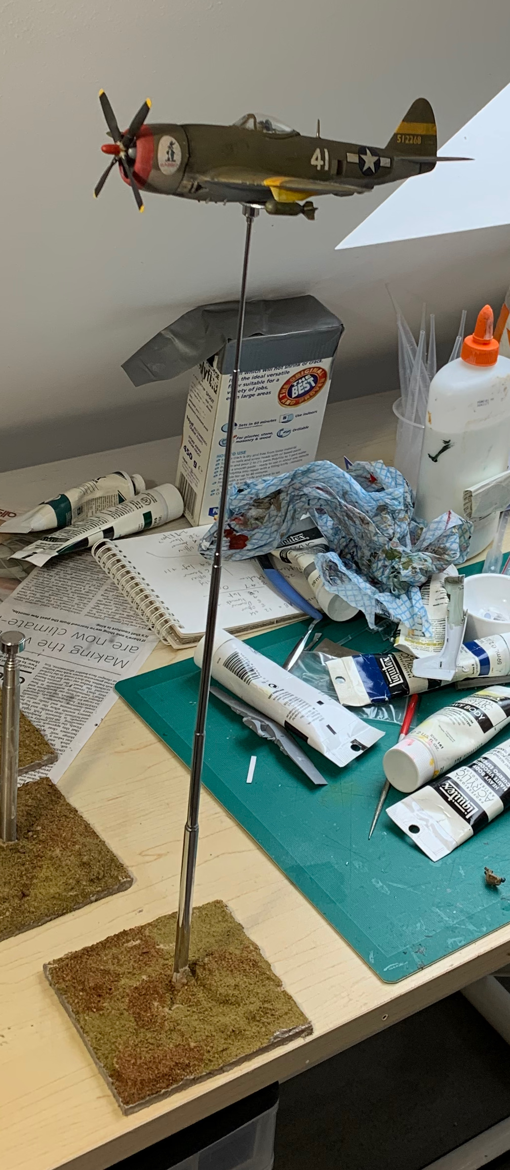
My P-47 soars high above my workbench on the newly made stand.
After the first WW2 aircraft for my wargames collection, the P-47 Thunderbolt, I decided that I needed to have flight stands ready before I attempted my next set of models, and to build in the mounting from the start. This would have the advantage of having somewhere to put models while paint was drying, etc. I had hoped to be able to buy something that could be used straightaway. The closest I could find came from Debris of War, which was really meant for smaller scales. This was very neat, but I thought it really wouldn’t work for larger models, just as they said; apart from anything else it doesn’t extend that high. I would have to make my own. This turned out to be not especially hard. In this post I will explain how I did it. There are a couple of things I learnt on the way, so this may help anybody who wants to do something similar.
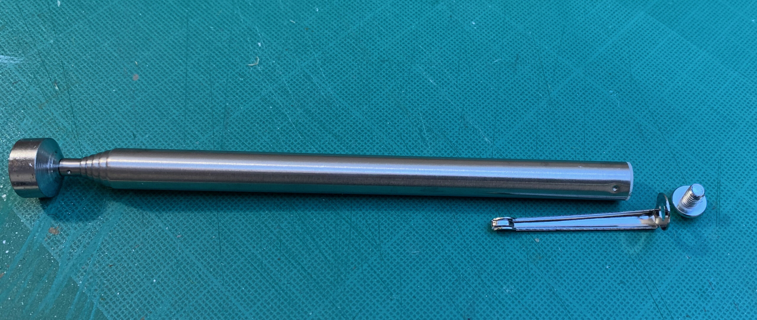
The starting point is a magnetic, extendable pickup tool. There are quite a few on the market. I tried out two different sorts. The obvious choice was the Amtech 2255 which can be had for a mere £2.59 on Amazon. Worried that this was too good to be true, I also bought another one from Raguso, which sells at £5.89 on Amazon. The Amtech is bulkier and extends a few centimetres less than the Raguso; the magnet at the end has a wider diameter, which is probably better for my purposes. But both work fine. The magnets are quite powerful, making the attachment pretty secure for models assembled from plastic kits. The Amtech is cheaper and delivery from Amazon is much quicker; there really is no reason not to go for this one, so I bought a few of them.
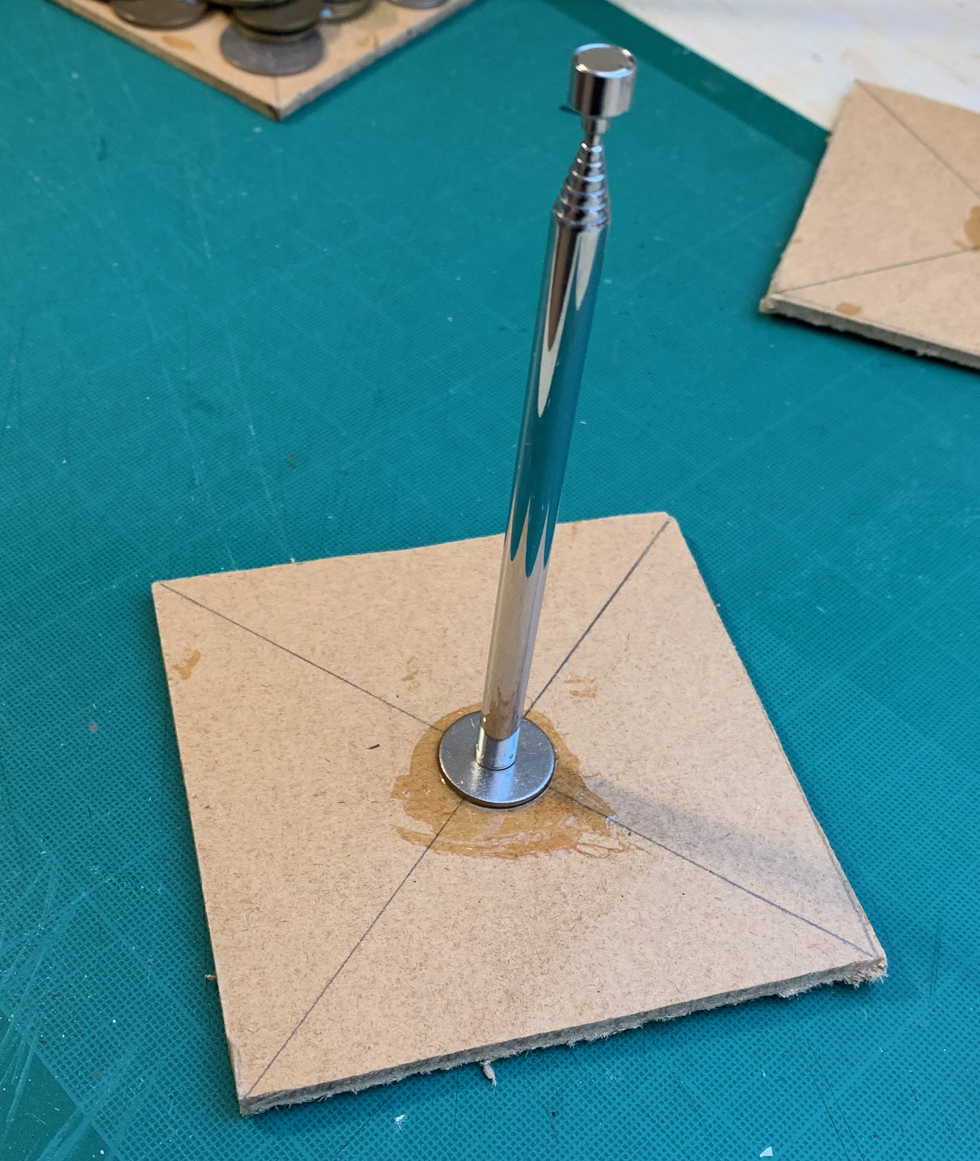
Both have basically the same structure: a telescopic arm (like an aerial) with a magnet fixed at one end, and with a pocket clip at the other end secured with a screw-in top. This is the Amtech one dis-assembled:
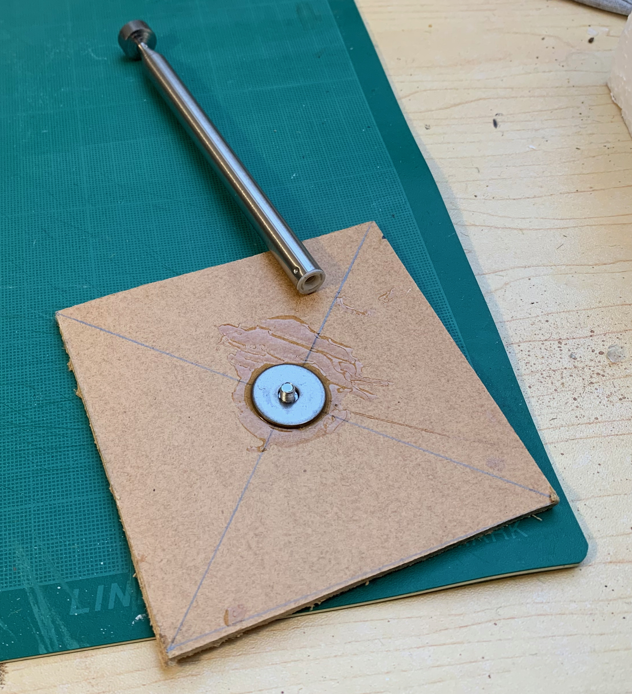
The clip serves no function for us, but the removable top comes in handy. This is bigger and domed on the Amtech; the Raguso one is neater and flatter. Next we need a base. I cut this from hardboard, simply because I had some lying around that needed to be used up. This material works, but is not so good for drilling holes in, as I found out later. MDF or hard plastic/acetate would probably be more appropriate. I cut out four inch squares. I thought this would give the best balance between stability and footprint. Something slightly smaller might well be just as good if I you weight it down properly. It doesn’t need to be bigger. I used the square shape because I wasn’t up for cutting out a circle, and I quite like squares on the games table anyway. I think you can get pre-cut circles of MDF or acetate quite easily.
So how to fix the arm to the base? My first idea was to glue the screw-in top into a recess drilled into the base, and then screw the arm onto that. However, the need to make sure the arm was properly vertical meant that in practice I needed to glue the whole assembly in. Then there was the question of adhesive. Having read that people used “liquid nails” I tried Unibond No More Nails. This failed. The adhesive didn’t bond particularly strongly in the context, and in a any case simply trying to glue the arm to the base was asking for trouble, given the leverage on the arm and the sort of forces that the joint was going to have to withstand. Take two. This time I drilled a hole right through the base. Hardboard has a bit of give, meaning that the it bulged a bit on the exit side of the hole, which had to be tidied up with a knife. I then glued a 2cm mudguard washer over the hole. I found some ancient Araldite in my things and I used this, having lost faith in No More Nails. Here is the result, with the Amtech device. Because the drilled hole was slightly bigger than the diameter of the top, I widened it a bit at the top and glued the washer in with it in place. This wasn’t necessary with the Raguso device.
The arm was then simply screwed onto the washer with the top, to create a very satisfactory fixing. This is the Raguso one.
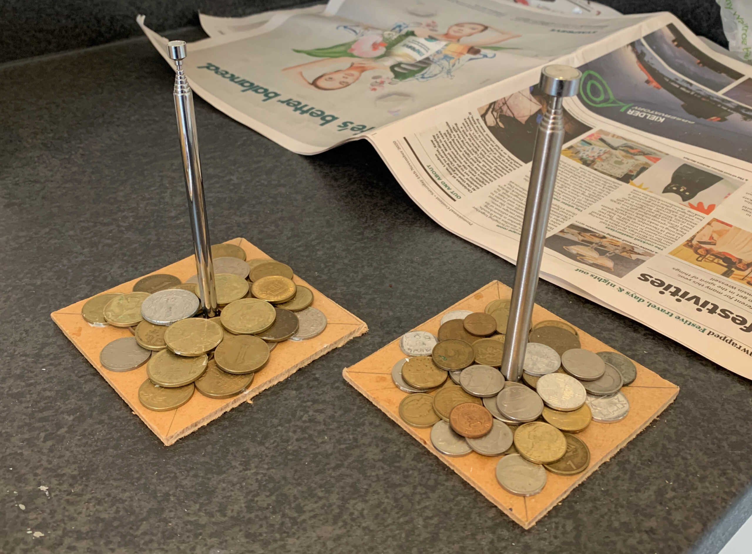
Next I felt the need to add extra weight to the base to ensure it was properly stable, especially with the arm extended. For this I used a collection of old coins I had from my 20th Century travels, including a lot of pre-Euro ones. I sifted out the ones that were attracted to a magnet, as I though these might have other uses. Other alternatives might include washers or similar bits of hardware, which can be had very cheaply from specialist suppliers like RS. One blog I read used a small number of very large washers for this, and that looks a good way to go. I used the No More Nails to glue them on. This shows one of each type of arm;
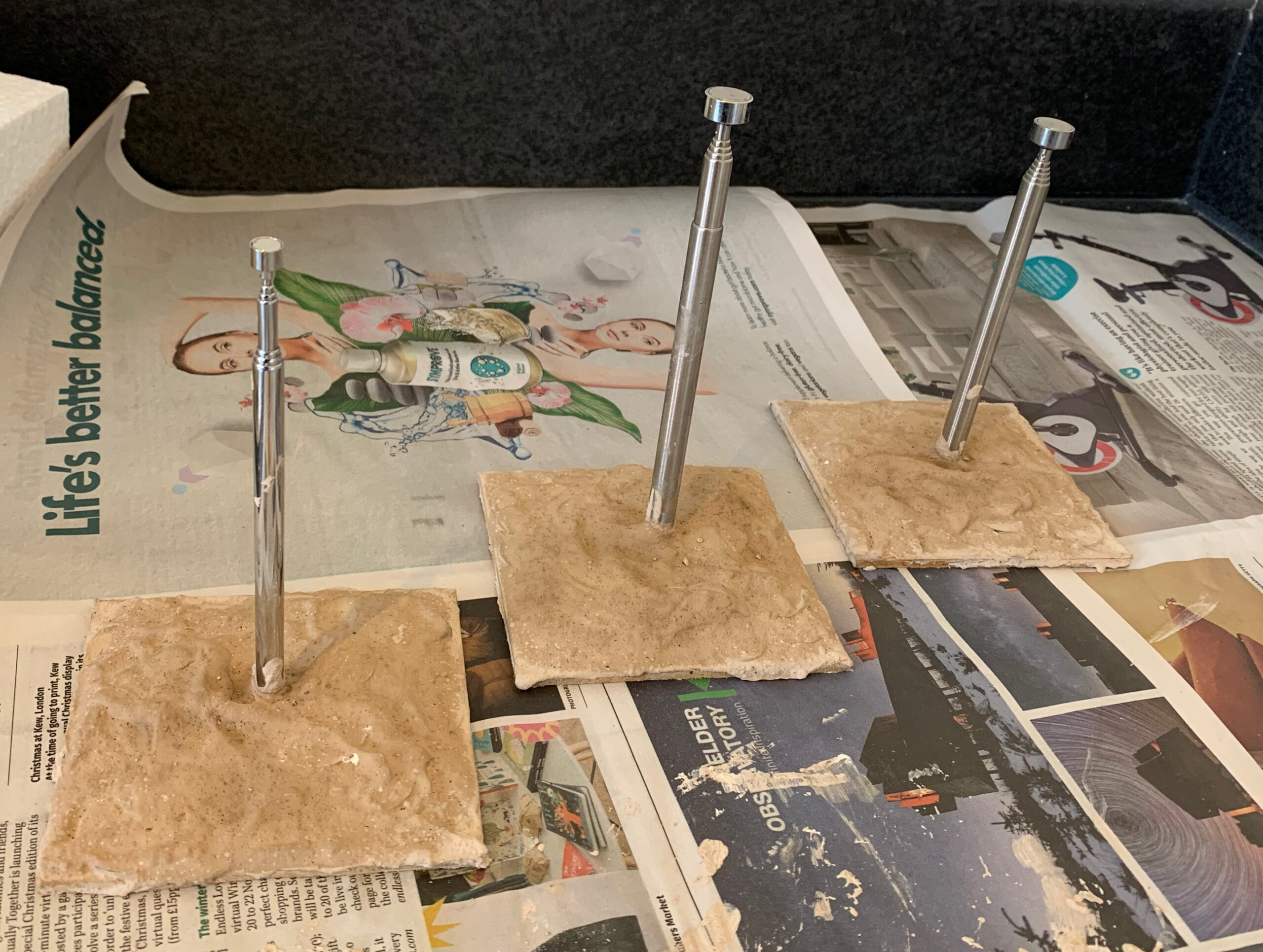
Next the coins were covered with plaster, mixed with paint (brown, yellow and white tempera), together with some of my old mode railway ballast to give it texture. The ballast didn’t work; some sand would have been much bette, but I didn’t have any cheap stuff to hand:
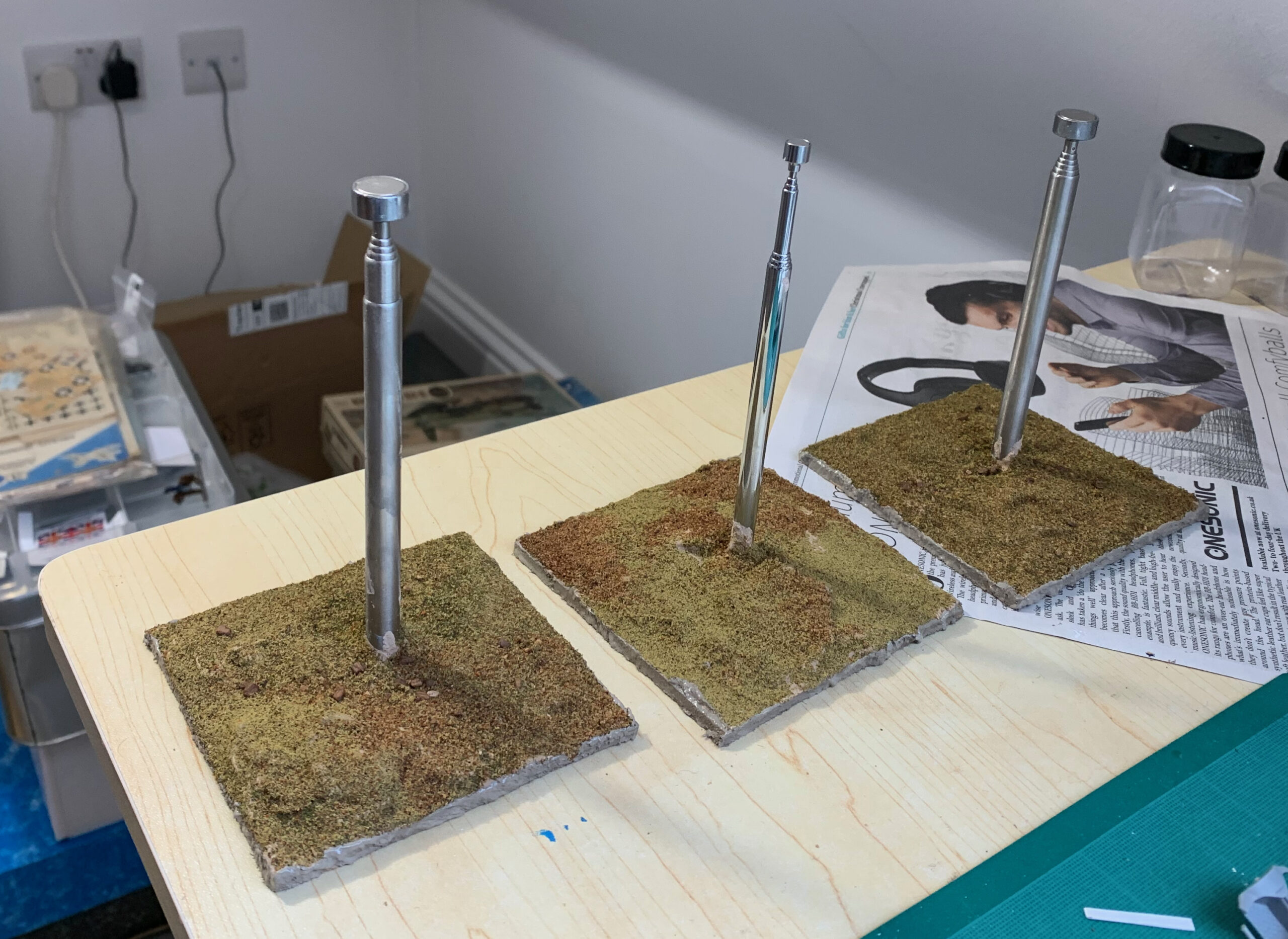
This is all standard terrain making stuff. I simply added flock next. I used two sorts of Woodlands scenic flock, plus some Games Workshop sand (ridiculously expensive but quite nice looking – I only use it for decoration). This was to get the arid terrain look. What worked best to semi mix the three components, and put it all onto the wet PVA at once – rather than applying the different types separately. I then sprayed more PVA onto it to seal it. Finally I painted the edges with a mix of Raw Umber and white to tidy it up. Of course you can be much more ambitious, with bits of scrub, rocks, etc. But I was in a hurry and I didn’t want the bases to draw attention to themselves. Anyway here is the end result:
All very easy. Of course at various stages things had to be left to dry out, so it took a few days altogether, but this could be fitted in alongside my other projects.
How about the mounting on the model? This is a bit of a work in progress. I started with a simple small steel screw – having drilled a hole into the model with a gimlet. This was robust but not entirely stable (though the model would not have been in danger). I then used the screw to attach a steel mudguard washer, which you can see from the picture above. This wasn’t completely horizontal (because it needed to follow the line of the model’s belly), and the screw wasn’t entirely flush. It nevertheless turned out to be very functional. The attachment is very stable and the slightly raised screw head allows for subtly different flight angles to be made. But it is over the top and unsightly. I’m thinking of gluing on a small coin if an appropriately angled surface is available. Hiding something with iron inside the model might work in some cases. it is a work in progresss.
Incidentally something I have discovered the hard way is that not all steel is attracted to magnets. Some stainless steel isn’t. When buying online it is safest to avoid stainless steel. I bought some the screw and washer from RS Online, though absurdly more than I will need to mount aircraft models: here are the screws and the mudguard washers; they both work with magnets. These are same size as the washers I used to fix the base, but in fact I used some I had bought a couple of years ago for basing 20mm infantry, that I thought would attach to magnets but don’t. Lesson learned.
UPDATE 16 March. I have found that the RS 12mm screws above are quite sufficient of themselves to fix to the model, without the need for anything bigger like a washer or small coin. This is for a Bf 109 and an FW 190, which are quite small, and also for a Stuka, which is a bit bigger. I drilled a hole into the underside with a model drill, enlarged it a little with a gimlet, and then fixed the screw in gently with a screwdriver; in all cases this was into a single kit part, not a join. Getting the angle exactly right is a bit tricky. In two cases I managed to get the head in a millimetre or two off flush; in the other (FW 190) another millimetre or two off – I was unwilling to force the screwdriver in case the force broke the model. The attachment is vey secure.
I’ve just finished reading this book. It is Volume I of 2, so I’d normally wait to read the second book before reviewing here. But it proved too good to wait.
There is no shortage of books on Waterloo. Modern ones are often disappointing, while older ones have their own flaws. John Hussey’s aim is to look at the campaign as a whole, and to get the big picture right. This volume sets the scene in 1814, and covers Napoleon’s return up the the battles of 16 June 1815, at Ligny and Quatre Bras. This does mean taking a look at the what happened and why of the battles, but he avoids a lot of the detail, which is what most books on Waterloo take on.
Mr Hussey is not an academic, but he is a serious historian – which sets him apart from most modern writers on the Napoleonic Wars, who don’t get beyond being hobbyists or controversialists, or both. I like that. I am an avid follower of politics, and studied History in my final year at Cambridge. I enjoy the top-level stuff, along with the military narrative. Mr Hussey handles this confidently. The tensions between the main powers occupies a lot of the book, and some readers might think he overdoes it. There is also a lot on Wellington and Blucher/Gneisenau’s planning for the campaign – again this might be too much for some. But I was left with a very clear appreciation of the agendas of the various parties. By contrast there isn’t so much on Napoleon, after he reaches Paris.
But eventually we get into the meat: the day before the campaign starts (the 14th), and the first two days. Mr Hussey paints a compelling picture of this. The Allied deployment was flawed, because each commander was working to a different agenda. Wellington’s army was deployed in depth, so that he would concentrate his army for the second or third day of the campaign to defend Brussels, the critical objective from his point of view. Wellington’s main error was not picking up the evident signs on the 14th of what Napoleon was up to. He had the intelligence but he didn’t act. Mr Hussey doesn’t get to the bottom of why – but he just seems to have been too busy. The Prussians (and it is hard to distinguish between Blucher and Gneisenau), on the other hand, deployed forwards, with I Corps very close to the border. That pointed to concentration earlier and further forward than Wellington; they were not so bothered about Brussels, but more about their communications with Germany. They did respond to the intelligence (much gathered by Wellington’s men, especially Dornberg in fact) on the 14th, which ultimately allowed them to concentrate three corps at Sombreffe on the second day (their intended concentration point, near Ligny). Their massive mistake on the 14th was not giving clear orders to the fourth and more distant corps (Bulow’s), meaning that it couldn’t be there for another day or two.
Napoleon seems to have understood the weaknesses in the Allies’ deployment, as he so often did, and decided to hit the Prussians first before Wellington could help them. But muddled orders meant that he didn’t concentrate properly, and Gerard’s corps in particular was a day late. One important feature of the Allies’ deployment concerns the main road from Charleroi to Brussels – which went through Gosselies, Quatre Bras, Genappe and Waterloo. At the border up to Gosselies, this was in the Prussian sector; after this it was in the Anglo-Netherlands sector. On the 15th Ziethen, the Prussian I Corps commander, abandoned this road in his hurry to get to Sombreffe, without higher authorisation and without warning Wellington. The road to Brussels was left wide open and Wellington didn’t realise this until very late in the evening, and got quite a shock (“Humbugged, by God!”). He managed to concentrate a large part of his army with remarkable speed to get to Quatre Bras the following day however – this was critical to both cover Brussels and the Prussian flank.
A huge amount of ink has been spilt over two centuries about who is to blame for what in these first days. A lot of it is nonsense. Mr Hussey feels he has to deal with the main controversies (such as what did Wellington promise to the Prussians?). But from a grand tactical perspective the Allies got the better of things. Blucher managed to get three corps to Sombreffe, and significantly outnumbered Napoleon. Wellington stopped two French corps from joining the battle (or strictly one, the other was more a French shot in the foot). The problem was that the Prussians still managed to lose.
One disappointment is that Mr Hussey doesn’t spend much time trying to understand why so many of the French were slow to get going on the morning of the 16th. This delayed the serious fighting to the afternoon. The 15th had been a long and tiring day, but the troops were carrying three days of rations. Was it that distrust between commanders and troops meant that the former did not feel they could push as hard as they might in 1805?
Mr Hussey’s accounts of the battles are quite high level. He gets a decent overall perspective. He doesn’t quite manage to explain how the Prussians lost at Ligny, though he does point to mistakes in their deployment, which he thinks should have been further back – this had been the original plan in fact. How the Prussians lost bothers me, as I want to be able to simulate it on the tabletop. I have conducted a few games based loosely on Ligny, and the problem is always the same: the French are short of infantry, especially since the Prussians are defending built-up areas, which get quite a big bonus under many rules systems (such as Blucher). I suspect that there is a vital aspect of simulating larger battles that is missing from the rules systems – but I haven’t found it yet! Mr Hussey follows the conventional story that Vandamme’s two divisions attacked St Armand from the west, alongside Girard. Personally I’m convinced they came in from the south. But that’s a detail. All that we can say is that Prussian tactical management in this battle was weak, and they fed their reserves in too quickly – whereas Napoleon’s management was masterly.
What if d’Erlon hadn’t backed off when he approached the battlefield in the early evening? Mr Hussey does not address this question. Almost every commentator suggests that the Prussians would have been annihilated – but I think this conventional view needs to be challenged. It was late; the French were tired and the Prussians hadn’t yet exhausted their reserves (which Blucher did as soon as d’Erlon backed off). The Prussians may simply have started their retreat earlier.
The battle of Quatre Bras gets rather more coverage than Ligny (30 pages to 20), which shows up the book’s greater interest in the British story. In a couple of places I don’t think he quite gets it right. In describing the battlefield he misses the hedges to the north of the Gemioncourt stream – which I think are a tactically critical feature, as they blocked cavalry, as well as providing an important obstacle to infantry. Also he describes two charges by Kellerman’s cuirassiers, where most people think there was only one. But, as he says, untangling the sequence of events at this battle is very difficult given the very scrappy nature of the evidence.
There’s not a huge amount for gamers in this book, apart from getting a better understanding of the context, and the controversies surrounding the campaign. But here are some thoughts that the book provoked in me, relevant to gaming:
The French corps commanders seem remarkably uncommitted to the cause and hesitant, when confronted with uncertainty, when not directly under Napoleon’s eye. They remind me of what people say about Austrian generals in their earlier encounters with Napoleon. They are more afraid of getting it wrong than keen to do the right thing. Once in the battle French tactical handling (more down to divisional commanders perhaps) was top rate, however.
The role of wing commanders under Napoleon (i.e. Ney and Grouchy) was a problem because they lacked staff and proper authority. Ney was initially energetic in pushing the French practically up to Quatre Bras, but seems to have lost his way the following morning. He really needed his corps commanders to be on the ball. How to reflect all this in command systems on the table is an interesting challenge.
The command of I and II Corps for the Prussians got very entangled at Ligny. Often brigade-level integrity was lost too. This was function of having so many units in a tight space, and using the nearest units to hand to cover gaps. This again presents a challenge. Something similar, though more deliberate, is evident in Wellington’s army at Waterloo.
There is also the question of feeding in reserves to bolster tired units, as opposed to using fresh unit to conduct operations on their own. Both sides used both ways of using reserves at Ligny. Feeding is isn’t well simulated in rules systems, however, which like to deal with brigade or division sized units as a whole.
Artillery often seems to be used at longer ranges than the oft-quoted “effective” range of up to 700 paces or so, and had tactically significant effects these longer ranges. I noted this at Wagram too. Also overhead firing played an important role at Ligny (and also significant at Quatre Bras), something that some rules writers suggest was not done.
On the subject of artillery, Mr Hussey suggests that the Prussians were outgunned at Ligny, with their grand battery being initially effective but subsequently outclassed by the superior quality of French artillery. I wonder if quality difference was not so important as exhaustion and management of reserves. This is something that Blucher covers well (unlike BUA fighting) and most rules systems don’t. Most rules (including mine) don’t bother with quality differences in artillery – but I do find the issue quite hard to relate to hard evidence as opposed to boastful claims by contemporary commentators, which so often turn out to be based on hot air.
I’m looking forward to volume 2 – though I might read something else from my extensive library of books I haven’t read yet first.
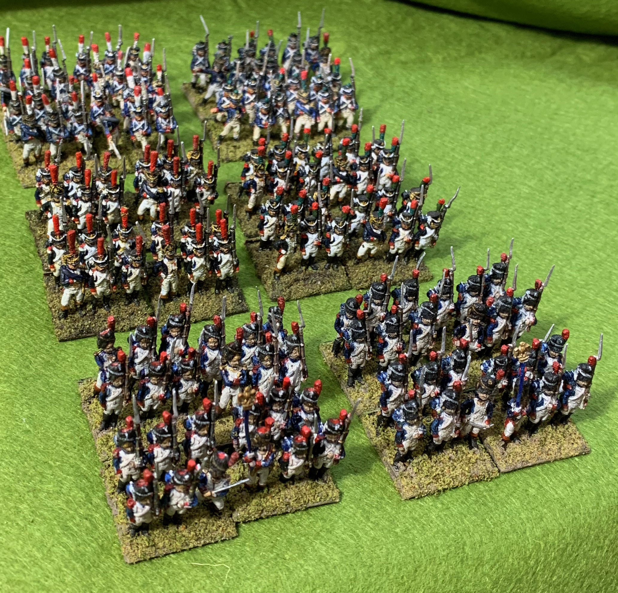
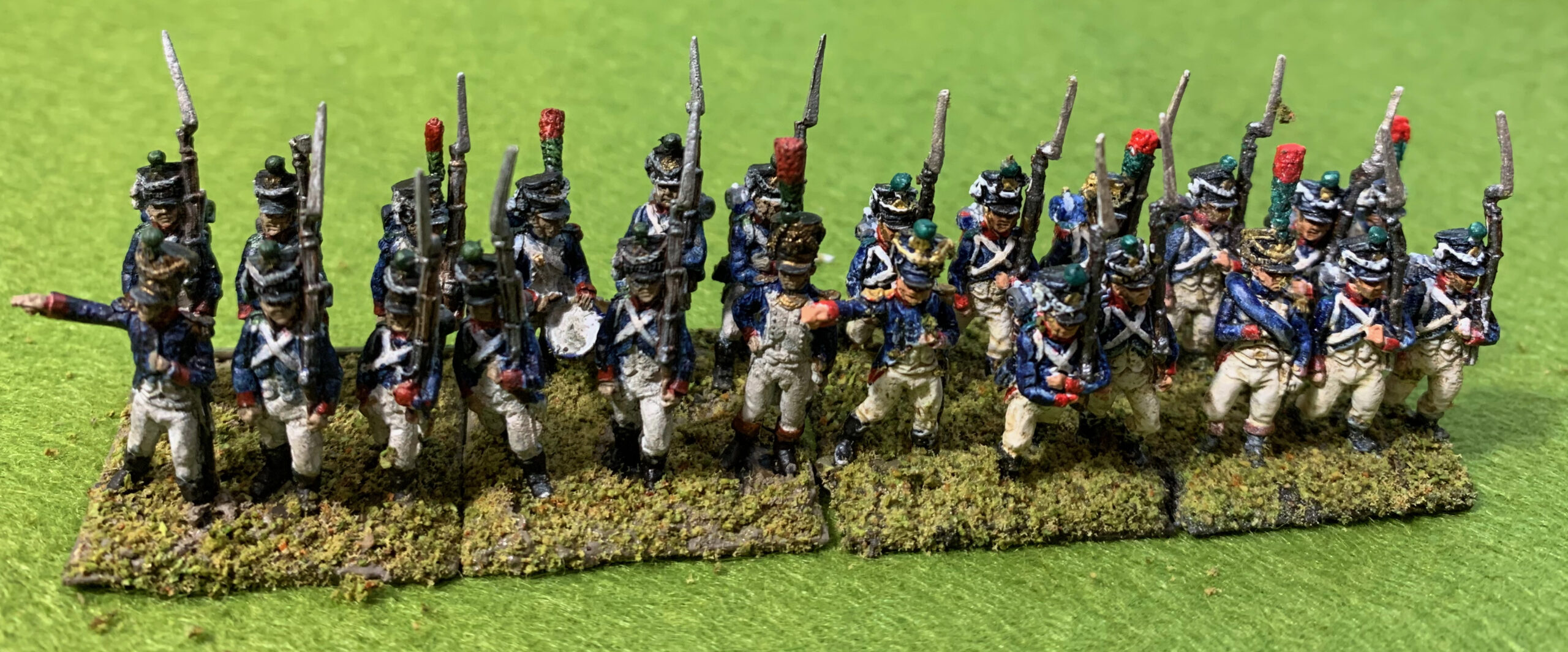
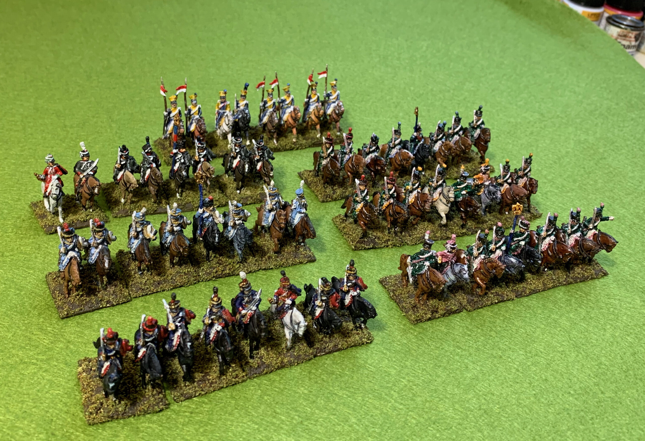
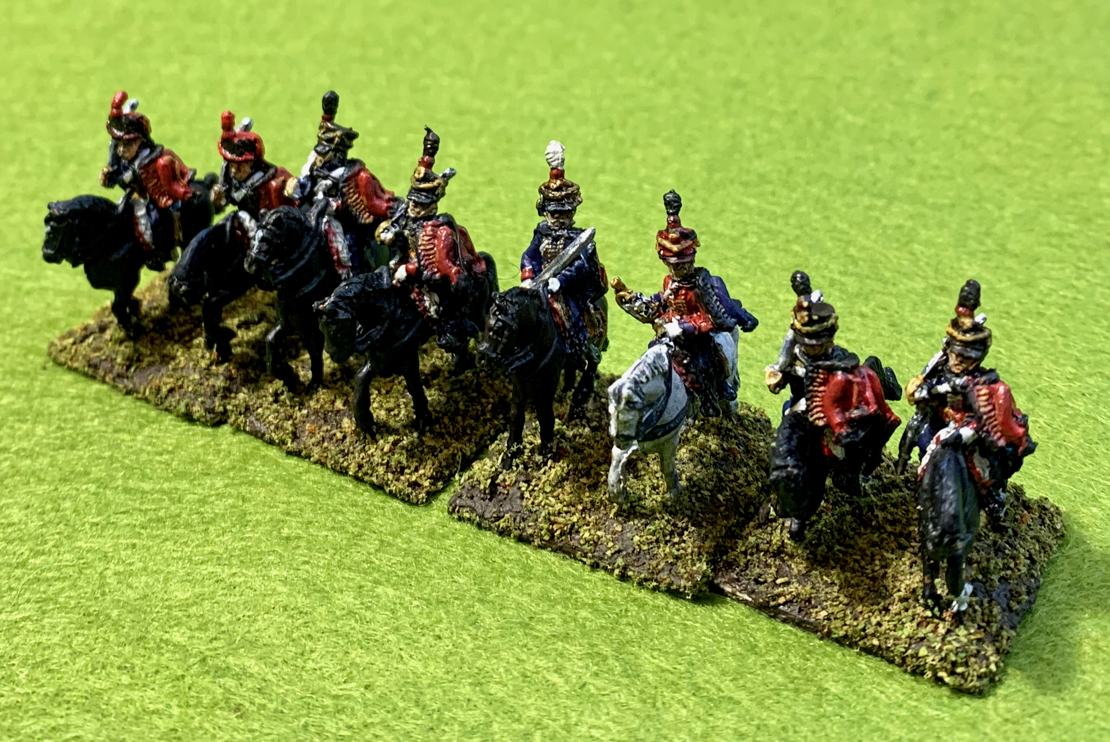
Back to the Napoleonic lead mountain for my next project. This is French Guard infantry circa 1809, using AB 18mm figures. In my original Minifigs army of the 1980s I had a couple of units of French Old Guard. I actually still have them – the only ones left from my French army. As befits Guard troops, I had taken more trouble to paint them than any of my other figures and they look quite smart. But not long after this I decided to upgrade the army with bigger, better figures from other manufacturers. The Guard was included in my schemes. My plan was to have 24 figures representing six types in 1809, with Grenadiers and Chasseurs from each of the Old, Middle and Young Guard. In those days I mounted them in strips of 3 figures, with four to a battalion, so this meant two units of each.
I started the upgrade with the Middle Guard, using AB figures for the Fusilier-Grenadiers and Fusilier-Chasseurs. After this I wanted to do the Young Guard with Tirailleur units. But at that time AB didn’t produce figures for them. Instead I used French light infantry figures, with Middle Guard figures for the drummers, half the officers, and NCOs – how realistic this is I don’t know. For the Tirailleur-Grenadiers this required the addition of a plume on the light infantry figures. I painted up 12 each of the Grenadiers and Chasseurs, leaving the same number unpainted, though converted. That’s where it stayed for more than 20 years, as I was distracted by other things. These 12 bases (in my new format of 6-figure bases) have seen a lot of active service, especially the Young Guard, but with only my diminutive Minifigs to represent the Old Guard, it was a bit of an embarrassment, though the Fusilier units often stood in for them. In 2019 I at last bought the AB Old Guard figures required to complete the project.
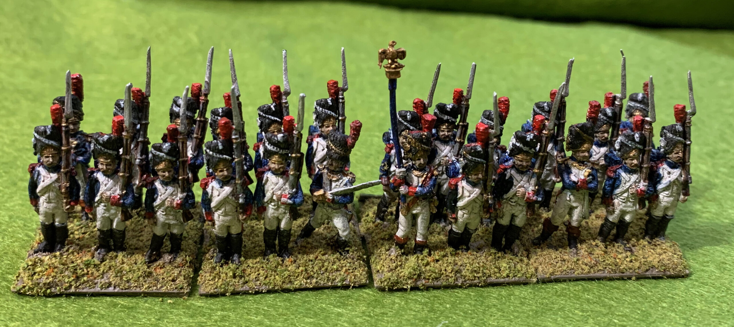
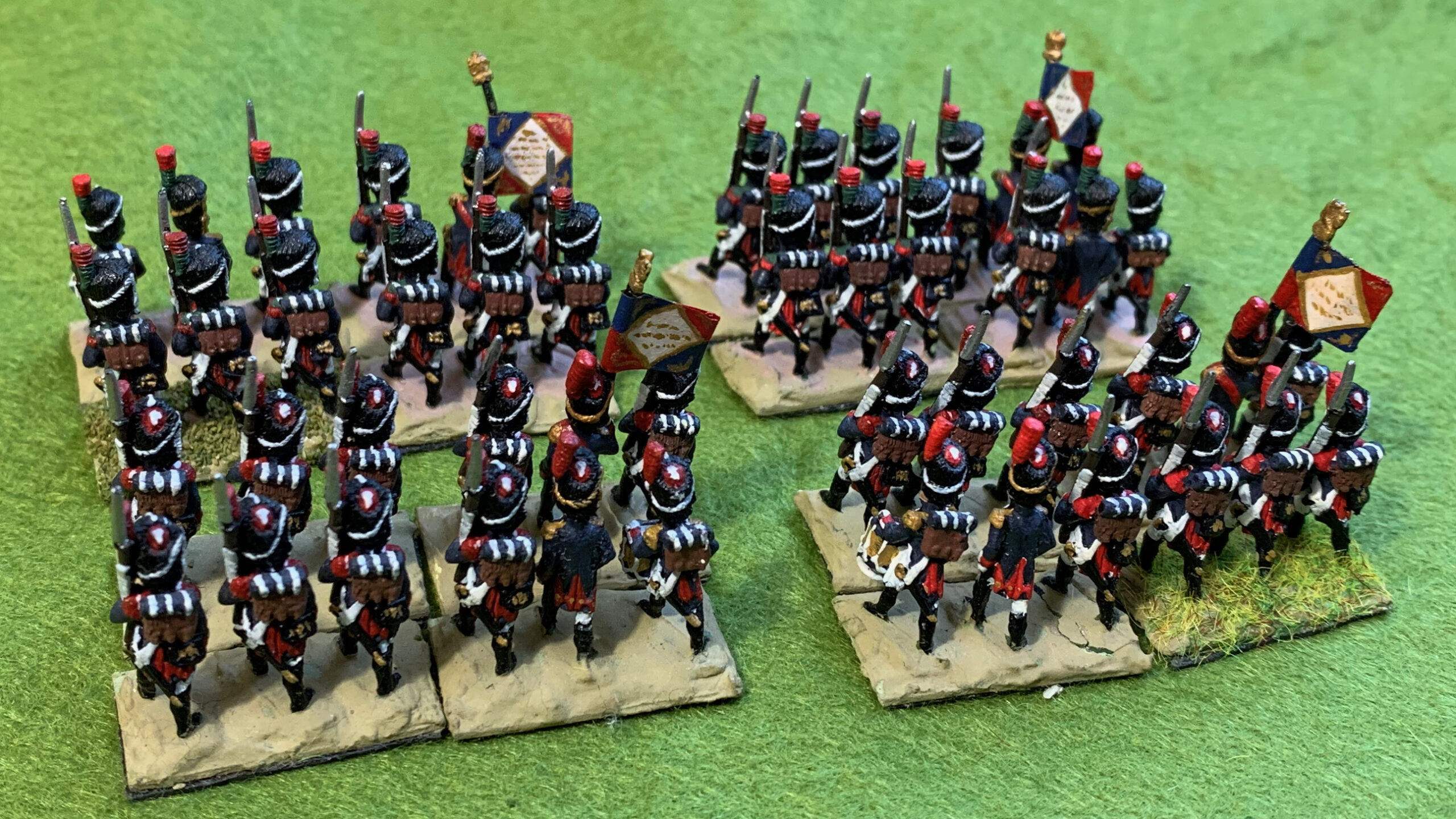
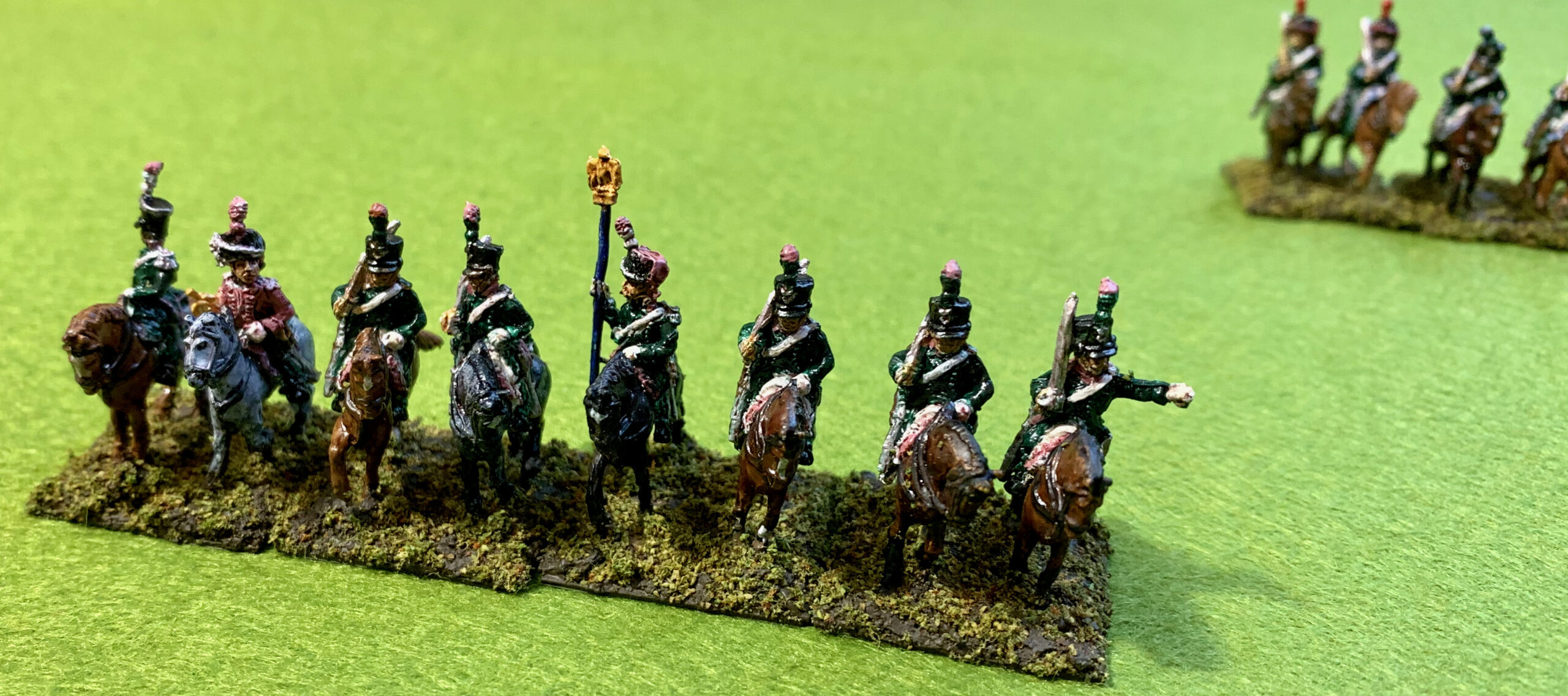
What I did this time was four bases each of the Old Guard units, and two each of Young Guard, to complete the original project. Here are the Old Guard:
Grenadiers of the French GuardChasseurs of the French Guard
These are represented in parade uniform with black winter gaiters. This is the most popular depiction amongst artists, whom we wargamers tend to follow. I think they would only rarely have looked like this on the battlefield though. In 1809 (presumably after the campaign that year) the Old Guard adopted a service uniform for the field, featuring a surtout and blue trousers, or greatcoats. Before that I expect they wore white gaiters in summer (which I don’t like as it makes them look like ballet dancers), or greatcoats in winter.
I wanted the figures to be reasonably compatible with the original ones., though my painting style has changed quite a bit in the intervening period. I undercoated with white gesso, applied with an airbrush for the first time (I mounted them on strips of card, one for each base). This worked pretty well. Coverage wasn’t perfect, but better than using an aerosol, and without the clouds of droplets. The blue for the uniform came from a mix of Indantherene Blue and Payne’s Grey, as per the originals. My usual go-to dark blue is now Prussian Blue Hue, but back in the day I used Indantherene, which is a bit darker and a touch redder. It’s actually a pretty decent starting point to represent indigo dye, and I bought myself a new tube when the original one died out (it wasn’t one of the everlasting Liquitex paints). For dark brown I used Burnt Umber rather than the more usual Raw Umber; I used this mixed with the blue to get the black. I didn’t mix a little white with everything, as is my current habit, as I didn’t for the old figures – but the primer was a brilliant white, so this helped to lighten things a bit. The rest of the paint choices were unremarkable; the white was Titanium White with a little Burnt Umber; I cooled down the Cadmium Red Hue with a little green; the green was Sap Green with some added blue and a touch of white. I suffered a bit of a disaster after the first painting session, when I left the top off my Stay-Wet palette, letting all the mixes dry out. When I renewed the water I put too much in, which meant that my subsequent paints were all too thin, making things much harder to manage than they should have been. I didn’t attempt quite as much detail as the old figures – no gold buttons for instance. But I did have a go at the moustaches and the gold rings on the muskets.
The AB figures were lovely, making the task much easier and more satisfying than my my Old Glory French Chasseurs. Still there were some gaps. AB don’t attempt the grenade patch on the Grenadiers’ caps, and the cuff flaps (which should be white) were vague and hard to find. I gave up trying to do blob for the former, as it just looked a mess; with the cuff-flaps I did attempt the first few and then gave up. Once the paint was on, I decided to do a wash, as I had for the original figures. I didn’t want to use the usual W+N Peat Brown ink, as this looks awful on white. I experimented with Daler-Rowney Antelope Brown ink (heavily diluted with water), but this stained the white with yellow, so I added quite a bit of black to it. I put it on quite generously; at first application it was too heavy on the white on the front of the figure, but I was able to brush most of this off (it tended to gather in the crotch, which needed attention). I was quite astonished by how much it improved the look of the figures, bringing out the beautiful detail in the mouldings. A wash produces a sharper contrast than the more subtle glaze method, like Quickshade, that I have used a lot. It lines the details more crisply – but it does this without being too cartoonish. Perhaps for 28mm figures the glaze technique works better than a wash, but this is the way to go for my 18mms, with my skill level anyway. I decided not to highlight or varnish.
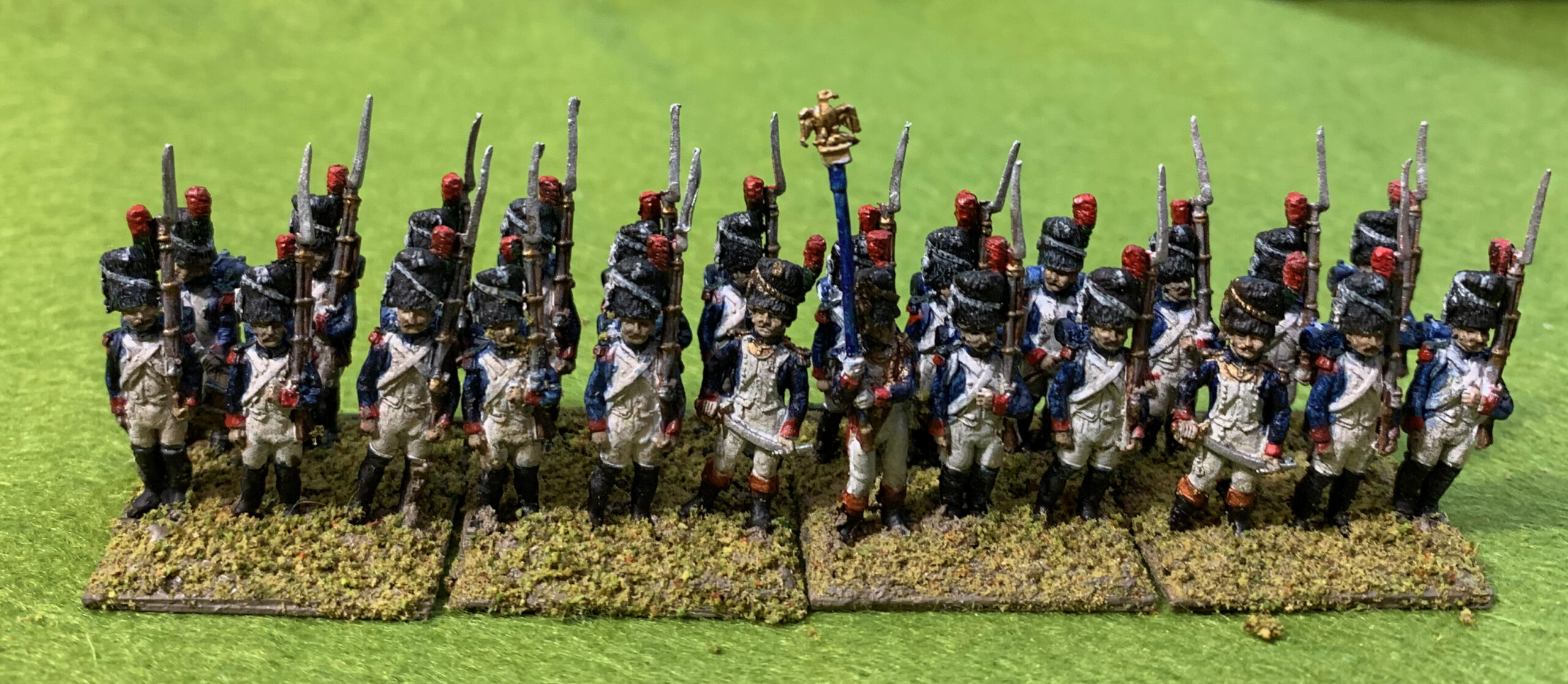
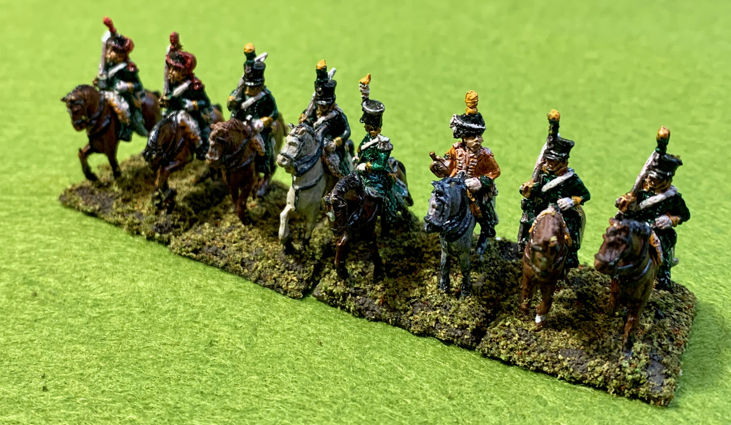
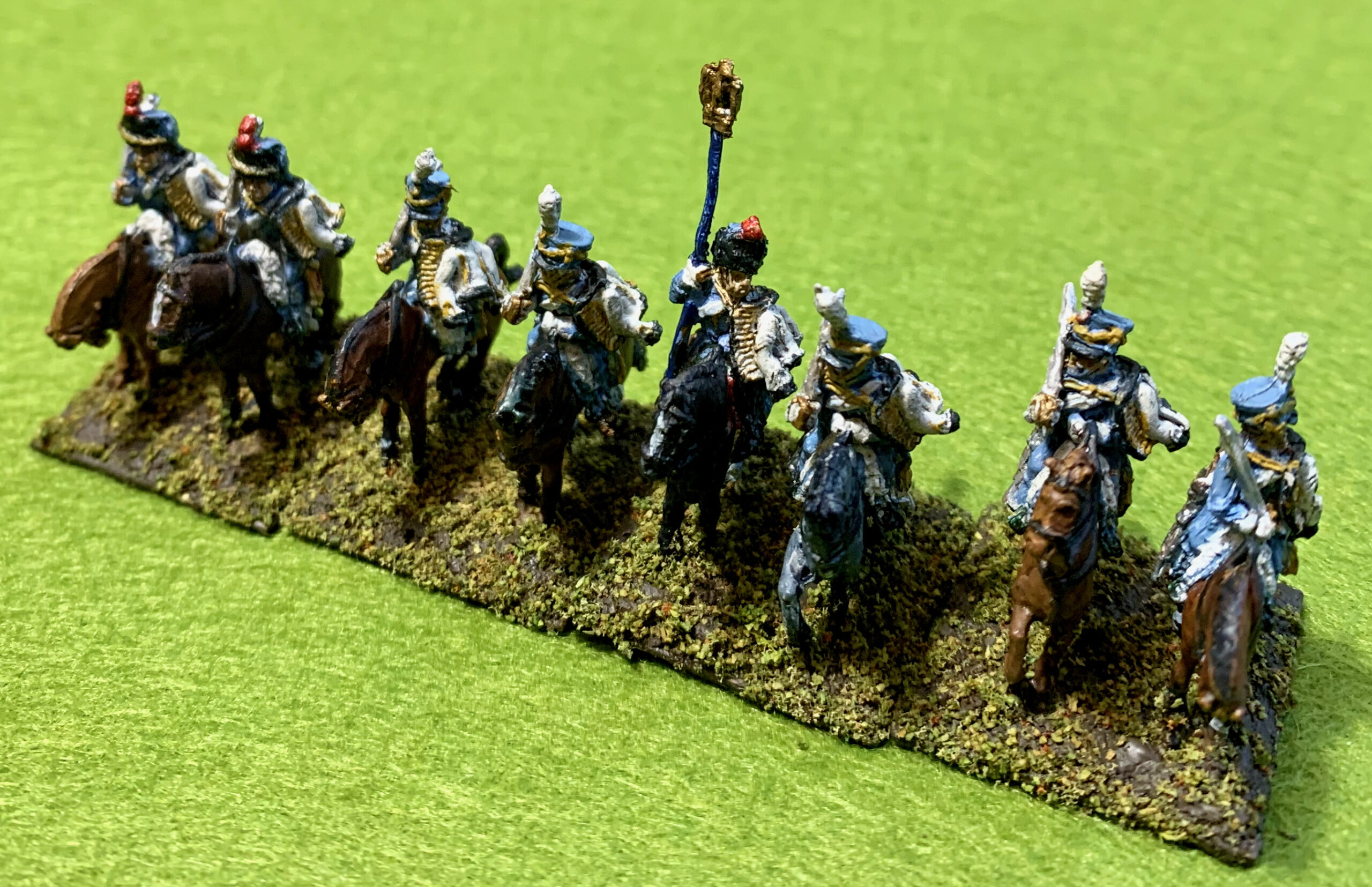
Meet the Young Guard:
Tirailleur-Grenadiers of the GuardTirailleur-Chasseurs of the Guard
The two bases on the viewer’s left are the new ones, the ones on the right are the originals. The new ones are distinctly duller and darker, and the wash used on the originals was plainly a bit browner. But the two should work well enough together on the table. In particular the green on the Chasseurs’ pompoms and plumes doesn’t zing in my new figures (I have the same issue with the Old Guard Chasseurs); this is partly because the paint had become over thinned, and was mainly painted over black, overlapping from the headgear.
A word about the bases. I had rebased the old figures last winter. I used my usual method, with a gunk of acrylic gel with sand and Raw Umber paint to set the figures in. On top of that I put mix of mainly Woodland Scenic flock. I now feel that this combination is a bit dark, and the a lighter colour would show the figures off better. This time I put a bit a bit white in the gunk, with old railway ballast mix in place of the sand. I lightened up the flock mix with the addition of more light olive flock. I put some of this flock mix on the old bases, to reduce the contrast between old and new. The flock was sealed with diluted PVA; it wasn’t dry when I took the pictures, hence bits falling off. The bases themselves are just cut from artists’ paper, with magnetic material stuck underneath. This is much thinner than the modern convention: the magnetic material adds thickness and I wanted to balance this and not raise the figures too high from the table. This carries extreme risk of warping, so there is no water in the gunk (I used to use plaster), and I leave the bases on a metal surface when setting or drying, so that the magnetic strip can hold the base flat.
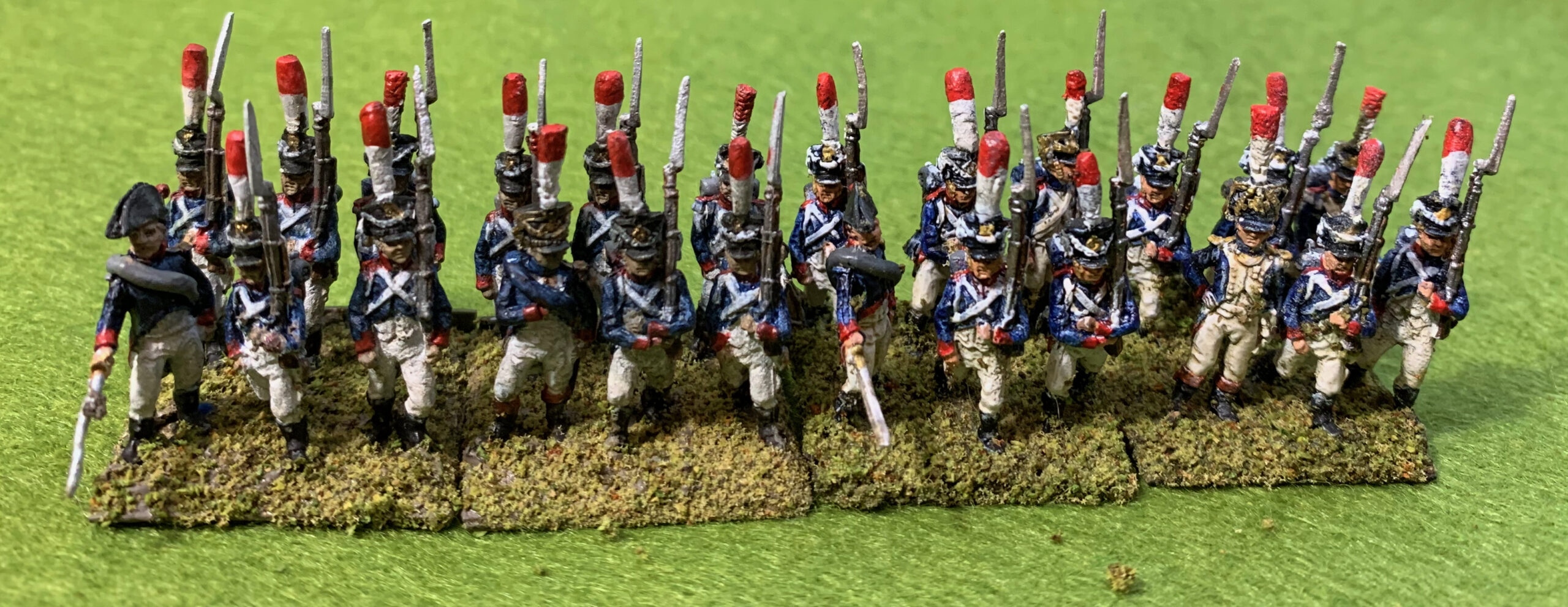
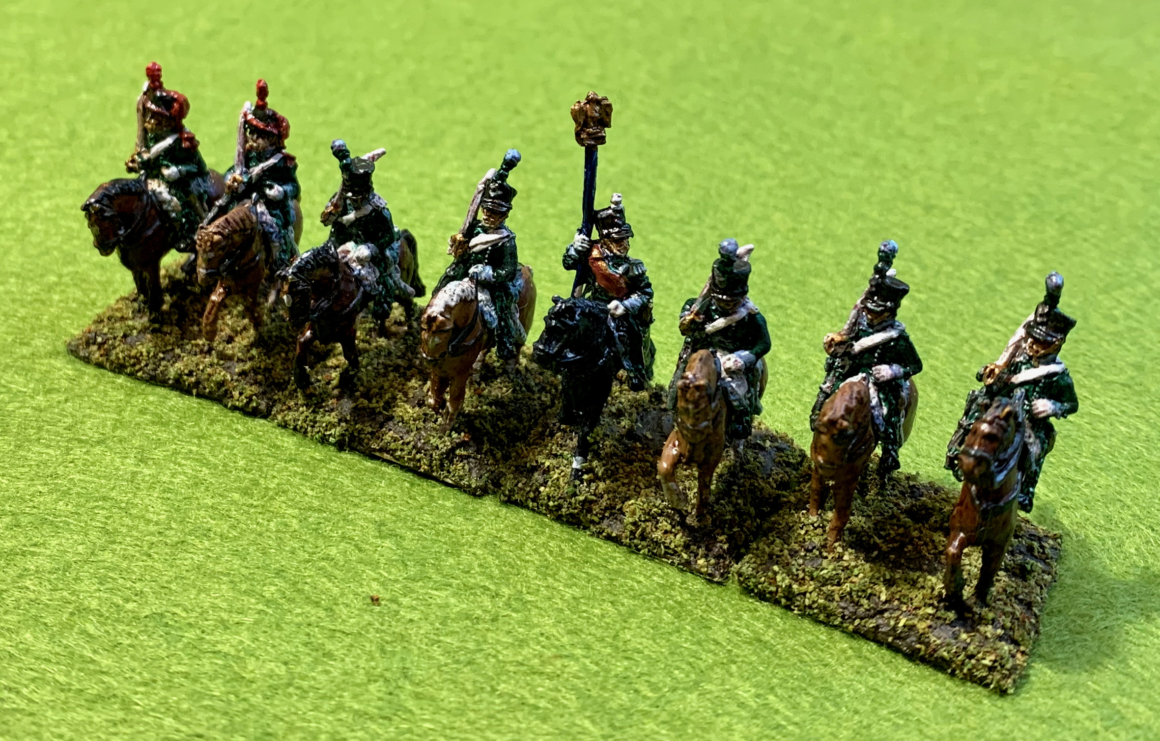
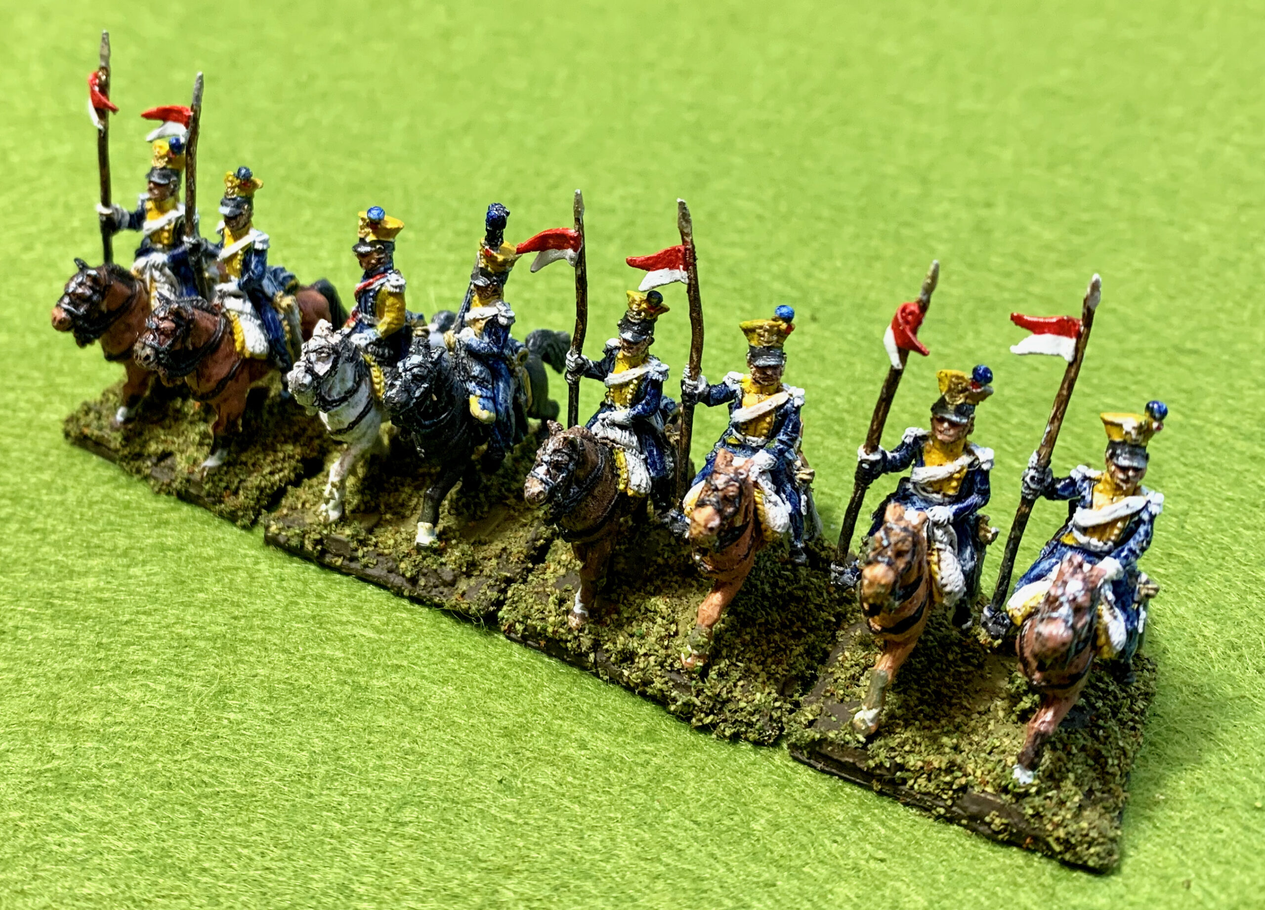
And now for the Middle Guard:
Fusilier-Grenadiers of the GuardFusilier-Chasseurs of the Guard
These are my originals from long ago, rebased last winter. The striking thing about them compared to my new figures is the gleaming white of the lapels and breeches. I used pure white paint, even though it was subjected to a wash. Also the red (and green) is much brighter, again with the use of pure pigment. In each unit half of the figures were painted with a white primer and half black; it is hard to tell the difference from these photos. Perhaps I should consider a little highlighting on the front with pure white on the new Old Guard units to reduce the contrast – but I actually think they look fine on their own.
These units represent the original incarnation of the Middle Guard, although they would be better regarded as Young Guard when they were formed in 1806. They wore shakoes in place of the bearskins, with tall plumes, which, apparently, were worn in the field, along with some Young Guard units. These plumes made quite an impression on British observers in the Peninsula in 1811, but things never got as far as combat. The might-have-been battles at Fuente Guinaldo and Aldea da Ponte, between Wellington and Marmont and Dorsenne (who had the Guard units), would be interesting to try out.
I am not done with French Guard infantry. I have figures for late period Young Guard that I want to paint up. That will be part of a late war French infantry project that is not near the top of the list, though. Finally it seems disrespectful not to show some pictures of my retiring Minifigs Guards. A glimpse into a more innocent age. These old figures might be a little crude by modern standards, but they were crisp and actually include details that eluded the AB figures. The main problem is that they are small, when representing big men.
Readers familiar with my blogs may have noticed an omission from previous post on the P-47. I didn’t say anything about the paint colours. And I’m usually a bit obsessive about that. A lot of hobbyists are, but I take it in an unusual direction because I mix my own paints from artists’ pigments, separately for each project. I left the topic out because I had too much to say. It needed another post, which readers less obsessed with colours can skip, and this is it.
The predominant colour on this model is, of course, Olive Drab. The underside colour is Neutral Grey, a mix of black and white, the main question around which is how light it should be. I based my colour on an old artists’ Liquitex Neutral Grey I had lying around; if it hadn’t been there I would have mixed Mars Black and Titanium White. The Liquitex colour is probably 50:50 and turned out to be a bit dark, so I added some white to it. From photos I suspect that the USAAF grey is a bit darker than it is portrayed by most artists, as the tonal contrast between it and Olive Drab isn’t that great. But I went quite pale nevertheless; white with everything is my standard practice for miniatures painting after all. Other colours are yellow for the stripes and red for the nose. My main concern with these was to make them bright but not too bright. For the red I recycled some red from my previous project (French Napoleonic cavalry) that was still wet on the palette, though I found myself tweaking it a bit. Yellow is a bit of problem because pigments tend to be bodiless and thin. I like to use Yellow Ochre or Yellow Oxide (the Liquitex name, but much the same thing), as this is the best behaved, but it is a bit dull, do I used some of my other yellow pigments. First an old yellow (can’t remember the name, but its not on sale any more) that was horrid and thin, and then Cadmium Yellow that was better. A little white was in there of course. But the result was still thin. I painted the stripes (with a brush over masking tape) over the Olive Drab and Neutral Grey, which had been airbrushed on. I started with an undercoat of white, but it still took at least three coats of the yellow mix to get anything satisfactory. Maybe next time (the yellow stripes will probably feature on my A-36 too) I will paint them first and mask before airbrushing the main colours.
But the big interest is the Olive Drab. This was the standard US military colour, developed in WW1 and used on both vehicles and aircraft in WW2. It is a notoriously tricky colour to pin down. The US authorities were very pragmatic on colour standards, and did not care greatly whether the colour precisely matched the standard, and it weathered quite dramatically. The official formulation changed slightly from time to time, and eventually the Army and USAAF went for slightly different definitions. Different companies used different pigment combinations (and doubtless changed these over time), so even the weathering varied a great deal. The colour could vary a great deal across the same aircraft, depending on when that particular part was painted. Probably no two vehicles or planes were the same colour (apparently like modern Israeli tanks), because in wartime this just didn’t matter. This causes hobbyists – wargamers, modellers, collectors or re-enactors – a lot of angst. Modellers like their premixed paints, and often ask which one to use, to which the answer has to be a shrug; “several” is to them the wrong answer. Collectors either paint with something like the as-new shade (doubtless in a modern paint that is much more colour-fast than the old ones) or make up a lighter shade to simulate what they think it might have looked like in the field, but which tends to look too fresh and new.
Meanwhile we have not so much evidence for what planes and vehicles actually looked like. Colour photography wasn’t prevalent, and not especially accurate on colour either; colourised photos, increasingly popular, are just an interpretation. And as with all dull colours in the middle of the colour wheel, small differences to colour sensitivity and lighting can make a big difference to how it looks to the human eye. This website (gmodelart.com) has a number of interesting pictures of aircraft, though (leading with one of a crashed P-47 in very similar scheme to my model), which shows how much variation there might be, even on the same plane.
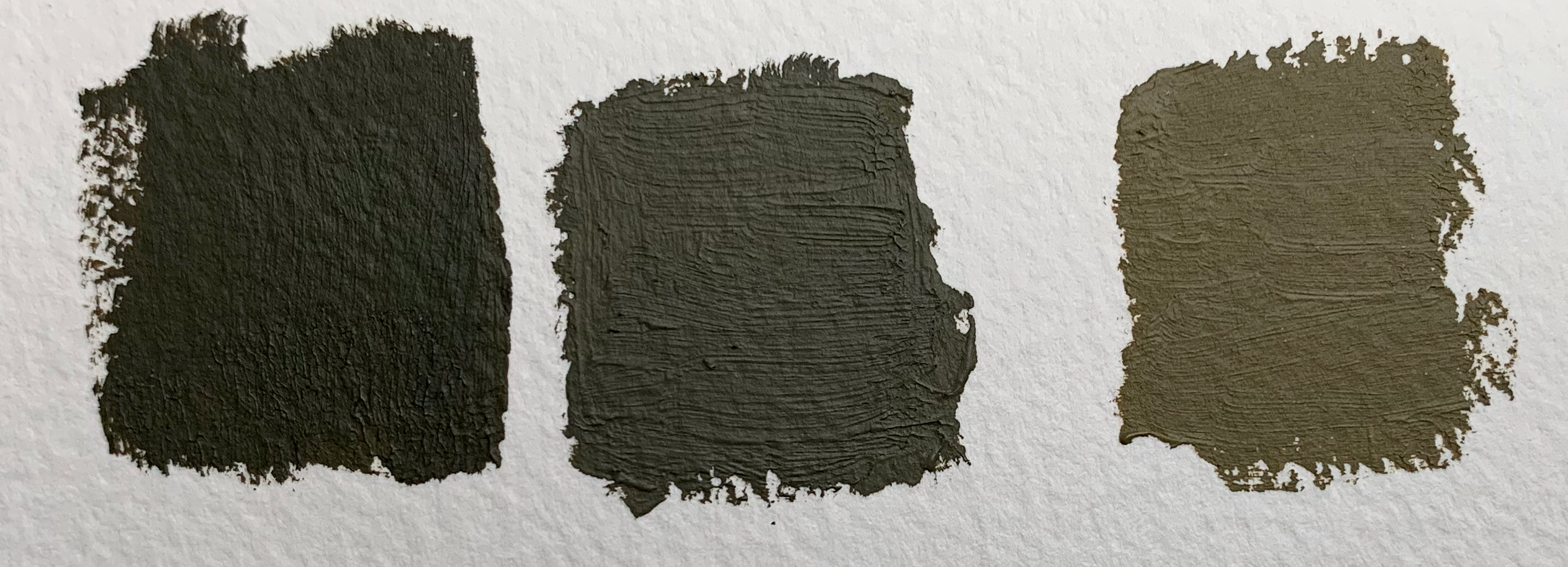
So what colour is it? “Pig crap” is an early description of the dark, freshly painted version. Olive is just on the green side of yellow on the colour wheel, but the “drab” takes it a long way towards the middle, meaning that it is quite brown. To date I have tried simulating it with a mix of three pigments: Yellow Oxide (i.e. Yellow Ochre), Black and White. I have assumed the standard way of making it was combining yellow ochre with black, as these were two cheap pigments – just as the French did in the Napoleonic wars to make the olive green they used for artillery woodwork. Here is a picture of the sorts of result yI get:
On the left you have just black and yellow; this is as close as I could get in tone to the colour swatch I have, which show the colour as new. In fact the swatches were slightly greener – but more yellow would have made it a bit too light I though. Fresh Olive Drab is a very dark colour, something that caused me consternation when I applied authentic Humbrols too my models back in the day. Next has a bit of white and a bit more yellow (I was assuming that the black would fade faster than the yellow); it turns into something a bit greener. On the right I have mixed the yellow with Neutral Grey to give something lighter and browner. My model is painted in something between the right hand and centre pictures. If nothing else this exercise shows how challenging photography is in representing colour; they all look darker than they “really” are.
As another exercise in demonstrating the perils of photography: the following show the effects of different backgrounds. The red in particular makes the model look browner, while the green makes it look greener. I don’t really understand that!. The lighting conditions were slightly different for this photo than the other three though.
Comparing these photos with the ones on gmodelart.com and my model is in the right zone, but looks a bit dark; it seems closest to the new Liberator bombers. But all the photos were taken in bright sunlight while I took my pictures on an overcast day, with a little artificial light to boost it a bit (and a lot more artificial light for the one against green cloth).
A further thought is that my idea that Olive Drab was often made using yellow ochre and black is probably off the mark. These may have been the appropriate pigments in the pre-industrial age, or even in Europe, where green pigments were in short supply, but 1940s America is another matter. The original formulation of the colour included raw umber, a dark brown. Chrome yellow was a standard primer, used in the interior of aircraft – this is brighter and greener than ochre. The greener hue of the colour swatches suggests it wasn’t ochre-black. It might be worth trying a different formulation, to produce something with a slightly greener hue. On the other hand the black-ochre combination produces a nice, opaque paint that is very easy to apply. A brief attempt to produce something using Raw Umber and Viridian was not nearly as good.
So where next? The issue will return when I do my batch of three US planes. The main issue is not the precise hue, but that fact that the colour is not standard. There should be a bit of variation between the planes and on the same aircraft. It is less of an issue for vehicles, since in 1943 most US vehicles used by the British were repainted. But if I move out into later war or US forces (and I’m thinking of just that in 1/300), the issue will return. This is a problem that will run and run.
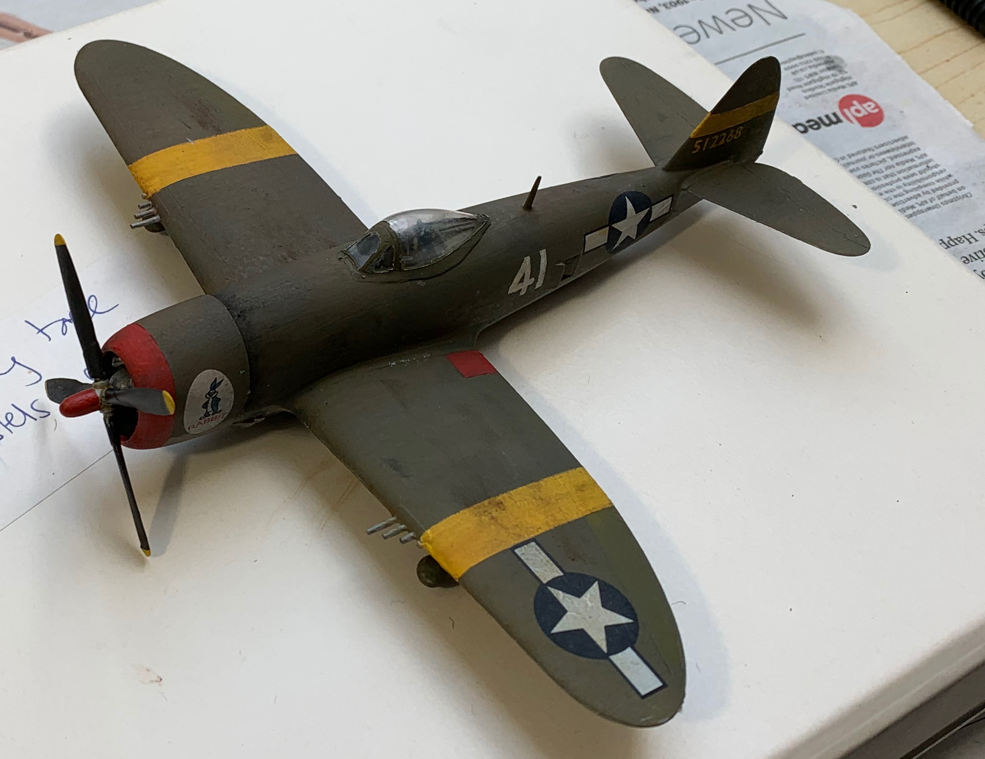
My lockdown madness has drawn my into 1/72 model aircraft. This is nominally part of my 1943 wargames project – but mainly a rekindling of my love of warplanes, especially from WW2. Somehow, and only my fellow hobbyists will understand how this has happened, I have acquired no less than 14 kits to make. My plan was to build them in batches of three, or even four, starting with the three US planes (an A-36 Apache, a P-38 Lightning and a B-26 Marauder) because their simpler colour scheme would be a good place to start. I then realised that aircraft modelling involved so many new techniques that it was best to start out n a single low-cost model that I didn’t mind mucking up. So I bought the Hobby Boss P-47 Thunderbolt. I have just finished it (more or less).
This aircraft does not belong in the scope of my 1943 project. The first P-47s were deployed in 1943, but these were of the ridgeback variety. There was only limited availability of cheap kits though – the three makes that seemed to be in scope were Airfix, Zvesda and Hobby Boss. I was looking for a US aircraft. The only available Airfix model was an early P-40, well before my period. Hobby Boss did the P-47, but only the bubble-top variety was available at short notice (they have done a razorback as well). I have a soft spot for the Jug, since a made a model an old Airfix one (a ridgeback as it happens, with moulded raised rivets – yuck) as a boy, which I didn’t even paint. The bubble-tops weren’t operational until well into 1944 – but they are handsome aircraft.
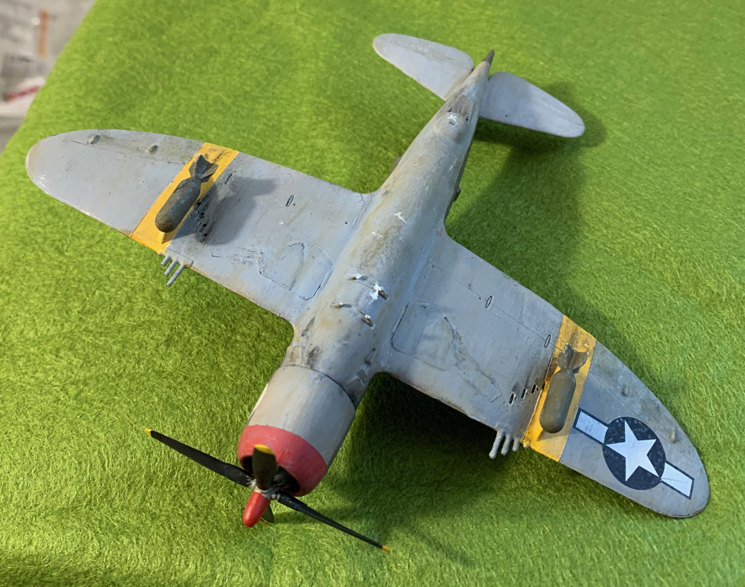
Hobby Boss models are simple and cheap, with only a small number of parts. But there was a big snag. They follow the modern convention of making planes with undercarriage down and no pilot. This is how all upmarket aircraft kits are presented these days – but you would have thought cheaper models would appeal to youngsters and wargamers, who would like to make them up as in flight. The box artwork shows the plane in flight – and it even appears to be a photo of the model. Airfix and Zvesda both give this option. The Hobby Boss had the tail wheel door moulded open. And the P-47 main undercarriage doors were in three parts, with the upper two moving to overlapping position when downed; these are moulded as a single piece in the kit, which had to be separated. All this involved some pretty tricky conversion work to model as retracted. The main doors did not fit into the holes exactly and had to be filed down. And fitting them flush was more than tricky, until (on the last door to be fitted) I discovered the use of plasticine. The tail doors I gave up entirely on. I just filled in the hole and filed it flush, and tried to score some doors in. The results of all this were very far from satisfactory, especially the tail door. I won’t have another set of tail doors to model until the Spitfire VIII, though, which I plan to do last, and which has properly moulded separate doors in the model. But modelling the doors as closed for the main undercarriage is going to be tricky for the one further Hobby Boss model (a Bf-109), and the seven “up-market” models I have now acquired. At least these usually have upper and lower wings in separate parts (Hobby Boss has the wings in a sing piece), making the doors much easier to fit flush.
Apart from this major problem, the Hobby Boss model fitted the brief perfectly. The interior detail of the cockpit is poor; the bombs are crude and inaccurate; not fitting the central fuel tank leaves an unsightly hole in the bottom centre of the fuselage; the panel lines are very shallow; the engine detail is derisory. But none of this really matters for the sort of model I was trying to make. You can’t really see into the cockpit; the bombs aren’t particularly visible; the fuel tank hole is where the flight stand attachment will go; overdoing the panel lines would be a worse error; and you have to look closely to see into the engine. What I got was a simple and robust model, much like my PSC tanks and APCs.
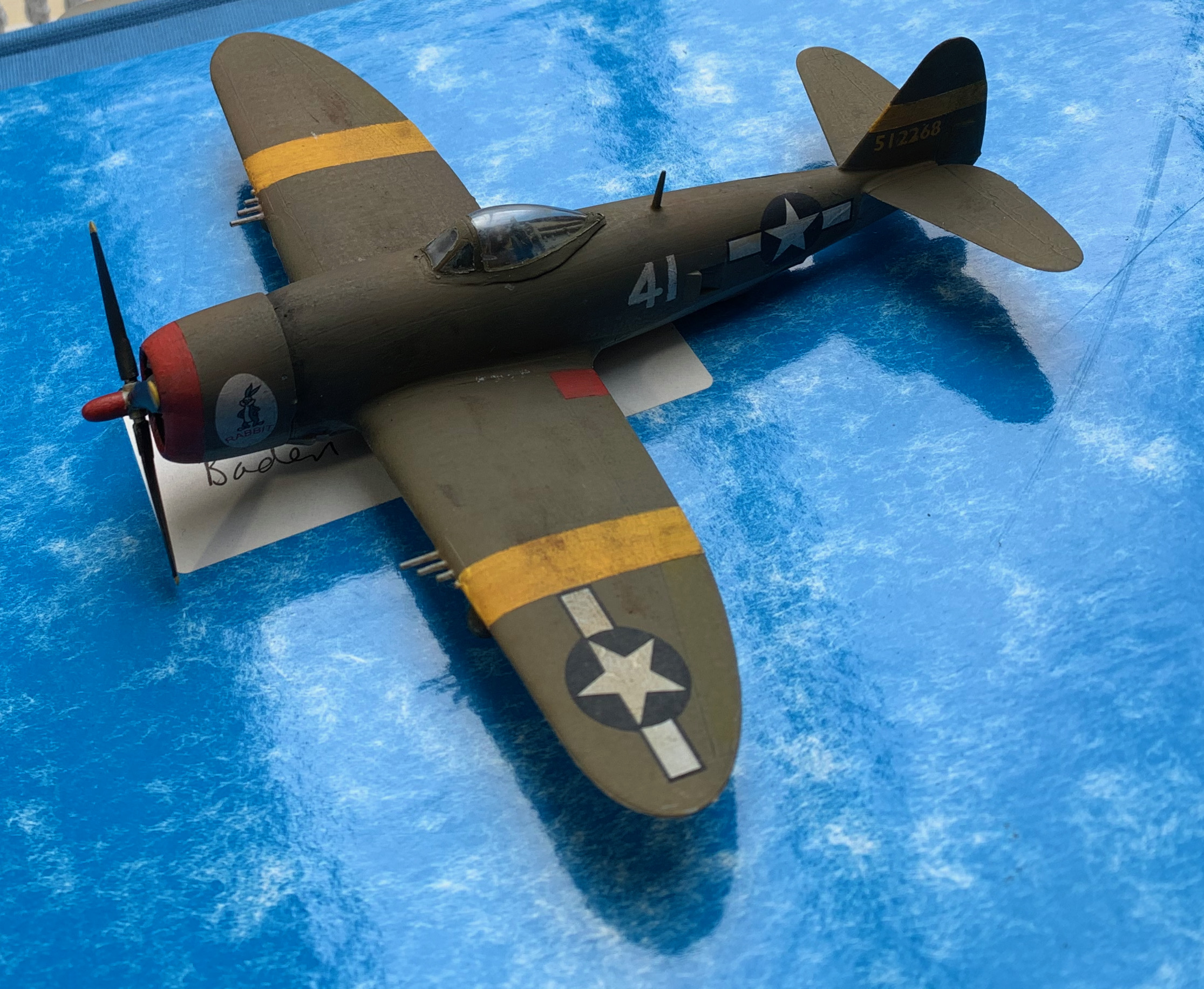
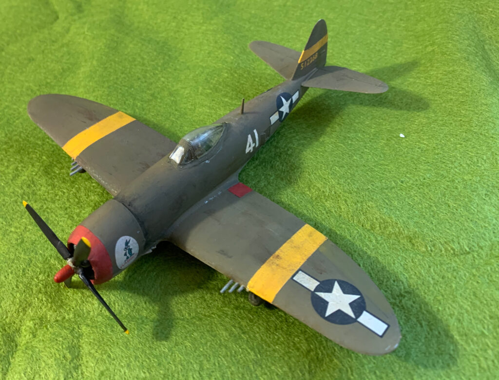
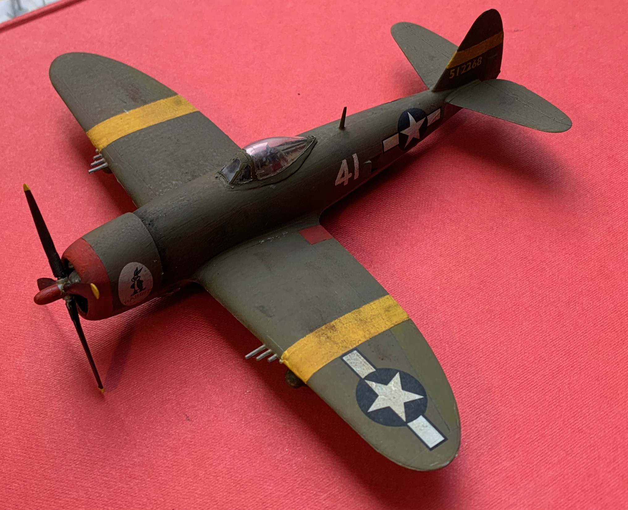
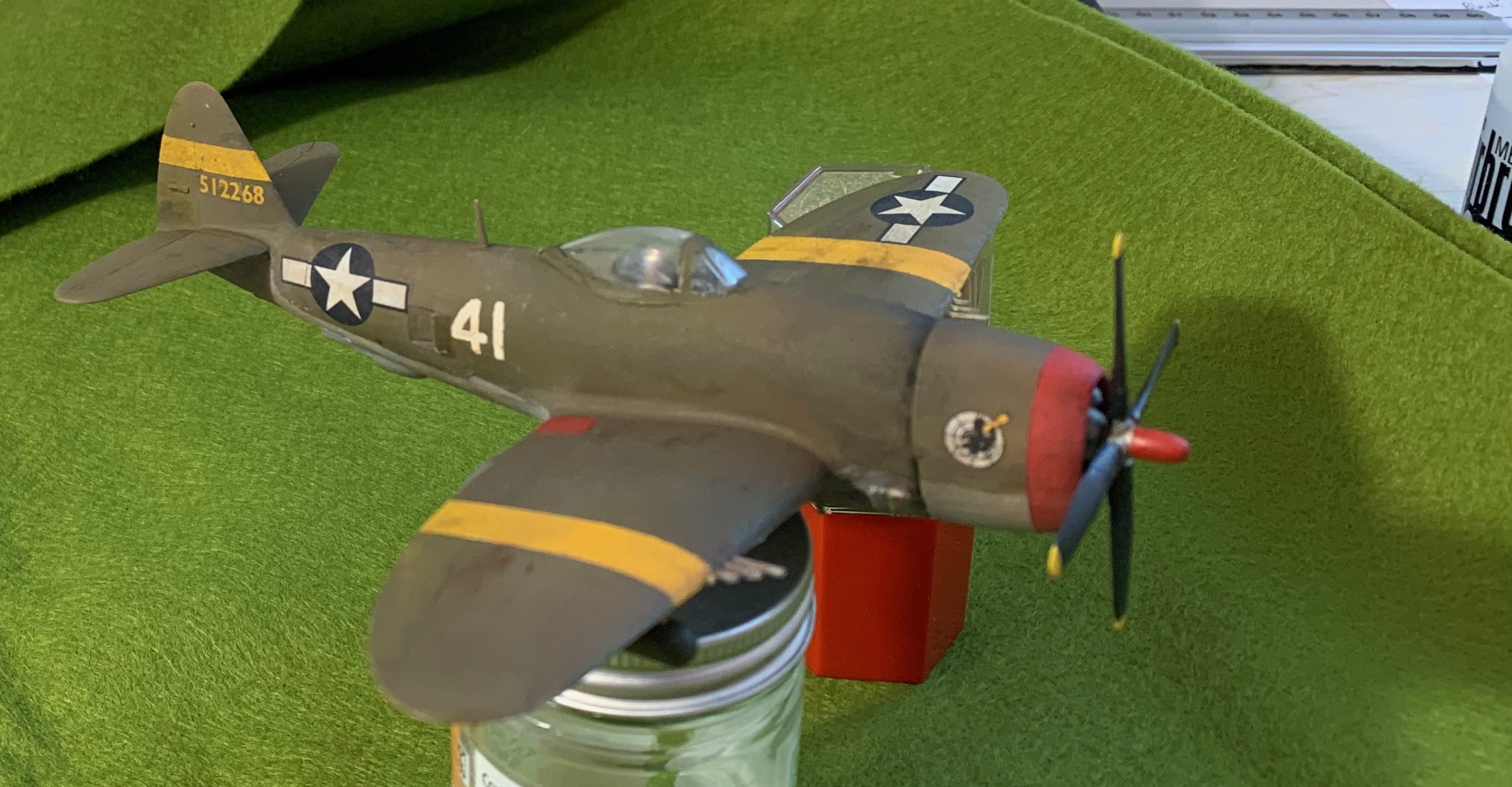
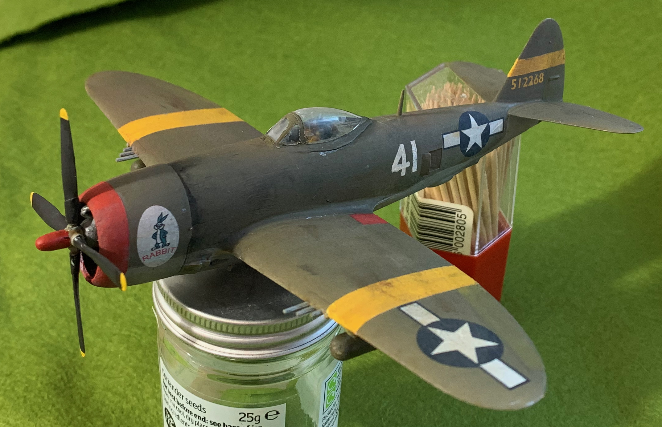
There was a problem with the decals though. By the time the bubble-top came into operation, US aircraft were no longer being painted at the factory, and almost all of them flew in bare metal. Both decal schemes were for such bare-metal aircraft. This is not a problem for the star and stripe insignia, but it is for the lettering, which is black on bare-metal aircraft, and yellow or white on painted ones. In the Mediterranean, however, aircraft were often left out in the open when on the ground, so many aircraft were painted by the service crews to make them less visible, using traditional olive drab and neutral grey. I found an example of such an aircraft in the Eduard “Jugs over Italy” kit (in 1/48), with the schemes and made models readily visible on the Internet. My scheme is based on this but with made-up serial number (the smaller yellow figures on the tail) and battle number (large white ones on the fuselage). I had an audacious plan to solve this, I actually had the unused decals from my old Airfix P-47 kit, getting on for 50 years old, which included a scheme for for a painted plane. Unfortunately these were damaged, and broke up when I tried to use them. My next solution was to try and cut out a 1 and 7 from the white decal printing sheet for the battle numbers. But these proved much too delicate. Apparently for decal paper to work this need to have a hefty layer of varnish on them. For the battle numbers my next plan was to overpaint some of the black numbers that came with the kit, of which the simplest was a “41” (actually converted from “4P”). This was hard going, and it was impossible to get either properly straight edges or an even paint coverage. To my surprise it worked. The imperfections are much less noticeable on the weather-beaten look I was going for. It looked as if the ground crew didn’t have the stencils or spray gun when they had to apply the numbers; I expect such things happened. For the serials wanted to print some numbers on transparent decal paper; I was bit concerned because my last attempt at this turned out to be rather transparent; standard printer ink doesn’t have a great deal of body. In fact my inkjet printer heads were completely messed up and unable to print much colour at all. but I found some old British Railway locomotive decals from a model one of my brothers must have bought, which would have been even older than my P-47. They were the right size and colour, but in Gill Sans script rather than USAAF stencils. Actually from a distance these aren’t too dissimilar, except for the zero, which is a big round “O” in Gill Sans. This featured in the numbers, but I cut the zeros out, and assembled the numbers from three pairs each. Apart from taking quite a while to loosen up from the backing paper, these decals worked fine. They evidently aged much better than my old P-47 ones. Finally on the engine cowl I simply used nose art from the Hobby boss decals, one for the plane “rabbit” and the other presumably for the unit. This was all part of the P-47 look.
There were two really scary things about this project for me. The first was use of the airbrush for the first time, and the second was weathering. The first issue was primer. I had bought some artists’ gesso to use for primer, but I found this didn’t bond well to plastic (though works fine on metal). Instead I used standard white acrylic paint that came with the airbrush. Initially this didn’t bond all that well either (even though I had washed the kit first), but with a bit of help from a paintbrush I got started. That first session with the airbrush was a bit nightmarish. I kept on getting it wrong, with the paint pooling up, which I then had to thin out with a paintbrush. After the white I tried putting on a layer of neutral grey (over the whole model, though only needed for the underside), but I ended the session with the model looking a real mess. Next session, after watching a couple of videos on airbrushing models, it went much better. And each time since my confidence has improved. A number of factors have to be balanced (air pressure, thickness of paint, openness of nozzle and distance from subject), and this clearly takes a while to come together. The big surprise to me is just how thin the paint is when it goes on properly. This is quite unlike an aerosol can. The flip side to this is that the spray is pretty controllable, and paint doesn’t go everywhere, like the aerosol. This thinness is what gives airbrushed paint such a lovely finish, of course. But it does mean the layers shine through each other. Using a white undercoat made a big difference. In one place (the lower rudder) I used a brush to correct an error: it came out much darker. Underpainting in dark colours to bring out individual panels is quite the fashion for serious aircraft modellers. I did try this with black for the undercarriage doors, but not very successfully (the underpainting needed to graded). One aspect of the thinness I hadn’t counted on is that the paint is very easy to damage. I quite often chipped paint off right down the plastic. This may suggest that a proper primer is advisable, and I have bought some from the airbrush company for future projects. But it also explains why modellers seem to be so keen on layers of varnish.
After the basic paint job I applied the decals. As with my vehicle models I applied to a layer of polyurethane gloss varnish (from a very old Humbrol pot), put on with a brush. I forgot to do this on the tail, though, but the decals (and these were the very old ones) went on fine with the help of decal fluid, with no flash showing. The smoothness of the airbrush finish probably means that this step is superfluous – except that it is an excuse to put on a layer of protective varnish. The decal application didn’t go that well, as I managed to spill almost a whole bottle of decal fluid. As a result of being a bit stressed by this, some of the decals were damaged and there was a little (and unforgivable) creasing. After this I wondered whether I could go straight on to the weathering without sealing the decals in varnish, as the finish looked quite good. But by then I was starting to understand that layers of varnish were a good thing. At that point though the only airbushable varnish I has was matt – and that was a bad idea at this stage. Decals are allergic to modern matt varnish; back in the day matt varnish was really satin, and I used it to set the decals (with the glue washed off the back) as a way of eliminating flash – a job the decal fluid now seems to do. I had some old Humbrol satin varnish, and I used this with a paint brush. This produced a very good finish on the top, but it has a slight orange colour to it, which discoloured the underside where it was a bit thicker. It also filled in some of the engraved lines, making them impossible to bring out in a wash. Unlike proper aeromodellers, I’m not that fussed about bringing out the panels – but I do like to show up the moving parts, like the control surfaces and the flaps on the engine cowling (which are completely lost on this model now). I now have airbrushable colourless gloss varnish. My idea is to use this before and after decals, with a wash to bring out the engraving before either or both coats.
Weathering is a multi-stage process for serious modellers (more than a dozen steps on one blog). I was looking for something much simpler. My plan was to use two main techniques: the “dot filter” method, applying oil paint, and pastel dust. I also did a little “chipping”, as well as a largely unsuccessful wash. The dot filter requires quite a bit of courage. You put small dots of oil paint of different colours on the surface, and then keep brushing into a very thin layer with subtle variations that bring out the direction of the brush strokes (generally fore-and aft to simulate the effect of air flow). Oil paint dries slowly, so you have time to brush it down very thin (and you can also clean it off with white spirit and tissue). The paint I used was white, Payne’s Grey, Raw Sienna and a little bit of Van Dyck Brown (being very sparing with the browns on the underside). I had bought these colours to paint horses, so the choice was a bit constrained (Yellow Ochre and Raw Umber would be good choices ordinarily). I did it after decals, rather than before (as advised by the blog I was following), because I wanted to integrate the decals into the overall finish. When I first pulled the brush over the spots, it looked like a disaster (it helps to see a video of this first to prepare you for the shock), but eventually the paint spread so thin that the effect was very pleasing. The red band on the nose was the only real problem; it did not respond well to the white, and so I had to use a bit of white spirit to thin it. The overall effect is to patinate the model and soften the paintwork and decals (the white is especially effective). There should be elements of unevenness too, to reflect where the different coloured spots went. It all helps to bring life to the model.
The use of artists’ pastels was an idea I got from another blog, as a substitute for weathering powders that are popular with modellers. I actually have a decent stock of pastels, which I had bought for use on terrain (not particularly successfully so far). You scrape off some powder with a craft knife and apply with a paint brush. At first I tried it directly after the oil patina had been applied. The oil immediately dissolved the powder, turning it into a liquid smear. This is potentially quite useful, but not the effect I was looking for, so I waited for a day for the oil paint to dry. I can’t say that I have mastered this technique. I tried to use it to provide a bit of contrast on the control surfaces, where the engraving couldn’t be brought out with a wash. In particular the ailerons merged with the flaps (though at least both were delineated from the wing). This wasn’t very successful; in fact it would have been better to try this while the oil was still wet, as the dry powder doesn’t do sharp edges. I was more successful in applying dark smudges to suggest exhaust stains by the engine cowling, and areas of dirt on the wing to suggest mud from ground crew boots, etc.
I also used a little silver paint to suggest places where the paintwork had been chipped back to the metal. Some modellers go to town on this, but I’m not sure how realistic this is. Japanese aircraft were notorious for paintwork being in terrible condition, but not other nations. The artist in the Osprey publication on B-26s in the Med delights in showing these planes with paintwork being in a very poor way, though I don’t think this is clear from the photos. But these bombers were exposed to airburst shells from heavy AA in the way fighter planes weren’t. The popular way for modellers to do this is using silver artist’s pencil, but I was reluctant to splash out. You can see my efforts the wing route in the picture. there are one or two spots elsewhere. I don’t think I have this quite right yet, but I’m not sure what is wrong.
The final step was a layer of matt varnish. I have lots of this in aerosol cans (a long story…), and I wasn’t bothered about it being quite heavy-handed, so I used this rather than airbrush. I wasn’t sure about this step. After the satin varnish, and the oil patina, with contrasting matt pastel I thought the model looked pretty decent as was. Aero modellers insist that a high matt look is authentic for this era, and in the Med, with all its dust and outdoors exposure, this makes more sense than elsewhere. But high matt isn’t great for aerodynamics, so I thought planes were quite often polished to a satin type finish – and this is how I used to present my models, using the satin “matt” varnish. Still this model is a learning experience, so I thought I had better try it. I think it does work, and it does recall contemporary photos of combat planes in this era, especially the US olive drab planes.The propellor was left off the for this phase, though, and I gave it a coat of satin varnish.
This model isn’t quite finished. First is the canopy. I attached it before the airbrushing, as I wanted to cover the joins for the static part in modelling putty. I used masking tape to cover the transparent bits, leaving the frame exposed to the airbrush. The masking tape came off after the matt varnish. The result on the canopy from was OK-ish after a bit of touching up, but the tape left marks on the canopy. Unfortunately the polish I had specially acquired to clean the canopy up has gone walkabout, so I’m waiting for it to re-emerge. Second the plane needs a stand. This has been a been a bit of a problem. Commercial stands are for much smaller models. For larger ones it is popular to make your own, either using an acetate stick or an extendable metal aerial. In the end I bought one made for an extendable aerial from Debris of War – but with a 3in base it is meant for smaller models (15mm scale single-engined aircraft max). I hope to be able to modify it to work for larger models, up to my planned B-26. A magnet is attached o the model to attach it to the stand. It would be a good idea to integrate this with the model building process, rather than it being an afterthought, as it would be useful to have somewhere to leave the model while paint is drying, etc. The stand is in the post.
Overall the model comes up to an acceptable wargames standard, and meets my needs. The underside is a bit of a mess, partly because of the botching of the undercarriage doors, and partly because the varnish was a bit thick and discoloured it. The weathering is a bit heavy-handed too, but that’s less of a issue – it doesn’t look implausible. Actually I’m very pleased with how this model has turned out. There may be a bit of a fine line between a model looking botched (I had lots of those in my youth), and one that looks realistically weathered, but on the topside at least, the model is on the right side of the line.
I have greatly enjoyed my return to aero modelling, even if it is a bit of a distraction from other hobby projects. It has given me a fresh understanding about how close hobby projects are to art, and how much they can be informed by art (I leave to one side whether the hobby actually is art). I am no artist, but I do take a close interest in art. What I have learnt from art is how to understand and deal with the series of subjective choices that any form of representation presents. You need to develop a clear idea of what it is you are trying to do. Serious aero-modellers want to present you with model you feel you can jump into and fly away in. The model needs to be coherent, but they like to overwhelm the viewer with tiny details to give you that feeling that you can are in the presence of a real plane. 1/72 o is a bit small for this (I can see the attraction of 1/48; I did make a couple of 1/32 models in my time, and they’re too big). I think they overdo things sometimes though, especially an obsession with panels. My aim is much more impressionistic. I want to convey an impression of a plane in action with a job to do; viewing is typically meant to be at a greater distance – and I do want to convey the idea of a purposeful and menacing machine. This allows me to adopt a much simpler approach and still produce something with its own impact. The weathering step is particularly interesting here; apart from serving to give the model a used appearance, reminiscent of wartime photographs, it helps unify the model, for example by integrating the decals and ID stripes. It may also help to show up moving parts, conveying that this is a working machine – though no so much on my model.
It was certainly right to get started on a single model. Some key learnings are as follows:
The airbrush produces a beautiful finish, and is ideal for this type of model, allowing the fine detail of the mouldings to come out. This is quite different from painting much hunkier metal miniatures. But the paint finish is quite delicate, and it can be a bit too smooth, requiring the weathering phase to bring the model to life.
The workflow is very different from painting miniatures with an ordinary, or even the vehicle models that I have done to date. There aremore gaps between steps to wait for things to dry out – leading to a larger number of shorter sessions. For miniatures I could conceivably finish a project in a single, long, session (though maybe without primer). It makes sense to do the models in batches for this reason, though I suspect more than three at a time would give me real problems until I’m more experienced.
I need to mount the models on stands pretty much from the assembly stage.
No more brush-delivered old Humbrol varnish except for small highlights.
A wash to bring out moving parts is a good idea, but needs to be done quite early, depending on how deep the scoring is on the model. Underpainting may also be a good way bringing out moving parts.
I can use my artists paints in the airbrush, but it is helpful to have the same paint mix available throughout the model production for the main colours. The Stay-Wet palette helps here, but it may be an idea to mix pots of more liquid paint at the start so that there is a reserve. The colour-by-numbers approach of hobbyists who buy ready-mixed paints makes more sense for airbrush projects than it does on miniatures. But I’m sticking to my guns – I find mixology way more fun.
My next project on aircraft modelling will be three German planes from early 1943, in desert colours. These feature two simple models – an Me Bf-109G from Hobby Boss and an FW-190A from Zvesda, and an old model, a Stuka from Fujima. But before that it’s back to Napoleonic miniatures.
My 1943 project (focused on the British Mediterranean campaign of that year) starts with Tunisia, though most of my recent focus has been on Salerno in Italy. This recently published book by Ian Mitchell (who has served both in the Navy and Army) looked of interest; it’s correct title is The Battleof the Peaks and Long Stop Hill, but Long Stop is the easily the best known of the engagements covered, and was the main objective of the campaign. It is a well-written book, but a bit unsatisfactory from my perspective., though I learned much from it.
Long Stop Hill (as it was named by British troops) was a relatively low but rocky double hill which stood alongside the the principal route to Tunis from the west and blocked approaches to the country’s principal port from this direction. With the the Army’s approach from the south blocked by even tougher terrain it became a critical objective for Allied forces in order to end the war in Africa, so that operations against mainland Europe could start. The Germans had turned it into a formidable fortress. It was assigned to the First Army’s 78th “Battle-Axe” Division. This book is an account of the campaign to take it, including the capture of nearby (and higher) peaks that were considered to be critical preliminary objectives, because they could be used to observe and direct artillery fire on the attacking forces.
The book is very successful in achieving what it aims to do – which is to give an account of the British units that carried out this series of attacks. We learn a lot about the soldiers involved, especially the officers, and individual achievements are highlighted. This coverage extends to supporting units, such as engineers, medical services and so on. This is quite a popular style of book, and is aimed especially at people whose ancestors or relatives took part. You do get a feel for the experience, and people are named where possible. Amongst other things it draws attention to the achievements of the First Army, one of the War’s forgotten formations, whose achievements are often overlooked. I would only fault the book on one thing within this remit: it needs more maps. It especially needs a map of the whole campaign area, explaining how the various objectives fitted together. It has just one map of the wider campaign area, which shows the movements in late 1942 (and the first battle of Long Stop Hill); it could usefully have repeated this map to show the movements of April and May 1943 as well. Poor maps is one of the persistent features of modern military writing, and unfortunately this book suffers somewhat: there are maps of the individual battles, which aren’t brilliant but do help a lot. It is thankfully free of other features of modern military books, such as frequent typos and inconsistencies, which arise from poor editing. Publishers don’t provide this service any more, and doubtless authors feel under pressure to bring their projects to a conclusion and so skip the editing. Mr Mitchell doubtless did the editing himself, assisted by friends and family. A hard, grinding job which has fortunately been done to a high professional standard.
The first problem I had with this book is that the frequent digressions into the past histories of those involved slows the narrative pace down, and it isn’t a riveting read. It is rather easy to put down, and it took me a lot longer to finish reading than it should have. A more fundamental problem is that its treatment of the German side of the story is cursory, and its main source seems to be British intelligence documents. Mr Mitchell does try to give their side, but he was not prepared to to the considerable and messy research required to get a more complete picture, from records that would doubtless have been incomplete anyway – and it is tangential to the book’s main purpose. This does limit the book’s value in trying to get a full understanding of what happened and why. A second problem is that analysis of the tactical problems is a bit weak and incidental, as well being limited by its British perspective. A third problem is that Mr Mitchell gets too drawn into the perspective of the soldiers within 78th Division, at the expense of the wider picture. He complains that the troops were overworked, and attacks conducted with less than adequate preparation. Given that this operation was on the critical path of the entire Allied Mediterranean war effort, I don’t think that these complaints are surprising, and he makes no attempt to show that the end result would have been achieved more quickly if the troops hadn’t been pushed so aggressively. His complaints of troops being wasted in unnecessary operations is more understandable, I prefer a more detached stance at this distance in time, This is war, not a game of cricket (and there are too many cricket analogies, though this arises from the fact that a lot of the officers were cricketers).
The tactical problems were considerable. The ground was rough and unsuitable for most vehicles, off the very limited roads. It could provide cover to troops who stayed still, and very good cover if you could dig into the rock, through natural fissures or with the use of explosives. But you were very exposed and highly visible if you moved through it. And if the enemy possessed the commanding heights they could direct artillery and mortars onto exposed troops with devastating effect, never mind the usual problem with machine-guns. This forced many of the attacks to be conducted at night. These were generally successful on the less heavily defended objectives; the open nature of the terrain reduced the usual chances of troops getting lost and mixed up, no doubt. The German tactics against night operations seemed to been the use of programmed mortar , artillery and machine-gun fire – which caused casualties, but were not enough to stop determined troops. But night attacks failed against the more important targets, notably the mountain of Tanngoucha, the village of Heidous, and Long Stop itself. In daylight the British did have a secret weapon: the Churchill tank, which could operate in terrain other vehicles couldn’t, and wrong-footed the German defences. This proved decisive, but the supporting infantry was still highly exposed.
One question that occurs to me, but the book doesn’t deal with, was whether the divisional strategy was well conceived. This was to work through a succession of peaks leading up to Long Stop, on the basis that each overlooked the next target, and that holding them would give the Germans a decisive advantage. But the British were unable to capture Tanngoucha or Heidous, covering Long Stop’s flank before the launch of their first assault on Long Stop. The nearer of Long Stop’s peaks was captured with these supposedly critical features still in German hands. Their occupation was more important for the second peak, but did this work two ways? The British quickly captured Heidous and Tanngoucha after the first peak of Long Stop fell. Heidous was abandoned and the resistance at Tanngoucha seemed weakened; Long stop seemed critical to the holding of these objectives as much as the other way round. This question is simply not discussed. Provision of a map showing all the peaks might have helped understand this conundrum a bit better.
Another issue is that quite a few of the minor details that wargamers like to know are missing. What armament did the Churchills have? The 6pdr was standard, but it is known that some were armed with 3in howitzers, as the 6pdr HE shell was deficient (this included a few Mark Is with the howitzer in the bow and 2pdr in the turret). Other Churchills were fitted with 75mm guns taken from knocked-out Shermans, but I don’t know if the 25th Tank Brigade (the unit involved) had any of these at this time, though they certainly did later. One source on the web suggests that these did not come into service until the Churchills were deployed in Italy, in 1944. But in my old Tank Battles in Miniature 4, written by wargames legend Donald Featherstone, it says that the conversions were made in January 1943, and they were used in Africa. Since Don served in Churchills in Tunisia (though not in this campaign) you’d expect him to get that sort of detail right! Another issue is that the book (and contemporary accounts) make much mention of German 75mm antitank guns. Were these PAK 40s, or were they the lighter PAK 38-based French 75s, which were less capable? PAK 40s were in use at this stage of the war, and the Germans did send state-of-the-art equipment to Tunisia, but in one episode it describes Churchills coming under fire from the 75s and suffering hits, but without that much damage being done. That doesn’t sound like the PAK 40 (in another episode it describes Churchills being knocked out by the 75mm guns of Panzer IVs, similar to the PAK 40). One issue that the PAK 40 was much heavier than the PAK 38, and o would have ben much more difficult to manoeuvre in terrain unsuitable for vehicles. How good the British officers were at identifying 75s correctly is another matter too; they noxiously over-reported Tiger tanks and 88mm guns. These guns could even have been 50mm PAK 38s.
What are my learnings for wargames simulation? First and foremost it reinforces a point I already knew. Artillery is central to this type of warfare, as it was to most of the warfare engaged in by British forces in the war, with the possible exception of action in the western Desert. Wargames rules are too dismissive of it, and usually little creative energy is put into bringing it into the game realistically. I have read more than once the claim that in the sort of company-level game which is the focus of most rules there would not be on-call access to artillery beyond mortars, so this should be out of scope. What this book (and others) shows is that is nonsense (though perfectly true for air support, I think). A company at the critical point of an attack (and very often a single company operation was critical) did have access to artillery, in both attack and defence. If wargames are going to focus on these important battles, as well as clashes of patrols, then they need to bring the big guns in as a central element.
Beyond this, I gained some new respect for two rule mechanisms that I don’t especially like from a personal game-playing perspective. The first belongs to the Battlegroup rules, and is the central mechanism for measuring each side’s will to keep going. The mechanism is randomised and the other side doesn’t know how close your side is to collapse. This book shows that encounters really do end by one side or other giving up after their will to fight has suddenly collapsed, which is very well simulated by these rules. The other is the Two Fat Lardies emphasis on individual characters, such as the “great men” in I Ain’t Been Shot Mum. This book is full of individual acts which dramatically influenced the course of a battle – and this is often what people who take part in these battles remember. How much the heroic types were known at the start of the battle is another matter, but I suspect they might have been.
How about the grand tactical game of Rommel? In terms of the forces involved (a division plus supporting units on both sides) and geographical area, this campaign looks an ideal subject. The rules’ focus on command resources as a proxy for the importance of planning looks spot on. But these battles took place over days, while Rommel is mainly about a single day of action. Also the rules don’t deal with the importance of vantage points, absolutely central here – though as I wrote in my initial review, this can probably be fixed quite easily. And night time is for recovery in Rommel, not prime time for combat. Still there may be some way of factoring all this in over a two-week time horizon for a game – the terrain clearly slows things down, so each move will cover much longer in elapsed time. This might be one way of testing the British peak-by-peak strategy with one that tried to bypass them with a stronger initial focus on Long Stop Hill itself.
Finally I just need to say that the climax of the events that this book describes, the two-stage battle for Long Stop Hill itself was quite an astonishing feat of arms by the British troops, and one of the outstanding feats of the Army in the war. The first attack was down to the 8th Argyll & Sutherland Highlanders, a unit that had suffered heavy casualties in the campaign to date, assisted by the 1st East Surreys (ditto). They drove through fierce artillery, mortar and machine-gun fire (including from the flank); the HQ company was wiped out, probably by mortars. And yet the survivors pushed on right up the summit, which it captured with barely 60 soldiers left active. The attack on the second peak was no less spectacular in its way. The approach was a long and exposed one (attacking directly from one peak to the other was too difficult), and this second peak was more strongly fortified by the Germans. The Churchills of the Northern Irish Horse led the way, alongside the 5th Buffs, who were very exposed and suffered heavy casualties. The tanks knocked out machine gun posts identified by the infantry, one group of tanks took higher ground that the Germans hadn’t expected them to be able to reach, and was able to deal with the German antitank guns from above. Another group of tanks cut off the German retreat. Artillery was constantly active led by FOOs right up in the thick of it. The British were not supposed to be as good as the Germans at inter-arm cooperation, but this attack was a model.
Th fighting described in this book is very different from that undertaken in North West Europe, or in the Western Desert (or on the Russian front come to that), though it was to be repeated in Sicily and Italy. It presents different challenges to do justice on the tabletop, but intriguing to try.
What a year 2020 was! From early March meeting up for wargames became impossible. Trapped at home with social activities drastically curtailed, most hobbyists had a ready outlet – preparing more figures for the tabletop (plus terrain items). Almost all of us have a “lead mountain” (though these days with a large plastic component in most cases) of miniatures waiting to be painted up, so this was a good opportunity. Alas many of us also browsed hobby suppliers online and added to the mountain as well. Hobby manufacturers were doing a roaring trade.
But for me it was different. I had (and have) a substantial lead mountain, but 2020 was the year we chose to move house. In January we readied the house for a sale; in February we were frantically sorting and packing our accumulated 24 years of possessions, and the lead mountain disappeared into boxes. In March we moved out. We had chosen but not legally acquired our new house in rural East Sussex, and lockdown slowed the acquisition process right down; we did not complete until the end of July. In the four month interval we stayed at a friend’s holiday home on the coast, with a small fraction of our possessions, and almost all hobby material in storage. Once we moved into the house the early priority was settling in, and getting on with the myriad of tasks associated with a new home, and then their was a health crisis with my father’s health deteriorated and he passed away (at 96 after a period of deteriorating health). It wasn’t until later in November that I was able to get back to painting miniatures. I have just finished my first lockdown project: upgrading my French light cavalry. This is a report on how the went. Warning: it is quite a long one, as I find it useful to keep a record of the main points – you’d have to be quite deep into the hobby’s obsessions to find most of it interesting!
This project has been a couple of decades in the making. My original Napoleonic armies, back in the 1970s, built up with my brother, were Airfix plastics for Waterloo. In the 1980s I decided to move to 15mm metal figures, with French and Austrian armies, using Minifigs. But I became tired of these fairly quickly – the figures were quite crude – so I decided to upgrade. This was mainly a mix of Old Glory 15s, Battle Honours and AB figures. This upgrade still hasn’t been finished for my Austrians, where my line infantry is still the old Minifigs, and the whole army is in a sorry state. But in a major push I have managed to upgrade the French, mainly with the OGs. While doing this I bought the figures I needed for the light cavalry. In those days OG sold their cavalry in packs of 30, with two sets of command figures. I bought one each of chasseurs and hussars. 12 of the hussars got painted up relatively early, but the rest languished as I was distracted by other projects. My Minifigs chasseurs soldiered on for quite a while but , but eventually I retired them as they were generally the only old Minifigs on the table for the French.
I have been short of French light cavalry ever since. My hussars (painted up as the 8th regiment) did sterling service, joined by a unit of AB Polish lancers and occasionally dragoons making up the difference. The 8th Hussars have green uniforms, so they resembled chasseurs from a distance, and it sort of worked. My main efforts went into upgrading the French infantry. After that the big push was to create an army of 1815 Prussians. while doing so my French cavalry was looking tired. So at the end of 2019 I decided that I really had to find those OG chasseurs and bring them into service. While doing this I found the other 18 hussars (or most of them), and started to think I could paint these up too, and bring in some more visually striking units than my faithful 8th. At this point I was thinking that the way to paint horses was to use large batches without riders (then glue primed riders to their backs and paint these mounted). So I decided to do all the horses in one batch; this morphed into doing all the riders in a single batch too. Normally I do two 8 figure cavalry units in a batch (though for infantry it is usually three 12 figure units). This time I wanted to do three chasseur units (of 8) and one hussar unit. The single hussar unit became two, as I decided to repaint four of my 8th Hussars, bringing it down to my new standard size and giving me an extra unit.
The horses
Many hobbyists struggle with painting horses. Look at the lovingly painted figures in wargames magazines (usually 28mm), and you will often see splendid riders sitting on very flatly painted horses, conforming to no common natural colour pattern. I have had my own struggles, and I still haven’t hit on a technique that I’m really happy with. This time I decided to paint a large batch without riders, with a white primer, and building up layers of relatively thin artists’ acrylic. I divided the group of 36 horses into subgroups: the biggest being bays, then a smaller group of chestnuts and smaller still groups of blacks and greys, with a single dun. I upped the number of blacks when I decided to mount the 4th Hussars on black horses, though four of these were to come from repainting the mounts from the 8th, and not the 36 new ones.
The priming and very first coats were actually done in early January before I realised how incompatible this project was with getting the house ready for sale. With some of the horses I tried a bright orange undercoat. I have long wondered how to paint a horse to get that wonderful glow that some chestnut and bay horses have, so I though that a bright undercoat with layers of. duller paint on top was a possible way to go. It didn’t really work as the coverage of each layer was generally not quite 100%, so there would be tiny patches of bright colour coming through! The process of layering took a long time before I started to get anything that looked satisfactory. what I did learn was that it was easier to put on thin layers of pure pigment, rather than try to mix them in advance, except with a little white maybe. I use artists paints, and the main ones I used were Raw Umber, Raw Sienna and Burnt Umber, with Payne’s Grey for the black and grey, with some Titanium White as required. I also needed to introduce some red, but my Burnt Sienna (the most suitable pigment for this) had given out, so I used some old Venetian Red, which was a bit too bright and had to be used in sparing quantities.
The greys were he hardest. I started all but one with a thin coat of Payne’s Grey (which is actually a decent match for horses’ skin), and then built up lighter grey colours, with a bit of speckling. Grey horses a generally pretty textured, and moving from dark to light (rather than the more usual light to dark) is one way of achieving this. However my white came from a free sample tube, and I don’t think the quality was quite up to scratch. I had to rescue some of the models with a thin layer of Liquitex white. In the end I was more or less happy with the bays and chestnuts, though I did not achieve the glow I wanted, and the blacks were pretty easy (one I painted as a very dark bay, which turned out to be nearly indistinguishable from the others – as in life, as I remember noting from the Horse Guards in Whitehall). The greys, and the dun I was much less happy with, but they were OK to put on the table. I didn’t manage to achieve a proper white horse among the greys – I find these very hard to do; they look quite simple at first, but look closer and you see sort of textures an slight colour variations..
I have another batch of OG horses which I have started to paint in acrylic (bays and chestnuts); I will use these for a batch of Prussian cavalry using acrylic, but my next big experiment on horses is to use oil paint. I did think that doing large batches of horses worked though, especially when being a bit experimental. It’s easier to try different ideas out, though also have to do a lot of repainting. But many layers of paint is supposed to give depth, so I’m not stressed about this.
The chasseurs
9th Chasseurs13th Chasseurs16th Chasseurs
I was always going to do three regiments in my new standard unit size of eight. Initially I chose 13th, 16th and 23rd, all serving in Lasalle’s division at Wagram, alongside the 8th Hussars. But the 23rd had capucine facings – a sort of orange-brown. With the 13th having proper orange facings, I thought the contrast wasn’t enough on 15/18mm miniatures. So I picked an alternative colour, I’ve always liked pink, and chose the 9th regiment, which served in Army of Italy in 1809 (including at Wagram) alongside the dragoon regiments in my army. All the cavalry figures were to be painted as at 1809, approximately, since that was how the castings were made. In fact most of my future campaigns are likely to be 1813-1815, but that is a detail! The chasseur uniforms of 1809 were more interesting anyway, especially the trumpeters. I didn’t research the uniforms too heavily, as I wasn’t prepared to go in for head-swaps and other conversions that would doubtless have resulted (though I did exactly this for my French line infantry). So the uniforms are quite generic, based on the regulation facing colours, reversed for the trumpeters. My main priority was to get theses figures table-ready, and to finish in 2020 if possible. I didn’t try much detailing especially in the lower body, which is not so visible on the table.
As usual I used artists’ acrylics (mainly Liquitex). Each colour was mixed for the occasion. The most important colour was the green for the basic uniform. Since taking up artists’ pigments I have struggled with greens more than any other colour. I wanted a slightly blue hue for the chasseurs. The best place to start would have been Hooker’s Green, but my tube from Daler-Rowney had dried up. This is not the first time this has happened recently with Daley-Rowney paint, which I initially put down to poor cap design, but I think may be deeper. I am still using Liquitex and Winsor & Newton paints bought in the 1980s. That left a choice between Sap Green, a well-behaved pigment which is a bit warmer than I was looking for, and Viridian, a bluer green which I had bought following a recommendation form an artists’ book. I chose the latter because it was closer to the bluish hue I was looking for. I immediately regretted it, as it is a thin an nasty paint that needs multiple coats on miniatures. I mixed it with a bit of Venetian red to tone it down, and a little white – which these days I do for all paints I mix.
To finish the figures I used a wash of Winsor & Newton Peat Brown ink. This went on undiluted from the bottle – a little risky but it worked. This has a sightly reddish hue, which worked fine against the green of the uniform, as well as the brown and flesh, but stained the white belts in an unhelpful way; these needed to be restored with some white highlight paint. It was a disaster on the pale grey and roan horses, which I had rescue with some white paint. Apart from these snags the wash lifted the figures beautifully, and brought out the details very nicely. I decided not to try a dry-brush highlighting. I’m not sure this makes enough difference on figures of this scale; I’m often too impatient and start with too much paint on the brush; and it is expensive on brushes. The ink wash left a slight sheen, which I don’t mind on Napoleonic miniatures, and helps bring out the detail (for example the breast buttons on the pictures above, which I had not attempted to pick out in paint). I decided not to try applying varnish either, as I was OK about the sheen from the ink.
The hussars
4th Hussars5th Hussars8th Hussars
Hussars are irresistible for collectors of Napoleonic miniatures, with their flamboyant uniforms, and I chose to paint up more units than I will ever be likely to need on the table at one time – simply because I had the castings. I had originally picked the 8th Hussars as this was the hussar unit most engaged in the 1809 campaign against Austria, the main focus of my collection at the time. It turned out to have the dullest uniform of all the French hussar regiments. This was made worse by the fact that I decided to paint the legs in overalls, rather than boots and breeches – the breeches were red. The detailing of the OG casting on the legs is a bit vague, and it wasn’t clear which it was. There was a uniform from this regiment on display in the National Army Museum in Paris, which showed the overalls, so I decided to follow this. As noted above, this unit served as generic light cavalry, frequently standing in for chasseurs, so predominantly green uniform was appropriate.
The first of the new regiments I chose to depict was easy: the 5th. This regiment with its white pelisses, has always been my favourite. My brother and I painted up a unit of this in our original collection, converted from Airfix figures. I now want to replicate all the identifiable regiments from this original collection in my current one, though in this case an earlier uniform will be depicted, as the shakos are in an earlier style (a shame, as I like the later cylindrical shakos for the hussars, and the 5th had them in red). But which other unit? The main candidates were the 4th, which served alongside the 5th in the Waterloo campaign in Pajol’s division, and the 3rd, whose grey and red uniform I have long been attracted to, ever since it was depicted in a film about two feuding French light cavalrymen, whose title I can’t remember [It was The Duellists, directed by Ridley Scott]. But the 3rd wasn’t part of the French army of the Waterloo campaign, and it was in Spain in 1809. What tipped it was when I read that the 4th was mounted on black horses. It is doubtful that the regiment would have been able to sustain such pickiness in wartime (though at least it wasn’t in competition with the heavy cavalry regiments, which loved dark horses, as it would have used smaller mounts), but it was an appealing idea for the table. It also solved a problem about repainting the four the horses from my old 8th Hussars unit – a repaint to black is much easier than trying to replicate my layering technique for bays and chestnuts.
For uniform details I consulted a number of sources, plus googled images. This gave a bewildering number of alternatives and variations for both regiments. In the end I went for a version that was close to Martinet’s depiction in his series of contemporary prints, though not the elaborate officer’s dress uniform shown for the 5th.
The main colours for the 4th were blue and red. The blue is usually depicted as being brighter and richer (a Royal Blue) than the standard infantry uniform blue (or that used by the various French heavy cavalry units, come to that), so I based my colour on Ultramarine, a very bright pigment, compared to my normal Prussian Blue hue (and a bit redder). It needed toning down, though, which I did with raw umber, plus a little bit of white. I also toned down the red (with green from the chasseur uniform, and white). The four newly-painted figures were undercoated in Payne’s Grey, to help them match with the 8th Hussar conversions, which also had a dark undercoat. All of this meant that the figures ended up quite dark (though the blue is nice and rich), so I didn’t think the Peat Brown wash would be strong enough. I decided to use Daler-Rowney black ink instead – but this needed a lot of diluting with water. This worked very well in picking out the lacing on the pelisses (which were done in Yellow Oxide, a close match to Yellow Ochre).
For the 5th I needed a sky blue for the base of the uniform, which was also needed for the facings of the 16th Chasseurs. I tried mixing a bit of white in the deep blue used for the 4th – but this came out a bit on the red side – a distinct hint of an unmilitary violet. It looked OK after mixing in some green; generally the best way of getting sky blues for uniforms is to mix white with Prussian Blue. The white for the pelisse (and in fact all the white elements on all the uniforms) was in fact an off-white made by adding a little Raw Umber in with the white. The yellow lace work was Yellow Oxide again. For the wash I decided to use the diluted black ink I used for the 4th – notwithstanding that these are much lighter figures (including the horses). I had learned that peat brown and white don’t go, and opted for the neutral black. I had to be careful to brush it off the white pelisses as far as I could, but overall it helped to lift the figures a lot.
You may notice that I am trying not to make the colours too bright and contrasty, in order to get a more authentic look. There is no black anywhere (except the ink washes), instead I used Payne’s Grey ( a dark blue-grey) and a more neutral mix of blue and raw umber – in ,most cases with a touch of white in there. Yellow Oxide is not a bright yellow (though better behaved than most yellow pigments, which tend to be thin and runny, like the Viridian). The red is only a bit brighter than a classic brick red. I am still developing these ideas about colour palette. In general I still have a tendency to make them a bit too dark – though in this case that only really applies to the 4th Hussars. This is all part of the adventure of mixing my own colours, rather than going for Vallejo paint-by-numbers, as most hobbyists do.
I have included the remaining eight figures from the 8th Hussars in the photos. These present an interesting contrast to my more recent work. I had only started my journey with artists paints at this point, but I think these were mainly done in Humbrol enamels. There was only one green artist pigment that I was confident with at that stage, which was a bit lighter than the one used here (I used it for my dragoons, painted at about the same time). The horses have a distinct Dark Earth hue – though I was mixing horse colours at this stage, and attempting to distinguish between bay and chestnut. The grey is very flat. My detail work is sharper than it is now, though I did not attempt the waist sashes either then or now (except one or two of the 4th). That clear detailing holds the whole composition up, though, allowing them to hold their heads high compared to my more recent work, in spite of the flatter and denser paintwork. Starting again, the main thing I would do differently (apart from the horses) would be to make the green a bit lighter and brighter. Having said that, the uniform in on display in Paris was very dark.
The Polish lancers
Polish Vistula Legion Lancers
Finally I have pictured the faithful Polish lancer unit. These are later work than my 8th Hussars. They are AB castings, which are much sharper than my OG figures. The men are probably a bit bigger (true 18mm rather than the OGs which are from the period when the 15mm was inflating to 18mm), though the horse aren’t bigger – as befits light cavalry. I much prefer the AB range to OG, though their early French figures aren’t their best (these lancers are later). All ranges tend to improve with time; they usually start wit the standard French types and as a result these tend to be their weakest. That is true of OG too; these French castings (the infantry as well as this light cavalry) are not as good as their later Prussians, which I happily mix in with the ABs. This unit was not my most successful paint job, and one day I might repaint it. The horses are a bit flat and matt; on the men I was too heavy-handed with a white dry brush. I was using a technique recommended in one of the rule books I used, but it didn’t really come off. Still they have a dusty on-campaign look, which is appropriate for the Peninsula theatre where they did their main service. The unit’s greatest triumph was at Albuera in 1811, which has been one of my favourite tabletop battles.
I have 15 OG French lancers, which I intend to bring to the table, though I want to find a way of topping them up to 16 to get two complete units. Another thought is to do a unit of Polish Guard lancers… but that would involve buying more miniatures. For now the priority is to paint what I have.
Basing
Finally came the bases. I wanted to get the bases of all seven units looking consistent. The two old units were mounted on un-flocked plaster painted in a washed-out olive green colour (Humbrol Hemp, I think). All bases are 25mm squares, and have magnetic material underneath. I cut the new bases from thick artists’ paper. This is thinner than the customary mount board or MDF, but with the magnetic material already increasing the height my recent practice is to use thinner mounting material. This means you have to be careful about warping. The gunk I use to set the miniatures in uses no water: acrylic medium mixed with some paint and some old railway ballast material (in place of the sand I usually use, which I hadn’t brought in the move). I let this mix cure with the bases placed on a metal surface, so that the magnetic material ensures they say flat.
The paint was Raw Umber mixed with a bit of white. I used the same paint mix to touch up the base edges, and also the outer parts of the bases on two old units. I then applied flock, which I mixed from a couple of sources. I decided not to try static grass at the edges, as I wanted to develop my application techniques later, and I was in a hurry (it was nearly New Year’s Eve by now). However I did feel the need to apply a further layer of diluted PVA glue to fix the flock, which otherwise leaves a trail wherever the figures go. This was very necessary, as the initial bond was weak, but it did mean that there was a lot of lumping of the flock, which became very uneven. That meant that a lot of the basing material was exposed, as you can see from the pictures. That shouldn’t matter that much as this should resemble bare earth. But the paint mix should have had more white in it, and it all looks a bit dark. The flock is also on the dark side. Overall the bases are acceptable but not great.
Conclusion
This project isn’t properly finished. The standards need flags (which I have bought) and I think the bases could do with more work. I also need to revisit my decision not to highlight and/or varnish. But this project had taken a long time and I wanted to declare victory by 31 December. I will revisit when I do my next batch of 18mm miniatures. This is likely to French Guard infantry.
As usual I wasn’t that happy when I put down the paintbrushes. By this stage in a project you are very familiar with the flaws, and have to draw a line. But, again as usual, I became progressively happier with the outcome afterwards, apart from the bases. The 4th Hussars are just a little too dark I think. But all the units will do fine on the tabletop when this resumes, and are likely to get into action quite quickly.
My main learnings:
This project took a long time. Partly because I was rusty and had to unpack various materials, but only partly. The horses might be a bit quicker with improved technique, but the really time-consuming bit was the detailing. I have tried to reduce this as far as possible, but the detailing left is just the sort that has a big impact on the end result. It is these high-contrast features (facings, belts and straps, and so on) that are the making of horse and musket miniatures.
Technique on horses needs more work. I need to rethink the approach for greys, especially the paler ones. In due course I want to do a unit of Royal Scots Greys, so this will need to come right. For the bays and chestnuts I need to work more with layers of pure pigment, including the Burnt Sienna that I lacked this time. This will be interesting in oils!
Don’t use Viridian again if you can help it. Perhaps tweak Sap Green with some blue, or use Pthalo Green (though this is very bright and will need quite a bit of toning down). Buying a new tube of Hooker’s Green looks a bit wasteful when I have all these other tubes of green on the go.
Peat Brown ink is great to use as a wash because it can be used straight from the bottle, though application needs some care to prevent pooling, but not on expanses of white or grey. Otherwise I can use diluted Daler-Rowney Black or Antelope Brown (a yellower hue) ink, which doesn’t seem to mind heavy dilution in water.
Basing is a bit of a headache. I need to lighten up the earth colour, but also rethink the flock mix. Static grass isn’t necessary but it may enhance the edges of the base once I’ve improved my application technique.
At long last I’m back to painting miniatures. I am picking up a project started in January: five new regiments of French light cavalry for my Napoleonic army. More of that another time. But as I’ve resumed work, I am starting to rethink the techniques I use.
I first mulled the use of an airbrush some years ago. I held back because the bedroom that I used for my hobby projects wasn’t well ventilated, and I had been a bit alarmed by some of things I read about the need for good ventilation. Lack of ventilation severely restricted my use of aerosol paints. These fears, as it happens, were probably exaggerated so far as concerns the water-based products that I was considering; the spray coming from an airbrush is pretty limited. But the studio in my new home, which now my new workshop, has much better ventilation, so that obstacle was falling away anyway.
Two things brought the issue to a head. First was the incipient new project of returning to aircraft modelling, which I have already posted about. Airbrushes are very much the thing for this these days, as I found when researching techniques. The second came about with my new cavalry, which needed priming. The primer I have been using in the last few years was Fortress Special Metals Primer, bought in 750ml tins at my local DIY store. This proved an excellent primer, by the way. It sticks well to both pewter and hard plastic while taking acrylic paints well. Better it dries in a nice, tight and thin coating. The problem proved to be the massive tin. This wasn’t designed for regular opening and closing. It was hard to prise open, and over time the repeated opening damaged the seal. Attempts to transfer to smaller receptacles were a bit messy, and these dried out rather quickly. By the time I opened it after about 9 months of non-use the remaining half of the tin was completely solid. Receptacle design is an increasingly important issue with me, having lost a number of artists acrylic paints due to badly designed tubes (one reason that I favour Liquitex and now avoid Daler Rowney). I have now ordered some artists’ gesso – more expensive per millilitre, but easier to use, and hopefully leading to less wastage.
I ordered this from Hobby Craft, who are taking their time to fulfil (this may be a function of having now moved out into the country). Meanwhile I found some white aerosol paint (I found two cans, but one gave up after a couple of minutes use). This reminded me of how just much I dislike aerosol paints. In one way they are an excellent way of applying primer. They don’t swamp the detail, which is the risk with a brush, as well as covering large areas quickly. But they are messy; it is difficult to control the spray and there are clouds of propellant, which is smelly and probably not very healthy. I feel the need to stand well back and put the miniatures in some sort of open box so to as protect my other possessions (or to protect from the breeze, if outdoors); and then there is the business of rotating objects covered in wet paint so that each angle is covered. All this palaver leads to mess, and frequently to missed recesses, especially on 15mm or 20mm figures. An airbrush, however, offers a much more controlled way of applying primer (or varnish – less of an issue with aerosols for me, as it isn’t quite so messy). The product gets on quickly and smoothly and you can give each figure individual treatment.
It was too late for my cavalry project, but my imminent aircraft project offered the perfect opportunity to learn how to use the device. My plan is to start of a single cheap model, before tackling the main part of the project. I regret throwing away my three old models, even after I moved them all the way here – they would have been excellent to practice on. And so I embarked on research. There is a lot of material out there. One particularly helpful blog (tangibleday.com) pointed me towards a US Badger product (the Patriot 105). But as I looked for places to buy airbrushes, I felt the need to go to a reputable dealer; there are fakes out there, quite apart from the need for ancillary products. This drew me to the Airbrush Company Ltd (airbrushes.com), which is based in Sussex, not all that far from my new home, though, of course, my plan was to buy online. Their website is particularly helpful, but their principal product range is Iwata, a Japanese company. The tangibleday blog says that Iwata are one of the three best brands (Harding & Steenbeck being the third), which has the reputation of being excellent but expensive. That blog is American, and written a while ago, I think. The balance of cost may be a bit different here and now – the cheaper Iwata products didn’t look too badly priced, given that they are a premium product. This drew me to Iwata.
There were two main candidates: the Iwata Neo CN (£85.80) and the Revolution CR (£130). The Neo is a new product, clearly aimed at the entry level, apparently subcontracted to a Chinese manufacturer. The Revolution was the entry-level series for Iwata before the Neo, and is more robust, according to the reviews. The critical operational distinction between these brushes is that the Neo CN has a 0.35mm nozzle, and for the Revolution CR it is 0.5mm. There is a Revolution brush, the BN, with a finer nozzle (0.3mm), but I ruled this out. Smaller nozzles are better for fine work; larger ones for wider coverage. Another issue is that I needed a compressor to provide the air supply. I decided to go for one of Airbrushes.com’s kits, with compressor and cleaning products, plus some basic paints. These started at £225 for the Neo plus a very basic (Neo) compressor.
After reading reviews for these two brushes it became clear that the nozzle size was a critical difference. One reviewer said that he found himself using both brushes, with the Neo used for the fine work and the CR for the higher coverage tasks. It then struck me that I wasn’t ready to use the airbrush for fine work. I wanted it for applying primer, and maybe varnish, and for higher coverage jobs on model aircraft and vehicles. The Airbrushes.com guide said that the CR wasn’t suitable for miniatures, but fine for models. I also decided that would spend a bit more on the compressor, as this was a pretty critical piece of equipment. So I decided to splash out on the Revolution CR, paired with the Silver Jet compressor for £306. Along with the kit come some small pots of LifeColor paints and thinner, plus three different cleaning products, which is probably a bit over the top. I also bought a basic cleaning pot – so that you can safely empty the brush while cleaning it. It all arrived in a few days.
My new airbrush and compressor (and cleaning pot) in the studio
So how is it working out? I have had one trial session, so it is much too early to tell. For all the complications you read about in the blogs, the technology is quite mechanical and simple, which is a relief. Still there are a number of variables and quite a bit to learn. Covering large areas with a thin coat is pretty straightforward. Doing fine lines isn’t; this may be bad technique on my part, or it may be that this brush has a relatively large nozzle. But fine work was always going to come much later for me. I’m looking forward to getting started on my first model.
Back to this blog’s original focus: Napoleonics! My reading about this era has focused mainly on the Waterloo campaign, the Peninsula War (1808 to 1813) and the Austrian campaign of 1809. I have dabbled in other campaigns: Napoleon in Italy 1796/7, Suvarov’s campaign 1799, Marengo 1800, Austerlitz 1805, and Russia 1812. That left a huge gap: the epic Central European campaigns of 1813 (and to a lesser extent the battles in France in 1814). I thought I needed to do something about this, saw an offer on George Nafziger’s three books on the subject, and bought them.
I started the first book, on Lutzen and Bautzen, last year, read the second, centring on the battle of Dresden, during lockdown, and have now finished the third, centring on Leipzig. I have very mixed feelings about the whole experience.
Captain Nafziger is well-known amongst wargamers for his intricate research whose main output is orders of battle for many encounters in Napoleonic and other wars, where he went much deeper than the usual British and French sources. He has also ventured into wider military history, with an account of the 1812 campaign, which I have, and others which I haven’t). Unfortunately his ability to ferret out and absorb multiple sources does not make him a great historian, and this series of books doesn’t show him at his best. His prose is leaden. His editorial choices are rather strange. No detail about which unit was to the left or right of another unit is too small for him to note down, but swathes of more strategic information get left out. His accounts include strings of place names, many of which do not appear on the (usually) sparse maps, and little geographical context is offered. It really is very hard to understand what is going on. The result is that I’m still pretty confused about how the earlier campaign, resulting in the battles of Lutzen and Bautzen, unfolded and why things happened as they did. The other books are generally a bit better, but still very hard going. Occasionally there do seem to errors. I found one case of what looked like the same episode being repeated. There are almost no eye-witness quotations to provide context and atmosphere (though in some ways this is a relief: some modern historians give too many undigested eye-witness accounts, and not enough interpretation).
Occasionally Captain Nafziger’s method works. His account of the prelude to Liepzig, the battle of Liebertwolkwitz, is much clearer than the two versions I had previously read (one by Digby Smith). but mostly it is thoroughly confusing. How accurate is all of this? I suspect him of giving too much credence to French accounts of their own prowess, though he does try to be objective. At Bautzen he describes dreadful execution done by French batteries firing across the river. And yet it was very hard to tally these with what he describes as happening to the Allied troops at the other end (which has a single horse battery being forced to retreat, if I remember correctly). There were other cases where praise for the conduct of French commanders is made for achievements that look quite modest. Where French sources are the main ones available, such as for many of the sieges a the end of the book, the accounts are very lopsided.
There is a lack of strategic commentary. Where he provides it, it reads more like thinking aloud than properly-developed argument. Overall there is a very 19th century feel to his commentary. In this era commentators (including military theorists) felt that Napoleon’s early campaigns (from 1796 to 1805 in particular), with their rapid manoeuvre and decisive battles were the epitome of good generalship, and the standard to which all military leaders should aspire. So they are continually critical of Napoleon’s more “lethargic” later campaigns, and have a good laugh at the floundering grand tactical leadership of the Allies. But war was changing, with massed armies, deficient training and stretched officer cadres. You had to fight wars differently. I suspect many of Napoleon’s “errors” can be explained by such considerations, which, for example, did not allow him to expose the logistical centre of Dresden. And, there is a plausible interpretation of the the Allies’ second campaign, masterminded by the Austrian Prince Schwartzenberg, as being one of the most brilliant of the era. There is a more modern flavour to these campaigns, compared to the more 18th Century earlier campaigns. It reminds me rather of the classic comparison of the generalship of Lee and grant in the American Civil War: one seems to look forward and the other back.
What are the takeaways? First I was right about 1813: this is in many ways the pinnacle of the Napoleonic Wars. In a wargamers’ terms (let’s dance lightly over the pain and suffering) this is very rich source of action – with the two sides remarkably well-matched. The sheer scale of it is clearly one of the big problems the author faced in his account. I might very well like to compare this work unfavourably with such masterpieces as Rory Muir’s book on Salamanca, or Eric Gill’s trilogy on the 1809 campaign – but these were much smaller affairs. It is very strange that these epic battles in 1813 are so weakly covered by English-language historians. Captain Nafziger is to be congratulated on taking such a challenge on. The level of detail in this book will make it a useful resource. But I badly need to read a more strategic account to get a clearer idea of what was happening (there are a couple around).
Incidentally, something rather interesting does emerge from wading through the mass of detail: it is how well the Austrians performed, right up to leadership level. I would go as far as to suggest that they were the most aggressive of the troops in the alliance in the second campaign (they were the freshest of the combatants, so this should to be too surprising). This is a far cry from the standard English language account which suggests that they performed poorly because their heart wasn’t in it. Indeed Austrian and Prussian leadership at corps level seems to be every bit as good as that of Napoleon’s veterans, and often better.
There are some mysteries to me that these books throw up, and which my further reading will address. The first is to get some kind of coherent narrative around the first campaign. I don’t buy the standard account that Napoleon outwitted the Allies and had them on the ropes when the armistice was agreed. After all, why then did Napoleon agree to the armistice? There is surely a strategic narrative that tells a rather different tale. Second is why did the Allies accept battle at Dresden when they realised that Napoleon was there in strength, especially when their deployment was so flawed? Third, was Napoleon really so close to crushing the Army of Bohemia after the Allied calamity of Dresden? And finally how close was Napoleon really to achieving victory against the Army of Bohemia on the first day of Leipzig?
That last needs to be explored in a wargame. I really don’t understand why this part of the battle isn’t attempted more often by wargamers. It’s big, but so is Borodino. And it has everything – Guard units and cuirassiers aplenty on both sides, and lots of drama. There are lots and lots of other wargames ideas to be found in these books (though I in many cases these will require the finding of much better maps). There are a couple of very interesting smaller battles that caught my eye too.
Conclusion. 1813 is where I need to be directing my future energies on Napoleonic wargames, following the realisation of my Ligny project for 1815.