This book attracted my attention recently – and I’m very glad I bought it. It offers insights into a neglected aspect of WW2 warfare and the use of artillery by the British (and Commonwealth) Army. It’s not a long book, and the core of it, Lyell Munro’s memoir, is padded out with other material supplied by his family, including a general background to the history of the Air Observation Post (AOP) in British forces. Alongside the interesting details of battlefield tactics there is a rather charming personal story, told in the good-humoured style so typical of British accounts of the period. This includes his own commentary on Allied strategy in Northwest Europe (he was not involved in other campaigns). Extracts of letters to his future wife are included, and complete letters of hers to him – they met when she was a nurse, but she moved on to be a Wren. This offers an insight to wartime life and love outside the world of cinematic portrayal.
The AOP role developed alongside the rivalry between the Army and the RAF. At the start of the war the RAF had a complete monopoly of military flight. They had developed an army liaison role, using Lysander aircraft for AOP and other duties, including bombing. The Lysander proved to be an unsuitable aircraft for the AOP role – it was too big and heavy, and too fast (i.e. an airman’s idea of what was needed). Besides, RAF crew did not make good artillery observers. Casualties in these squadrons in France in 1940 were very heavy (118 out of 175 aircraft lost), and the RAF gave up on the idea. The Army, and the artillery, did not. They insisted that if you put an artilleryman in a suitable aircraft, it could be of real value. The aircraft would have to be slow and and agile, with an upper wing so that ground visibility was good (which ruled out the Miles Magister – one candidate). It needed to be able to land in small fields close to the front. The slowness was mainly for the benefit of observation, especially of fall of shot. It also, a bit counterintuitively, reduced vulnerability to enemy fighters. The tactic was to get out of the way and hide in the landscape, even landing if need be. Losses were surprisingly light. Munro’s squadron lost two pilots in the air (at least from June to August 1944 in and around Normandy). One was hit by the fire of the battery he was supporting, the other hit an electricity cable. Munro was acutely aware that his chances of survival were much better than that of an infantry officer. I was surprised that no aircraft were lost to ground fire in his squadron. Flying low and slow they were surely vulnerable. Of course they would try to stay well away from any flak units spotted, especially the feared 20mm quads. Infantry may have feared giving their position away. This is a quote from a Tiger tank commander:
That damned English crow is hanging in the sky again. Doesn’t he know there’s a war on? He’s got a nerve, flying in curves and circles over the front like that! A machine gun could easily bring him down. But nothing stirs in our front line. The infantryman there knows that the slightest sign of life will bring down the shells of the enemy – and they will be bang on target. Throughout the intense heat of the July afternoon our infantry lie motionless in the ground, following with their eyes every movement in the sky above.
Ernst Streng – quoted in “Hill 112” by Major JJ Howe MC
The plane that Streng is referring to may well be Munro’s – the day corresponds to the one when he describes a contest with a lone German Tiger. Incidentally he found that 25 pdrs weren’t enough to deal with it, but it did shift when coming under fire from a 4.5in medium gun he managed to bring in. That forced it to take cover in a village, where it was later abandoned.
The AOP squadrons were flown by pilots from the artillery, like Munro, but maintained by RAF crews, and were technically RAF squadrons. They operated from ad-hoc bases very close to the front line. When not in the AOP role they often ferried around army officers, or flew them over operational areas. Later in the war they also carried out successful photo reconnaissance. The pilot was the principal observer for artillery fire, but they took up an additional crewman (volunteers from the ground staff) to be an extra pair of eyes, especially for enemy aircraft – which remained present through the war – including Me-262 jets later on. Munro describes an encounter with an Fw-190 that had shot down a Typhoon – but didn’t spot him.
The AOP role was considered to be a big success. The Americans also adopted AOPs, using aircraft such as the Stinson L-5 Sentinel (the only purpose-designed AOP – an earlier version of which was the first choice for the British AOP – but the Auster could be produced locally) or Piper L-4 Cub. The Germans may have had a suitable aircraft in the Fieseler Fi-156 Storch, though this was notably bigger and heavier than the Allied aircraft. The write-ups say it was used for artillery observation, but I haven’t seen this mentioned in specific battle accounts. It could be that the Germans suffered from inter-service rivalry too. I suspect the Storch was used mainly as officers’ transport and scouting rather than AOP.
How about AOP in wargames? Many rules do provide for them (e.g. Battlegroup and Rapid Fire!). My sense is that AOPs tended not to be used in the thick of the sort of action we like to war-game – when the battlefield would be quite a dangerous place for a little aircraft – but much more during static situations, or lulls, when artillery was being used to pick off enemy positions. They were also used off-table in a counter battery role. Munro mentions that they were used to try and find mortars – but that German mortars were nearly impossible to spot when firing. They would try to guess where they were and direct a general bombardment in that area, to suppress as much as to destroy.
How about AOP for my 1943 project? The Austers were certainly in use in Tunisia and onwards by the British. This is presumably where tactics were refined before D-Day in Europe. The US Navy attempted to use AOPs launched from ships in the invasion of Sicily – but apparently this was a disaster and losses were very heavy. These would have been big and clumsy floatplanes, fine for observing gunnery in naval battles, but lacking the agility to stay out of trouble over land. There were no Austers at Salerno – but I guess appropriate airfields were lacking and it was too long a flight from Sicily, even if they could find smaller fields to use. Apparently an Auster was used to scout out German positions on Longstop Hill – but I don’t think they were used in the assault.
I have a soft spot for the Auster. My first ever aeroplane flight was in one, in Somerset when I must have been about 10 or 11. This was a treat while we are on holiday. I don’t remember too much about it. I’m sure I was told it was an “Auster 8” – but this does not correspond to any model that I can find. But the shape fits my memory – just about big enough to take my Dad, my brother and me, in addition to the pilot. My Mum wasn’t so keen.
I would like to do a 1/72 model of an Auster in 1943 Med theatre colours. I certainly don’ want to do a Lysander instead, as some wargamers seem to. However there’s a problem about finding a mode. AZ Model produced one as recently as 2016 (in Czech colours but no matter), which is also the right model – a Mark III. But they only seem to do very small production runs and there don’t seem to be any around second-hand. Other than that there is the Airfix Auster Antarctic. This is an early Airfix model, but was produced in large numbers over time, so they do turn up on the second-hand market, although sometimes for crazy prices. This is of a later, post-war mark though (and Airfix did do an AOP version, but one appropriate to Korea not WW2), which is moulded in bright yellow plastic and has optional floats or skis. However the undercarriage, cabin and engine are all different, so it would entail some conversion. The best strategy may be to wait for AZ to reissue.
I’ve had more trouble with German Dunkelgelb, the standard base colour for vehicles and equipment from 1943, than any other colour. I first attempted to mix it on my batch of Panzer IIIs in 2017, and it took me several goes before I settled on something – and even that does not look quite right to me now! However, on my most recent batch of German vehicles, I have hit on a formula that I think works.
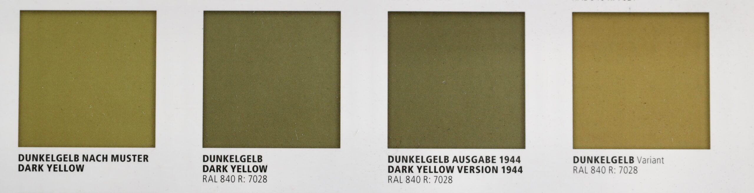
Much has been written on the topic of Dunkelgelb by modellers, as each hobby paint manufacturer has its own version. It’s a real rabbit hole – like US Olive Drab, which I have also struggled with. My main authority now is the book Real Colors of WWII by AK. This is based on quite a bit of research, including examining bits of surviving equipment. They produce for swatches to show the variation, even before various field factors intervened. The photo above shows the four swatches in this book, though it does not do justice to the actual colours. They give some idea of the degree of variation, though. The first, Dunkelgelb Nach Muster, came with the original directive in February 1943 saying that all vehicles should be painted in this colour, with camouflage over painted in olive green and red brown. Some suggest that this shade was never actually used. The second swatch shows the RAL 7028 standard for the colour registered in March 1943 – RAL referring to to the German colour standard system, which is still in use today, though RAL 7028 is now defunct. This is greyer than the earlier version. The RAL system was reworked in 1944 to reflect wartime exigencies – and the third swatch shows the even greyer version in this. And finally, for good measure in the fourth swatch they produce shows another variation from actual samples, to give an idea of the amount of variation there was in the field. This is even yellower than the original sample. What to conclude? There is a lot of scope for producing whatever variation you happen to like – but as the war progresses, the greyer it gets.
The starting point for mixing the colour was always clear: Liquitex’s Yellow Oxide. This pigment is based on Iron III oxide-hydroxide (FeHO2); it is an industrialised version of the ancient yellow ochre, which is usually slightly redder. This is almost certainly the pigment the Germans actually used for the colour – as it cheap and light-fast. But by itself, even with added white, it is much too bright. Back in 2017 I was heavily influenced by artist’s colour theory for mixing pigments – so I sought the colour’s complement to dull it down. This is purple – but the purple pigment I had was very bright and I could not get the results I was looking for. It was my introduction to the fact that colour mixing in practice does not follow the standard theories (there is a good theoretical reason for this, but I digress). Easier, I thought, to use a combination of a dull blue (Prussian Blue) and dull red (Venetian Red). I mixed these straight into the yellow, along with the ubiquitous white. From this I learnt never try to achieve a colour by mixing three different pigments. It was very hard to get the blue/red balance right while minting the right balance with yellow. In fact I should have mixed the blue and red prior to mixing into the yellow.
Years passed before I was next to attempt to mix the colour – for my recent German soft-skin project. I was older and wiser by then. I had got past my idea that you should not use black (or neutral grey – a black and white mix) in colour mixing – to satisfy my inner Monet. So I thought I would try mixing some Neutral Grey into the yellow, before I tried a purple. Immediately this proved to be a direct hit. I could get close to all four of the colour swatches (allowing that they should be a bit lighter when used on a model vehicle) by varying the balance of yellow to grey. The Neutral Grey got pretty close all on its own, but for tweaking I used Mars Black and Titanium White. This was much easier than my earlier efforts – and it got better. By upping the ratio of black to yellow, I got something greener, which looked a lot like the olive used for German tropical uniforms (and in turn more added white could replicate the fading these uniforms showed). Of course it is quite likely the Germans themselves mixed the paint using yellow oxide and black pigments – increasing the black element as the yellow oxide got scarcer.
Interestingly enough, yellow oxide mixed with black and white is also what I have used to replicate US Olive Drab – to say nothing of Napoleonic French gun carriages (which used paint mixed from yellow ochre and black…). In fact the US colour can be a bit greener than this, and they often used a green pigment.
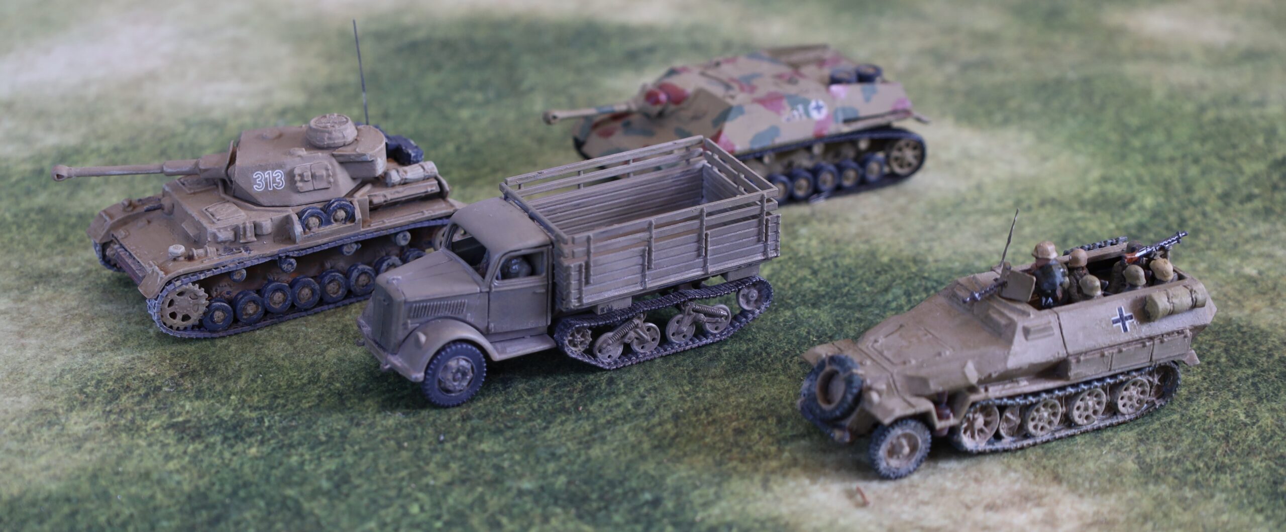
Anyway here is a picture of a selection of German vehicles in my collection, to illustrate the sort the variation.
The Panzer IV is an Airfix model from my original collection from the 1970s, repainted in 2017. The Sdkfz 250 is a PSC model painted not long after, using the same technique. The Opel Maultier truck was in my most recent batch, using the yellow-grey mix. Behind it is a Jagdpanzer IV, which I converted from the Airfix Panzer IV kit in the late 1970s, in its original Humbrol enamel paint, using the “Authentic Colour” range straight out of the pot. The Panzer IV and Sdkfz 250 are not far from the “Dunkelgelb Nach Muster”; the Maultier is close to the RAL 7028, while the Jagdpanzer IV is a fit with the fourth variation swatch from Real Colors.
I am still left with the question of how pale the colour should be. The swatches are dark; contemporary photos look quite a bit paler, as do photos of surviving equipment. Why this should be is a much debated topic – there is the hotly debated “scale effect” suggesting that scale models must be paler to simulate atmospheric effects; colours tended to fade when exposed to the open air and especially sunlight. Part of the problem may even be that the models are usually seen indoors in shade or artificial light, while the photos show vehicles in direct sunlight. My Maultier is maybe a bit on the dark side.
There remains a question of whether Dunkelgelb is the right colour for Tunisia, where my 1943 project begins. The German vehicles used there were all recently manufactured. There were just about no survivors from the old Africa Korps after El Alamein and the retreat, and most of the German troops were reinforcements anyway. These would have been units refitting in Europe after being withdrawn from the Russian front, doubtless leaving any surviving vehicles in theatre there. All the pictures from Tunisia show vehicles in fairly pale colours (i.e. not the old Dunkelgrau), and the Tank Museum has painted its captured vehicles from Tunisia (notably a Tiger and a Panzer IIIN) in what lookes like a yellower version of Dunkelgelb. From this I assumed that Dunkelgelb was the appropriate colour (though without the camouflage green and brown – not visible on phots from this theatre until much later). But the directive to use Dunkelgelb was not issued until February 1943, by which time most of the equipment would have been shipped. In fact it is more likely that the vehicles would have been painted in the previous tropical colours of RAL 8020 Gelbbraun (the primary colour) and RAL 7008 Graugrün for camo patterns taking up to one-third of the vehicle). RAL 8020 Braun and RAL 7027 Grau were authorised substitutes for each of these respectively, given shortages. The Gelbbraun is really not very far from the greyer version of Dunkelgelb, according to the swatches, but has a slightly warmer tinge. The Braun is distinctly redder, and may be the origin of the Humbrol Africa Korps desert colour in issue back in the day, which was quite a bright orange shade. I might try replicating these in a future project for vehicles especially destined for the Tunisia phase of operations – though alas too late for my Tigers and Panzer IIIN.
Anyway, Dunkelgelb is the right colour for Sicily and later, and I’m very glad I have found a way of replicating it without too much trouble.
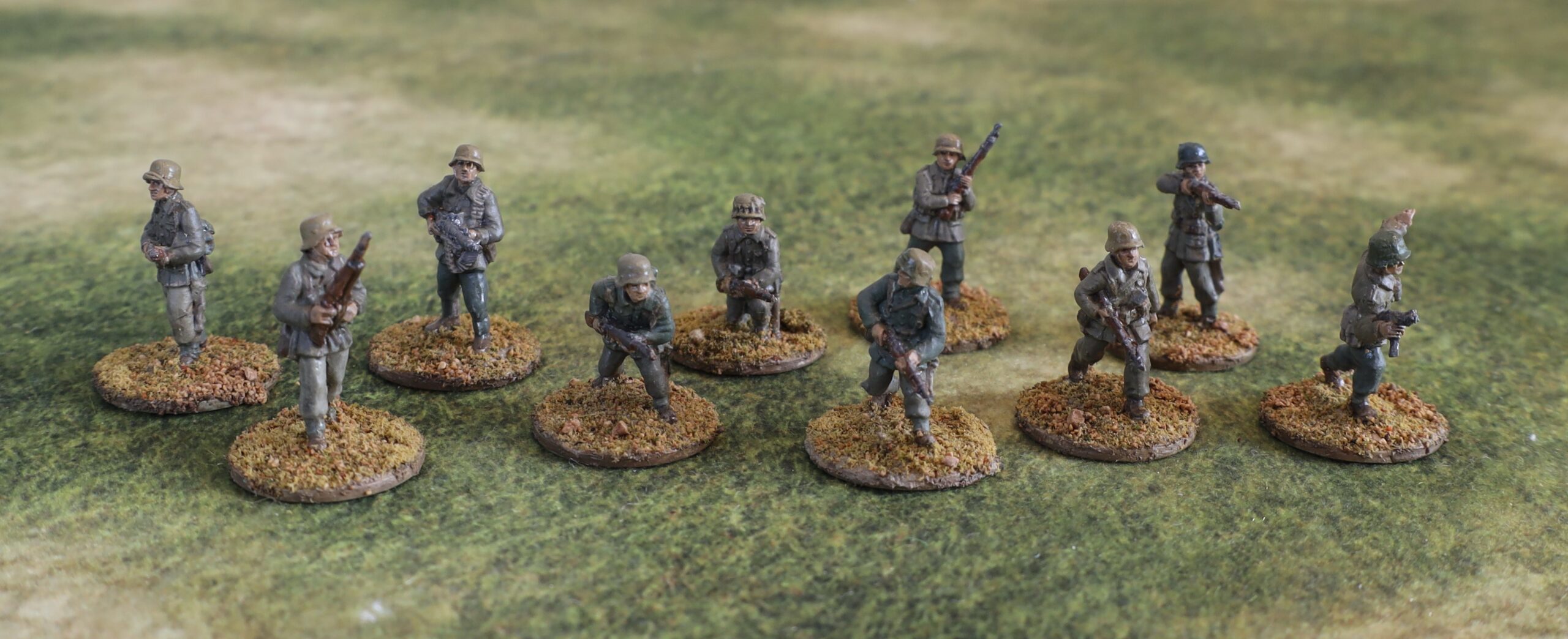
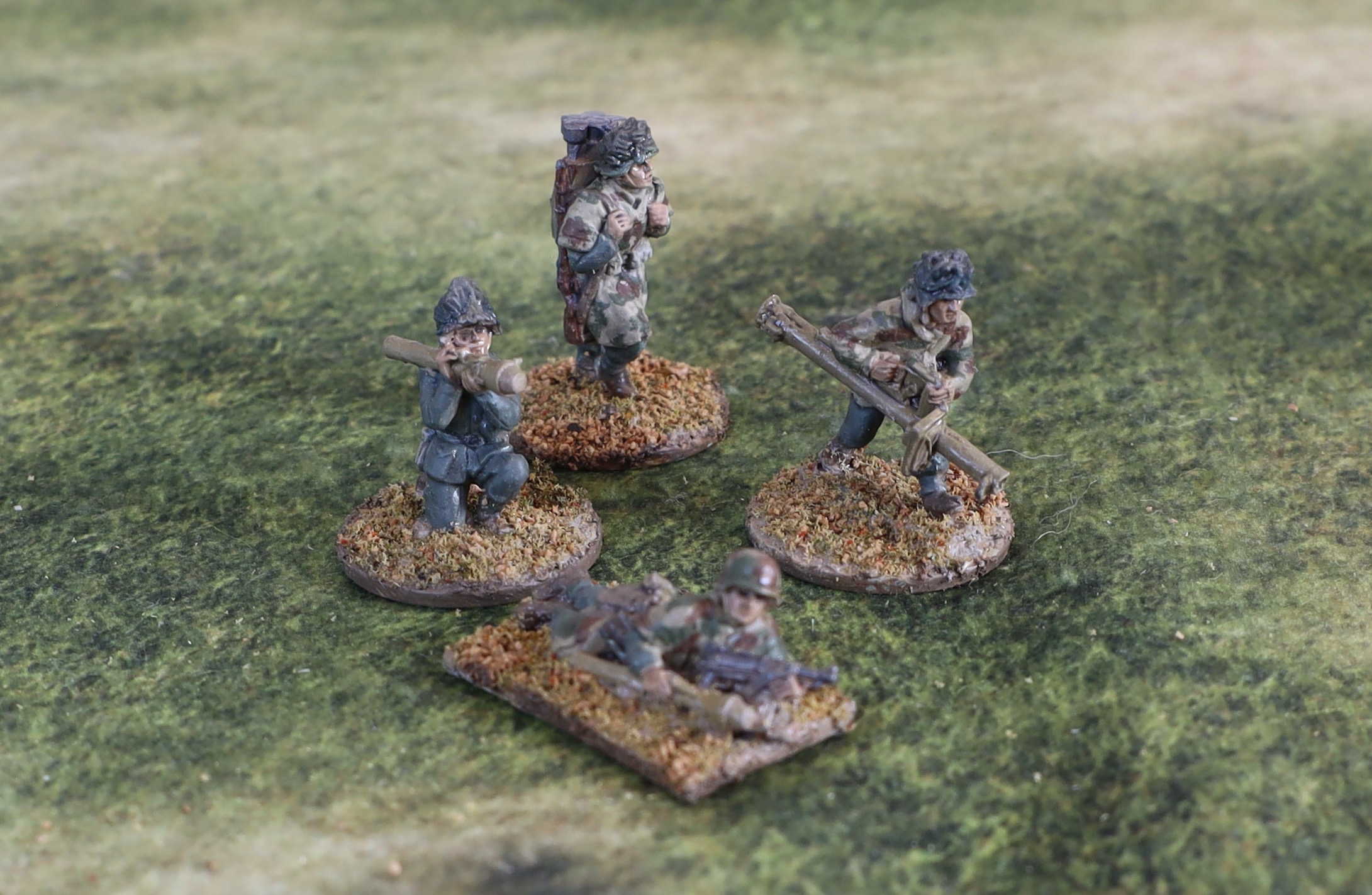
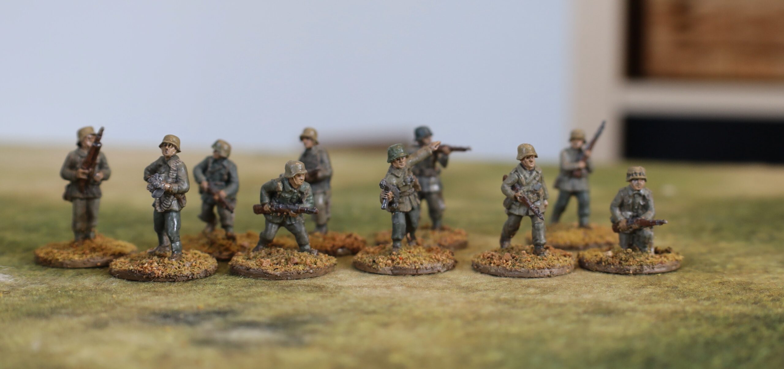
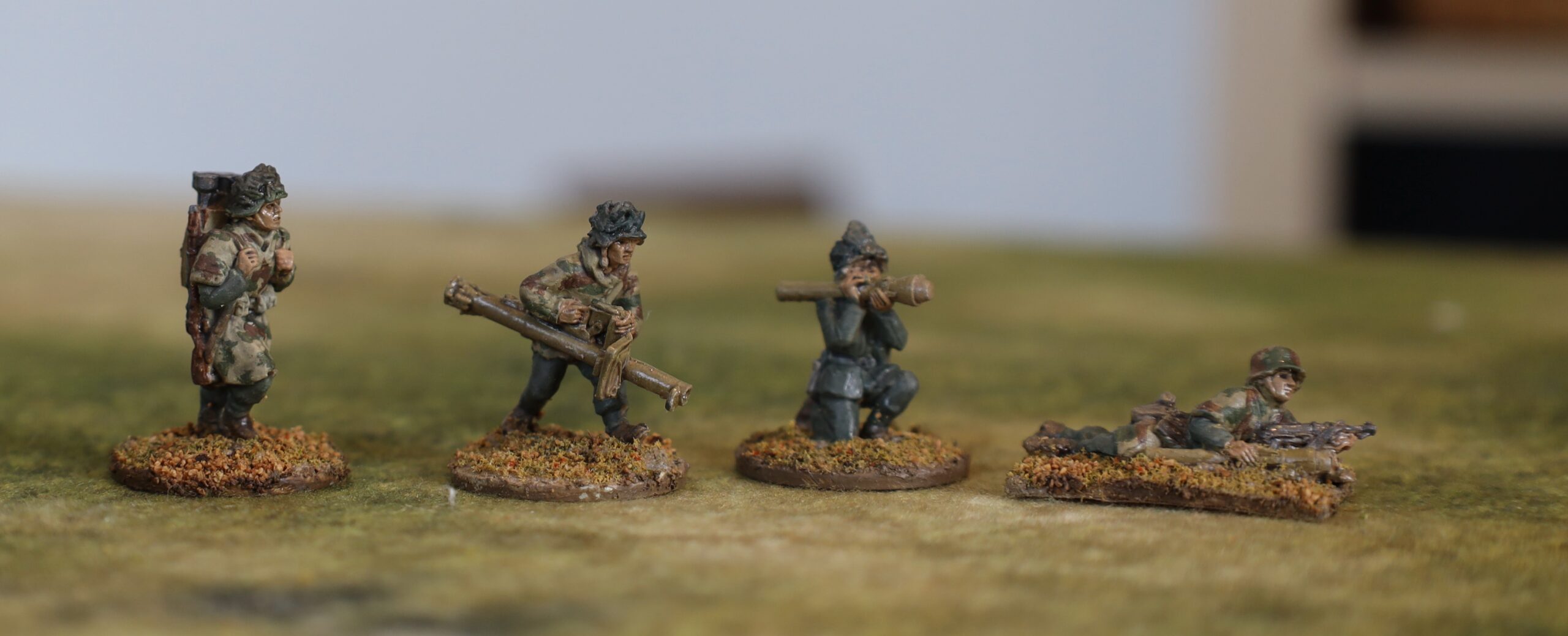
Alongside the vehicles and guns, I also painted 14 German infantry (in 20mm) for my 1943 project in my last batch of work. This was for bog-standard infantry, serving as either panzer grenadiers or ordinary infantry. Most of the German infantry in this theatre in 1943 were either panzer grenadiers or paratroops – with the exception of parts of the Tunisia campaign, where ordinary grenadiers, as well as ad-hoc units, were used extensively. I have not done any paras yet – though these played a big part in all the various campaigns. This smaller batch of infantry was put together so that the Germans have numerical parity with the British in my collection, giving me more gaming options. I painted one pack of AB infantry – the “section advancing cautiously”, which was ten men, including one MG34 and an NCO with an MP40. In addition I painted up one panzerschrek team and two figures with panzerfausts. These antitank weapons were only distributed to the German infantry late in 1943 – and after Salerno – so I hadn’t painted any up yet. But these will be needed to do later scenarios, especially if I push into 1944.
The panzershrek and panzerfaust figures
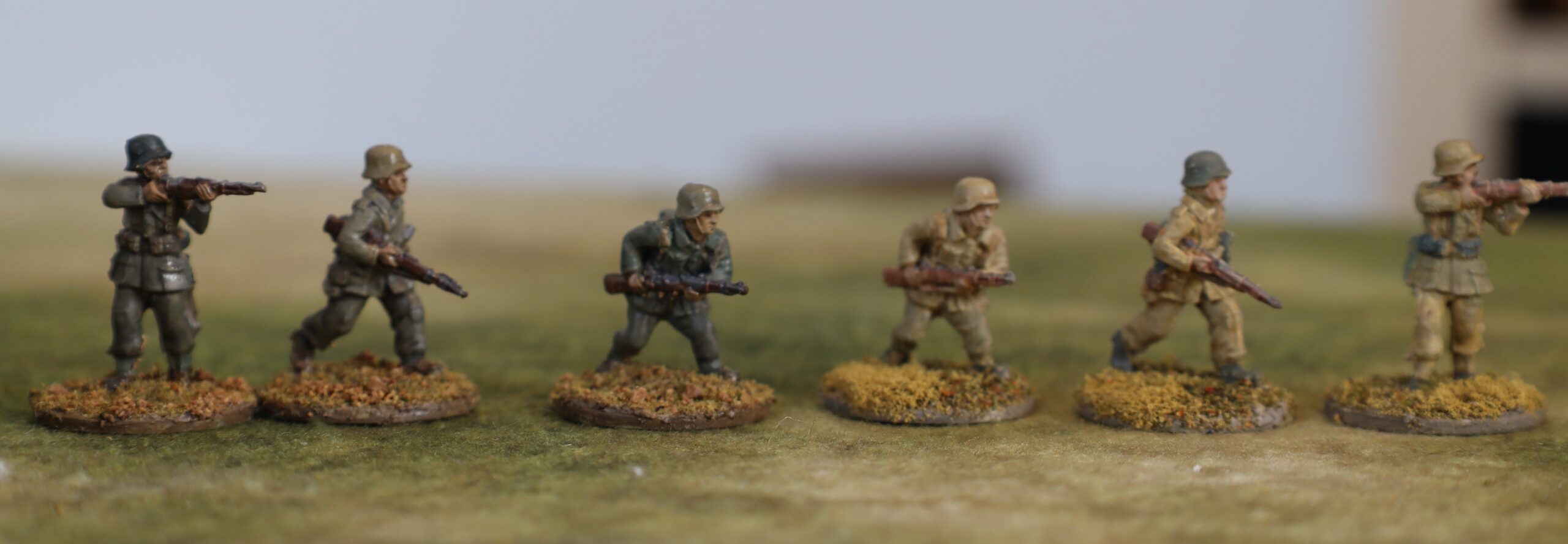
I did my original batch of German infantry back in October 2017. I wasn’t very happy with the end result, though I wasn’t able to articulate clearly why. The problem is that there are very few photographic sources for German infantry in Sicily or Salerno (and even these are mainly paras!). There is a little more for Tunisia. I think I was heavily influenced by pictures of prisoners in Tunisia, showing a huge variation in uniform colour, with quite a few people wearing very pale uniform items. So I depicted a lot of very pale kit. In fact the very few pictures from Italy show the German uniforms as being a bit darker than this, apart from some of the helmets. So I decided to go a bit darker this for this batch.
The panzer grenadier section
As before I decided to use the German infantry figures from AB depicted in standard uniform, rather than the tropical or summer uniform. The three uniforms were a very similar shape (the main difference was in the clot and dye), so they look pretty similar from a distance. In fact in Tunisia the weather was pretty cold and wet, so there wouldn’t have been call for rolled up sleeves etc. and other signs of a warm climate. I avoided Africa Korps figures because these tend to include figures in caps and shorts – which I didn’t want. In fact the in-combat DAK infantry figures from AB don’t have either – and not even rolled up sleeves. The only problem looks to be that a few of the figures have sand goggles on their helmets. I dare say that these can be cut off and filed down.
The figures were first mounted on steel washers, set in my usual mix of sand, acrylic paste with a bit of paint (white and raw umber). They were primed with gesso (I can’t remember if this was applied with airbrush, or darkened with some paint). For the main uniform for the most part I used a mix of Liquitex Yellow Oxide (aka yellow ochre) with varying amounts of black and white (sometimes using a neutral grey mix to speed things up). This gives a decent representation of the tropical uniform. This is exactly the same combination of pigments I used for the dunkelgelb on the vehicles, about which I post separately. The ratio of black to yellow is higher, giving a more olive finished result. There was not quite as much variation in colour as I had intended – the white seemed to fade on drying! some of the items were painted in field grey, which I mixed using a Viridian green mixed with neutral grey and tweaked a bit (I may have added some burnt siena to calm the green). The helmets were mainly painted in the dunkelgelb used for the vehicles, with one in dark field grey (as they would have left the factory) and one in olive green (as per the tank camouflage colours). As for the accoutrements and webbing, I had almost no guidance from photos, and conflicting advice from other sources. I ended up with a dull brown for the webbing and certain items, and greys mainly for the rest. The boots were brown.
The picture below shows three of the figures next to the same three from my original batch from 2017. They are much darker, but I’m happier with the overall appearance. Next time I might try to lighten the olive mix a tad though.
The panzershrek and panzerfaust figures
These depict figures from later in the campaign, when winter had struck, as well as the fighting moving further north. I therefore decided not to depict them in tropical gear. Three of them are wearing camouflage smocks. I am depicting them in sumpfmuster 43 pattern – though how well I have caught this I’m not sure. It’s probably a bit too chunky. The remaining figure is in field grey. Three of the helmets feature attached vegetation. I painted this quite dark – probably too dark, but I wanted to avoid the garish greens I so often see on miniatures – I may touch these up later. The prone figure features a painted camouflage pattern using panzer camouflage colours.
Luftwaffe uniforms
As a slight digression I will mention the AB 88 crew that I also painted as part of the batch. These are in Luftwaffe uniforms. The tropical colour was paler than the army one, apparently – so I used the same basic mix with more white. And in place of the field grey, the Luftwaffe had blue. This I got from black, white and Prussian Blue, a paler variation of the mix I used for the “panzer grey” gun and tractor. This is guesswork as I have few colour pictures to go on.
Finishing
After the paint I applied a glaze. As with my most recent Napoleonic figures, I used alkyl medium as the base, mixing in some oil paint – a mix of Payne’s Grey and Burnt Sienna to reach a sort of dull mauve, to complement the olives and yellows that predominate in the uniform. This dried quite glossy – which I can accept in Napoleonic figures (it adds depth to the colourful uniforms), but not for WW2. But I didn’t want to use aerosol varnish, as I didn’t want a uniform matt finish. So I used my old Winsor & Newton varnish in a bottle to apply to the uniforms. This is unreliable, depending on how much of solid gunge at the bottom of the bottle gets into the mix. My first batch, used on the vehicle tilts, was fine. The batch used on the figures, alas, still left a strong sheen, which can been seen on many of the figures. For the weapons, helmets and skin I wanted a slight sheen – and I used another brand of matt varnish, which is more reliable, but not very matt. The next time I mix up some really matt varnish, I will need to touch these figures up.
After that it was the bases. I applied My usual Woodlands Scenics flock mix with some sand using undiluted artists strong glue. I then added patches of sand to give a bit of variation. For some reason the adherence of the flock/sand on the larger weapon bases was much better than on the figures. I needed to seal the latter with diluted PVA glue, but not the former. I think I was more careful to press the flock in on the larger bases, which I did one bit at a time. Must remember to do this on all my bases next time, as the sealing is an extra step and a faff. I did not dry brush the figures; I though of dusting them, after the technique worked so well on the vehicles, but I decided not to. It is no necessary.
Overall I am happy with the result, apart from the sheen on the uniforms, which is easy enough to fix later. I am pleased that my painting technique is settling down – this will speed things up in future.
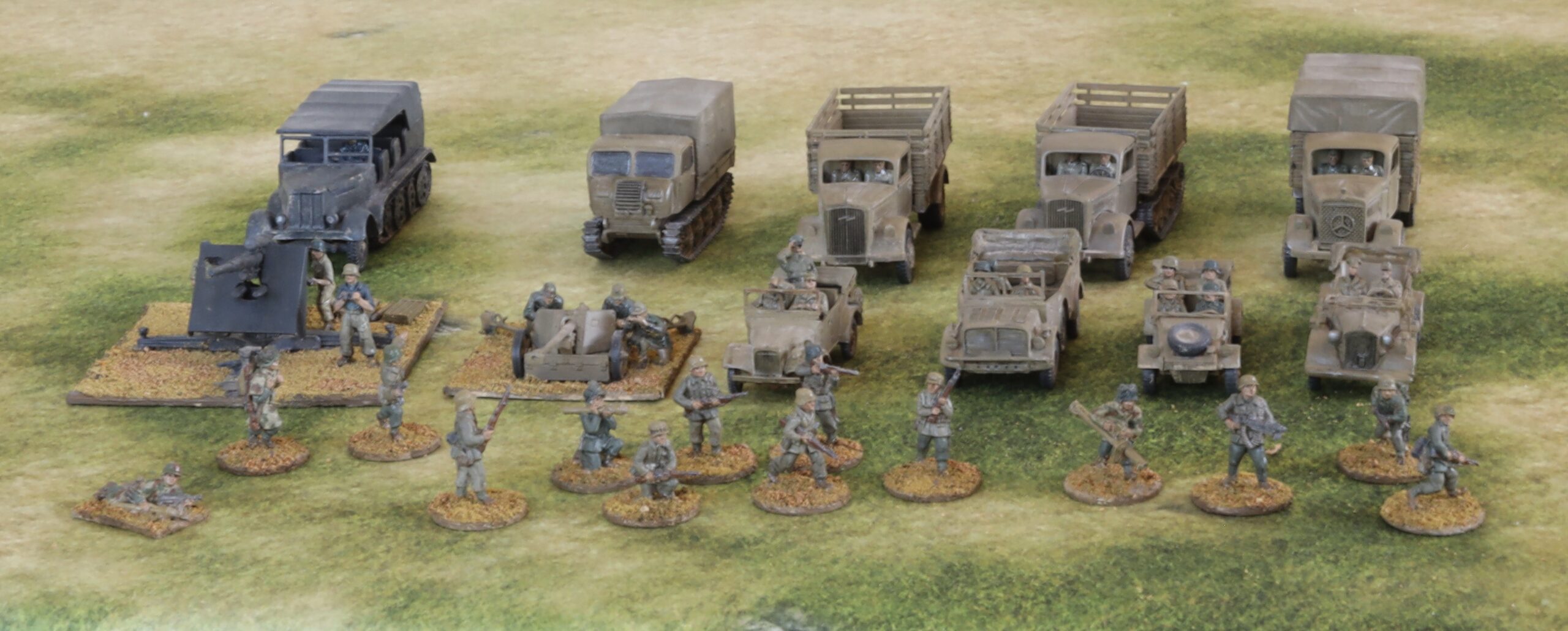
I’ve been off line here for nearly three months. At first I was pushing on with my Napoloenic rules project. I reached the point where it needed play testing – and then got distracted. I then moved on to my next project, which was to build more 20mm ground forces for the 1943 Mediterranean campaigns. These are 9 vehicles, two artillery pieces and 14 infantry figures, all German. At least twice I lost momentum as the project progressed, and I got distracted by other things. So the whole thing took quite a few weeks. I have been going for bigger projects to get more stuff done more quickly – but you can overdo it. This one was too big and complex, causing the fatal loss in momentum.
Looking back on it there were two main problems. First was combining infantry (AB metal figures) with model vehicles/guns. The processes between the two are too dissimilar, so for almost every session it was either on one or the other. Even though the models featured crew figures, these were much simpler than the infantry – and the artillery crews had different uniforms anyway. The second problem was that many of the models took far longer to assemble than I expected. The main culprit were the three Milicast cars, which are resin models with a number of fiddly parts and no assembly instructions. The Airfix Vintage Classics 88mm gun and tractor was also a nasty model to put together – mainly because the parts were ill-fitting. By contrast the Plastic Soldier Company (PSC) models (three medium trucks, a Raupenschlepper, and a Pak 40) were simple models that were quick to assemble. The S-Model Kubelwagen was somewhere in the middle. It was quite fiddly (more parts than then the Milicast ones), but in polystyrene, with well fitting parts and with clear instructions, so it was much easier to assemble. Painting and finishing a vehicle batch of this size was not a problem, however, even with two different colour schemes.
I will describe the project in three parts: the vehicles (and artillery) in this post, followed by the infantry, and a digression into dunkelgelb, principal vehicle colour.
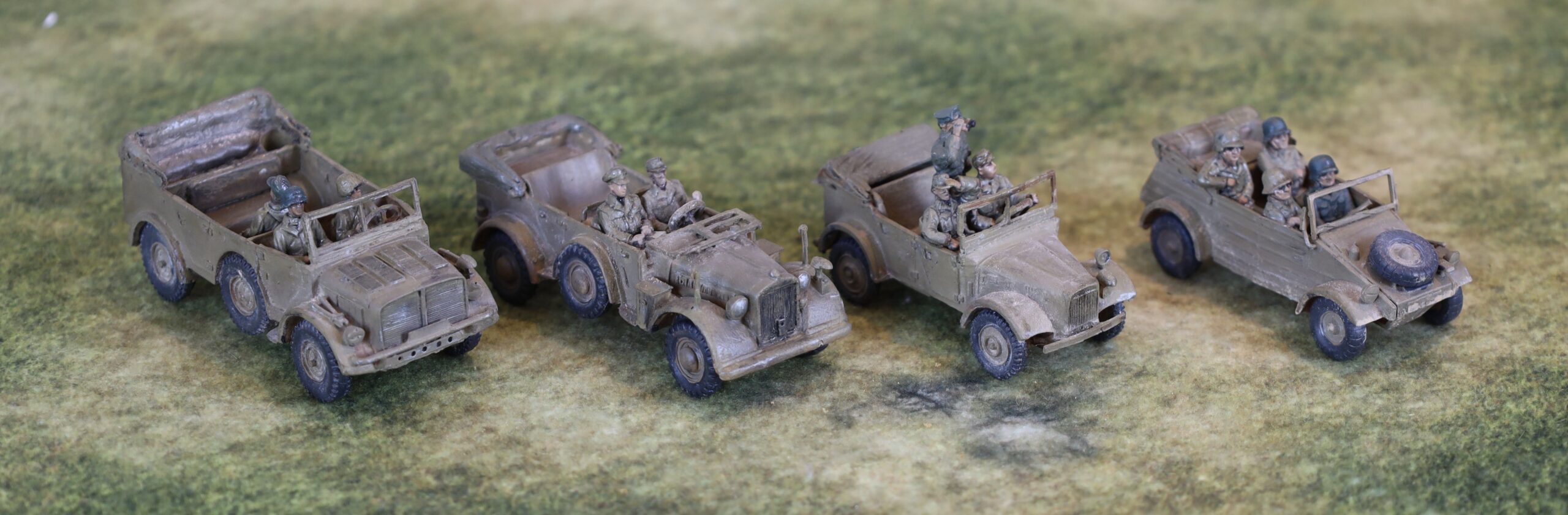
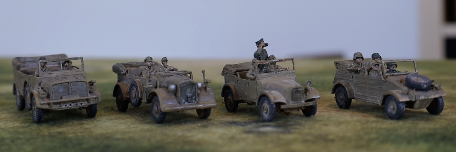
The four cars
L to R: Horch Kfz 69, Horch Kfz 15, Stoewer Kfz 1, Kubelwagen
These vehicles (Horch Kfz 15 and 69 heavy cars, Stoewer Kfz 1 and VW Kubelwagen field cars) will be used as transport for small command, comms and observer groups. The two Horch cars (especially the large Kfz 69, really a light truck) are also suitable as tows for lighter field weapons, such as the Pak 38. The 69 could transport a small infantry squad too. All except the Kubelwagen are from Milicast. This is one of the two suppliers I am using for slightly more obscure vehicles and equipment; the other is SHQ, who make metal models. Both are in 1/76, so on the small side. I’d prefer 1/72, as these work better with the AB metal figures I like to use, but there is quite limited availability at this scale. The Milicast models are in resin – which can produce very fine detail, but is a bit fragile. I fell in love with the pictures of these vehicles on the website and got a bit carried away. I bought three SHQ metal models at about the same time (back in 2019), but was a bit disappointed. I have assembled a jeep and a Loyd carrier (a Bedford truck is still awaiting assembly), and found them a bit crude. The parts weren’t especially well-fitting. The end result was more than acceptable though.
Another view!
What I discovered this time was just how difficult resin is to work with. It didn’t help that the crew figures were resin too (bought separately from Milicast), and often needed arms to be glued in place. For each of the vehicles, the body came in one piece, but wheels, windscreens, lights, mirrors, steering wheels and various other bits, depending on the model, had to be glued on. I faced four main problems. The parts were fragile; they were often tiny; there were no recesses to secure them; and gluing was a bit tricky. On the final point I used standard cyano superglue. It look longer than expected to harden; the (usually tiny) part often needed to be I held in place for few minutes, and wasn’t properly secure until the next session. By a miracle no parts were lost in assembly, though some did go awol for a bit. At least one of the of the front lamps broke off at later stage, and I did not even attempt to search for it. Trying to clean flash off the windscreens was a nightmare, given the fragility the material – and one of them broke into several fragments that had to be reassembled. The upshot of all this is that these three cars took several two -hour sessions to assemble. I was vowing “never again” at the end. Come back SHQ, all is forgiven! Alas I have two more Milicast models awaiting assembly: a 17pdr antitank gun, and a 2cm Flakvierling (with quad barrels) which looks a complete nightmare, though this time with some assembly instructions.
The fourth car is the classic Kubelwagen. I actually have no less then four models of this vehicle (only one assembled) from old 1970s Airfix reconnaissance sets – but these were so terrible as to be unusable. They are tiny, and you couldn’t fit 1/76 figures in, never mind ABs – they came with some very diminutive crew figures, so it would have been obviously wrong to the designers. Those were the days. Instead I bought an S-Model kit in 1/72 – there are two models in each box, and I am saving he second one for later. To my relief the model proved big enough to take an AB crew of four figures specifically designed for the Kubelwagen – which fitted quite nicely. This wasn’t a particular simple kit, but in plastic, and with well-fitting parts (mostly with recesses to aid fitting), it was much easier than the resin models.
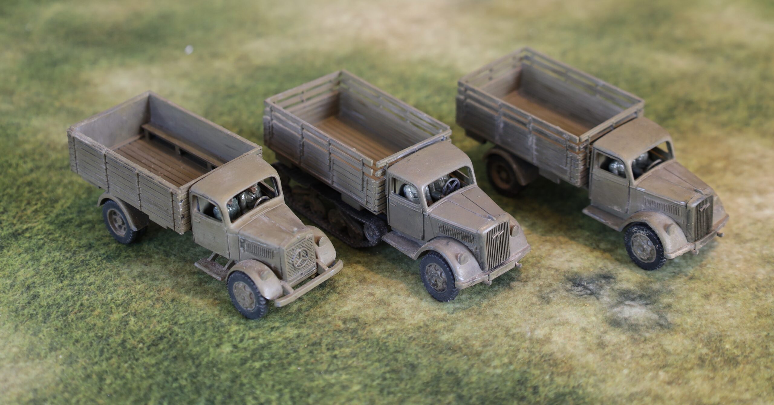
The medium trucks
The PSC trucks
From one extreme to another! These models came from a single box from PSC, designed with wargamers in mind. They are in 1/72, but originally engineered for 15mm scale (i.e. about 1/100), so they are quite chunky. There aren’t many parts, and no fiddly bits (no wing mirrors, and with headlamps crudely folded onto the mudguard, for example). They were very quick to assemble. The only complication was that I had to paint the interior of the cabs before assembly, which meant assembly of this bit was delayed. By the time I got there some of the parts had bent a bit out of shape, so the fit wasn’t as good as it should have been.
A different view in different lighting
As is generally the case with PSC, there were multiple options – leaving a lot of unused parts at the end. There were two choices each for cab (Mercedes or Opel), drive (wheeled or half-track) and bed (higher sided without tilt or lower with tilt). As you can see from the picture, I tried each of these variations out.
You can see the Mercedes truck without tilt here
These aren’t fine models, but work well enough for tabletop gaming, and I’m really pleased with them. On the strength of this I bought a second box (PSC models are often out of stock, so it’s best to buy while you can). I have an idea of converting one of them to take a Flak gun on the back. Otherwise these vehicles are versatile as troop transports (the German troops in this theatre were usually motorised), tows for medium-sized guns, or supply vehicles (although there is limited call for these on the tabletop).
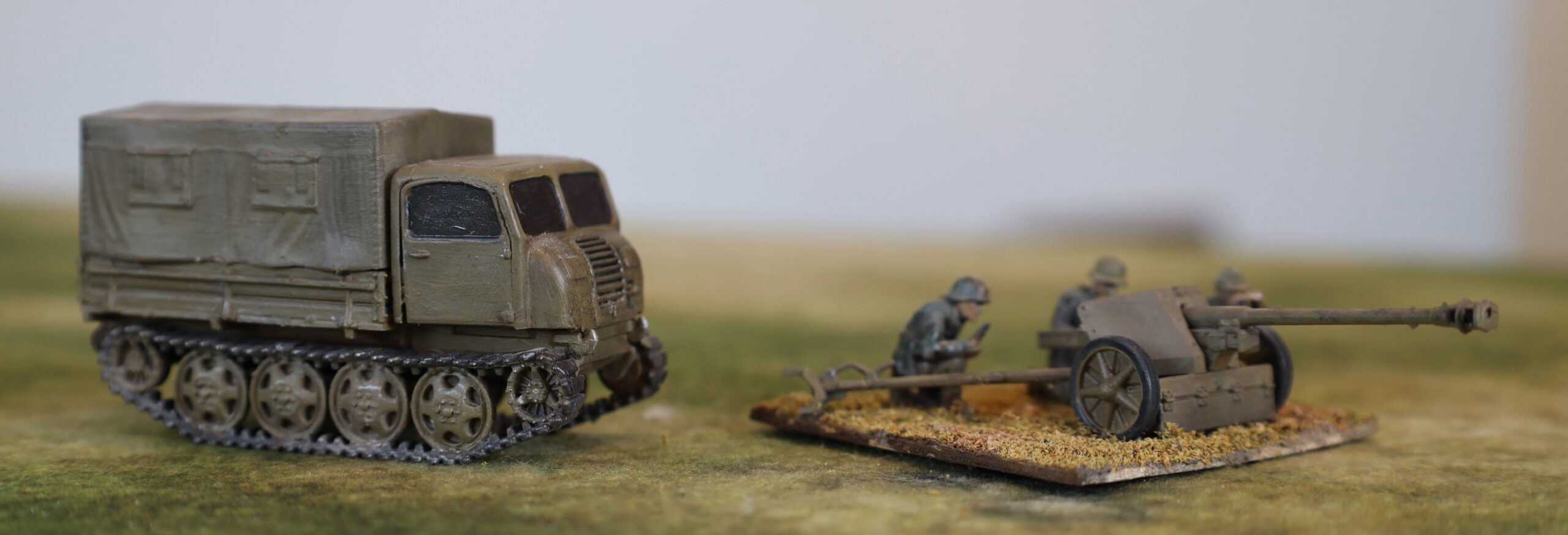
Raupenschlepper and Pak 40
This is also a PSC kit. I needed Pak 40 75mm antitank guns, as these, according to some sources, were used in Tunisia (I’m not sure but Pak 36(r) converted from Russian 76mm guns, which used Pak 40 ammunition, definitely was in Tunisia), and by Salerno they seem to have been the standard antitank weapon in use by the Germans. The model comes with the Raupenschlepper Ost as a tow. I haven’t seen any pictures of this vehicle in use in this theatre, but Wikipedia has a picture of it in Albania in September 1943, so presumably it was around. It was designed for the Russian front, and used as a tow for medium weapons – it is usually pictured with the 10.5cm howitzer.
This isn’t such a good buy as the trucks. There are only two sets of models in the box. The Raupenschlepper has an alternative cab, with flat-panel construction used later in the war. There are also parts for a version used as a self-propelled Pak 40. Very few of these were actually built, so why all that plastic was used in a model designed for wargames use is a puzzle. I’m not especially a fan of the solid windows – though these looked much better in the end result than I feared. The tilt is moulded in two parts, and the join needed filing and puttying so as not to look too obvious. The crew figures for the Pak 40 aren’t very nice. These are standard PSC sprues, which I also had for the Pak 38s, with some figures requiring assembly. Somehow these are much harder to get looking lifelike than the AB cast figures, though these are quite expensive. They are depicted wearing smocks, which I painted up as early pattern German camouflage (though this is perfectly in keeping with the theatre).
Still the models were easy to assemble and the result is perfectly satisfactory. I’ll do the second models later.
From a different angle
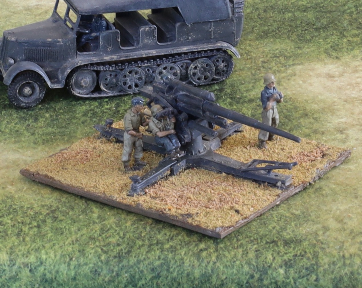
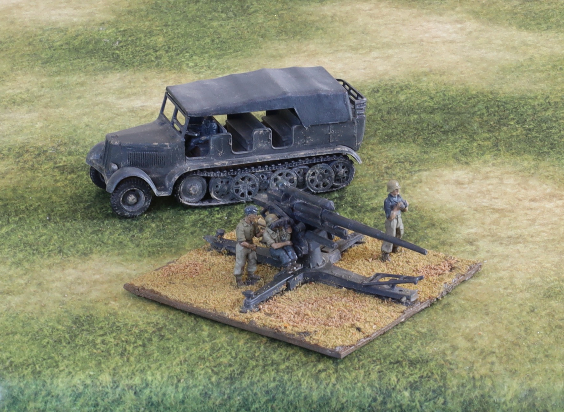
88mm Flak gun and Sdkfz 7
The 88 without shield
This was a bit of a disappointment. I bought the model from the Airfix Vintage classics range (see my 2018 post here) – in fact I bought two of them. They looked good value as I remembered them as being decent models back in the 1970s, though the track wheels on the tractor were a bit awkward to assemble. I also bought crew figures from AB. But the parts fitted badly, which made assembly harder than it should have been. Each of the running wheels comes in two parts, and the track is flexible polythene. The tractor was not particularly easy to put together as a result. But the gun was a bigger problem. Back in the day I could get the wheels on and off and the side-riggers up and down so that we could have it in both deployed and in transport mode – but for this model the fit was not tight enough. I did paint the wheels, but in fact none of my artillery is in towed mode, so I decided not to use them. The gun does not fit snuggly into the cradle. But worst of all the fit of the gun into the base was loose. This mattered because I attached a metal seated figure to it, which meant that the assembly tilted over to that side. In the end I had to feed plasticine into the hole in the base to help hold it in the upright position. The model comes with a shield, not shown the in picture here, as this was often not used. I had to cut a hole in it so that the seated crew figure and use his range-finder.
I decided to paint this in pre-1943 colours of “panzer grey”. Photos, even from the later war, often show 88s quite dark. The narrative here is that this is an old weapon brought forward from a rear area for front-line use, which nobody had repainted. The crew is Luftwaffe, who had slightly different ways of doing things. The AB crew figures are excellent, and the scale difference isn’t jarring. I painted them in slightly different colours to the infantry to reflect the Luftwaffe provenance.
I don’t think I will bother the second gun. I do have the crew for a second 88, but I will source this elsewhere – as a later variant of the weapon if I can get it. I will assemble the second tractor at some point, as it looks OK when finished. It can be used with any second 88, or with a towed 15cm howitzer if I get one.
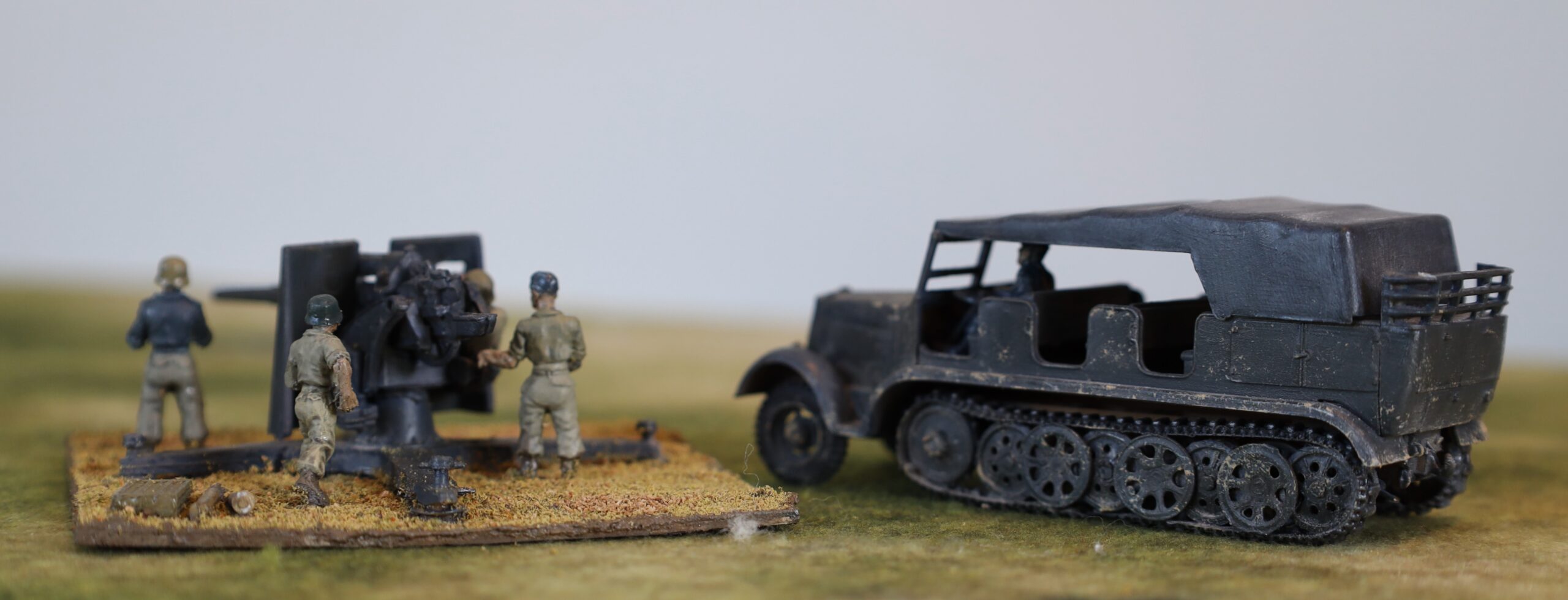
With shield, from rear
Painting and finishing
Step one was primer, which I applied after assembly (except of the cabs of the trucks. I wanted something quite dark, so that it wouldn’t show if the later painting did not reach all the recesses. To get into those recesses I used the airbrush. I used white airbrush primer paint mixed with darker acrylic paint (and some medium to make it more fluid). I used a brown for most of the vehicles, except the 88 and tractor, where I mixed in black. I’m still working on airbrush technique – and I’m being a bit frustrated with the tendency of the nozzle to clog – so the phase took longer than expected. Getting into the recesses was a bit harder than expected too. In future I will try to doing this differently. I have bought some Vallejo primer, with some in German dark yellow (and olive drab) – I will use this directly out of the bottle. I will also prime the parts before assembly, while still on the sprue – though still with the airbrush.
After this I painted the interiors and crews, so that I could finish assembly of the cabs. That done I painted the rest. This was simply one layer of the base colour applied by old-fashioned brush. As usual I mixed the colour using artists’ pigments – I will explain more how in a later post. The tyres, tracks and other detailing was then done. There were no decals. 88 barrels often have rings, presumably signifying claimed kills – but I couldn’t find anything suitable to use. I decided not to bother with number plate – and second line German vehicles such as these did not carry other markings.
After this I used the oil paint patina technique that I have been using on model aircraft. I dabbed small dots of oil paint onto the model – white, yellow ochre, brown, Payne’s Grey, black – and brushed it into a very thin layer. This softens the flat finish, giving it a rather worn appearance. It also gives the models a slight sheen, like new paintwork. I applied matt varnish to the tllts and the clothes of the crew. I am using a very old bottle of Windsor & Newton varnish, which is not reliably matt, but it looked OK. I then applied a glaze of dark mauve-grey that I was using on the infantry figures, to the crews and radiator grills. This left a slightly glossy finish, that will need a bit of touching up with matt varnish.
After this I used a metallic pencil (silver and pewter) to simulate exposed metal. Since the theatre was mostly dry, rust would be less prominent than vehicles elsewhere. The pencil works quite well, but the impact of this was not great, and I don’t think this is really worth bothering with. The exception may be on the tracks, though even this wasn’t very visible in the end.
Finally the vehicles got a dusting in – another technique learnt from model aircraft. Previously I used a specialist textured paint to simulate dust. This is quite thick and easy to overdo. It looked pretty good on the last batch of British vehicles I did; less so on the previous German ones. I tried putting some on a couple of the vehicles – including the dark grey Sdfz 7. I thought it was a bit too strong, especially on the dark grey. This technique works better to simulate mud than dust (though there was a lot of mud in Tunisia – not really in Sicily or Salerno). I then created dust from ground down artist’s pastel – mixing white, pale yellow and grey mainly. I then applied this generously with a paintbrush. It worked pretty well, though the process created clouds of pastel dust. A mask would have been a good idea, but I just held my breath. I am pretty pleased with the result. In fact I think careful application of the paint product on the wheels and lower surfaces complements the effect quite well. But dabs on the upper surface, as per the Sdfz 7, don’t really work. The dusting did away with the need for dry brush highlighting.
After this came the question of whether so seal the models with a layer of matt varnish from an aerosol can – as I have done with my earlier land vehicles. This would serve to hold the dust layer in place and protect the model generally. I decided not to in the end. Aerosol matt varnish gives a very uniform flat finish. The dusting gave a generally matt finish, but with a bit unevenness that makes the models more interesting. Alas these models are unlikely to see much tabletop action, so protection isn’t a priority.
The aim with my modelling and figure painting is to achieve a strong impact from a medium distance (a foot or two), and to do this with as few steps as possible to simplify production. This contrasts with serious modellers, who like to use lots of different techniques together. I am now settling down to a pattern. Dark-ish primer (perhaps before assembly) applied by airbrush; base coat and detailing; decals if any; oil patination; dusting. There is not usually a need for washes, glazes, dry brushing or varnish.
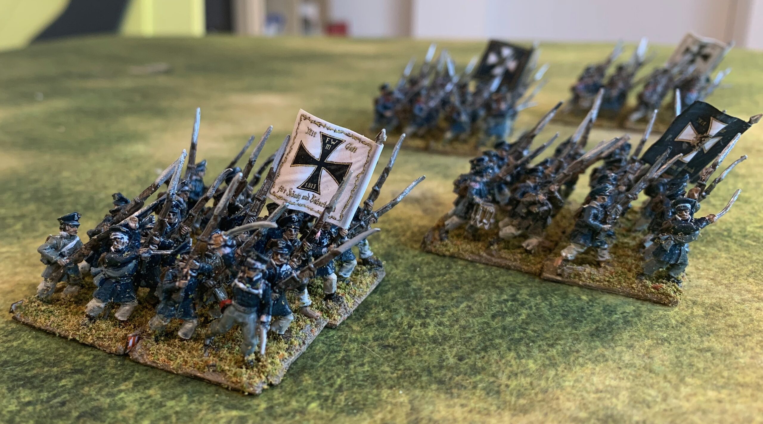
The two Pomeranian units. The officer o the corner of the font unit is from AB, almost all the rest are Old Glory.
After my WW2 aircraft modelling, I wanted to return to the attack on my lead mountain of Napoleonic 18mm miniatures. This time I experimented with new techniques for a large batch of figures (102) to help make more rapid progress in future. I have painted them up to form four battalions of four bases, painted for two different regiments, from Pomerania and Kurmark (Brandenburg).
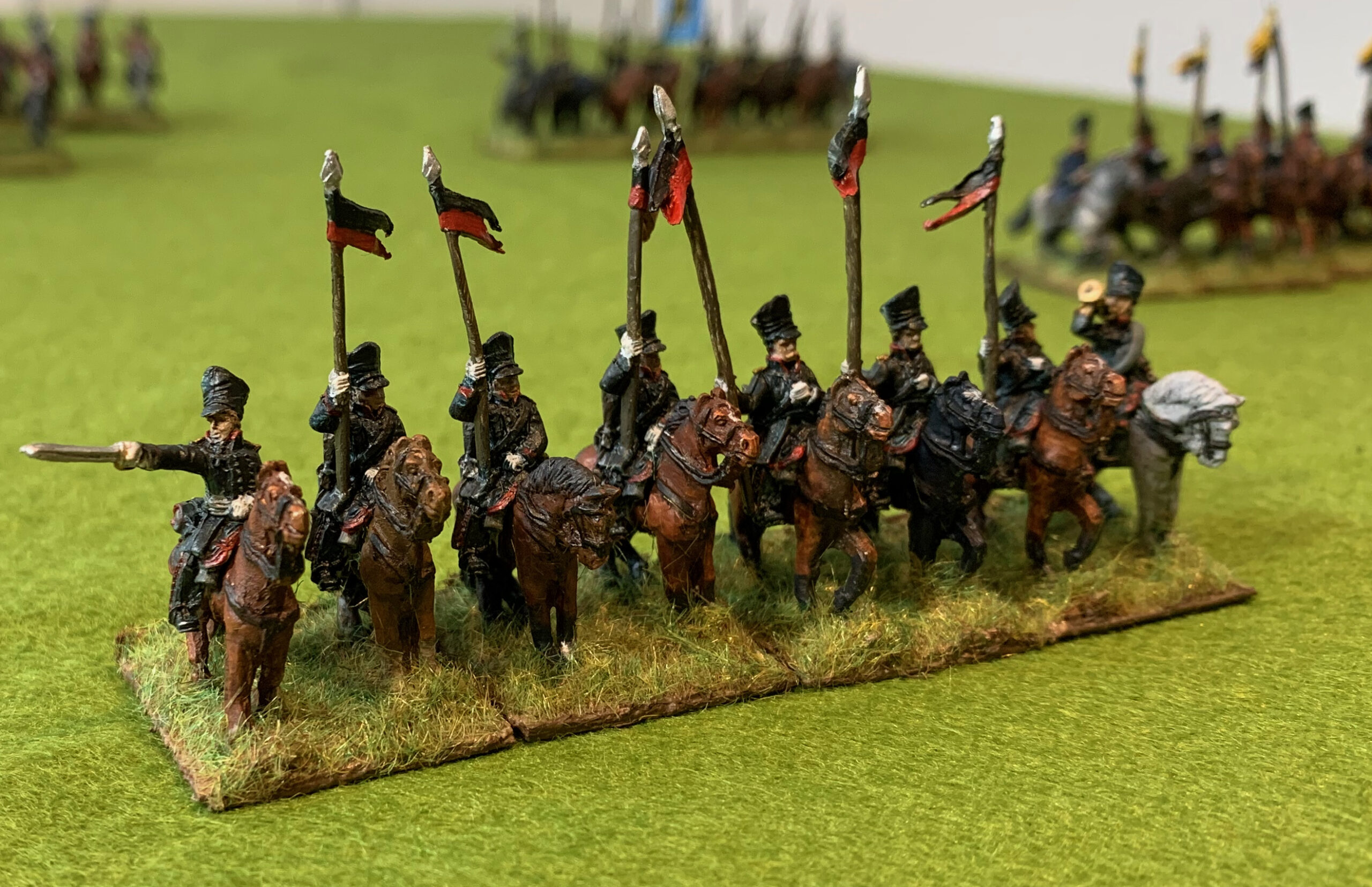
For a number of reasons I had far more Old Glory 15s Prussian landwehr infantry in my unpainted pile than I ever really intended. The figures aren’t the finest, and the caps are a bit low. I already had 19 six-figures bases of these done up for Westphalian and Elbe regiments. I have 60 or so of the somewhat nicer AB landwehr miniatures unpainted, which I plan to paint up as Silesians. Still the OG figures are nicely animated and look well enough in bulk – and the Lasalle game system that I have recently acquired is quite expensive in miniatures the way I play it. I could always do a few more more battalions of landwehr. So I thought I would try out some techniques in mass batch painting, on a larger batch than usual. I decided to do four four- base units, from two different regiments, plus one extra base base of Elbe landwehr so that I could top up my current landwehr stock to a full five Lasalle units. Each unit was to have a flag (figure manufacturers are usually over-generous with standard bearers, and I had four spare landwehr flags). Each base was to consist of five ordinary infantrymen, and one “command” figure – standard-bearer, drummer or officer. One of the standard bearers, and two of the officers were AB figures (where I had more than I needed for my Silesians), the rest were OG.
I am not a follower of hobby fashion, and I am ploughing my own furrow on presenting my miniatures. I base them close together on small bases (six infantry on a base 25mm square). The current fashion is for beautifully painted miniatures spaced further apart, sharing bases with rocks, tufts of grass and such. I find photos of the more fashionable 28mm figures based four to a 40mm square base painful to look at (the equivalent of four 18mm figures to one of my 25mm square bases). All contemporary illustrations show infantry in tight-packed masses – tighter than even my basing. Also I often find that the exposed expanse of bases often clash with the terrain board. Of course there is a very good reason that people go for these looser presentations – the painting of the figures is usually of a very high standard, and time-consuming. Looser mounting mean fewer figures to a unit, and the extra space allows the paintwork to be shown off to better advantage. These miniatures always look much better up close and personal than they do en masse and in pictures. I want to achieve the opposite – something that looks better en masse, while requiring less work on each individual figure – something more impressionistic. But I don’t want the miniatures to look terrible up close either, though. My technique had been to paint the figures individually, mounted on strips of card, and then mount them on the bases when they were finished, with the application of flock to the base being the final step. This felt a painfully long process, especially with a batch size of 12 bases (72 miniatures), which I felt to be the minimum to make progress with army building.
This time I decided to mount the figures on the bases much earlier in the process. This wasn’t the first time I have tried this. I did it with my first batch of Prussian line infantry (again 16 bases plus bits), but I didn’t consider it a particular success, as it was hard to paint the figures mounted so close together. I thought it was worth another try. First I primed them by airbrush, using gesso mixed with a bit of black. I then did a quick paint job on the legs below the coat, and some of the feet, and brown on the bases. To get a bit of variation in coat and cap colours I applied an undercoat of dark brown or white on the coats and caps for one figure in six, not including the command figures. This was a bit of a failure on the end result – the variation is hard to see. And then I mounted them on the bases, using the matrix of sand, acrylic medium and paint that I usually use.
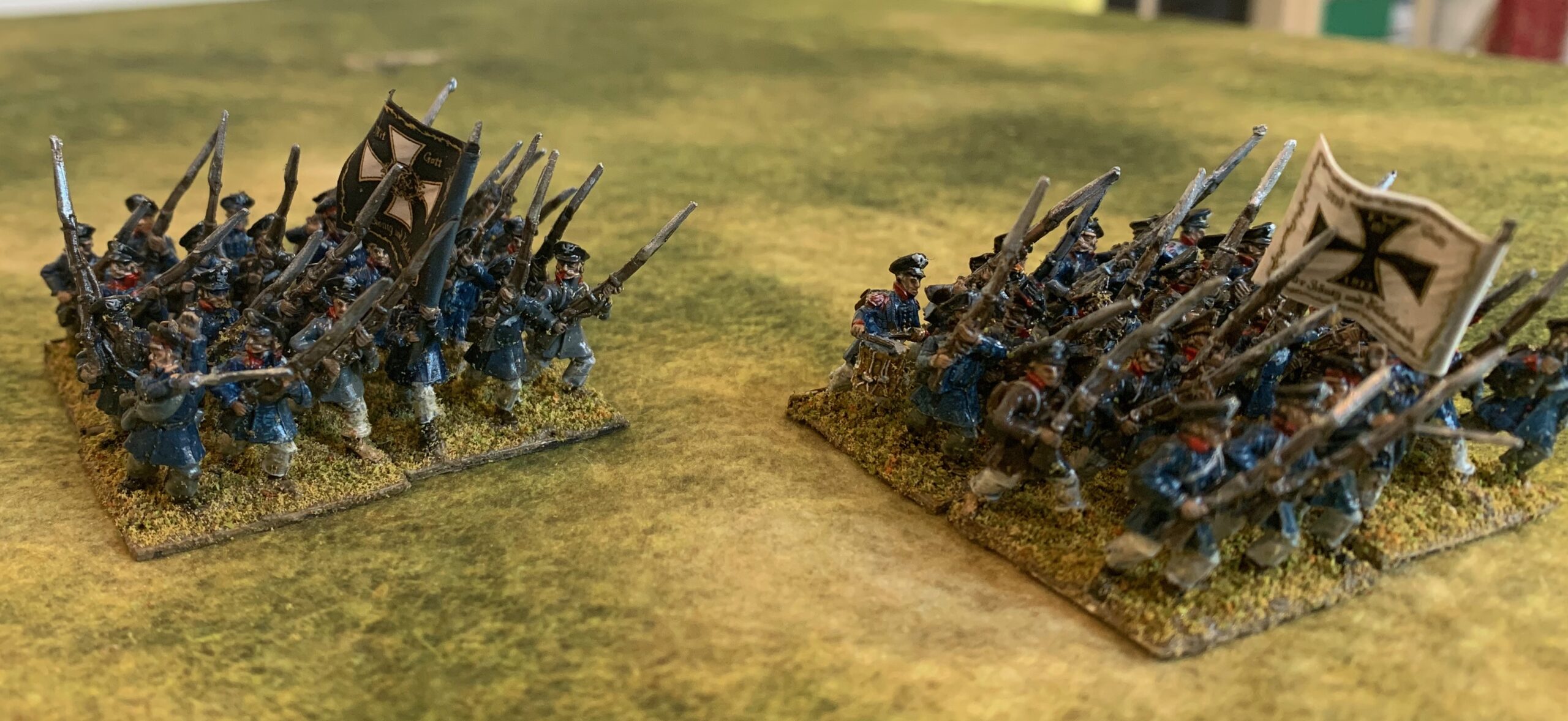
And then on to the rest of the painting. The coats were mostly blue (a slightly different mix for each regiment, not that this is very noticeable), with a few brown and grey ones. The caps were black (actually dark grey) for the Kurmark regiment and blue for the Pomeranians. And so on. Predictably the webbing was the hardest – but this is not so prominent on the landwehr, and most of the poses had muskets held close the front of the body, masking the straps. If anything was too hard to reach because of the close packing of the figures, I left it out. I tried to highlight the white cross on the cap front, but not always very successfully; I thought I could rely on the final wash to correct this by highlighting the outline. I could just about reach the collars for the facing colour (red for Kurmark, white for Pomerania), but I did not attempt shoulder straps except for the AB command figures – the straps aren’t moulded properly on the OG figures, and very hard to pick out – their line infantry castings have the same problem. I tried to limit the detailing, but I did paint the gun barrels, as these are very visible. Quite a bit of paint strayed onto neighbouring figures, requiring touching up later. This was basic block painting – nothing clever.
Finally, in order to pick out more detail on the figures I gave them a wash. I’ve tried a number of strategies on this over the years. From acrylic paint and water, to Quickshade, to acrylic ink (sometimes diluted). This time I tried something a bit new again. I had bought some alkyl-based oil painting medium for future use in my aircraft models, to speed up the drying time of the oil paint glazes I have been trying there. I thought I might try this mixed with a bit of oil paint (Payne’s Grey) for the wash. This worked a treat, once the right ratio of paint to medium was found – it needed more than I thought. It dried to a satin finish which was slightly glossier than I normally have, but which helped give the figures depth. And that was the figures finished. No final varnish.
All that remained was to flock the bases. I used the same mix as for my last batch of figures, but it didn’t go especially well. It was impossible not to get flock onto the figures, and not all that easy to brush it off – not helped by the relatively dynamic poses of the figures making them hard to brush. And the flock needed to be sealed with diluted glue once dry, with more risk of flock straying onto the figures. This is a lot of faff for an effect that looks very ordinary. I think I need to try something different. That surely means painting rather than flocking – but I still need to find something textured to cover the bases so that they merge with the basing matrix (without getting onto the legs of the figures!). The base painting would then be directly after this texture is applied and dried, and before the main painting of the figures. Something to think about. With such a density of figures on the base, there is less need to try so hard.
I think the overall result is a success. These aren’t fantastically finished figures, but they are fine on the table. And, though I wouldn’t describe the process of painting them as quick, it felt like a significant improvement on my previous method. The batch of 100 was quite manageable.
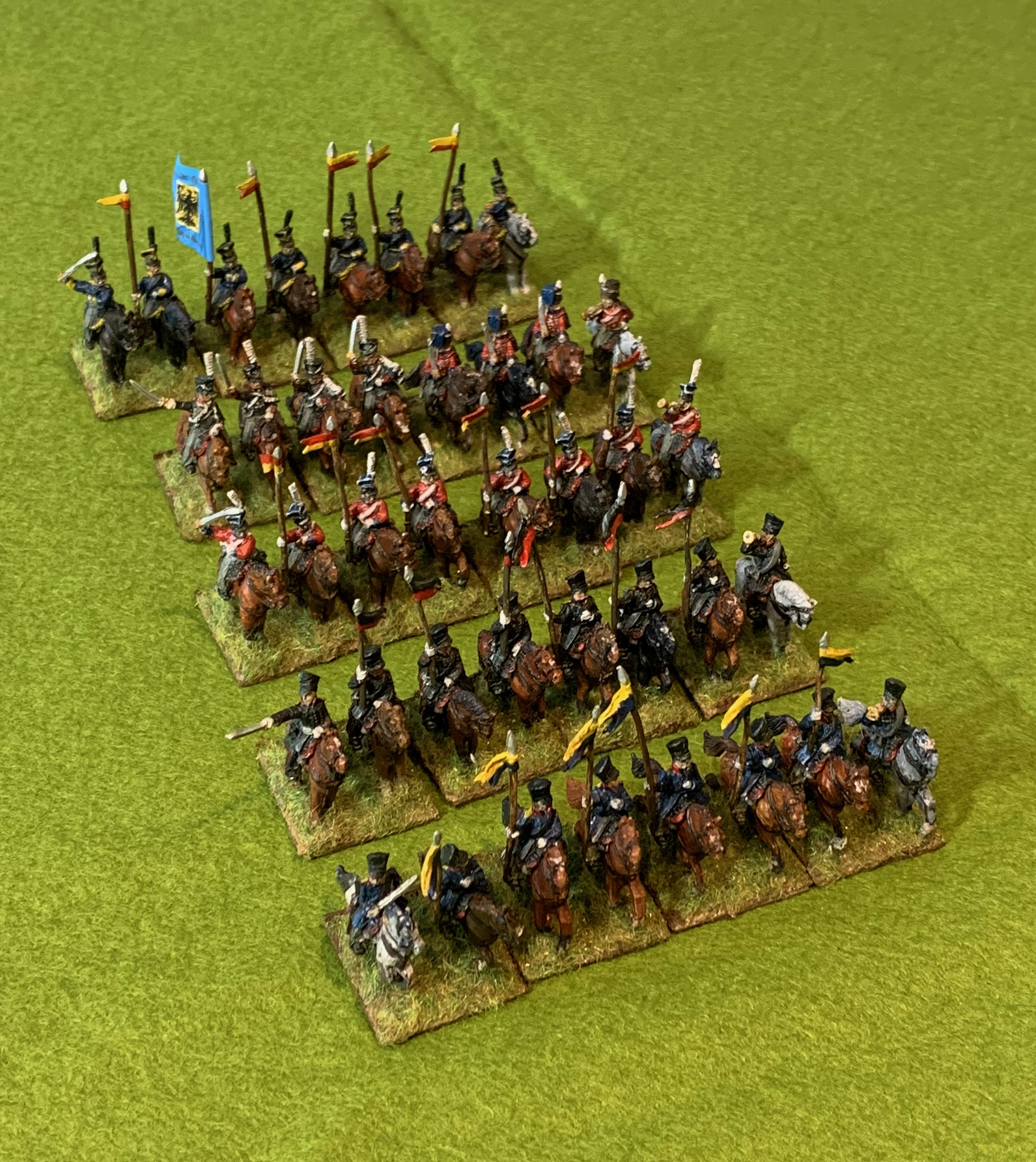
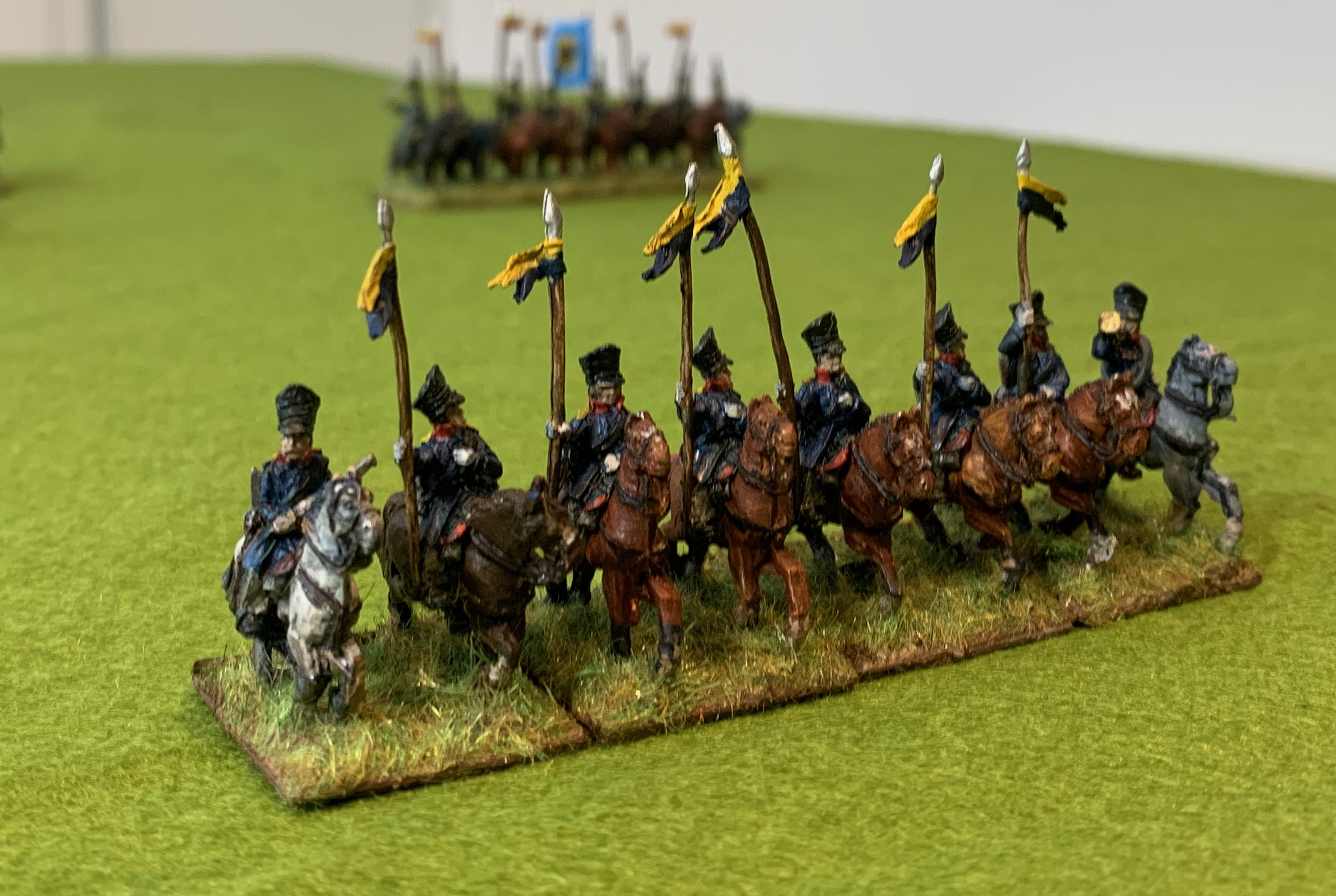
My attack on the lead and plastic mountain continues. For this project I wanted to draw a line under my remaining Old Glory Prussian cavalry. I had two packs of uhlans, with and without czapka, and a mixed pack covering Prussian friekorps, in reality a motley collection of British and Prussian figures from other packs. From these I have painted up five four-base units representing 3rd, 6th and 7th Uhlans, 8th Hussars and 3rd Silesian Landwehr cavalry. These are not outstanding examples of the figure-painters art, and there are minor inaccuracies, as well as the nonsense of that large infantry flag. But they will help to brighten up my 1815 Prussians, who can be a little dull.
The method was to paint the horses first, without riders, in batches depending on horse colour. I’m still developing technique on this. For these I tried oil paint for the first time, having read so many people recommending it. The idea is that you undercoat in white or some bright colour, and apply oil paint (Van Dyck Brown is usually recommended) over it and let it go tacky for about an hour or two. Then gently wipe off the paint with a rag from the raised areas. That leaves a patina of paint on these raised areas but deeper colour in the recesses. and it should dry to a nice off-gloss finish. After some early experiments I restricted this to bay and chestnut horses, which are about 80%. My Payne’s Grey oil paint came out very glossy and hard to work with, and this is what I wanted to use for the black horses. I wasn’t sure how the technique would work for grey and other pale horses anyway. I probably shouldn’t give up on the Payne’s Grey. Some oil medium had separated out and came out of the tube first; I may have mixed too much of this back into the pigment (I’m only using small amounts) – I think excessive oil may be the problem. All the horses were primed in white (using airbrush primer). I painted on Raw Sienna (a lovely orange-brown) and Burnt Sienna (a reddish hue) as undercoat in acrylic for the bays and chestnuts (more of the former for the chestnuts). I also experimented a bit with Yellow Oxide (a Yellow Ochre substitute), but not by itself. Then on went the oil. I rubbed it off after about an hour with a bit of old tee-shirt, better than using kitchen towel or tissue. I used various mixes of Van Dyck Brown, Raw Umber, Burnt Umber and Burnt Sienna, with a little Zinc White mixed in. The results were mostly very nice. The main learning is that it is important that the undercoat and is compatible with the oil layer – if one is yellowish and the other reddish then the effect is rather awkward. While at first I didn’t think the results were markedly superior to my earlier method of using layers of acrylic, the more I handled the figures the more I liked them; I’m not sure what accounts for this.
For the other horses (blacks and greys and a sort-of dun or roan) I used layers of acrylic, starting with Payne’s Grey. I stippled on some white on the some of the greys using the cut down brush I used for the Bf-109. I wasn’t especially happy with these and I think I need to develop technique some more here.
After the horses were painted, I attached riders, ready primed but otherwise unpainted. Nothing particularly special about painting technique to note here. As usual I used muted colours and a bit of white with almost everything. All the figures were finished in a diluted black ink wash. Time to look at each of the units.
3rd Uhlans
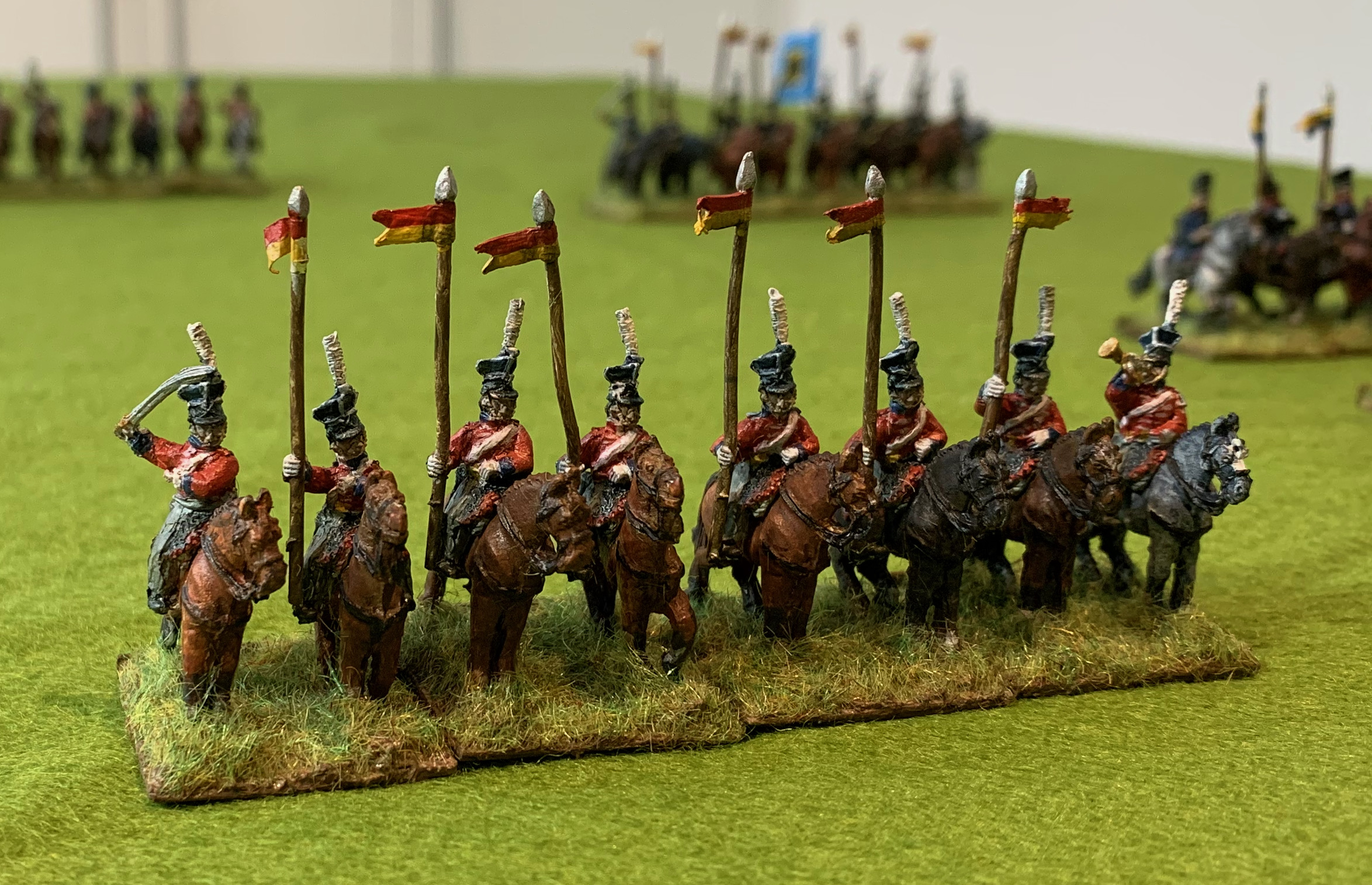
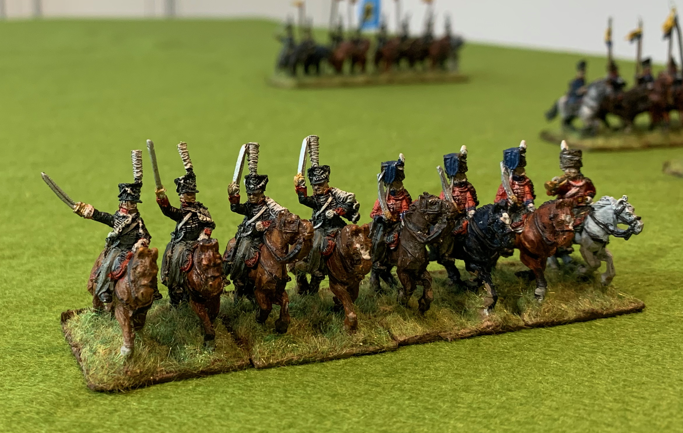
This was the only unit in regulation uniform, with a blue overcoat, red collar and grey overalls. My source for the yellow over dark blue pennons was the centjours website, as it was for all my units. The photo might be unimpressive but I was very pleased with the blue of the coats (mixed from Prussian Blue) which had just the right brightness to set off the red and yellow elements nicely. Unlike my rather disappointing dragoons.
6th Ulhans
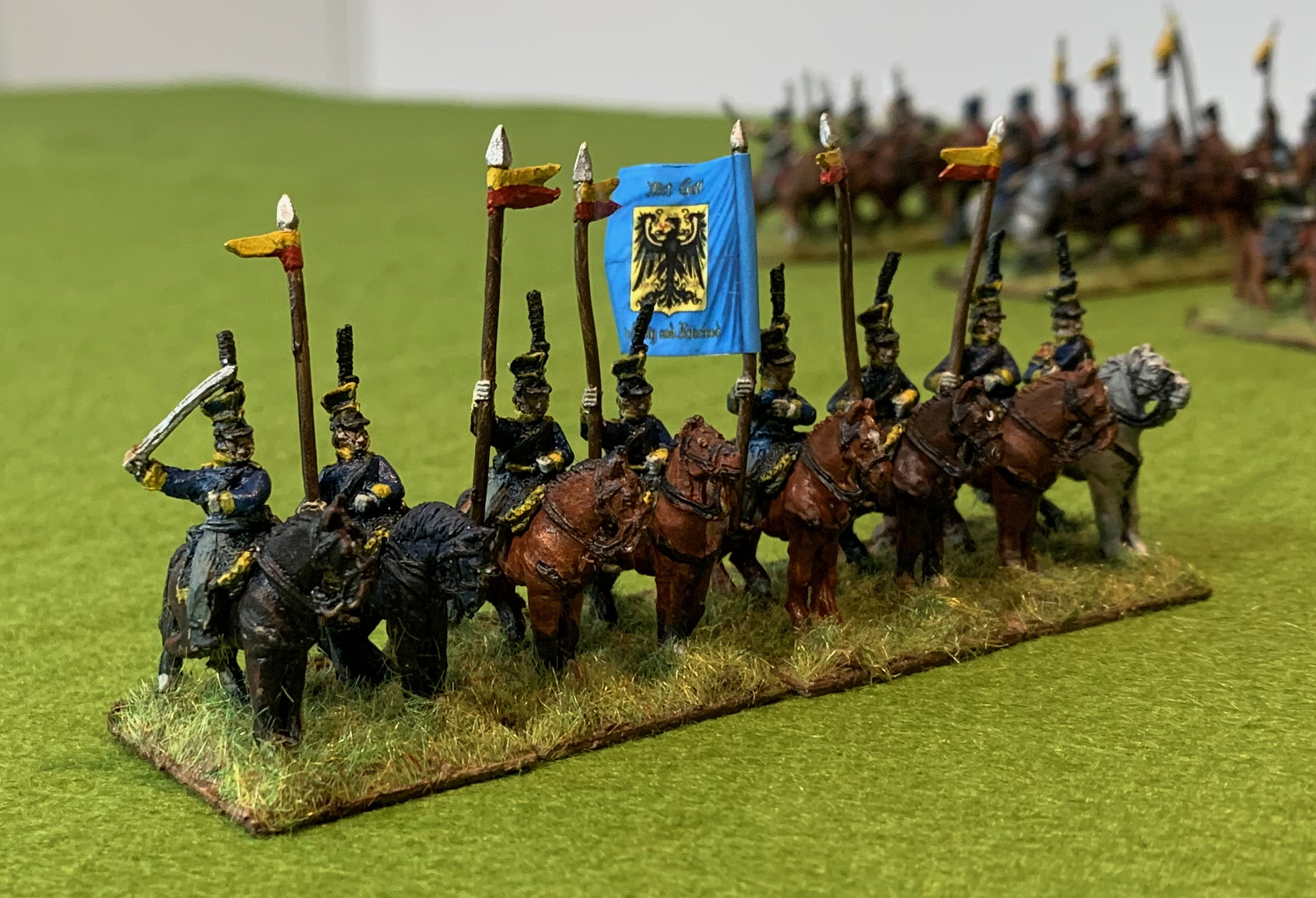
The 6th Uhlans were based on Lutzow’s freikorps; the unit was led by Lutzow himself and involved in some heavy and critical fighting, in which Lutzow was captured. I painted up the whole unit in the uniform of the first two squadrons; the third squadron had a hussar uniform and the fourth czapkas in place of the shakos. With so few figures in a unit there are limits to the variation that can be accommodated. I used standard uhlan figures, some of which were included in the freikorps pack, allowing me to dispense with standard bearers. The uniform is black with red piping on the collars and overalls and yellow shoulder-boards. Simple but striking.
7th Uhlans
This uniform is again based on the first two squadrons, which were formed from Hellwig’s freikorps. The third squadron, formed from Schill’s freikorps, were in blue British hussar uniforms. I had a rather embarrassing pack of Prussian uhlans with czapka to use up – czapkas were not incorporated into the Prussian uhlan uniform until after 1815. This unit, and the 3rd Silesian Landwehr, were as close as I was going to get, though they had lacing on their tunics – and their red jackets were very striking anyway. One problem with this pack was that it had 16 figures, just enough for two units, but including standard bearers, which Prussian light cavalry did not use. I was able to make a pennon from foil and turn one of them into a regular lancer, based alongside the officer. I did attempt to represent the white lacing with paint, but not very successfully. These are not good quality miniatures – the worst of all my Old Glory Prussians. The regular uhlans aren’t great, but not too bad by comparison.
3rd Silesian Landwehr cavalry
Here are the rest of the uhlans in czapka, this time painted as Silesian Landwehr. Apparently the 3rd regiment captured and appropriated Polish lancers’ uniform in 1813 and were still wearing it in 1815. There is no lacework this time, so the the paint job is more straightforward. This time I decided to use the standard bearer figure as designed. I had lots of spare Silesian landwehr infantry flags (from GMB). This is nonsense of course, as the flag would have been too unwieldy to use. But I thought it would add some visual drama and help mark the unit out as landwehr rather than regulars.
8th Hussars
The 8th Hussars consisted of three squadrons thrown together from different formations: the 2nd Lieb Hussars, the 3rd Hussars and Hellwig’s Friekorps (again). I have represented the first squadron, with its black uniform and death’s head insignia, and the Hellwig’s, in their red British hussar uniform with brown colpack. The figures were from the Freikorps set, originally being Death’s Head hussars and British hussars. The saddle cloths are wrong, but these are the nicest miniatures in the set and fun to paint. Overall it looks as if the British figures are amongst Old Glory’s best in the 15mm range, based on my experience with French and Prussians. Some nice riflemen came with this set too. Making a unit out of two such different uniforms is a bit awkward though, but the but these figures would sit respectably alongside the 6th or 7th Uhlans if I needed and extra base or two.
For the bases I decided to go back to static grass, and risk it sticking to the miniatures. I mount my figures on unfashionably small bases, as I want to represent the close formations the troops actually used, as opposed to the loose files. Most people use 30mm squares rather than 25mm. The bigger bases are better for showing off the paintwork, and they also allow more creativity on the bases. There is not much scope for variations my bases, so they get a uniform layer of flock or grass. No space for tree stumps, bushes, etc. This time I mixed static grass from a variety of sources, including a fair amount of beige. The mixing wasn’t overdone, so there is some variation. The beige helps lighten up the bases, part of my battle against darkness and saturation. I used a different glue this time – “strong artist’s glue”, though still a white liquid like the PVA. I did not dilute it. After plastering on the static grass I turned the assembly upside down and tapped the bottom hard, both to knock off the surplus and straighten out the strands. The results were OK, and better than normal. The strands were nothing like as straight as you can get using a static electricity applicator, but the bases are small and I don’t mind if it looks a bit trampled – it’s in the middle of a moving cavalry unit after all. There wasn’t too much trouble with the strands sticking to the figures, and when try only small amounts worked loose. This is just as well as you can’t seal static grass by plastering on dilute PVA. Overall this means that static grass is a bit less hassle than flock, a little unexpectedly, and it is especially suitable for cavalry.
So that’s all my Old Glory Prussian cavalry done. I have a few spare miniatures which will end their days in the corner of the junk box. I have just one Old Glory cavalry pack left: some 15 French lancers, which I want to turn into two units of 8 somehow. I plan just three more Prussian cavalry units; I have AB figures for one each of hussars and landwehr with British shakoes. I also want some cuirassiers for 1813 and 1814 scenarios, but I haven’t bought these yet. But I still have masses of Old Glory Prussian line and landwehr infantry. Do I have a big drive on painting these up, or do I switch to the more interesting AB figures that are also waiting for paint?
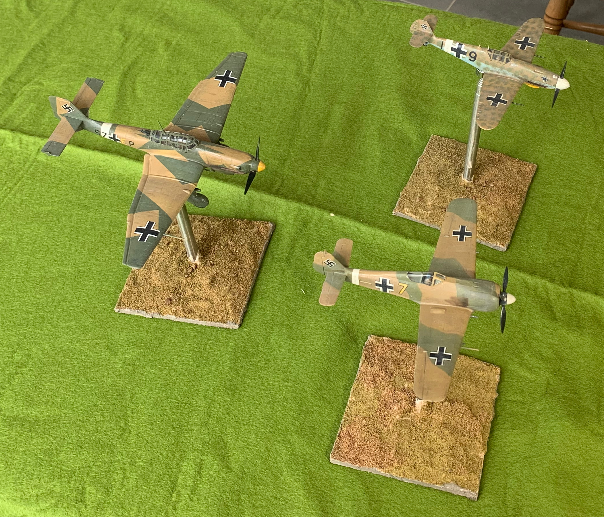
And so to the last of my trio of Luftwaffe models for Tunisia. I wanted a Stuka as it was such an iconic aircraft, and it certainly did make its presence felt on the battlefield in early 1943. But by then the plane that symbolised the terror of Blitzkrieg was obsolete. It was vulnerable to enemy fighters, and not that effective against dispersed troops and moving vehicles. Latterly the pilots only look them up when there was a lot of cloud cover, which didn’t help to find their targets. It was withdrawn to be used only well away from Allied air cover. This model proved quite hard work, however. At pretty much every stage it took me more time than the two fighter models put together.
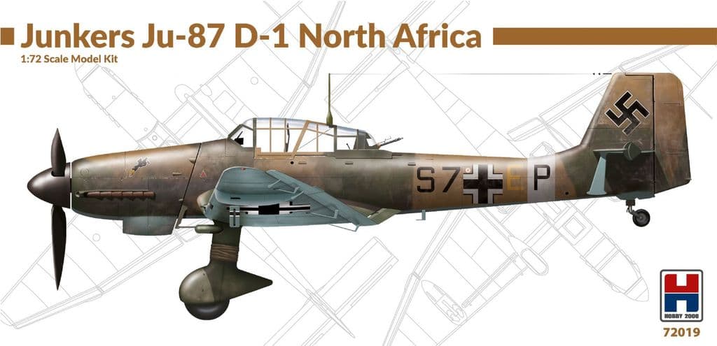
For this project I needed a model for the D, or Dora, which had come into service during 1942. Most models are of the B, which was in service at height of the aircraft’s career. There was not a great deal of choice. If manufacturers prefer the B, their next choice is the G, a similar aircraft which saw extensive service on the Russian front later in 1943 as a tank buster, with two underwing 37mm cannon. This is very similar to the D, which does not have the cannon, but does have dive brakes and bomb pylons. There was a Hobby Boss model of the D, and for once the undercarriage would not have been a problem, but this was really an adapted G without the dive brakes. Instead the best reviewed option was this one from Hobby 2000. This was in fact a reissue of a much older (1990s) Fujimi model. All things equal I would have preferred a later D5 version which had longer wings and 20mm cannon in place of the wing machine guns. But Hobby 2000 had an issue for the D1 specifically covering North Africa, including decals and colour scheme for a rather interesting one with a splinter camouflage scheme with desert sand, featured on the box art. I also bought an Eduard stencil for the cockpit frame; this is complicated and I wanted to give this method a try. In fact one of the improvements that Hobby 2000 have made is to include a stencil of their own, so I have one spare! The model includes all the parts for a G1, the version based on the D1 (and often converted from it). Hobby 2000 also have an issue for the G2, which has the longer wings of the D5. This would need to substitute the (separate) wing sprue from this model to be accurate. The model does not include crew, which I supplied from resin models bought separately (I actually used US crew as stocks of Luftwaffe ones were low).
This model is quite different to the two fighters (or the Hobby Boss P-47) that I had made previously. This is partly because it was never intended as a quick-build, and partly, I suspect, because it is much older. The build was much more complicated. This included drilling holes in the wings to accommodate the dive brakes and bomb pylons – which I didn’t discover until after I had glued the top and bottom together, and had to rapidly pull them apart as this needed to be done from the inside. Mistakes like this didn’t help, but a bigger problem was that I didn’t find the parts to be especially well-fitting. And many of the smaller parts didn’t have clear recesses to fit them into. There was quite a bit of “How is this meant to work?”. A couple of parts I left out altogether. Quite a bit of model putty and filing was needed to cover up the gaps.I suspect that this is an area where model manufacturing standards have progressed. Back in the day (by which I mean the 1970s) I remember using a lot of putty. So assembly took a lot longer than the other models. Of course it is bigger and more complicated anyway.
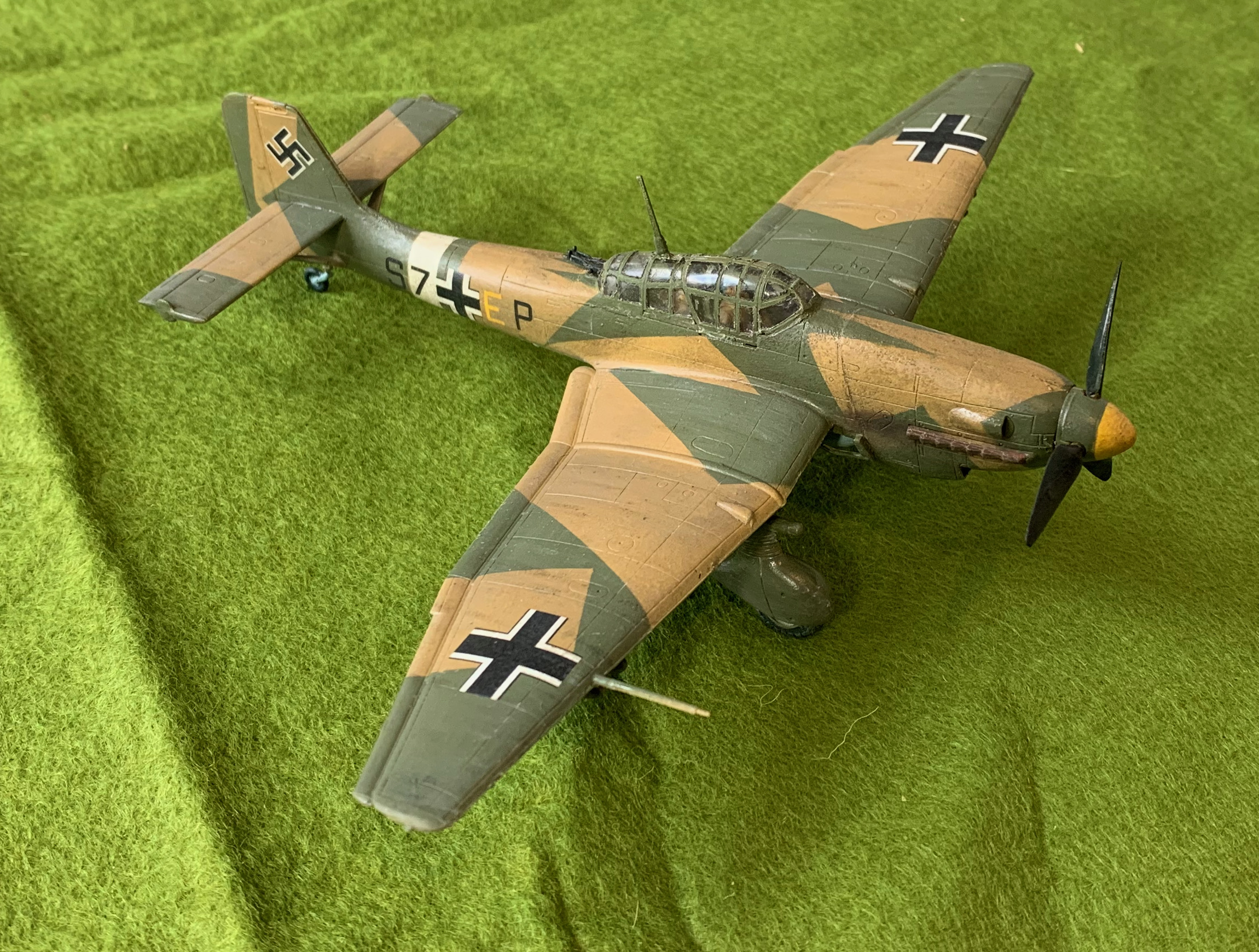
Unlike the other models I decided to use the scheme and decals in the box. This showed a rather unusual splinter scheme. The box art said that the three colours used should be the three Luftwaffe desert colours of sand, olive green and azure blue. I though that this was rather unlikely. These paints would have been applied in theatre and replicating the complicated factory patterns was not done. Instead the whole upper parts were usually covered in sand, with blotches of olive green on top of that. Instead what I thought had happened was that the ground crew had just used sand to overpaint the black-green of the standard three colour splinter scheme the aircraft would have arrived in (dark green and light blue were the other colours). This was because I noticed from the box art that it was the sand was where the black-green was on the aircraft in the standard scheme. I used the same sand as the two fighters, and mixed the other colours specially. For the blue I started with the bright blue that came with my airbrush order, in the hope that I would create an airbrush friendly paint. Alas this was much too bright. I added a lot of white and brown to cool it down. I didn’t really succeed, I ended up with far too much paint and something too dark and too blue – it was hard to distinguish from the separately mixed azure I made for the Bf-109. The dark green was hard to judge. Studying pictures the contrast with black-green is not that great, so I was quite happy that I had a reasonably authentic colour. But there was a very strong contrast with the sand, when I had been hoping for something much closer to the box art.
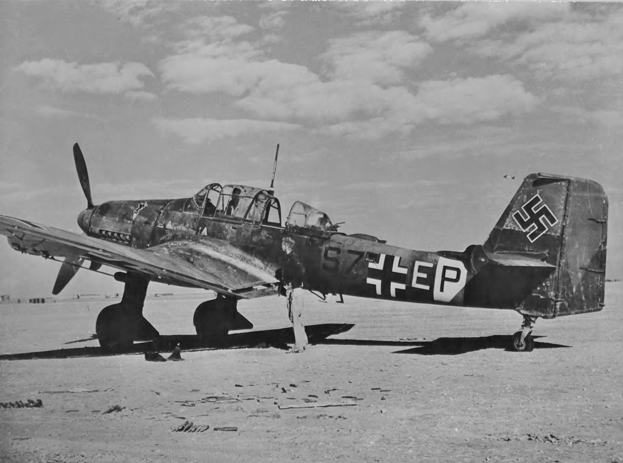
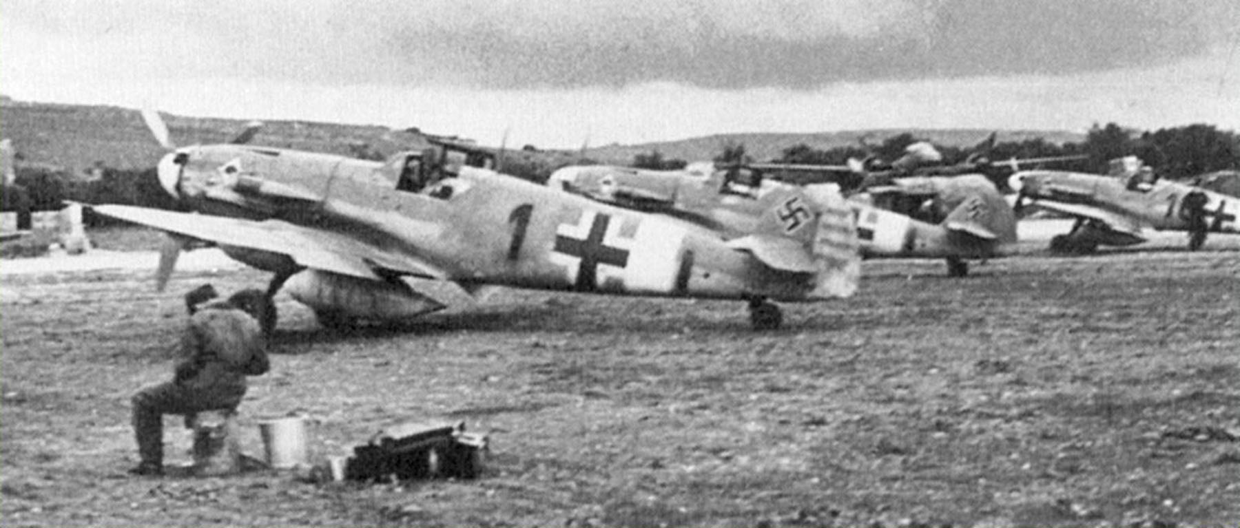
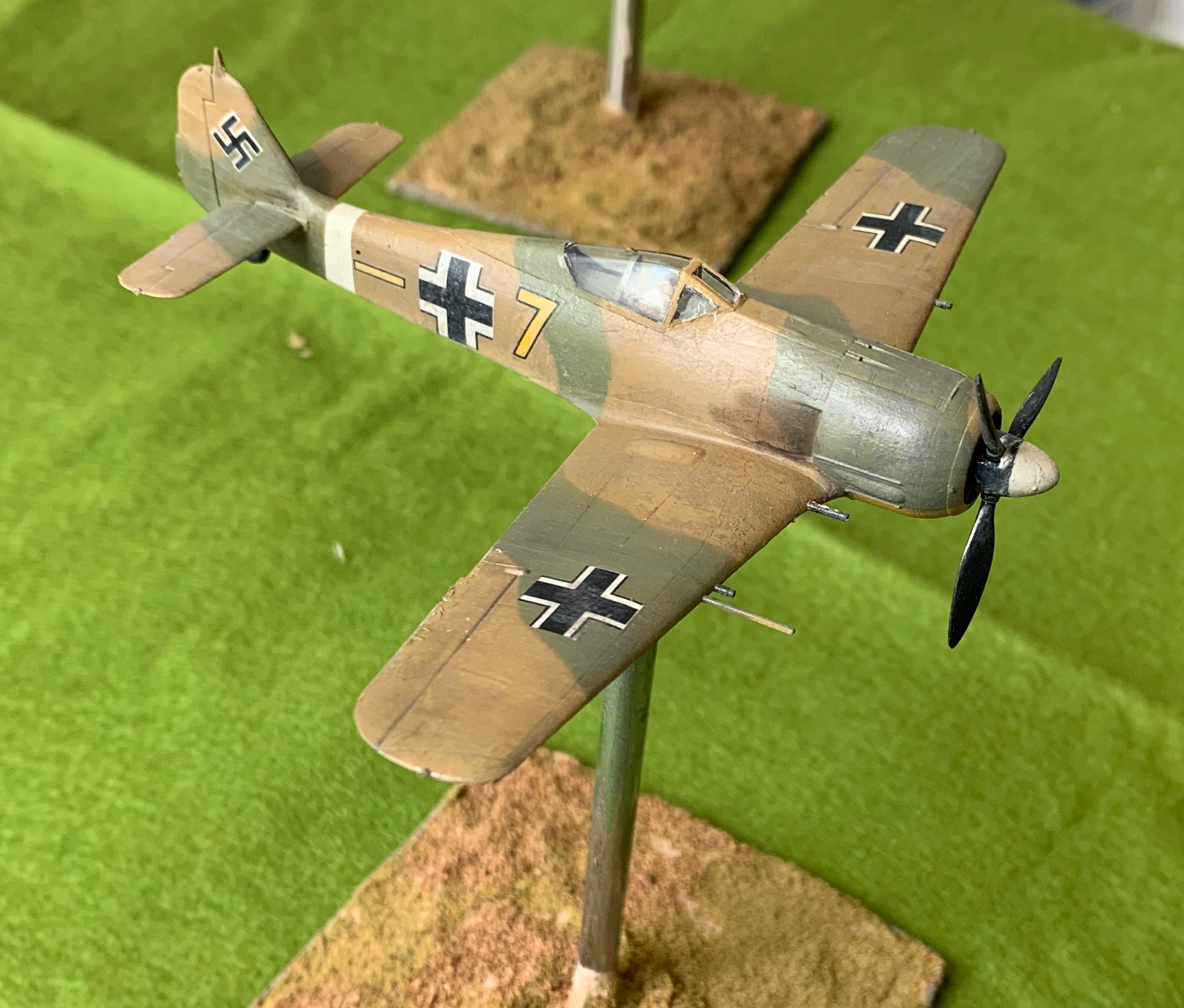
I then saw another interpretation of this aircraft (S7+EP) in the Osprey book on Mediterranean Stukas (which arrived too late) in just the standard scheme. I have only just now discovered the source picture (above) and looks as if Osprey has it right. Look how the yellow E stands out and the black S7 doesn’t. I also made a mistake in the positioning of the white fuselage stripe, which I put further forward than it should have been. This was entirely my mistake as the box art had this right – though a lot of Stukas did have it in this more forward position. So that leaves me with an irony; this is the only plane I have made so far which is based on an authentic aircraft rather than a generic one – and I’ve got it wrong! Researching aircraft colour schemes is all part of the fun, but I’m learning it the hard way.
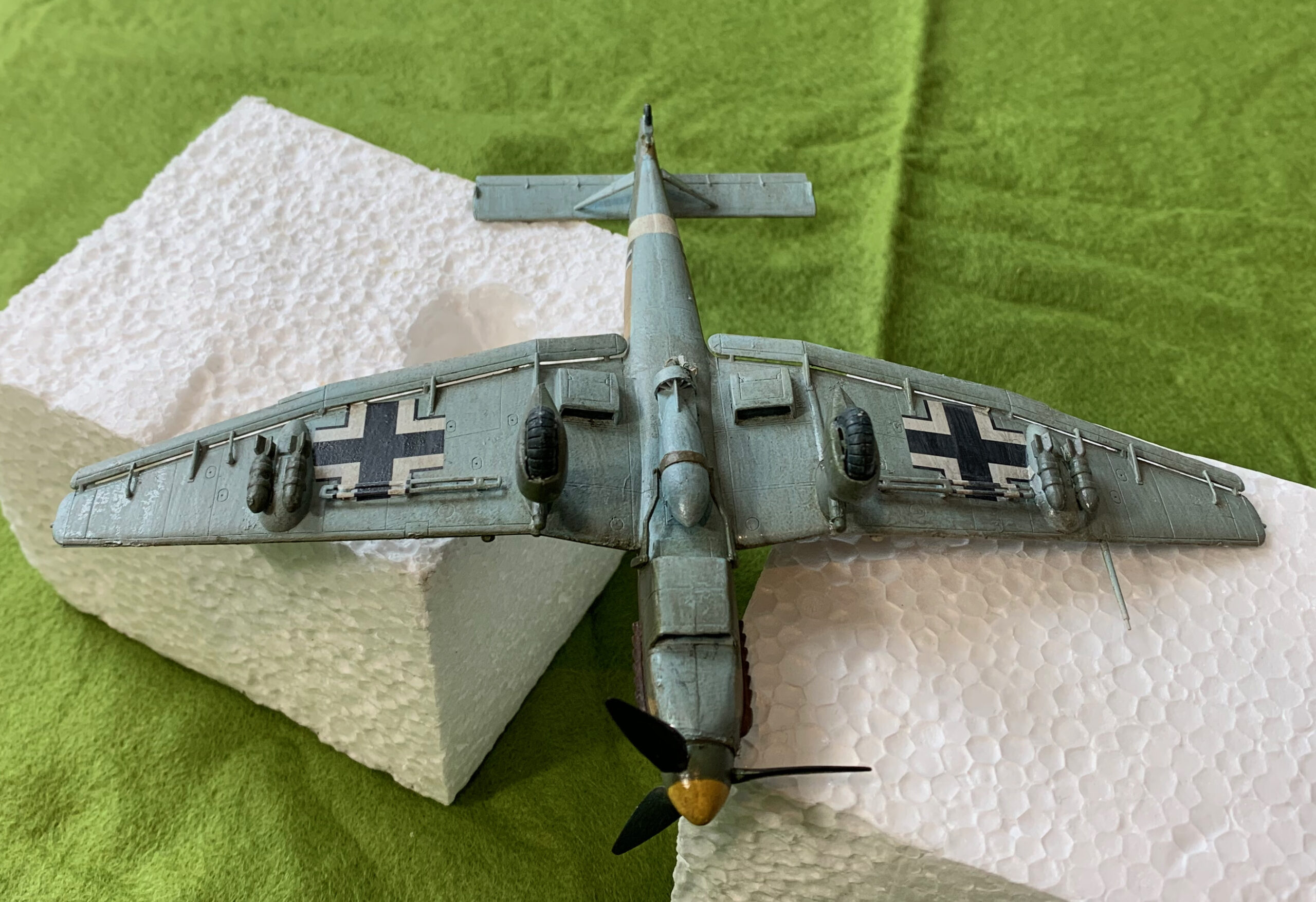
The paint was mainly applied with the airbrush. I had similar difficulties as the other planes with the paint consistency, but apart from spraying a bit of the green on the undersurfaces by accident (I though it would be easier to use the airbrush on the undercarriage than it was) I did not need much correction using the paintbrush. I achieved the splinter by applying the green over the sand, using masking tape. The tape took a long time to put on, but the effect is stunning, however unrealistic. Here is the underside:
Apart from the swastika I used the decals that came with them model. These proved quite hard to move into position, regardless of using generous quantities of fluid – much harder than for the other models or for the 40+ year old ones from stock. The underwing crosses were especially tricky as the air brakes and bomb pylons got in the way. A little cutting was needed. Hobby 2000 supplied the stripes to be applied on top of the air brakes (so that the cross comes out from below); these were a bit fiddly but not quite as hard to put on as I feared, and do look good.
I did the patination after my near-death experience on the fighter models, and I was very hesitant, after all the time I had already lavished on this model. So the upper surfaces look quite fresh, rather than trying to get anywhere near the weathered look you can see on the photo (though in that picture we don’t know how long the plane had been left abandoned for). Still the patination helps to integrate the colours and decals.
Another job that took quite a while on this model was the canopy, as there were many panels on the stencil to first put on and then take off. The result is OK but not better than would be achieved using the old-fashioned paintbrush method – albeit that acrylic paint doesn’t stick that well to the acetate, so you need a primer.
A lot of effort resulted in a nice-looking but unrealistic model, which is only relevant for the first part of my period. But you can’t have a collection of WW2 Luftwaffe aircraft without a Stuka.
And so to the next model in my trio of Luftwaffe Tunisia planes. The 109 was the workhouse German fighter arm throughout the war. They used no other fighter aircraft in the Mediterranean theatre, apart from the brief intervention from the Fw-190s of JG2. I wanted to go for one of the earlier G models. These are very similar to the F, whose introduction give the RAF such problems until the Spitfire V came along. The G had an engine upgrade, giving it superior performance; these early Gustavs appeared in mid-1942. Later ones (like the G-6) had an upgrade to the fuselage machine guns, which necessitated the characteristic blisters each side of the nose in front of the cockpit.
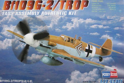
I chose the Hobby Boss kit because it was cheap and simple – just what I wanted when I was still learning how to do model aircraft. I had already bought the Airfix 109G-6, which is suitable for later in 1943. This is probably quite a good kit for my purposes but to represent the G2 would meant removing those blisters – which would be very hard to do cleanly. In fact Zvesda produce what is probably a more suitable model (actually of an F, as well as a later G). I had already experienced Hobby Boss with my P-47, so I knew what to expect. The big problem is that it does not have an undercarriage up option, in spite of the box art (which says it all in my view!). The model is simple and robust apart from that. It actually had more interior cockpit detail than Airfix, though it necessitates the amputation of the lower legs of the pilot. The join between the upper wings and the fuselage wasn’t seamless, and required filing, putty and sanding. The fit of the cockpit canopy wasn’t quite right either (which I failed to rectify). Otherwise my only complaints were that the scoring to denote control surfaces is a bit shallow (like the P-47) and it doesn’t come with a bomb.
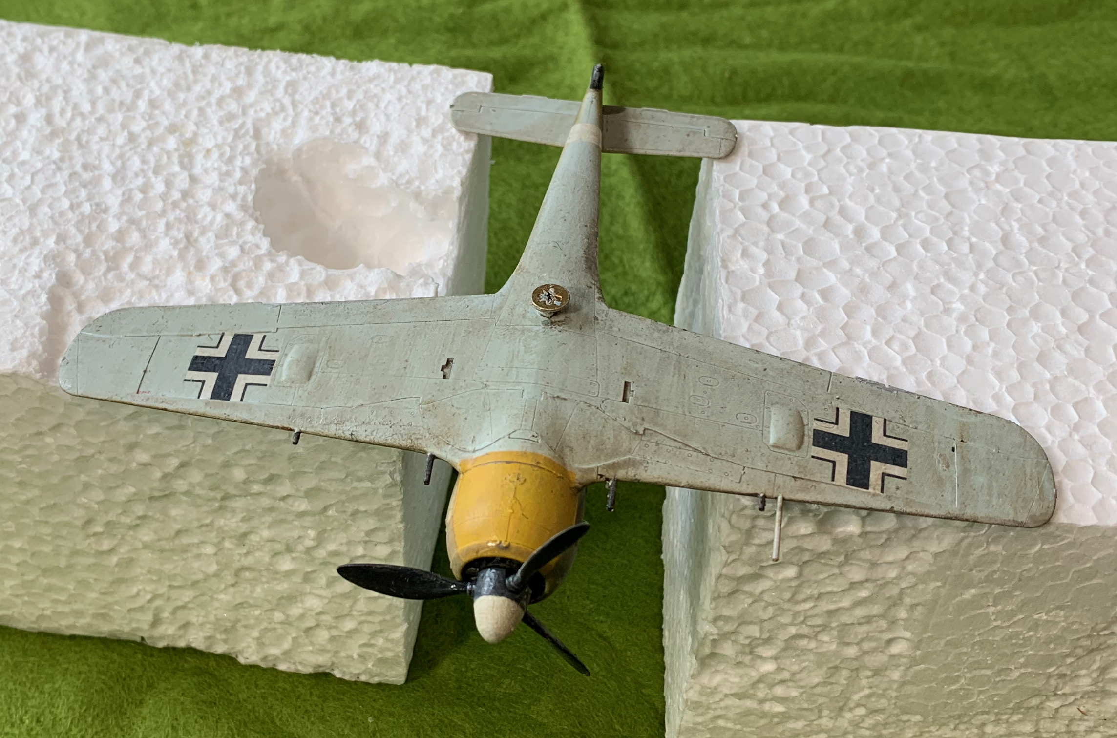
I wanted to represent an aircraft in the classic Luftwaffe desert scheme (as per the box art) overpainted with Olive Green splodges, doubtless to fit better with winter in the greener environment of Tunisia. The model came with decals for such a plane – Yellow 13 from JG53. But this was the plane of an ace pilot (with victory marks on the tail), who was lost in Tunisia. I wanted something more generic. The simplest thing to have done would have been to use the same scheme with a different number (as I did with the Fw-190). But doing yellow number with a black outline looked a bit tricky at the time (in fact I managed it for the 190 without difficulty). I wanted to keep the Ace of Spades insignia for JG 53, so I went for different Gruppe and Staffel – black letters with a downward stroke after the fuselage cross and white band. I was inspired by a picture of Black 1 (see above – another ace, as well as staffel leader), with some aircraft in the background. Evidence for the actual schemes is pretty thin. I have seen Yellow 13 represented with and without the green splodges, and with different shaped ones. Black 1 is usually shown in a very mucky version of the sand and azure scheme without the olive green (a fair interpretation of the picture). It’s actually quite hard to tell on the planes in the background in the picture, especially if the olive green has a similar tonal value to the sand (as was the case for my 190 – but not pictures from earlier in the war), though it should still show up against he blue. I wanted the splodges (“dappling” is the correct term, I think), to help me develop technique for my next batch of German aircraft in the standard grey scheme, which have dappling on the fuselage. Some modellers show splodges on the fuselage and stripes on the wing. I went for splurges on the wing too, following one of the interpretations of Yellow 13.
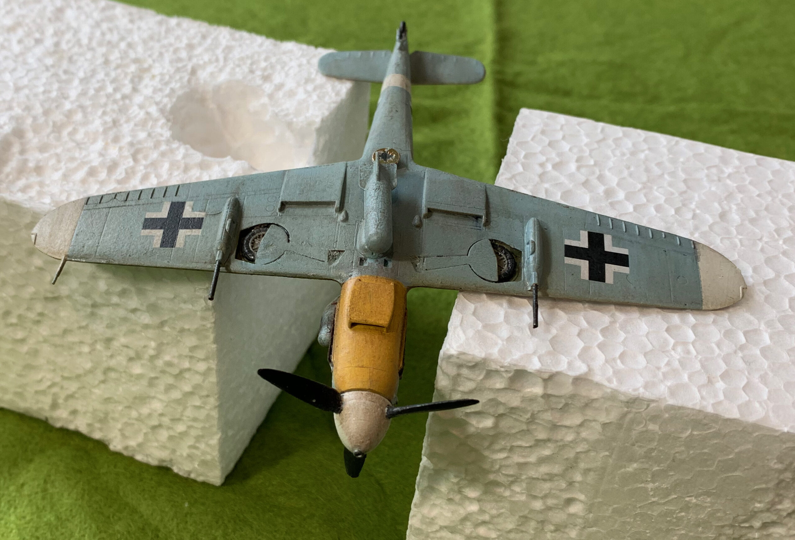
As with the 190, I had to make decisions about the yellow and white markings. The JG53 109s clearly often had yellow rudders and under the nose. Black 1 had what looks like a yellow rudder – but it looked to me that this was to show off the pilot’s awards and kill marks; it wasn’t clear if the other planes in the background had it. I decided to leave out the yellow rudder, but, like the 190, to have yellow under the nose. I also had white wingtips underneath, following quite a few portrayals of 109s in the theatre. Desert 109s often had white wingtips; I think they were often left off the upper surface to make them less conspicuous on the ground, especially later on. Finally I decided to represent the plane in fighter-bomber mode. Unlike the 190s used by JG2, the 109s do seem to have been able to carry bombs. British soldiers often wrote of being attacked on the ground by “Messerschmitts”, and they were certainly used in this capacity in Sicily. The ID skills of British soldiers isn’t to be relied on though. I suspect a tendency to identify all single engined fighters as 109s, and there were fighter-bomber 190s in theatre (funnily enough aircrew often identified 109s as 190s, such was the reputation of the 190, rather as their army colleagues kept identifying Panzer IVs as Tigers). Anyway as my 190 was a pure fighter, I wanted the 109 as a fighter-bomber. More straightforwardly I put on underwing cannon too, though I don’t know if this staffel had them (though it does look like it from the picture). The early 109 is a bit under-armed, and I am speculating that the extra engine power of the Gustav gave pilots the confidence to take the performance hit of the extra armament.
And so to the build. The biggest problem by far was having the undercarriage in the up position. The wheel wells as modelled were very shallow, and the wheels needed a lot of filing down to fit in. The doors were a poor fit too. I actually found that the doors from the Airfix 109 (those for the down position – they had a different moulding for up) were closer and used them instead. It still took quite a bit of work. As I eventually did with the P-47, I set the doors in plasticine to ensure they were flush. I needed to provide a pilot – I used a resin one from PJ Productions. PJ seem to have this market to themselves, which I find amazing. They are nothing special, and have arms moulded separately, which are tricky to glue into place. Resin is very brittle for such small things. Considering how easy it would be to provide a pilot with the model (as well as undercarriage up), I find it amazing that so few people do it. Only Airfix and Zvesda in the models I have bought. It is even more surprising that Hobby Boss don’t, given that there is surely more demand for this at this end of the market. The cockpit interior, while modelled (an advance on Airfix, which just has the seat), is too shallow, like the wheel wells, which meant that the lower legs of the pilot had to be removed. I have already referred to issues on wing roots (which meant that some panel details were filed off) and cockpit canopy, which I’m sure I could have done a better job of. Incidentally I fixed the canopies in place before painting the exterior in all my models, as I wanted to putty the joins for the non-moveable bits. For this model I masked the whole canopy, apart from the edges, and painted in the frame later. I added a bomb from the Airfix model, which I indent to represent s a pure fighter. There was no means of anchoring it to the pylon though, and it ended up a bit skew.
For the paint job I used the same sand and olive green mixes as the Fw-190. I mixed an azure blue for the underside. I started with an Azure Blue from Daler Rowney, and added a bit of white and neutral grey (and maybe some brown – I can’t remember). The result was pretty much what I was looking for, but disappointingly similar to the standard Luftwaffe light blue I used for the Stuka – mixed by a totally different route. I had fewer problems with the airbrush on this model than I did with the Fw-190. I think this may be because the mixes made up from artists’ paints are a bit thick, though I used copious amounts of thinner for the brush. Anyway I have more to learn on that front. I applied the blue and sand that way. For the olive green dappling an experienced aero-modeller would have thought nothing about using an air brush too – but my skills are nowhere near that level. My first idea was to use cotton wool buds – but these are quite absorbent, using a fair amount of paint that never gets on the model, which then proceeds to dry. Instead I decided to do what I did back in the 1970s – create a stipple brush by cutting down an old paintbrush. This worked adequately, though on one side of the fuselage I got the paint a bit thick, which proved quite hard to undo and redo. The result is still a bit mucky (it’s the other side from the photo above) – though the for the scheme and theatre that’s not such a big deal.
For the decals I used a similar solution as for the Fw-190. The fuselage and lower wing crosses were from the kit (rather better quality than the Zvesda), but it came with the simplified upper wing crosses. I used old Almark decals for the upper wing crosses, the swastika and the number and stroke (which identifies the Gruppe). All pretty straightforward. The stroke came from a separate sheet from the numbers, and is in fact too thin, looking again at the photo. The kit came with Ace of Spades markings, but without the black outline which pretty much everybody shows they had. I had quite a few spares from the old Airfix 1970s 109 model. These broke up slightly and I lost part of the outline (on both sides). Looking at the photo, the border is in fact very thin and the ones with the kit may have been a better choice.
This model suffered much the same problems with the oil paint patination I have described on the 190, with the additional issue that I think I overdid the white on the upper surfaces. The model still looks slightly milky even after the frantic attempts at correction. Here is the underside:
Apart from the skew bomb (which doubtless I will correct at a later point), I was actually quite happy with the underside, unlike the Fw-190. That may just be because there is more going on, with the vents, cannon and exposed wheels, and the colour is more interesting. I wasn’t sure what colour to paint the bomb. I read that the Luftwaffe often painted them blue to fit in with the underside colour, so I chose this. I used my standard Luftwaffe blue mixed for the Stuka (also used for the Stuka’s main bomb) – you can see how little contrast there is. For the exhaust stain I used powdered artists’ pastel, a mix of dark grey and brown. Looking at the photo I could made it quite a bit bigger.
Overall I’m pretty pleased with this model. Incidentally I didn’t notice the white splodge on the nose when I took the picture. I don’t know what it is, but it came off quite easily. Next I will describe the final member of the trio, the Stuka.
And so to the first of my three recent models of German aircraft. The Focke-Wulf Fw-190 A4 is one of the earlier models of this classic fighter aircraft. The 190A is one of my favourite WW2 planes from an aesthetic point of view, up there with the Mosquito and Spitfire Mk VIII/IX.
I wanted to model one of the early variants, which were around in early 1943, in one of the Mediterranean camouflage schemes. These early planes were slightly shorter than the later ones (from the A5 on, and the F series of fighter-bombers), which had the engine pushed slightly forwards to shift the centre of gravity, to ease the carrying of bombs. To meet my aim meant going for one of the pure fighter planes in JG2. Some early fighter-bombers were deployed in Tunisia at this time, but they seem to have used the standard European grey colour scheme. This would have made them look very like the A5 fighter-bomber that I plan to make later on. Given this, the Zvesda kit pretty much chose itself. Most models, like the Airfix one, of the 190A are of the later A8, which belongs to 1944. And I wanted a simpler, cheaper model at this stage in my modelling journey.
The Zvesda kit was an excellent choice. It has an undercarriage-up option, and comes with a pilot. Better than that, the fit of the parts is excellent; it needed very little filler. How unlike the kits of my youth! And also better than the low-cost Hobby Boss models. It sells as a snap fit model, without the need for glue. I did use glue, but it was only actually needed it in one or two places. I have just one significant complaint – the Fw-190’s tail wheel partly retracts in flight – but on the model it is in the fully down position. It was a bit tricky to replicate the retracted version. The decals aren’t great either. The only other point to note is that there are no bomb racks included with this kit to make a fighter-bomber version (which would also require the removal of the outer wing cannon) – though not many of these entered service for the A4. Sometimes kits are supplied with extra parts to make different versions, even ones for which instructions and decals are not supplied – not this one. Based on this kit though, Zvesda are the ideal maker of 1/72 kits for wargames purposes. The shame is that they only have a limited range of models. It looks OK for Russian aircraft (unsurprisingly), but otherwise it’s thin. There is no later, or fighter-bomber, version of the Fw-190 – a bit strange given how big a role this aircraft played on the Russian front. But there are a couple of Bf 109s, and they might be a better source for these than the Airfix or Hobby Boss kits that I have bought.
II Group of JG2 (Staffels 4, 5 and 6) was sent to Tunisia in November 1942 as part of a general rush of German reinforcements to this theatre – the unit had been based on the English Channel (the aircraft in the Imperial War Museum that landed in England in 1942 by accident was from JG2). They stayed until February 1943, and were the only Fw-190 fighters to be deployed in the Mediterranean in the war, as opposed to fighter-bombers. Only 109s took up the fighter role for the rest of the war, in a demonstration of the economic principle of comparative advantage – the Fw-190 was generally thought to be a superior fighter to the 109, but the latter was a much inferior fighter-bomber. What colour scheme? The Luftwaffe Mediterranean schemes were always ad-hoc, and that applies even more to Tunisia; there was no manual. Tunisia itself in winter was quite green for the most part, meaning that many of the aircraft rushed in were not given a new paint job at all, like the Fw-190 fighter-bombers. However there is evidence that at least some of JG2’s were. Unfortunately there are very few photos, and even fewer of them are available on online searches, so I’m relying mainly on secondary interpretations. The kit comes with decals for White 14 from 5 Staffel in Tunisia. This appears to simply have blobs of overpainting on the conventional grey scheme (and with the white on the fuselage Balkenkreuz painted out). This wasn’t very interesting. Two other schemes come up in searches: a group staff plane (with black chevrons) in overall sand upper parts, and Yellow 1 from 6 Staffel, either shown in just sand, or in sand with broad olive green stripes. Yellow 1 (1 denoting staffel leader) was flown by fighter ace Erich Rudorffer. I wanted the sand and green scheme, which would give me practice for the similar British schemes (sand and brown stripes), but I didn’t want a famous ace, but something more generic. I decided to do one from the same staffel but with a different number (seven in the end) – fictional, perhaps, but the sort of generic thing suitable for the tabletop. Details on Yellow 1 vary on the illustrations. Sometimes it is shown with white wing stripes – markings which were apparently used by German planes in Vichy France, but these would not have appeared on planes in Tunisia. Also shown are white underwing tips, yellow under the engine cowling and a yellow rudder (as well as the white fuselage stripe which almost all Axis planes in the theatre had). All of these appear on German fighters in the theatre, but not universally. The yellow markings were also used by JG2 planes in their previous posting on the Channel. My speculation is that the upper parts of the planes were overpainted in sand and olive green, but the underparts were left in the pale blue-grey of the original scheme (rather than azure in the German Mediterranean set). Winter in Tunisia wasn’t particularly sunny (it rained a lot), so there was no good reason to overpaint the underside. Besides a large part of the use of aircraft camouflage schemes in this theatre was to make the planes less conspicuous on the ground, as the airfields were quite basic, and there was little cover. Even the Americans were forced to do this in 1944 when they stopped painting their aircraft at the factories. So, I reasoned, they would have overpainted the yellow rudder but left the yellow under the cowling. I wasn’t sure about the white wingtips, but these aren’t very conspicuous, so I left them out.
Here’s the finished model:
And underneath:
There’s not much to note on the build. It was very straightforward apart from the tail wheel. I used the airbrush to prime, but this time with LifeColor purpose made white primer. This went on more easily than standard paint, but there was still a slight tendency to bubble (even though the parts had been washed). The sand and olive green were mixed for use on this and the other models – the sand on all three models, and the green with the 109. The pale blue grey (“white-blue”) was mixed just for this model. I took the darker light blue I used for the Stuka and mixed some white into it. It should probably have been a bit greyer (on the Stuka too). The sand was Raw Siena with a bit of blue and white – and I am very happy with how that turned out. It’s a bit darker than it is often shown, but close to many representations of this aircraft. The olive green is usually shown as been noticeably darker than the sand (which comes out on may photos) but in this case I thought it would be tonally similar. One the one photo I have of Yellow 1 (showing just the nose) the stripes are nearly invisible. I started with Sap Green, mixed in some Yellow Oxide and white. That works well on this model.
I have already written of my traumas at the painting stage. I painted the whole upper surface in sand, and then over sprayed the green on top, using Science Putty for masking. I used this product as an alternative to the more expensive “Panzer Putty”, and it worked pretty well. However the problem with it is that it moves, so you can’t leave it on the model for long. Blue Tac is probably more appropriate. I had to top up a lot of the airbrushed green with a paintbrush. For the decals I used the Balkankreuz that came with the model for the fuselage and underwing, but they supplied the simplified cross for the overwing, which didn’t seem to be accurate. At this stage, and in this theatre, the Germans seemed to use the standard cross with a thinner white band. This, and ID markings and the swastika were all sourced from my brother’s stock of German markings from the 1970s (or even late 1960s), mainly from Almark. Almark still seem to be going, though Scalemates says they started in 1975, my brother’s main modelling activity in 1/72 was long before this, and I generally only needed the swastikas for my models at this time, so I don’t think I bought these. Zvesda do supply swastikas, but, doubtless for legal reasons, they are cut in pieces and a faff to put on. The old decals took a little while to free themselves from the backing paper, but then were fine to manipulate – actually easier than many of the modern ones. Using decal fluid the flash, a big problem back in the day, disappears – though it didn’t help that we usually applied them to matt enamel painted surfaces. For the ID markings I had to put on the yellow markings first, and then the black outlines over them. I am very pleased with how they turned out.
Overall I am very pleased with the result on the upper surfaces, in spite of the nightmare on the oil paint patination. The LifeColor matt varnish has left a faint sheen (or maybe it’s the oil coming through) which is just what I wanted. While American planes in the Olive drab scheme often appear in a very matt finish, this seems less true of Luftwaffe planes. Doubtless the crews kept the planes clean to extract every ounce of aerodynamic performance. The whole effect is cleaner than the P-47, but consistent with a recently-painted aircraft. The patination nevertheless helps to integrate the whole model, including decals, and give it more of a real-world feel. The underside is much less satisfactory. The main problem is that it is too monotonous. Some of the detail could have done with being brought out. The fit of the undercarriage doors is so good you can hardly see them! The patination effect is also much more visible and makes it look a bit mucky. That’s not unrealistic in itself, remembering that this is the bit that wasn’t overpainted, and the underside would have taken a pounding from dust on take-off and landing, but it still doesn’t look quite right. But after the traumas with the oil, I wanted to draw a line under the project, and had no wish to spend yet more time trying to fix it. The underside is not going to be that visible on the table after all.
So at last I have finished my latest project. These are three German planes from Tunisia at the winter of 1942/43: a Messerschmitt Bf-109G2, a Focke-Wulf Fw-190A4 and a Junkers Ju-87D1 Stuka. I want to describe each of these planes individually in separate posts, but before that there are a few things I want to say about the project as a whole.
The project was quite a late idea in my plans for an aircraft collection based on my 1943 theme. The P-47 was an interesting trial run, but I thought it would be a good idea to do some more practice on cheap models, before launching into some of the more sophisticated (and expensive) kits that I had bought. I was also a bit short of German aircraft (three from the original ten). This wasn’t so inappropriate given that the Germans rapidly lost air superiority in this period, but at the start air superiority was fully contested. Also I had planned to do the three German aircraft in the standard European grey scheme. But in the early period, in Tunisia, they used their desert colours as well, adding some more interest. And they also used Stukas, which I wanted to model, though increasing Allied air strength quickly drove them into a very minor role. So I bought cheap models of the early versions of Bf-109G and Fw-190A in use at this time, the former from Hobby Boss (£6.25), and the latter from Zvesda (£8.50). For the Stuka I went to Hobby 2000, which was substantially the 1990s model from Fukashima; this was a bit pricier (£11.80), but not in the same bracket as modern hobby models.
The project took a lot longer than I expected, and I had some more learning to do. This was mainly due to my daily routine, which only allows 2-3 hours in the afternoons for the hobby, and very often it proved not possible on that day. To improve my work rate I will have to do some morning time too – fortunately my other commitments are easing, so that should be doable (though there’s more to be done in the garden…). But there were other issues. I had the same problem with raised undercarriage with the Bf-109 as I did with the Hobby Boss P-47, and only the Zvesda model came with a pilot. The Stuka proved quite tricky to assemble. There were some fiddly parts, some of which I gave up on, but a bigger issue was that the fit of the parts wasn’t that great, especially when compared to the lovely fit of the Zvesda. Manufacturing standards have clearly improved. But the real problems came with painting and finishing.
I am still learning with the airbrush; it feels like one step back for every two forward. Partly this is because I mix my own colours. I quickly found this easiest with artists’ colours, rather than using hobby paints (a few Lifecolor ones came with the airbrush). But that gives quite a thick paint that needs to be thinned. Getting the consistency and pressure right was quite hard, especially as things seemed to change as the job progressed. It took longer than expected, and a lot of the green on the Fw-190 turned out to be too thin, and I had to top it up with an old fashioned brush. I would not advise people to take up an airbrush for aero-modelling unless they are quite happy to learn new skills. For wargames purpose I’m, sure you can get satisfactory results with a paint brush, provided the paint isn’t too thick, which may mean you use more than one coat.
The real problems came when I tried the oil paint patina technique for weathering the model – referred to as “dot filtering” in the blog I picked it up from, which isn’t very informative. This means putting small dots of oil paint on the model (such as white, brown and blue-grey) and then brushing them into a very thin patina, which I did after the decals in order to integrate these better. It softens contrasts, creates subtle changes of tone, and simulates some of the effects of fading and dirt. I found this not to hard on the P-47, especially as I could correct over enthusiasm with a bit of white spirit. On that model I applied the oils to a surface on old Humbrol enamel satin varnish. This time I thought it would be clever to to apply a coat of matt varnish first – using Winsor & Newton in an aerosol can. Bad idea. I tried with the Fw-190 first, and I found that the spreading of the paint on the matt surface was much harder and it was not possible to spread the paint thinly enough, which left heavy streaking. So I put a bit of white spirit on. That didn’t help because it reacted with the matt varnish to created a horrid claggy mess. By this time the disease had spread to the 109, as I tried a more restrained application of paint, but without success. This was getting desperate. The models were cheap but I’d invested quite a bit of time in them! I then tried oil paint medium (mainly linseed oil) to thin the paint, and this at last started to shift the streaks and help lift some of the clag off. On the 109, on the unrated areas I applied a layer of medium first, and put the dots onto this, with reasonable results. With a bit of work I got to a generally acceptable result on the two fighters, though close examination reveals areas of mess, especially on the 190. The big problem with this approach came later. The medium took days to dry, and finished in high gloss, rather than the rather nice faint sheen I got on the P-47, before putting on the matt varnish. I had been aiming for that light sheen rather than the heavy matt of the P-47. I had to apply matt varnish, but I didn’t want to use the W&N aerosol, partly because it meant re-masking the cockpits, and partly because I wasn’t looking for the extreme matt finish that this product gives. Instead I used Lifecolor varnish applied with a paint brush. Some of the medium clearly hadn’t quite dried, though, and the gloss finish kept bursting through. After this I had very little patience for further weathering, though I did apply pastel powder for some exhaust stains.
With this disaster unfolding on the 190 and 109, I realised I needed to do something different on the Stuka. I put a layer of Lifecolor gloss varnish onto the matt surface, and applied the oil paint to this. This worked much better, but in places I was still a little heavy-handed, so I put on a little oil medium to thin out. This worked, but I had the issue with it taking a long time to dry. I didn’t dare use the white spirit as the Lifecolor product wasn’t polyurethane (or that old Humbrol product), and I thought it might react in the same way as the matt varnish. Judging by how effective white spirit was on shifting dried varnish on a brush I forgot to clean, this was probably a good call. The patina effect on the Stuka was much more restrained, on the top surfaces anyway, than on the other models (including the P-47), as by this time my confidence had been badly dented.
Other points to note? The white fuselage stripes, and the yellow under the nose on the fighters, was painted on directly after the primer and then masked. On the P-47 I painted the yellow stripes over the main paint. Yellow and white are tricky to overpaint (it took several coats on the P-47), and I think this approach was better. I tried three different strategies for the cockpits. I bought a tailor made mask for the Stuka; frustratingly the model actually came with a mask so I didn’t have to do this – and I used the mask that came with the model. On the 190 I cut masking tape for each of the transparent panels leaving the frame exposed. On the 109 I masked the whole cockpit except the edges and painted the frames afterwards. Some modellers swear by masks, but I’m not sure – I don’t think the end result was any better than painting on, though on the Stuka it would have been much too hard to mask the panels by cutting tape. This is only practical on a much simpler canopy, such as that for the 190 (and P-47), where I was pleased with the result. The results on the 109 were fine for my purposes, though the acrylic surface doesn’t take paint that easily and needs a bit of priming (and the white primer needs toning down as it is visible from underneath). The canopy on the Bf 110 is going to be a real challenge, but I think I’ll take the same route as I did with the 109.
Overall I’m very pleased with these models, except on the undersides, which won’t be all that visible in use. I got away with the botching of the patination. A key learning is that, unlike a true aero-modeller, I am aiming for a good effect from a distance, and not to impress with close -up detailing. These models would be a bit of a disaster by the latter standards, especially the fighters, but they work very well for my purposes, as I think the photo shows. They do a good job of evoking Luftwaffe aircraft of that time and place. In particular fussing around with minor bits of detail, like bringing out panel lines, or showing scuffed paint, isn’t worth it. More comments when I review each model individually.